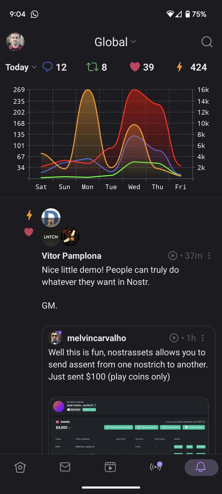
Who did better?
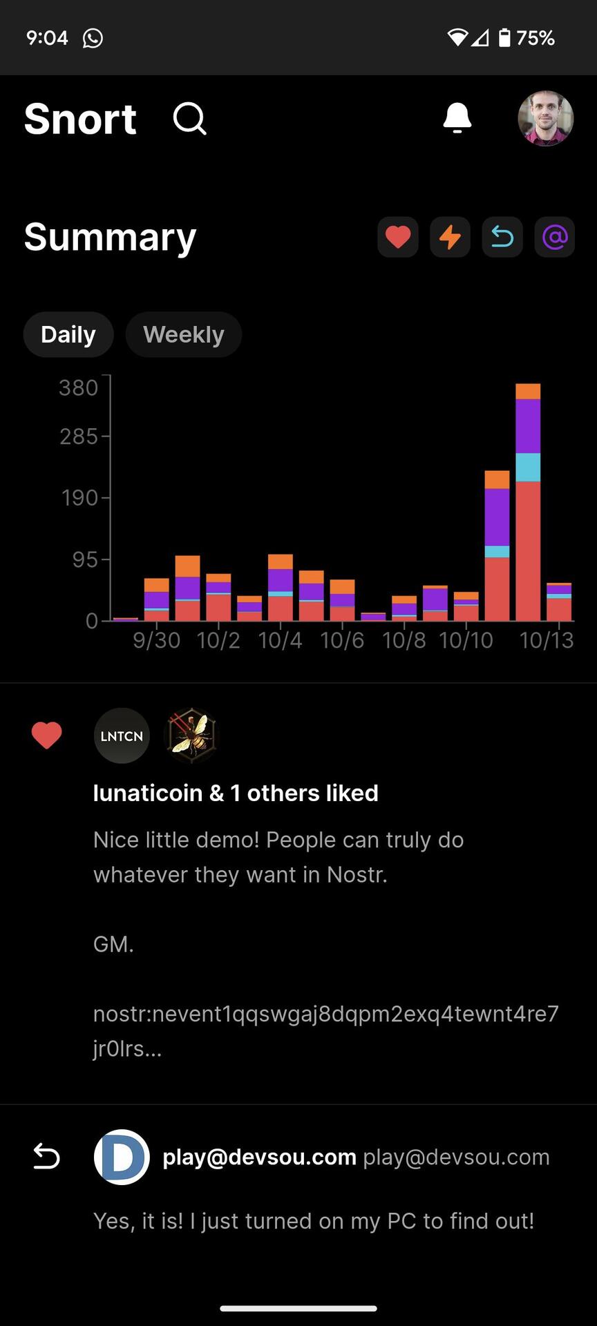
Who did better?
I like the Amethyst version better
Snort
Close, but I would say that right now, Amethyst is the undisputed champion.
Amethyst, I think.
Both look good but Amethyst is clearer in terms of counts of each type vs relative counts.
(But secondary axis on Amethyst is confusing)
Más lindo #amethyst
I like amethyst's ...but I'm also used to it. I may feel differently if I was green to the feature.
"weekly" is a clear advantage imo!
The bars on the right are more correct. It's about events per unit of time. Lines would be appropriate when large numbers are involved and a connection between events over time exists or is at least suspected. So I prefer right.
If the data is grouped per day, it is clearer to also visually group them per day 👉 blocks
But snort doesn't really visualise the amount of sats of the zaps.
Got me brainstorming 😉
It's interesting to think what the user wants out of this. It feels to be less about precision of the numbers and more about relative concepts.
Agree, then Amethyst wins because you can see in a glance whether any of the four metrics went up or down relatively. This is unreadable in Snort without hiding the other three metrics. The grouped metric doesn't seem useful.
Will still think about an alternative to the curves though.
Btw: a detail, but the colors of the icons and the graphs don't match
The lines are a way nicer visualisation. Which makes this a slight humblebrag 👁️
I missed this when using Snort, had to add it haha
I am about to steal this thing: https://void.cat/d/HhgfWZtvSo7ubWQ3d1ux8J.webp :)
The first app.