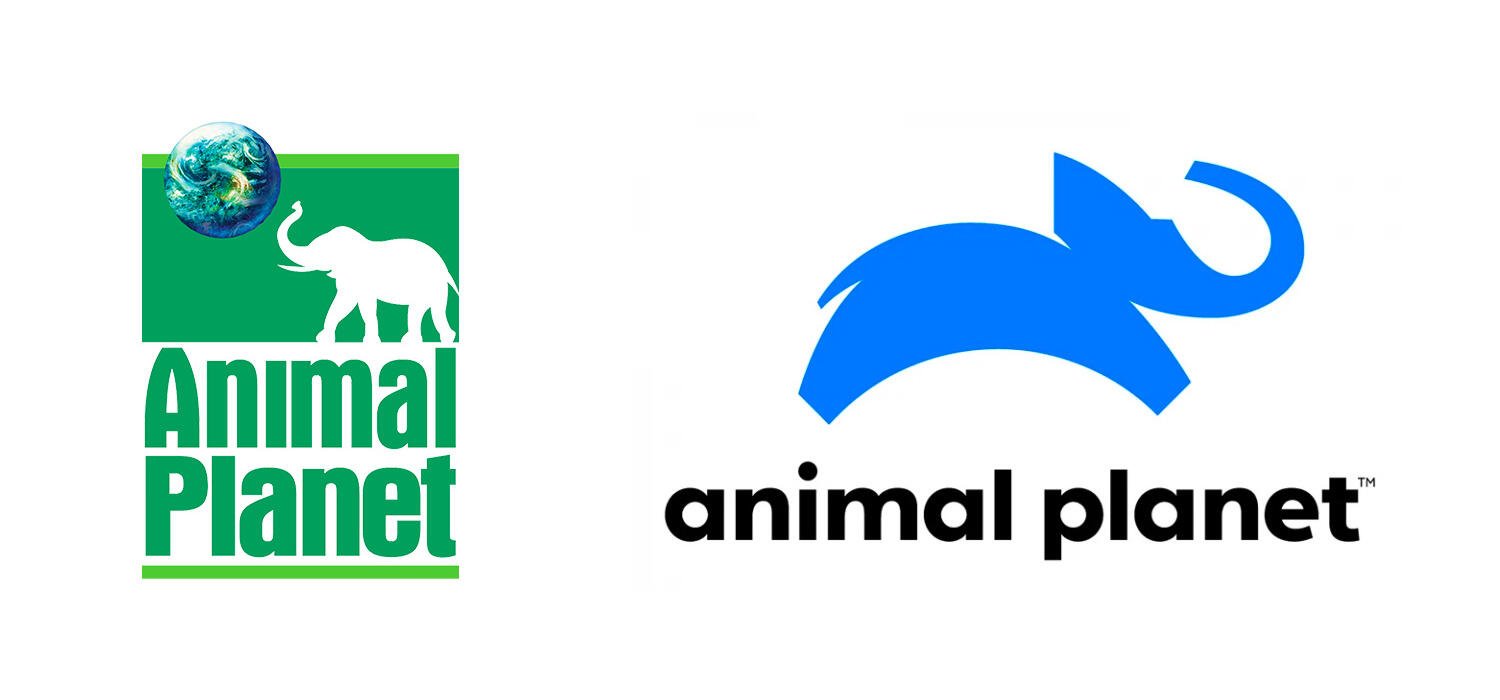
One of my favorite stories about logo design was when I heard a talk by the designer of the new Animal Planet logo.

The client insisted on two things: First, don’t give us an elephant. Second, it can’t be blue. As you can probably guess, the final logo is the one on the right.

Logo design is not about giving the client what they ask for, it’s doing what’s right for the brand, so that it tells the story for you.

Reply to this note

Please Login to reply.

Discussion

Am I the only one who thinks this doesn’t look good?

I think it is dynamic and kind of fun. The elephant seems to have a good time.

I like it a lot. It has energy.

It changes how I feel about animal planet in a bad way for them, but in a good way for me, since I now know what kind of decisions they are making as a company (spending money to destroy brand equity for nebulous superficiality). Reminds me of changing IHOP to IHOB.

It’s ugly

It’s so ugly

I agree new logo is terrible. Not just mildly worse but Orders of magnitude worse

I prefer the old logo way more!