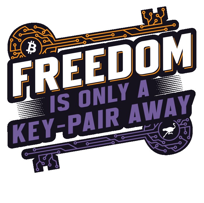
Ok, I think I am liking this version best.

Some folks liked the horizontal, rather than angled, keys. They bugged me more and more as I looked at them, though.

I also felt like having the drop-shadow on "is only a key-pair away" was a bit too busy, and removing it makes "FREEDOM" pop even more, which is what I am going for.

nostr:nevent1qvzqqqqqqypzpde8f55w86vrhaeqmd955y4rraw8aunzxgxstsj7eyzgntyev2xtqy2hwumn8ghj7un9d3shjtnyv9kh2uewd9hj7qgswaehxw309ahx7um5wghx6mmd9uqzqythfgmpm9ujlpydkc0t8h40h5ehqj46ve689hdc9xvn6pjc533lr6uhjm

#Bitcoin #Nostr

Reply to this note

Please Login to reply.

Discussion

How about this

I like that as well. A couple concerns I have, though:

First, even though "key-pair away" is colored, which would normally catch the eye more, it has less contrast than "is only a," which will tend to reverse the emphasis.

I think keeping both lines in the solid purple keeps the main focus on "FREEDOM" and secondary focus on "key-pair away." If I really want to ensure that is the case, I can make "is only a" a bit smaller, or less bold, but still in the same font family.

Second, this is going to be printed on a shirt, and gradients don't always print well. I know solid colors will print cleanly, so I will probably stay with that on the keys and the accents to the side of the middle line.

Oh that's true when printed on shirts. Yeah, just throwing ideas here.

For sure! I appreciate the feedback!

Yup, this one is my favourite too.

I really like it.

Just wondering if the hyphen is necessary. I think key pair without it is correct, but it might be clearer with it.

Hyphen is not necessary. Seems the preferred is "key pair" unless using the phrase as a compound adjective, such as "key-pair generation," which is probably where I saw it used that way.

I will get it updated.