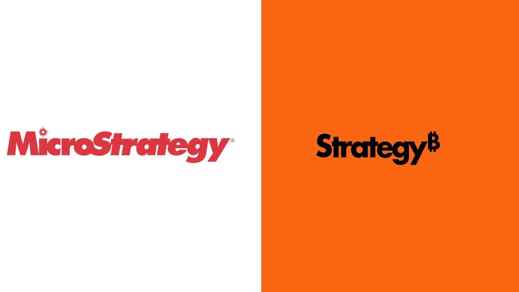
The font is goofy. It should be serious and bold.

The colors reminds me of Harley Davidson. I don't think it fits for a financial brand.

The brand is not Bitcoin. I think adding tue Bitcoin logo depersonalize your own brand and prevent you to go beyond it.

Imo, Microstrategy lost all its personality.
nostr:nevent1qqsxgwx897apr5kyg2r6hw0wxjtu7k63s3pf9z9ayd2f4cly64jmw7gpvemhxue69uhkv6tvw3jhytnwdaehgu3wwa5kuef0dec82c33wcc8gen2wc6kz6rjxd3nyd3sdf685ertx4mngwrtwfjhyunwddnnsendvdhxxdtvwpnh26esw9jxzvp5v4ch5mfnd5ek20mzwfhkzerrv9ehg0t5wf6k2q3qv0tfjv5ahr3c260jtzdk5w48krerrnkg8fmcnc5lpguk0qda04eqxpqqqqqqz7pv5rm

Reply to this note

Please Login to reply.

Discussion

This is terrible. Very agreed. It fits in all too well with all of the modern rebrands from the past decade or so.

Designers have lost their artistic skills and replaced them with a weird loyalty to simplicity and efficiency.

That's called laziness. Lol

That's the word I was looking for!!

Did Microstrategy have any personality to begin with?

'Business Intelligence' software is a particularly grey & dismal field. (Where MS operated before it pivoted)

And Saylor himself comes across as not particularly personable and he has an irritating way of speaking.