An other proof that Microstrategy is fiat as fuck.
This is almost as tasteless as Jaguar rebranding.
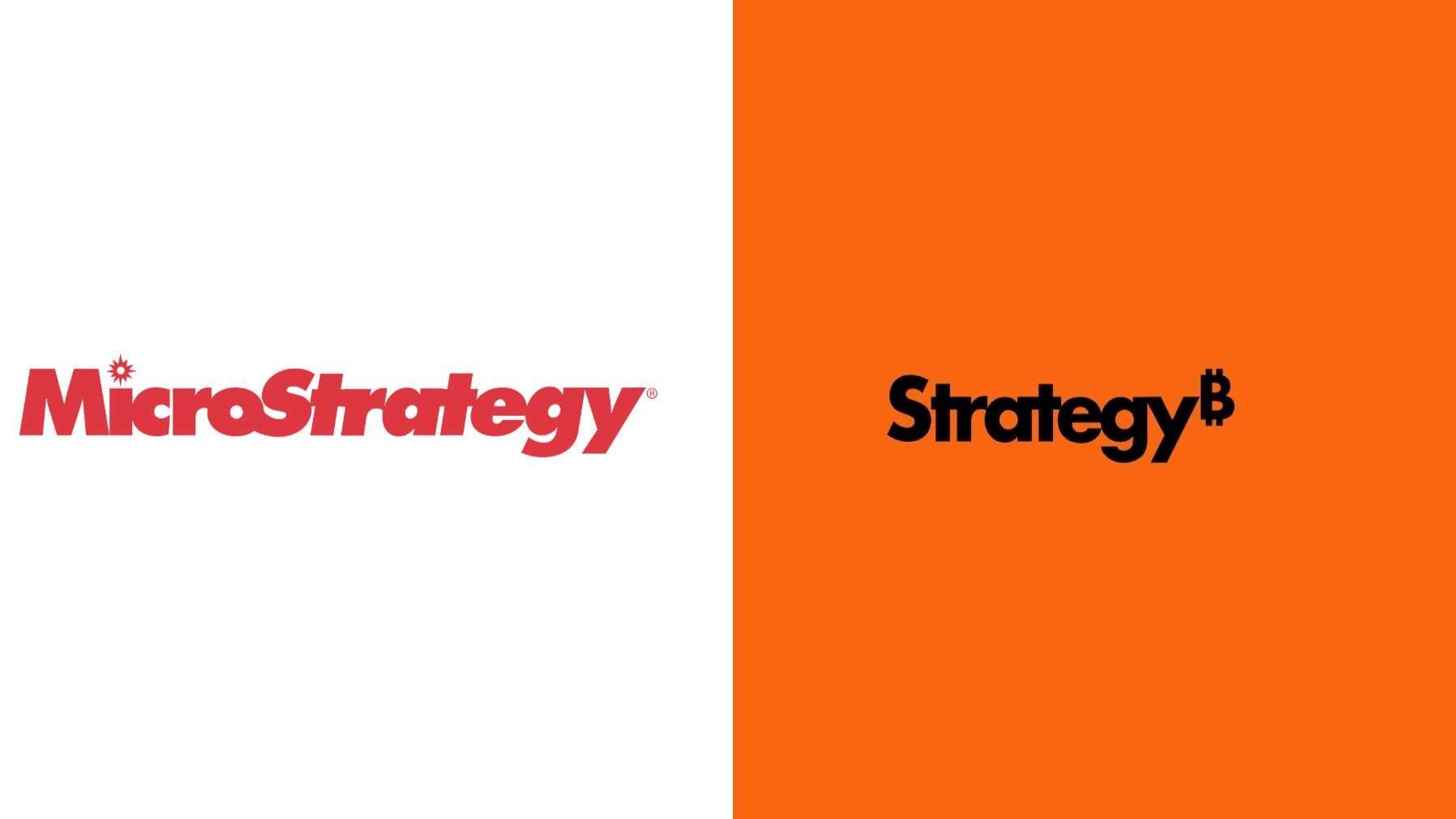
(Yes, this is real and official)
An other proof that Microstrategy is fiat as fuck.
This is almost as tasteless as Jaguar rebranding.
(Yes, this is real and official)
Yeah...well... They should have kept the orginal name but on the other hand microstrat sounds too much like microsoft
interesting I was thinking crostrate
I'm pissed because I was planning a red and white wallet.
The font is goofy. It should be serious and bold.
The colors reminds me of Harley Davidson. I don't think it fits for a financial brand.
The brand is not Bitcoin. I think adding tue Bitcoin logo depersonalize your own brand and prevent you to go beyond it.
Imo, Microstrategy lost all its personality.