I love the LETTERING!!
nostr:npub149p5act9a5qm9p47elp8w8h3wpwn2d7s2xecw2ygnrxqp4wgsklq9g722q
This is #Asciidoc, at work! 🤩
We can create truly elegant, beautiful, documents.
I love the LETTERING!!
nostr:npub149p5act9a5qm9p47elp8w8h3wpwn2d7s2xecw2ygnrxqp4wgsklq9g722q
This is #Asciidoc, at work! 🤩
We can create truly elegant, beautiful, documents.
The lettering all comes out of the box with Flowbite's Svelte components.
We can switch to a serif font at some point, and we can use a different font to make the document summary/overview right below the title pop out.
Can it automatically tell, to write like that, since the first words are capitalized?
I should do that with the Bible books. I've been waiting, for us to finalize the changes to the spec, so that I can transfer everything to Asciidoc, from Markdown, and then clean it up. But that sort of lettering is so classy, fr. Antique.
It can't tell automatically, but at render time the Svelte component is viewing a list of documents nodes and rendering them in order, under each section. I told it to capitalize the first letter of the first node in each section.
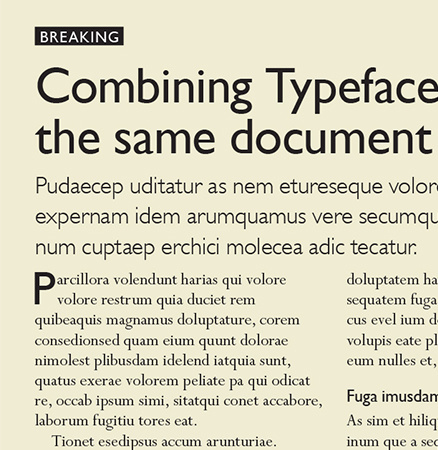
Serif for the article.
Sans for the intro.
I like that. Is there a specific reason why? I want to understand the design logic.
Maybe because the horizontal lines make it easier to read?
Just checked. Serif easier to read at smaller scale.
**Serif** is the best experience (for most people) for long form reading:
Articles, Book chapters, ...
**Sans** is great for shorter, more chopped up types of reading:
Posts, Wiki entries (with all the links etc...), Descriptions, ....
Many are critiquing Serif as inheritance from the printing press and so on.
Plus, a lot of research has gone into maximizing readability.
Lexend — Change the way the world reads. to name just one example.
But you don't see many customers actually preferring those fonts. Readability isn't everything. Serif has a great vibe going for it and fonts like "Lora" are very much readable enough.
Left: Inter + Lora VS Right: Lexend

Which common fonts are the left ones closest to?
They **are** the common fonts lol.
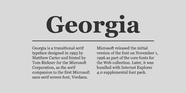
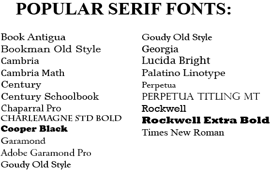
Lora, Georgia, Cambria are some that I'd recommend.
Ooooh, nostr:npub1wqfzz2p880wq0tumuae9lfwyhs8uz35xd0kr34zrvrwyh3kvrzuskcqsyn look, pretty! That looks very neat and a bit classic.

I love that for a body font.
More CSS then asciidoc in this case, but yes looking great.
First letter capitalized is great for this use case 👌.
Asciidoctor's extensions API made this relatively easy, given the complexity of what we're trying to do.
It's so elegant, that it looks like it must be simple to do, but we've been breaking our heads over this, for weeks. 🤣 Discussions, PRs, diagrams, research papers with LLM models and algorithmic design and now the parser and...
The complexity of the data structure is so well-hidden. Very nice. Looks just like you would expect it to.

Just wait till we add in the fun features.
Wikilinks, point-and-click reorganization of zettels, remixing, commenting...
The goal is to make it feel natural. What you see is just the beginning.
The Asciidoc markup helps determine the stylesheet. It's the closest you can get to HTML, without writing in HTML.