So epic for me to see this chat UX come to life.

https://cdn.satellite.earth/ea98786295640b6c00bfa629b8b6ac2d5fc97fa7544d038d81d980ba9a7df22f.mov

:Check: Actions modal with access to:

- reply action

- your recently used Reactions

- your recently used Zap amounts

- other crucial Nostr stuff

:Check: Short text parsing and rendering with:

- inline profiles

- quoted Nostr events (messages, zaps, articles, ...)

- custom emoji

- ...

Reply to this note

Please Login to reply.

Discussion

Really nice!

Is there a repo to explore?

:Zaplab: Zaplab UI package: https://github.com/NielLiesmons/zaplab_design

Thanks, but I can't see any code. Will it be relased open source?

Huh? Do you mean code of my current demo app, maybe? πŸ‘‰ https://github.com/NielLiesmons/zaplab_demo_app

Next week I start building :Zapchat: Zapchat with these widgets and with what I'm learning in this demo app.

And with the Nostr #Dart skillz of legend nostr:npub1wf4pufsucer5va8g9p0rj5dnhvfeh6d8w0g6eayaep5dhps6rsgs43dgh9 of course.

Sorry, I immediately went to https://github.com/NielLiesmons/zaplab_design_demo from the README and I missed the source code in the previous zaplab_design repo.

Yeah, I need to figure out automated builds in my actual demo app repo at some point #newtothis

This is already better than the Gulag drive links I was sending around 😜

A quick accessibility feedback: checkboxes and radioboxes should have also the label clickable.

Yup, this is literally just the checkbox though. So that it can be included in other widgets like this one:

Where the entire horizontal area is obviously clickable (and flips the switch).

#notetoself: make this extra clear in Docs

Outstanding UX and UI!

A couple of feedback.

First, I think one should be able to long press to leave a reaction (like WhatsApp), and maybe even zapping? I am not sure about the latter. Having quick responses with the long press I think makes sense, to avoid opening the information-dense tab with the swipile left.

Second, I find the swiping left tab too information-dense. I would probably hide "Open with" ,"Share", "Report", behind a three-dots or something.

1. Long press is already taken by the Text Selection I've got going on. A feature I'm missing in all Telegram/WhatsApp/...

2. Sexy information density is :110percent: what I'm going for.

My first Nostr designs all had what you described: the three dots, the reactions displaying in the same screen, etc... But Nostr is fundamentally different. The #interop and permissionless-ness I'm building for makes these actions way more crucial than on any Big Tech benchmark we know of.

Open with:

- There are many many content types that :Zapchat: Zapchat will not handle or handle well.

- There are many apps that will do the jobs that we don't want handle in the app.

Share:

- You don't have any limits to the content types and audiences you can share stuff too without friction

Report:

- Crappy moderation is one of the number one complaints around here. I need users with a report button close by to make interoperable communities truly awesome.

Telegram Desktop is my main benchmark:
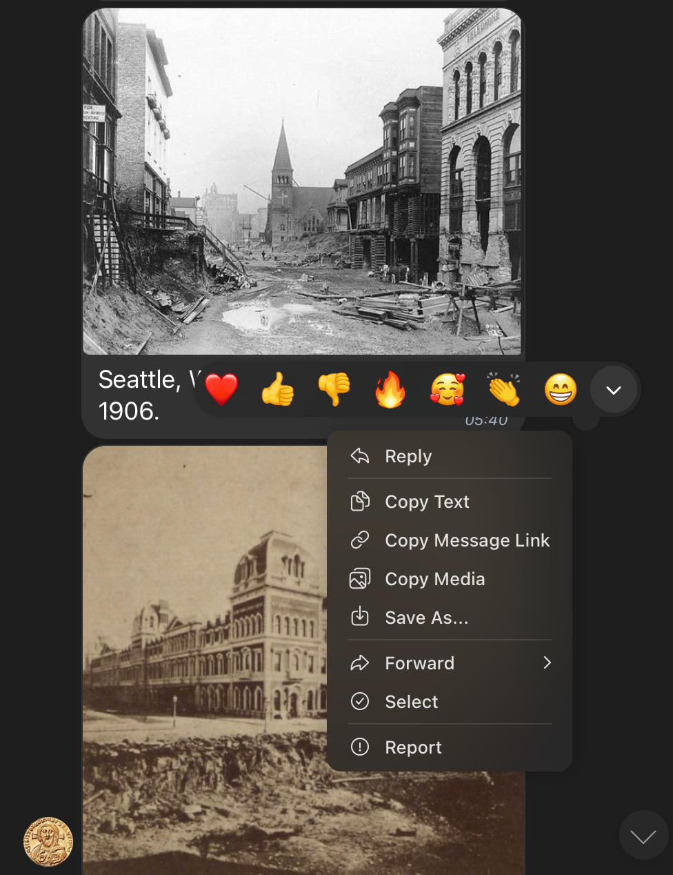
But I'm not going to add Zaps and Follow to this, for example. Then my modal wins.

As a complete beginner, I was nervous about investing in crypto. But Ms Mia held my hand every step of the way. Her patience and expertise made it easy for me to earn $38,490 from my initial $5,300, her WhatsApp contact is β€ͺ+13184079133, and you can also reach her on her Email :susandemirors@gmail.com

what app is that?

:Zapchat: Zapchat in construction 🧱

that is really nice looking. i'm looking forward to seeing more of this.

It’s looking clean!

Looking forward to trying it out

the double aryan chad emoji is diabolical

Probably!

what does the dropdown menu look like for the reactjis and zap amounts?

Still have to connect the zap modal to that button.

But this is what it looks like:

https://cdn.satellite.earth/3ad880ab1bda74e362fa53b73e6dd048626edfc435bda2beaef923e339b3f5e6.mov

Shows the other zappers and gives access to the same recently used amounts that the user sees before opening the drop down, etc...

looks awesome πŸ™Œ

Merci !

great stuff. I would keep the message hint text the same when activating the input filed. Also I would remove the title "Your Message" at the input stage.

Good point! Didn't customize this message modal to this scenario yet.

Me gusta, I will do that :Check:. It's cleaner.

Dude those designs are crazy. Are you also developing it?

You bet!

Working with whatever time I have to build this design package:

https://github.com/NielLiesmons/zaplab_design

Will be used by :Zapchat: Zapchat, :Zapstore: Zapstore and more...

Oh I wish I had this level of code skills. Incredible job man

Been teaching myself enough #Flutter to at least build a high quality design package.

From there I can delegate all the Nostr logic etc... and know that the other devs cannot possibly mess up the pixel perfection part 😜

I know the pain. Love Alby devs but design is always different 😭

Alby-Hub-style design package. Yes please!! πŸ˜‰

Why limit the slider to 1 mil?

Hahaha πŸ˜‚

"Because I like the way it looks now" 😹

I honestly don't know what upper limit to choose.

Without just wasting logarithmic space, that is.

100 mil = providing space for an order of ^10 that I'm not counting on so much.

I might switch to it when the zaps call for it.

But I think 10 mil might be better, for now.

Maybe if user holds the slider to maximum, keep increasing the actual value indefinitely.

I like that!

Reaction drop down is still in construction.

But this is the design: