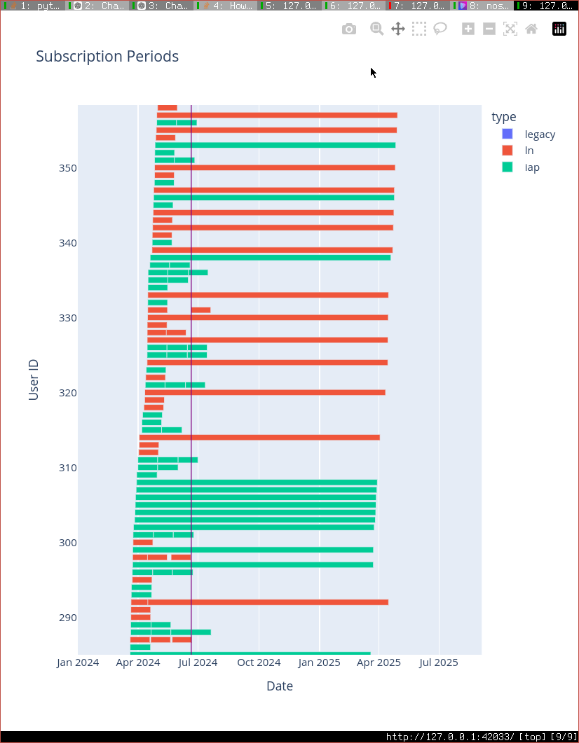
Wasn’t sure the best way to visualize our subscription data, so I gave a very small sample to chatgpt (just sub#, no pubkeys, just start and end dates), and it suggested a gantt chart. Very cool. Not sure I would have thought of this. It even wrote all of the python code and used a library called plotly which i never used before. thank you gpt sensei.

Reply to this note

Please Login to reply.

Discussion

#Elon Musk will ban Damus at Tesla if gets to know you are providing subscriptions data to ChatGPT. Not PII but still.

Im not providing subscription data, it was just example data to get it to generate the code

I would love to see how many new Nostrs are awakening from the matrix every day. A sort of counter placed somewhere

Visually they look evenly split as a user count (ln vs iap).

Overall revenue, iap users look stickier and ln users churn out.

Is that what your numbers show?

I haven’t done the exact calc yet, just a visualization, but it is definitely looking like iap is more sticky. This is kind of what I would expect.

Hopefully at least 30% more sticky. And you have to wonder how many of those IAP users would have never done an ln subscription. Seems like an overall win.

I wonder if Venice.ai could do the same for you. So we can stop feeding the chat gpt overlord