Whats better?
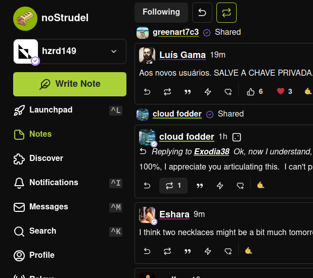
I added an option to the display settings in noStrudel to show the pubkey color as an underline instead of a border around the avatar
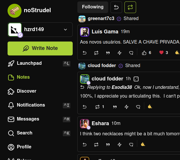
Whats better?
I added an option to the display settings in noStrudel to show the pubkey color as an underline instead of a border around the avatar
Much nicer.
Personally not a huge fan of underlines, I think they make things look too busy.
Love the border.
I like border. But would also love an option to have it as a color circle before the name. If the color is on its own it won't get mixed with the color of the image and maybe be more memorable.
Color circle example 
underlines are just bad, easy decision
more useful would be showing the first 4 first last characters of the npub (after the npub1 ofc)
underline
I like the border better.
2
Border.
border
Border
+1 Avatar
the reason FOOLS below think underlines look busy is because there are SIX underlines but only THREE borders