Negative space ftw #logodesign
Negative space ftw #logodesign
nostr:npub1s3ht77dq4zqnya8vjun5jp3p44pr794ru36d0ltxu65chljw8xjqd975wz, nostr:npub1l5sga6xg72phsz5422ykujprejwud075ggrr3z2hwyrfgr7eylqstegx9z, nostr:npub15qydau2hjma6ngxkl2cyar74wzyjshvl65za5k5rl69264ar2exs5cyejr all yours if you like it.
nostr:npub1qdjn8j4gwgmkj3k5un775nq6q3q7mguv5tvajstmkdsqdja2havq03fqm7 nostr:npub1ecdlntvjzexlyfale2egzvvncc8tgqsaxkl5hw7xlgjv2cxs705s9qs735 nostr:npub1wqfzz2p880wq0tumuae9lfwyhs8uz35xd0kr34zrvrwyh3kvrzuskcqsyn nostr:npub1q6ya7kz84rfnw6yjmg5kyttuplwpauv43a9ug3cajztx4g0v48eqhtt3sh nostr:npub1356t6fpjysx9vdchfg7mryv83w4pcye6a3eeke9zvsje7s2tuv4s4k805u nostr:npub1w4jkwspqn9svwnlrw0nfg0u2yx4cj6yfmp53ya4xp7r24k7gly4qaq30zp nostr:npub1m3xdppkd0njmrqe2ma8a6ys39zvgp5k8u22mev8xsnqp4nh80srqhqa5sf
🤔 Do you see the knight's helmet?
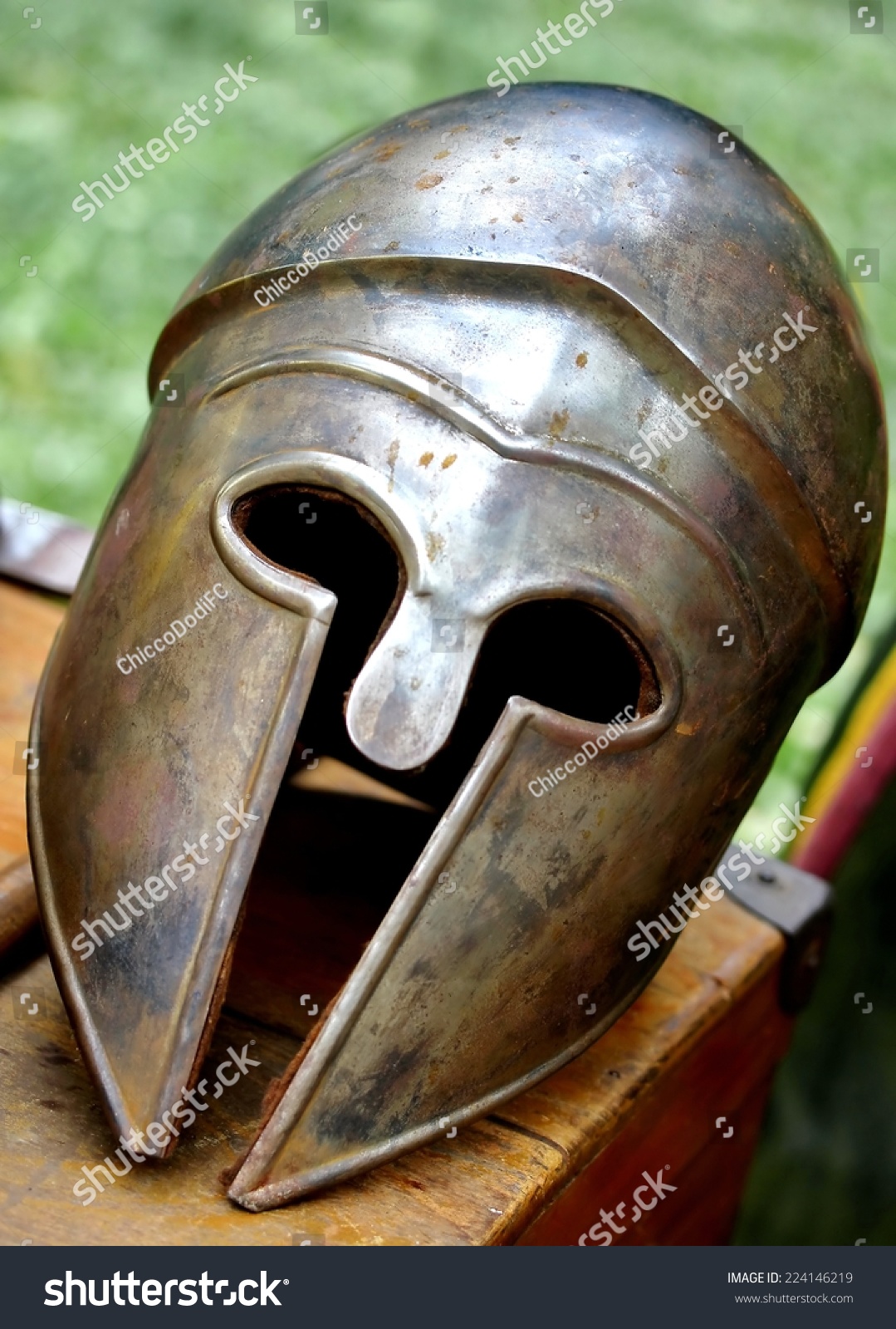
I love the helmet motif.
The style fits the stuff my daughter has been working on, well, and she didn't have one for GitCitadel, yet. We were going to use a castle for thecitadel.nostr1.com relay, and didn't have anything for the gitcitadel.com website.
Or maybe we'll do it the other way around. We'll see. She got the GitRepublic rework done, and it looks nice.
I love it !
Mine.
nostr:npub149p5act9a5qm9p47elp8w8h3wpwn2d7s2xecw2ygnrxqp4wgsklq9g722q can you get me a version where it reads "GitCitadel"?
🫶 bro, fr
Keep trying to zap you. Minibits is acting up. 😅
Looks a bit like a weeping knight 😆
I see what you mean, mmm.
This is awesome! Hopefully I can get my wallet up and running soon!