
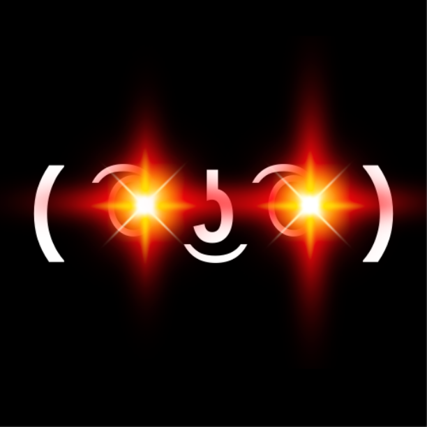
Lmk what you think 🤙 


Not John Wick lobby, nostr:npub12r0yjt8723ey2r035qtklhmdj90f0j6an7xnan8005jl7z5gw80qat9qrx was exploring some new ideas yesterday 🫂 🙌.
nostr:npub12gu8c6uee3p243gez6cgk76362admlqe72aq3kp2fppjsjwmm7eqj9fle6 nostr:npub13cnlldwfhwxd6qf34hnwlfya2m2qrd2zfk0alxnrup6d2fasw9wqxwkzpe nostr:npub18ams6ewn5aj2n3wt2qawzglx9mr4nzksxhvrdc4gzrecw7n5tvjqctp424 nostr:npub1t3ggcd843pnwcu6p4tcsesd02t5jx2aelpvusypu5hk0925nhauqjjl5g4 nostr:npub1jk9h2jsa8hjmtm9qlcca942473gnyhuynz5rmgve0dlu6hpeazxqc3lqz7 nostr:npub1paj65nf92xpx8pec38esgl74ugvdxwejmpjw3gs3m8qy2ghaxywsyq4wpxnostr:npub1g3827ewz6d23rlgdhkaslc78gyule52ymcqdyt2hsxdwtlw8dt5q7dfpvg nostr:npub1ppjkfvk0ek3g584gp7qp9d3znwdznadchet7q2aez9r27620n9zs45xvx2 nostr:npub1yx6pjypd4r7qh2gysjhvjd9l2km6hnm4amdnjyjw3467fy05rf0qfp7kza and all the frens hopefully are available to join 😃
Discussion

First and the last two look promising 🤔

That second last one is centred like the first but the neon cursive is a bit thin
The second 👌

1st and last 🤙🏻
This one:


I like the one nostr:npub12rzunrxvx89f78h4df284lzvkjqetljkq0200p62ygwmjevx0j8qhehrv9 picked but I want to see it in this font.

👀
I realized too that when uploaded the lighter background doesn’t have enough contrast to read it when it’s a smaller thumbnail 

One and two look best to my eyes.
Last one is not bad either.
Stack the second one and put it on the middle 🤔


Second one 👌🏻


Number 2
Number 2

The first, second, and last are my preferred styles. They are easier to read and have a somewhat interesting techno vibe.

2nd and 2nd to last catch my attention most
Pick 1 or 2 

1
2, but move the text a bit lower
💡🙌
I like the tree as a centerpiece 💜
You have a file to send, so that I can play around with the text box?

Perfect 💜

How about throwing the text up top 🔝
I was asked for bottom 🫡 center was a creative choice


1 🔥

1st and 2nd last

The 2nd one, clean and modern at the same time 💜💜🫂