
This is such a cool chart! Thanks for it!
Discussion

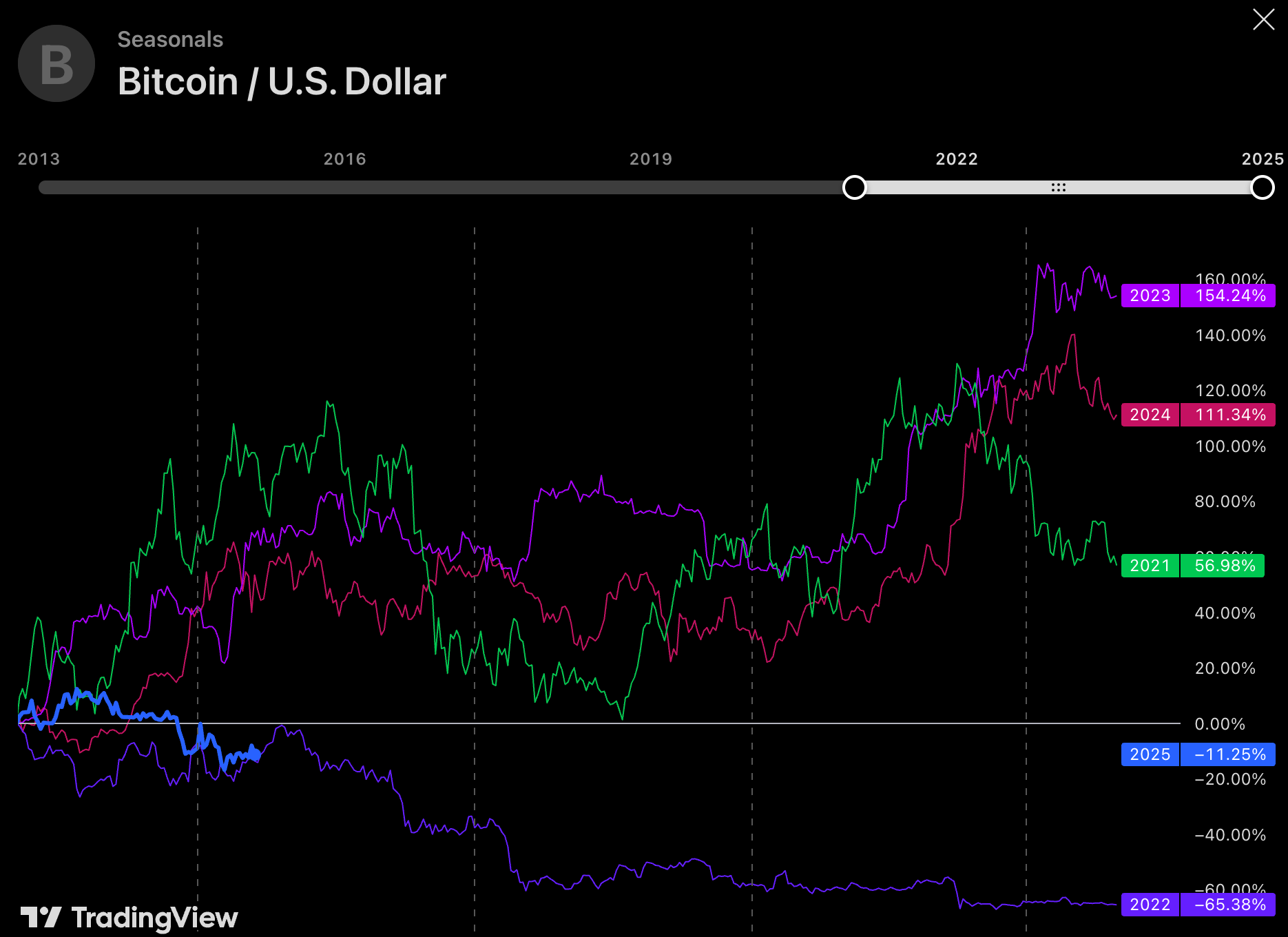
Courtesy of TradingView 😉
It's interesting to play around with, they have data going back to 2013; fun to compare different years to each other.
I'm definitely going to set this up. This with respective global M2 liquidity and also a longer chart (more time, to see the bear cycles too) would be very cool.
Top notch stuff. Thanks again :)
Comparing Bitcoin price chart to global M2 is wild– the correlation (delayed by 10-12 weeks or so) is so close it’s crazy!
Spoiler alert: M2 has been going ⬆️