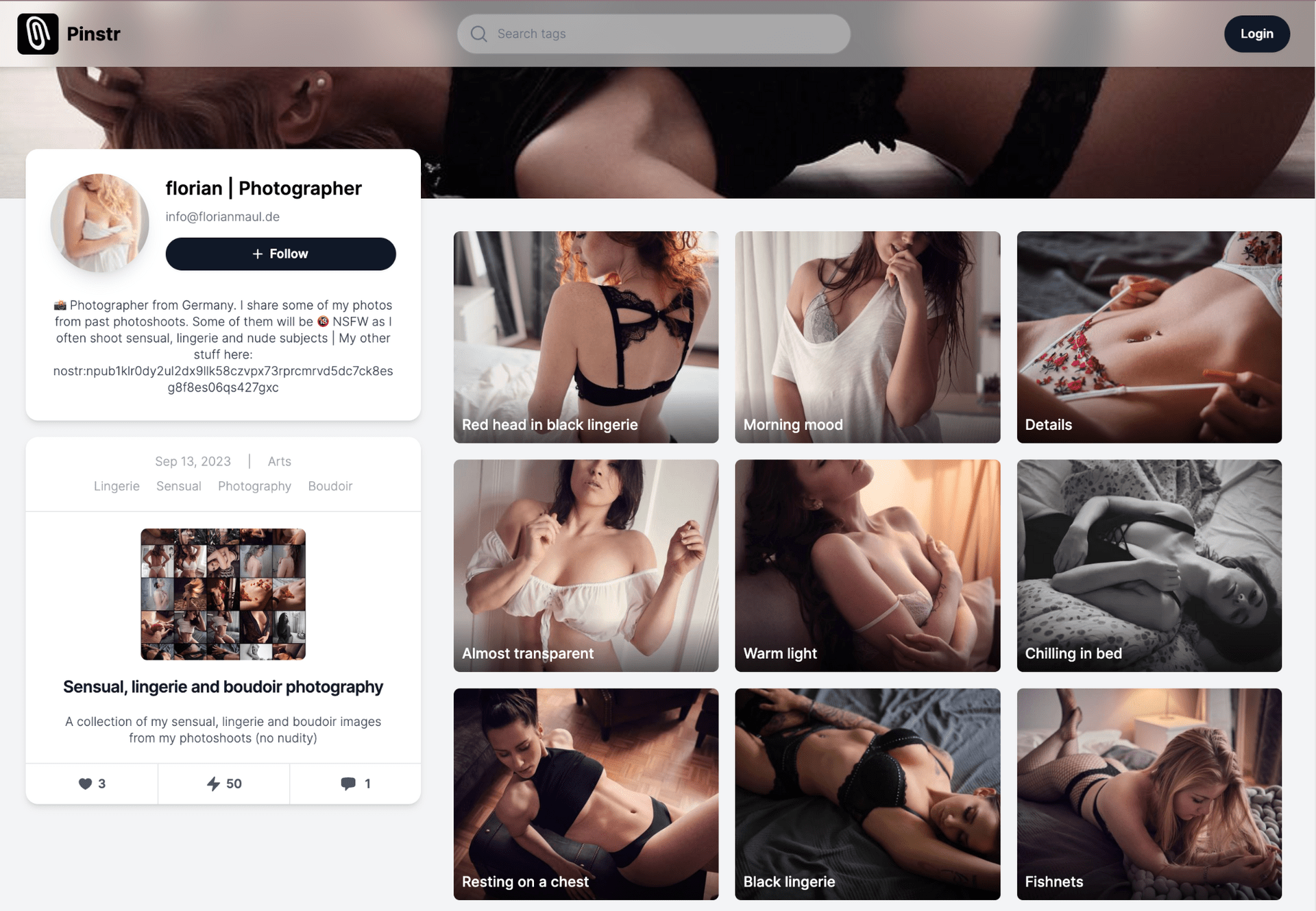
Haha, you're really trying to convince me here. Must be hard to work if your prototypes look like this 😉.
This is a layout that is not easy to understand though for me.
On the right: how does the user know if these are pictures or albums?
On the bottom left: having the details on top instead of the pic or Title is confusing. Also, this segment could use a title or something, if not I don't know what I'm looking at and it looks the same as the profile info on top.


