Nosotros always showing your connected relays top right, and having the relay icon for each post too, is nice UI. This is the first client that has made me really feel the pulse of Nostr.
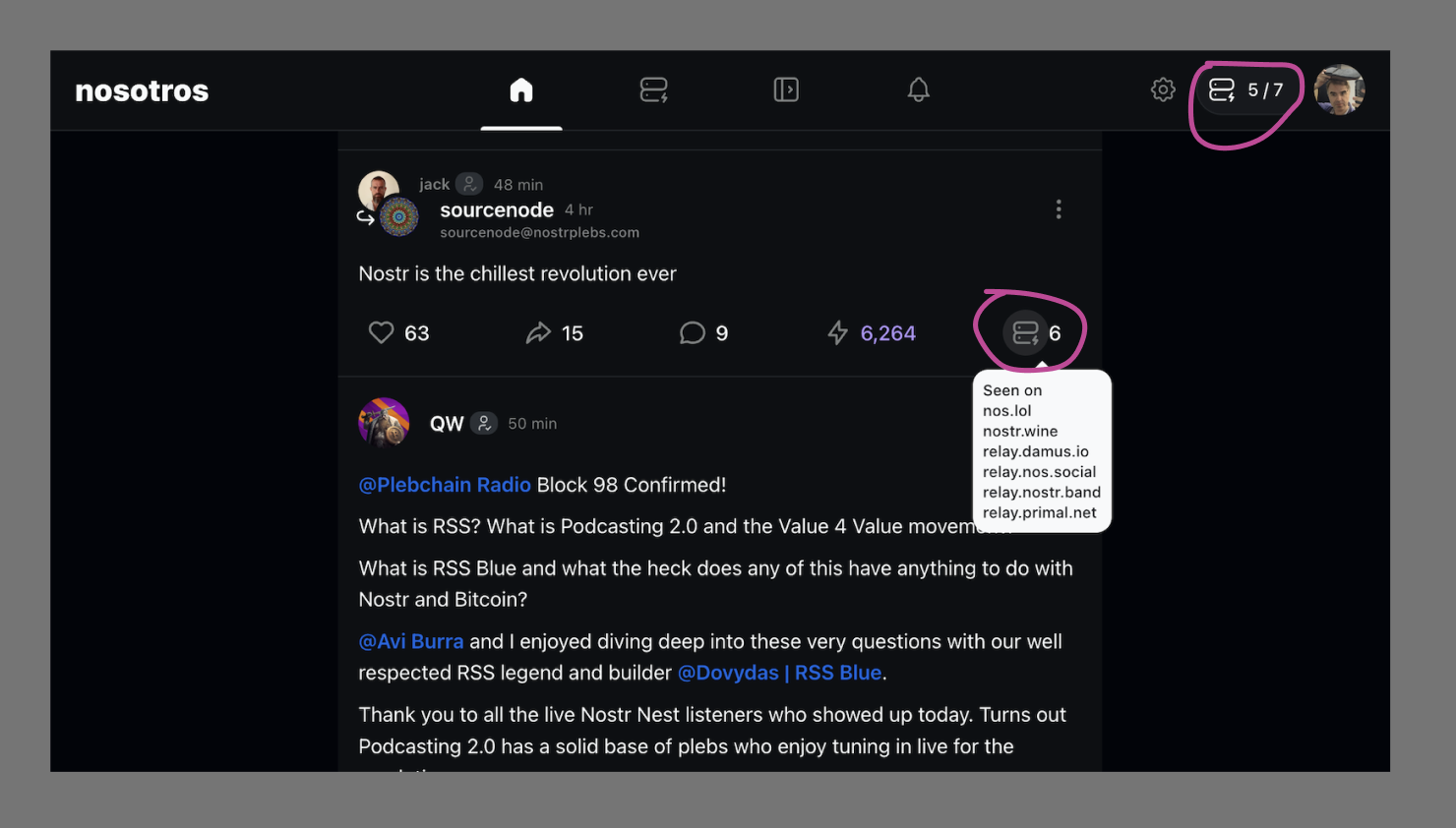
Nosotros always showing your connected relays top right, and having the relay icon for each post too, is nice UI. This is the first client that has made me really feel the pulse of Nostr.
I like having the full UI turned on in Amethyst for the same reason.
What OS is Nosotros on? Not familiar with it.
it's on the browser, nosotros.app, let me know what you thing, next update will more stable and faster.
Replying from Nosotros. Looks pretty clean!
Home feed feels a bit like each note runs into the next. Not enough indication that they are separate.
Deck view looks very promising. Need more options for column types, such as hashtag feeds, lists, a particular relay, etc.
That's an interesting insight, thank you for this, I will think about something
I like this on the posts.
It goes a long way to solve Nostr's "is this thing on!?" UX problem.
Could use relay pfps rather than force user to read wss URLs.
Could pair with a broadcast/blaster feature to extend reach.
"is this thing on!?" UX problem -- Good name.
This helps a lot. Loading seems off, quick glance up shows 0/7 relays, change VPN, shows 7/7 (and shows then coming online one by one too), so no need to dig into network settings somewhere.
An idea nostr:nprofile1qqsgzfdez8ksa9xmuvqg5zly3nl9e5xqkpvj8nllj9aw06ra4pqq3qcpzamhxue69uhhyetvv9ujumn0wd68ytnzv9hxgtcafn9rr this UI on the posts may be quite nice for a relay-centric client.
I think so, too
Try jumble.social and let me know what you think.