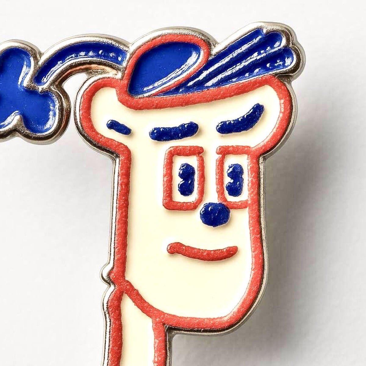
I'd argue nostr doesn't need a logo for the protocol. there is no logo for nostr just like there is no logo for SMTP, TCP/IP, DNS, and the list of protocols goes on.
But we do need something to rally around. It is the nature of humans when they form connections. We rally around the ostrich.
The ostrich has become a mascot. Early nostr adopters first developed nostr as a social media alternative to the little blue bird. To encapsulate the desires to be better, faster, stronger, the community went with the biggest bird, the ostrich.
coincidentally, the ostrich has many letters in common with nostr which is, in my opinion, serendipity.
These new designs that want to be "the logo" for nostr that don't pay at least a little homage to the ostrich are seriously missing out on a piece of culture that shaped the beginning of nostr. It's almost insulting when they say "adopt this new logo because its better because it doesnt have an ostrich."
I will be very sad for the day that the ostrich disappears from the collective mind as the symbol for nostr because we will have lost a part of our history.


 #m=image%2Fjpeg&dim=519x519&blurhash=UDGbJr%3Fa00DjRJDiR%25.800V%5DtKtR%25LtkM%5DMx&x=ada5eb806a09e63e3a419a8d8678936d2b8ea21fc29e56414d94222e81100451


 #m=image%2Fjpeg&dim=804x345&blurhash=ZeQmCrt7%7EqRjayWBRjj%5BM%7BRjof%25MRjM%7BofRjxu%25MD%25of%25MWBRjayWBofofD%25of%25MayofWBWBWBRj&x=bafa753dede778eb3a04e9b88e5956ba2213e29606d02c8fe152fbf06ef0b731