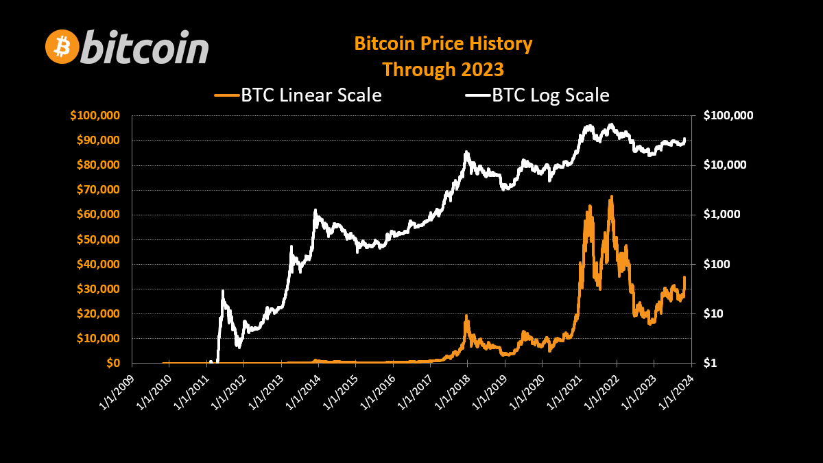
“We’ve all seen the logarithmic bitcoin chart. You have to remember that the vast majority of people in the world have not seen that chart.”
— nostr:npub1a2cww4kn9wqte4ry70vyfwqyqvpswksna27rtxd8vty6c74era8sdcw83a
“We’ve all seen the logarithmic bitcoin chart. You have to remember that the vast majority of people in the world have not seen that chart.”
— nostr:npub1a2cww4kn9wqte4ry70vyfwqyqvpswksna27rtxd8vty6c74era8sdcw83a
Showed the M2 money supply chart to someone while discussing Bitcoin. He asked if that chart was just a Bitcoin thing.
Early.
That sentence caught my attention as well.
I have missed that chart for 4 complete years, or worse 7 considering the first unintentional BTC purchase to a wallet.dat that I lost lol. Starting 2017 I was always saying, oh those Bitcoin maxis what are they thinking 🤔 7 transactions per second! Are you kidding me?
So, I didn't invest, I didn't learn, I wasn't curious enough to ask, and instead I kept fighting fiat bosses for pennies until it gradually but surely and suddenly sunk in and I woke the fuck up.
mfw Bitcoin is on establishment news
 #m=image%2Fjpeg&dim=888x499&blurhash=iAK-5zIU%7EV00Di%25f%25gIUWC00019togNH%5E*E1oL-%3B_N%5E%2B8_-%3Bo%7D9FkDIo%3FaSeM%7BS5NFx%5BIUn%25xtt7-%3BIoflIV%252a%23%25M%252t7&x=d54b55a88e6eeac190b8a50879725a4b46a3ce07ed96c612952f72c0b69cf7a5
Most people don’t even want to acknowledge it when you show it to them either. They are too conditioned from a lifetime of rug pulls in the fiat world.
I think you're right.
What almost immediately convinced me when I was orange pilled 2,25 year ago was not so much this chart, but rather the concept of scarcity...
What is the logarithmic bitcoin chart?
This one.
I’ve got a better one https://video.nostr.build/bbd2c3362fee6c0d26d7fc1c7d26a8b7f0855cc75aeea1c2b708a5e388af4738.mp4
nostr:npub14uhkst639zvc2trx2nlsvk4yqkjp690zk89keytnzgmq2az0qmnq58ez89 makes sone wicked good chahts
This one actually breaks my brain.
If the proles haven't seen a logarithmic chart yet, a polar one will blow their minds.
Few are ready for the spiral chart.
Yet
Now put US national debt chart in log scale...and you'll see that its an exponential increase as well.
Same with that image of USDollar purchasing power. If you don't put that in LogScale the last 50yrs look fairly benign.


I've seen that chart.
https://en.m.wikipedia.org/wiki/Tulip_mania #/media/File%3ATulip_price_index1.svg
We're now at "Nov 25"
2nd. attempt
https://en.m.wikipedia.org/wiki/Tulip_mania #/media/File%3ATulip_price_index1.svg
Somehow a space keeps appearing before the #