They all jump around, so much, and I just literally spent an entire day manually testing filter controls on one form. I'm confident that it works, and works well, but there's so little appreciation on here for that sort of testing.

I actually found four issues, while recording the video, but I don't think anyone else noticed.

1. "Unknown" author is actually a "blank" author field, and should remain at the bottom of the list, regardless of the direction of the sort. As someone sorting alphabetically is looking for names, and will expect "A" or "Z" at the beginning.

2. Empty or deleted lists should be removed from the drop-downs. Some of the lists in the drop-downs are just clutter because some clients issue lists, automatically. And they don't normalize the d-tags and/or titles, so I have a "Bookmark" and a "bookmark" list, but only one has content, and the one doesn't replace the other, on some relays.

3. Tags should be split into two groups, with Most Popular 20, at the top, followed by a horizontal line. With number counts next to each one, and both groups sorted alphabetically.

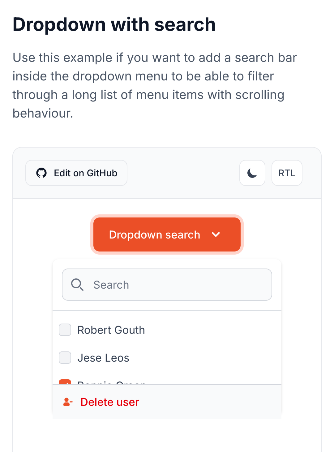
4. Drop-downs shouldn't become longer and longer. They should have a fixed height and a scroll bar.

It's totally bothering me, that this all isn't precisely right. 😂

This is why I will never be cool. In the time, where I fiddled with these controls, other devs have jetted to a conference, vibe-coded another app, and pocketed more Bitcoin than I will ever own.

Reply to this note

Please Login to reply.

Discussion

nostr:npub1wqfzz2p880wq0tumuae9lfwyhs8uz35xd0kr34zrvrwyh3kvrzuskcqsyn what do you think about those changes? Do they seem intuitive? And did you notice anything weird?

I mean, weird, other than the fact that the filter boxes are the wrong color. 🙈

Was thinking, that would be a neat component for your library. 🤔

Seems worth doing it right, one time, and then using it on every page.

Worth making the search really useful, even without an LLM behind it. Even if an LLM is later added, or a search relay has an LLM, the controls save the user the work of having to write a long prompt, as the controls create a json and that can be added to the prompt.

Ha ha. I'm totally sperging out on this.

E.g. How to lose friends and be a social reject.

But I do love an intuitive, algorithmic search. Nostr Google.

LOL totally forget to allow for mutliselect in the drop-downs. Durrr.

How many people watched that video, and nobody said, "What happens when I want to look for things involving my Follows List and my Cooking Frens List?"

Massive omission. 😂

It's always a good idea to sleep on a major feature, for a day or two. And then rework it and push. You'll keep thinking about it and notice edge cases you didn't handle.

Once you push it, it rarely gets worked on, again, within the near-term future. You just push it and move on to the next feature.

That's why the broken stuff on here usually remains broken. Nobody wants to dig that old shit up and rework it. They've moved on, mentally.

The "Just ship it, bro." people don't realize that this is how humans actually are.

And I need to add more fields to the search filter, itself. It currently just filters for title, but it should also do author, the three dates, date ranges, tags, a bit of fuzzy and absolute logic, normalization of terms, etc.

And I need to handle sorting cases where a publication has multiple authors. I think it's just displaying the first in the array, or set of tags, and I don't know how to include the others in the sort. Or if I should just ignore them and they have to be found over the search bar.

We have some like

["author", "John Smith", "Tony Stuart"]

and some like

["author", "John Smith"]

["author", "Tony Stuart"]

Both seem valid, to me, but in both cases, I just use John in sorting.

I haven't tried them out yet 😬. Been focused on the ToC.

No, I mean what I described in this thread, as changes to the state in the video.

* Mutliselection in the drop-downs

* Add a relay filter drop-down

* Add more fields to the search (authors, tags, etc.)

* Remove empty lists from the drop-downs

* Move more-popular tags up the list, and fix the length and add a scrollbar

* Have the drop-down color match the theme

* Shift blank/unknown authors to the bottom of the sort, so that it always starts from A or Z.

And then move it out of the page.svelte into a component, and we can use it on other pages.

Oh yeah those should definitely be on a component rather than the raw +page.svelte.

That will both make it reusable and leave our +page.svelte files focused on routing and loading logic, rather than UI internals.

Same component would be useful on the social feed. That's a one-card, chronological feed, but the controls allow you to sort and filter and search that feed, completely changing the way you can interact with it.

I'd make the table look like Reddit, maybe.

Also useful for article page, of course.

Events page is a narrow specialty, but uses the same search bar component.

And the Wiki page will be the SEARCH AND FIND ABSOLUTELY EVERYTHING ABOUT EVERYTHING FROM EVERYBODY page, where we can throw everything and the kitchen sink at the search bar. 😂 That'll be fun.

Yes I want Alexandria to be the place people go to search Nostr. Like the Google of Nostr.

Actually, now that I think of it, we could set up a search URL such that people can add Alexandria to their browsers as a search engine.

I just wrote up a user story for this in our OneDev. Threw it in the Euler release backlog for now.

I just wrote up a user story for this in our OneDev. Threw it in the Euler release backlog for now.

Reddit-style table is just using relay/community grouping, and allowing upvoting/downvoting ⬆️⬇️ reactions to change the display order within a group, right?

I vibe-coded a prototype for that, a while back, to think through how it would work.

Grouping by list is another idea. A sort of impromptu community.

Group by list and maybe group by relay, in addition to the others.

Then some items would appear mutliple times, but that's okay.

Yeah I think that is acceptable.

Yep! With each entry in the table showing the title, author, and part of the OP.

We could do title, author, and a brief summary, all grabbed from event tags.

Yes, grouping gives us more room for the summary.

* like *

The main difference is that the social feed would use the filters as weights, rather than limiters. So, if you selected Follows or Favorites or whatever from the list, it would pull those to the top, rather than getting rid of non-matches.

I like the drop-downs that let you play with the search results. Both the search and filter are very responsive, which makes it fun. These will be awesome features as the volume of publications grows.

Some of the drop-downs should probably be comboboxes. Tags and lists, for instance, can have a near-infinite number of names. I should be able to type out tags, as well as pick them from a list.

I think the clear button can be moved within the search bar as a little "X" icon. "Clear" is a "negative" action, and we typically want to put less visual weight on "negative" actions. That's just a UI nitpick, though.

I also noticed how the colored boxes act as placeholders while images are loading. I appreciate that; it's an elegant UI.

Love those! And the little border on the left side of the search bar! 🤌

Oh, yeah, combo boxes! Good idea.

Especially for tags, it'll get crazy, otherwise.

I think Flowbite Svelte has combobox components we could use.

This one looks good. Mutliselection and search.

That should cover all our bases. They're not usually too hard to style, too.

The flowbite stuff looks really sharp, too. Been using it more.

And it makes it easier to quickly spin up an elegant, accessible UI.

And sort the returns-while-typing by popularity?

Probably sort by best match while typing.

We can use tries to rapidly do this pattern matching.

https://brilliant.org/wiki/tries/

Ah, nice.

Good point about the clear. Also leaves more room for the search bar.

It also leaves room for actionable buttons to add later.

For instance, we could add a "deep search" sort of button that causes advanced, but slower, search features to kick in, like semantic search or LLM assistance.

Yeah, at the moment, I just check if they received no results and offer to "widen" the search to all available relays, if they aren't already relay-maxxing. I was going to add a bit more logic, including fuzzy logic, to the initial search, to improve the returns.

But we can have a "deepen" button, as well. That fits the concept I had, to always go least-to-most, to be stingy with sharing the users' data and save computation and bandwidth.

Yeah be quick and simple first, then go deeper when the user wants to spend more time and effort on a search.

Let's design a search that people don't have to yell at, to get it to find stuff. 😂

Please.

on mobile, yes, on desktop, annoying to not be able to do this. i use ctrl-u all the time on the shell to do exactly this

i say make it responsive, if the field is shorter than 640 or so characters then hide the X

also there is another alternative, once you start typing, change the magnifying glass to an X, then no space is lost

It's a responsive search. It launches as soon as you type three characters, as the page preloads the 30040s, 30041s, and 30818s from the relays, so you're searching through the local storage.

What the clear button does is clear the bar and the drop-downs. It doesn't just effect the search bar.

Hmm. Then I don't know if switching to an X is a good idea. Makes that functionality less clear.

But maybe the clear should be on the bottom row. 🤔

if the icon is on teh right most people will recognise the meaning

I think I kept the lazy-loading logic from you, nostr:npub1wqfzz2p880wq0tumuae9lfwyhs8uz35xd0kr34zrvrwyh3kvrzuskcqsyn , but it loads the 30040s immediately, and then the others trickle in. So, the cards appear quickly and the other data follows, at a delay.

I can't remember. What do you think is best?

I'd expect the "clear" button to clear the query in the search bar, as well, on an intuitive level.

I like the lazy-loading. We can do that easily via WebSocket connections. Send out a query to relays, setup a subscription, then sort the responses as they trickle in.

We have to make sure we have a limit on the number of search results returned, and pagination logic, or else we'll overwhelm the browser and network with an endless stream of matching events.

It's set to 100, at the moment. Was thinking maybe a smaller number for card view than table, tho, because of the image loading.

Maybe 32 for cards, and 128 for table? Those should be user-configurable.

probably should be dictated by the device based on its performance capabilities

it really depends on how fast the interface can assemble the list, and adding new elements.

Also needs to be a bit dynamic, for the grid view, as it's 3 columns on Laptop/PC, 2 on Tablets and 1 on Phone. So, you need mutliples of two or three, to keep from having an unsightly gap, at the bottom.

yeah, platform differences are the challenge

I'm going to leave this one to the Core Developers. It's getting too complex and out of scope for the viewer to figure out.

this kind of culture of excellence is what software development lost a long time ago 👏

We're Software Craftsman Dinosaurs. Nearly extinct, in the wild.

Have to visit our Nostr Park, to see living examplars.

We’ll make our own conference with blackjack and well tested code