Most #nostr clients still suck in terms of discoverability. But they don't have to.
They don't have to because we have all the right building blocks already, we just lack courage to steal. Yes, STEAL. I'd encourage everyone to steal—not copy—what other clients did well. In the spirit of "good artists copy, great artists steal."
Let's take a web-based reddit client for example, one that still works (sometimes) despite all the horrible API changes: https://www.popular.pics/
If you visit that site in your browser, you'll be greeted with something like this:
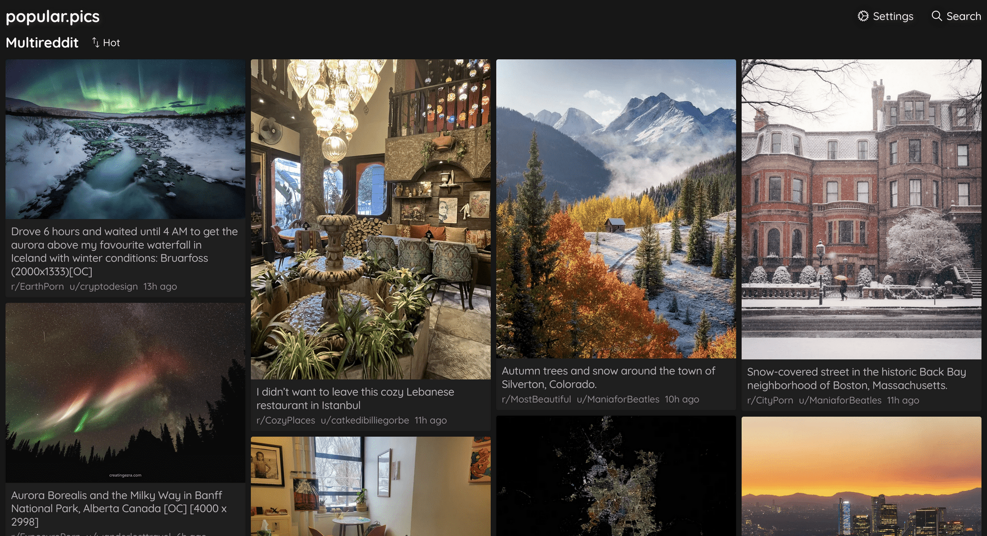
It's a viewer that supports multiple subreddits by default. You open it, and it just works. It has sensible defaults. (Important!) It defaults to multiple subreddits from the get-go. Subreddits that are visual, i.e. subreddits that have users posting visually pleasing images.
You can change these defaults easily, and the URL will update accordingly. This one is for subreddits concerning #nostr #bitcoin and #memes for example: https://www.popular.pics/reddit/subreddits/posts?r=nostr,bitcoin,memes - easy to share & easy to see what's going on. Steal this. Please.
Of course, if this is a nostr client (and if you're logged in) this should default to your personal web. The people and hashtags you follow; the communities and relays you are part of, etc. Bonus points if you implement an "expand" button which will expand your personal web by one degree, i.e. shows "friend of a friend" kind of stuff. Not only people you follow, but people followed by people you follow. Another click and it's two degrees. You get the idea.
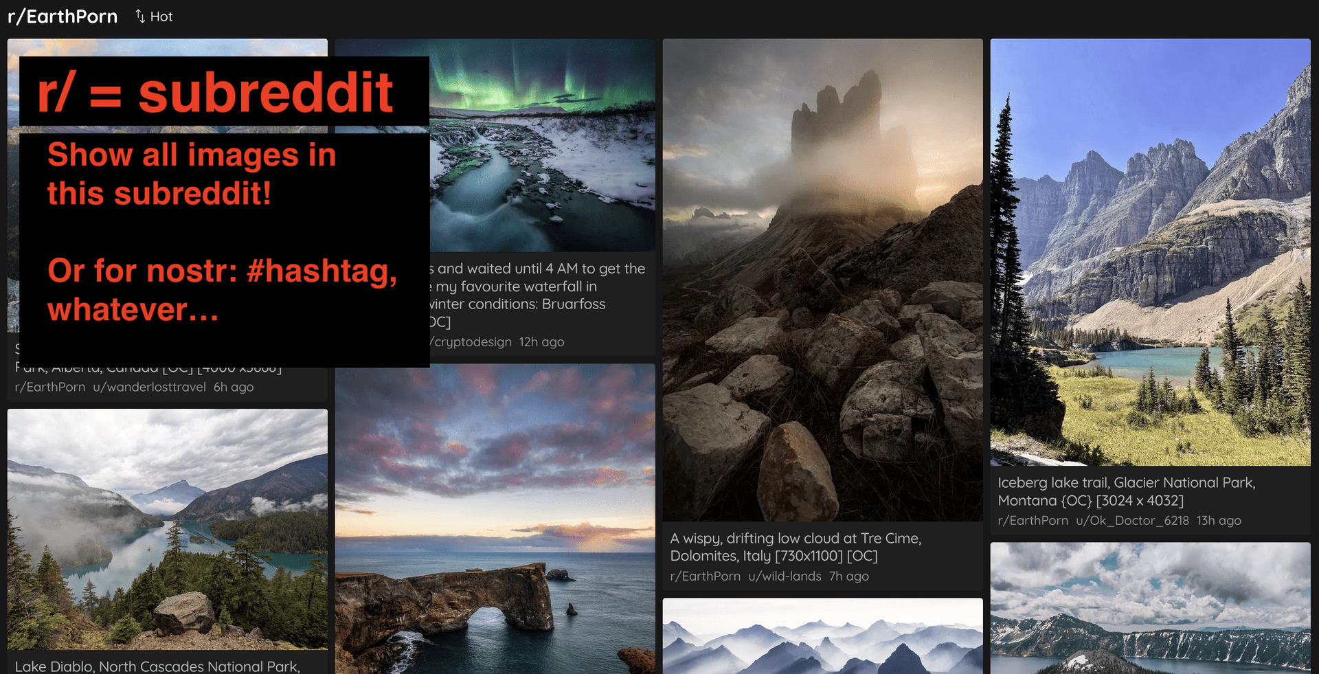
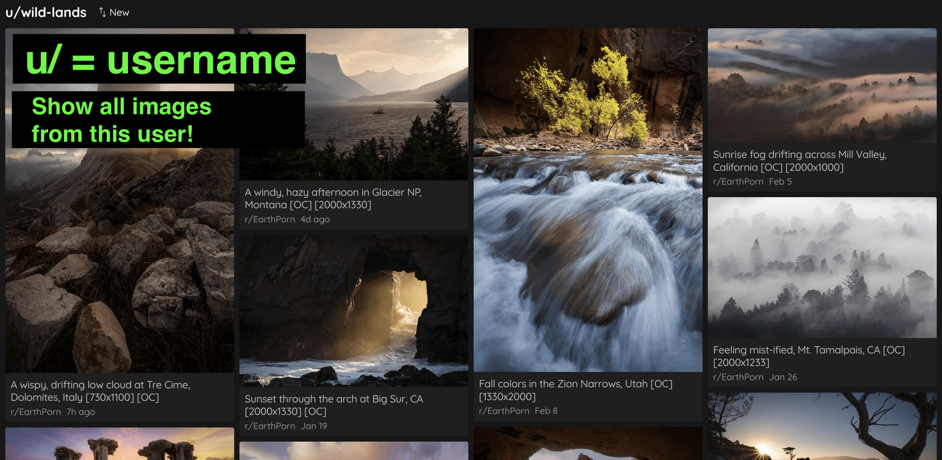
Back to the interface, and the problem at hand: discoverability. As you can see, every image card quite prominently shows the subreddit it was posted the as well as the user who posted it.
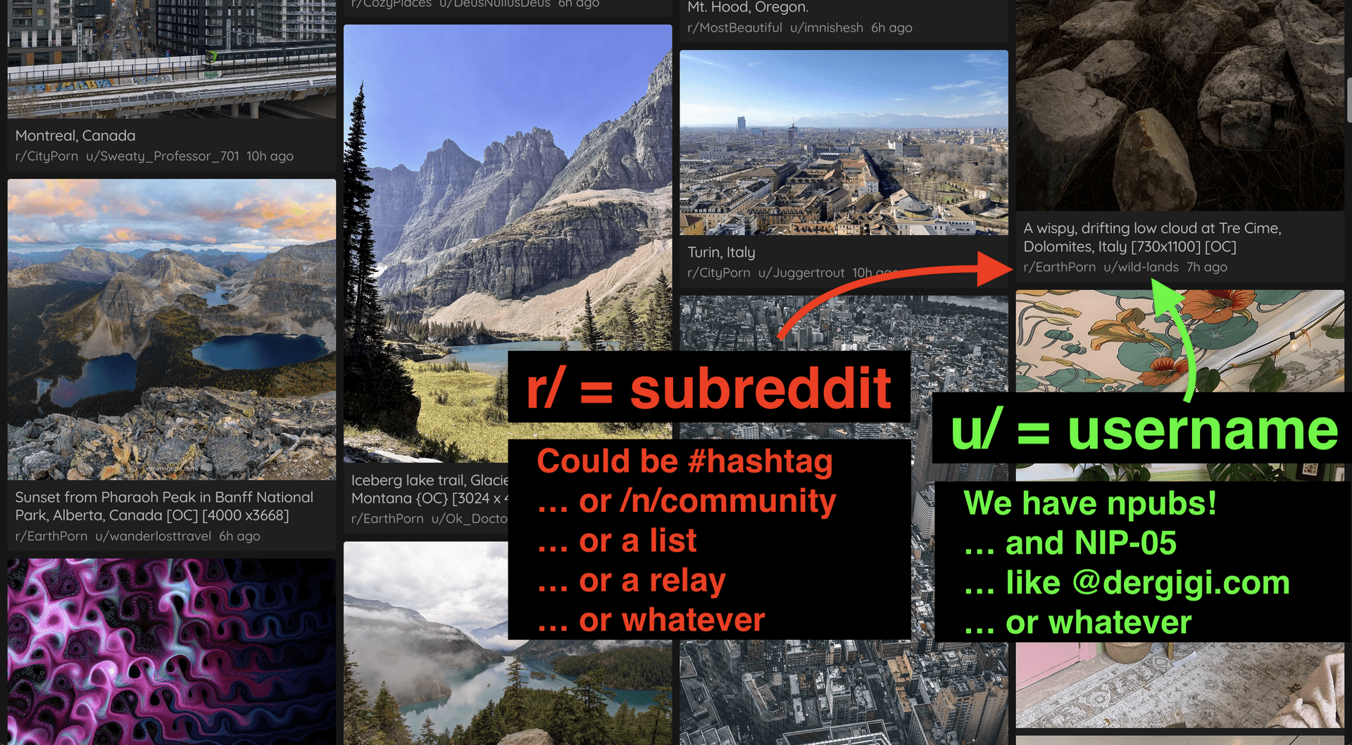
Apart from the beautiful masonry layout (did I already mention that you should steal this too?), that's the one thing I like most about this image interface: it's so fucking easy to discover stuff. You click on a subreddit, and boom, you see all images from this subreddit.
You click on a username, and boom, you see all images from this user.
You will discover new subreddits via the "user" view (most users post to multiple subreddits) and you will discover new users via the "subreddit" view (most subreddits have posts from multiple users). You can spend DAYS just clicking through stuff, and we could do the same on nostr with #hashtags (or NIP-72 communities) and usernames (yay, we have those).
Even more, you could go from user to NIP-05 provider, which basically gives a list of users under a single domain. Or you could show what kind of actual lists (NIP-51 lists) the user is part of, so you again have a list of users which you could use as a base for your exploration, populating the grid view which is the base of this image client. And again, because this is nostr, we get a "ghost" mode FOR FREE. You can use someone else's npub and look at things through their eyes. Some clients implement this quite well already. Most people have no idea that this is possible (because we suck at discoverability, including discoverability of features).
Pinstr is ALMOST there, but it takes like ~5 clicks to get to a hashtag (and it doesn't always work for me). Slidestr has potential and is also ALMOST there, but again, it takes like ~3 clicks to get to a profile and open it in Slidestr and you have to know exactly what you're doing, which isn't exactly discoverability-friendly. Same for hashtags, which are even more hidden, as as you have to open an almost invisible menu at the bottom of the image view.
Don't get me wrong, I love what we have. But we shouldn't be afraid to steal what other clients did well in the past, especially stuff that has been around for a long time. To me, the popular pics client is near perfect. No pop-ups. No modals. No unnecessary clicks. Everything makes sense and is in the right place. It doesn't waste space and is beautiful to boot.
I think we're very close to greatness on many fronts, and I hope that—with some technical improvements that are around the corner, as well with some help from #nostrdesign—we can finally kick some ass in the discoverability department too.