Yep, you have to seed these platforms with content and we have the best tools to do this already. We're just missing the hacker spark.
I would start with a handful of categories and go deep into those before moving into another.
Yep, you have to seed these platforms with content and we have the best tools to do this already. We're just missing the hacker spark.
I would start with a handful of categories and go deep into those before moving into another.
The content is there. I've seen many beautiful pictures on nostr, just look for #photography and go from there.
Examples: #マストドン写真部 #noedit
There's also plenty accounts that post beautiful stuff, you just have the discover them (oh, the irony!). Accounts like nostr:npub1tlgqfynfdyup4s4m8ge8yqpkm8ukxtfflv3dcxl4mra3e83x27vqrlj5tp
Nice one! Yeah I agree discoverability needs a lot of work and much of it is already designed in clients like Snort, but has not been implemented.
I was thinking more about platforms like Pinstr where there doesn't see much of anything there now, or Slidestr which seems full of totally random stuff - like I have no idea why I would go to a website that is random images lol
I follow #photography! But currently on Snort there is no good hashtag exploration implemented. We don't even show top hashtags anywhere as far as I know
Slidestr does an okay job and has some sensible default hashtags, but it could be improved by a lot (with just a few small tweaks, as per my original post).
the masonry layout when coupled with visible tags felt too distracting for me. That's the part I was referring to - personal preference. I would rather see a column view if you keep the tags, or no tags visible but have a nice category selection somewhere, and prominent search. But show tags on individual items (especially on mobile)
I love masonry for its density, especially on very large screens. Still love it on mobile though (2 columns). It's the default for Pinterest too.
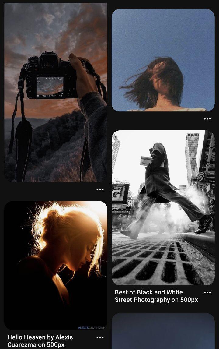
And I'm not a fan of text bleeding into images, as you need vignetting or darkening to make it always readable. But yes, personal preference I guess.
Yeah you do on light images. It depends on how users browse. Do they go into a category first and devour everything there? (maybe they dont care to see the text so much). Or do they click hashtag to hashtag and spend a bit of time in each (then it probably matters more). I think it could go either way.
yep, 2 col is great on mobile and I like that the most
That's why I'm saying STEAL FROM THE BEST. Don't copy. Don't try to re-invent.
Pinterest has been doing it for a long time, they've figured the out how to do presentation (and discovery) best.
We can do zaps and other stuff they can't do, but we have to get the basic stuff right too. Copy the basic stuff from them.
💯