What do you like better about it?
this looks significantly better to me than the current nosta.me URL: https://nostr.band/npub10r8xl2njyepcw2zwv3a6dyufj4e4ajx86hz6v4ehu4gnpupxxp7stjt2p8
Discussion

comparing this to the other screenshots I just sent, we have a nice simple block with the main profile details, as well as the bio showing in full and the download link being shortened there and easy to click on. a nice plus is seeing the recent posts at the bottom like I'm in a nostr client myself 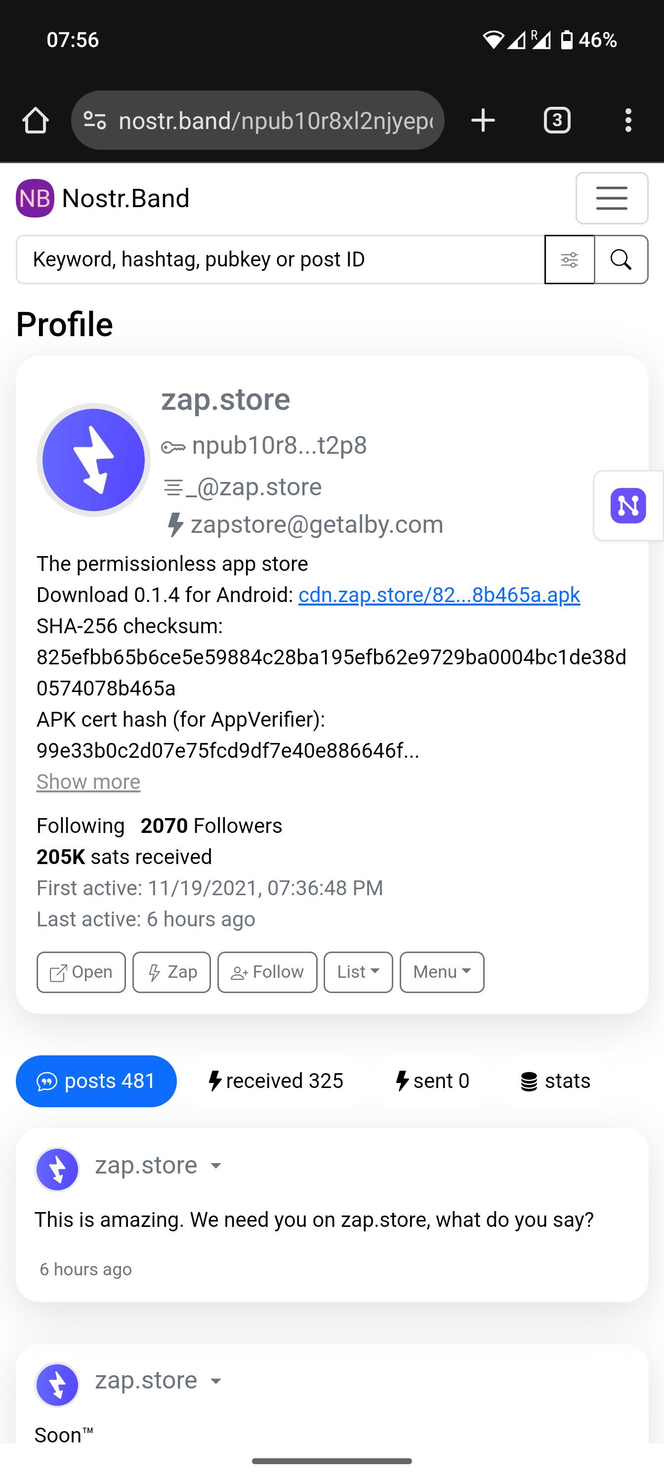

Nice. True, if you just want a super clean view, then this is great. Nosta tries to be more playful and colorful, and also shows activity other than notes (blog posts, files, badges...). Different tools for different purposes.
Nosta is great but the text display on mobile is broken
Looks great over here. Which device and browser do you use? That will help narrow down what the problem might be.
The nostr:nprofile1qqs83nn04fezvsu89p8xg7axjwye2u67errat3dx2um725fs7qnrqlgzqtdq0 npub on Android for example
Should be fixed now. It was just the text not wrapping properly, right? Or are there other problems?