As a student of human nature & paradigms, I have some advice for BTC influencers out there trying to wake everyone up.

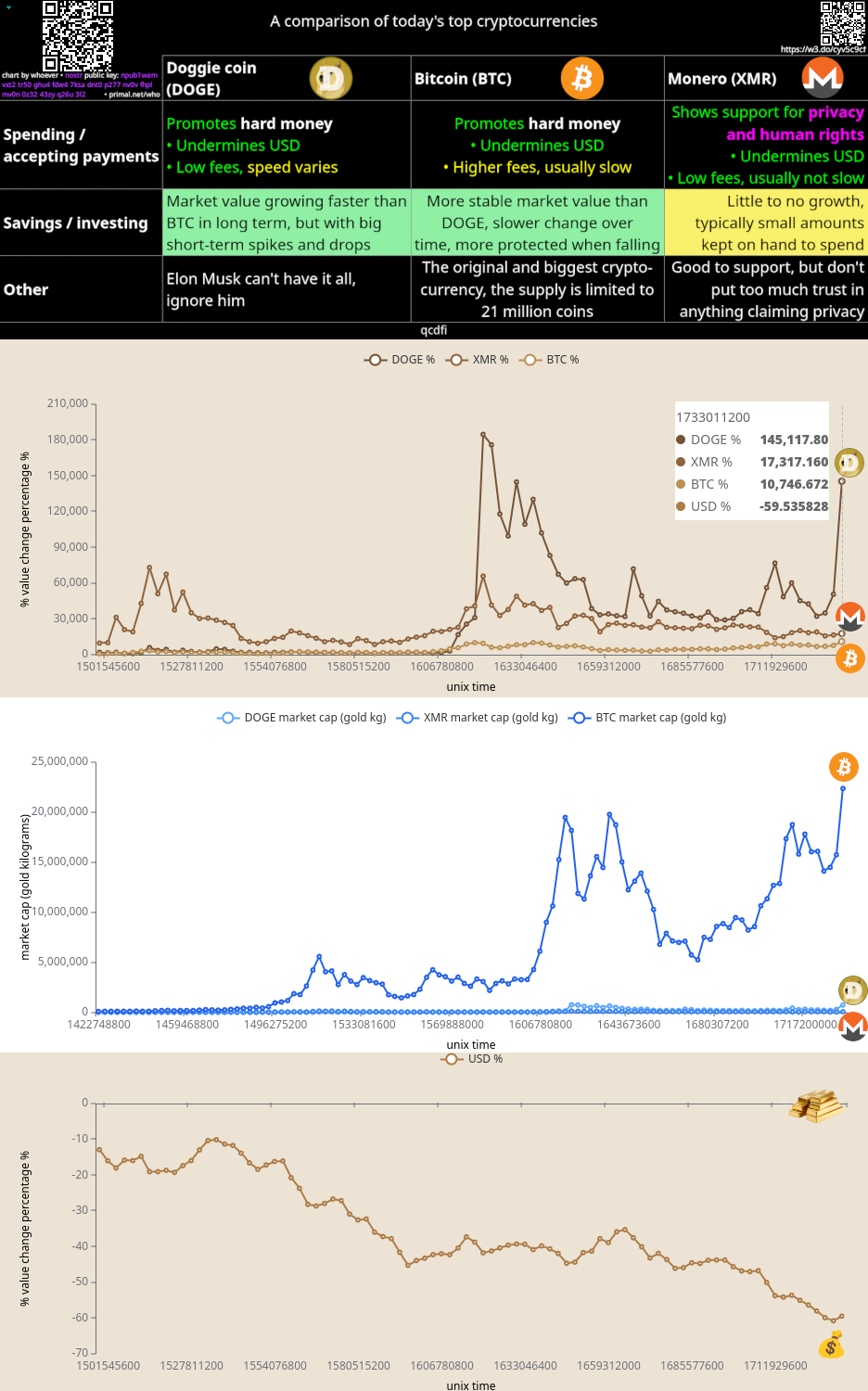
The best strategy I've seen is to show how the price of things in BTC have changed over the years. Don't show the price of BTC going up, show the USD going down compared to BTC.

People define value in $ and that confuses them & makes BTC look dangerous. Flipping the paradigm seems to help them see the folly of this. Here's an example...

Reply to this note

Please Login to reply.

Discussion

Here's another example

This just looks like a scary bubble to most people

certainty has this property of being downwards and depressing

people are used to hope being dashed (haha, what does dash mean anyway) so upwards is not actually positive

Good approach!

I just gave a presentation at a library and did the exact same approach

this is the way ™️

seriously, people don't get it until they grasp that graph and that's what we should be promoting

i use the network value-the real NGU imo- too/*

comms++

Seems like you are playing loss aversion to your strength.

To be fair, the chart uses log scale. If you also change the upward-trending charts to log scale, the perceived bubble effect goes away.

As I said last time I saw this chart, let's see the same chart but in doggie coin.

It's performed much more strongly than Bitcoin over the same time period

the housing example is powerful and could help so many Americans struggling with an affordability crisis in fiat terms. it's also a good way to illustrate how broken the current system is - housing is unaffordable for utility as people who can have rushed there to offset inflation

Yup! 🙌

I've had more success showing people how much they are losing with #Fiat, rather than show how much they would "gain" with #Bitcoin.

This is the way.

This website is an excellent tool for exactly what you are describing https://www.pricedinbitcoin21.com/landing

People get Bitcoin at the price that they deserve man.

Most lack the humility to see it or don't want the responsibilty that's required.

I don't think the chart displayed has much to do with it. If their favourite influencer tells them it's a bubble, they'll continue to dismiss it.

Most Bitcoin charts should be displayed in log scale.

Australian property is a absolutely a shitcoin

Useful advice!

Worthy advice to take note #Bitcoin

nostr:note17hd6fzn5yp2fhg37kemafhmx5zsudgmdt92pg4jc3qlehwnf0qssjryr2v

I like this framing a lot. I think it ties into the biological tendency to feel the loss of something more keenly than a similar sized gain. We have an asymmetric emotional valence wrt losses vs gains.

It's easier to rationalize missing out on an investment gain (especially if it seems risky or volatile) as opposed to taking a hit to one's net worth (everything priced in Bitcoin).