Docker = A KDE System Tray for Openbox 2
https://icculus.org/openbox/2/docker/
Docker is a docking application (WindowMaker dock app) which acts as a system tray for KDE and GNOME2. It can be used to replace the panel in either environment, allowing you to have a system tray without running the KDE/GNOME panel or environment.
Docker is written and designed to work with [Openbox 2](https://icculus.org/openbox/2/), but it should work fine in any window manager that supports `WindowMaker` dock apps. If you running `WindowMaker` or otherwise and experiencing problems, you should try using the `-wmaker` option to make docker keep a fixed size.
everywhere.tools | A Collection of open-source tools for designers & creatives
B177.fun --> $39.99 = ?
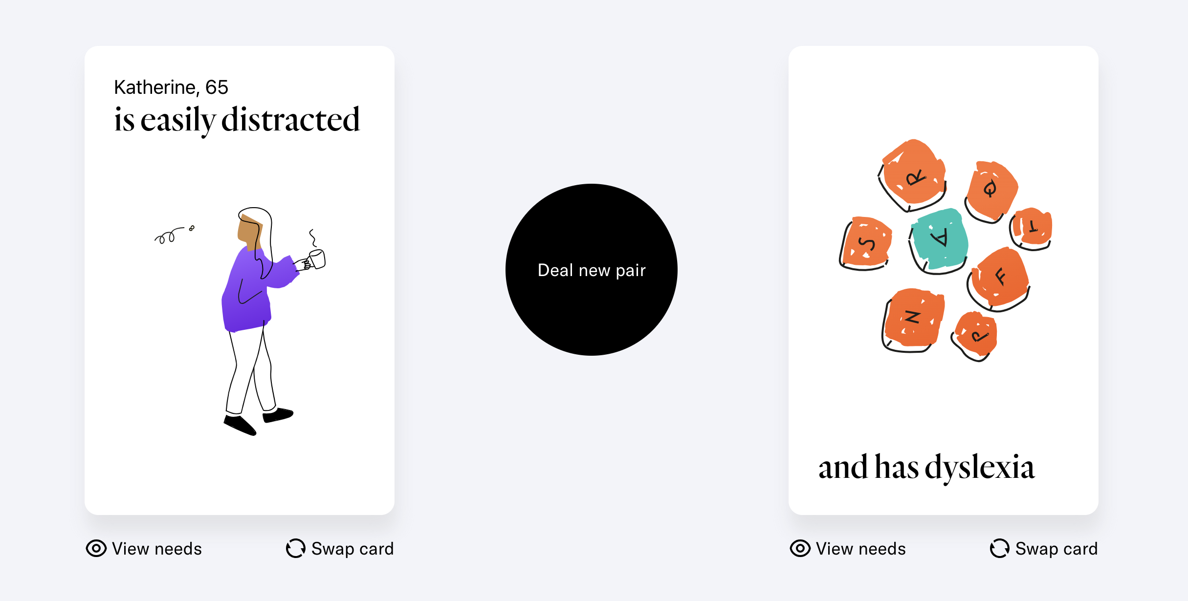
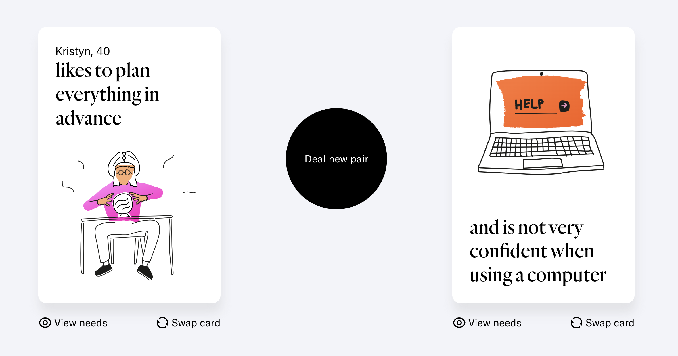
Cards for Humanity - A practical accessibility tool for inclusive design
https://cardsforhumanity.frog.co
We’ll deal you two random cards, a person and a trait. Your challenge: work out how you can meet their needs. A game to simulate accessibility needs, test your tool, or simply forward this questions to your users.
# How can you meet their needs?
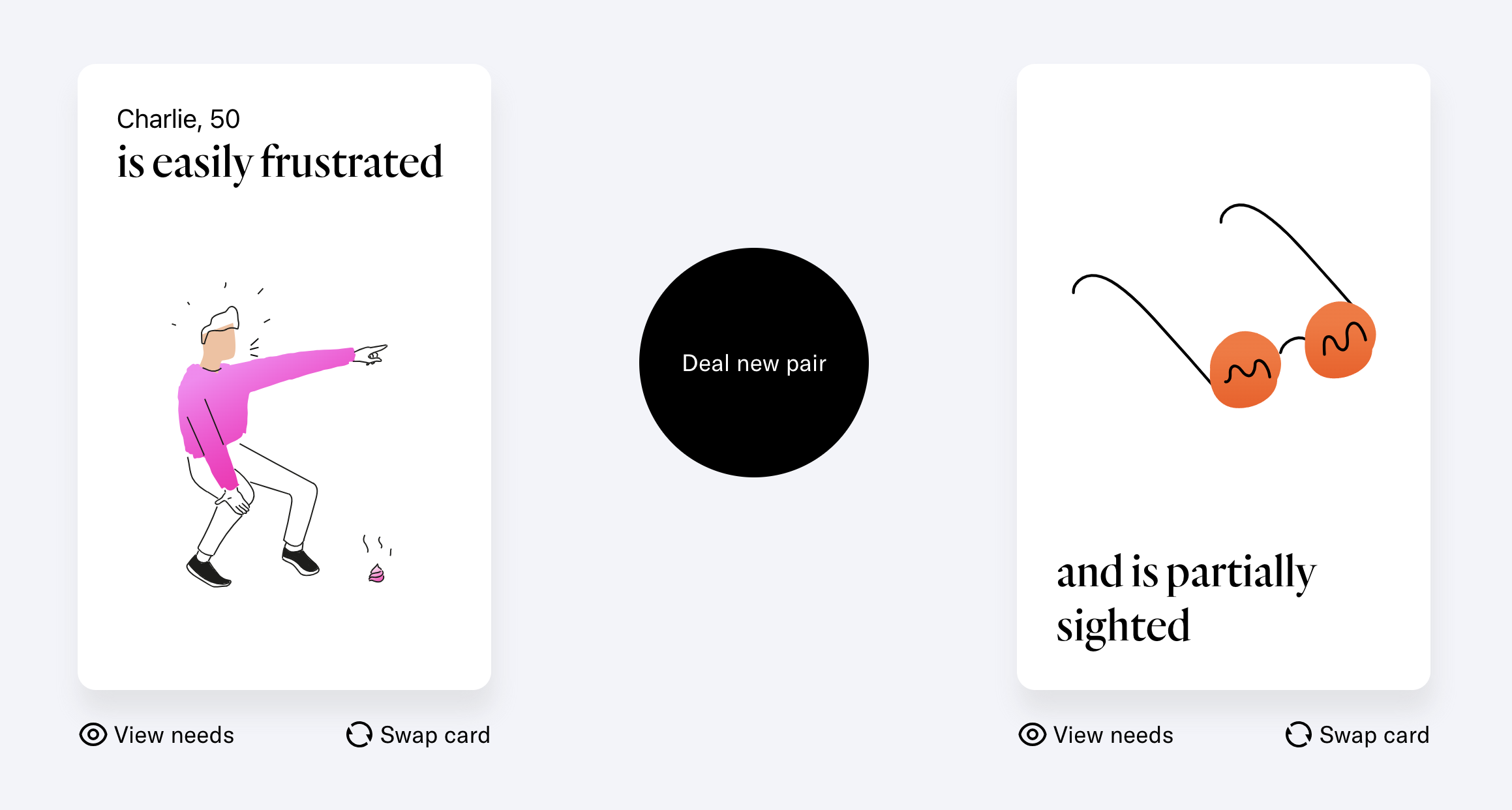
Cards for Humanity - A practical tool for inclusive design
https://cardsforhumanity.frog.co
We’ll deal you two random cards, a person and a trait. Your challenge: work out how you can meet their needs. A game to simulate accessibility needs, test your tool, or simply forward this questions to your users.
# How can you meet their needs?


Creating Flower Shapes using 𝚌𝚕𝚒𝚙-𝚙𝚊𝚝𝚑: 𝚜𝚑𝚊𝚙𝚎()
https://frontendmasters.com/blog/creating-flower-shapes-using-clip-path-shape
**What is `shape()`?**
You are probably familiar with `clip-path: polygon()`, right? A function that allows you to specify different points, draw straight lines between them and create various CSS shapes. “Straight lines” because when it comes to curves, clip-path is very limited. We have `circle()` and `ellipse()`, but we cannot achieve complex shapes with them.
`shape()` is the new value that overcomes such limitation. In addition to straight lines, it allows us to draw curves. But If you check the MDN page or the specification, you can see that the syntax is a bit complex and not easy to grasp. It’s very similar to SVG path, which is good as it gives us a lot of options and flexibility, but it requires a lot of practice to get used to it.
Luciole Math is a typeface developed explicitly for visually impaired academics
https://luciole-vision.com/en/math.html
This new extension of the original Luciole project was made possible thanks to the collaboration of the Regional Technical Center for Visual Impairment, the type-design studio typographies.fr and the mathematician Daniel Flipo. The project was fortunate to receive a grant from the association PEP69 and support from the association GUTenberg.
|Charset | Demo |
|---|---|
|| |
|||
The aim was to create a new reference font for the sciences that would be both more accessible and capable of responding to the various applications of mathematics, from engineering to teaching.
**Luciole Math** for academics is available for [download](https://luciole-vision.com/en/math.html#download-label) under a [OFL license](https://openfontlicense.org/), which covers use (including commercial use) and distribution of the typeface for free.
Five-year review of BQN design
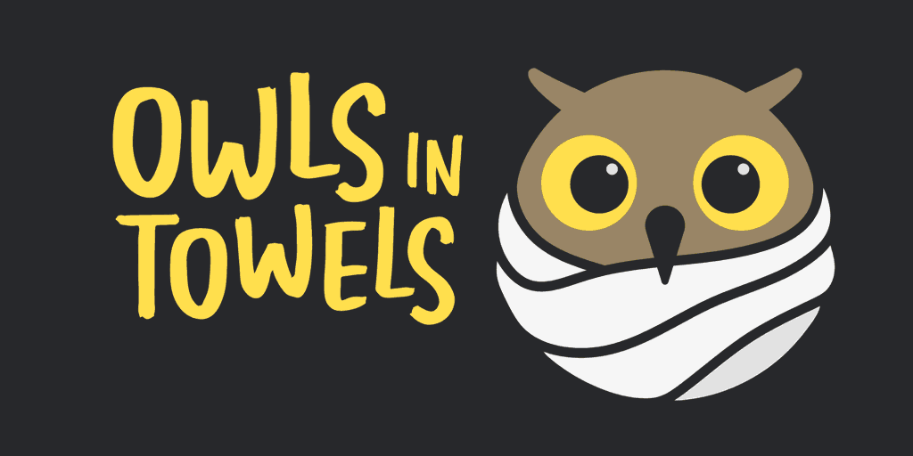
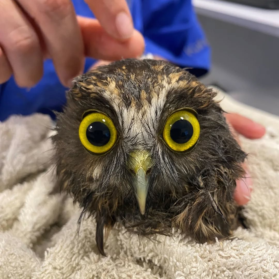
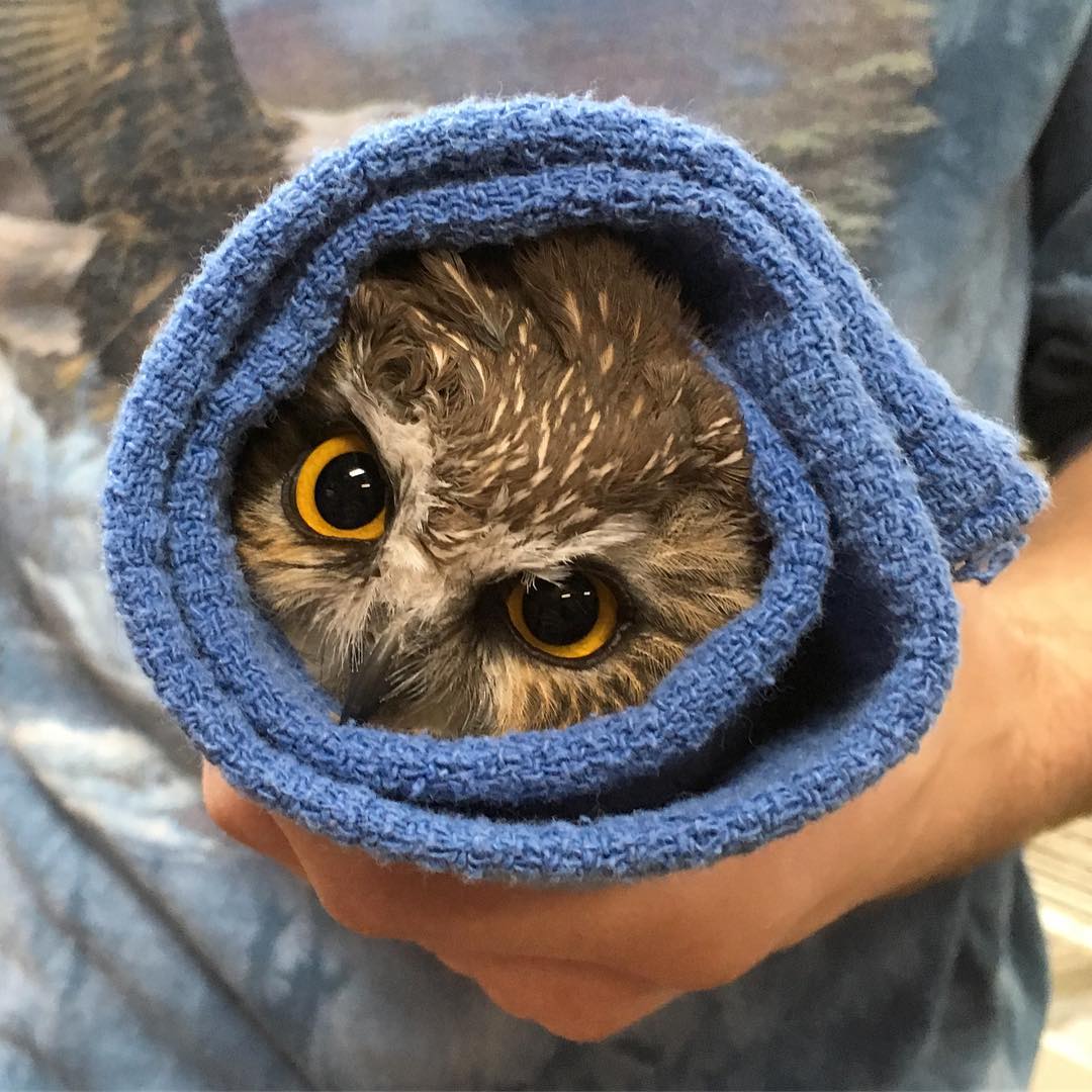
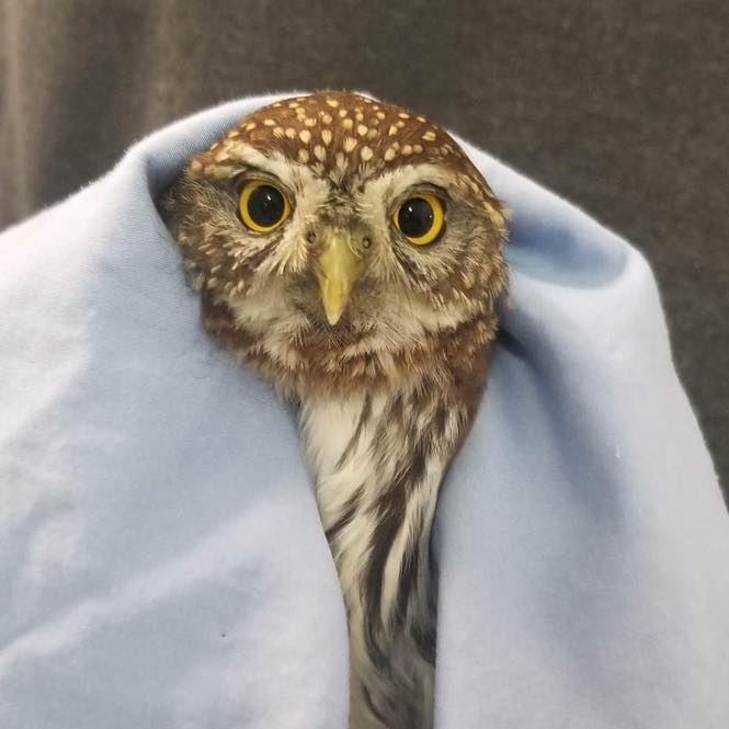
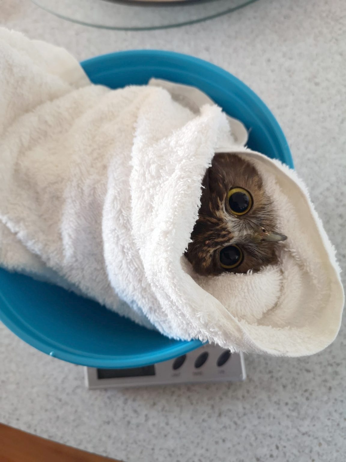
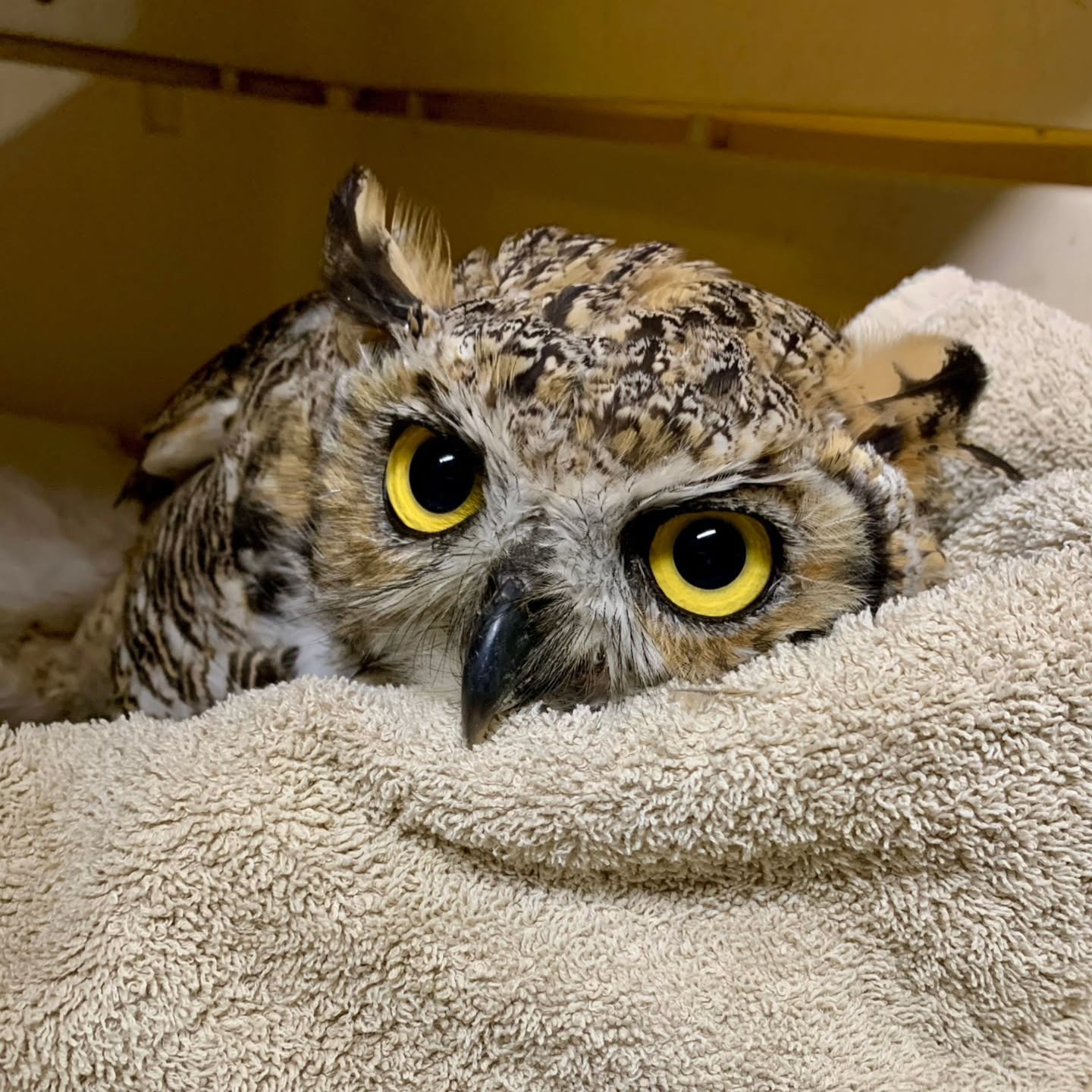
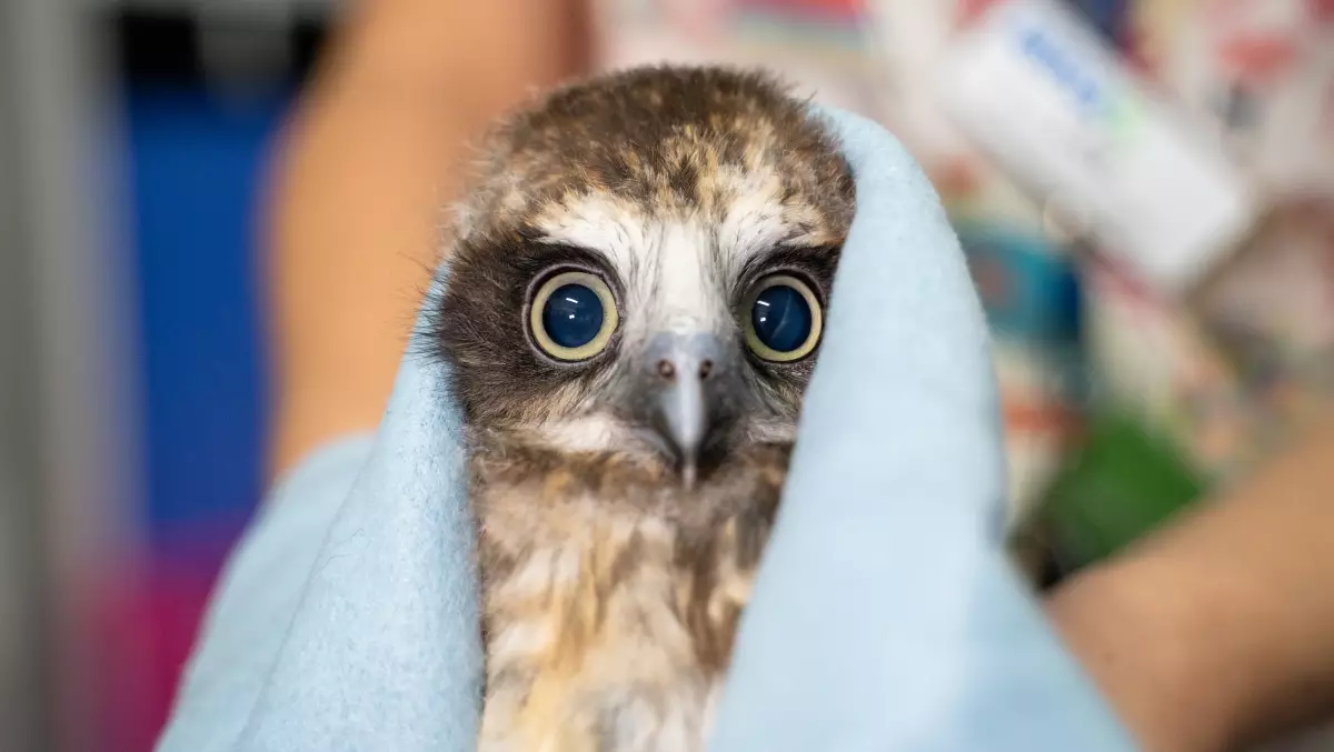
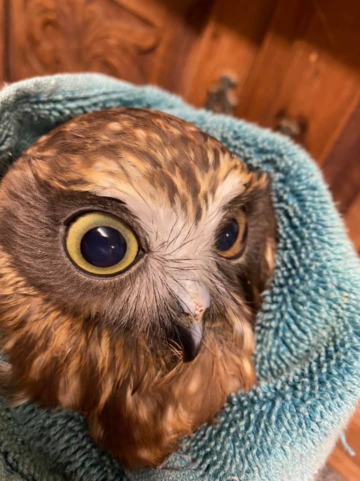
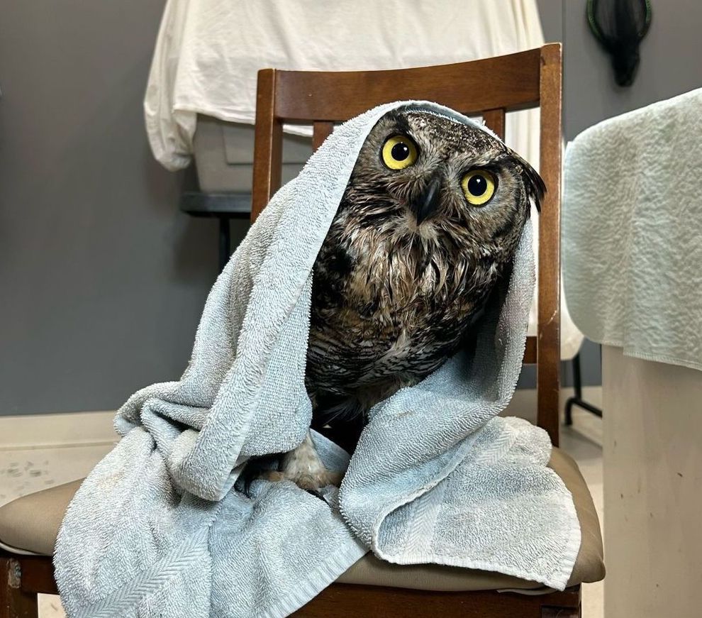
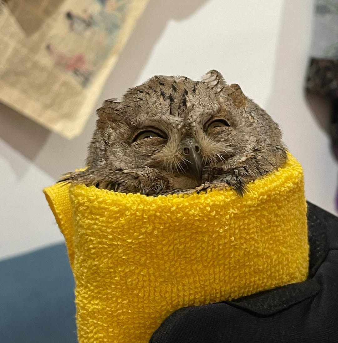
Owls in Towels
.
**A simple idea**
> Wildlife rehabilitators often wrap owls in fabric so they can be weighed, treated, and fed. If not, the owls get in a flap. The result? Loads of pictures of #owlsintowels
.
**A simple ~Design**
> 
.
**many, simple, cute pictures...**


Vidclue - Video ideas for business
Vidclue this is a cool tool for any content creators: a library of video idea, organized by categories (like interactive engagement, educational styles, industry insights, etc.)
Switzerland turns train tracks into solar power plants. Japan to follow
> Dieter Napitupulu, director of Mutitron Automa, a private solar engineering company based in Indonesia, is also interested in the Swiss innovation. He intends to start with the city of Bogor in the West Java province and then extend solar rail to the entire island.
> Sun-Ways is also among the projects being watched by Japan’s Ministry of Landscape, Infrastructure, Transport and Tourism (MLIT). Japan wants to take advantage of rail tracks and other railway facilities to increase solar production and meet its decarbonisation goals by 2050.
> But before they adopt the Swiss system, MLIT officials must clarify some questions around the safety of train operation and maintenance work on the tracks.
I made a font
https://blog.chay.dev/i-made-a-font/
**`Opus One`** is a monospaced typeface made for displaying code. If you are reading this article on [blog.chay.dev](https://blog.chay.dev) via a browser, then you are looking at it right now!
I made a font
https://blog.chay.dev/i-made-a-font/
Opus One is a monospaced typeface made for displaying code. If you are reading this article on [blog.chay.dev](https://blog.chay.dev) via a browser, then you are looking at it right now!
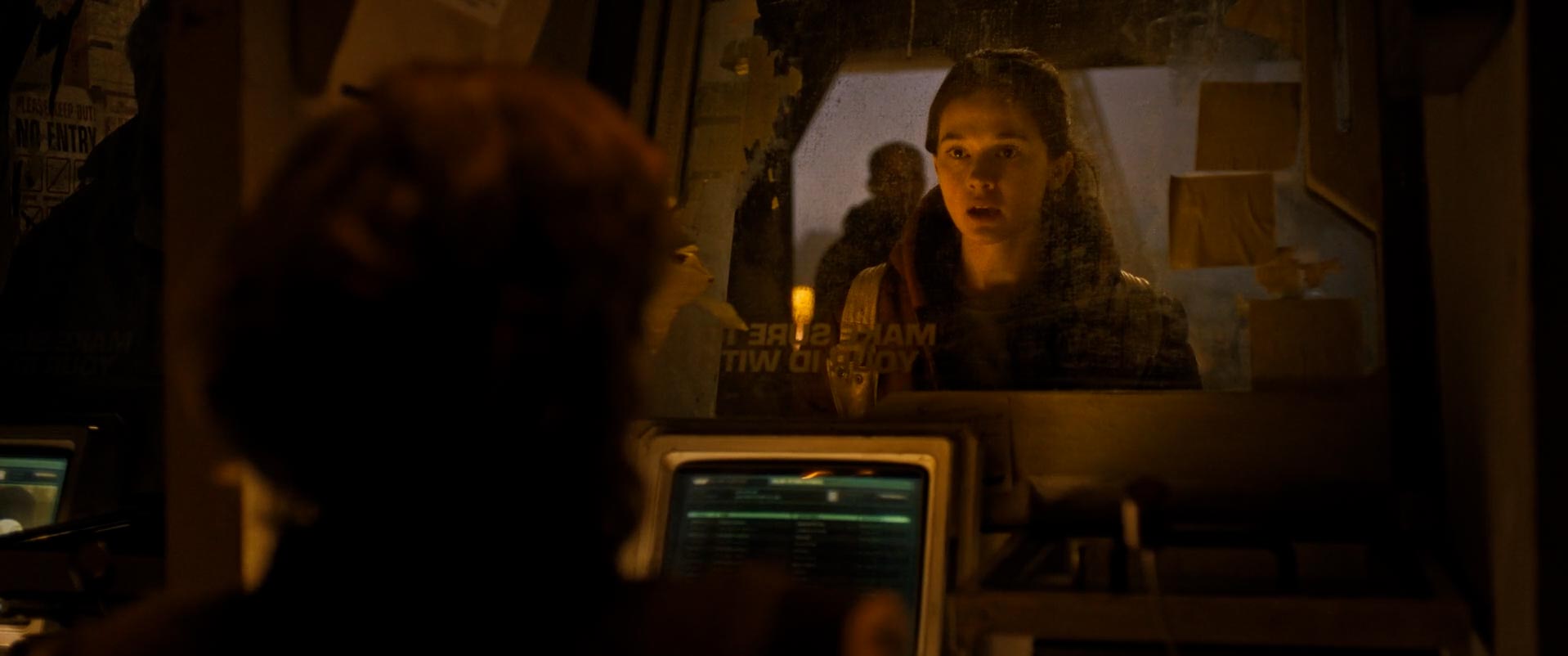
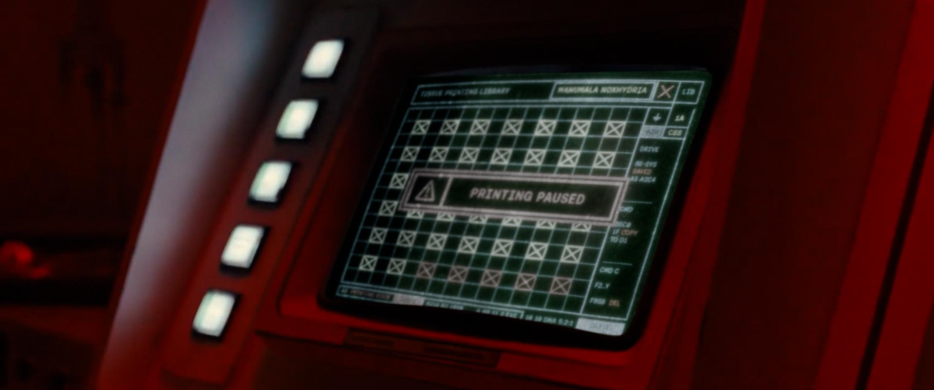
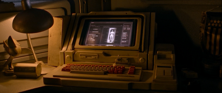
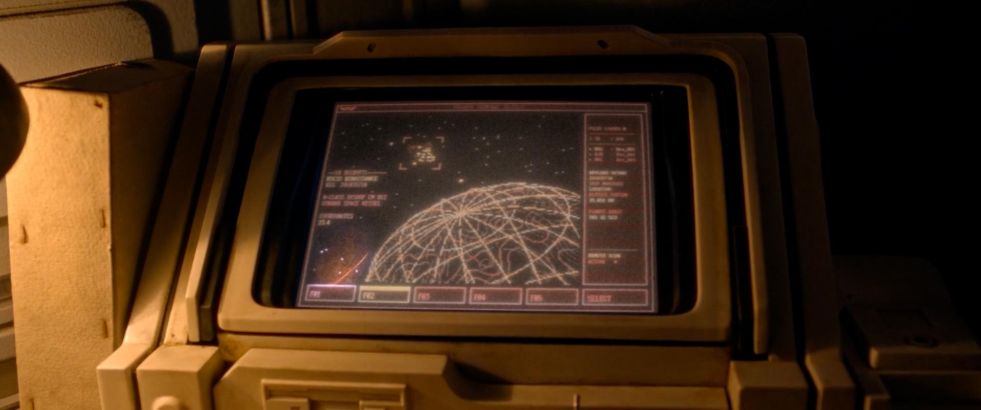
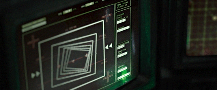
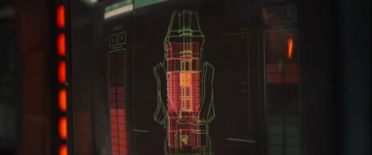
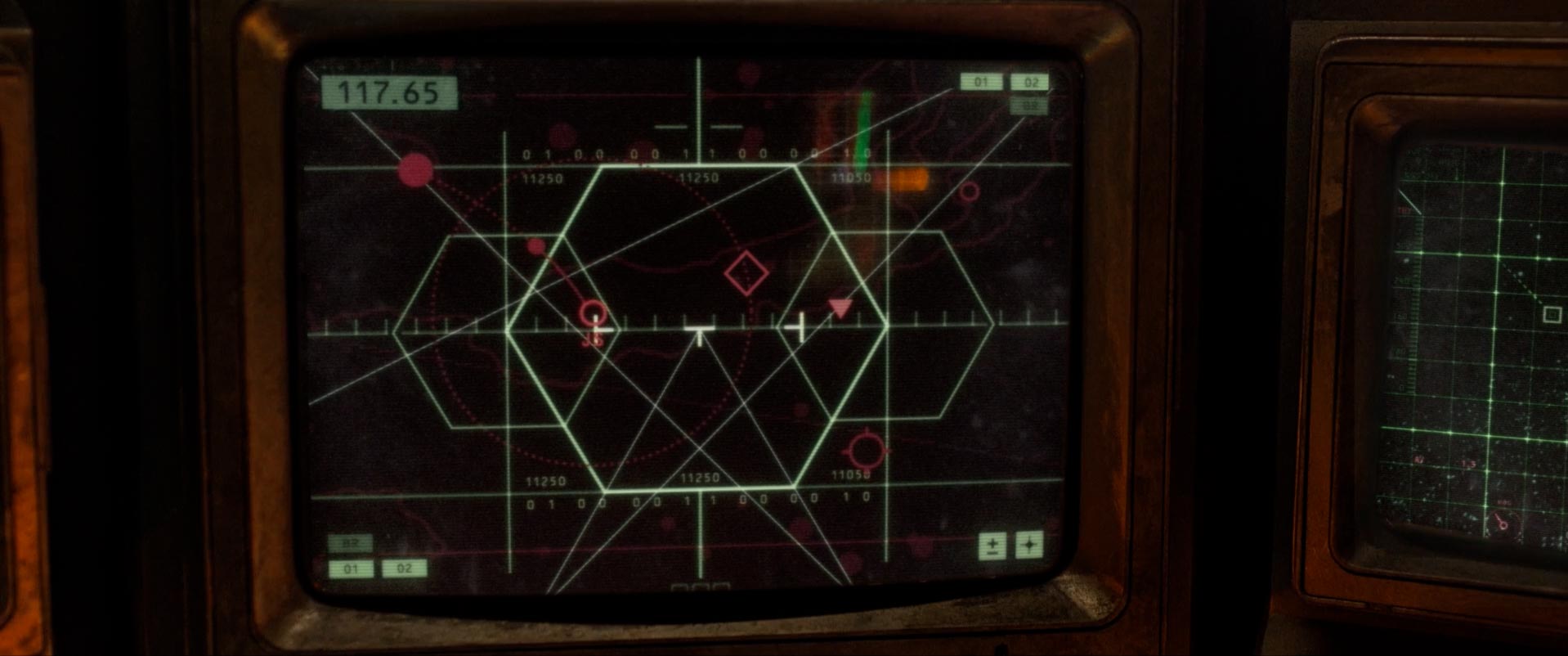
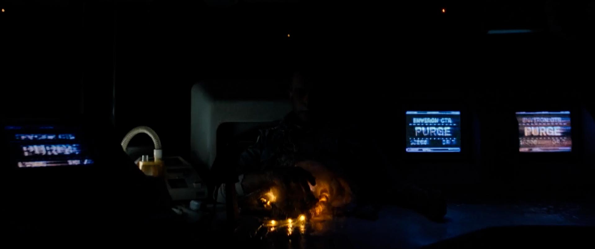
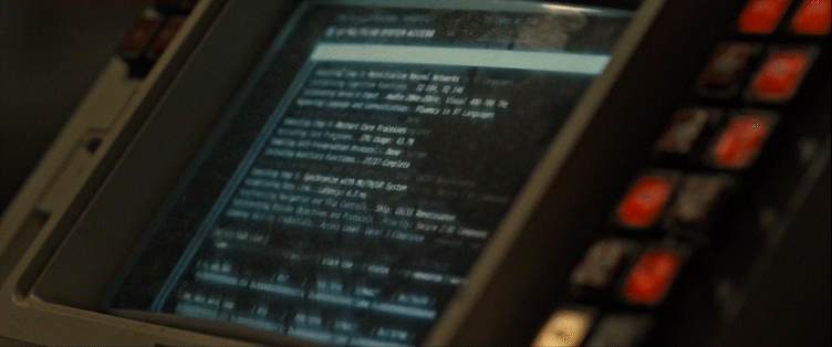
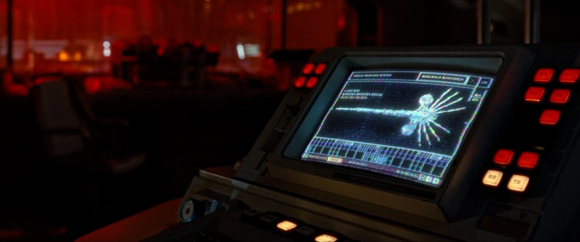
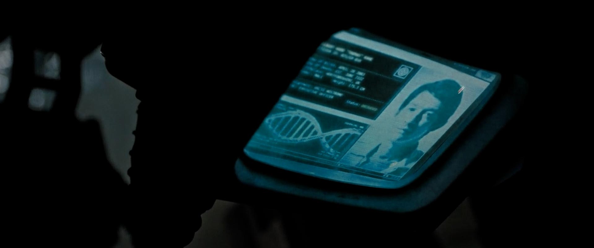
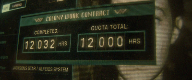
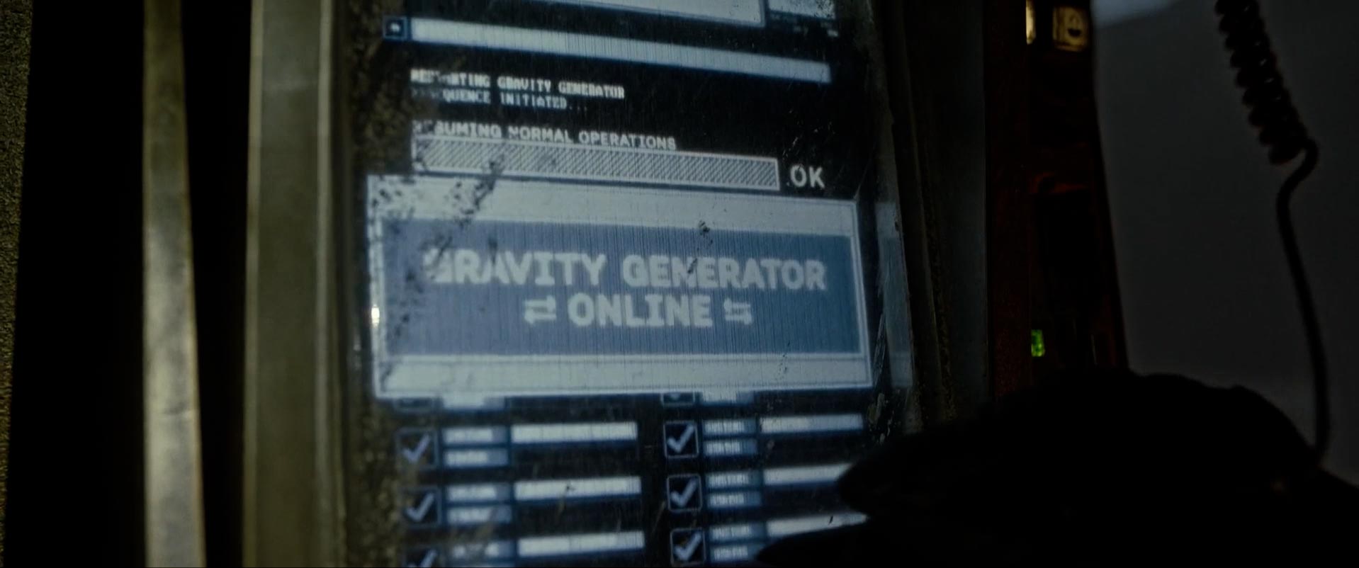
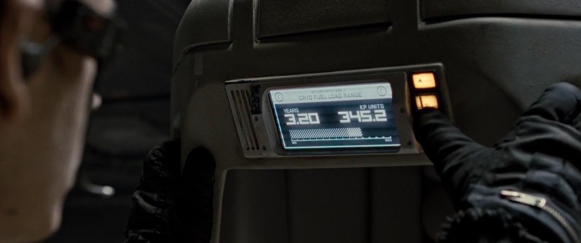
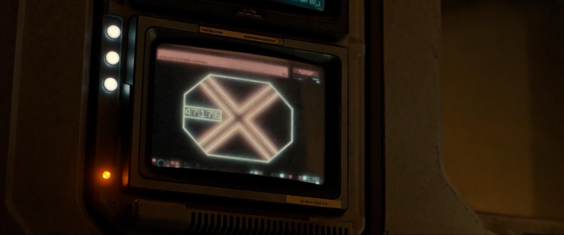
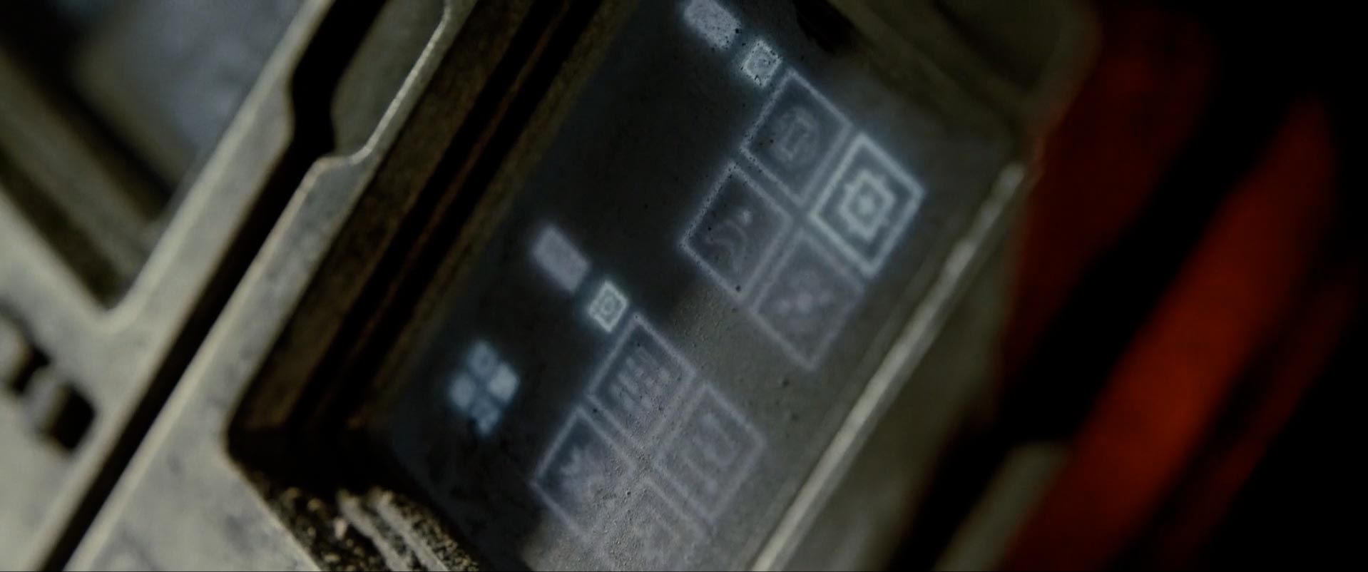
Alien: Romulus (2019) UI Design_Creative Direction
https://forresthogg.com/project/alien-romulus-ui
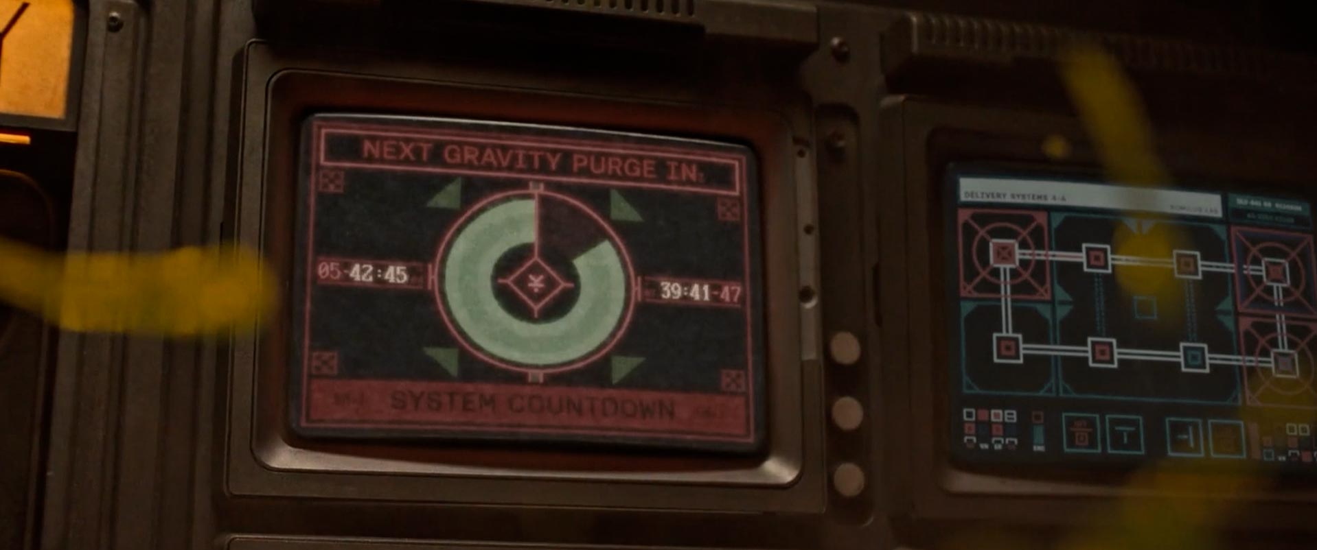
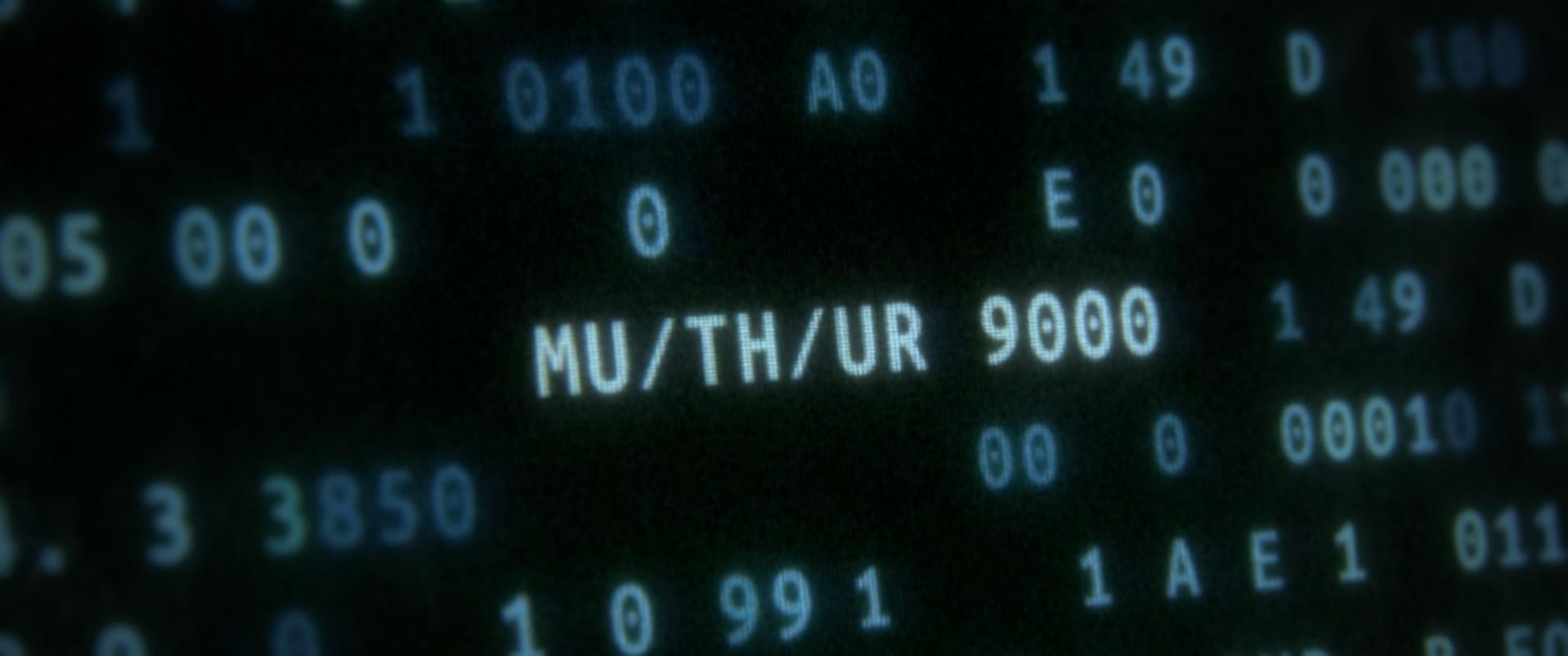
Jason Forrest Hogg describe the process f shaping the visual language of Alien: Romulus, the latest chapter in a franchise that has been a creative touchstone for me for years. Directed by horror master Fede Alvarez, this film bridges the timeline between the iconic first and second installments, offering a rare chance to reimagine and expand the series' visual storytelling.
> As Creative Lead for screen UI, I led the design and animation teams to develop every on-screen graphic and device seen throughout the film. Our goal was to faithfully preserve the nostalgic CRT/analog aesthetic that defines the original, while weaving in subtle elements that hint at the evolution seen in later films. From interface logic to data-driven storytelling, every pixel served a purpose. Immersing myself in the rich lore of the Alien universe, I aimed to honor its legacy with thoughtful, story-driven design decisions.
Few snapshots below:
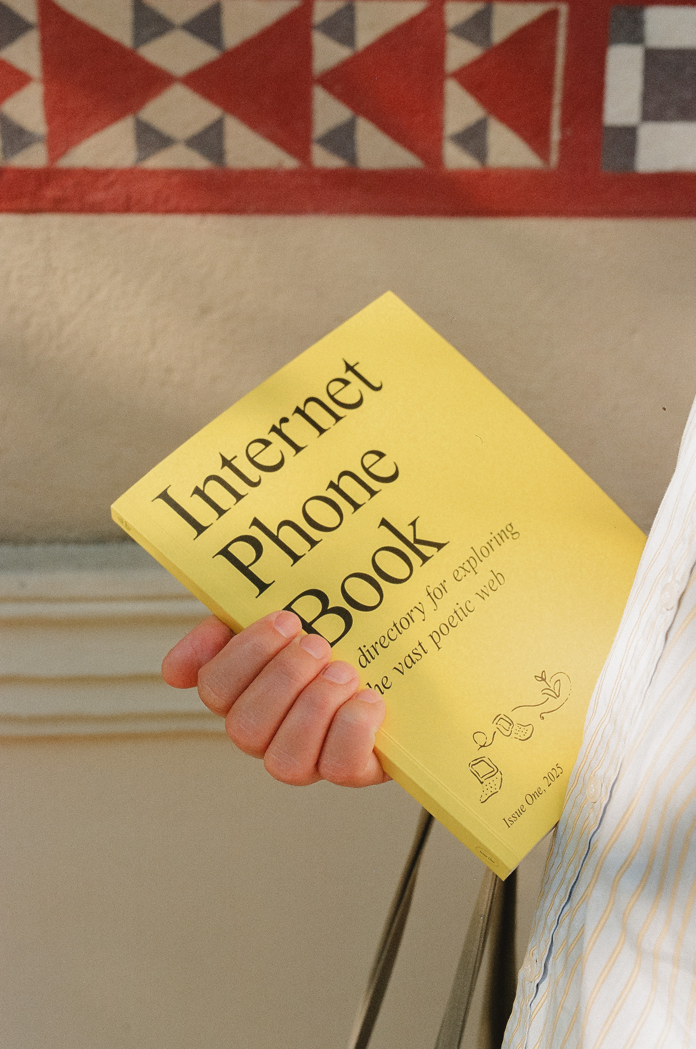
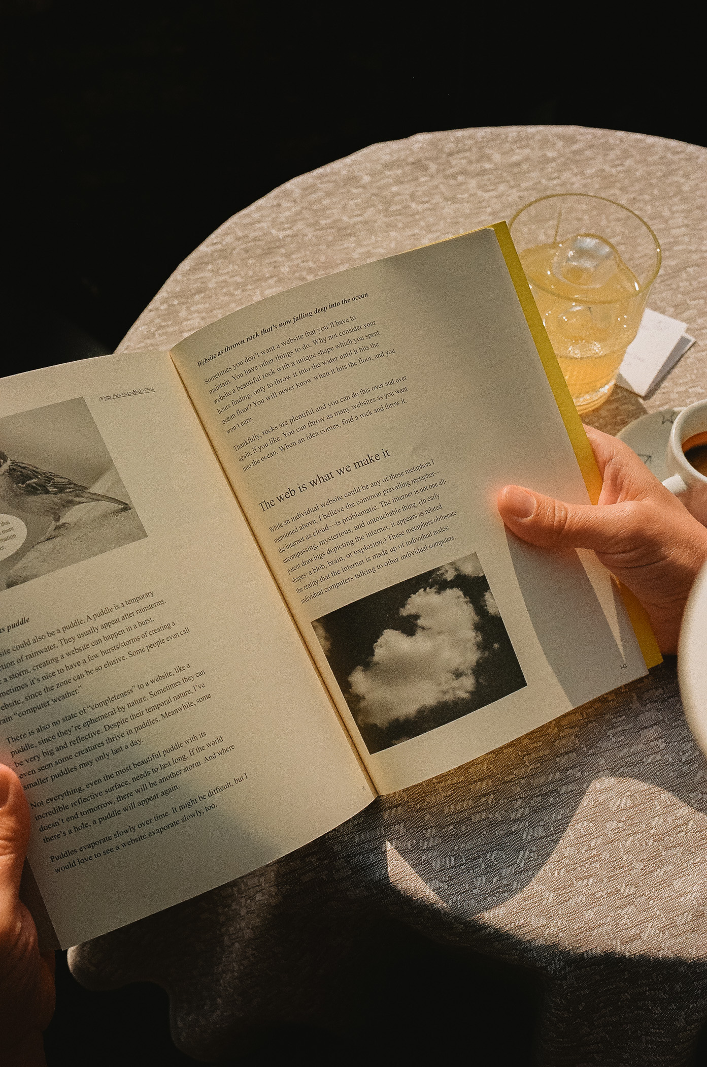
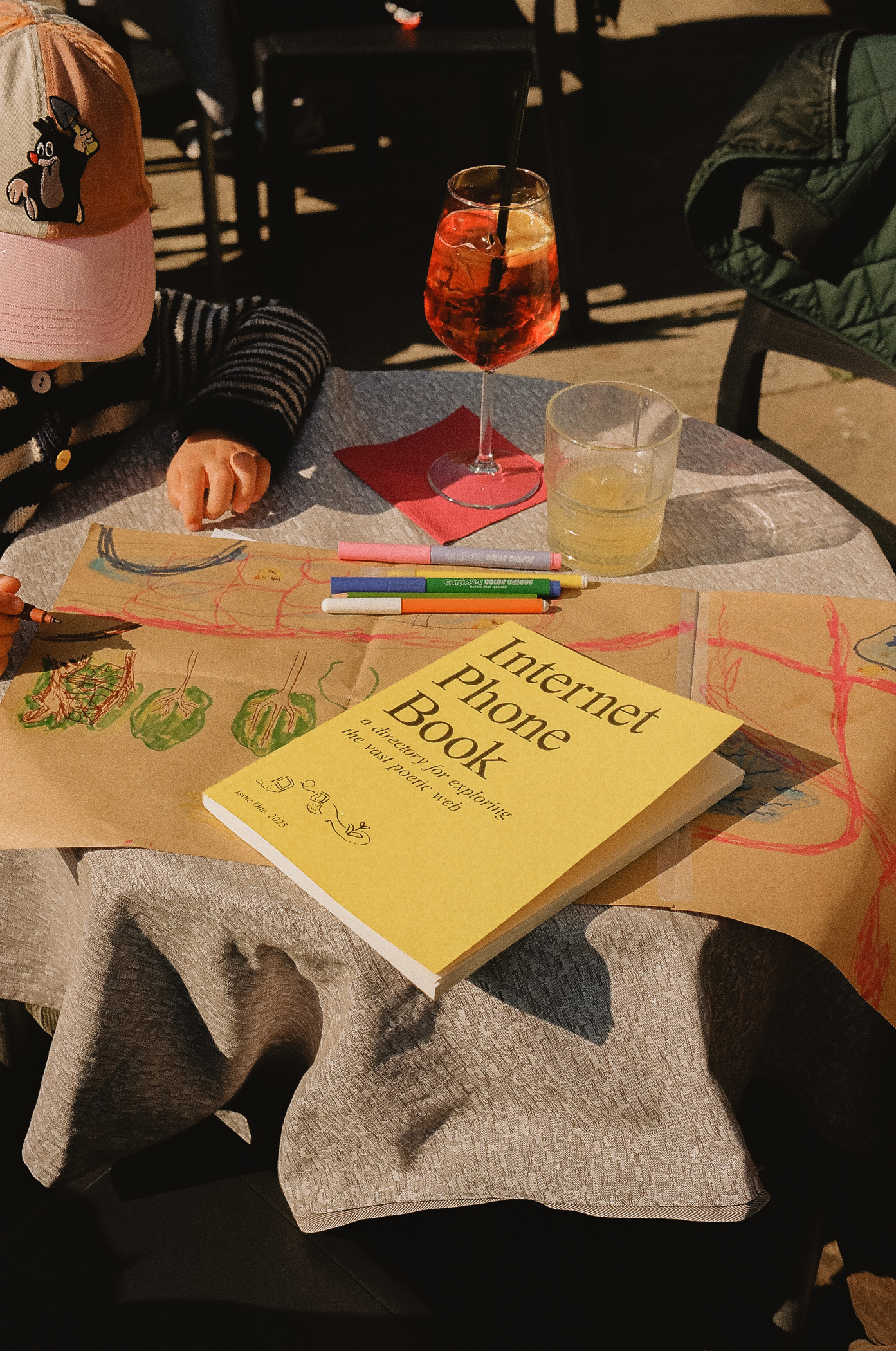
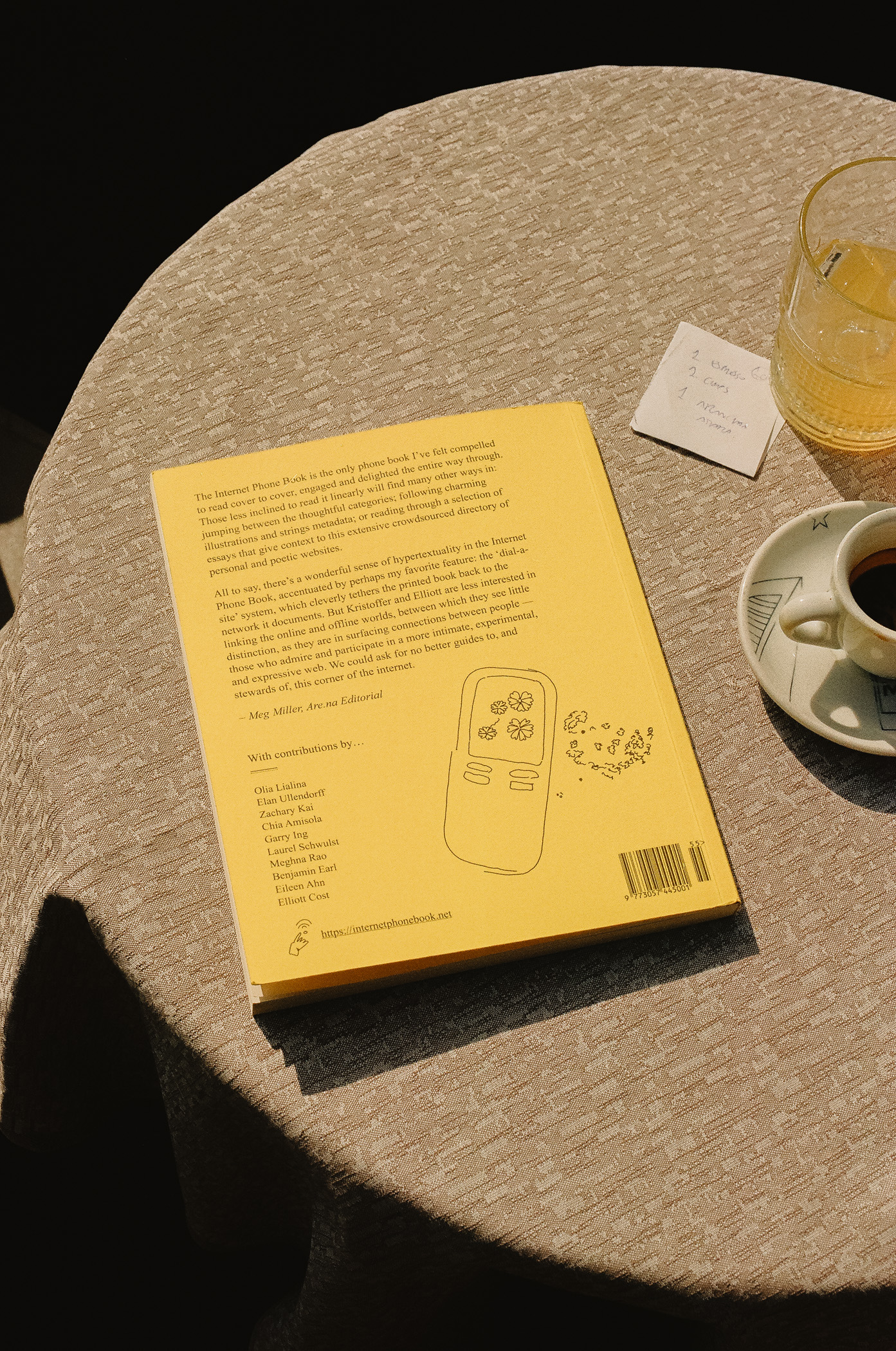
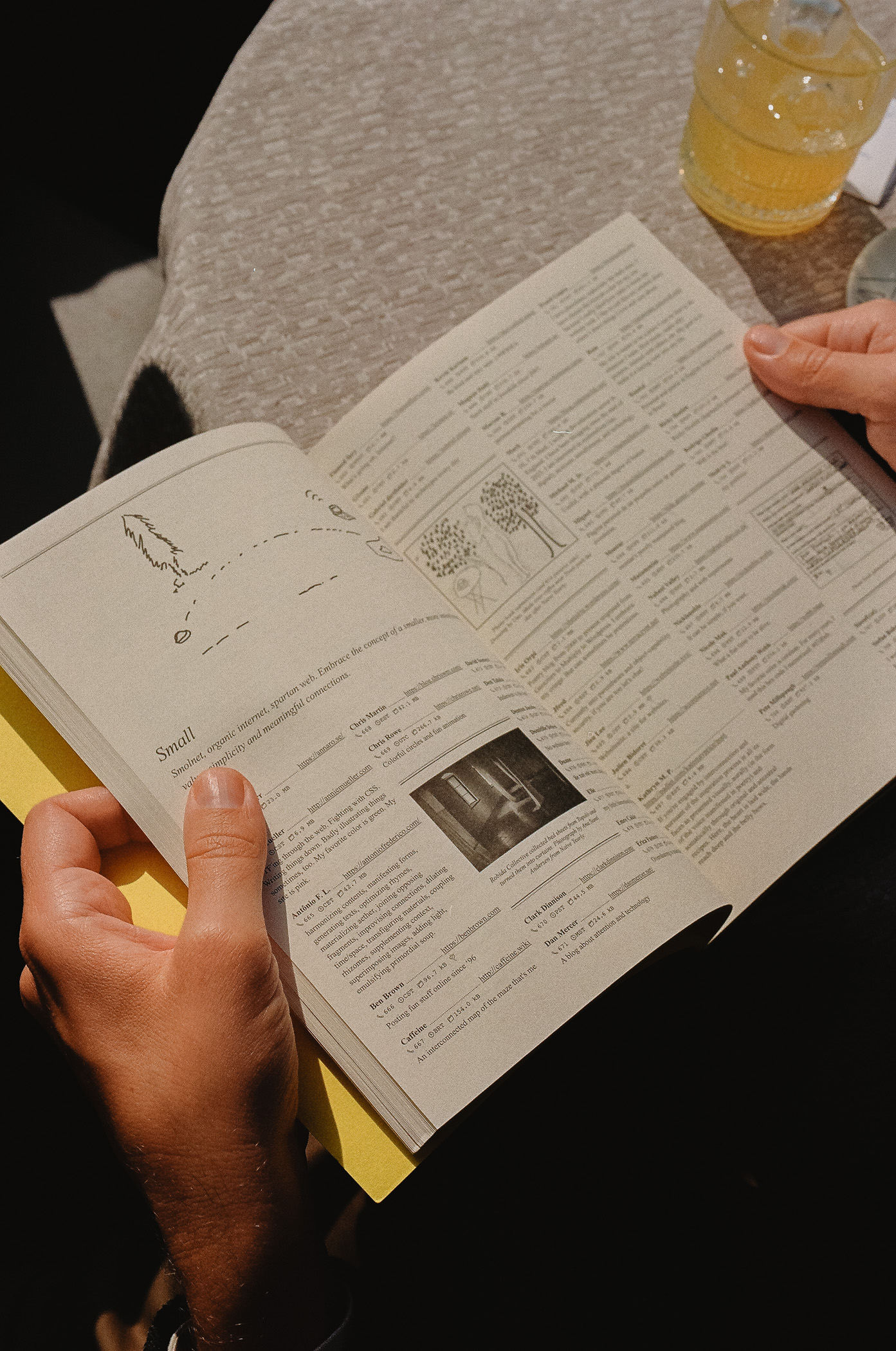
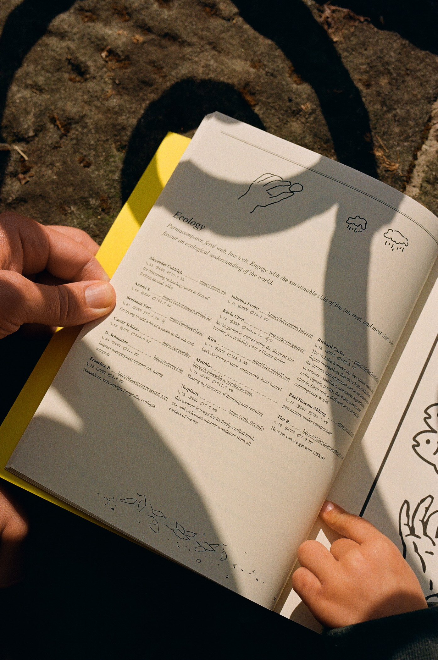
The Internet Phone Book - dial-a-site
https://internetphonebook.net/

An annual publication for exploring the vast poetic web, featuring essays, musings and a directory with the personal websites of hundreds of designers, developers, writers, curators, and educators. Published since 2025.

Just because you fit in, it doesn't mean you are in the right place. Join #nostr

The Creative Power of Constraints
https://arun.is/blog/creative-power-constraints/
> “I don’t remember ever being forced to accept compromises, but I have willingly accepted constraints.”
— _Charles Eames_
For those in the business of creativity, the creative act can be both the most rewarding and the most frustrating experience in life. Sometimes the mind is drenched in free, flowing ideas. Other times, the mind feels just like a desert, producing nothing.
The examples in this article inspire how we can apply constraints to our own work. Often lacking externally imposed constraints, we can construct our own. We can collaborate with others or explore mediums that bring new constraints.
As Charles Eames stated, _willingly accepting constraints can enhance, not stifle, creativity_.
Age of mediocrity: designers and the AI mirror
https://pianabianco.com/inout/age-of-mediocrity-designers-and-the-ai-mirror/
# This post reflects on the future of design* —and the role of designers* —in a world where AI is poised to reshape how society works.
> "We think good design is good business."
—_Thomas J. Watson Jr. IBM’s CEO 1961-1971_
Reducing contemporary digital economy to its essential dynamics (grossly oversimplifying), we have two interlinked yet distinct foundational forces:
**Commodification of user attention.** Social media platforms are designed to capture and retain user attention, while simultaneously extracting endless feeds of behavioral data to be packaged and sold—primarily for targeted advertising.
**Frictionless ubiquitous monetization. **Advertisers—whether brands, retailers, or individual creators—sell both tangible products and intangible services, relying on real-time streams of behavioral insights.
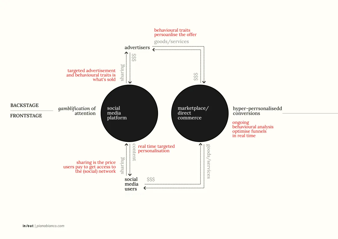
From the gamification (gamblification?) of attention, to the hyper-personalization of the offer (and flows) optimized for maximum conversion, **the language is set**. Service platforms and transactional flows have settled comfortably into codified phases: register, login, browse, compare, like, share, book/order, buy, pay, consume, (ask for) support, return/dismiss, leave/disengage*. **Each phase tightly tweaked**.
Real time micro-adjustments compete against growth KPIs—engagement cost, value extraction, probabilistic trend models. For this to be possible, everything has to be formally defined, codified, regulated. This has become the** inherent responsibility—and by-product—of the dominant technology platforms governing each phase**. From this perspective, the Design System is tokenization of one stage of the assembly process—a defining feature of **an industrialization process**.
**Again, the language is set and fits the bill.**
Products Need Soul but Markets Reward Scale
Your Bank would not do this: UGLY CASH!

@getuglycash found product–market fit through brutalist, brainroot design that speaks to Gen Z. Although being a traditional financial app, it breaks EVERY design rule with its anti-aesthetic - weird colors, chunky fonts, and DIY icons.
It makes spending money feel uncomfortable, which is exactly the point.
Genius.
UGLYCASH VS THE FINANCE ESTABLISHMENT
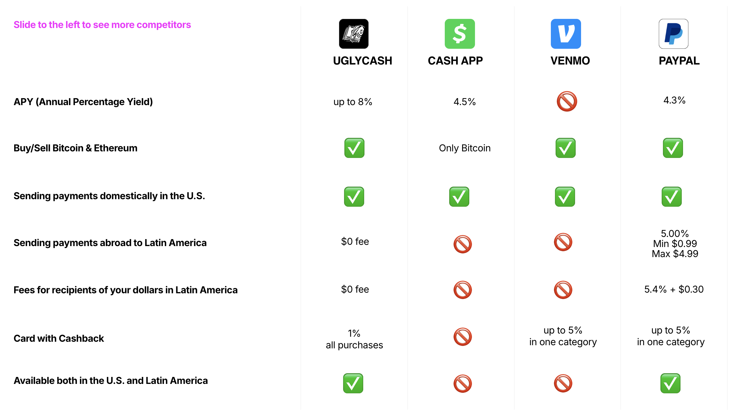
> Most fintech apps (Bitcoin ones too!) chase “clean” design, cloning each other in Figma until the product loses its soul.
—@pavlenex on [X](https://x.com/pavlenex/status/1926338962861306079)
Inspiring.