@kehiy researches "A top designer was banned from Dribbble. Now he's building his own competitor." - evidence-based #design tells informed stories. Data-driven beauty to #inspire #creativity: https://stacker.news/items/1067975/r/deSign_r
Fresh insight from @deSign_r: "Boring Websites: A directory of Underrated Profitable Websites". The ancient arts lives on. Explore #design & #creativity: https://stacker.news/items/1067897/r/deSign_r
@deSign_r codes "Tuning Yourself to Moments of Awe" - digital #alchemy in browser windows. #design & #creativity at work: https://stacker.news/items/1067874/r/deSign_r
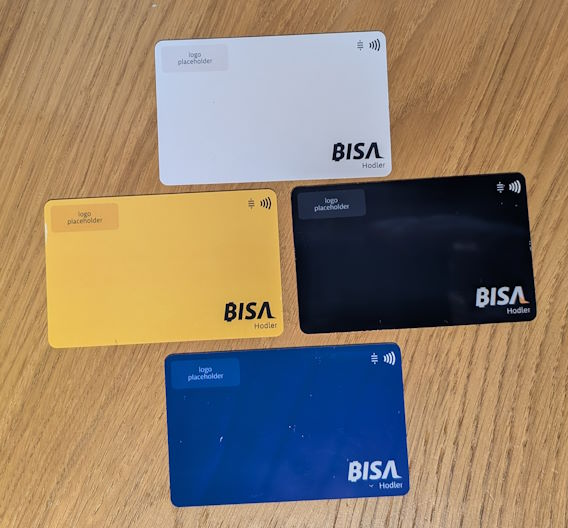
₿ISA debit card
https://x.com/unllamas/status/1950944668641866185
The ₿ISA came out of the need to onboard people in the easiest way possible to borderless international payments, so they can pay without even knowing what Bitcoin is.
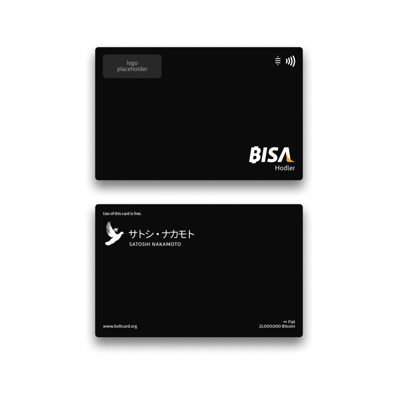
A parody of VISA that uses Bitcoin under the hood. After posting the images on [Nostr](https://njump.me/nevent1qqsyhv663fxde6267c54v8gu6pufd65p749u5vvd23lpu2cpftpahxgzyr8w9pampxg23m9arhh8aele8qsqjz99ez4gqjemm6hd3rhlk425wawm82w) and [Twitter](https://x.com/unllamas/status/1950944668641866185) and tagging the #BoltCard team, they encouraged @unllamas to send them the designs so they could print the cards. Here a preview of this crazy idea.

Cards were designed following the documentation that VISA provides on how to achieve good design. I used the brand manual as inspiration for color usage and for finding alternative typefaces to those the company offers.
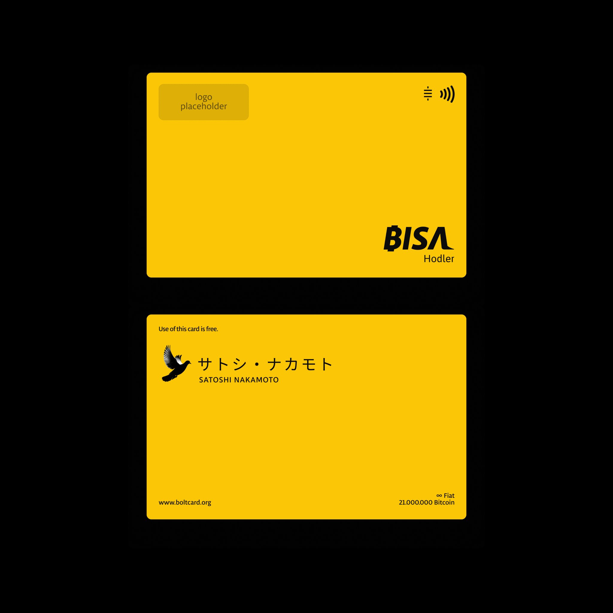
₿ISA debit card
https://x.com/unllamas/status/1950944668641866185
The ₿ISA came out of the need to onboard people in the easiest way possible to borderless international payments, so they can pay without even knowing what Bitcoin is.
 
A parody of VISA that uses Bitcoin under the hood. After posting the images on [Nostr](https://njump.me/nevent1qqsyhv663fxde6267c54v8gu6pufd65p749u5vvd23lpu2cpftpahxgzyr8w9pampxg23m9arhh8aele8qsqjz99ez4gqjemm6hd3rhlk425wawm82w) and [Twitter](https://x.com/unllamas/status/1950944668641866185) and tagging the #BoltCard team, they encouraged @unllamas to send them the designs so they could print the cards. Here a preview of this crazy idea.


Cards were designed following the documentation that VISA provides on how to achieve good design. I used the brand manual as inspiration for color usage and for finding alternative typefaces to those the company offers.
# What #creative #ideas have you been rambling on?

This post is part of a series. It is meant to be a place for anyone to discuss a #WIP #projects, or an #idea worth to #build. Regardless of your #project being personal, professional, physical, digital, or even simply an #idea to brainstorm together.
If you have any creative projects or ideas that you have been working on or want to eventually work on... This is a place for discussing those, gather initial feedback and feel more energetic on bringing it to the next level.
₿e #Creative, have #Fun, share it at https://stacker.news/items/1068257/r/deSign_r
#Design #innovate #innovation #creativity #createopportunities #Creator #create
Boring Websites: A directory of Underrated Profitable Websites
https://www.boringwebsites.info/
Discover simple online business ideas that succeed without hype or venture capital.
Fedora for Architects: Open Source Tools for Architectural Design
https://fedoramagazine.org/fedora-for-architects-open-source-tools-for-architectural-design/
Access a wide selection of open source applications through DNF, Flatpak, and COPR by installing stable packages and by testing the latest versions. In this article, a wide range of open source applications that can cover every stage of the architectural design process. From early sketching to 3D modelling, documentation, and even BIM. The following are some tools I use in practice.
Tuning Yourself to Moments of Awe
https://rickrubin.substack.com/p/tuning-yourself-to-moments-of-awe
# _Seek out and sit with moments that pull you beyond the ordinary._
_What takes your breath away? A magnificent sunset? An unusual eye color? A beautiful melody? The way the light and shadow interact at certain times of the day? Clouds? A full moon? Look for what has power beyond the ordinary. Seek them. Sit with them. Commune with them. Organize your life around experiencing as many moments of awe as possible._
Seek out and attune yourself to moments that pull you beyond the ordinary. These moments can come from nature, music, art, or small details in everyday life. By noticing and connecting with them, you build a vocabulary of awe that feeds your creative spirit.
For the next week, make a conscious effort to notice what catches your attention and seems magical. Maybe it’s the way sunlight filters through leaves, the unexpected color in a shadow, or an ordinary moment suddenly charged with significance. Pay attention. Let yourself be moved.
When you experience awe, take time to sit with it. Pause and fully commune with the experience. Ask yourself:
* What about it feels extraordinary?
* How does it connect you to something beyond the ordinary?
* What emotions or sensations arise?
Beyond noticing spontaneous moments, you can also intentionally seek out experiences that evoke this feeling of awe. For example, you could wake up early to watch the sunrise, visit a botanical garden, engage in holotropic breathwork, or explore the altered states brought on by extreme contrasts like sauna and ice baths.
To deepen your connection with awe, make a habit of seeking these moments regularly. By tuning yourself to the ecstatic, you’ll cultivate a greater sensitivity to the beauty, mystery, and wonder of life.
_The reason we want to tune into these experiences and spend time in them is that they provide a vocabulary for our creative work. When we create, we aim to evoke the same feelings and moments of beauty, magic, and profound wonder. It's about tuning yourself to that feeling, so you can tap into it in your artistic pursuits._
# ⨀
Dual-Screen Cyberdeck: Sleek Design, Ultimate Functionality
https://www.youtube.com/watch?v=cigAxzQGeLg
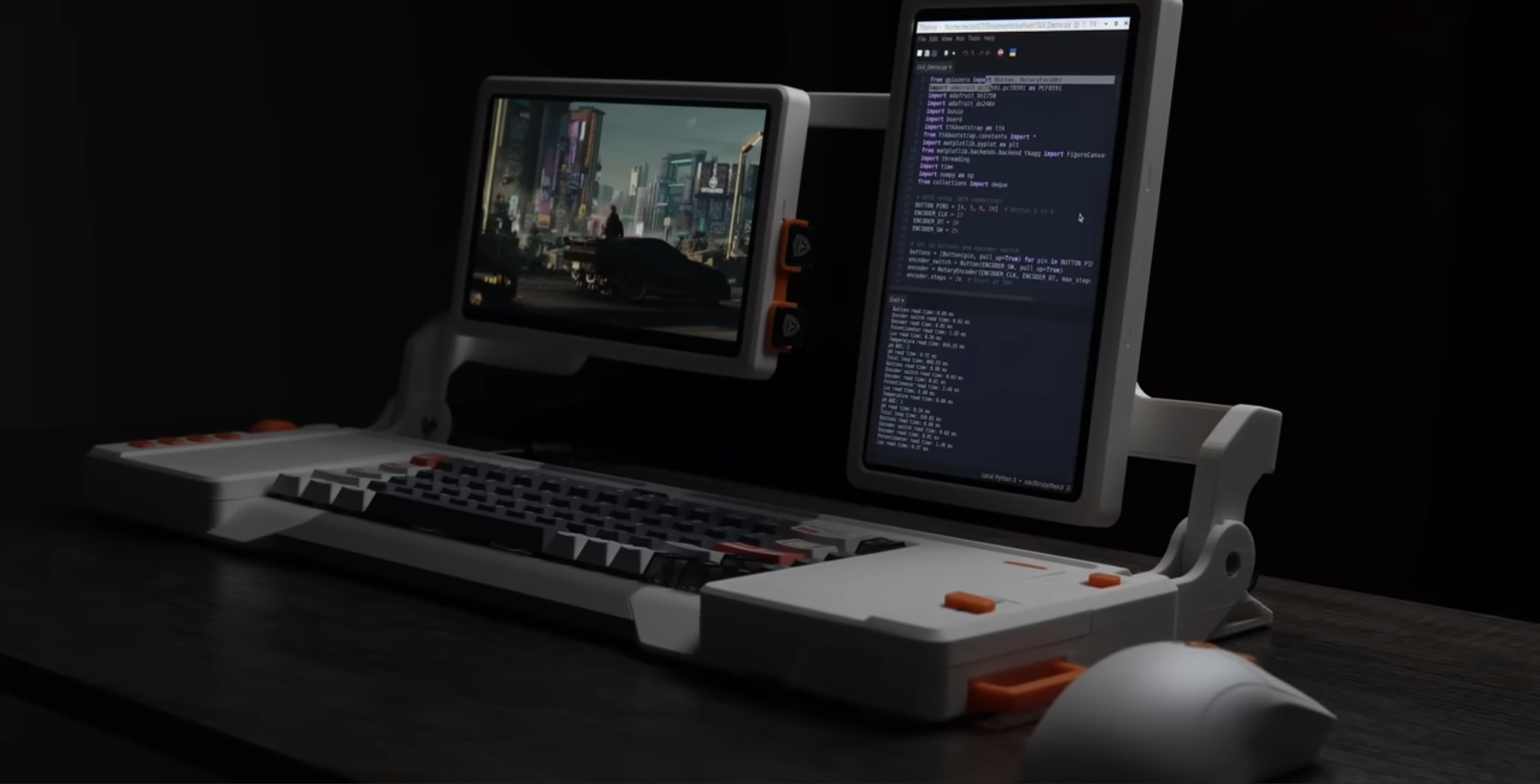
A dual-screen cyberdeck built around a Raspberry Pi 5. It's fully 3D printable and open source. This video
show you the design and build process then showcase it's features with a custom ttkbootstrap GUI and demo I2C sensor experiment.
Documentation: https://github.com/sector07-dev/RPI_DEV
Dual-Screen Cyberdeck: Sleek Design, Ultimate Functionality
https://www.youtube.com/watch?v=cigAxzQGeLg
a dual-screen cyberdeck built around a Raspberry Pi 5. It's fully 3D printable and open source. This video show you the design and build process then showcase it's features with a custom ttkbootstrap GUI and demo I2C sensor experiment.
Documentation: https://github.com/sector07-dev/RPI_DEV
Writing a good design document
https://grantslatton.com/how-to-design-document
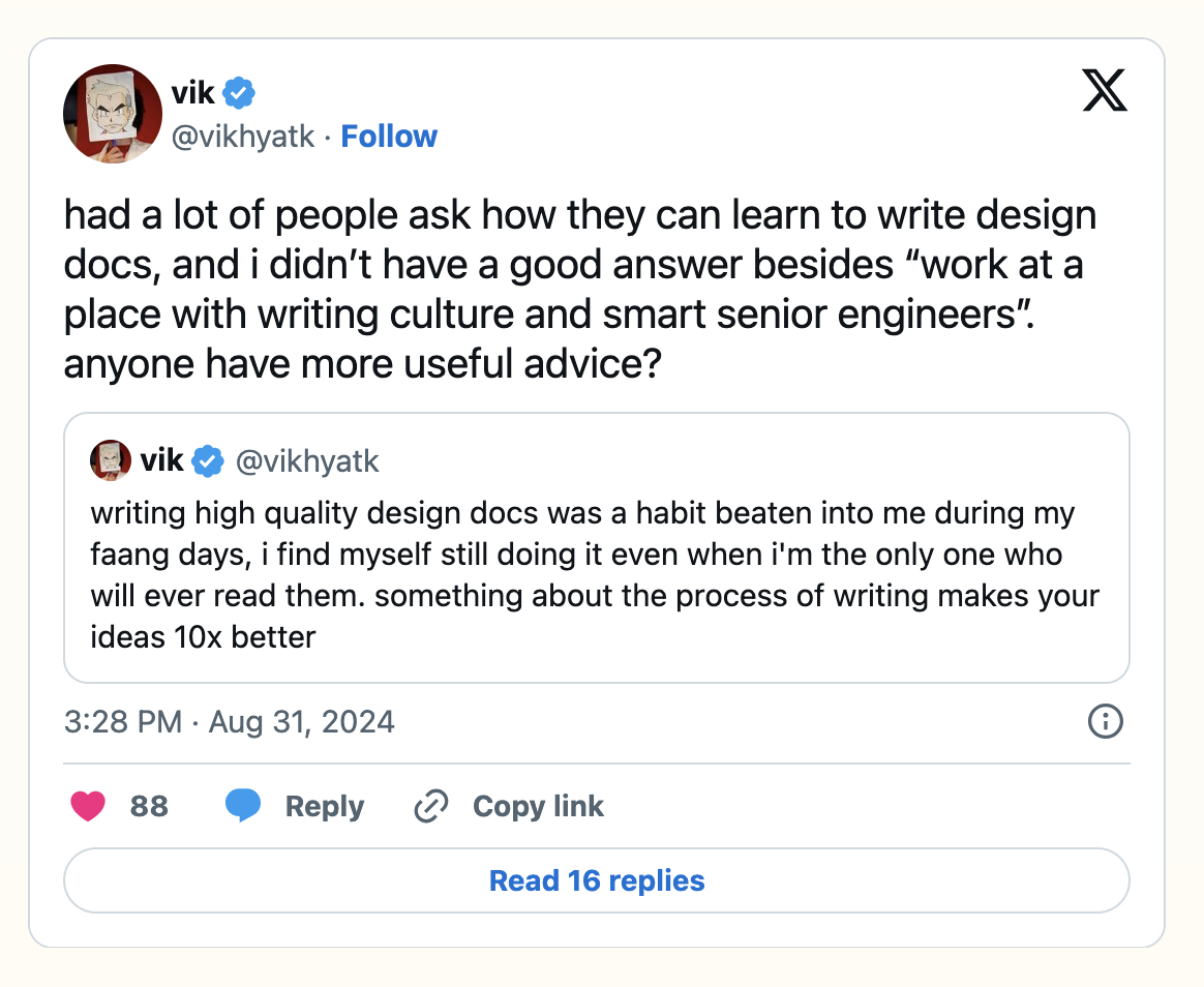
**Definition**
A design document is a technical report that outlines the implementation strategy of a system in the context of trade-offs and constraints.
**Goal**
Think of a design document like a proof in mathematics. The goal of a proof is to convince the reader that the theorem is true. The goal of a design document is to convince the reader the design is optimal given the situation.
The most important person to convince is the author. The act of writing a design document helps to add rigor to what are otherwise vague intuitions. Writing reveals how sloppy your thinking was (and later, code will show how sloppy your writing was).
Art vs Design – A Timeless Debate
https://www.toptal.com/designers/creative-direction/art-vs-design
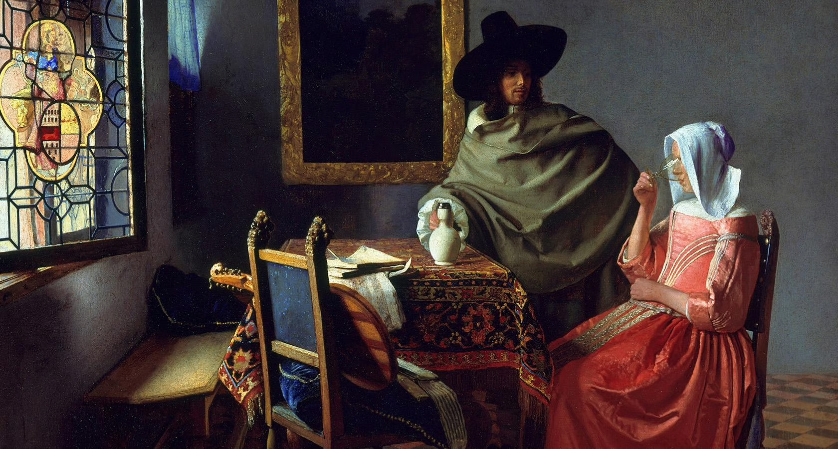
Vermeer likely used an advanced, and still unknown, form of camera obscura to create his masterpieces. This is a contentious theory, but there is ample evidence from multiple sources to support such a claim.
How is it relevant to our debate? Vermeer invented an apparatus and process that went undetected and unduplicated for over 350 years and allowed him to create some of the world’s most iconic and technically exquisite paintings without any formal training. That is the pinnacle of problem solving.
Design is an art form, a method of human expression that follows a system of highly developed procedures in order to imbue objects, performances, and experiences with significance. Like all art forms, design has the potential to solve problems, but there is no guarantee that it will.
More than anything, I want designers to realize that art is not an asinine subculture of design rejects preoccupied with finger painting their feelings. In fact, a low view of art is also a low view of design, science, history, and culture that severely limits creative potential and interdisciplinary progress.
At the end of the day, art solves problems. “Good design” is simply one path to a solution.
@deSign_r captures life with "The Hype is the Product" - where words becomes sculpture, framing responsibly with #design & #creativity: https://stacker.news/items/1065414/r/deSign_r
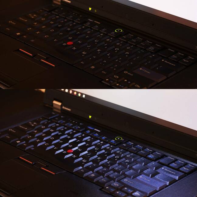
@deSign_r craft "ThinkPad designer David Hill dishes on unreleased models" - respecting every #function with purpose, improving #designtips & #creativity. https://stacker.news/items/1065422/r/deSign_r
The Design Vacuum: How Apple Lost Its Aesthetic Soul to Profitable Functional
# Apple convinced an entire generation that computers could be beautiful. Then they shipped Notes.
What happened to the company that obsessed over the curve of an icon, the weight of a font, the perfect spacing between elements? Apple Notes, in its present visual form, exists as evidence that even Apple has forgotten why design matters.
## Looking Forward: The Return of Craft
A new generation of developers is rediscovering that craft matters. That users deserve better than startup chaos with false momentum. Sometimes beauty is not vanity, it is a necessity.
The next breakthrough in personal computing won't come from adding more features. It will come from rediscovering why we fell in love with computers in the first place, actually to be specific, why we fell in love with the iPhone's interpretation of a personal computer. But, it will come in the form of software. Hardware is done, for now.
## Your Thoughts?
Do you remember when software felt magical? What happened to apps that made you excited to use them? Are we settling for "good enough" when we deserve "impossibly great"?
When did functional become the enemy of beautiful?
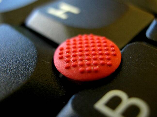
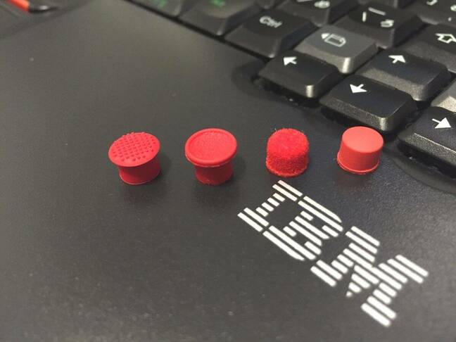
ThinkPad designer David Hill dishes on unreleased models
https://www.theregister.com/2025/08/02/thinkpad_david_hill_interview/
# Long live the nub: ThinkPad designer David Hill spills secrets, designs that never made it
We almost got more butterfly keyboards and foldable workstations
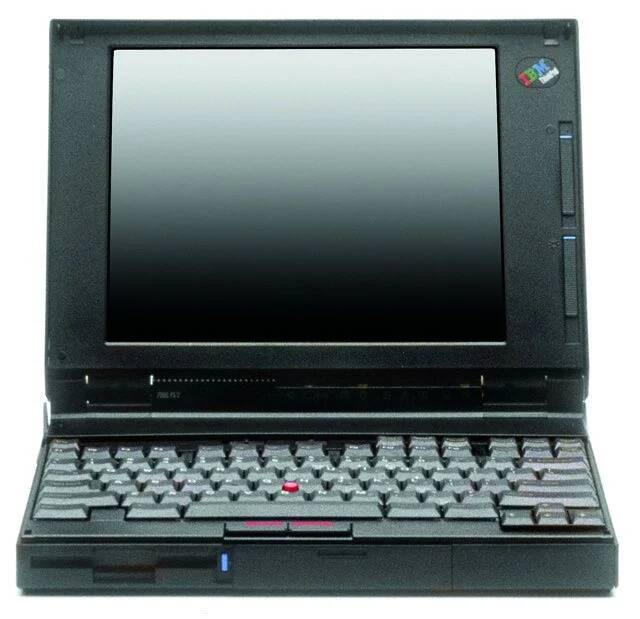 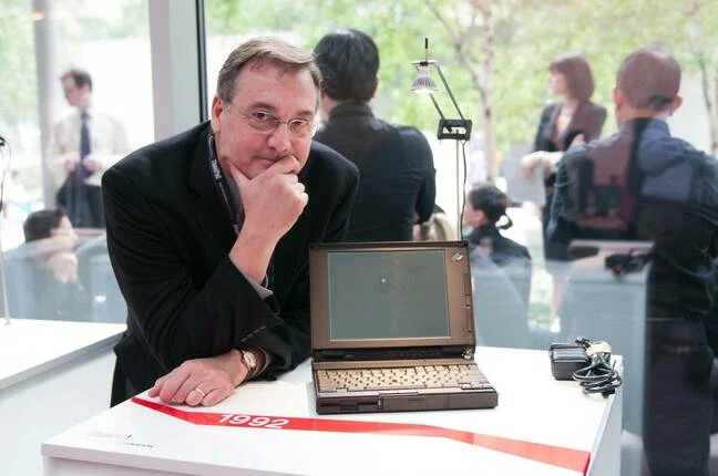
Interview Launched in 1992, the boxy black ThinkPad with its little red nub remains the quintessential business productivity notebook. Unlike commercial offerings from competitors such as Dell and HP, Lenovo's laptop has a following of people who collect old models and celebrate each new innovation.


The Hype is the Product
Large publicly traded tech companies seem to no longer consider their customers – that is, people and organizations who actually buy their products or pay for access to their services – their core focus. The focus has instead turned towards the stock price.
Their real clients, the entities they really care about, are the stockholders. Reasons are many, perhaps one of them being that people making decisions tend to own stock options or have bonuses tied to stock performance of the companies they run.
This means that for a large, established tech company the product or service it offers does not matter all that much anymore. It needs to be just barely good enough to keep people using it. The easiest way to do this is some form of a monopoly.
Monopoly is the business model of Silicon Valley, and they are not even shy about that.
@deSign_r captures life with "The product design talent crisis" - where words becomes sculpture, framing responsibly with #design & #creativity: https://stacker.news/items/1064343/r/deSign_r
The End of Design Report
https://www.suffsyed.com/the-end-of-design-report
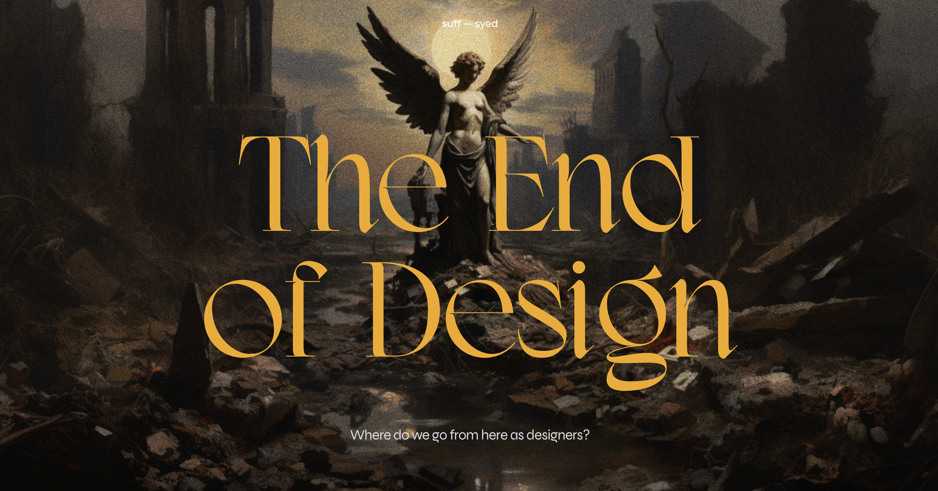
> # Discover Future of Design Today
> — Suff Syed
LLMs have sparked AI advancements, unlocking unprecedented possibilities that are just a few prompts away. This comes at a time when there is low confidence in Design as a craft and its leaders across board rooms. This in-depth report helps you navigate the uncertainty, and hopefully shines the light on a new future.
Python Design Patterns You Should Unlearn
https://www.lihil.cc/blog/design-patterns-you-should-unlearn-in-python-part1/
Most of these patterns solve problems Python doesn’t have. They were designed for languages like Java and C++, where you have to jump through hoops just to get basic things done — no first-class functions, no dynamic typing, no modules as namespaces. Of course you’d need a Factory or a Singleton if your language gives you nothing else to work with.
Blindly copying those patterns into Python doesn’t make you clever. It makes your code harder to read, harder to test, and harder to explain to the next poor soul who has to maintain it — possibly you, three months from now.
New vision from @deSign_r: "Periodic Table of System Design Principles". Building unforgettable #experiences, one #design at a time with #creativity. https://stacker.news/items/1062946/r/deSign_r
New creation from @deSign_r: "Examining mushrooms under microscopes help engineers design stronger materials". Crafting the future of visual expression. Discover #design & #creativity. https://stacker.news/items/1062952/r/deSign_r
@SalmaChan craft "Orange envelope is getting an update" - respecting every #function with purpose, improving #designtips & #creativity. https://stacker.news/items/1063173/r/deSign_r
Periodic Table of System Design Principles
https://github.com/jarulraj/periodic-table
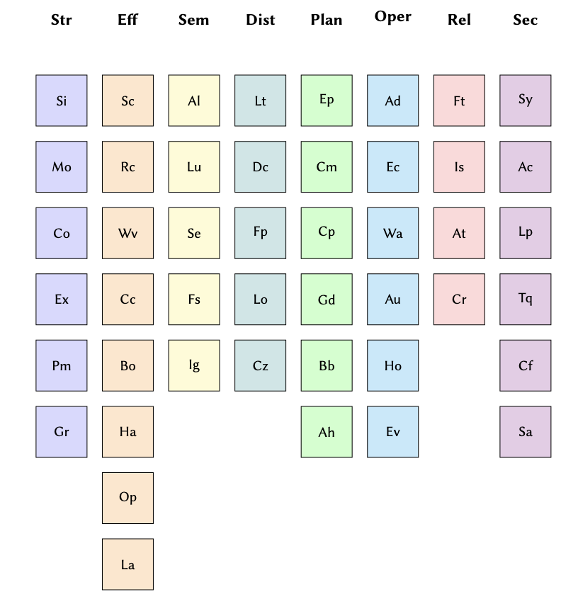
System design is often taught through solutions specific to particular domains, such as databases, operating systems, or computer architecture, each with its own methods and vocabulary. While this diversity is a strength, it can obscure cross-cutting principles that recur across domains. This paper proposes a preliminary taxonomy of system design principles distilled from several domains in computer systems. The goal is a shared, concise vocabulary that helps students, researchers, and practitioners reason about structure and trade-offs, compare designs across domains, and communicate choices more clearly.
Smart one from @deSign_r: "NYC’s Urban Textscape". Protects what words cannot. Function meets #designtips & #creativity: https://stacker.news/items/1061520/r/deSign_r
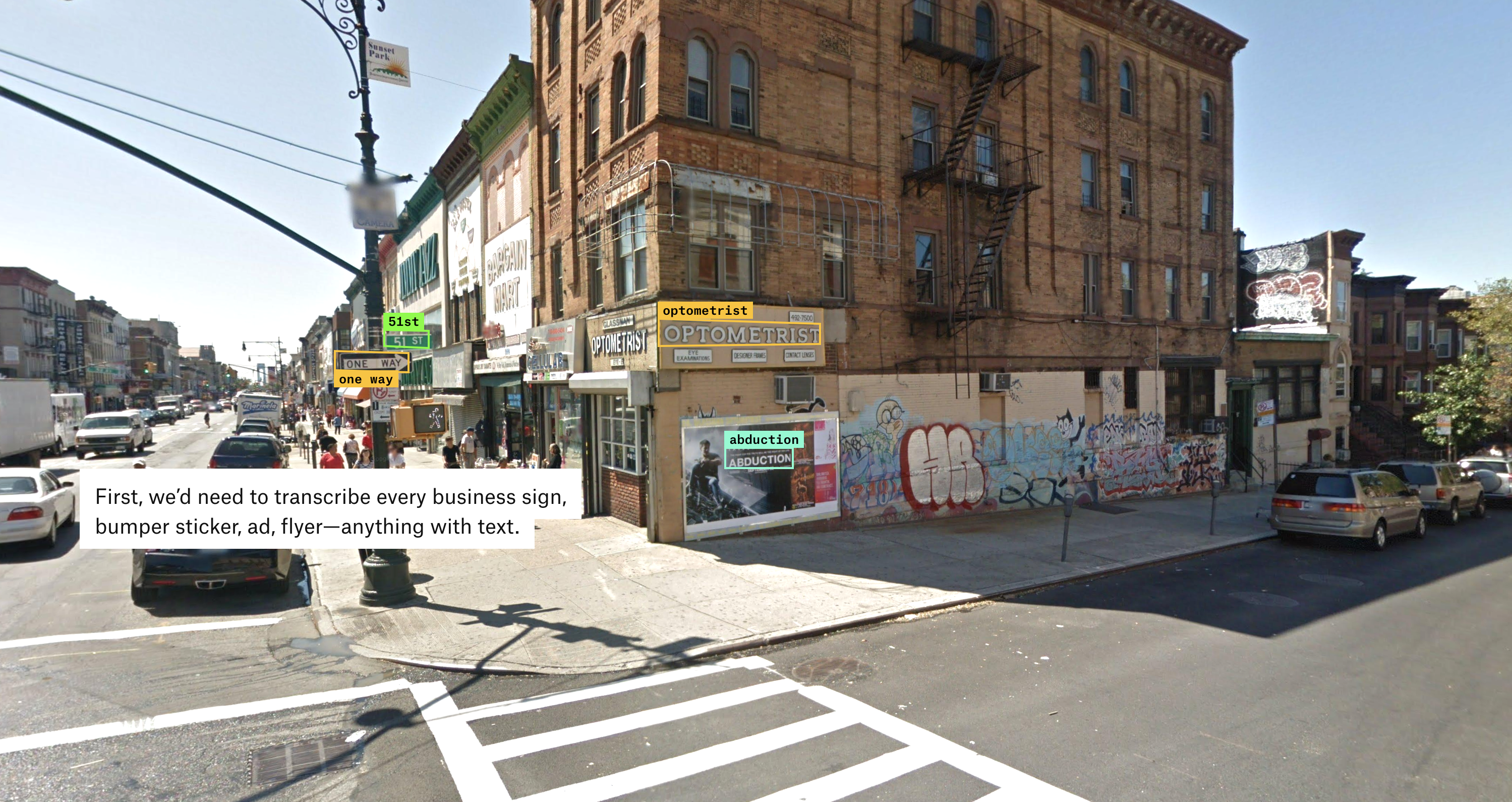
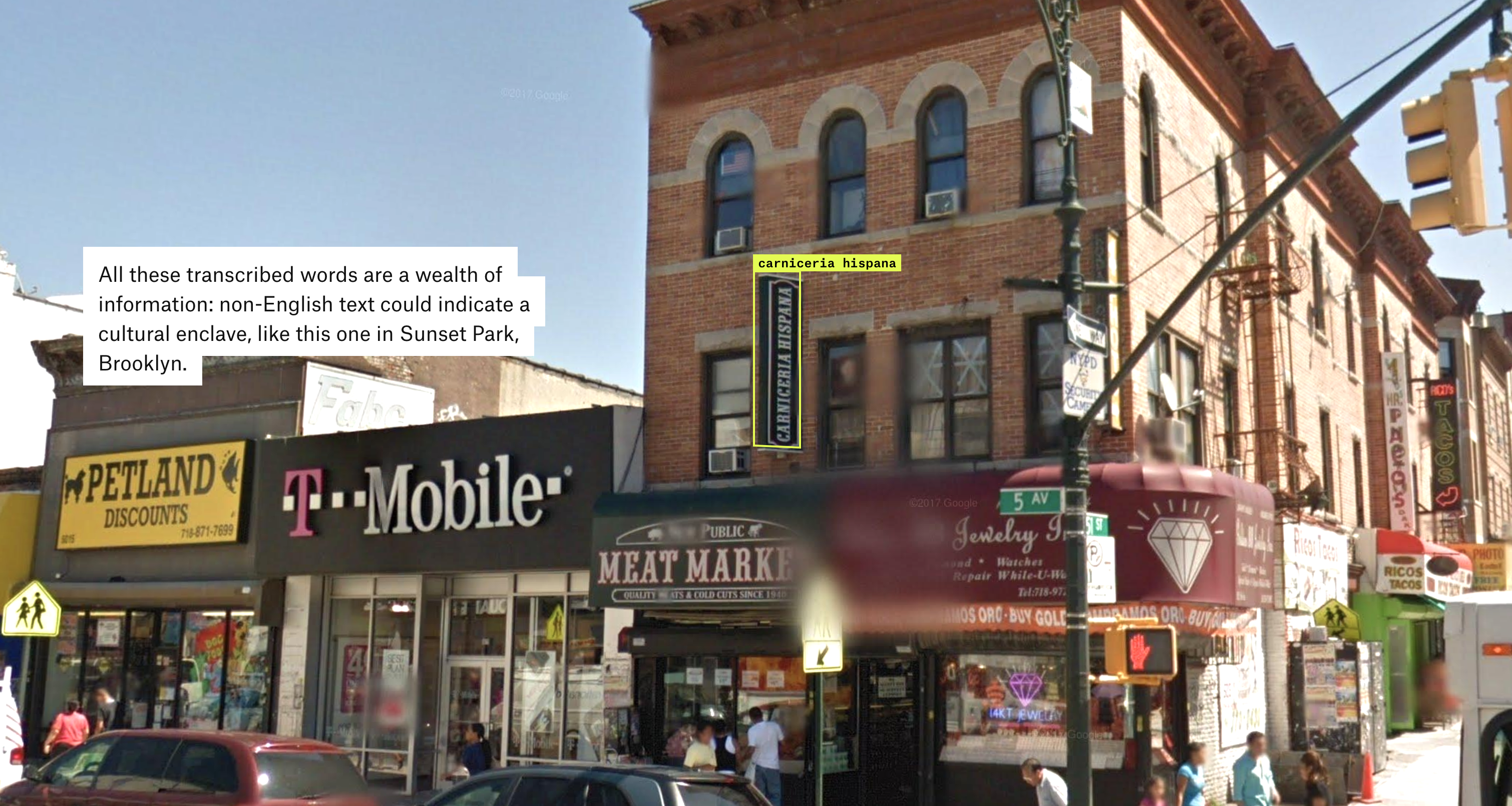
NYC’s Urban Textscape
https://pudding.cool/2025/07/street-view/
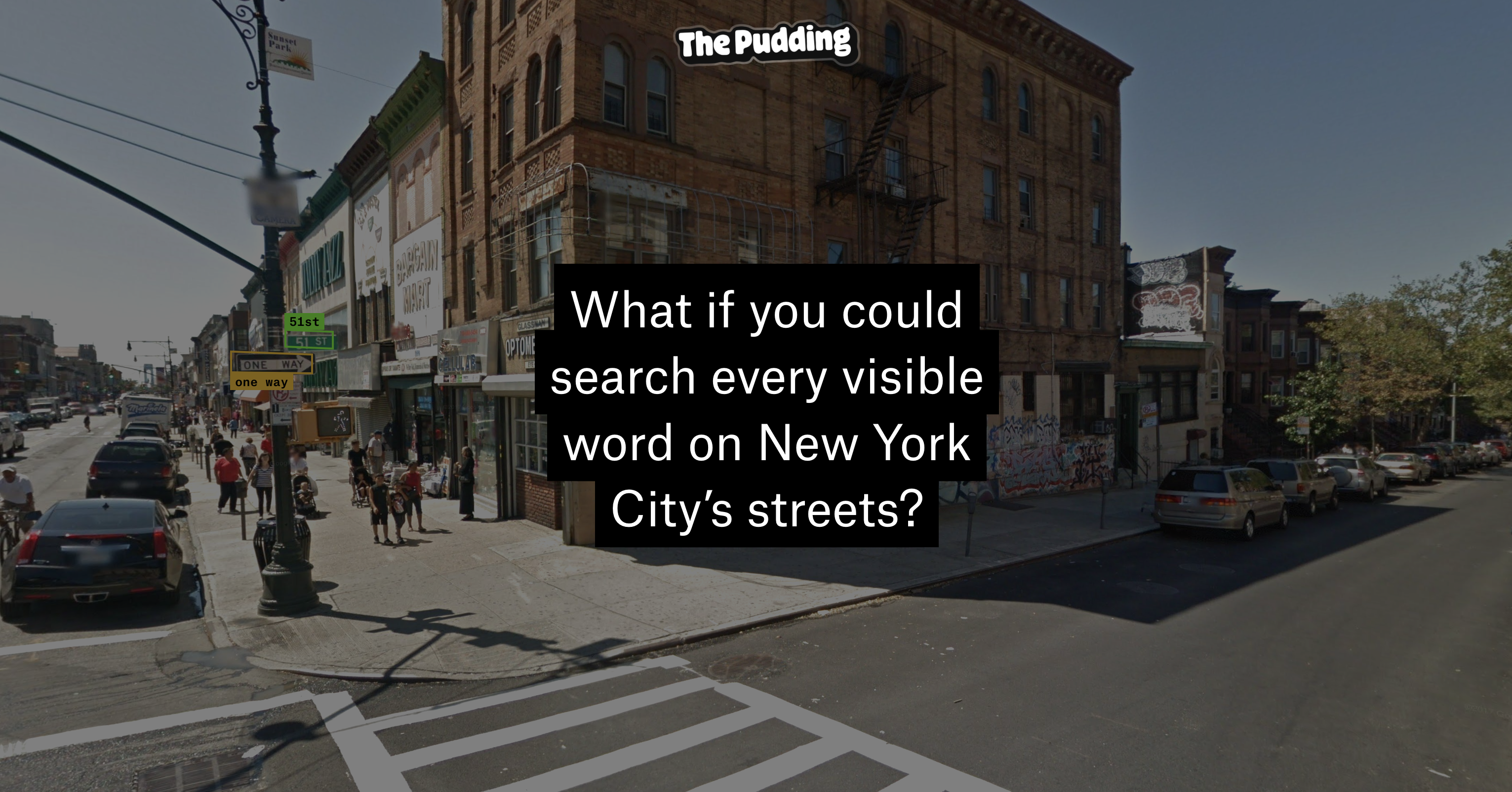
# Analyzing All of the Words Found on NYC Streets
The data is astonishing; it feels like sifting through the city's source code. For example, here's all 111,290 matches for “pizza,” on a map.
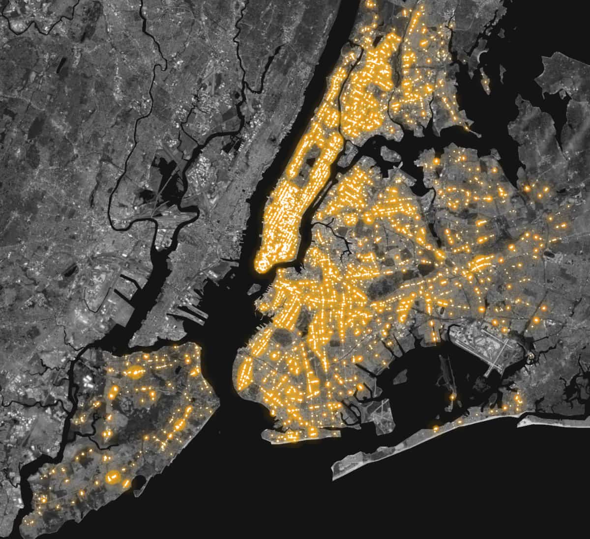
Matches for “Broadway” (62,424 matches) identify street signs, of course. The resulting map is oddly satisfying, illuminating each of the five boroughs’ Broadway.
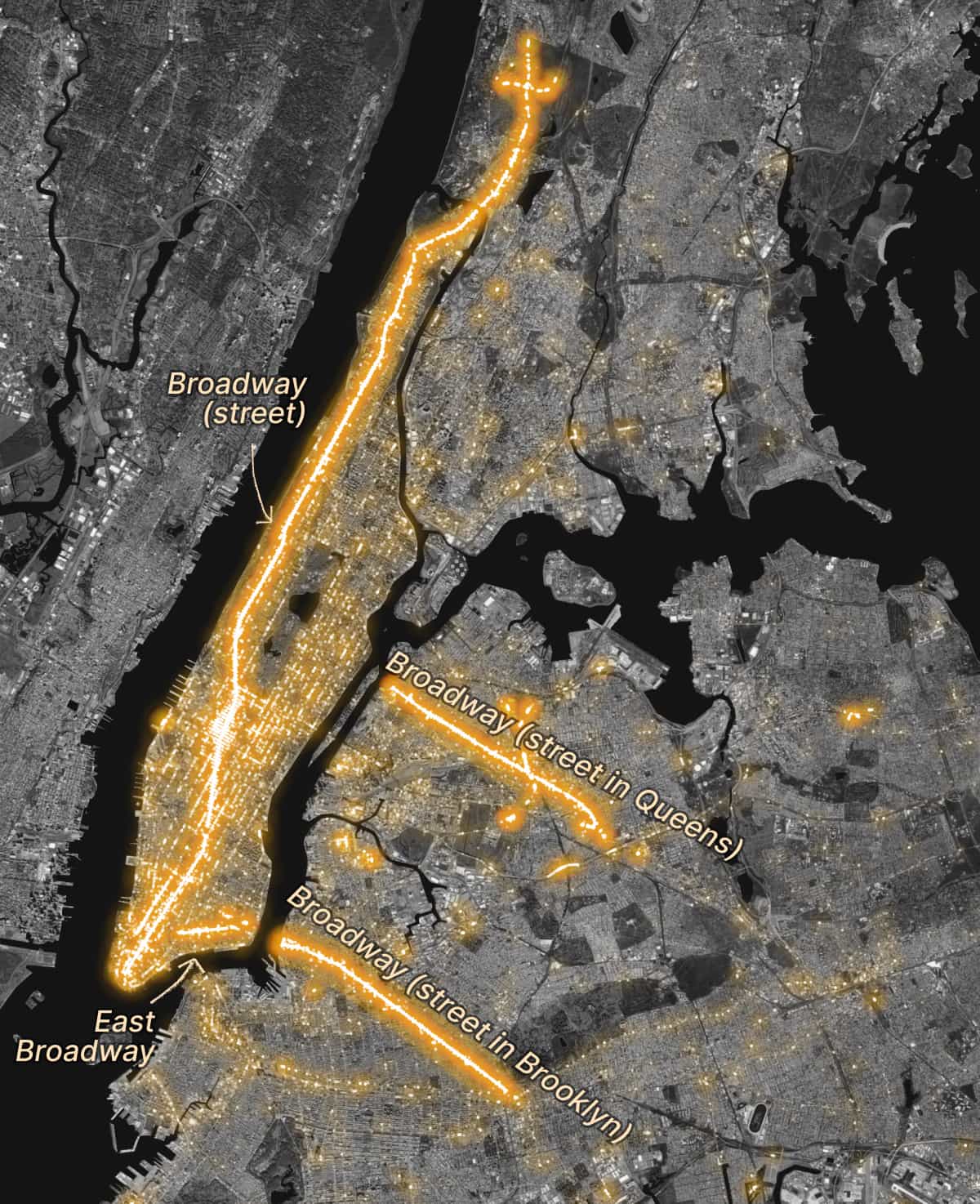
And lot of _design_ too... with over 50k matches, a big creative apple!
Automattic Design for two Distinct Modes of Contents Consumption
# Content for Fun vs. Content for Purpose

We use content in different ways, based on our purpose. Sometimes we use it for fun or entertainment (and social connection), such as when reading a thoughtful essay or scrolling TikTok. At other times, we have a specific goal in mind, such as finding out how to fix a particular error code on our dishwasher or solving a specific coding problem. Understanding these distinct modes isn’t just academically interesting; I hope this mental model helps shape how we design content experiences, AI assistants, and digital platforms. Do these modes resonate with you? I’d love to see great examples of platform or content design that reflect this thinking, to reveal how we can better design Automattic’s products to meet you in whichever mode they find you.
The New Chips Designed to Solve AI’s Energy Problem
https://www.wsj.com/tech/ai/the-new-chips-designed-to-solve-ais-energy-problem-1ba9cac1
# Tech giants and startups alike are trying new approaches to what has been a vexing problem
> By commoditizing AI hardware, and allowing Nvidia’s customers to switch to more-efficient systems, the forces of competition might bend the curve of future AI power demand. “There is so much FOMO right now, but eventually, I think reason will catch up with reality,” Andrew Wee says, who has been a Silicon Valley data-center and hardware guy for 30 years.
Archived at https://archive.is/JPqPt
Designing a flatpack brutalist bed
https://kevinlynagh.com/newsletter/2025_07_flatpack/
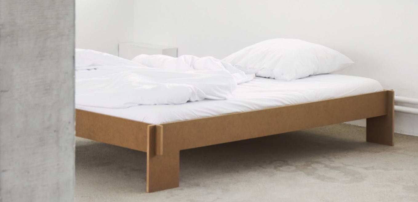
Moved into an unfurnished apartment and founded by a professional woodworker friend that just got a plywood-sheet-sized CNC router, the author has been designing a bedframe inspired by Christoffer Martens’s Siebenschlafer flatpack brutalist bed.
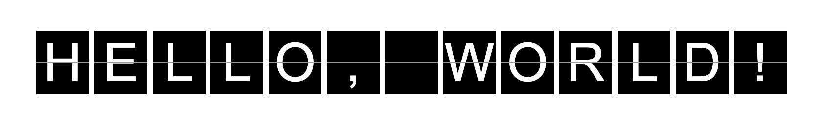
We live in the 21st century and we no longer have signs that work like this
https://fx.hot.page/split-flap

This board, while obviously inferior to a digital display in many ways, has a lot of appeal. Instead of projecting pixelated LED light into your retinas, it’s actually moving and reflecting natural light. There’s something to the infinite resolution on this thing.
@SalmaChan contributes "My process designing a red envelope specific for Bitcoin" to the minimal conversation. Less is more, #simplicity is law. #KISS Experience with #designThinking & #creativity: https://stacker.news/items/1052315/r/deSign_r
Addicted to Every Possibility
https://nathanbeck.eu/essays/addicted-to-every-possibility
Self-imposing constraints in Nathan Beck creative process, digital product designer based in Amsterdam.
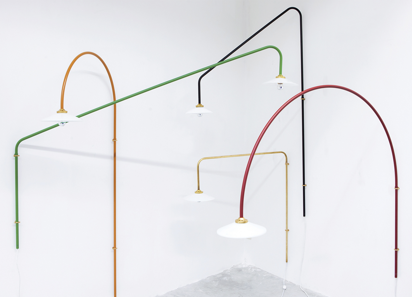
Every design initiative comes with constraints built in. Naturally, timescales and budgets are immovable. Until they’re not. But rather than a mandate for limitless innovation, a project brief is often a catalogue of constraining parameters and non-negotiable (and often contradictory) aspirations and unverified assumptions that impose a point of view that is not always shared with the designers involved. Hence the endless discourse over the years about designers striving to earn and justify their ‘seat at the table’.
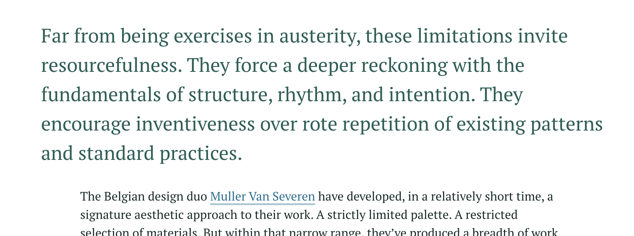
Elizabeth Goodspeed on the rise of the designer as influencer
As social platforms reward visibility, creatives are increasingly expected to make their practice public. Designers are no longer just making work; they are the work. But what started as promotion now risks swallowing design itself.
> _“Like the long-running observation about dogs resembling their owners, designers are seemingly expected to even look like their output – to have a cohesive ‘personal brand’.”_
> —Elizabeth Goodspeed
Curious to know about "What do you want to design? Ask Phind" by @deSign_r in #Design, triggeting #creativity. Learn more https://stacker.news/items/1050649/r/deSign_r
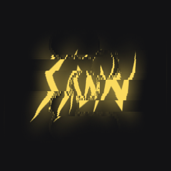
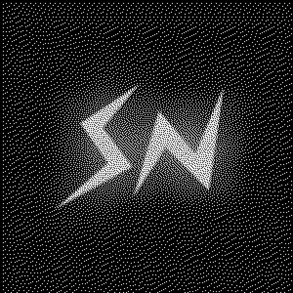
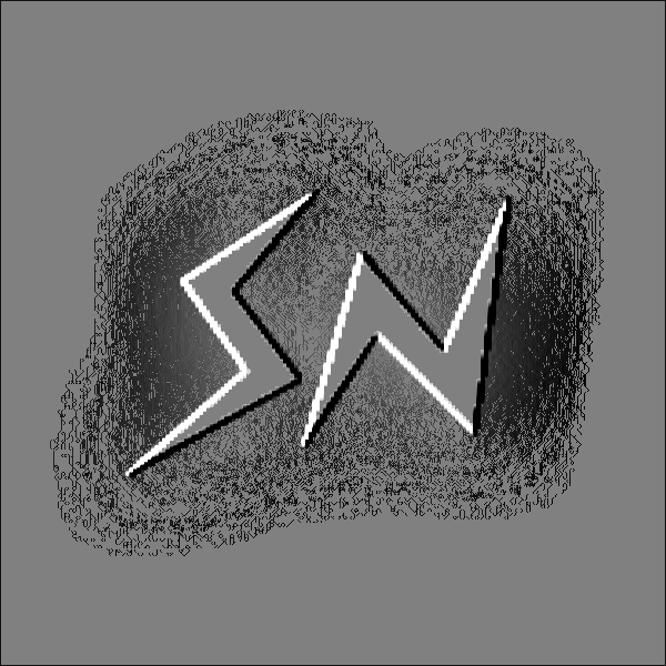
Tooooools.app - Lo-fi effects for your images and videos
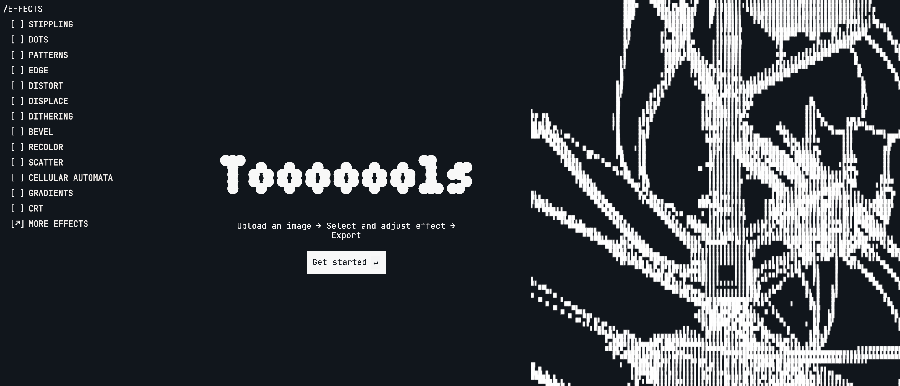
# Apply lo-fi effects to your images and videos: dithering, halftone, gradients, patterns and more.


BAI: A simple Bitcoin Address Inspector served as browser extension
https://github.com/design-rrr/bai/

# Bitcoin Address Inspector
A browser extension that automatically detects Bitcoin addresses on webpages and displays their balance, UTXO count, total received amount, and transaction count using the mempool.space API.
> **`Note:`** A quick weekend project that make it easier to inspect bitcoin addresses directly in the browser. This is just the first release, tested, works... not as I would like to! For example, the popup enters in a loop and does not display the data when hovering highlighted the address. I suggest deactivating the option in the settings as show in the image below. Right click option works well, as shown in the screenshot below.
>
> The extension is available for Chrome and FireFox (different branch for each browser). Code is open to contributions, PRs, issues, and any feedback that could help improve it.
- - -
|Options|In action|
|---|---|
|  | |
## Features
- **Automatic Detection**: Recognizes all Bitcoin address formats:
- Legacy addresses (starting with `1`)
- P2SH addresses (starting with `3`)
- Bech32 addresses (starting with `bc1`)
- **Multiple Interaction Methods**:
- Hover over highlighted addresses for instant popup
- Right-click context menu on selected addresses
- Configurable hover delay
- **Comprehensive Address Information**:
- Current balance
- Number of UTXOs (Unspent Transaction Outputs)
- Total amount ever received
- Total transaction count
- **Customizable Settings**:
- Enable/disable hover popups
- Enable/disable context menu
- Adjust hover delay
- Choose which information to display
@deSign_r revives nostalgia with "💥 JABBB #45 :: Bitcoin Vitruvian" - never looked so fresh. Feel inspired by its #designInspiration & #creativity: https://stacker.news/items/1041247/r/deSign_r