
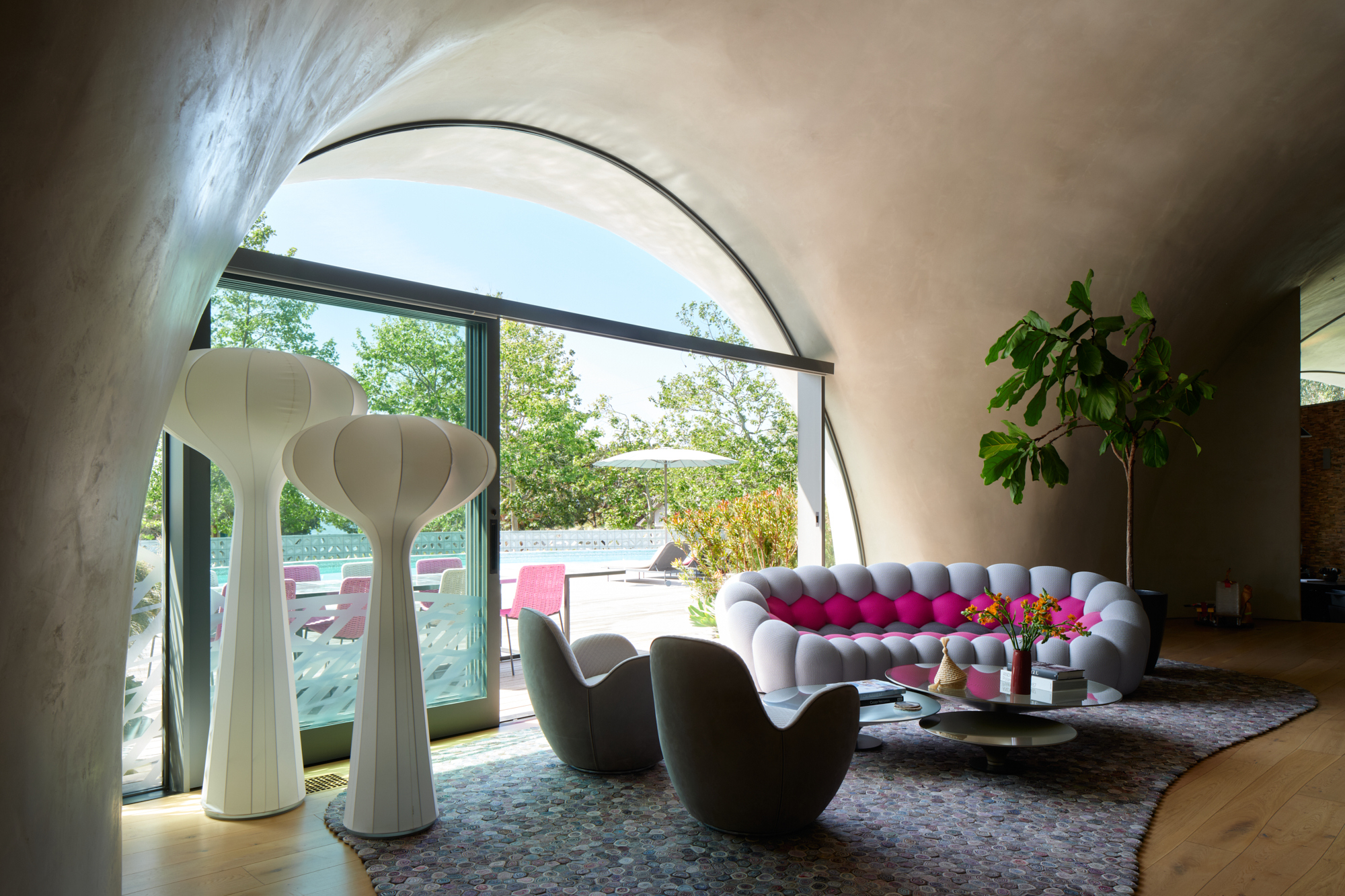
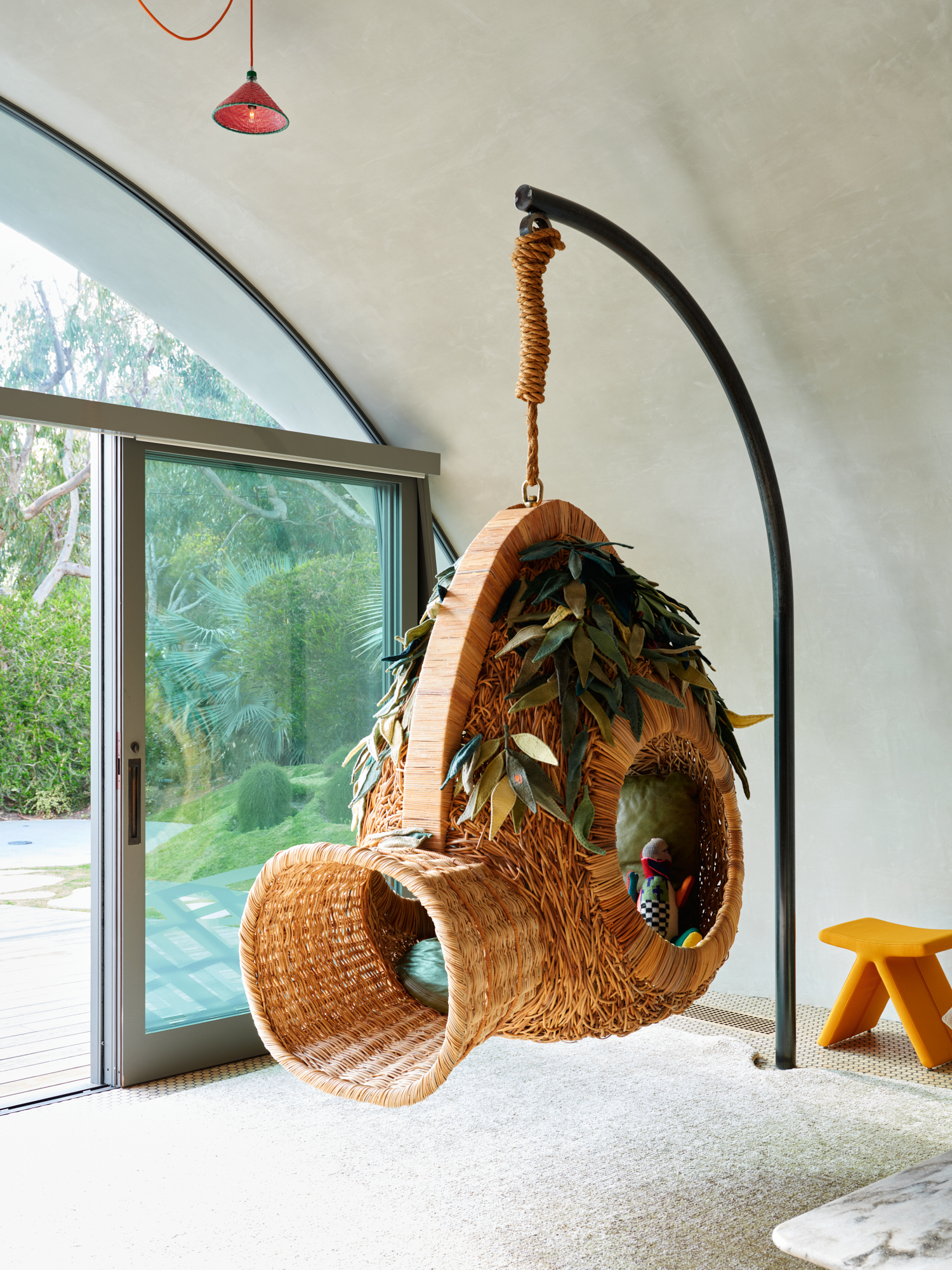
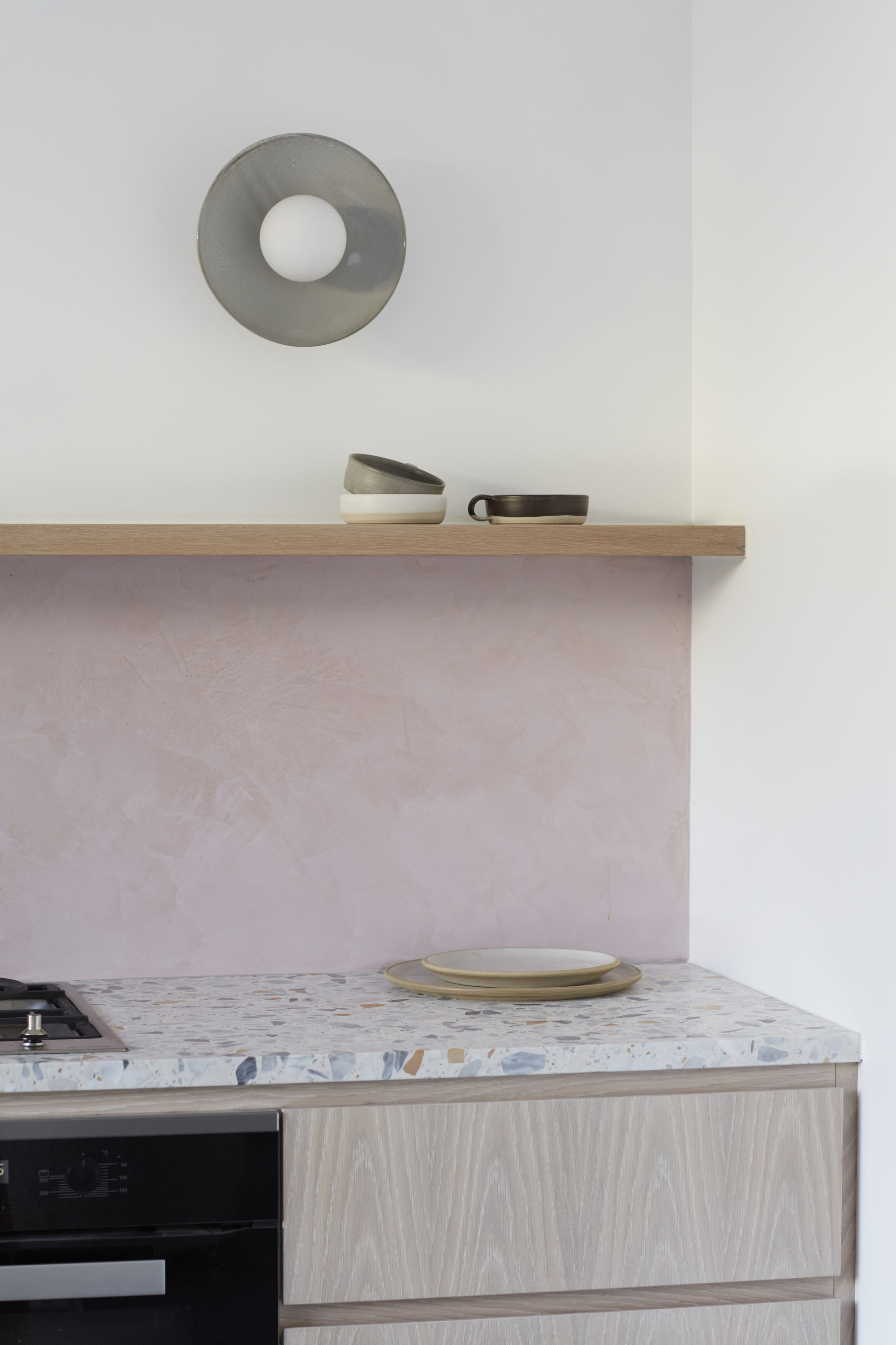
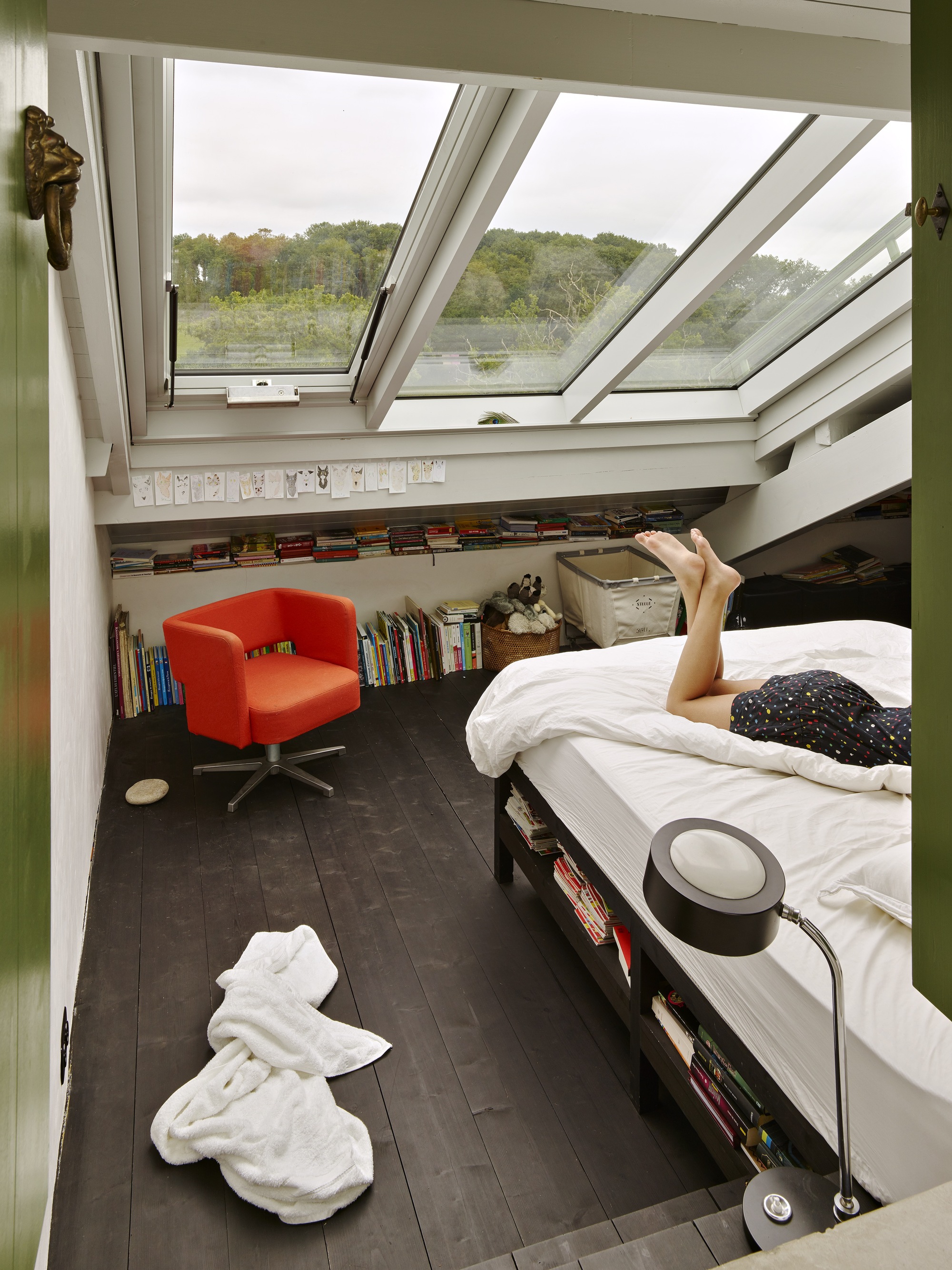
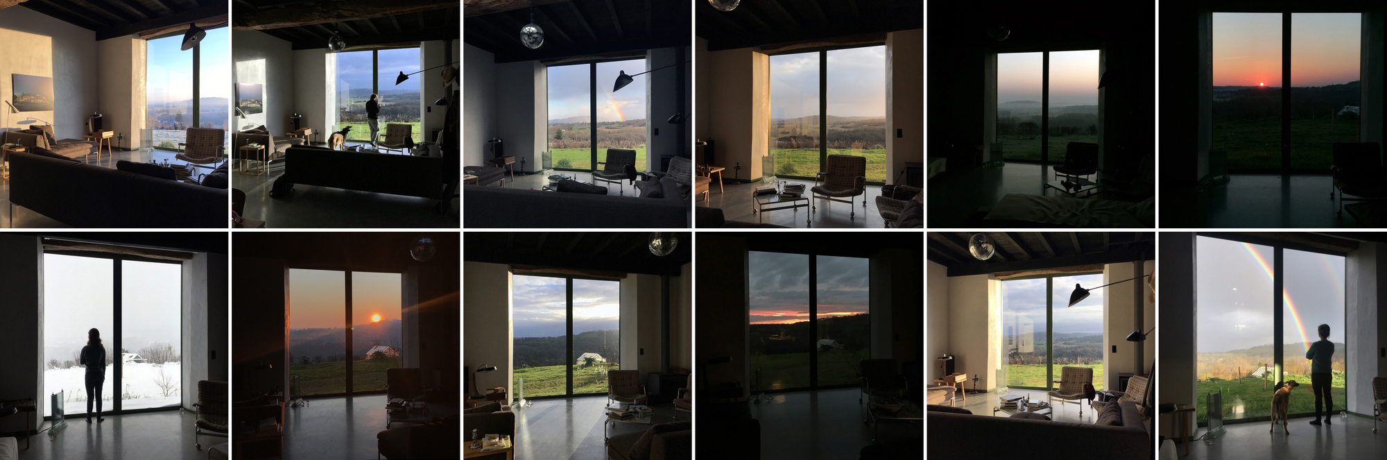
I like it. I think with some home items it would look great. Clearly this was immediately after constructions and its totally empty.
Alexandria House
#architecture
Architects: Lachlan Seegers Architect
Area: 143 m²
Year: 2023
Photographs: Rory Gardiner
City: Alexandria
Country: Australia
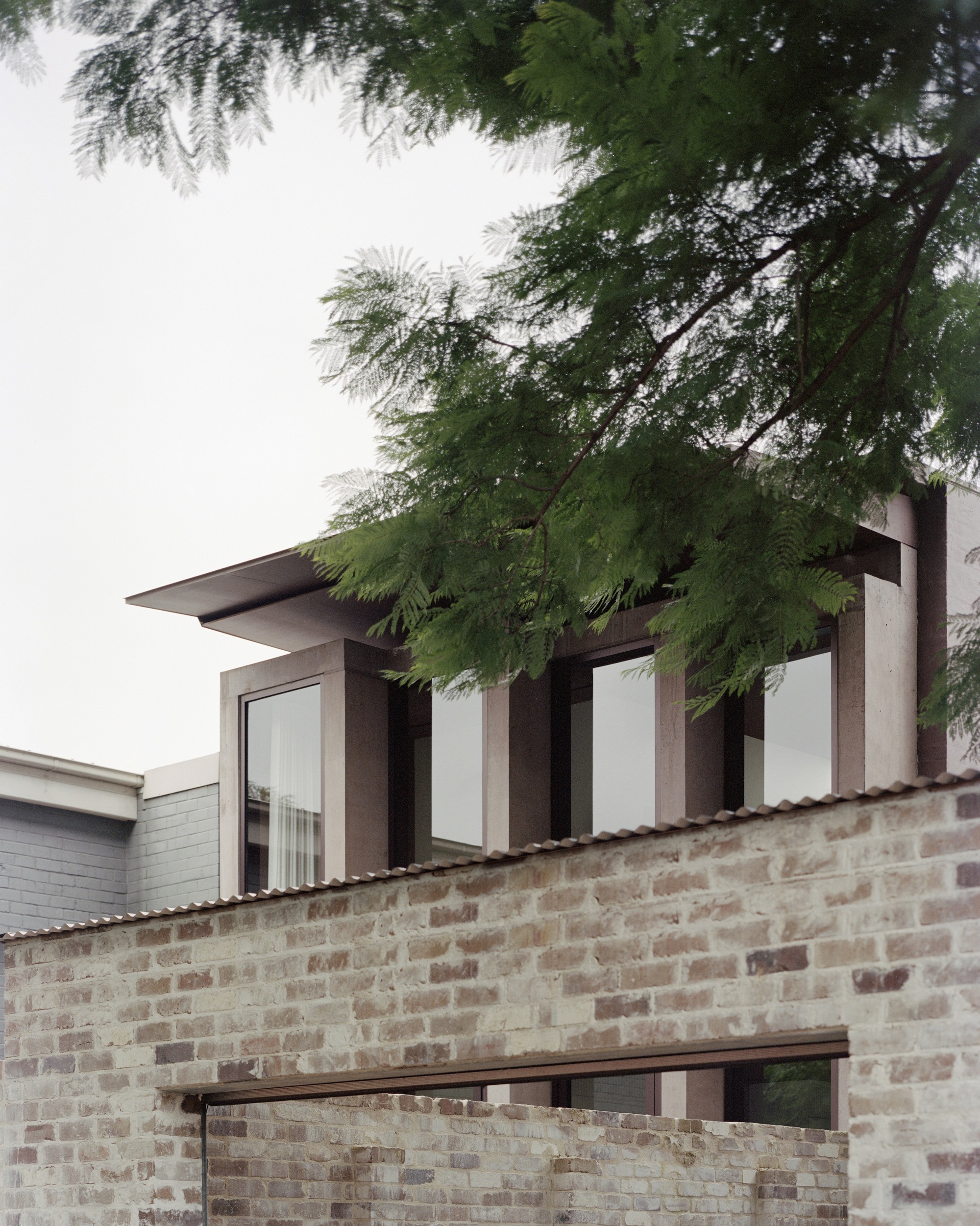
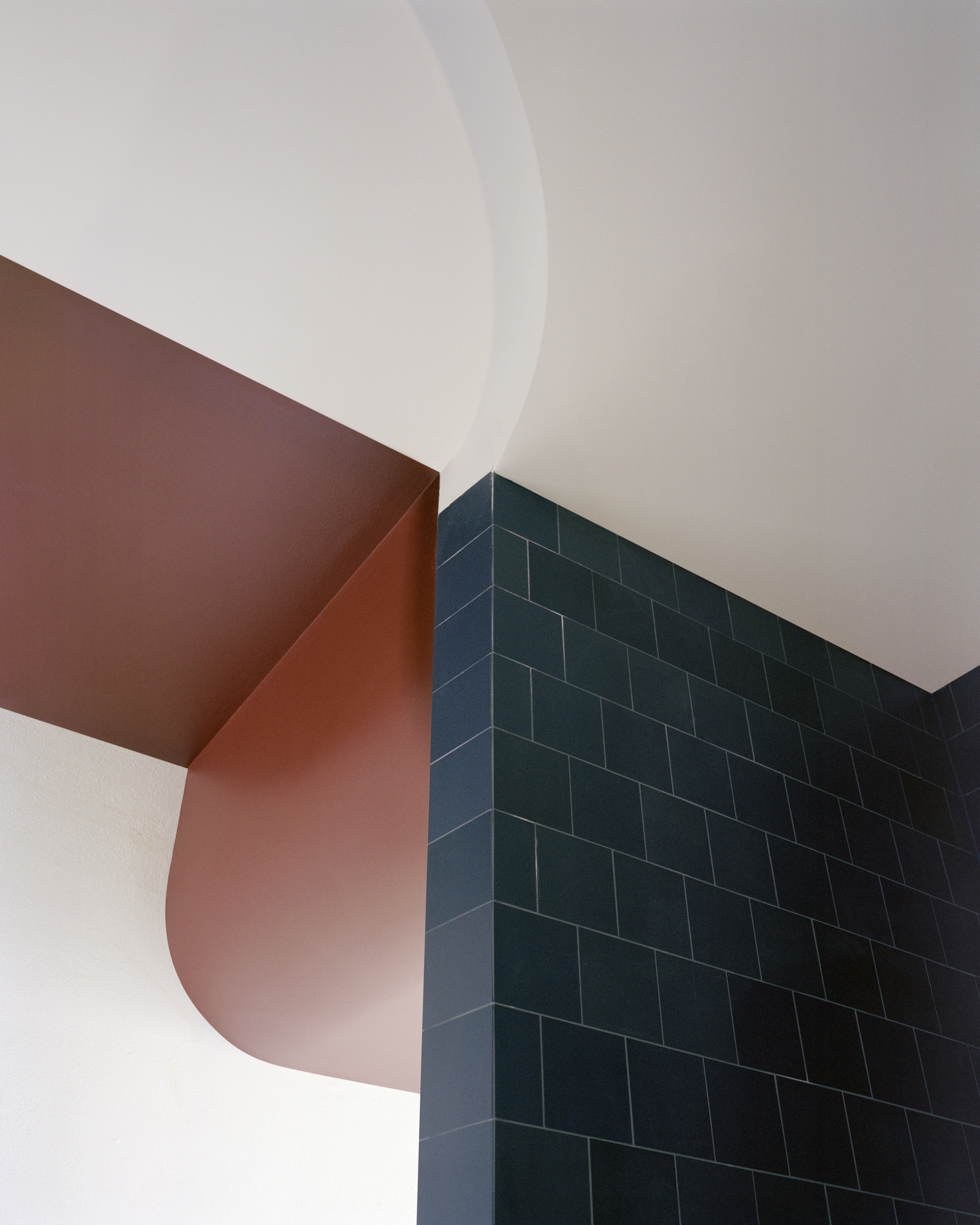
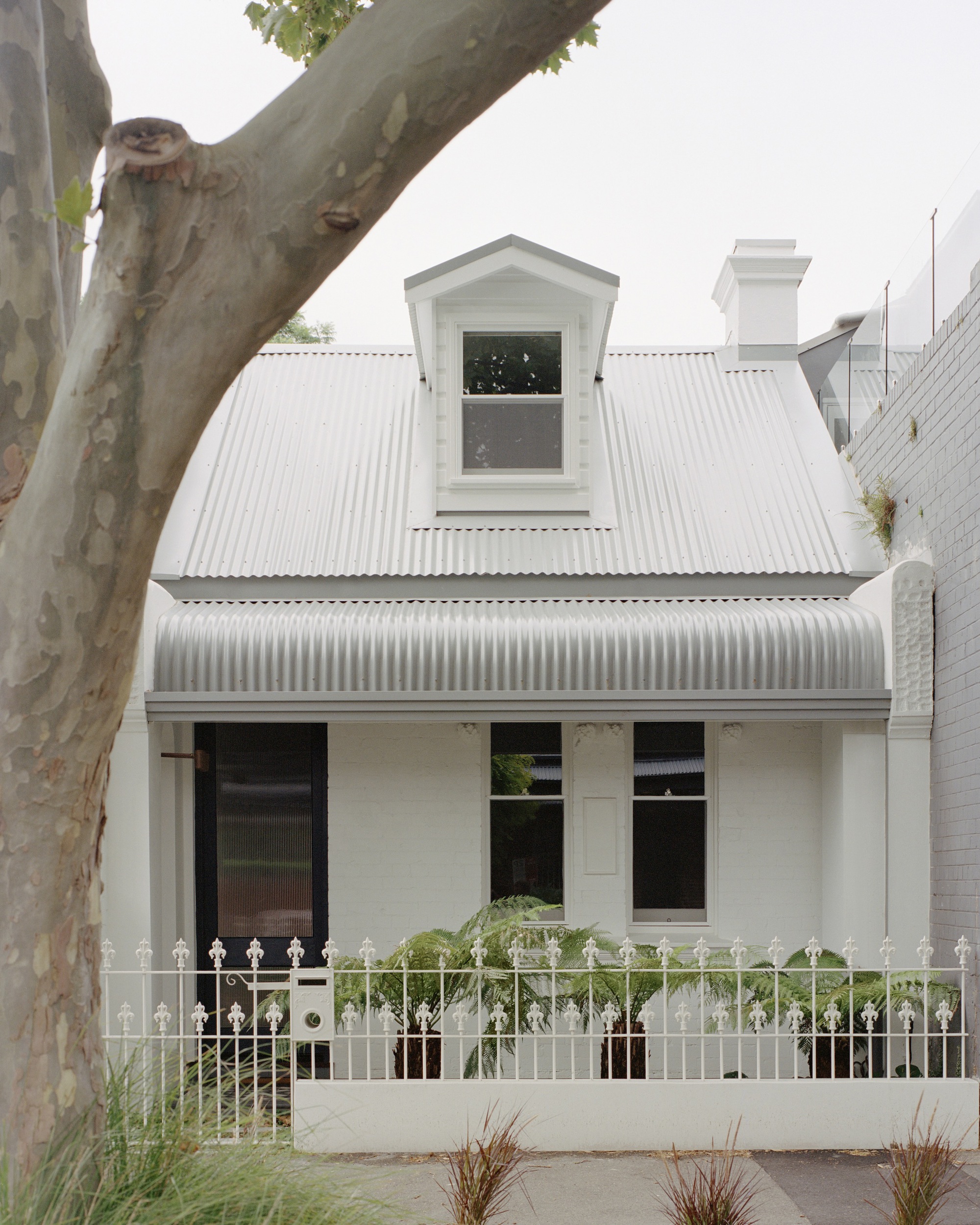
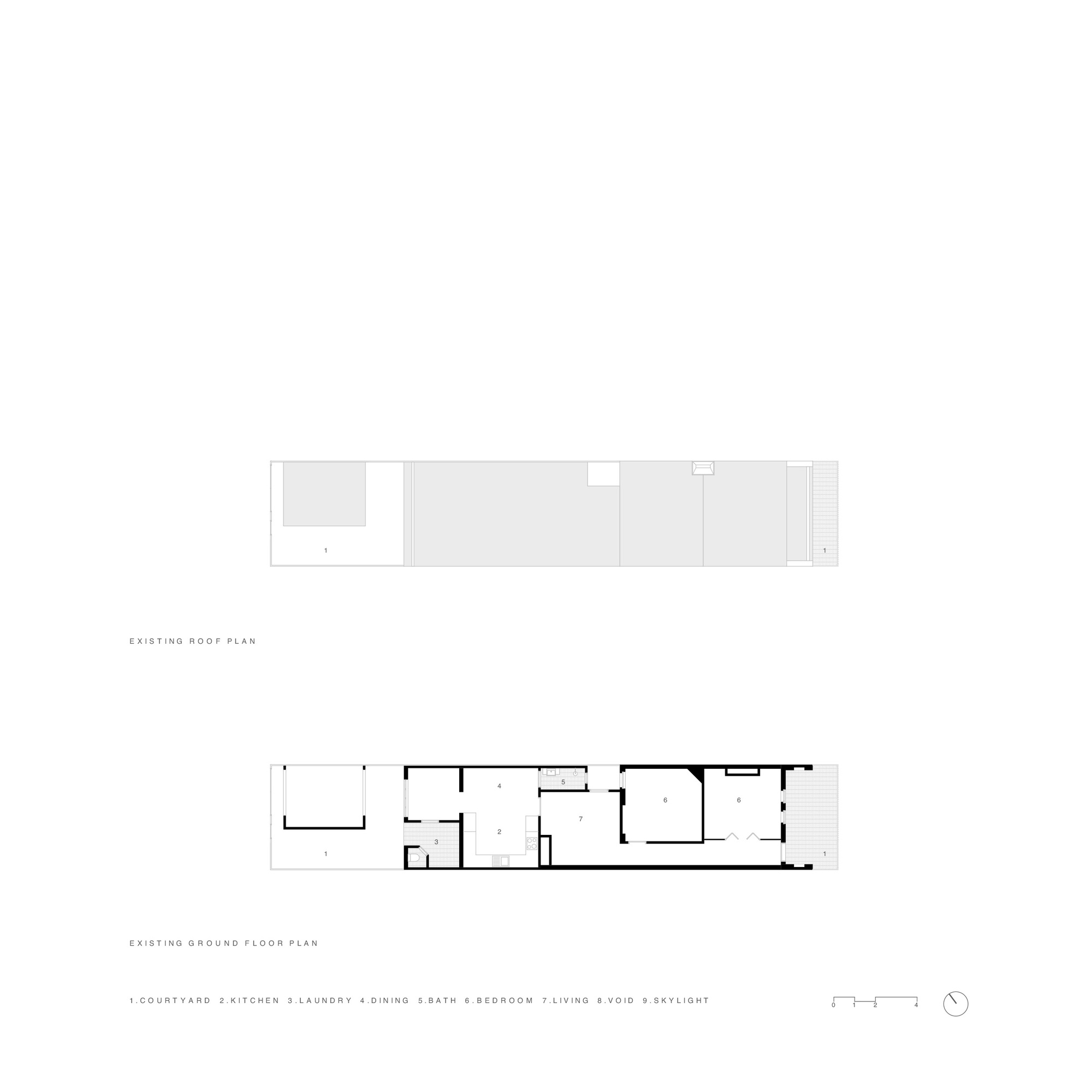
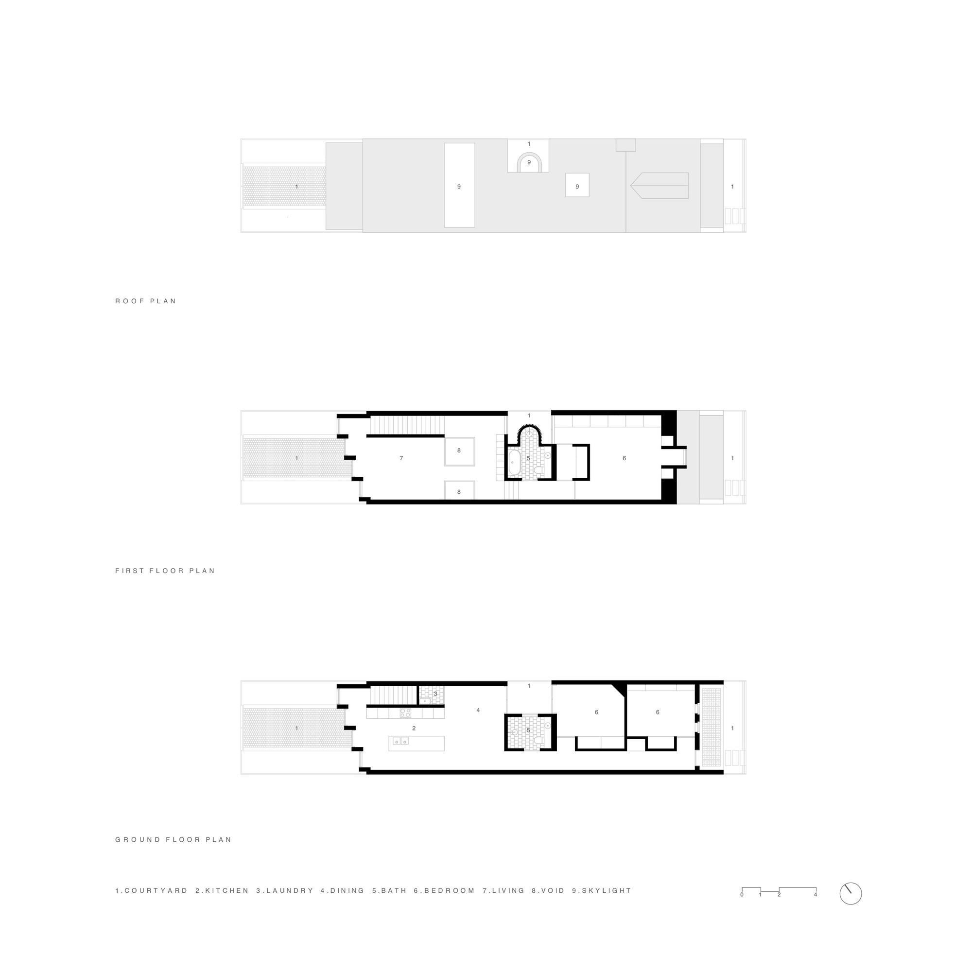
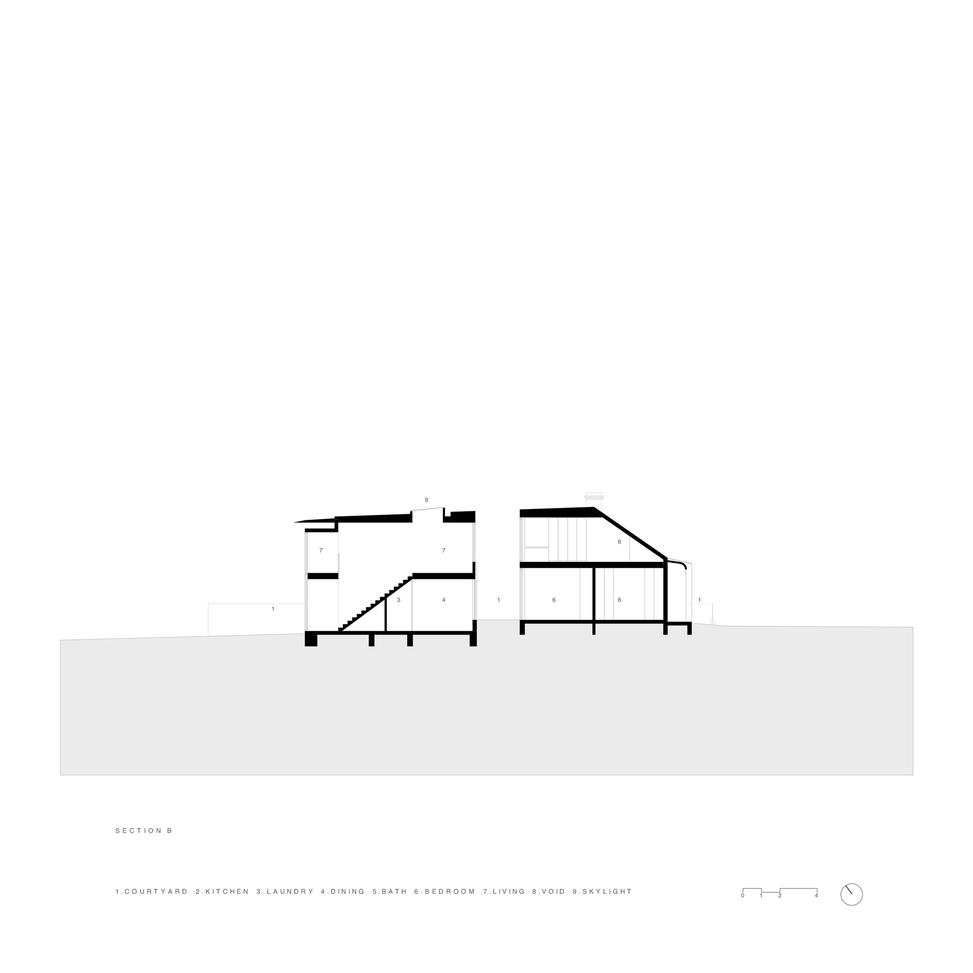
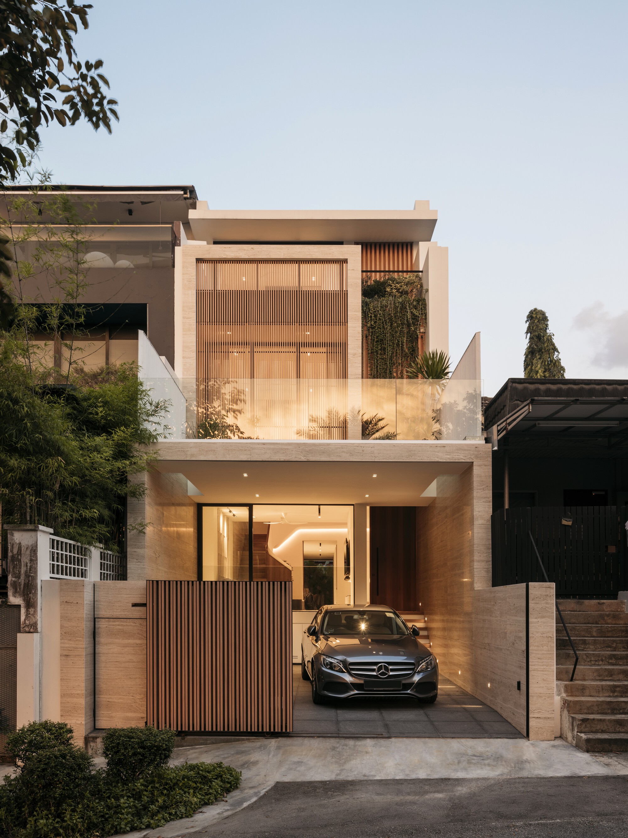
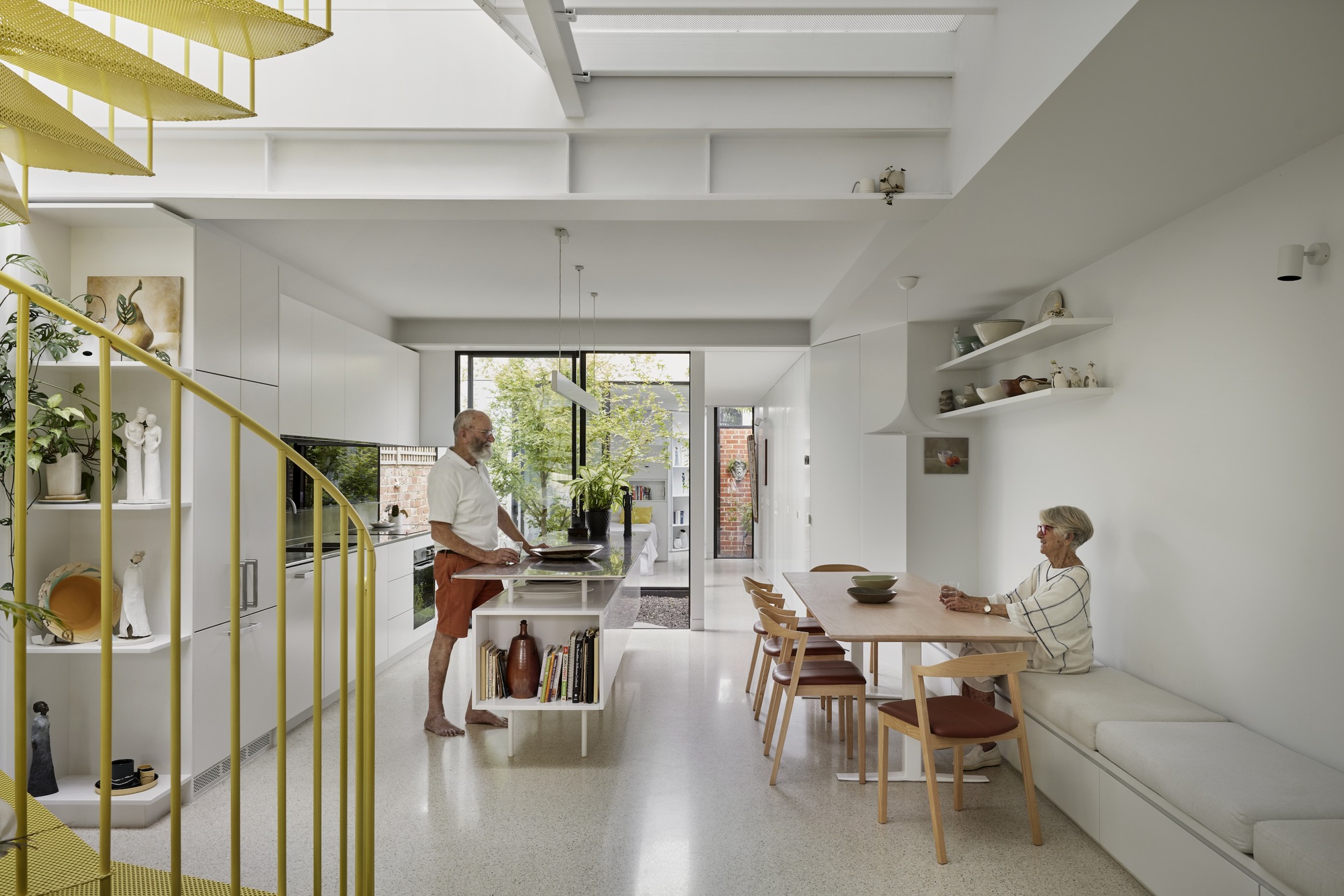
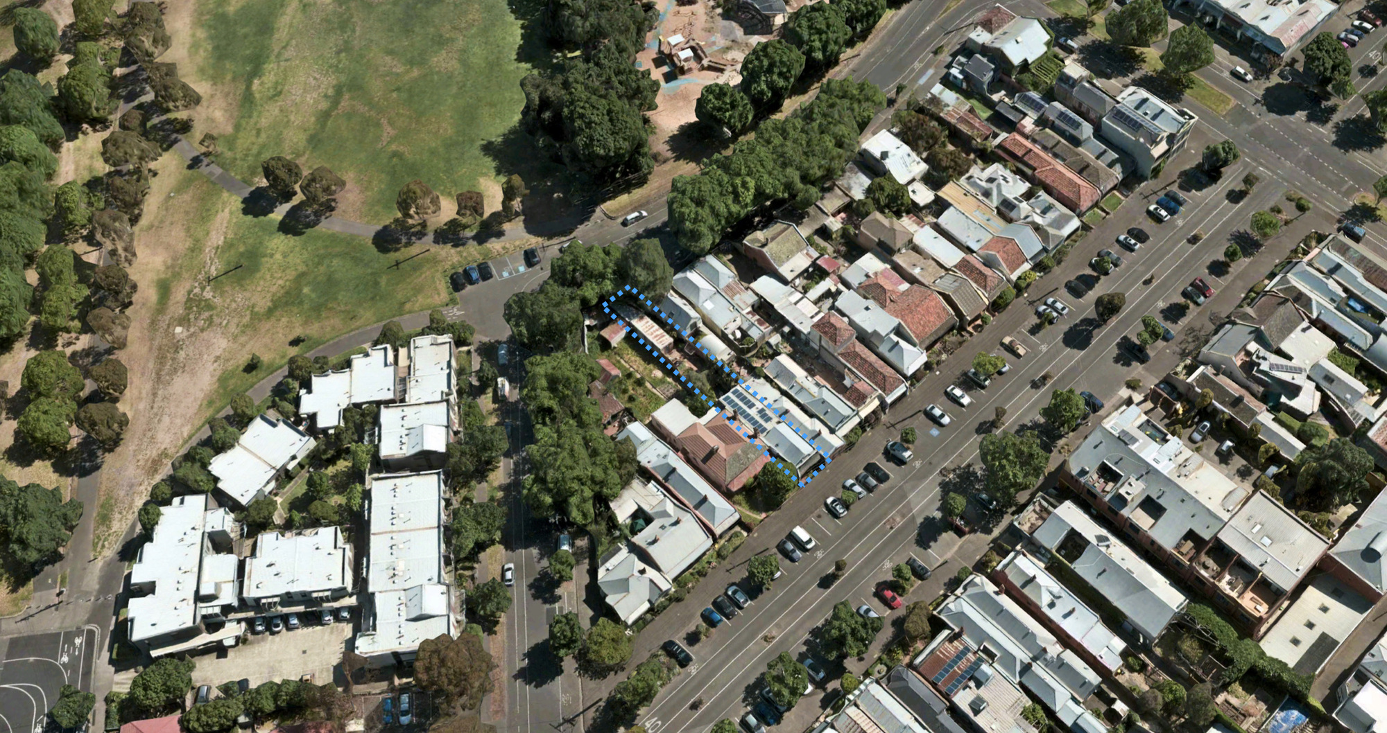
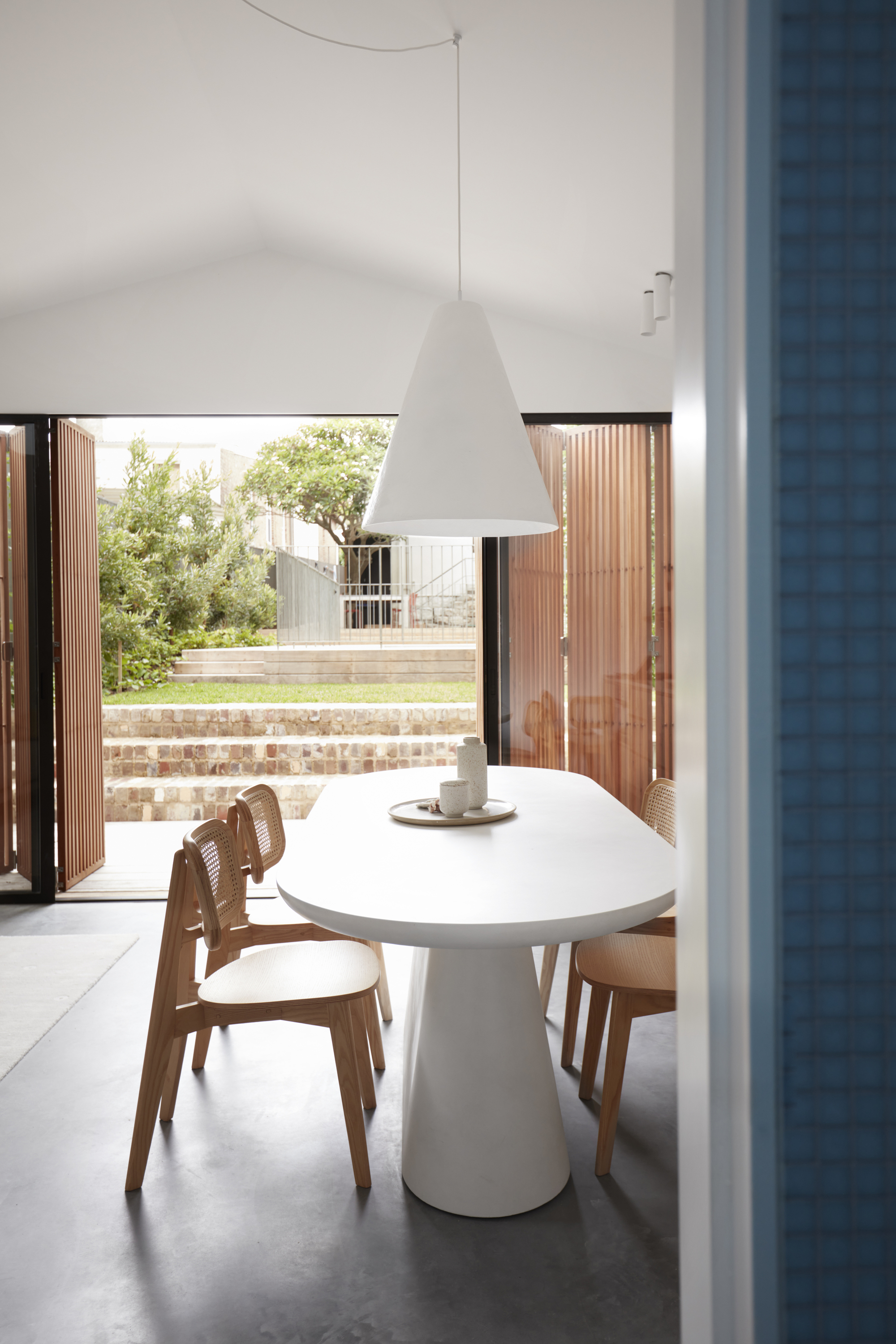
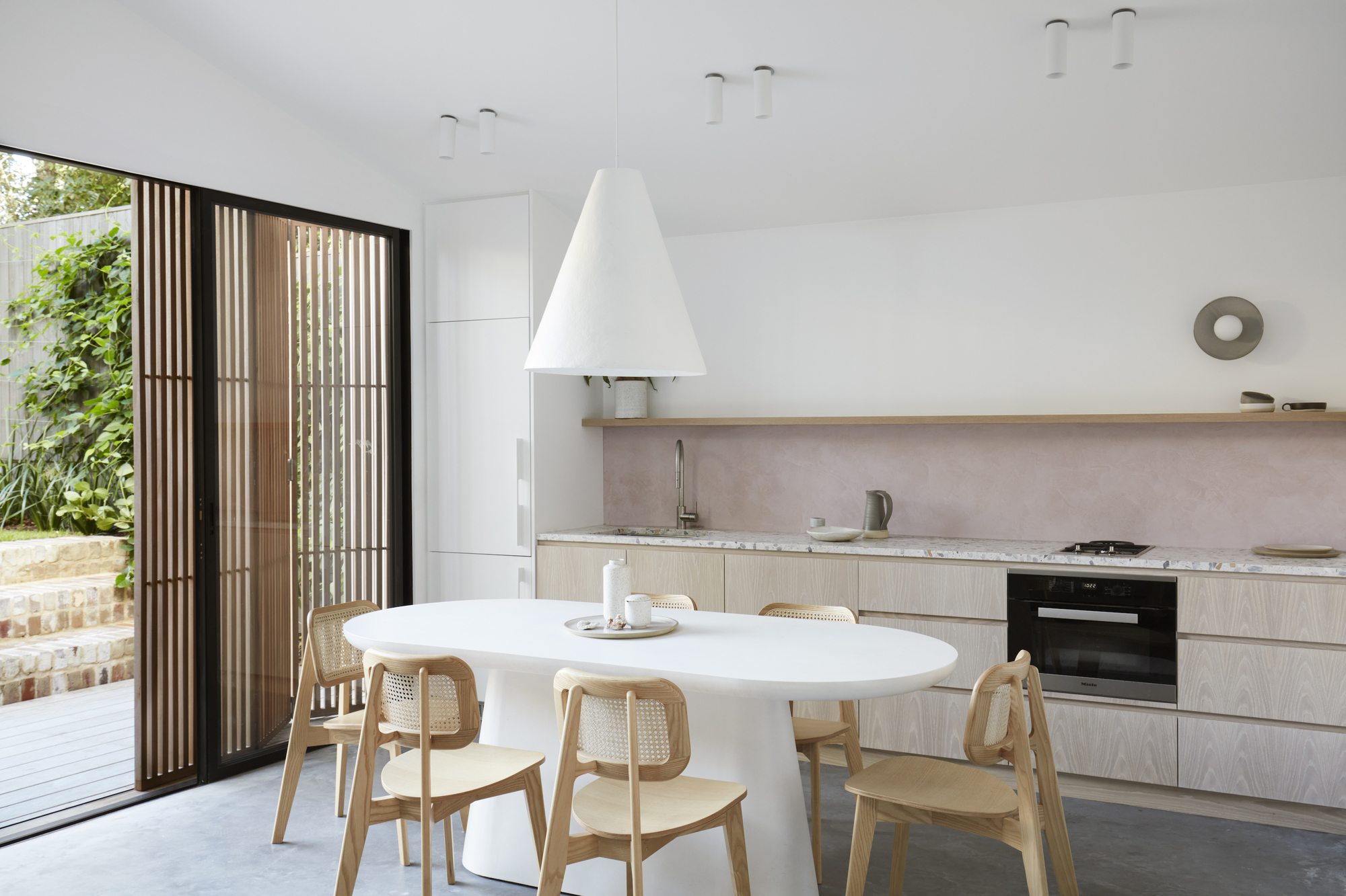
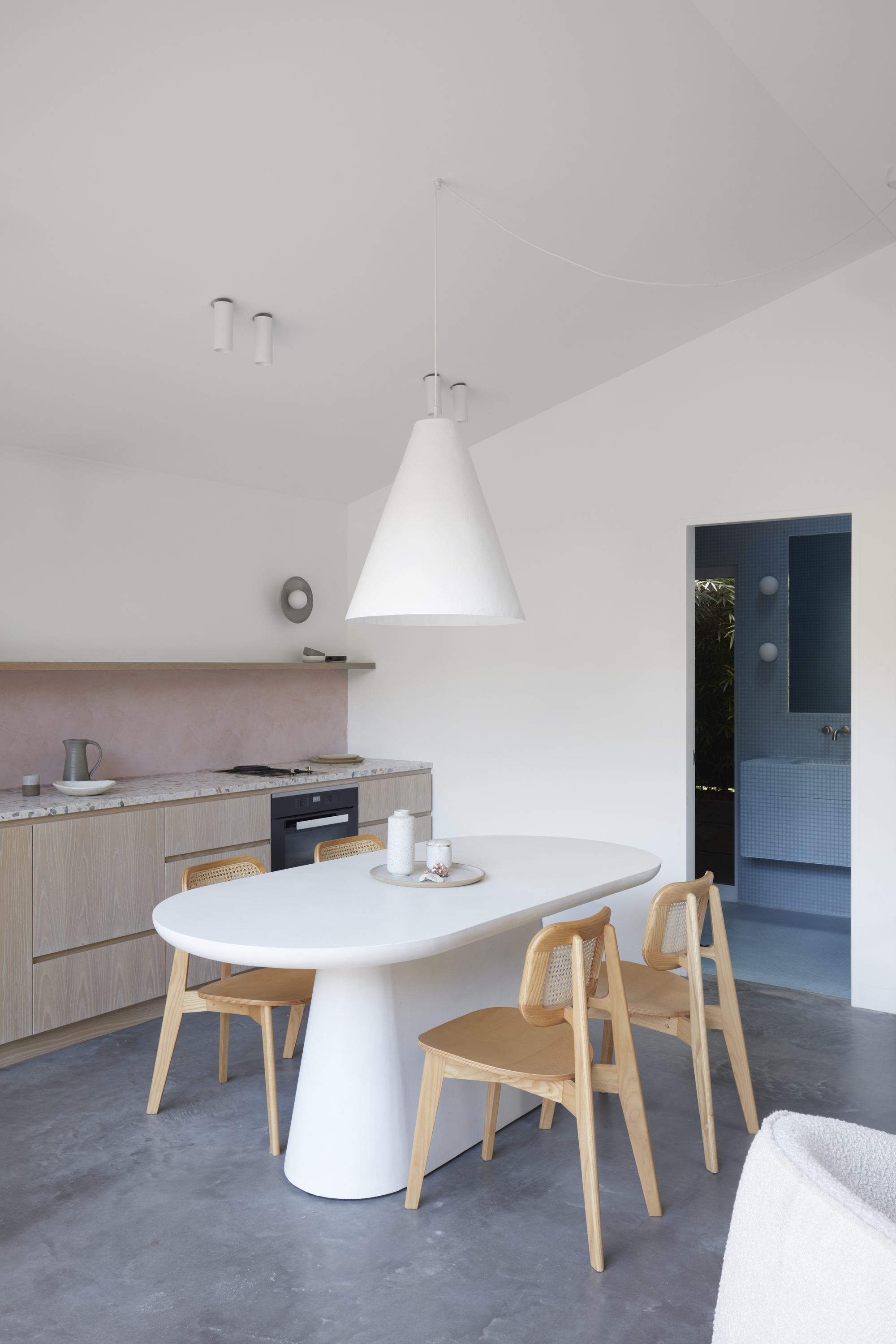
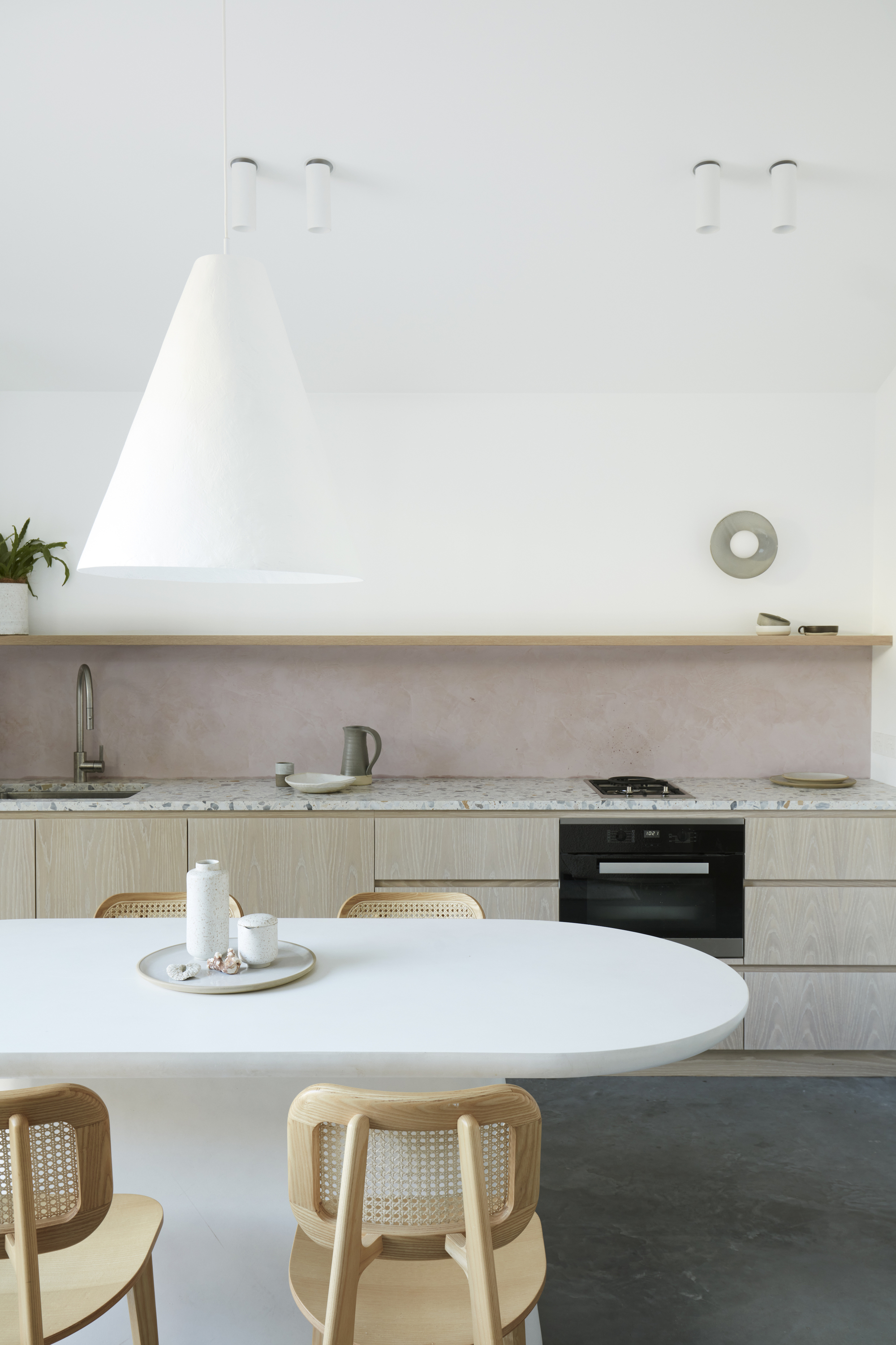
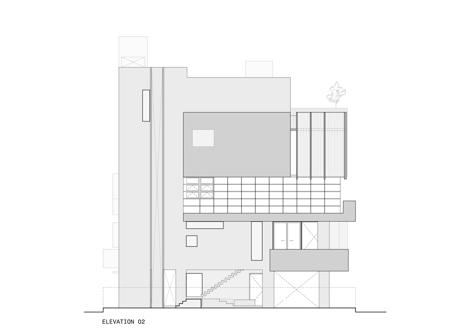
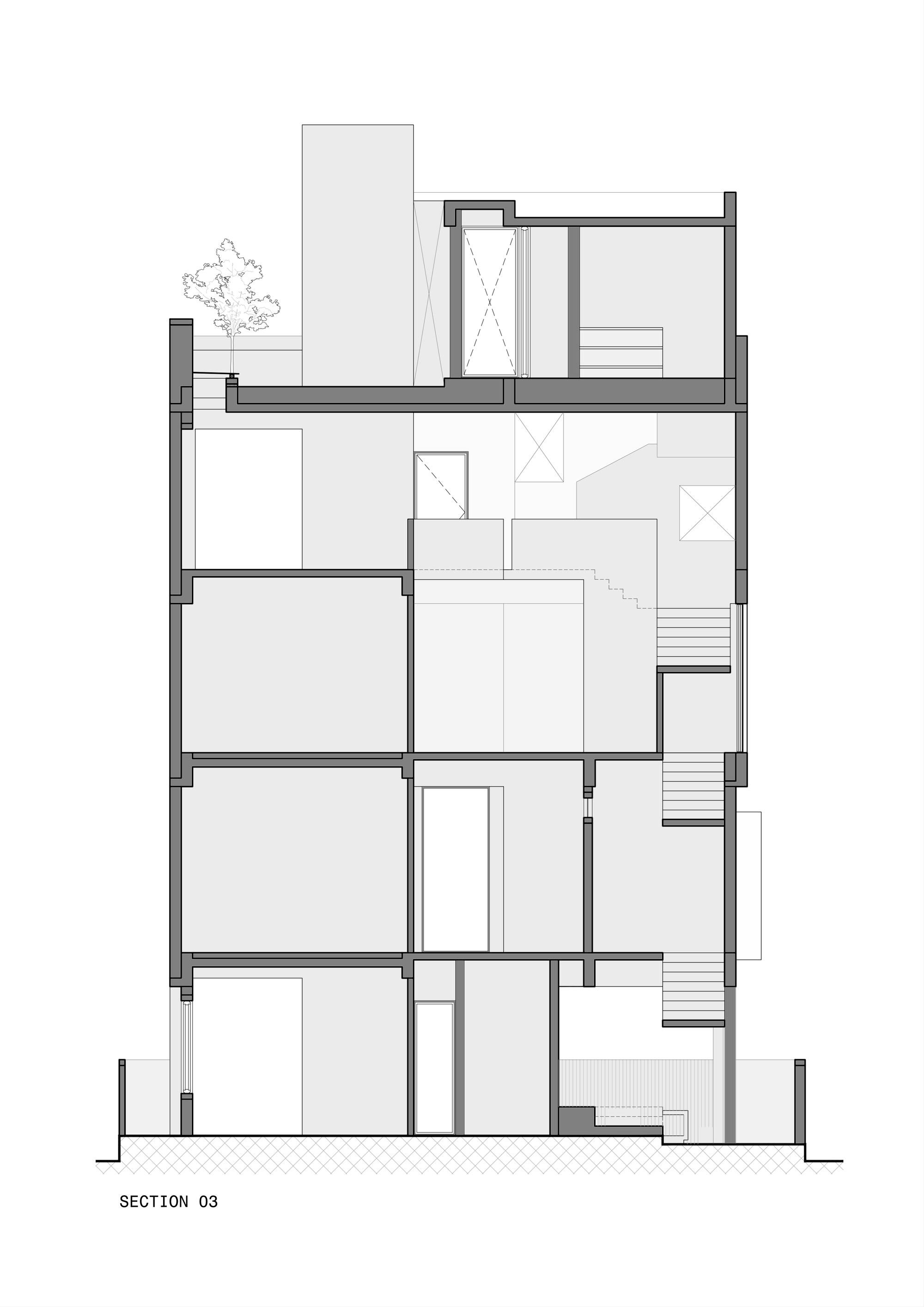
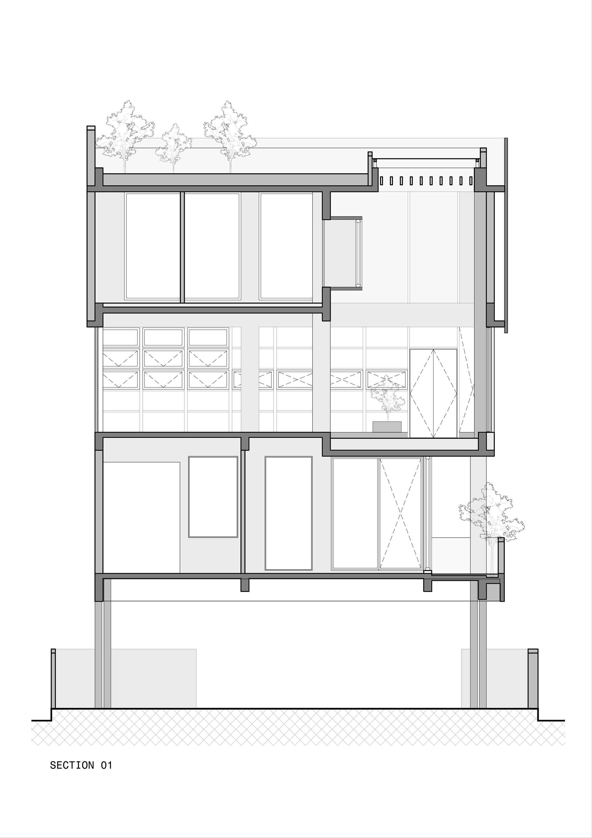
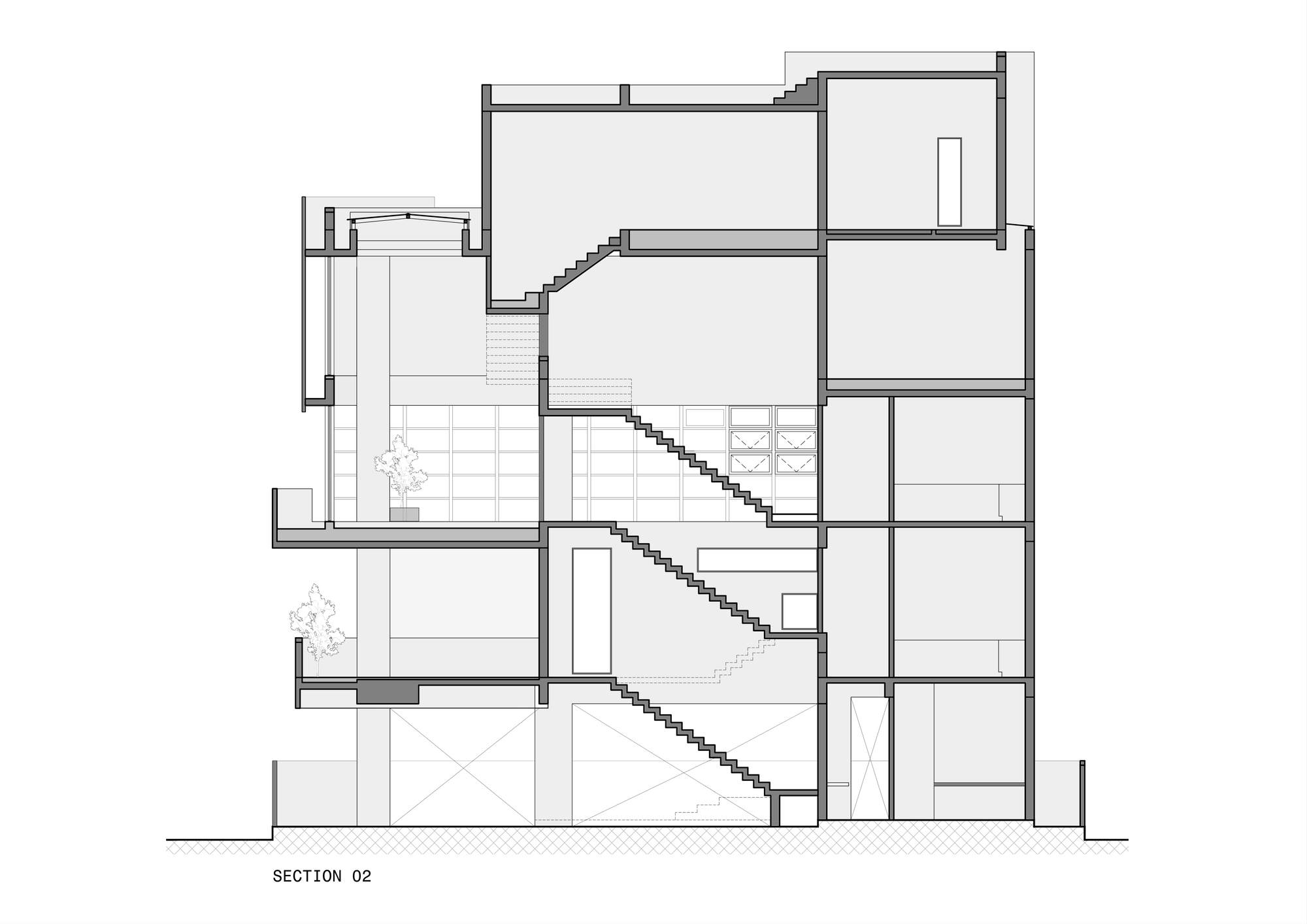
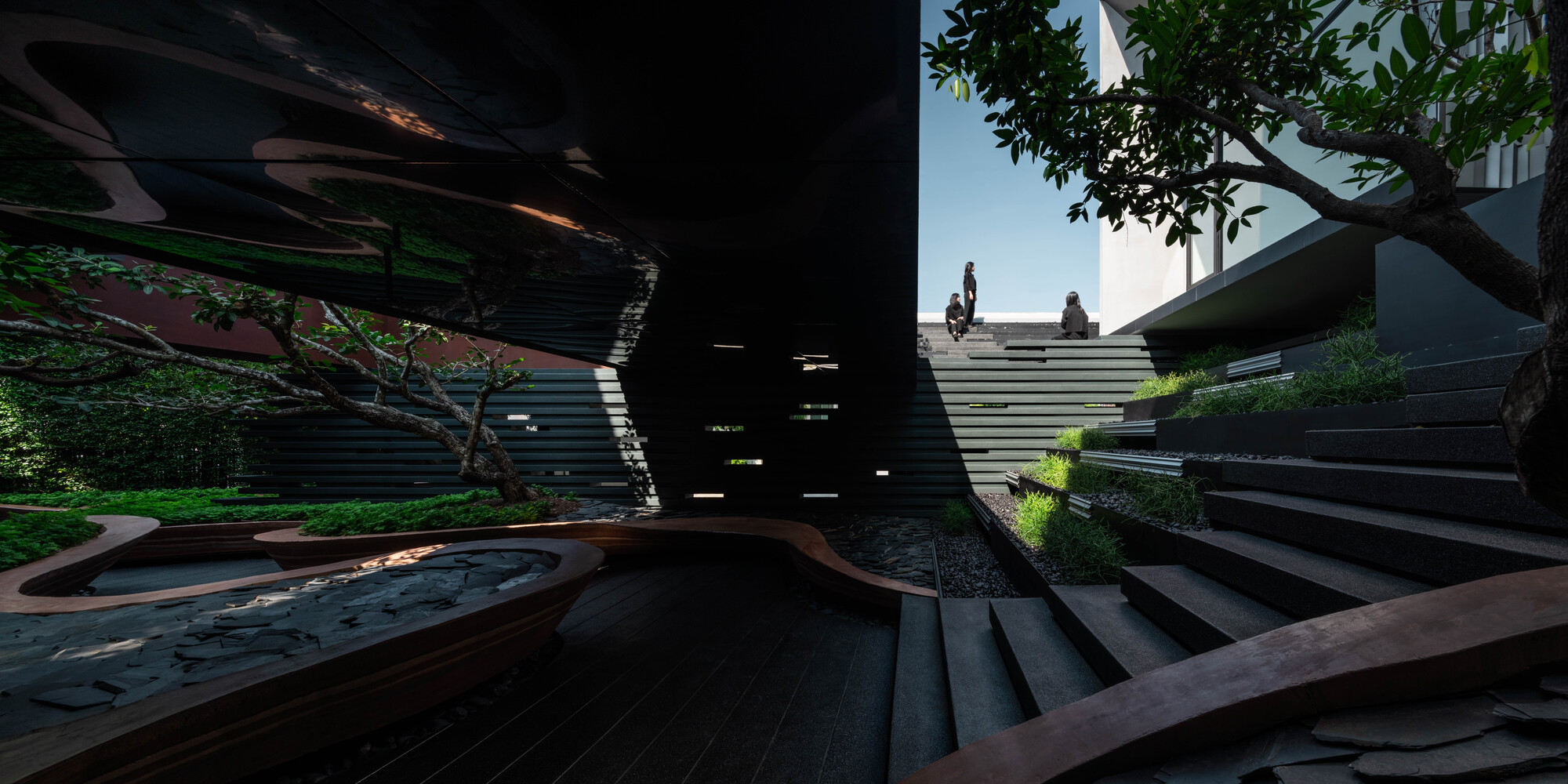
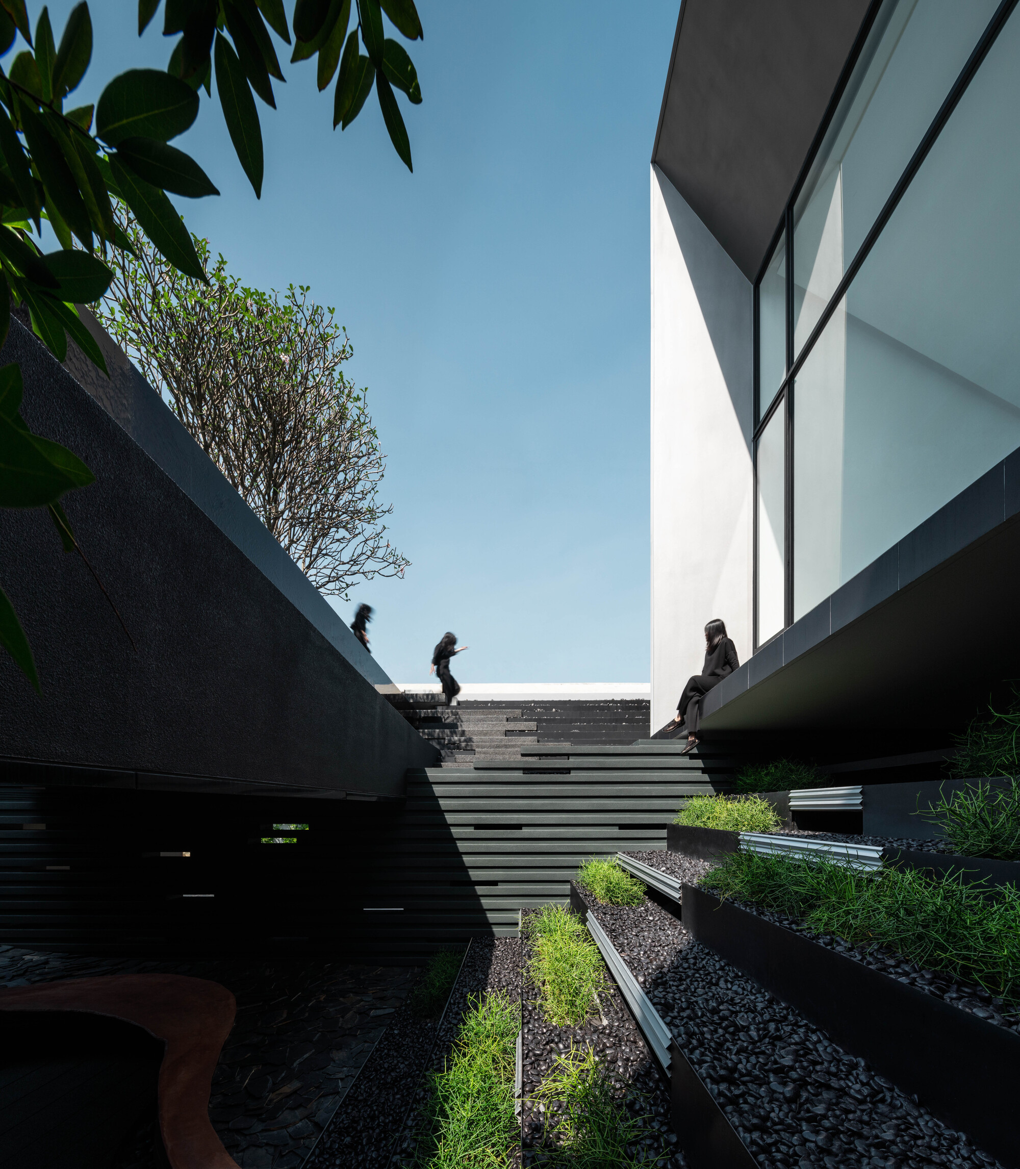
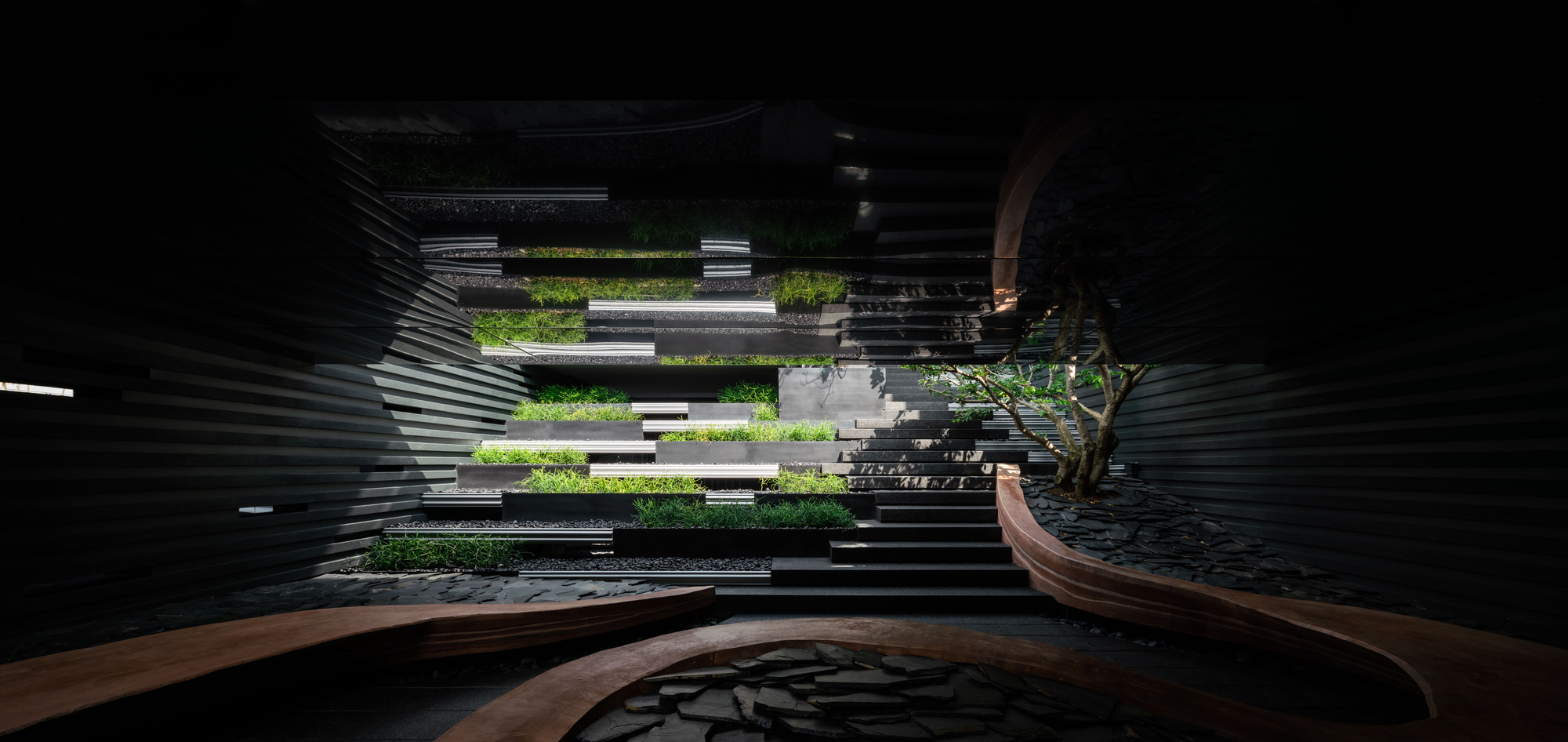
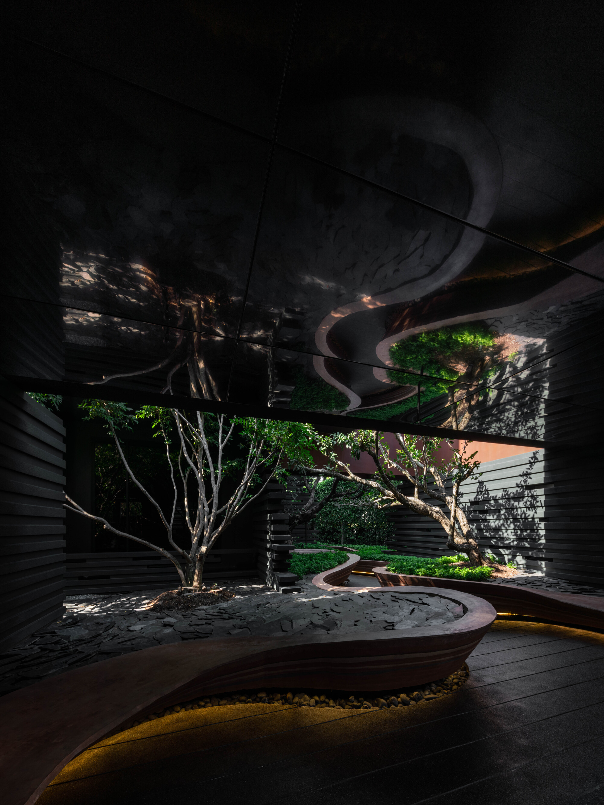
Located within a suburb that has witnessed radical transformation over the past 150 years, this terrace house was constructed in 1886 as part of a row of seven single-story terrace houses erected simultaneously in various styles. The passage of time and the shifting demographic of the suburb resulted in the single-story terrace falling into a state of utter disrepair. It was therefore decided that the existing, street-facing contributory structure should be restored and nurtured whilst the rear, dilapidated structures that had accumulated over its lifetime should be removed to make way for a new method of occupying the site.
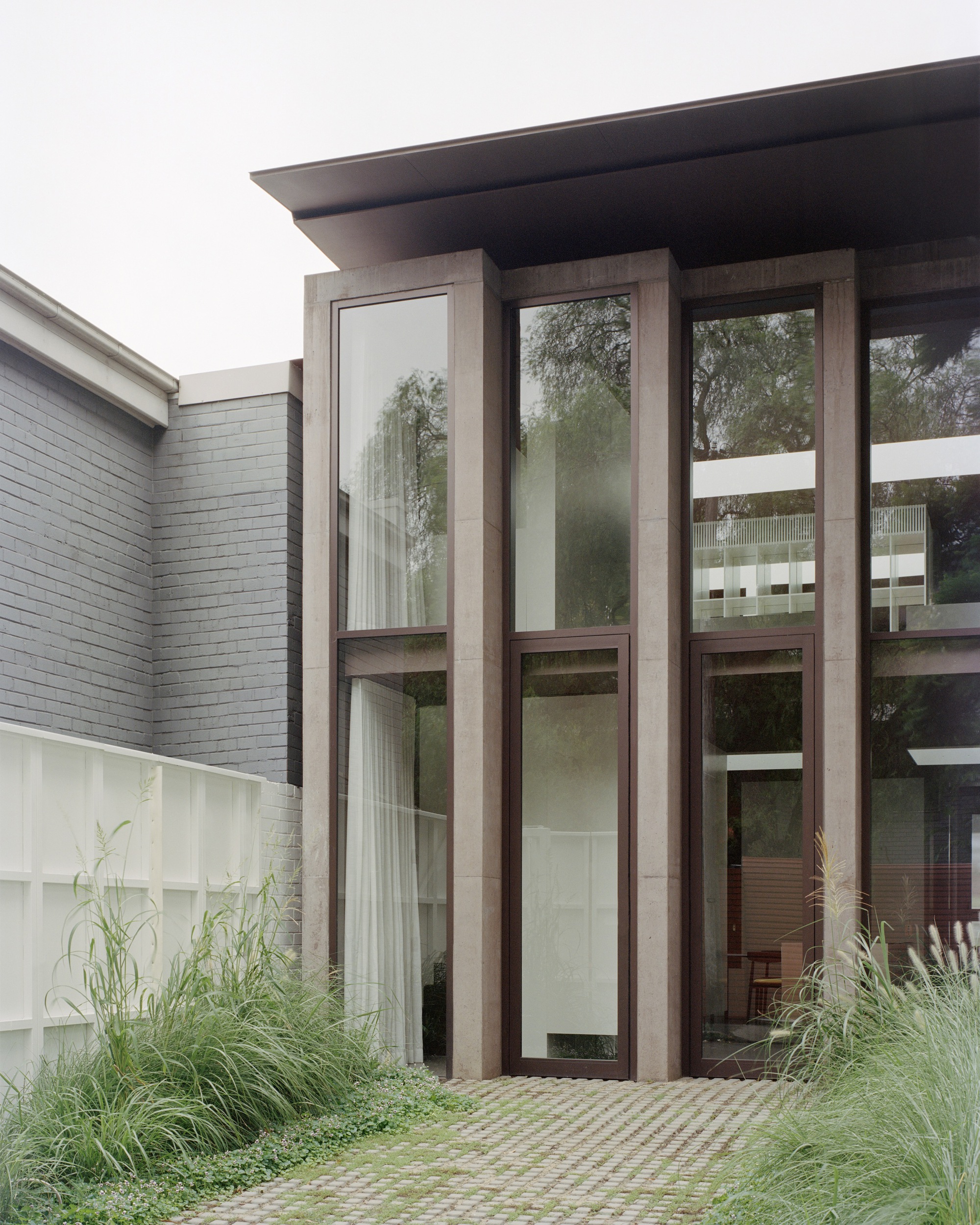
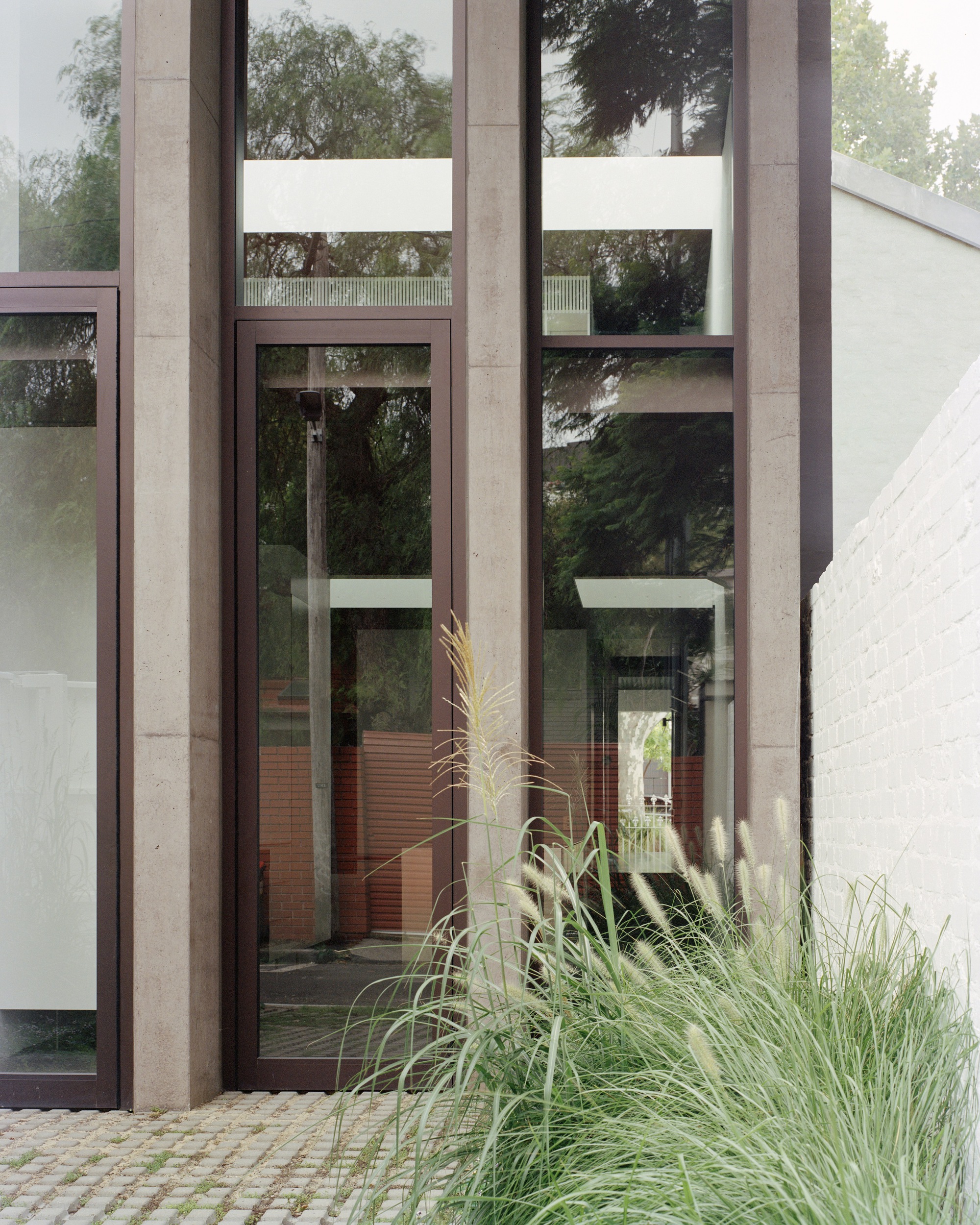
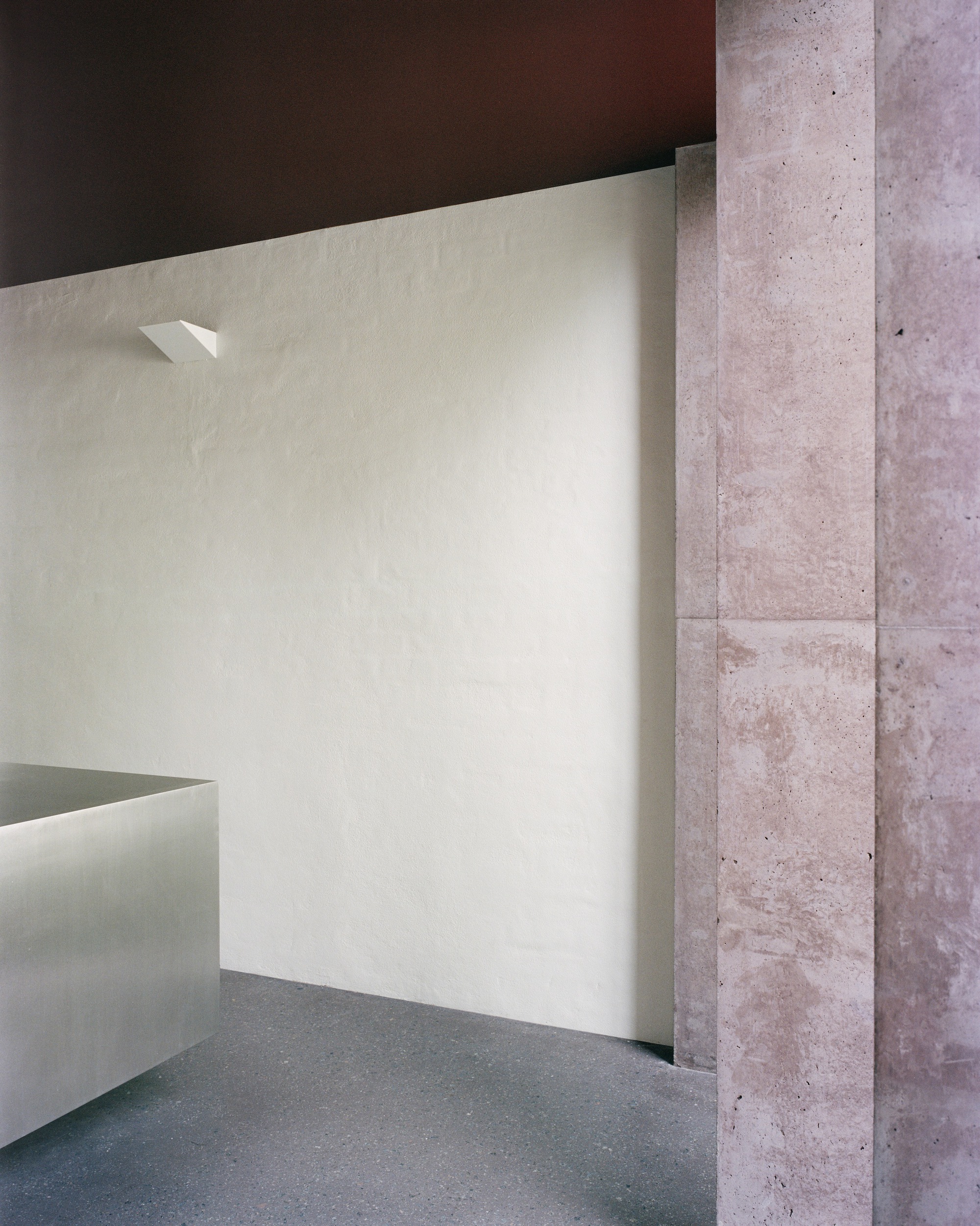
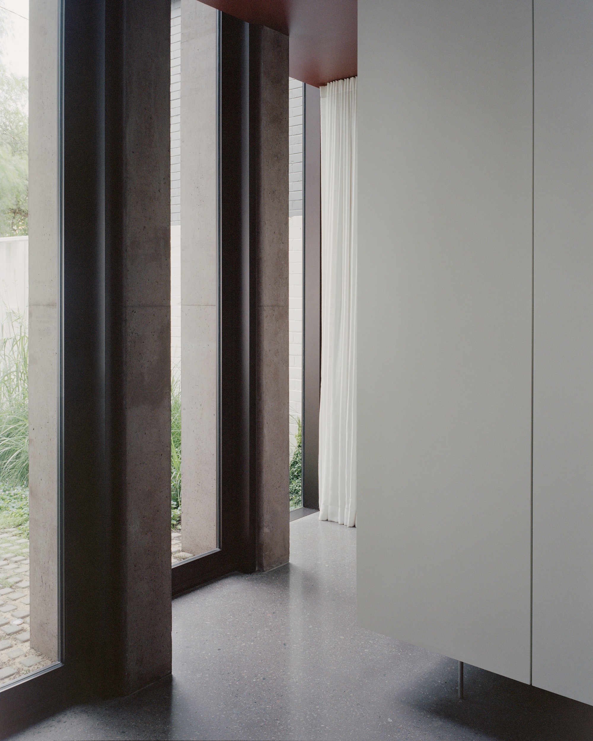
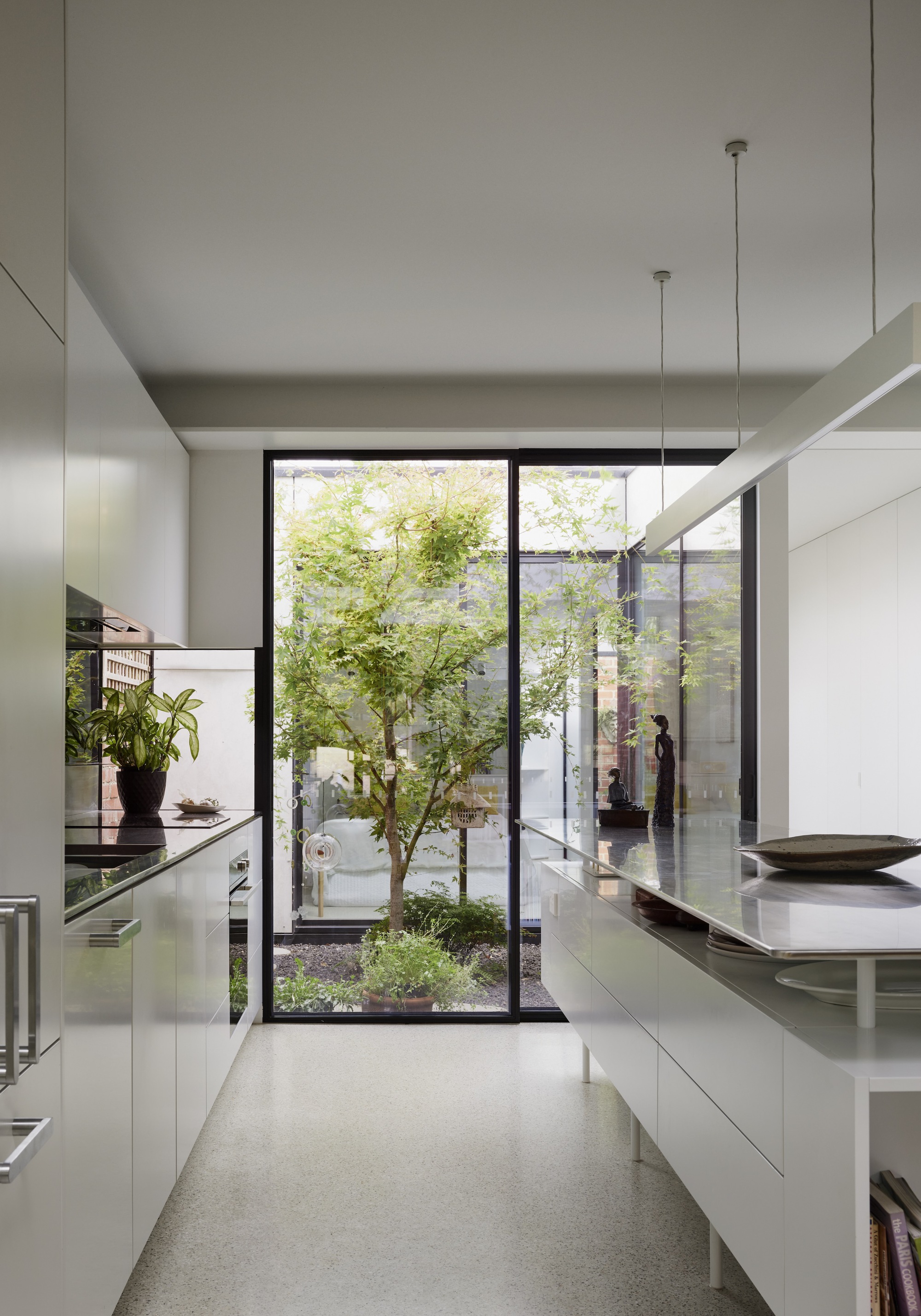
The rear façade was cast in earth-coloured pigmented concrete and was conceived as a monument of permanence that reflects the necessity of permanence embodied in the contributory street façade. It was important to develop a dialogue whereby the old and new begin a refreshed process of aging together. The new rear of the house establishes a formal order as a counterpoint to the chaos of the rear lane. The stepped arrangement acts as a mediator between the two adjacent neighboring properties, respecting what exists rather than introducing an urban infill that was dislocated from its context. As a consequence of this urban mediation, the rear façade also makes way for the mature Jacaranda tree that is gently cradled by the diagonal geometry, creating a living canvas where architecture and nature exist harmoniously in this dense, urban environment.
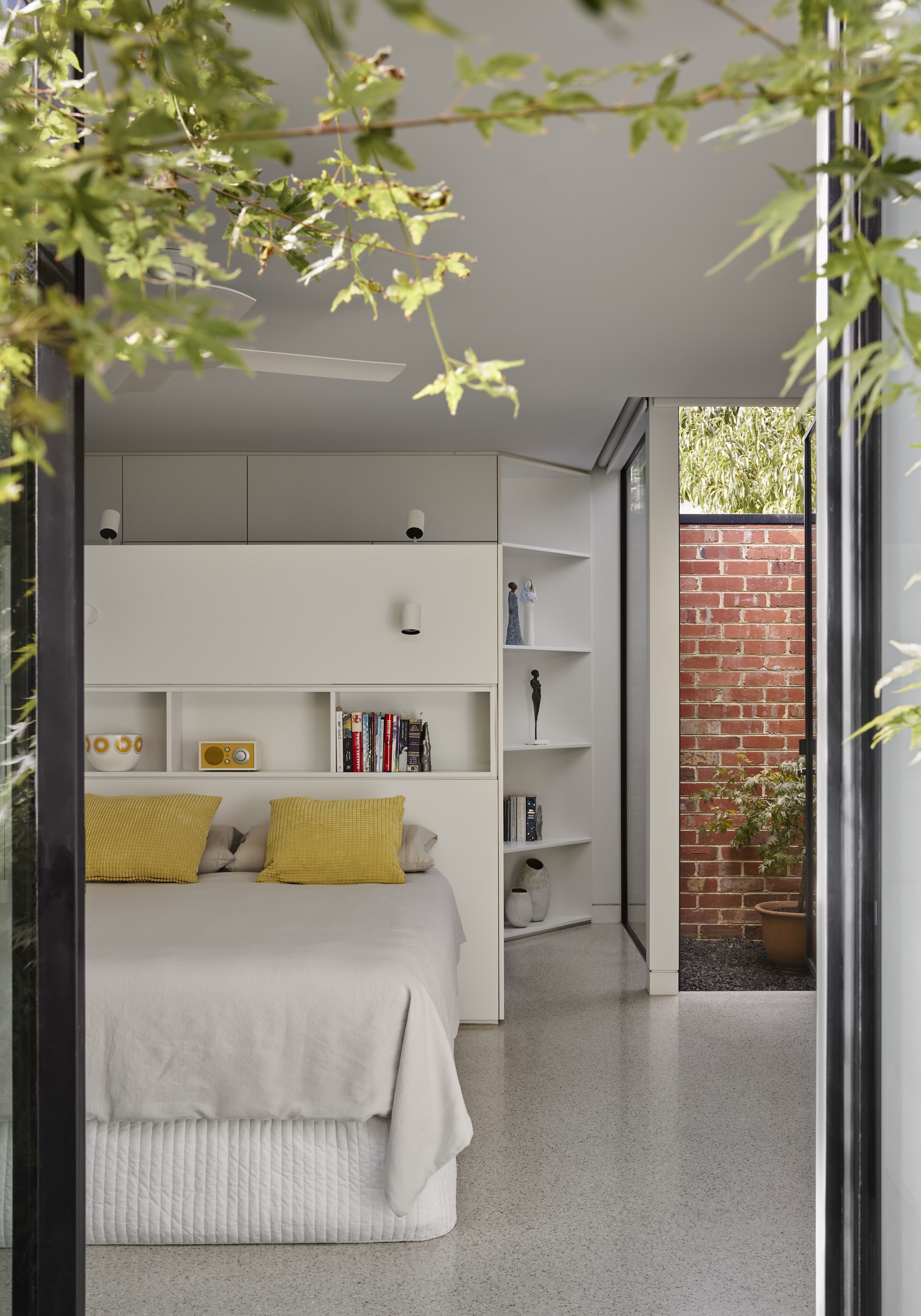
Internally, the new work allows two distinct circulation choreographies to unfold: a linear axis from the front door to the rear lane and an intricate, diagonal passage between the kitchen and the rear façade. This diagonal passage links the main circulation axis to a concealed stair, utilizing the element of surprise to amplify the perceived scale of the home. This secret stair, entry sequence, and circulation considerations were implemented to address the client’s desire for a strong sense of seclusion and privacy associated with the upstairs living and sleeping zones.
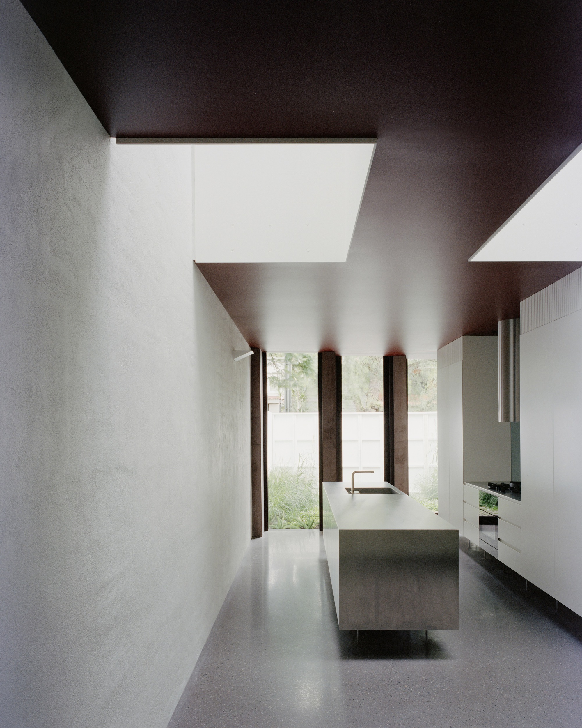
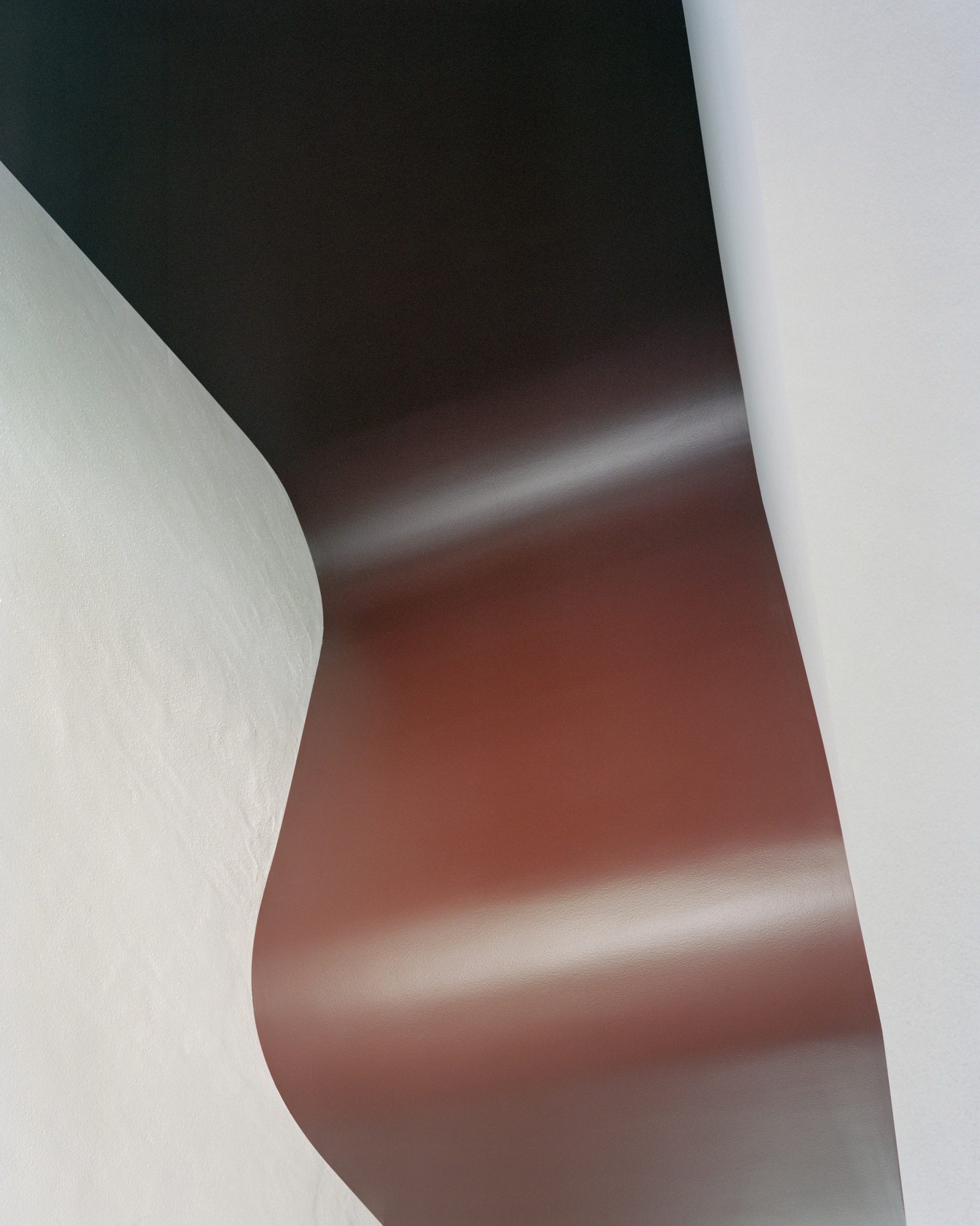
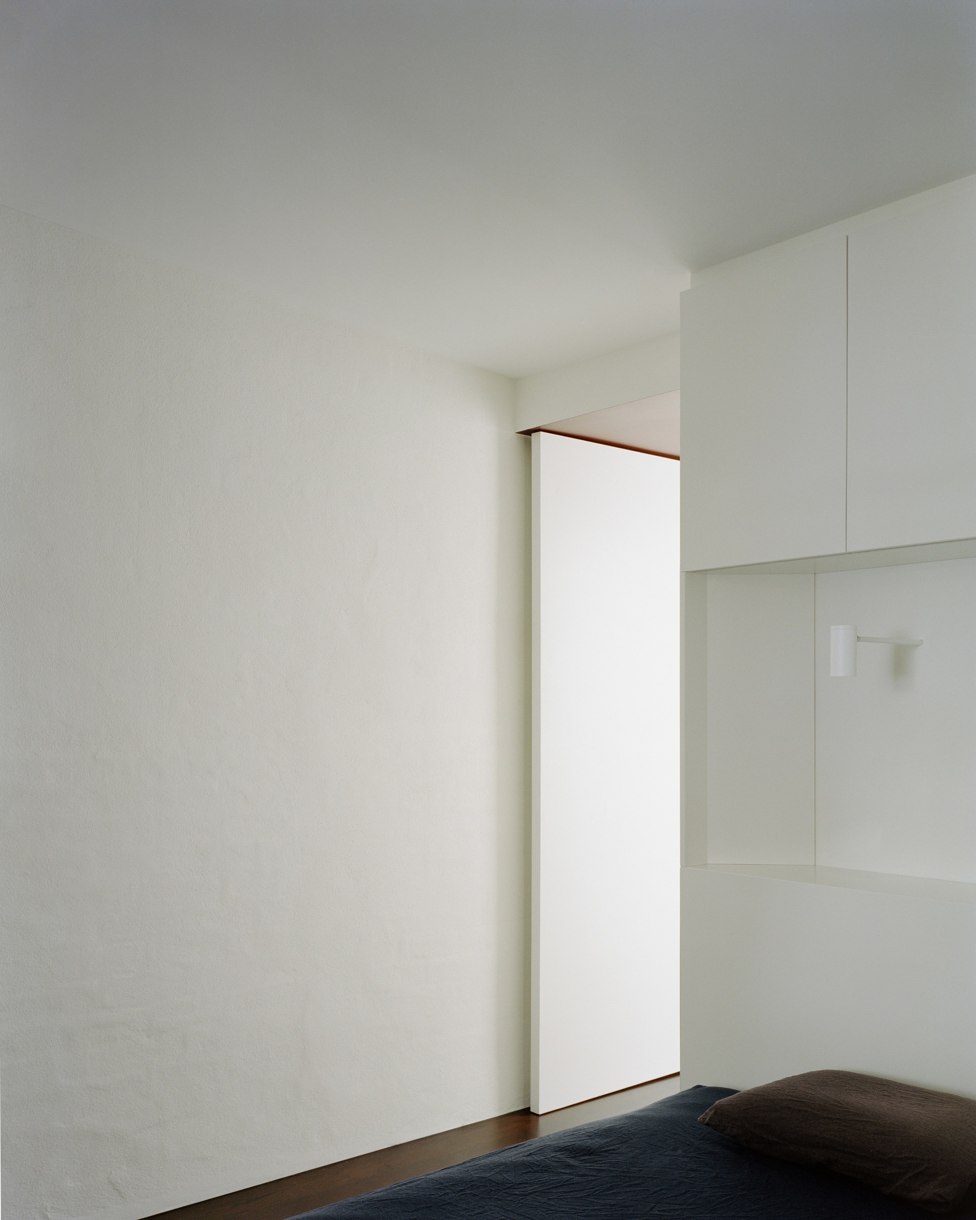
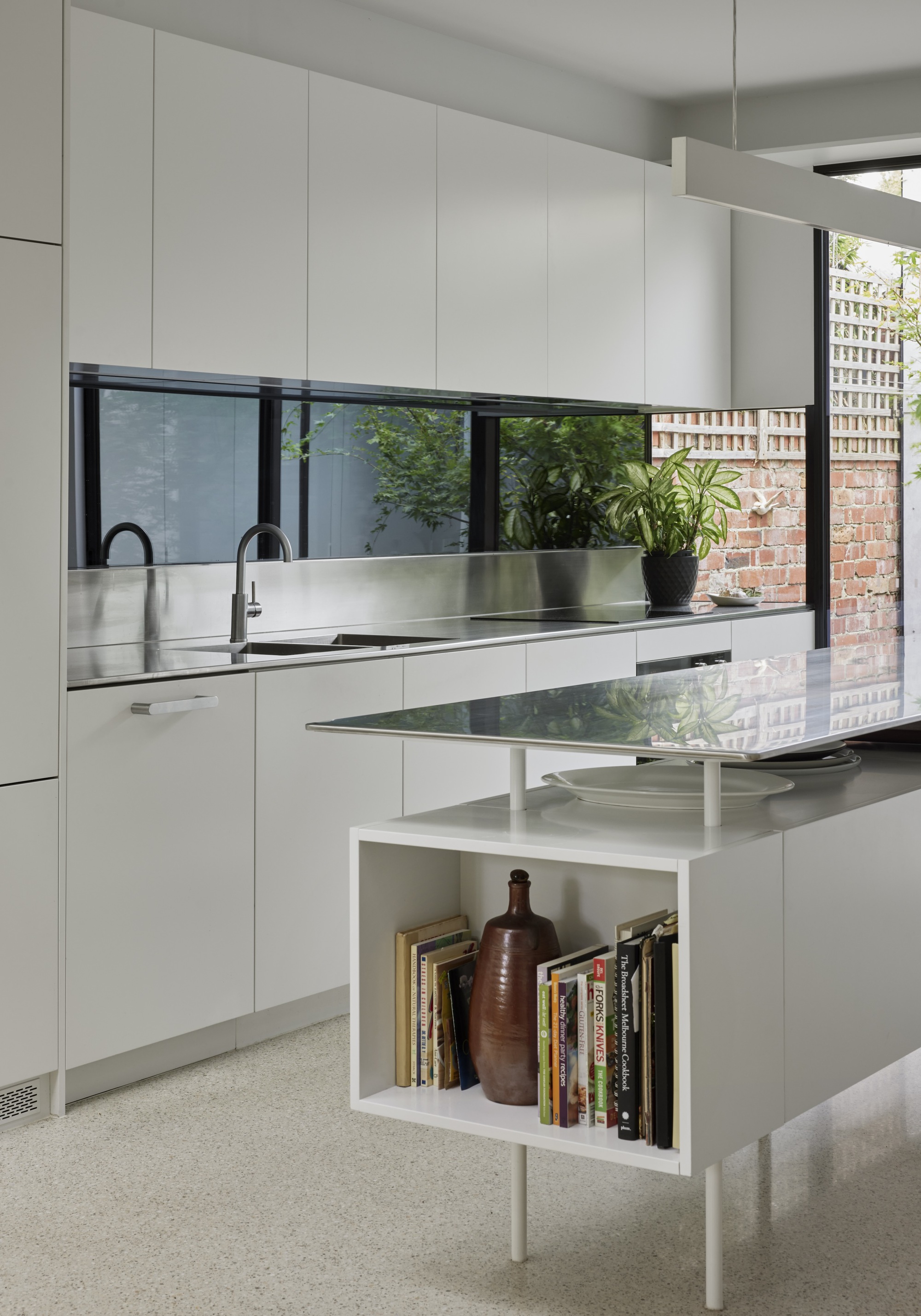
To further enhance a sense of tranquillity within the dense urban context, warm, earthy hues were woven into the fabric of the space through pigments, aggregates, ironbark and rich surfaces of deep burgundy. An intentional, soulful depth to the architectural narrative then emerges in the play of shadows and illumination. The deep burgundy ceilings conceal their true hue in darkness, only revealing their essence when exposed to the gentle touch of controlled natural light.
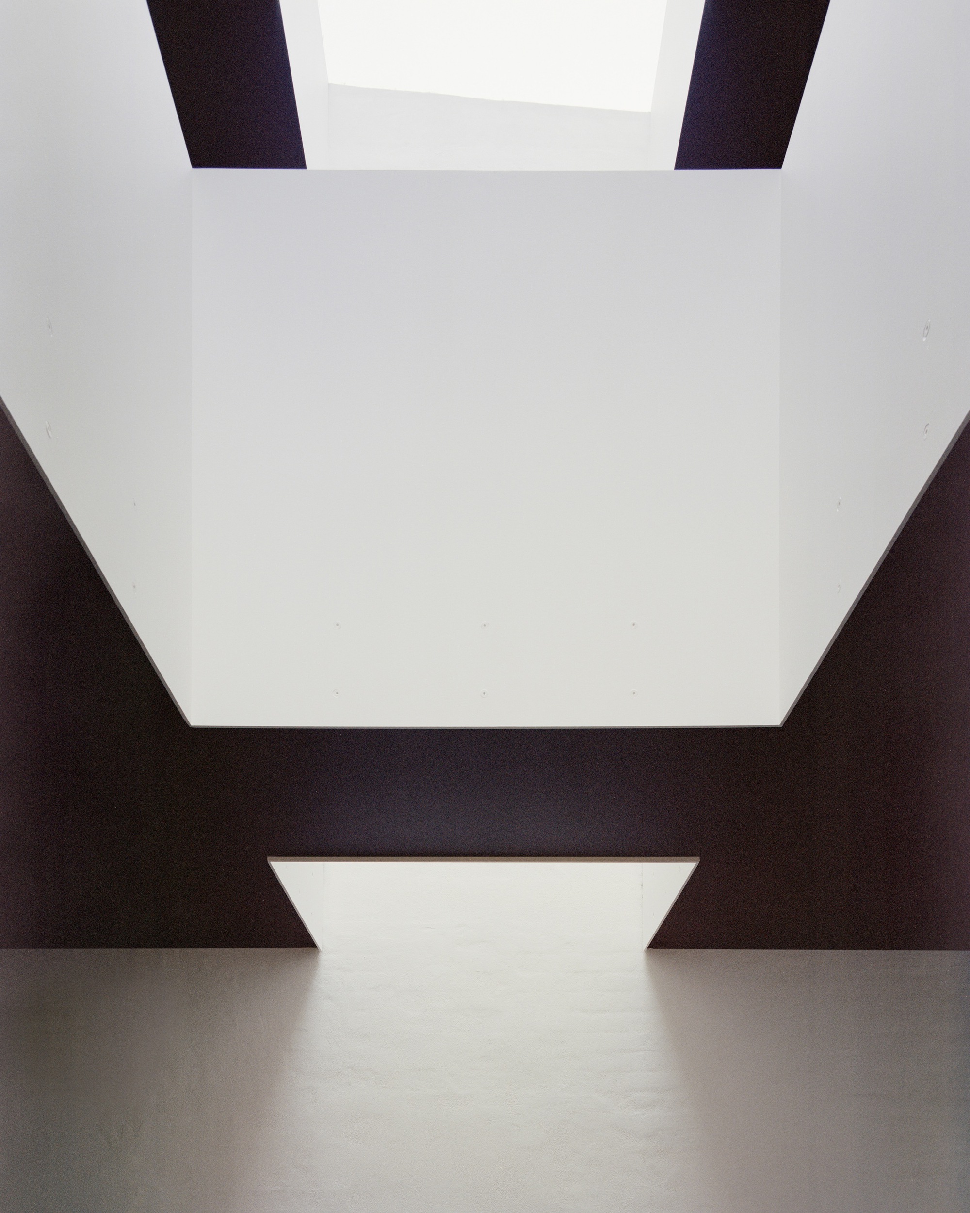
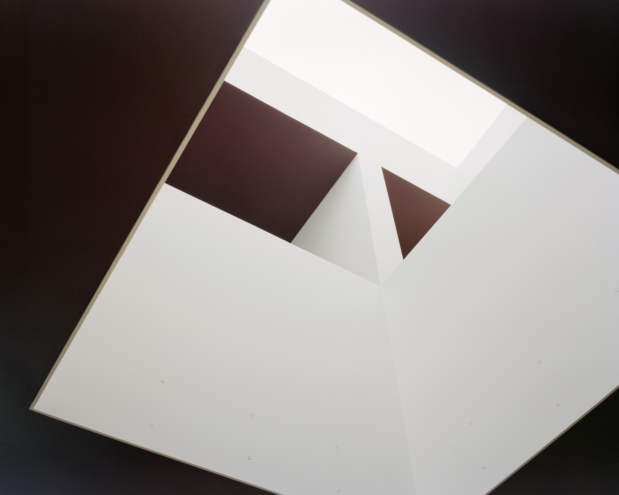
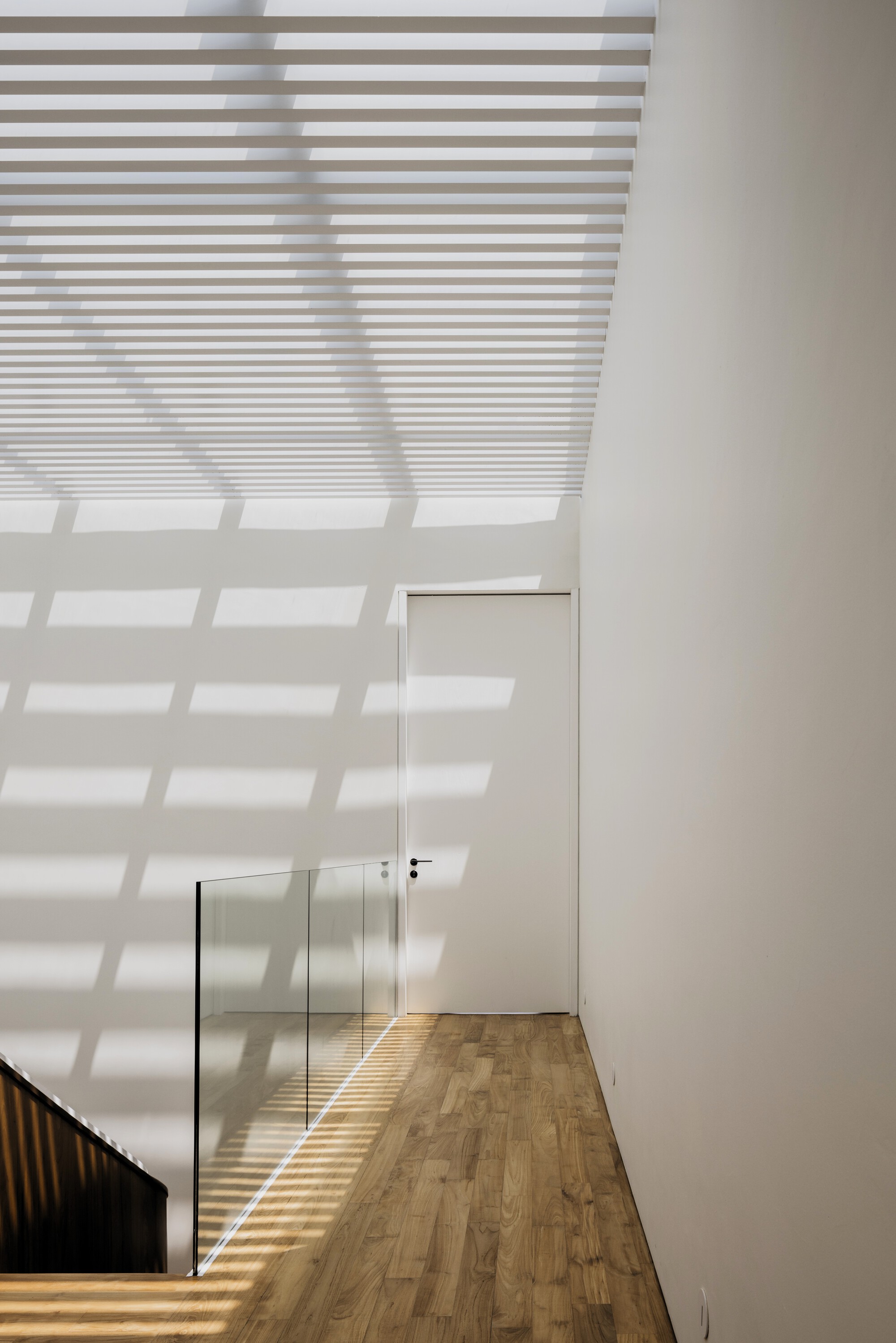
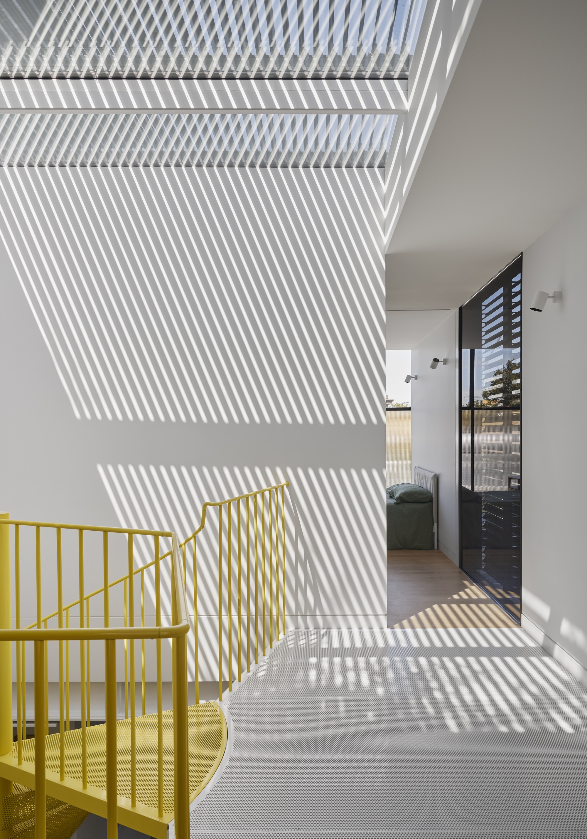
In a departure from terrace house norms, both bounding party walls are located within the site boundaries as opposed to on the boundaries. This prompted a desire to honour and celebrate their defining presence. The solution unfolds as a full-width opening carved from the roof creating a party wall-to-party wall skylight that draws in an abundance of natural light from above. Purposeful voids, adorned with plate steel balustrades painted white, further intensify the transmission of light and provide a visual narrative of depth between the ground floor and the expansive skylight above.


Haha, I wasn't thinking that until you said it. Now I can't unsee it. It does feel like an office. And the open "courtyard" or whatever that is - what's that about?
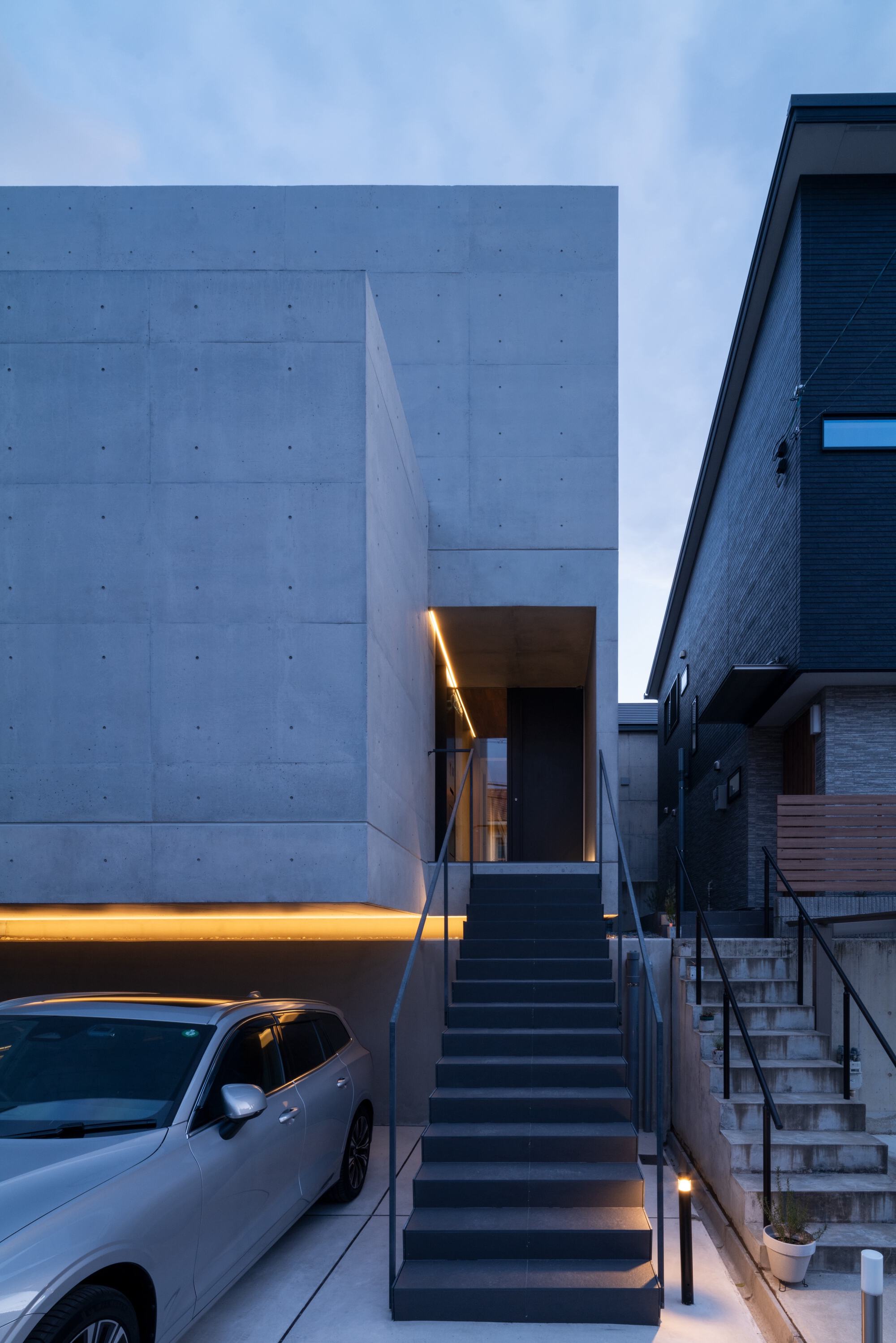
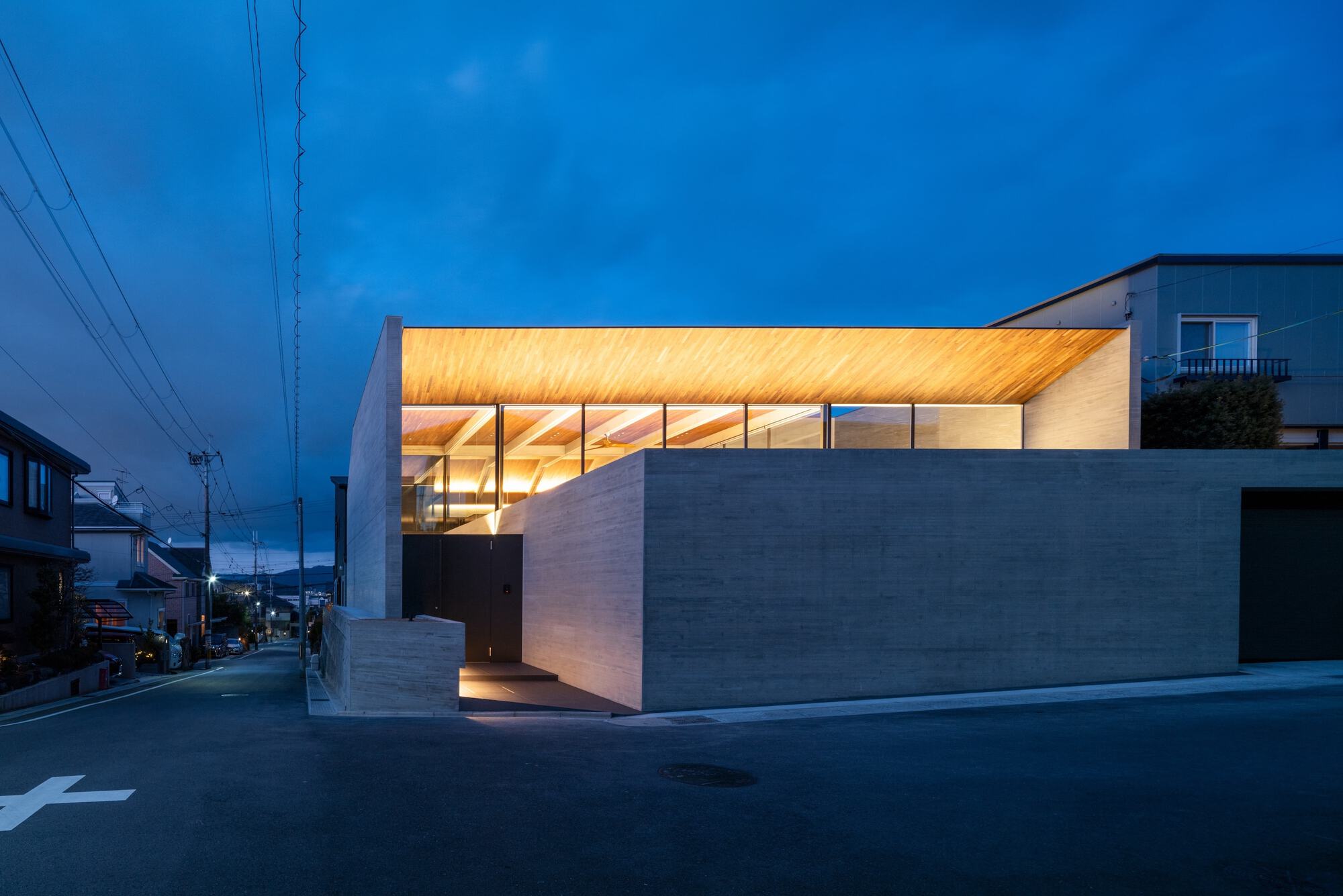
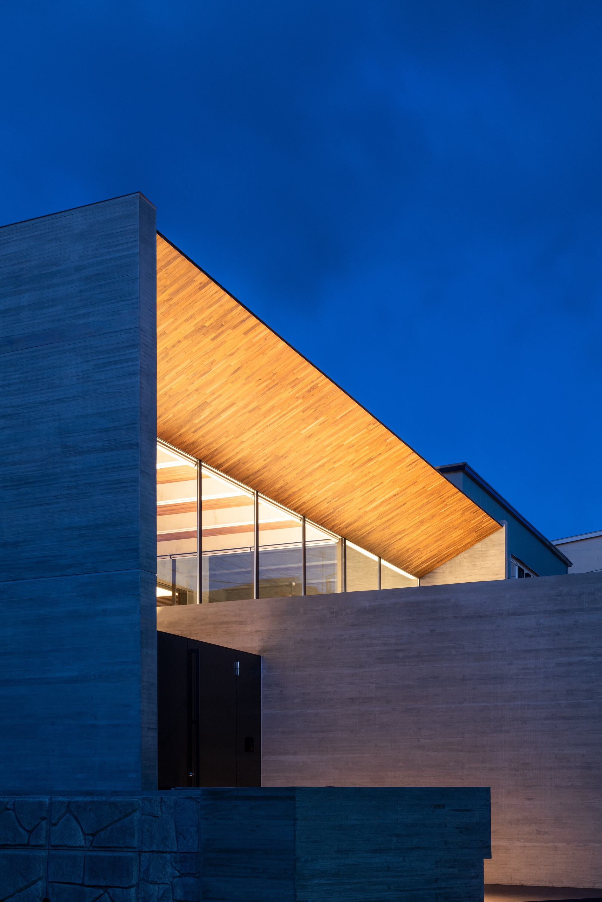
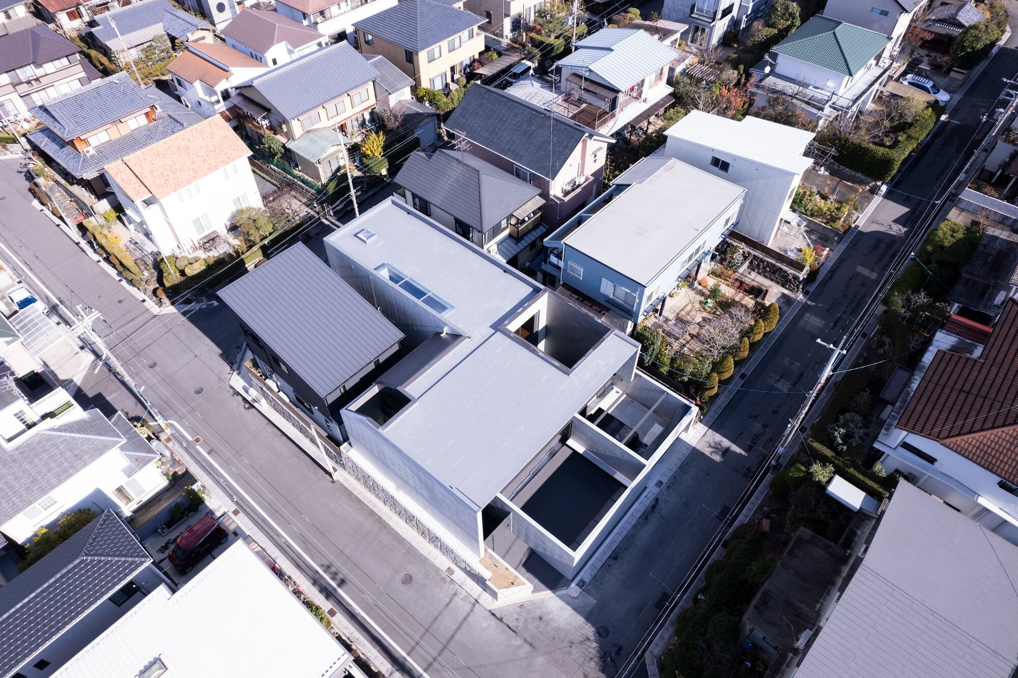
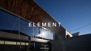
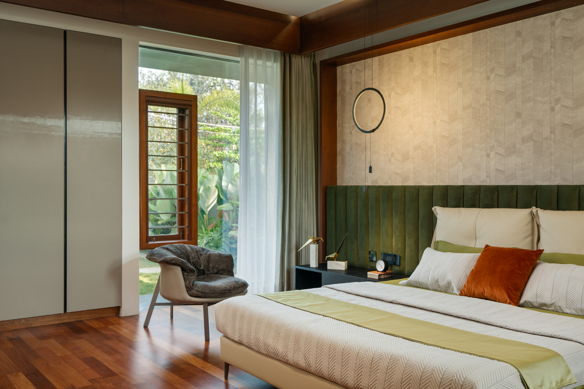
Element House
#architecture
Architects: APOLLO Architects & Associates
Area: 189 m²
Year: 2024
Photographs: Masao Nishikawa
City: Uji
Country: Japan
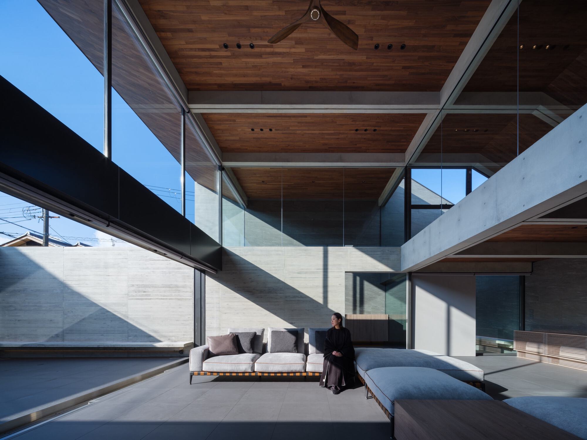
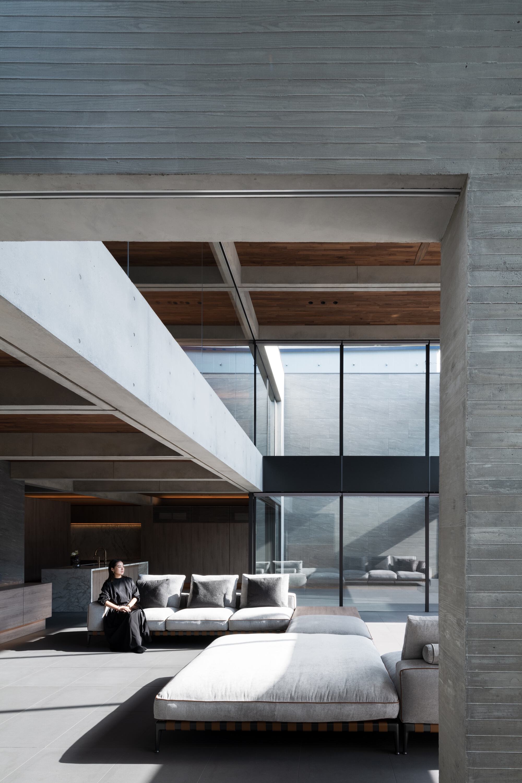
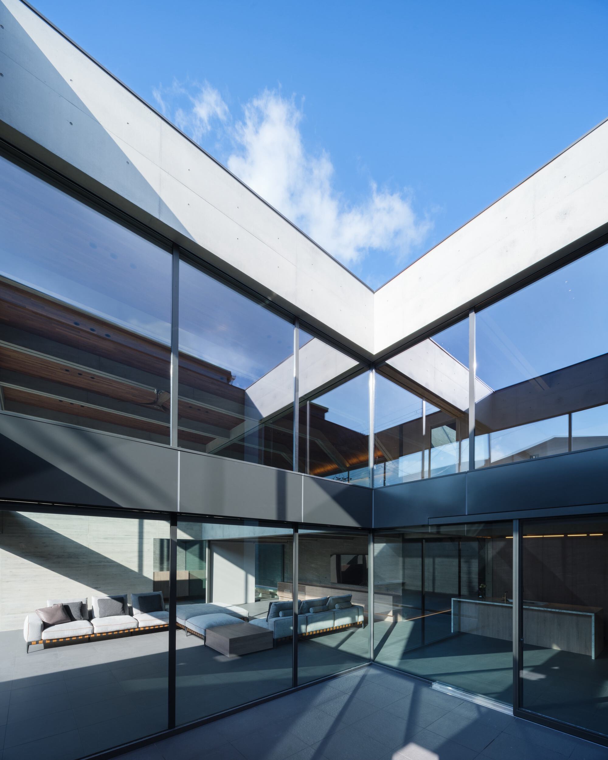
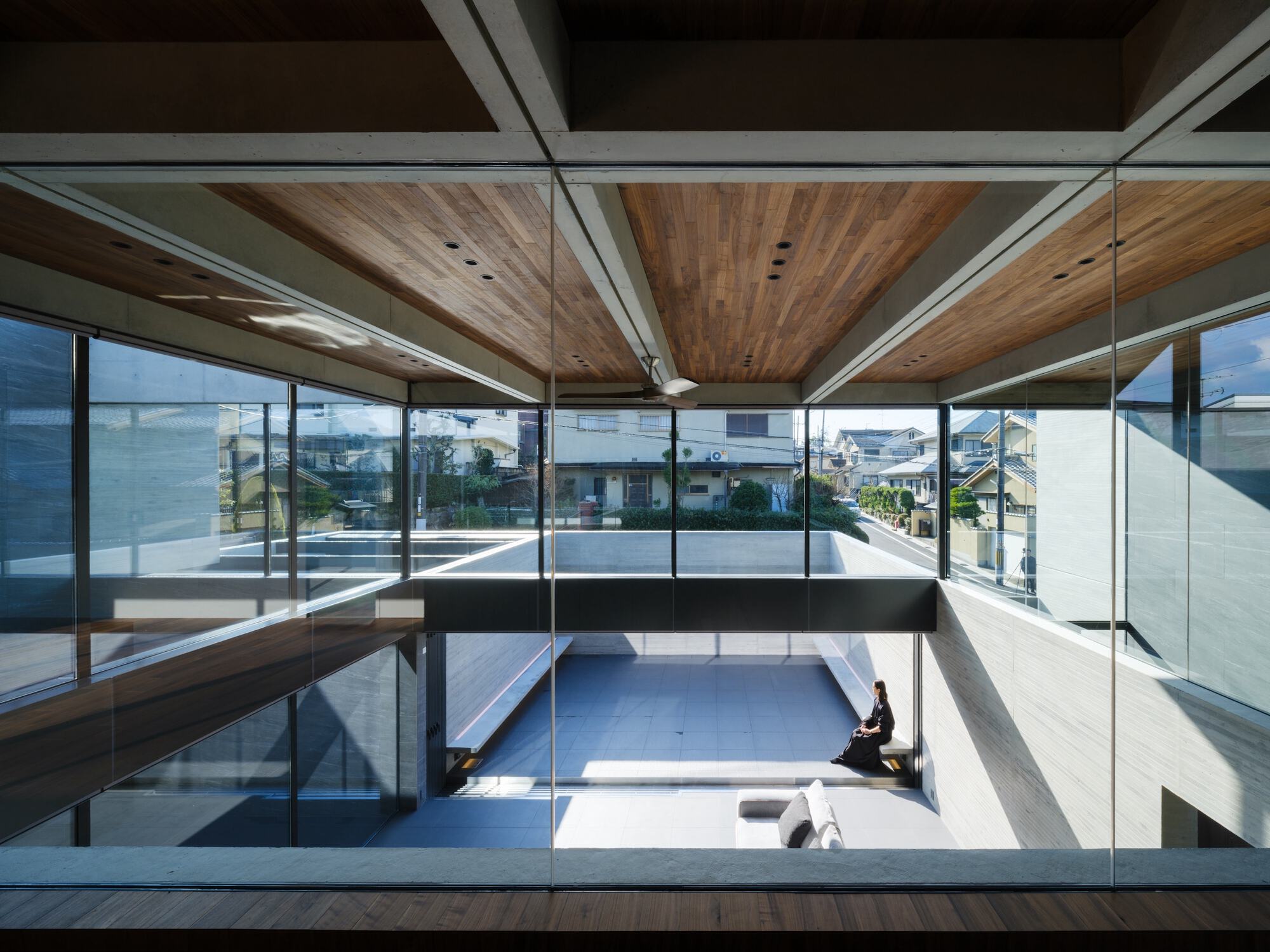
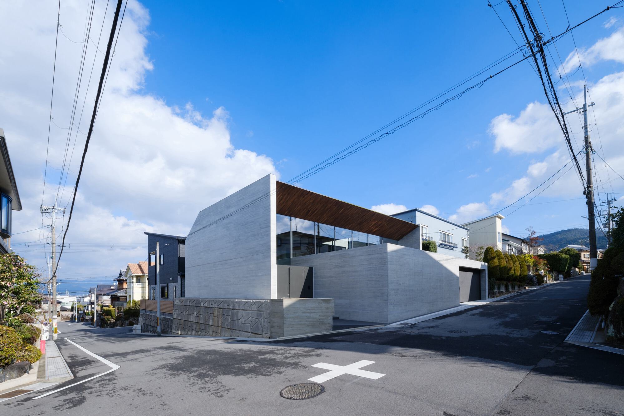
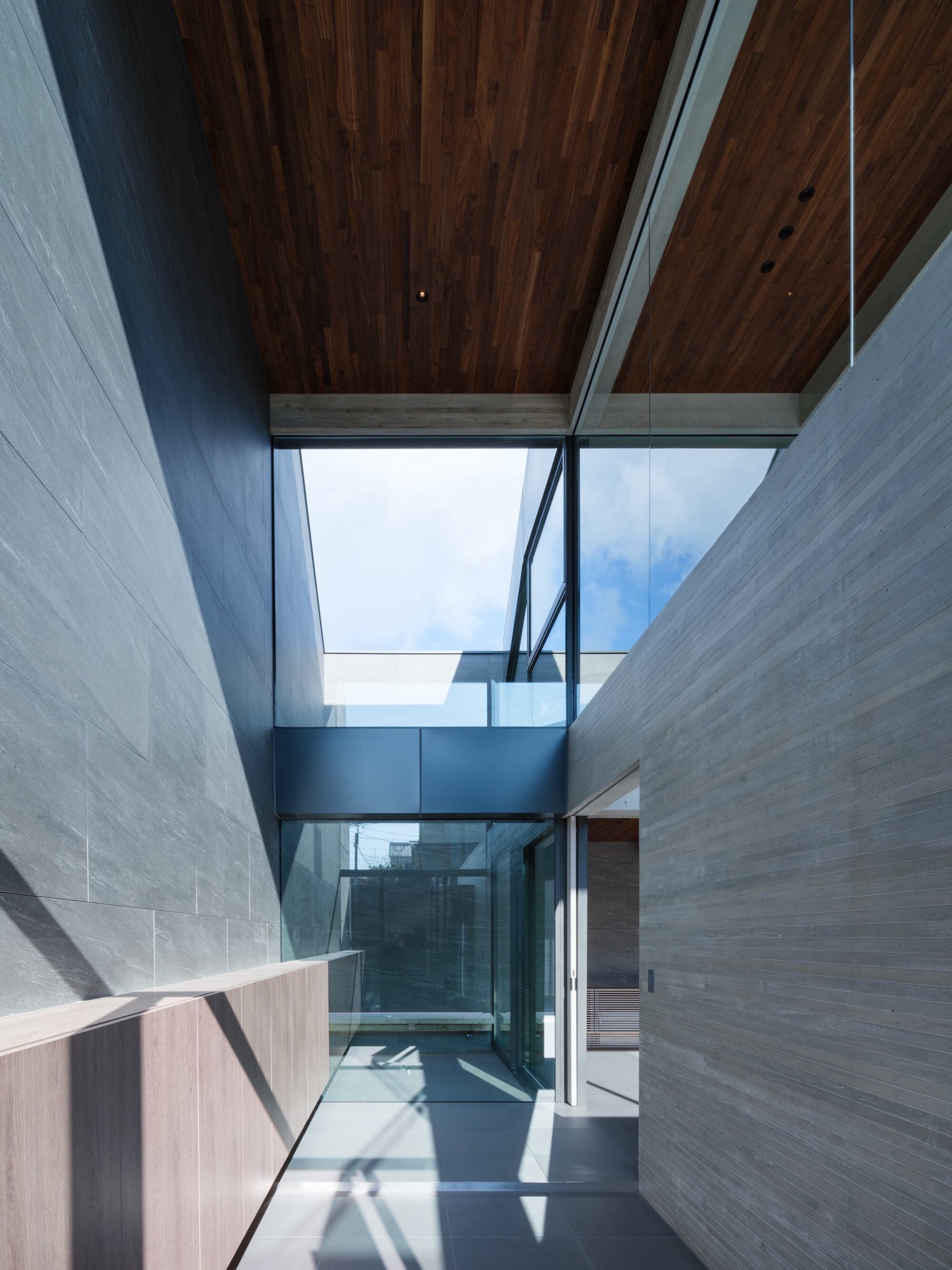
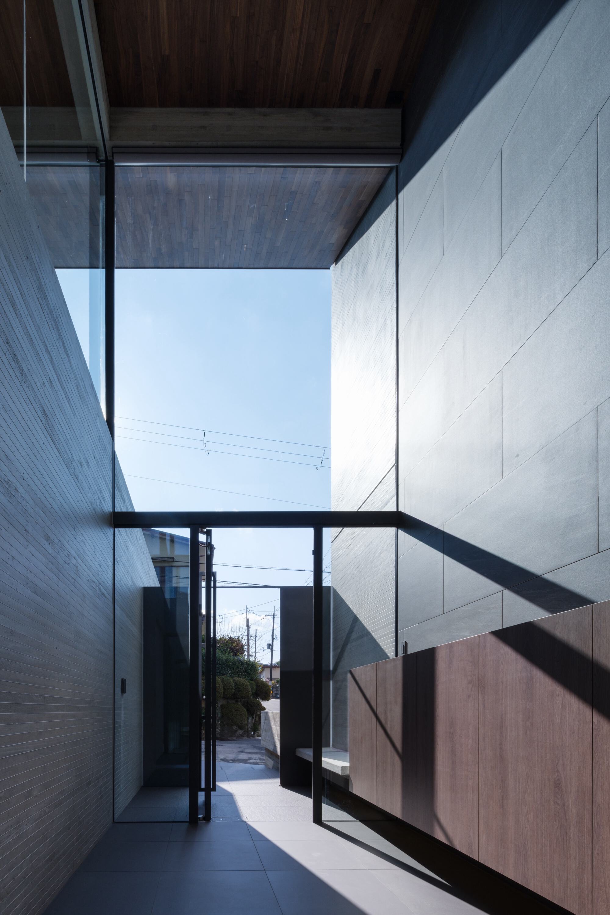
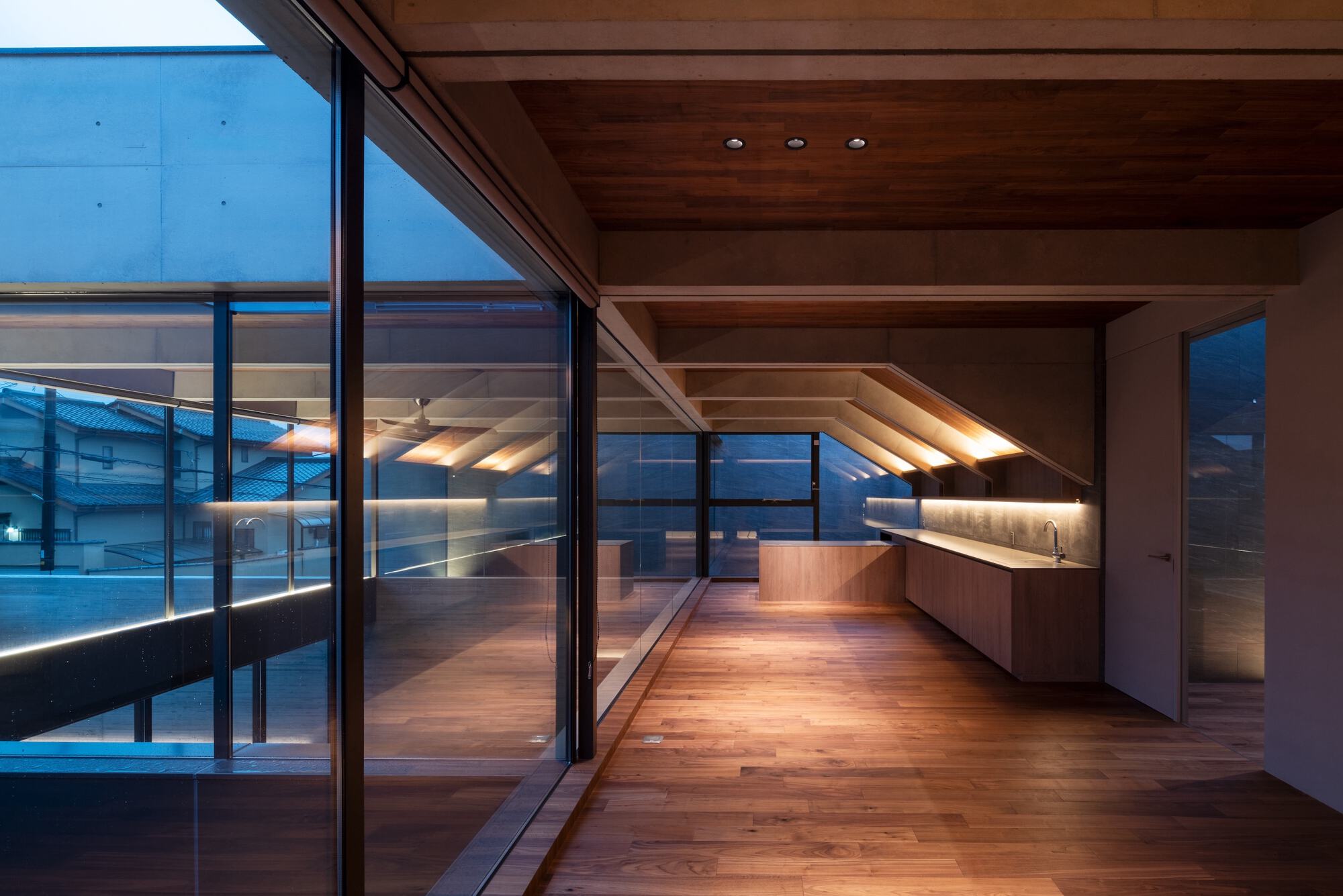
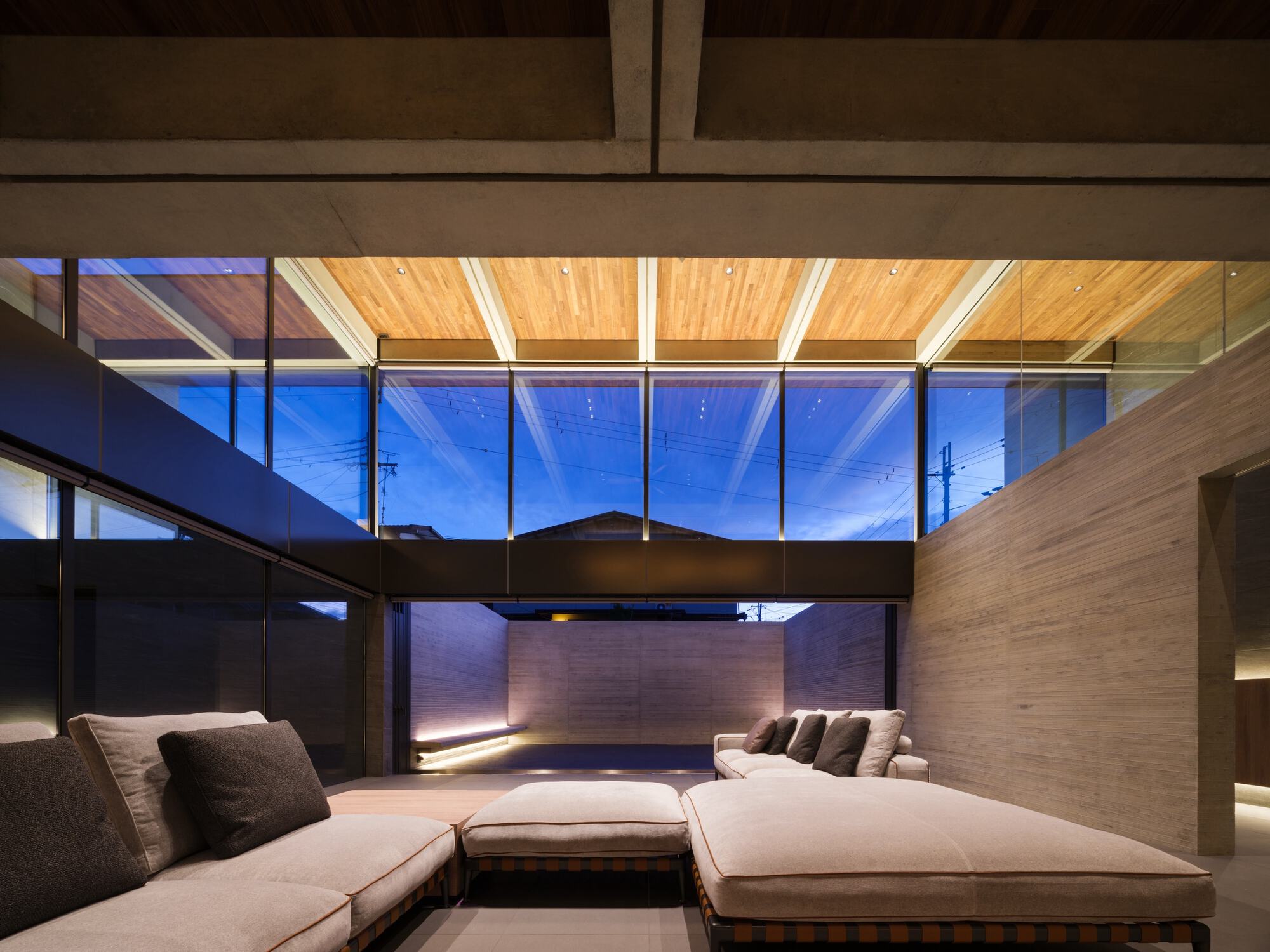
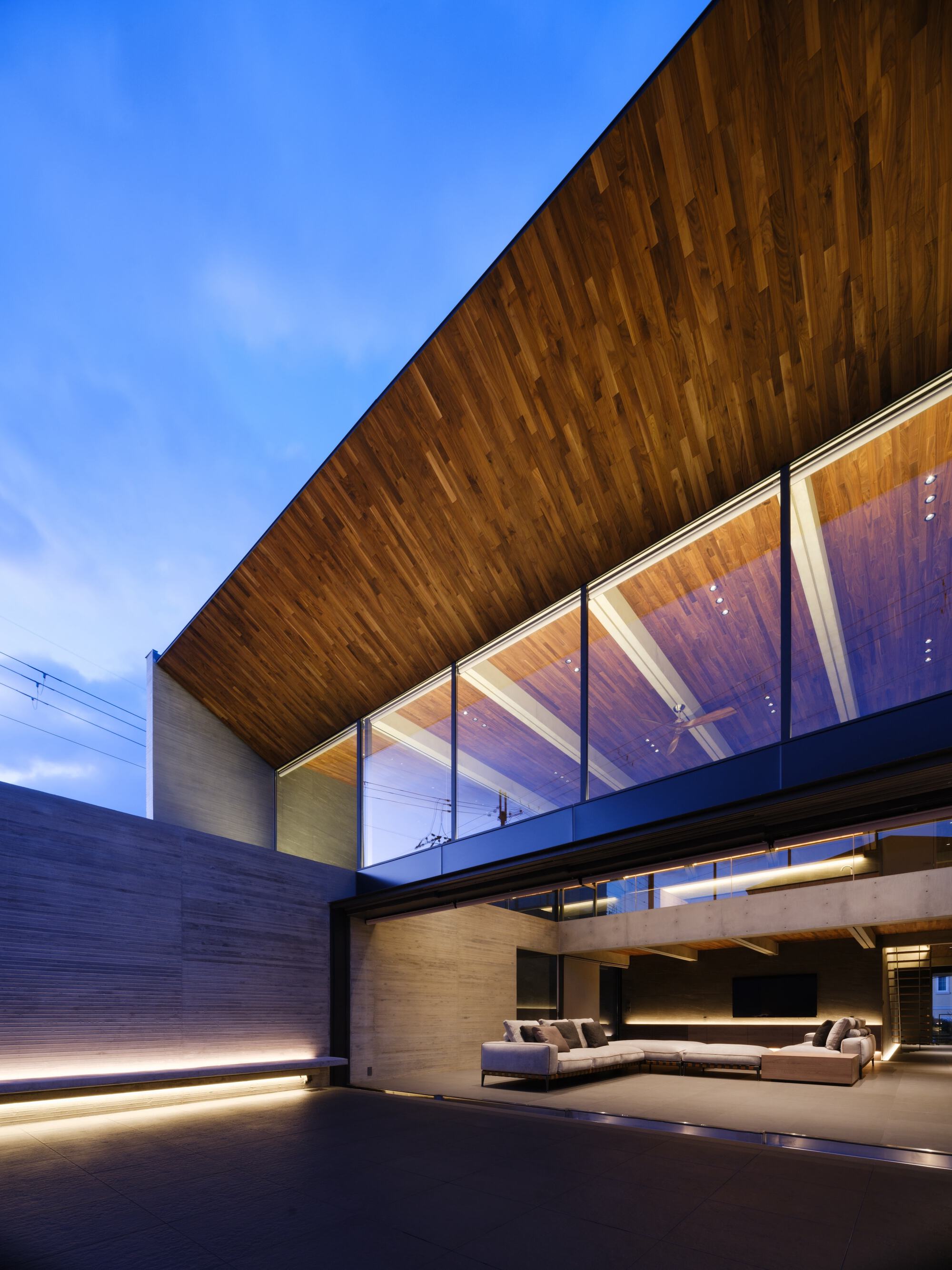
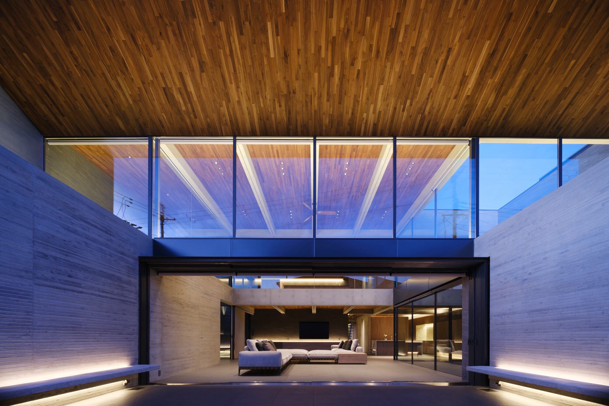
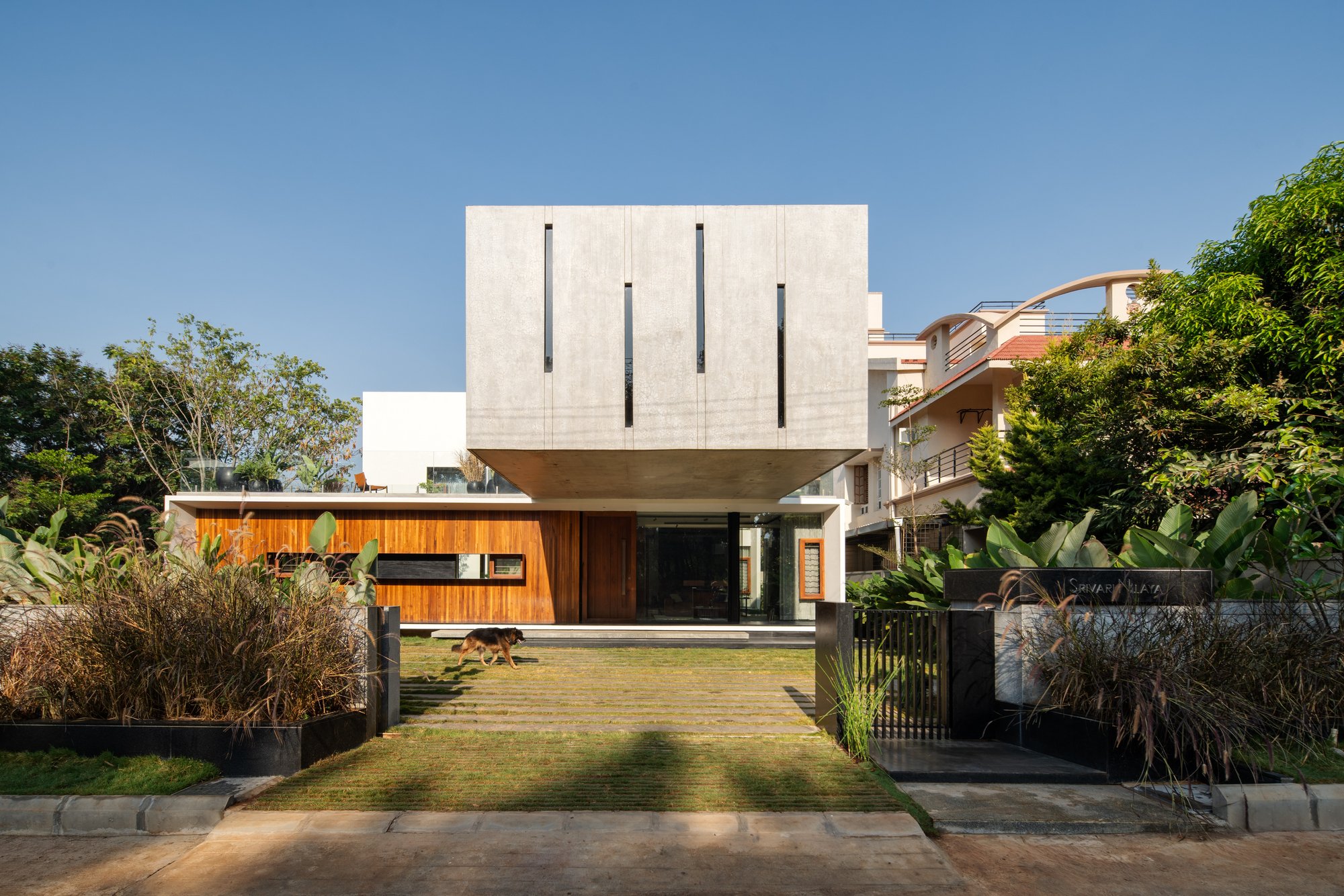
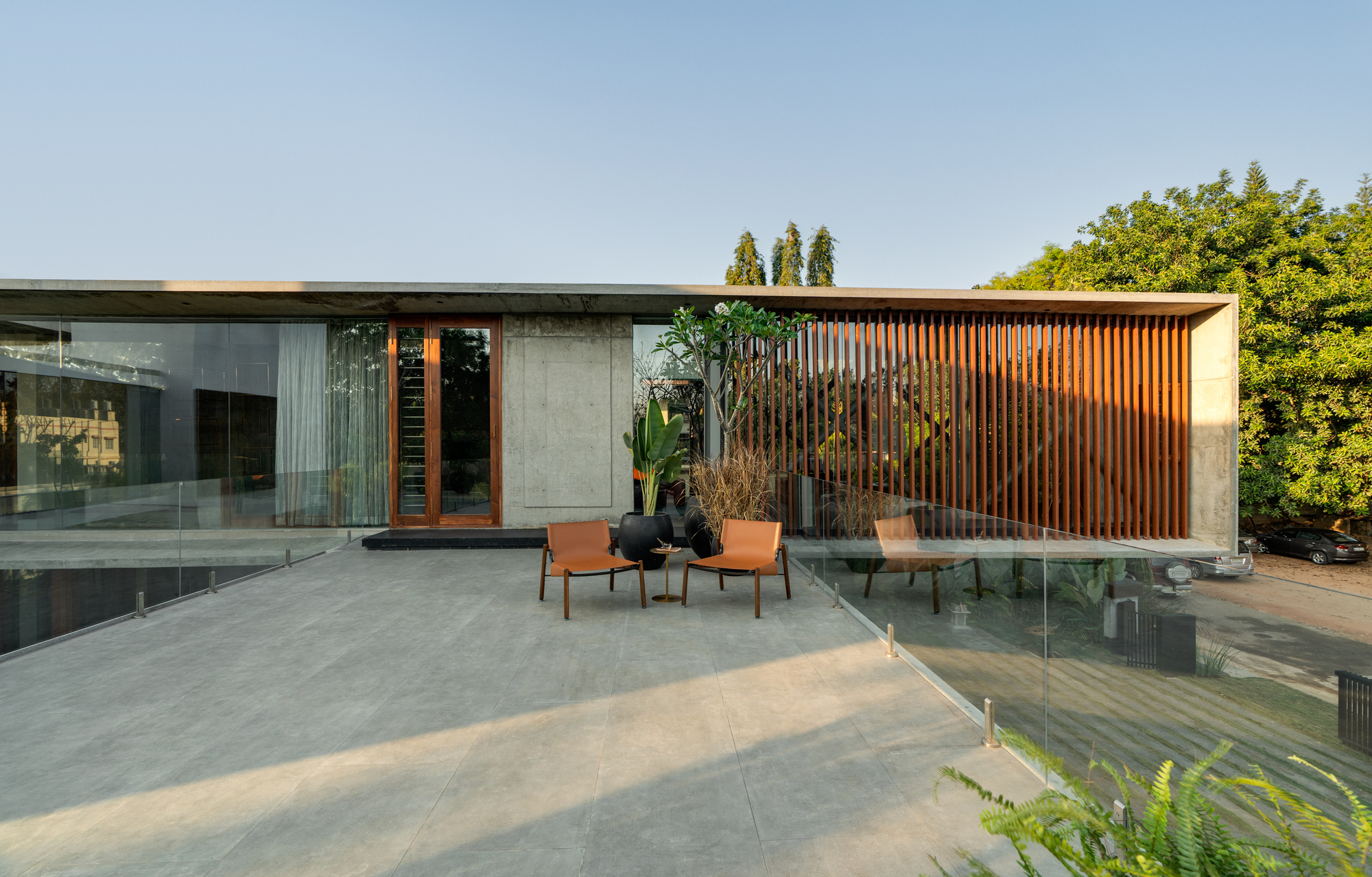
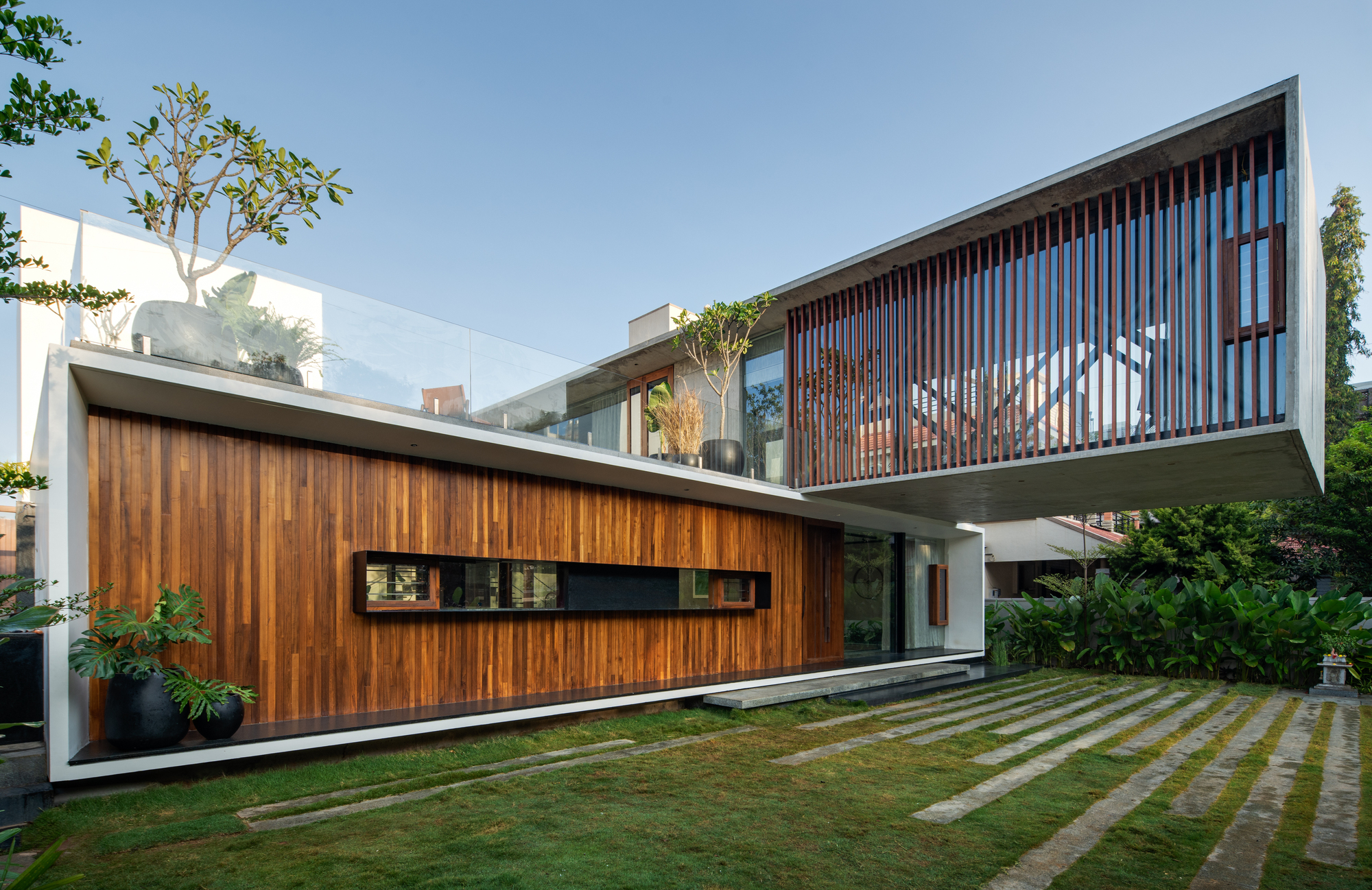
ELEMENT stands in a quiet residential area in the southern part of Kyoto. The L-shaped plot, which faces two roads, features a change in elevation and distinct facades on the north and south sides. The main facade is characterized by a large overhang with a wide southern-facing window, enclosed by a concrete wall imprinted with cedar-board formwork. The secondary façade is distinguished by its powerful cantilevered appearance, which allows for a pilotis-style garage area.
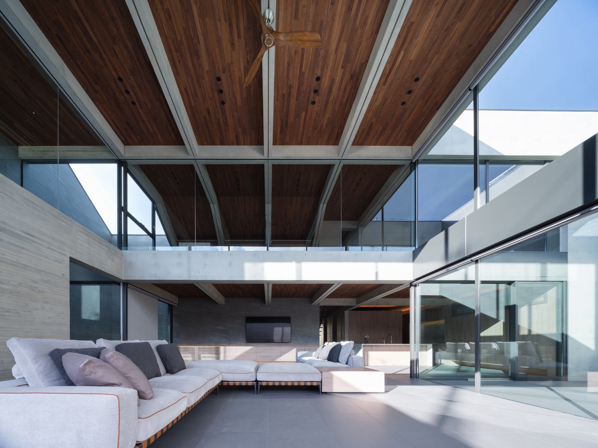
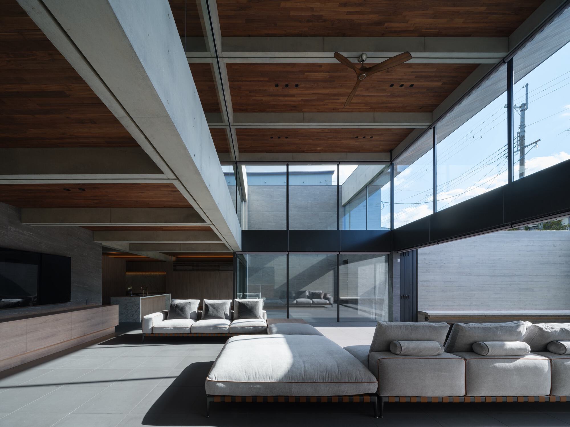
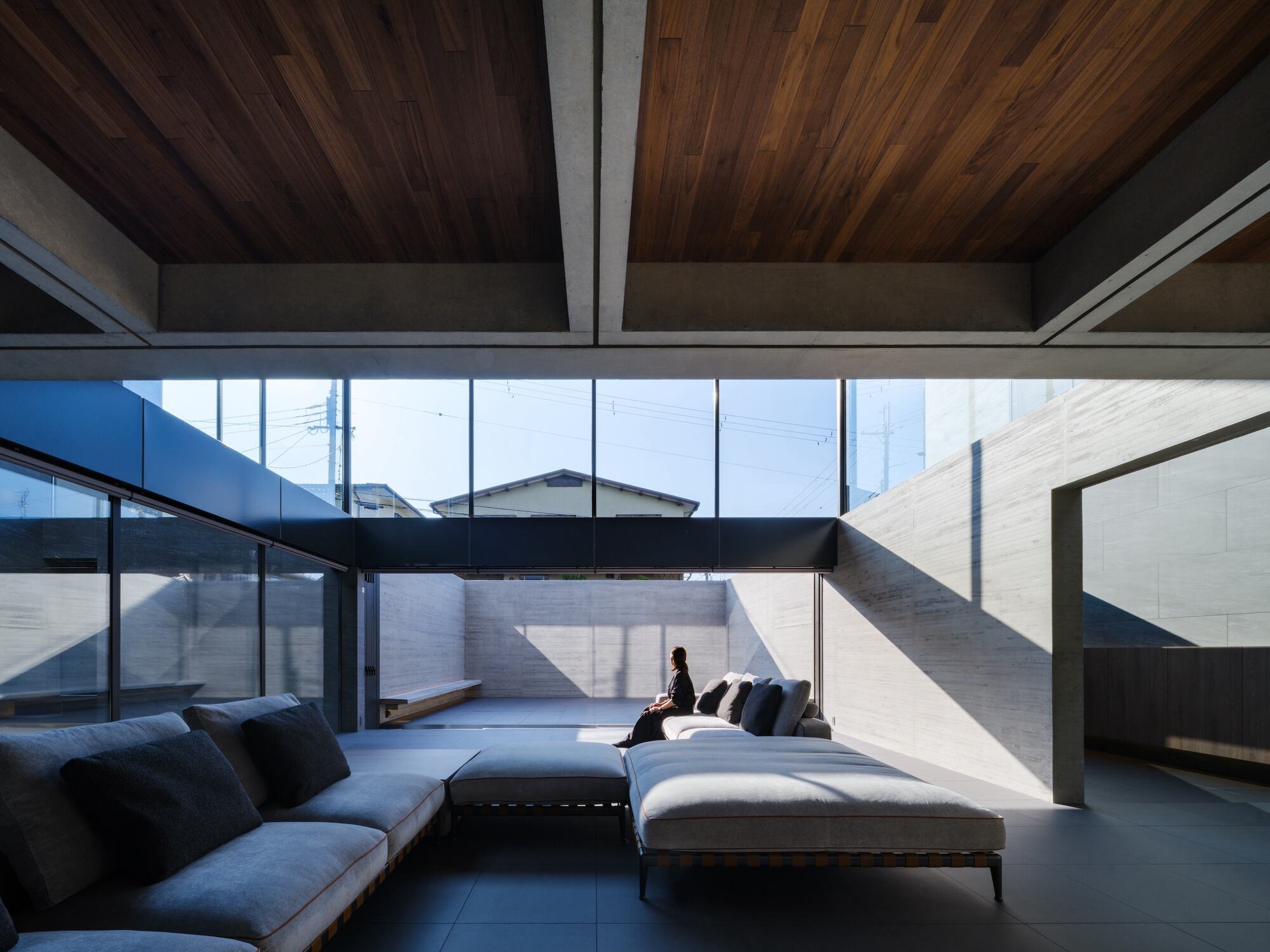
The main entrance opens into a two-story atrium space, where light streams in from high windows positioned on both the north and south sides. Guests are warmly welcomed by a cozy entrance courtyard visible directly ahead. The family living area, located within the atrium space, is complemented by a total of three courtyards of various sizes.
In addition to the entrance courtyard, there is a courtyard in the kitchen and dining area that draws natural light all the way into the back of the kitchen, as well as a central courtyard equipped with a bench and full-opening sliding doors. Each of these distinct courtyards makes a unique contribution to the spatial experience within the home.
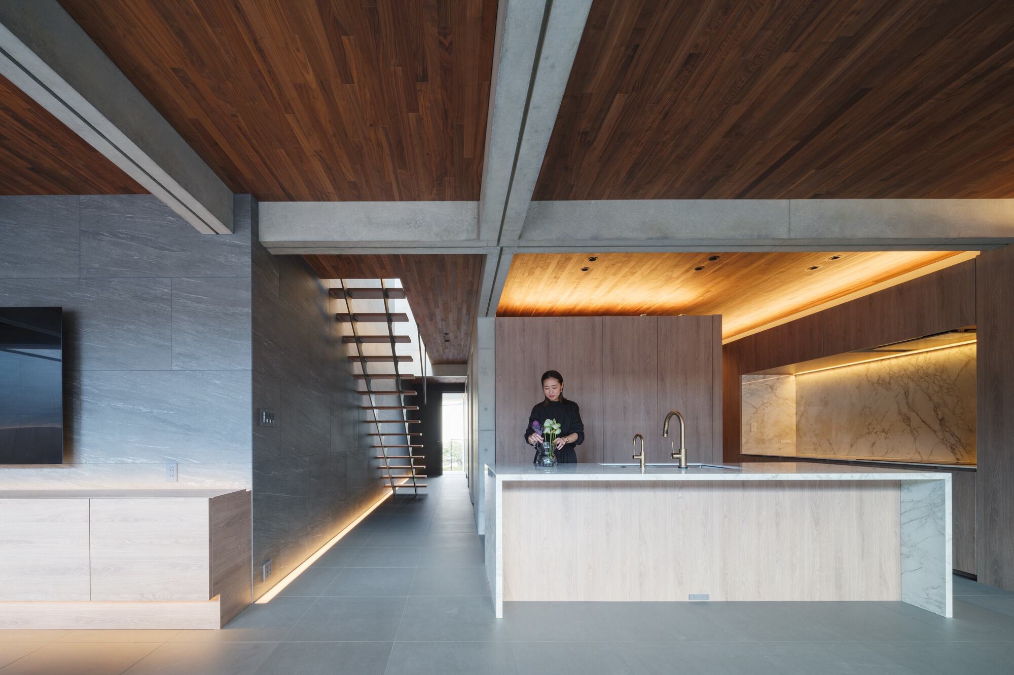
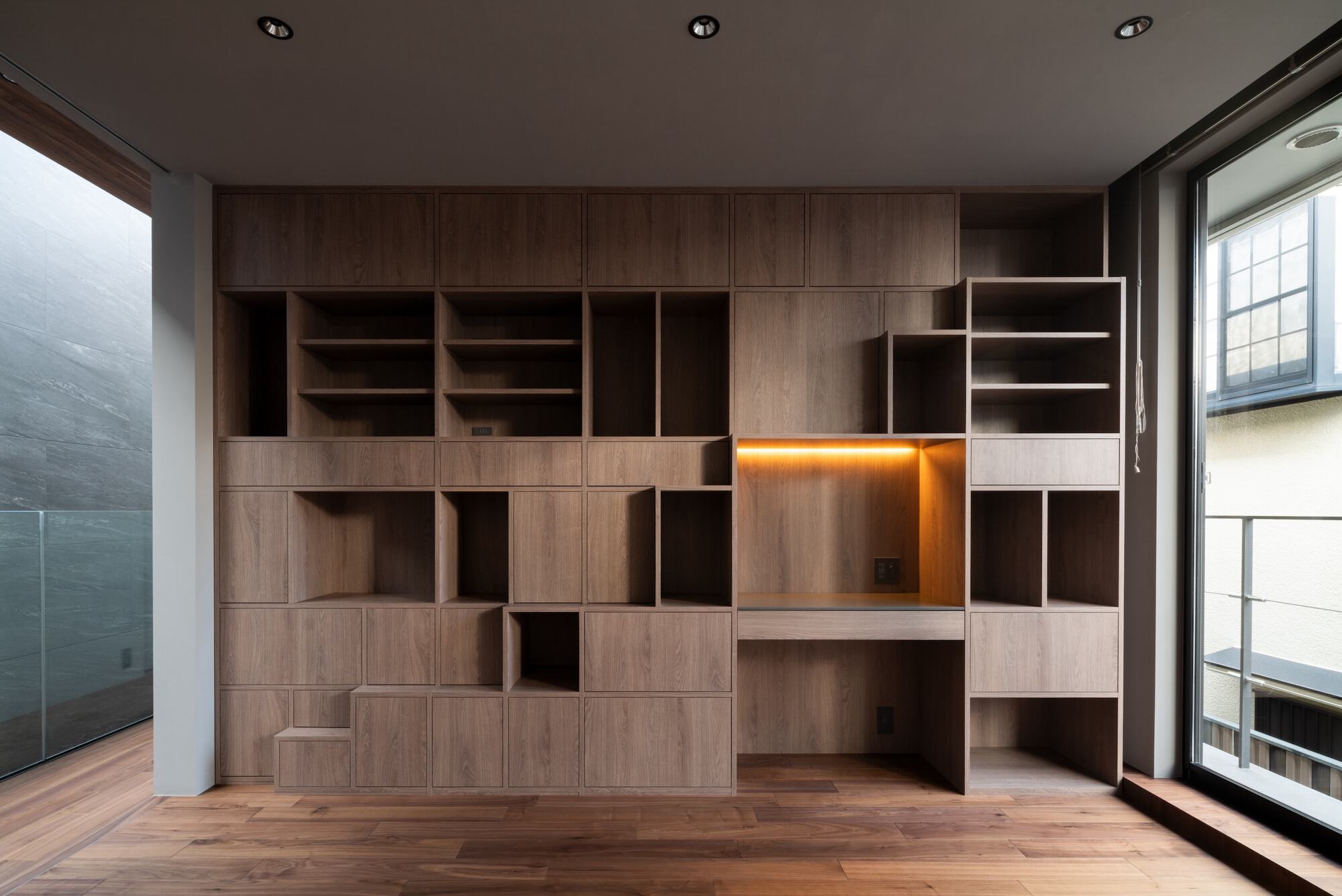
The second-floor workspace is equipped with dedicated office and meeting areas as well as fitness facilities, providing a perfect base for remote work. From the living room's atrium, one can look up through the glass to catch a glimpse of people engaged in work or physical training, creating an atmosphere that promotes both productivity and well-being.
Additionally, the ceiling features a visually striking combination of concrete ribs and recessed solid walnut panels, creating a coffered effect that spans the entire living space. This element not only introduces a distinctive rhythm and harmony but also serves as the foundation for the interior design of the space.
Private rooms and wet areas are concentrated near the secondary entrance, while public areas such as the living and dining rooms and outdoor spaces are laid out near the main entrance. ELEMENT subtly integrates these various scenes of daily life to create a unique narrative, serving as a model for an environment where life and work are in perfect balance.

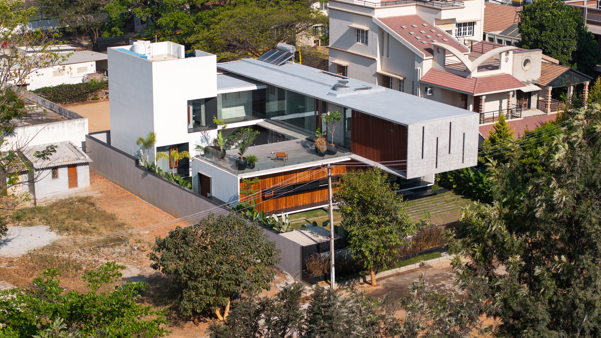
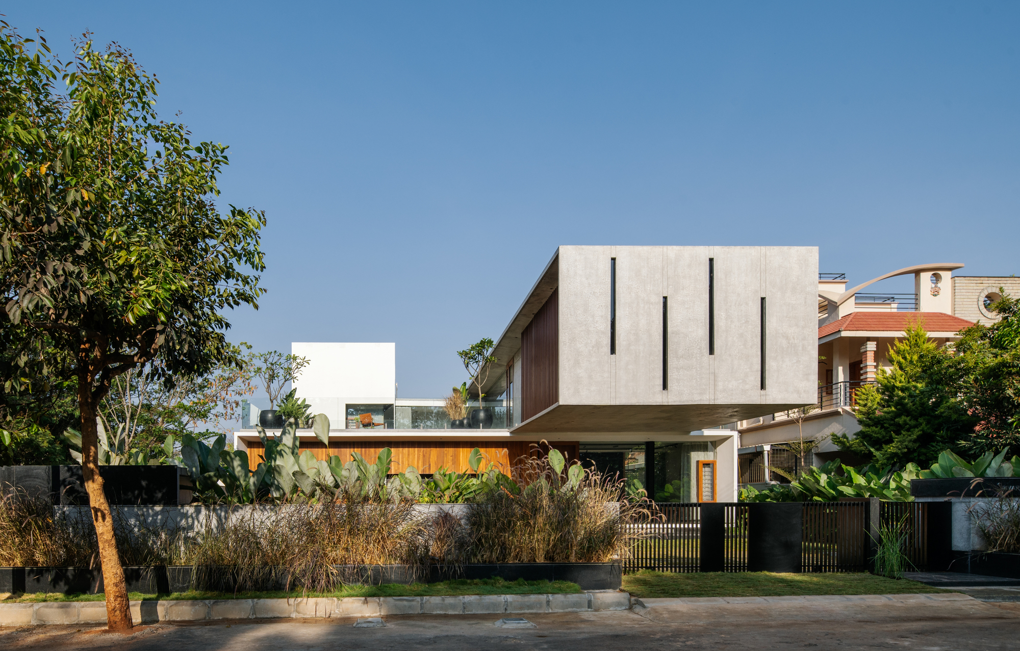
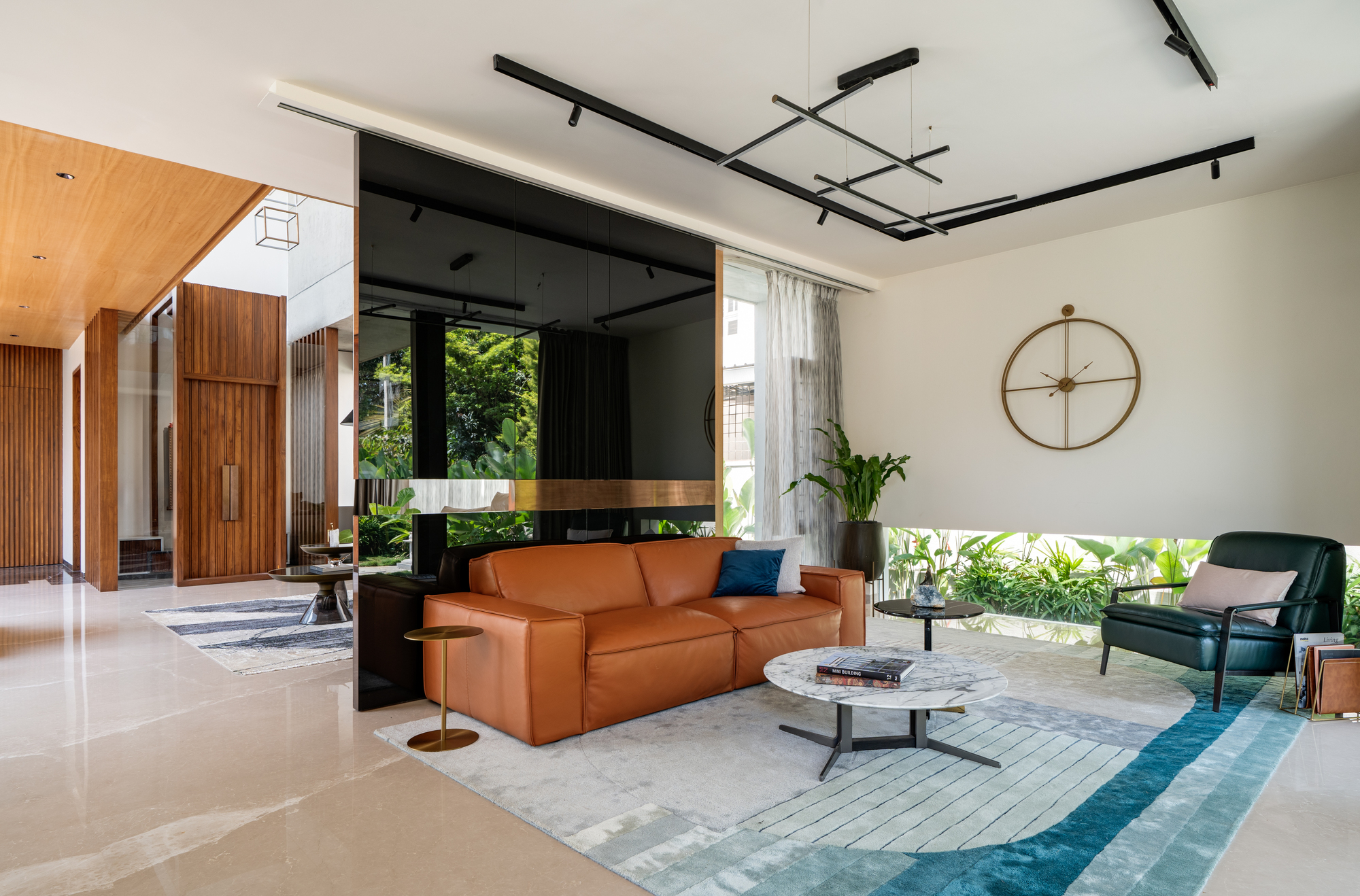
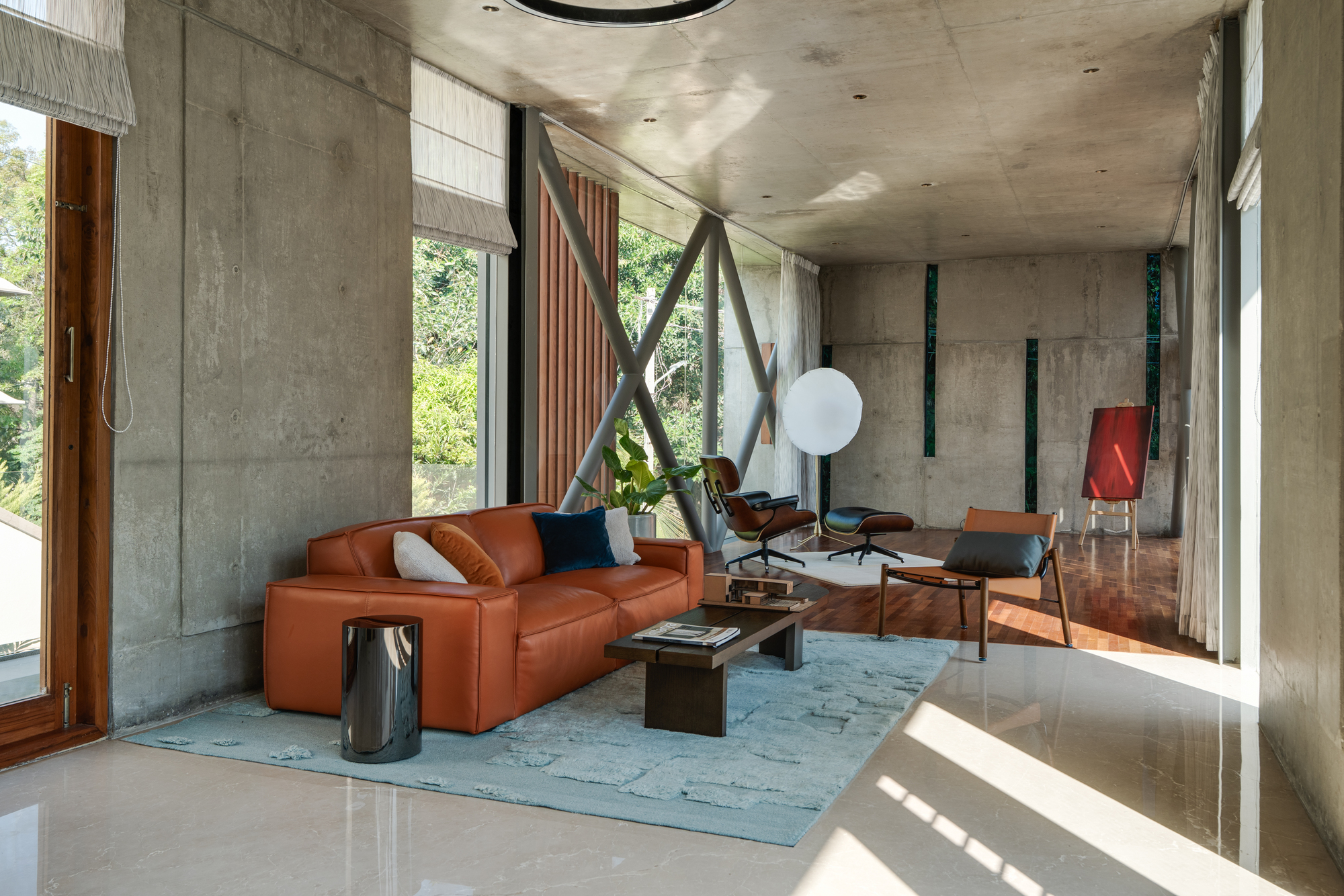
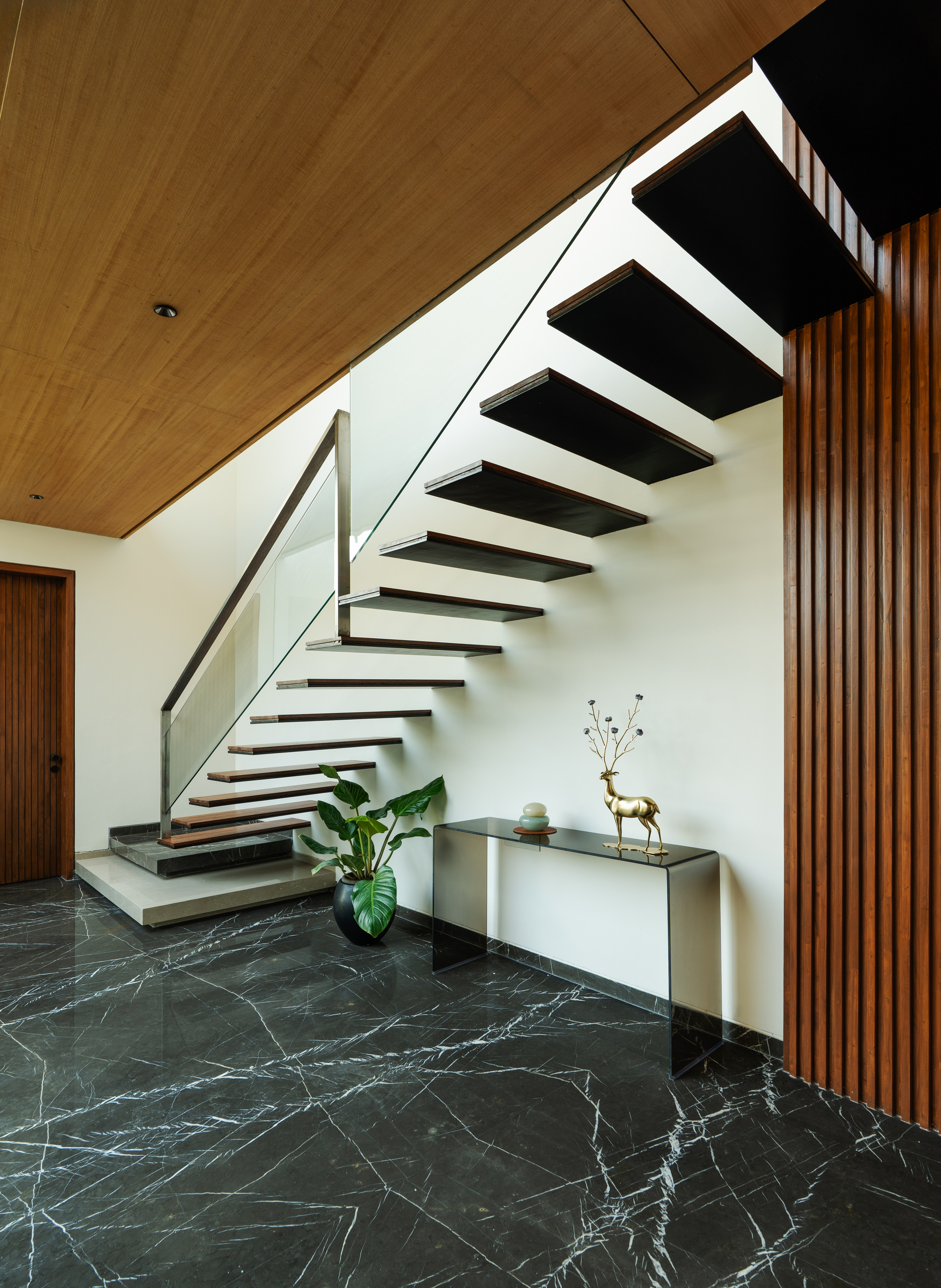
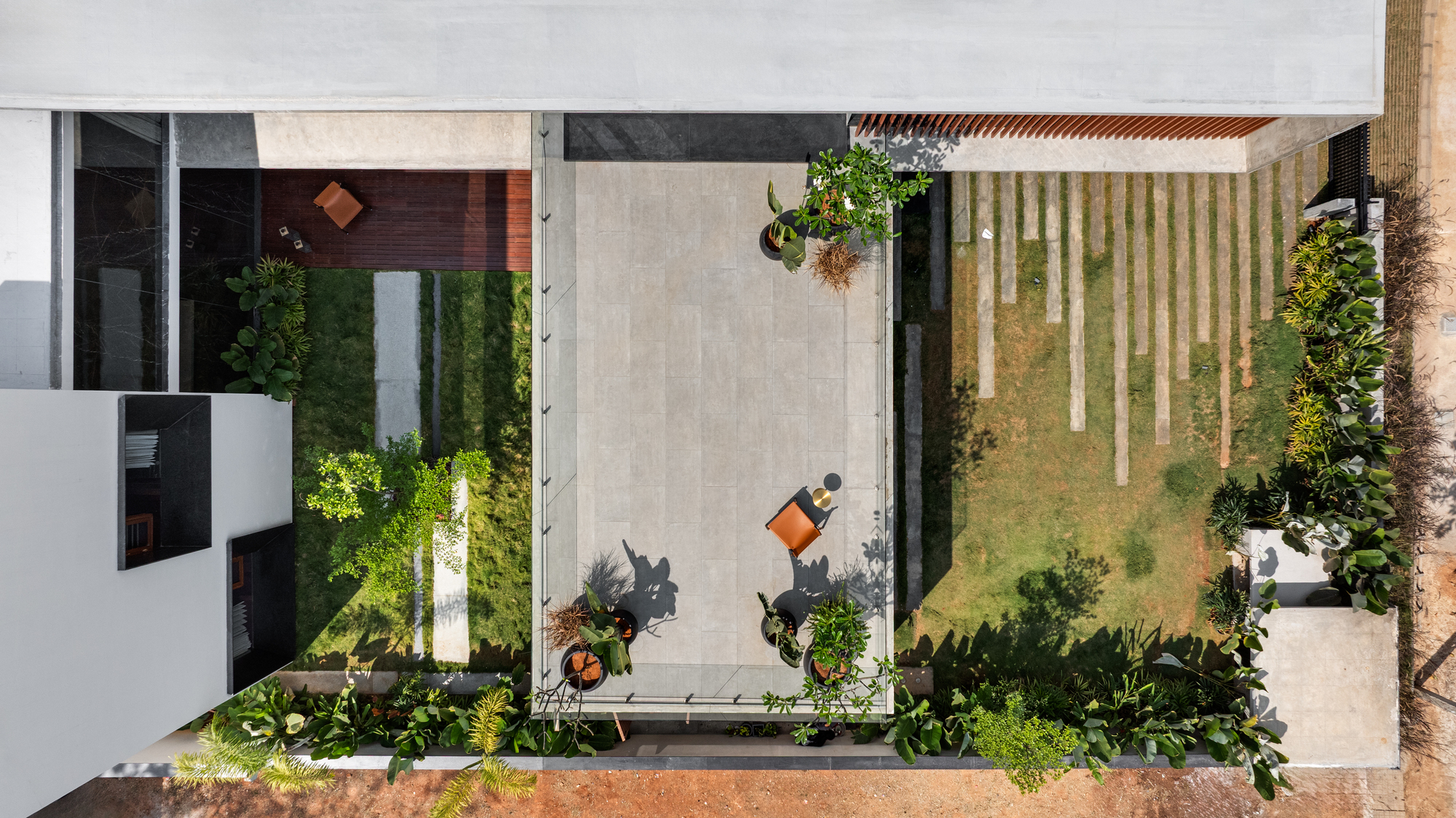
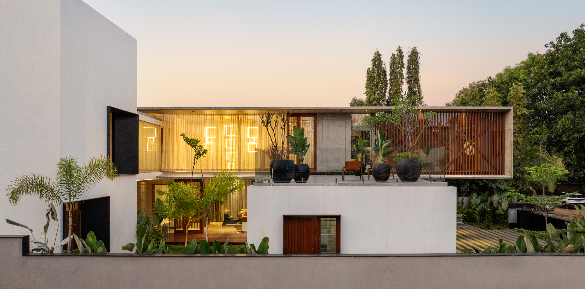
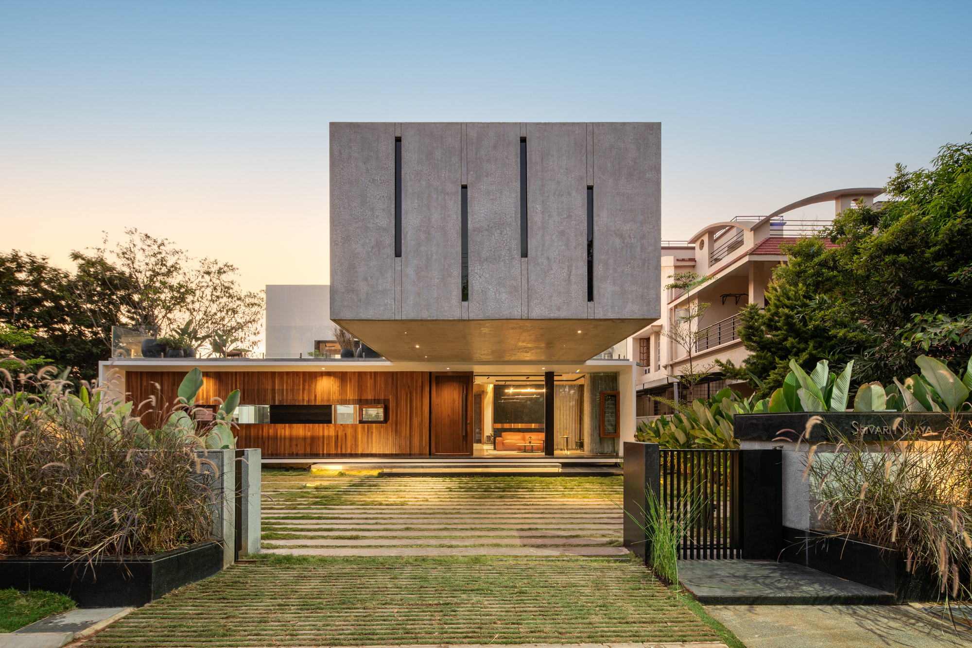
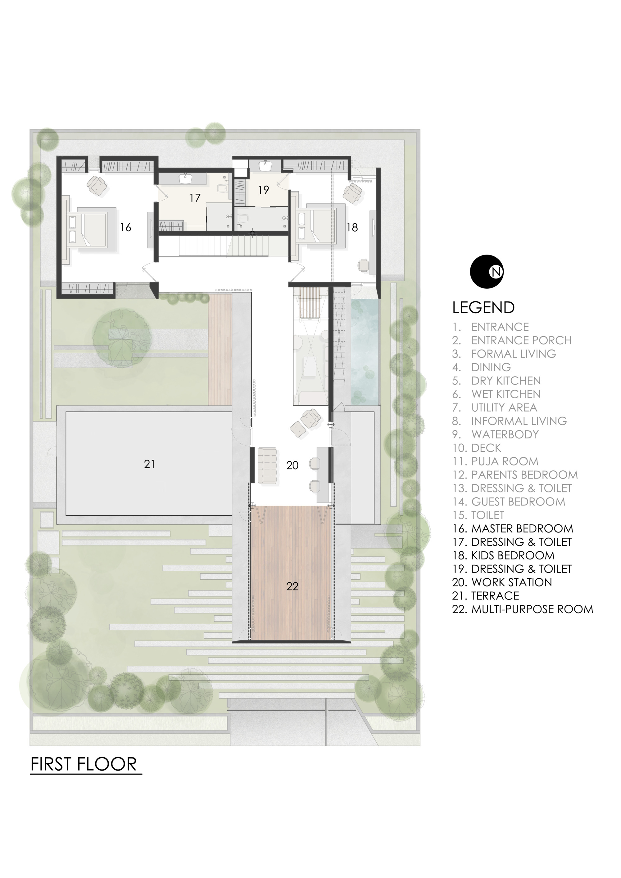
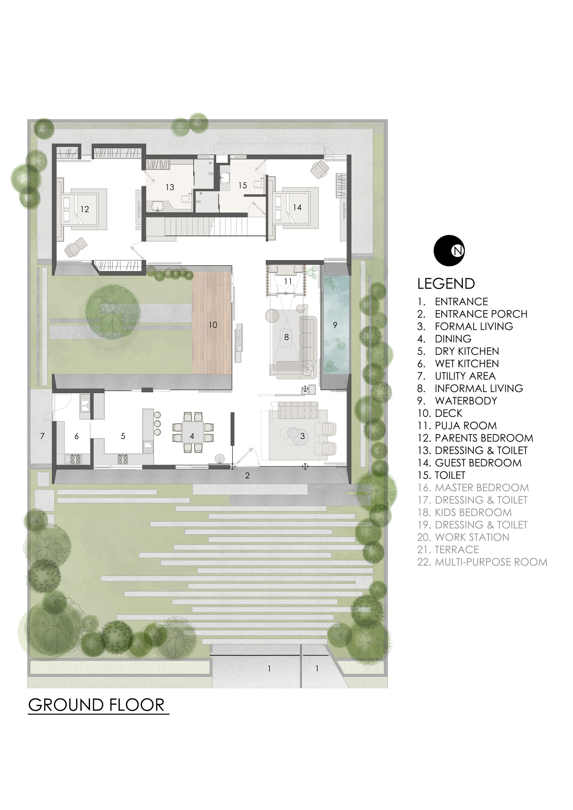
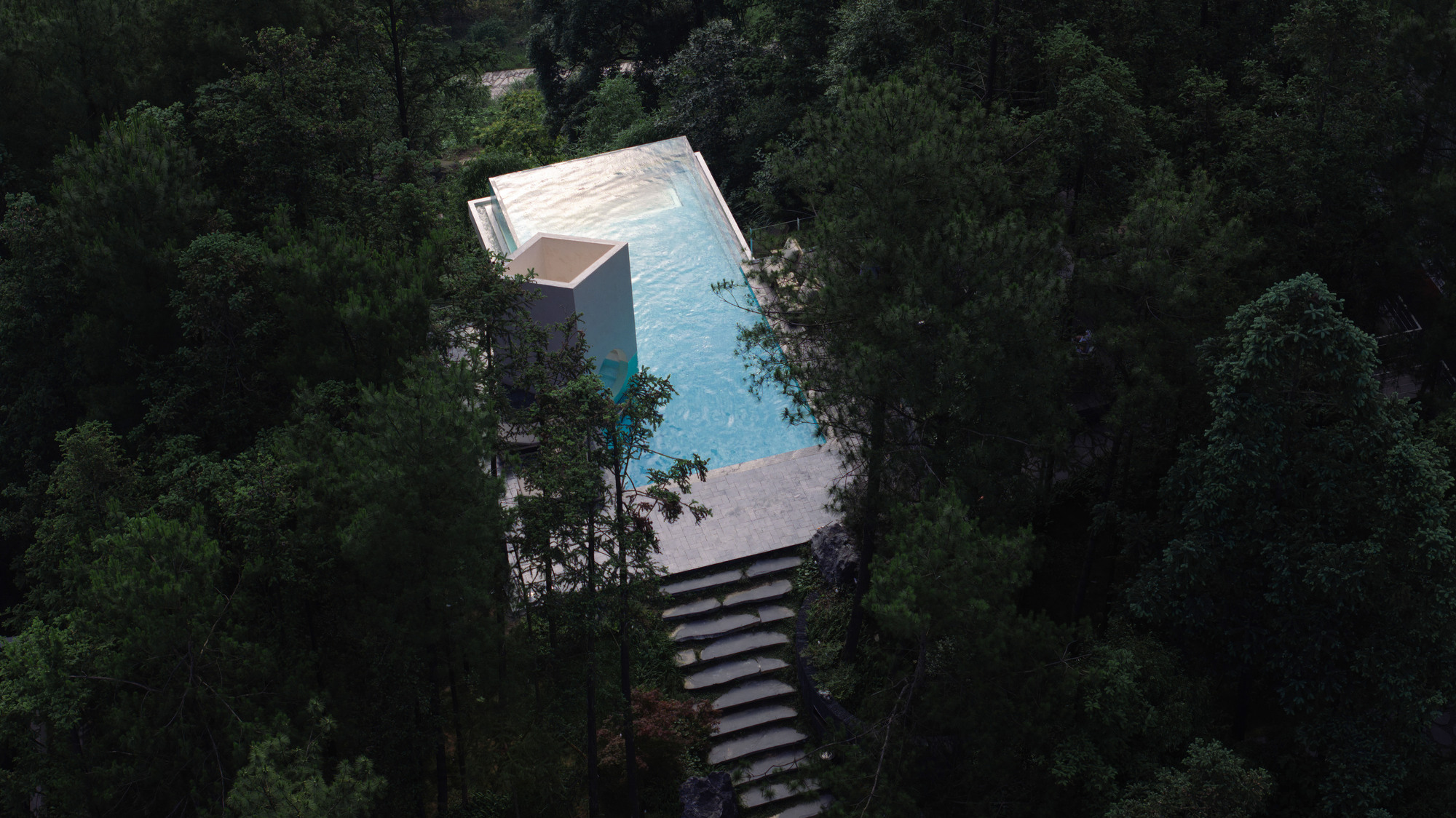
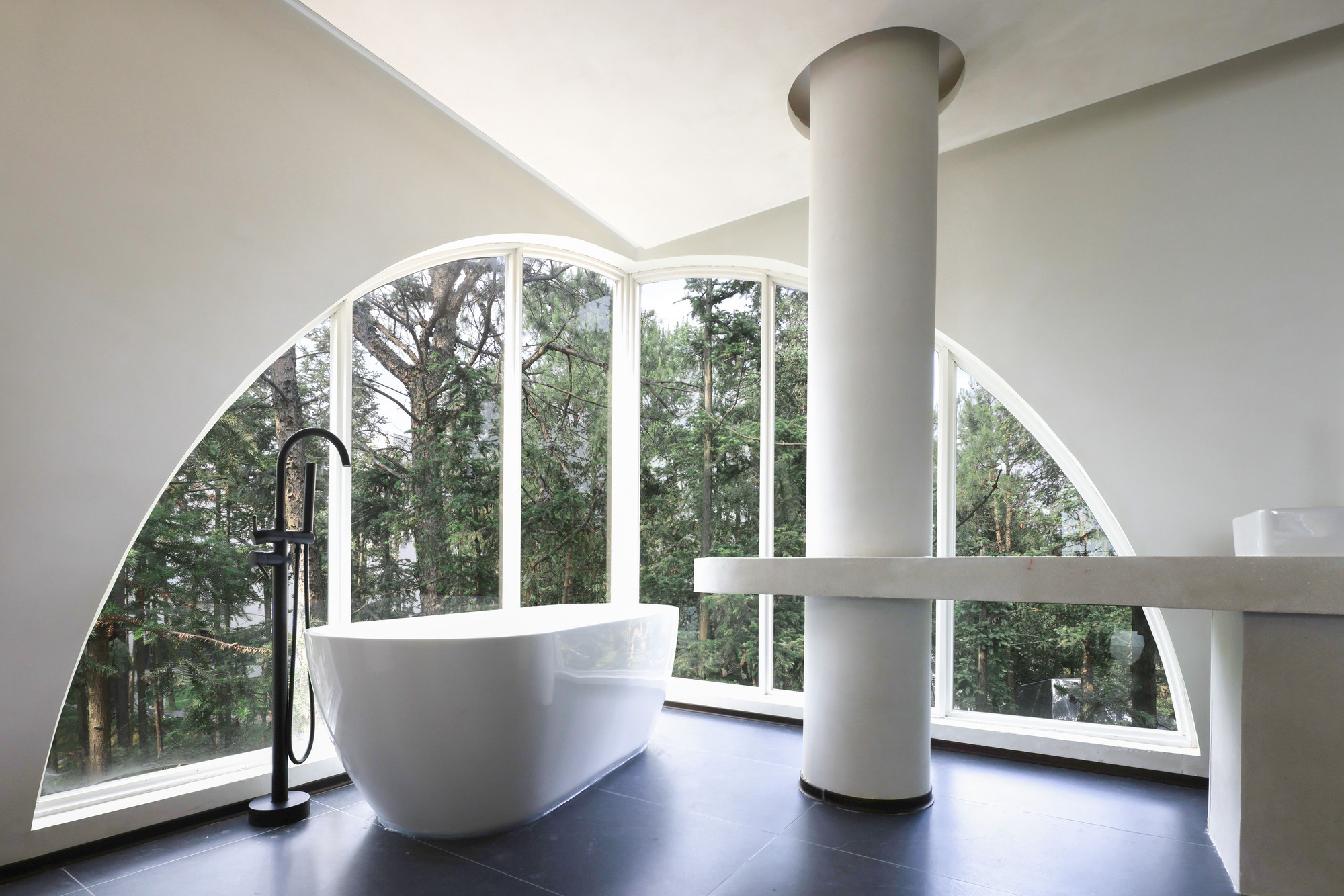
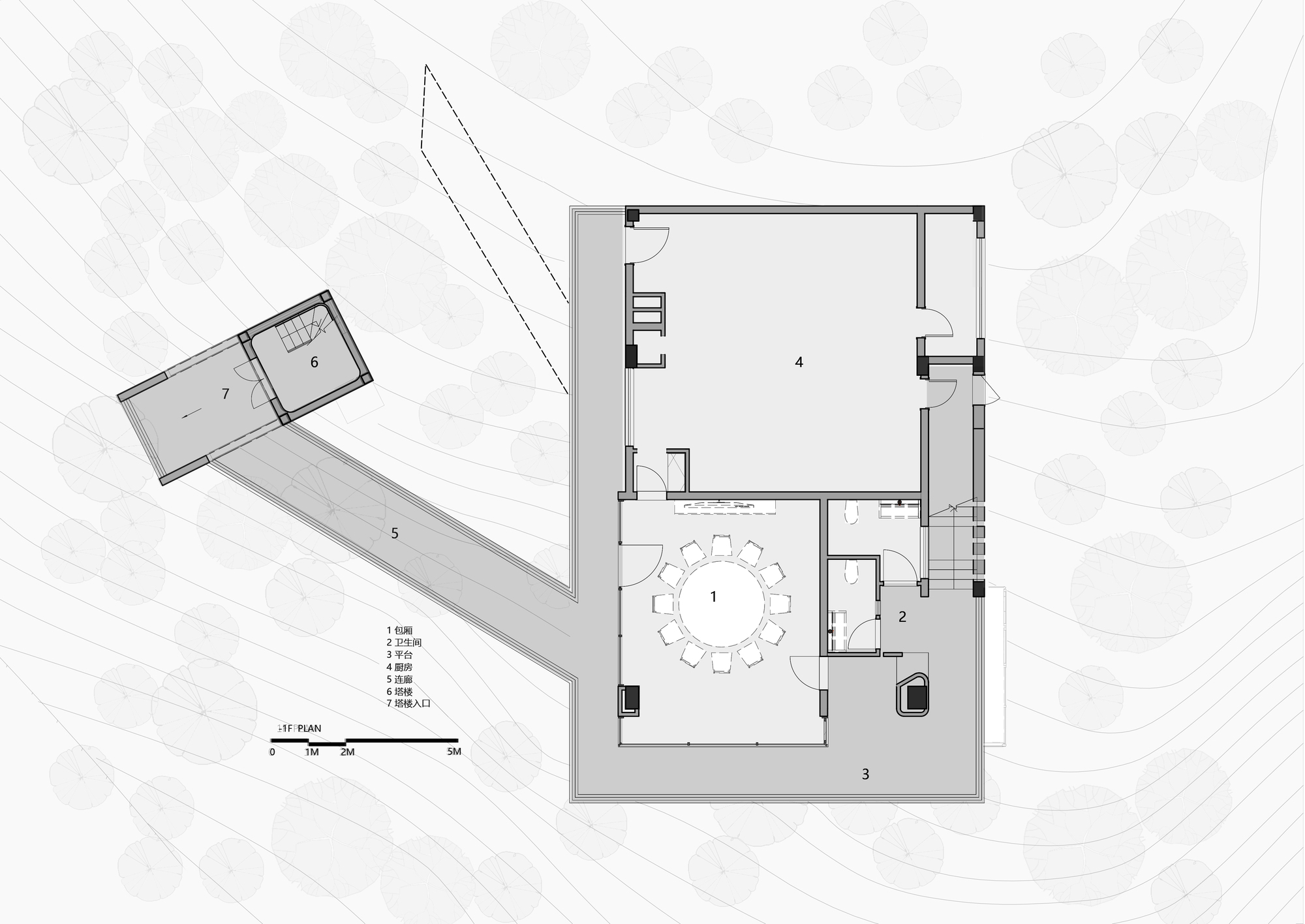
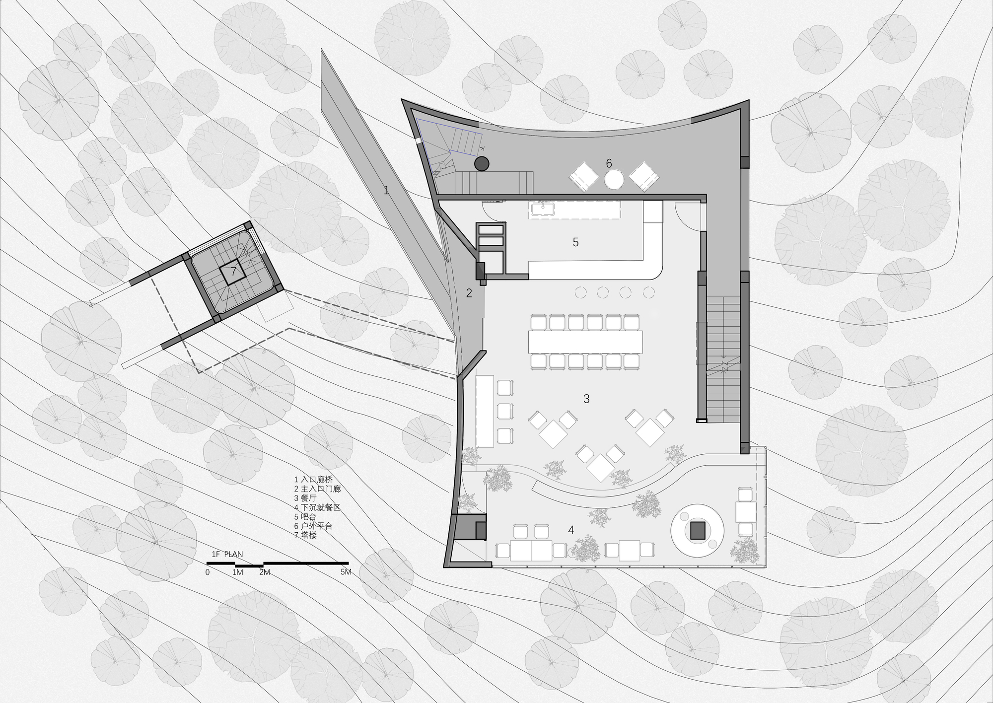
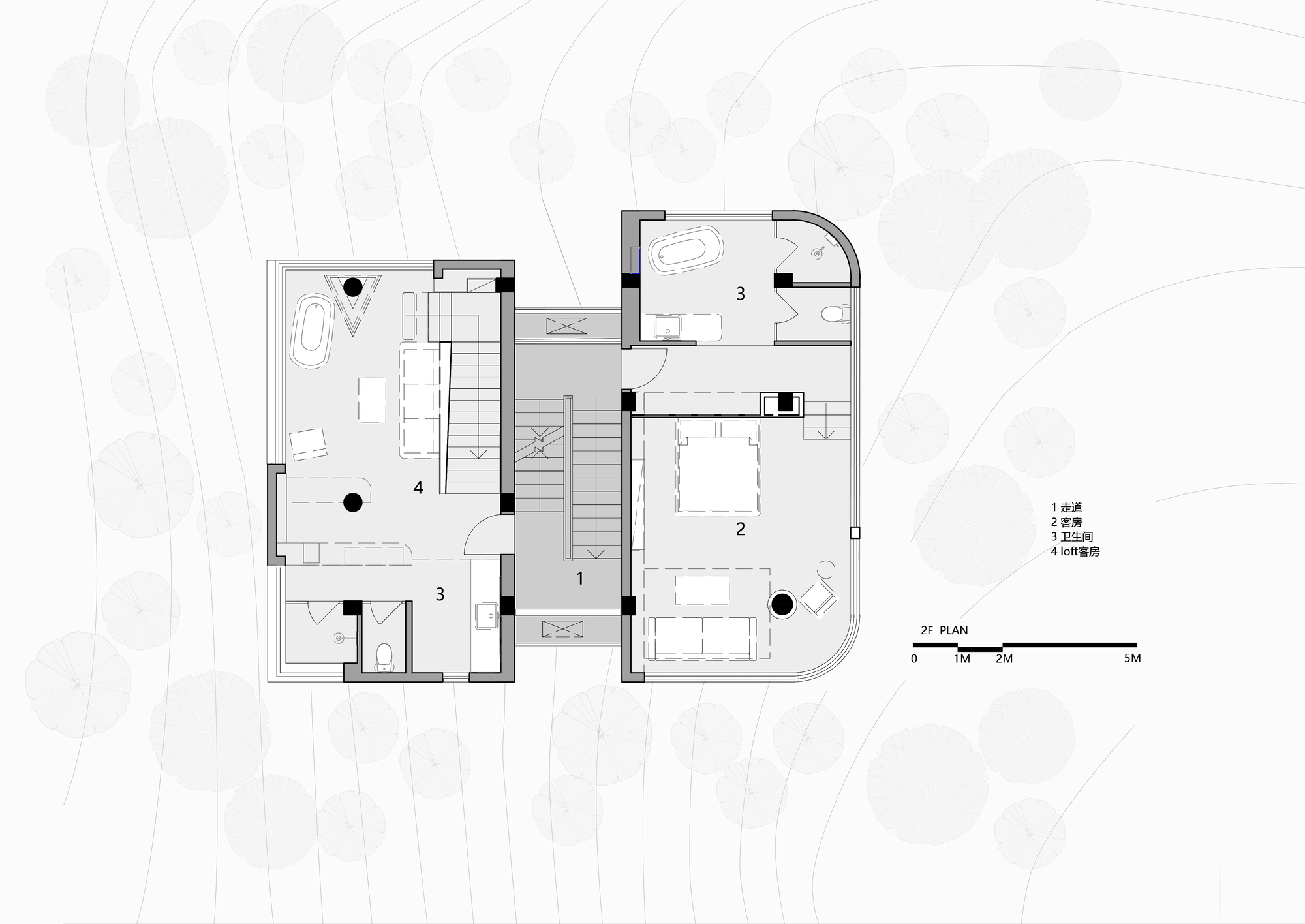
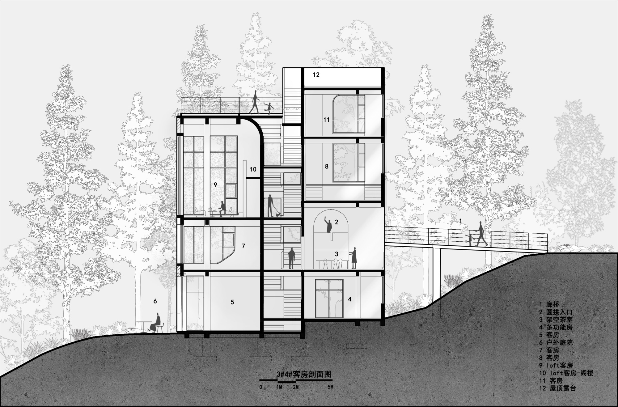
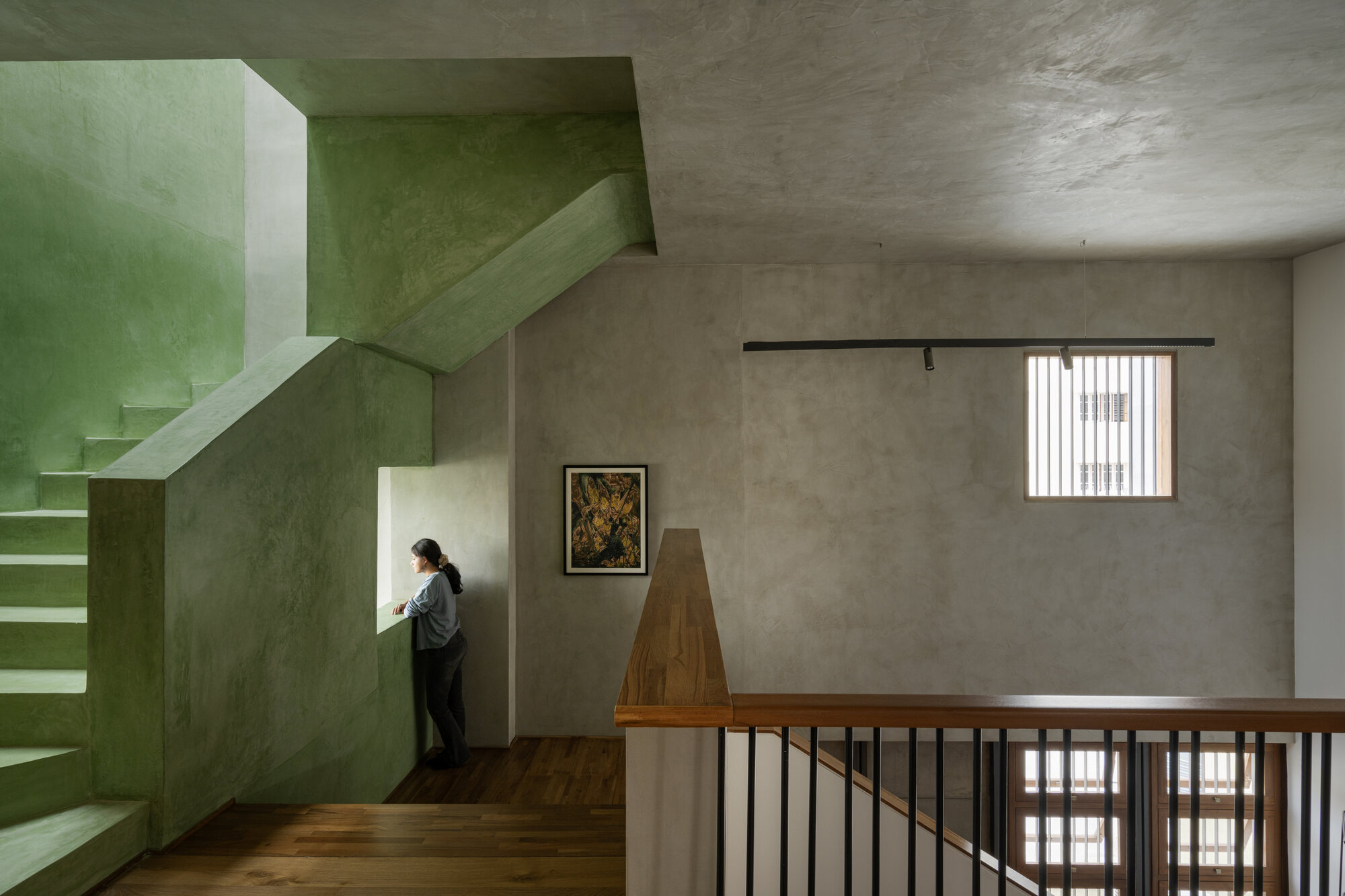
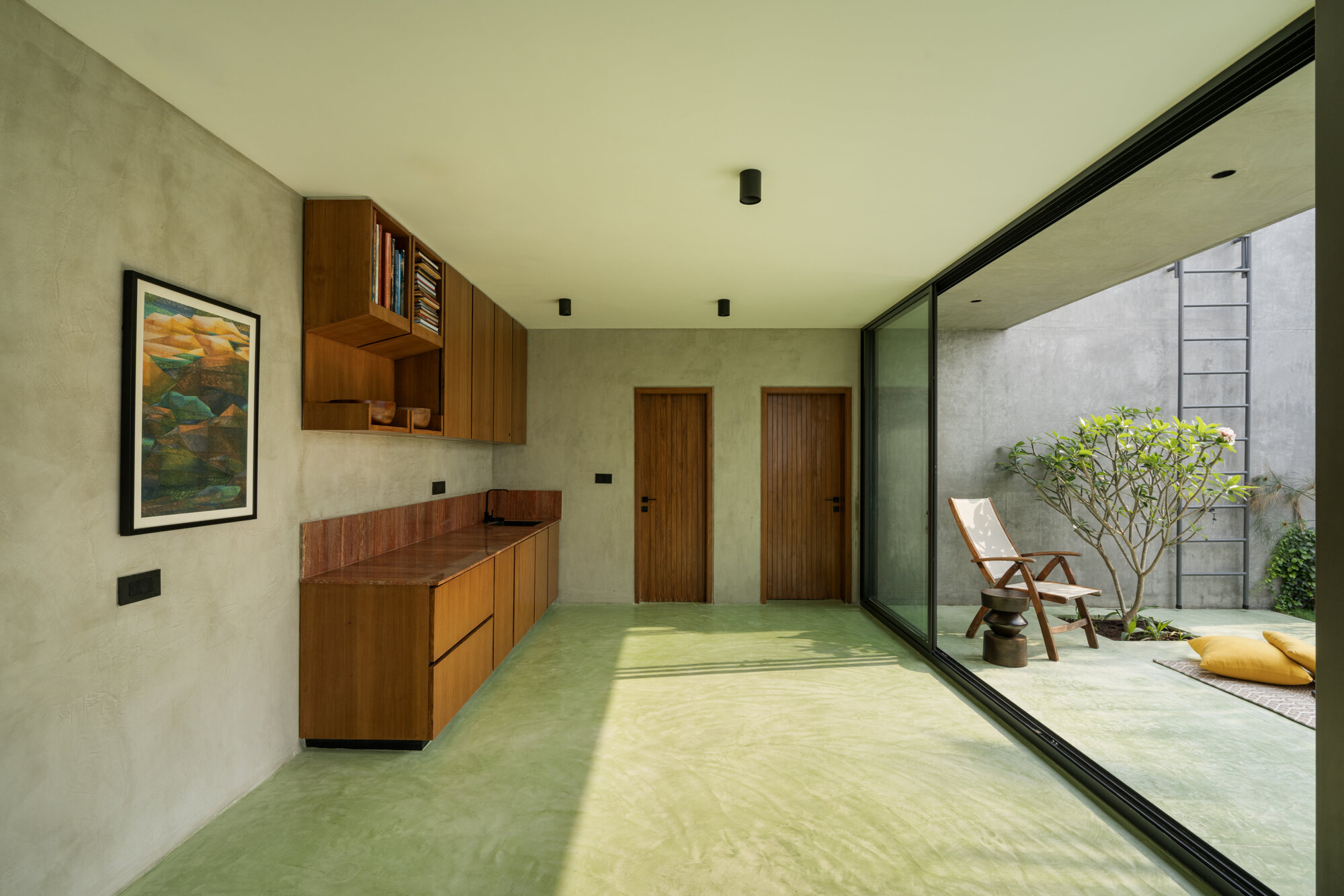
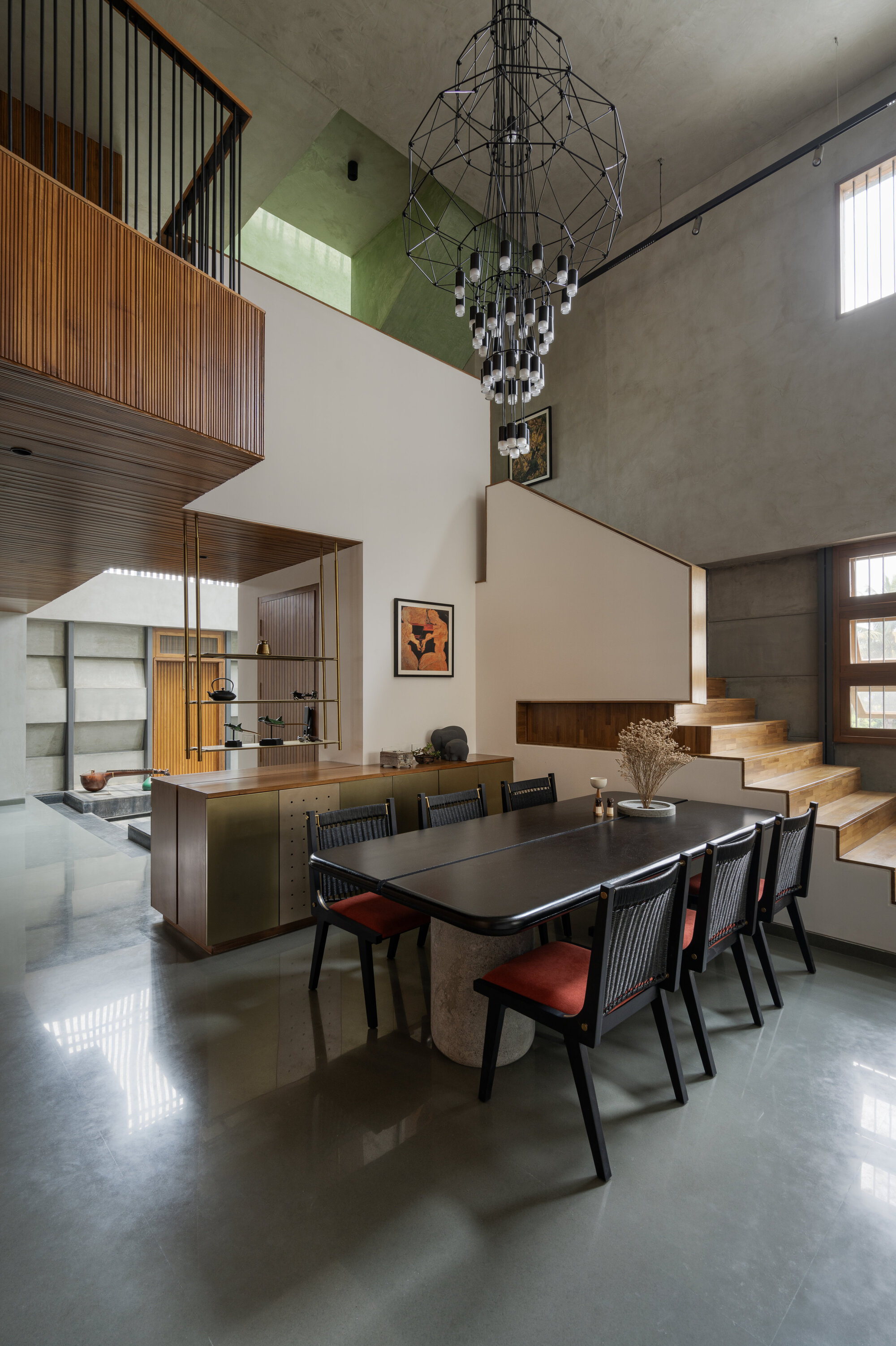
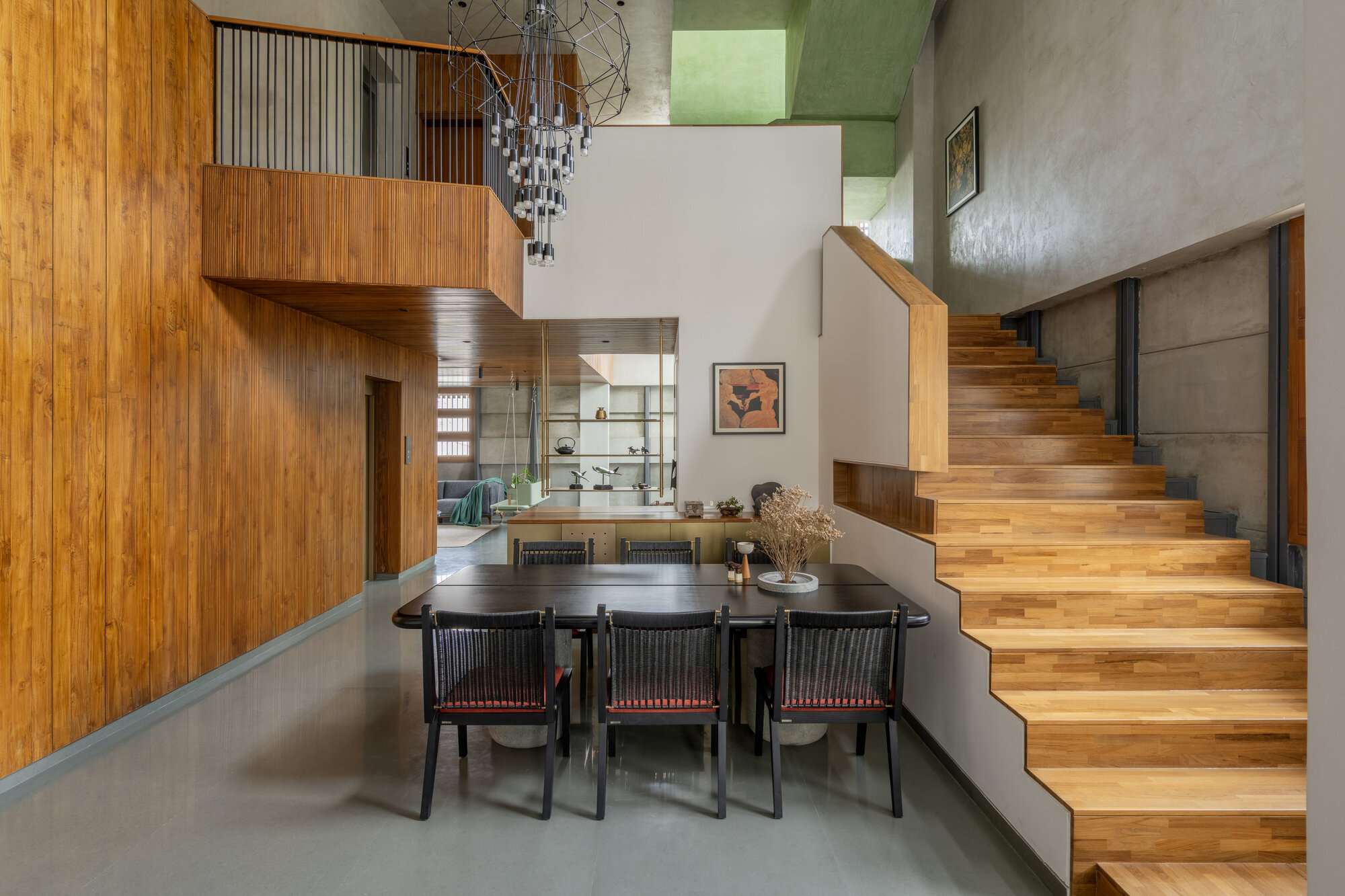
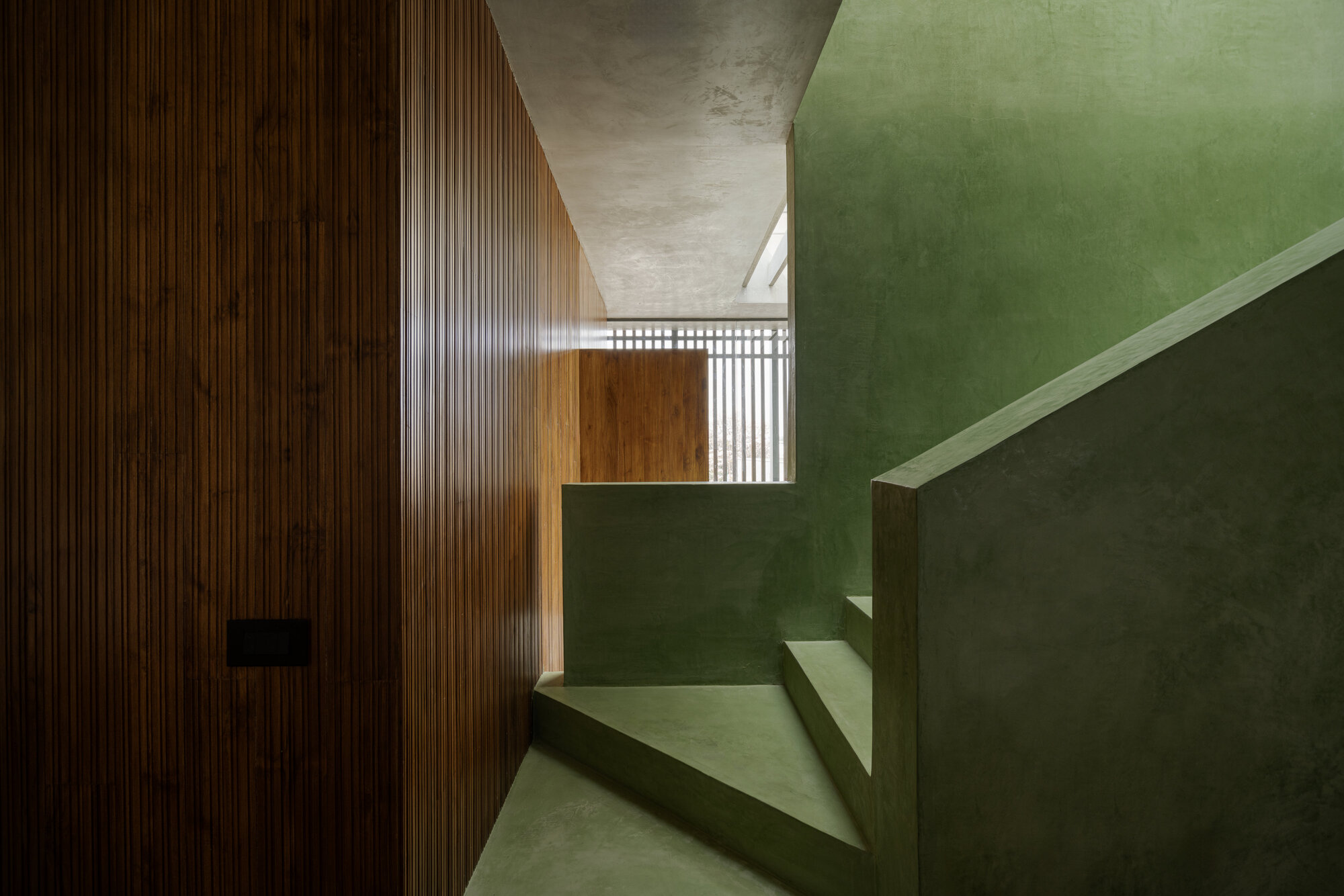
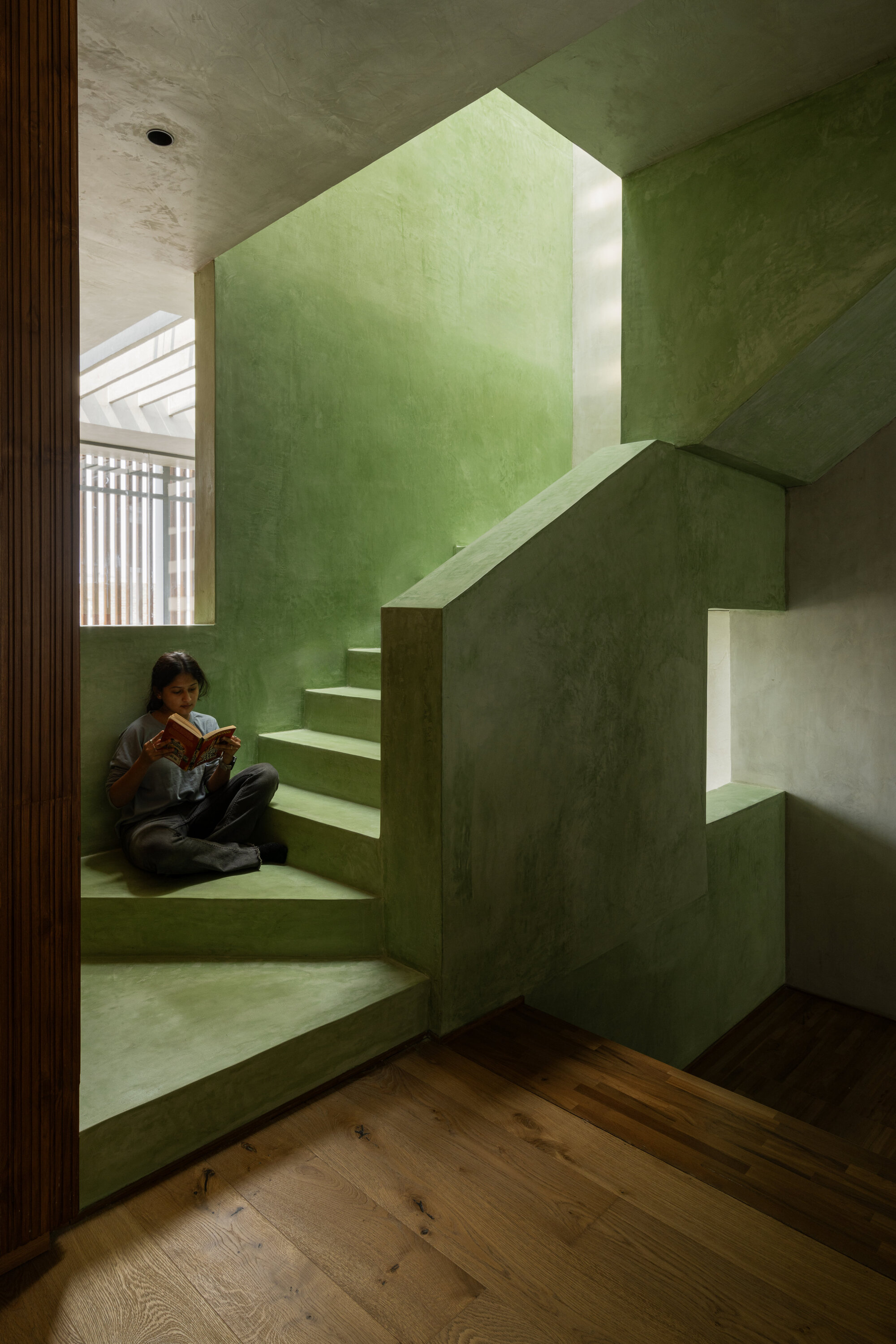
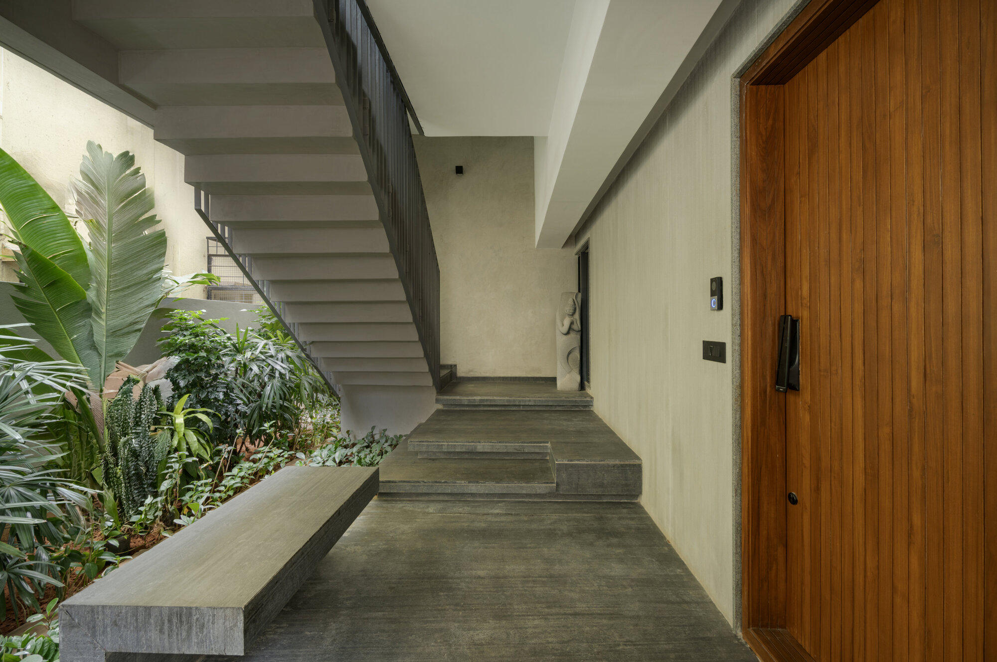
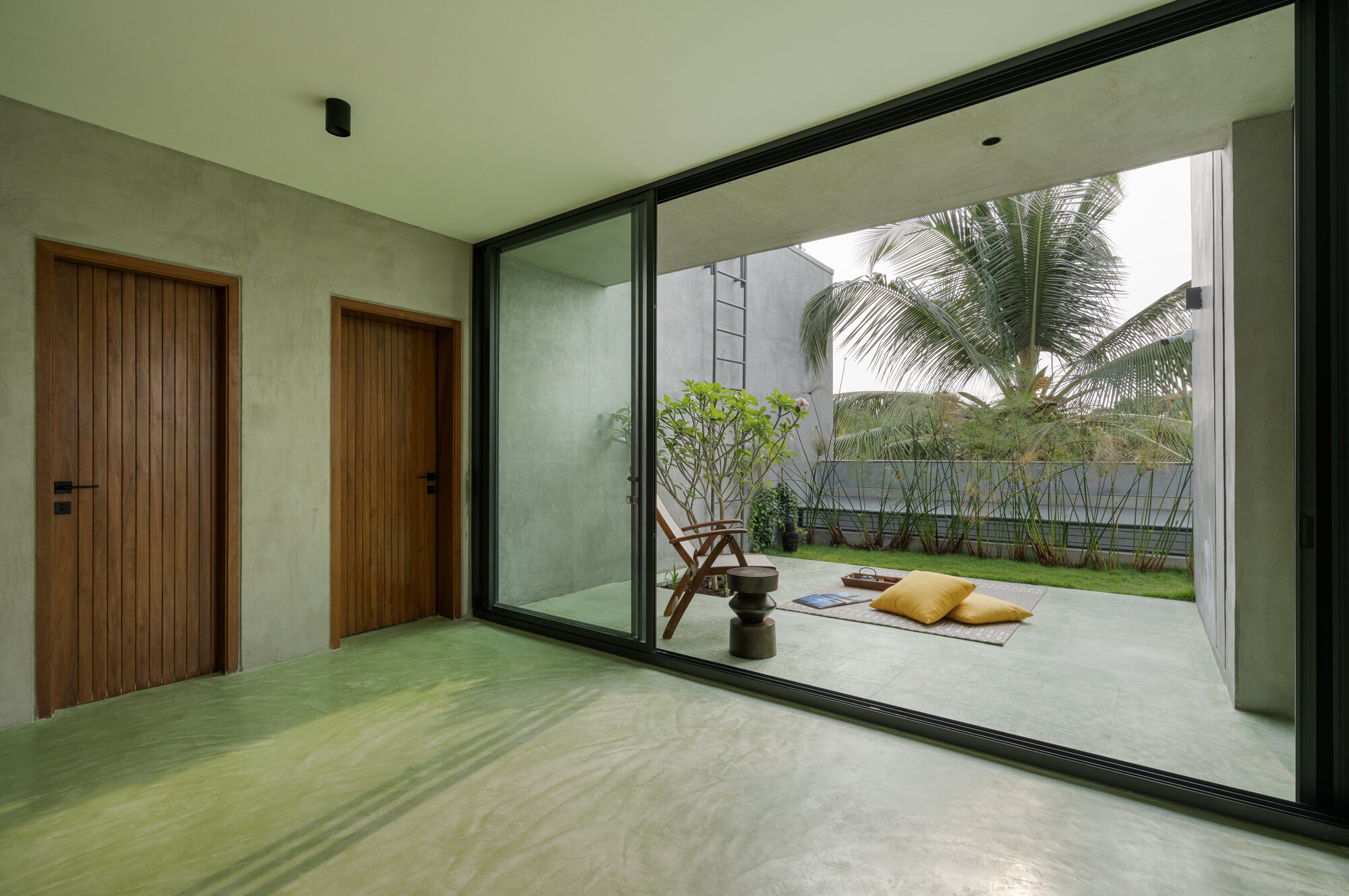
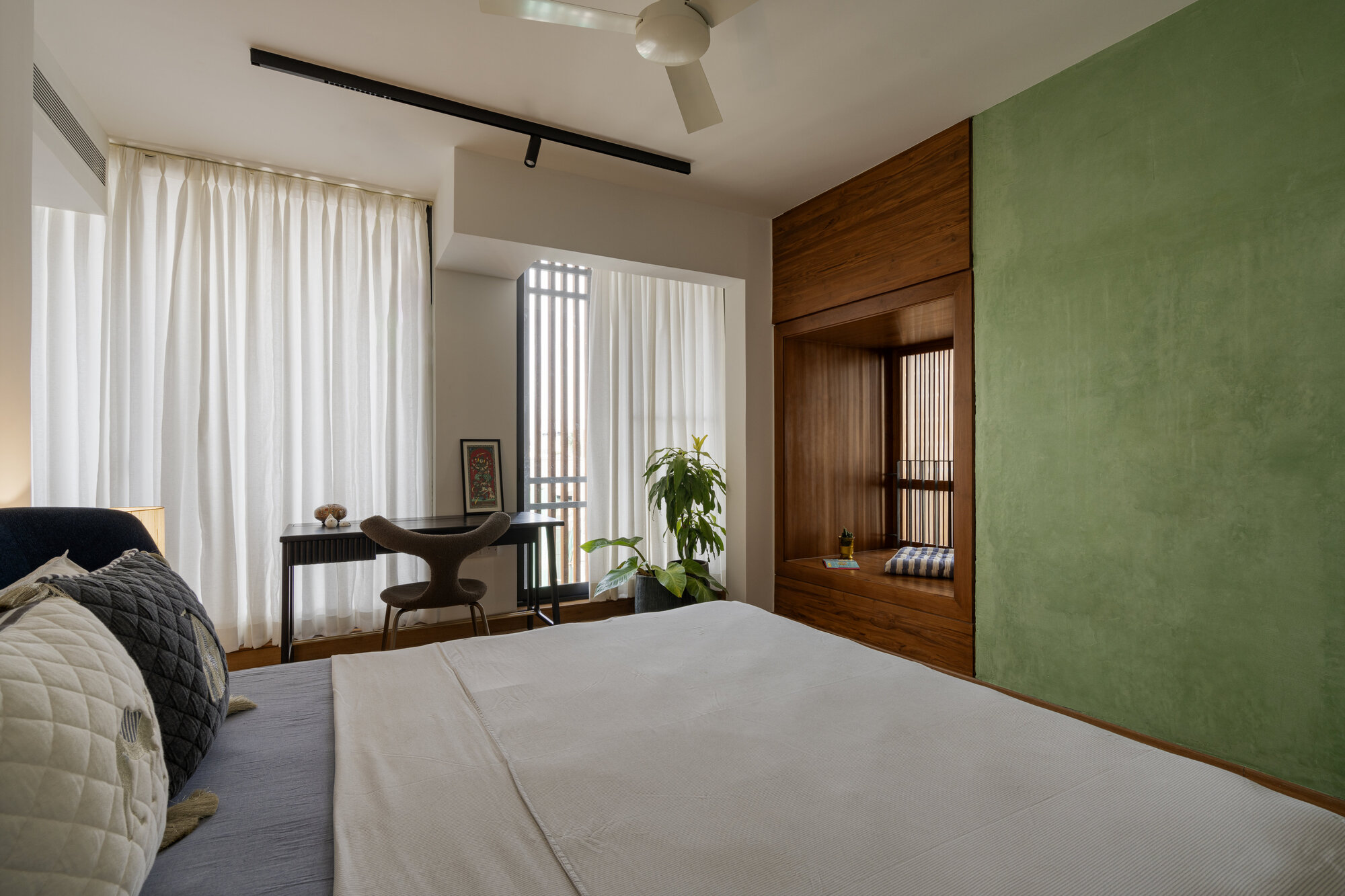
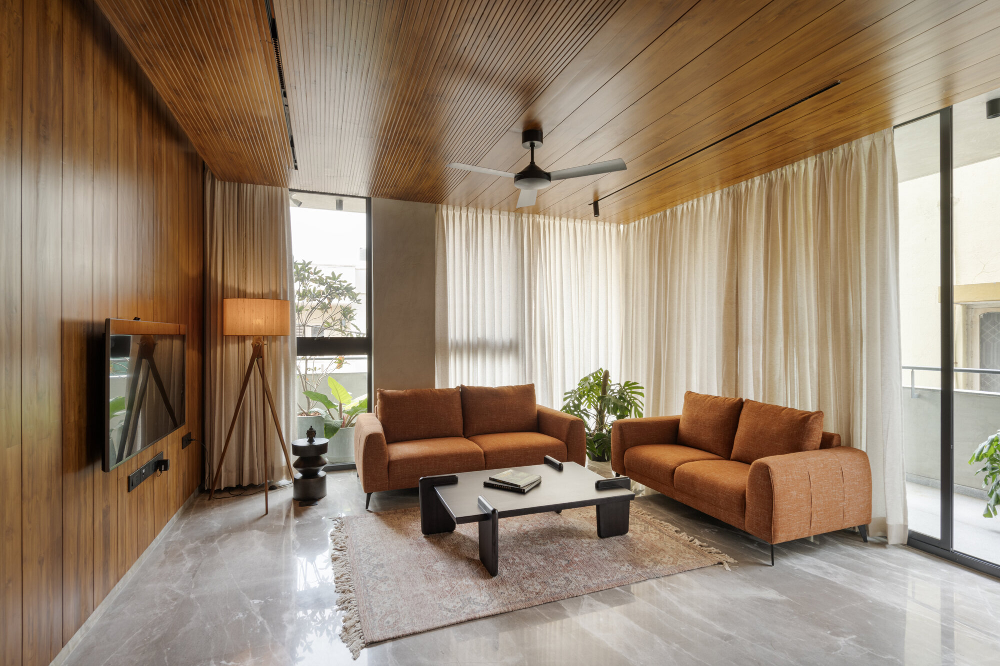
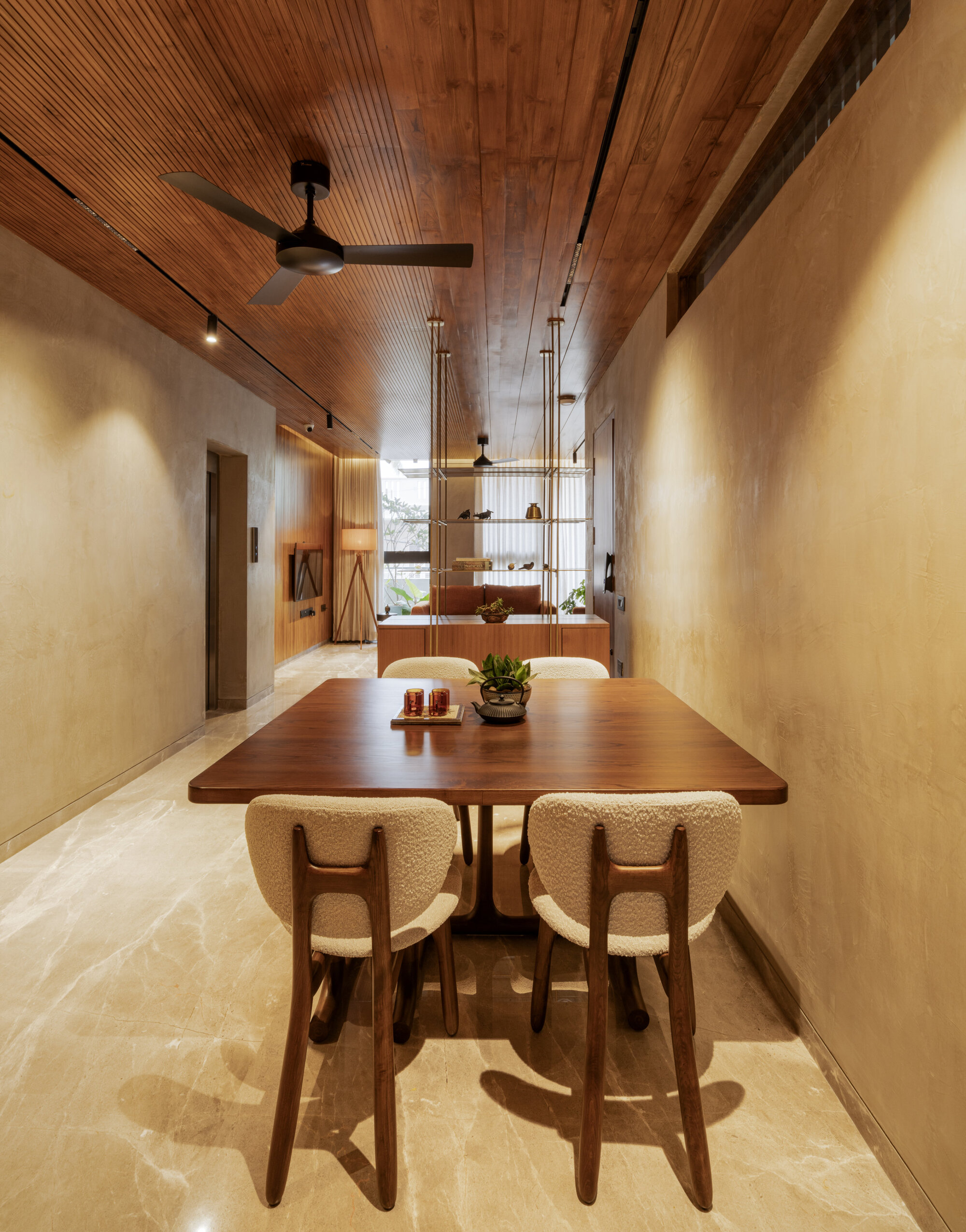
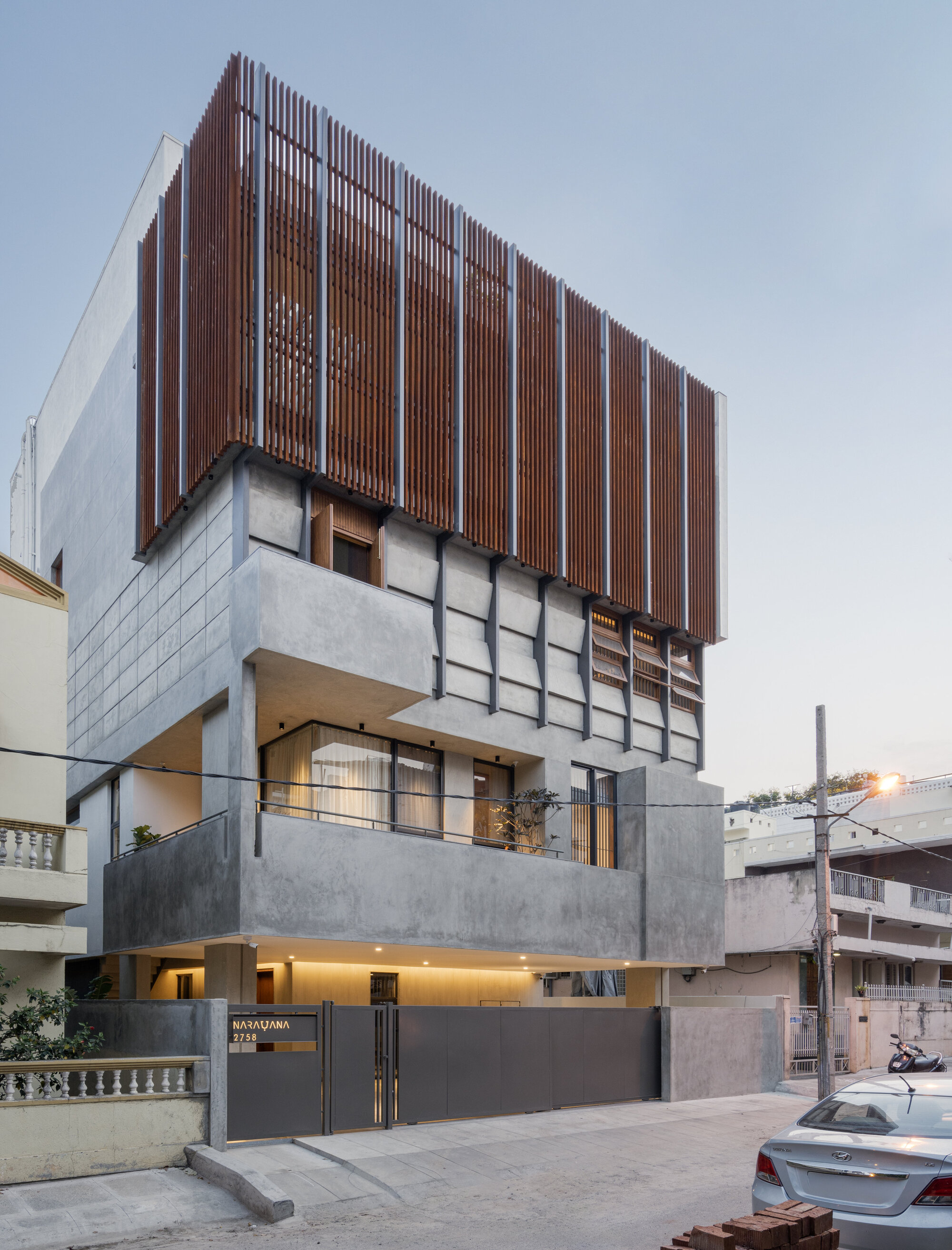
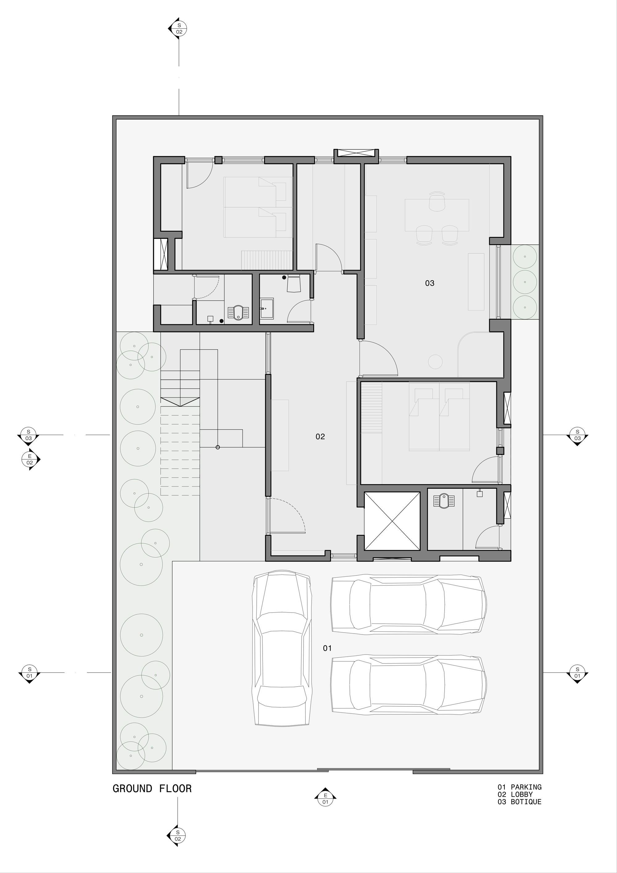
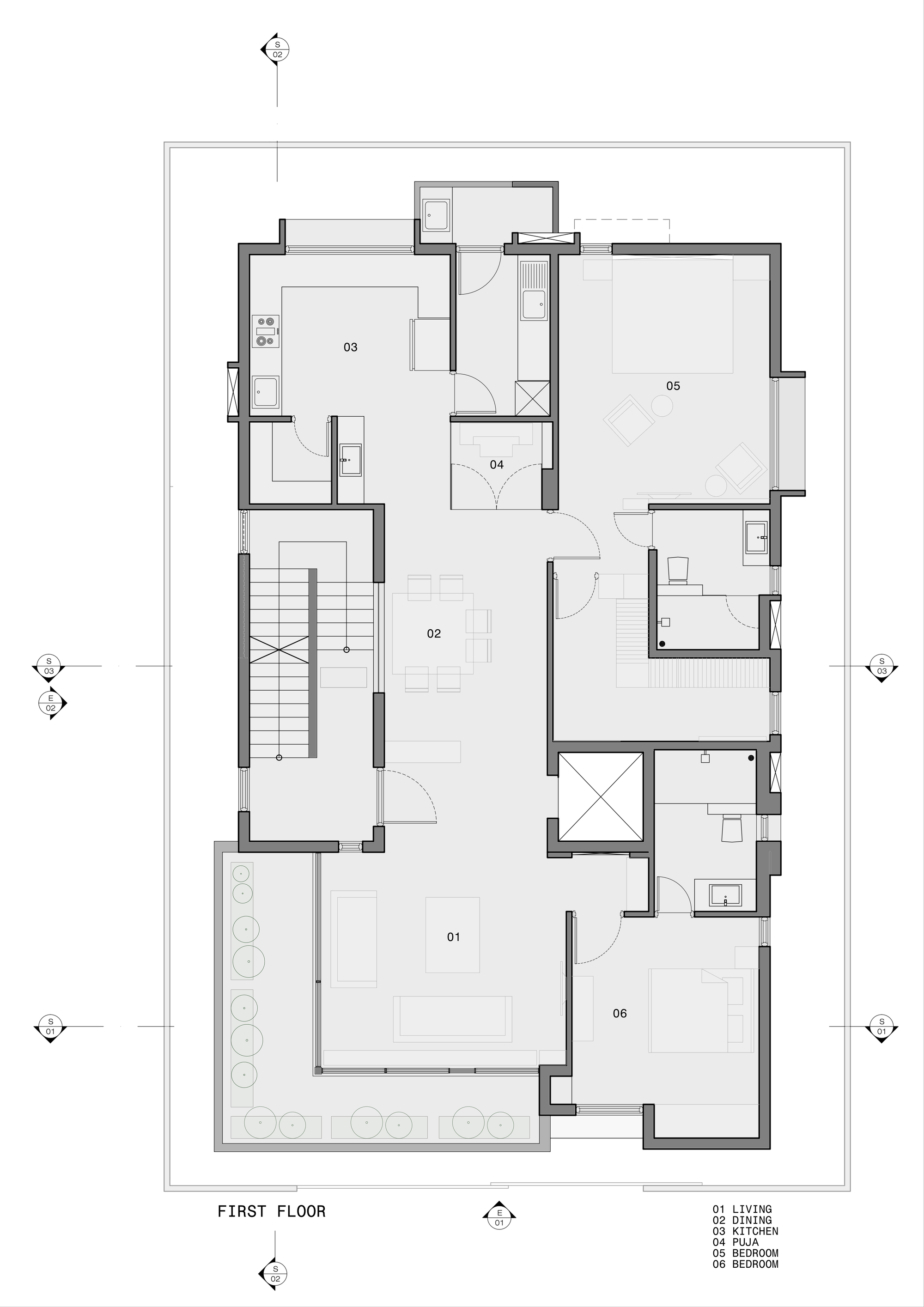
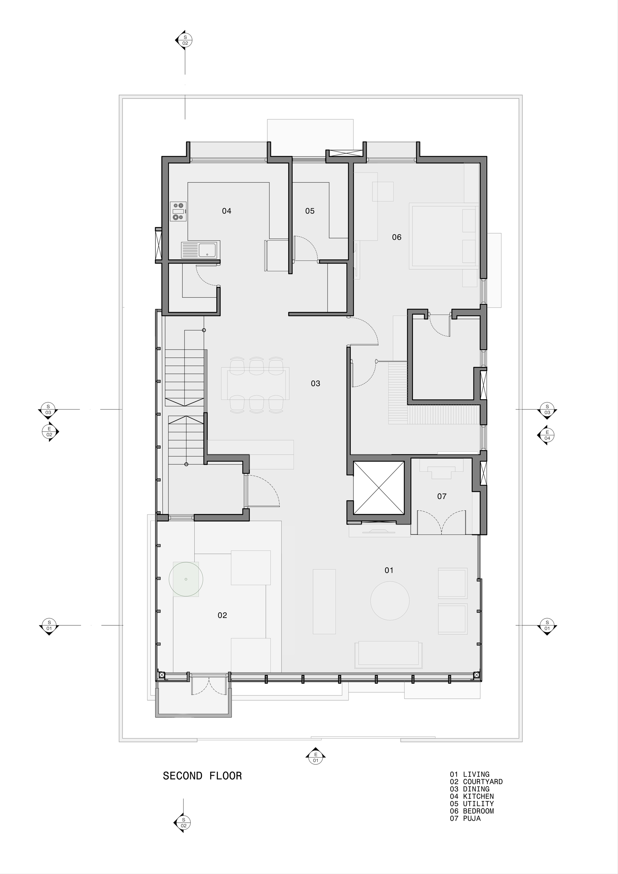
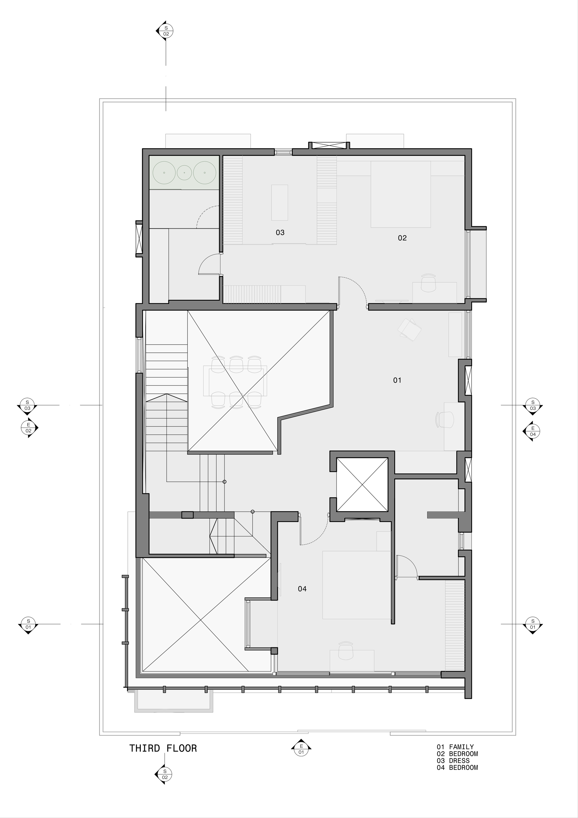
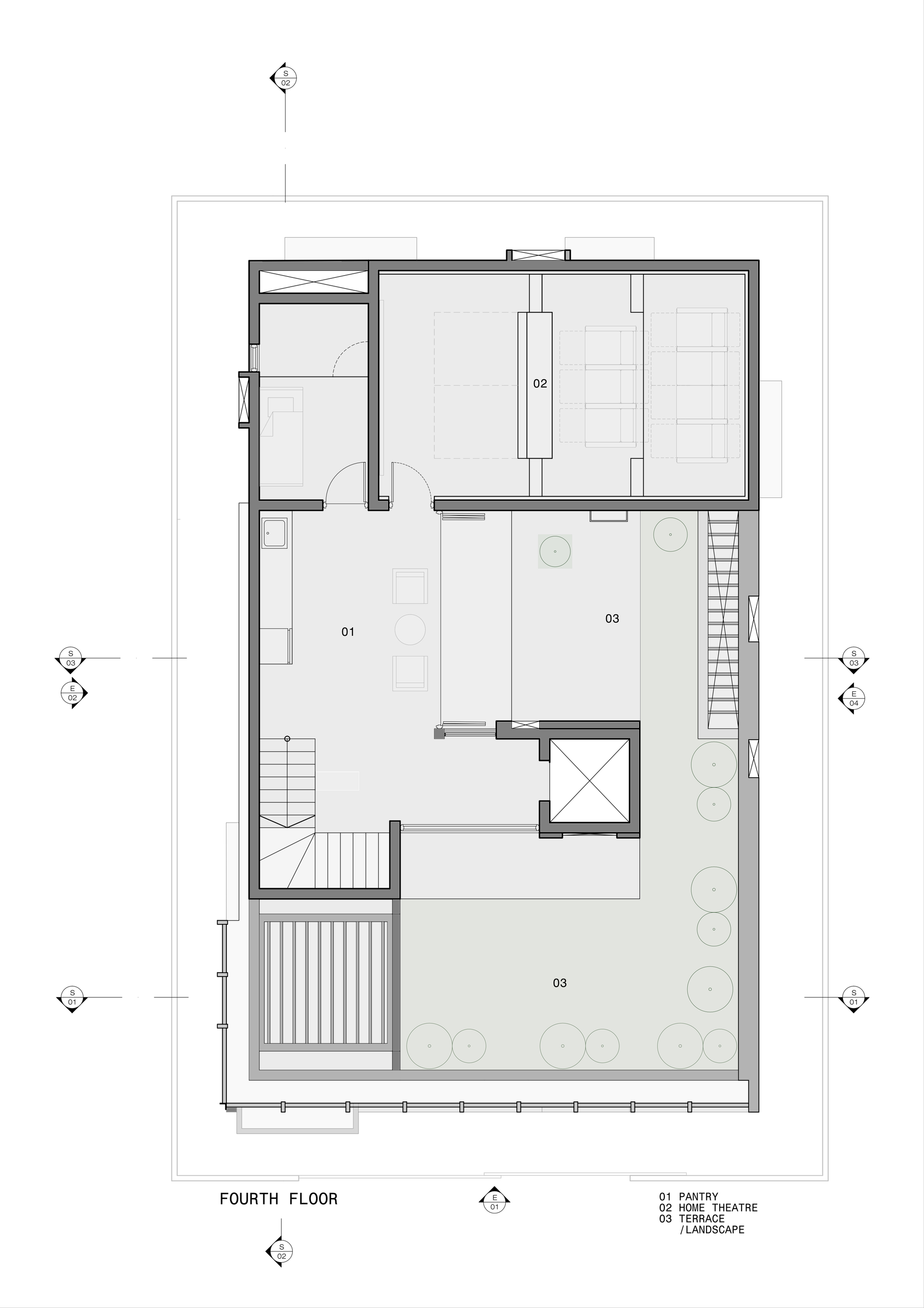
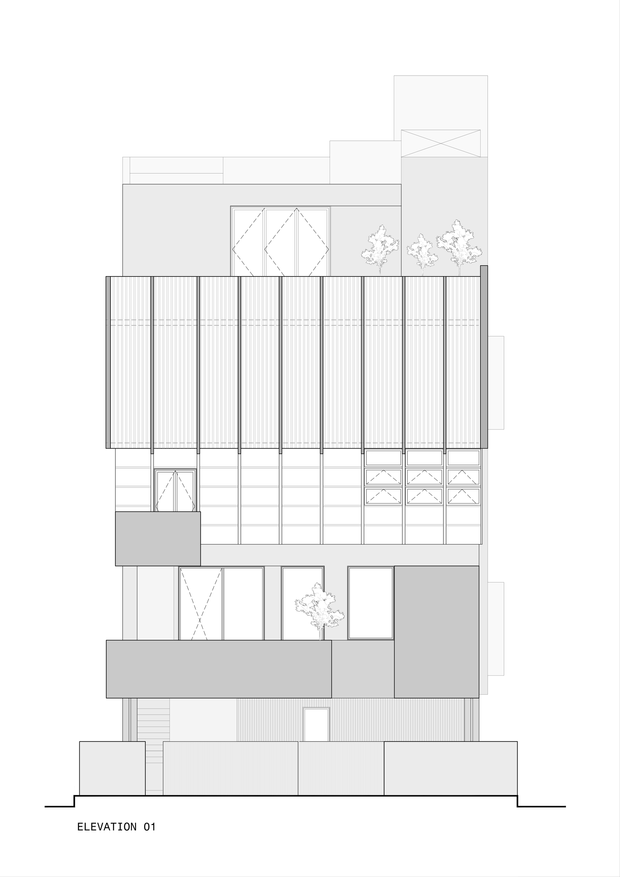
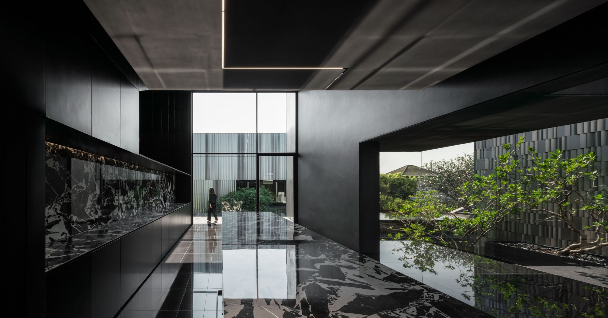
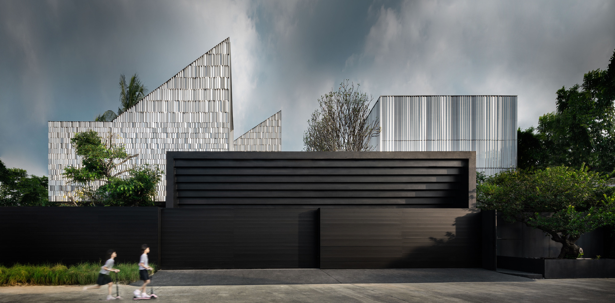
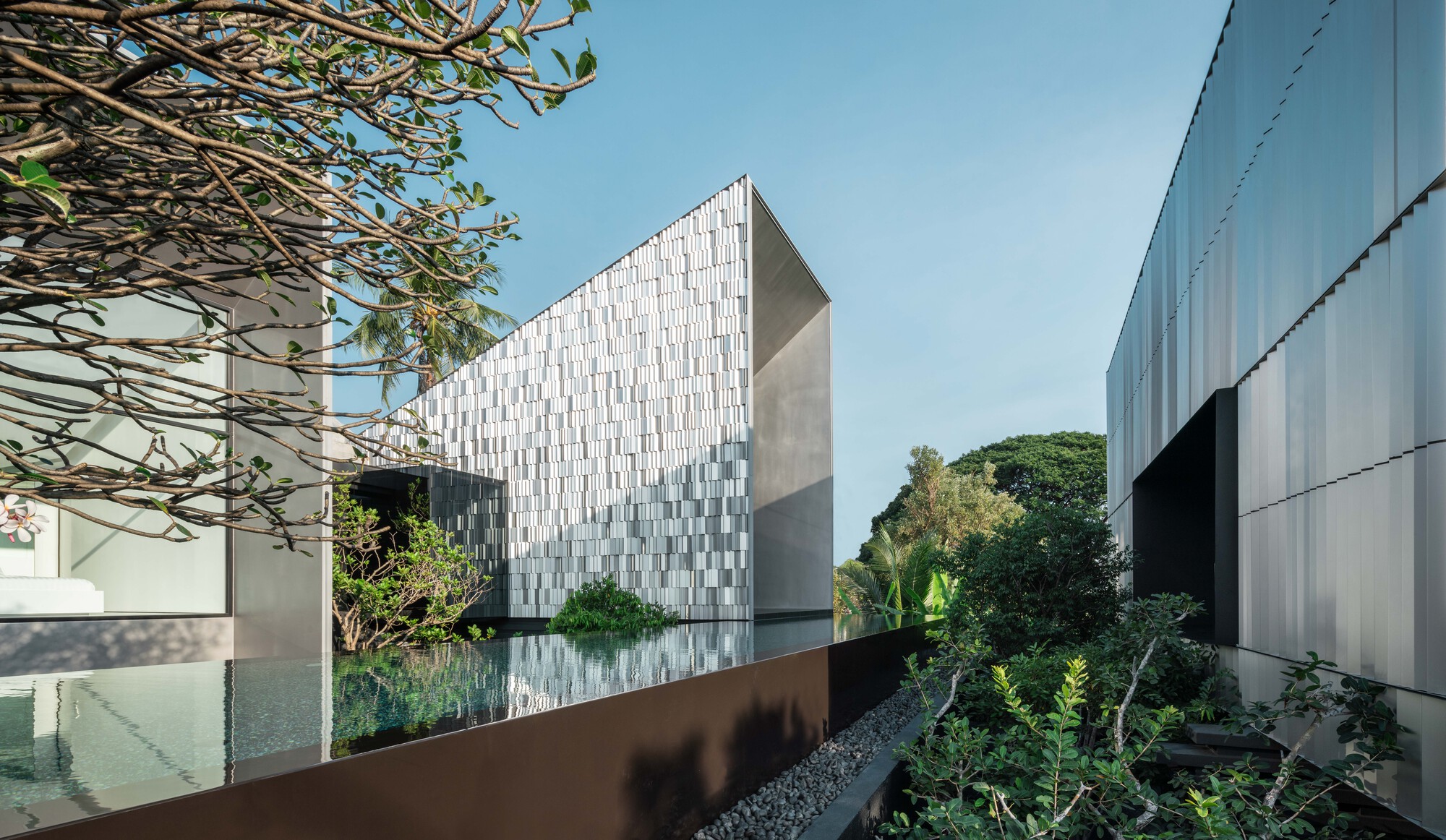
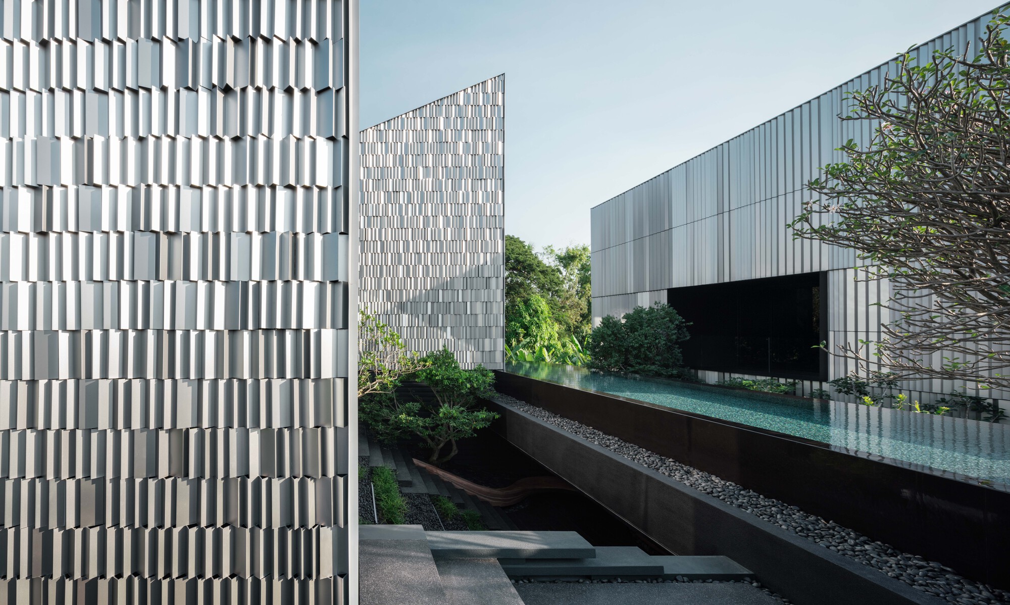
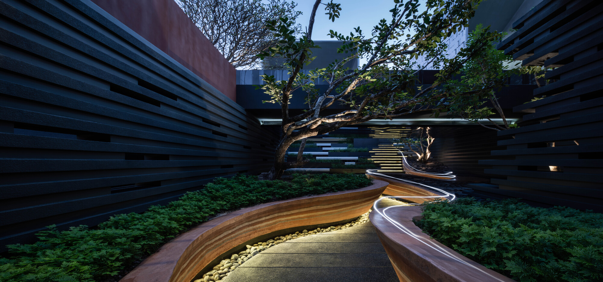
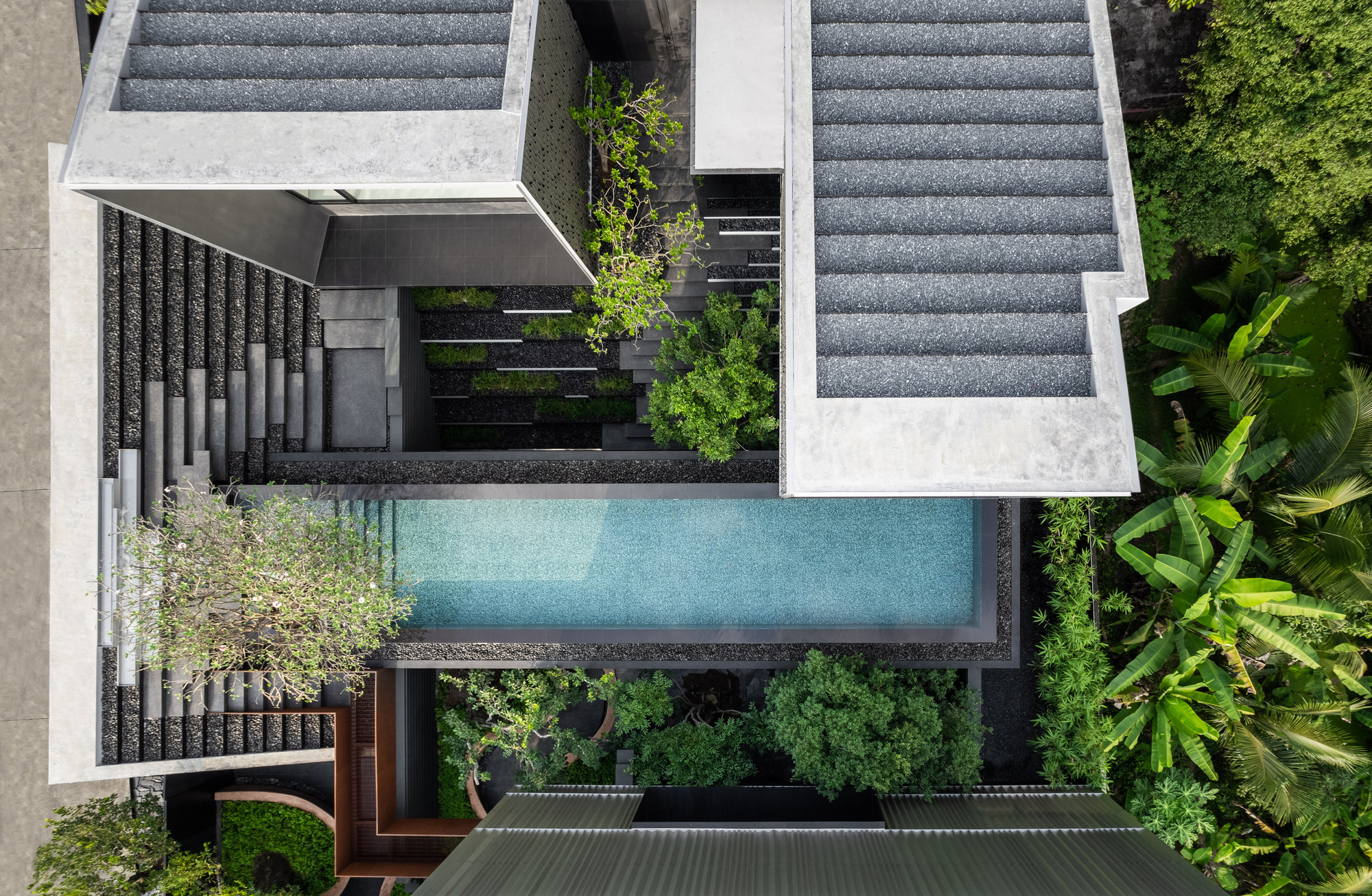
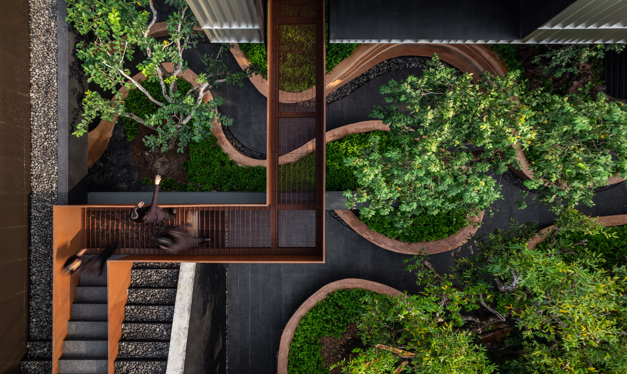
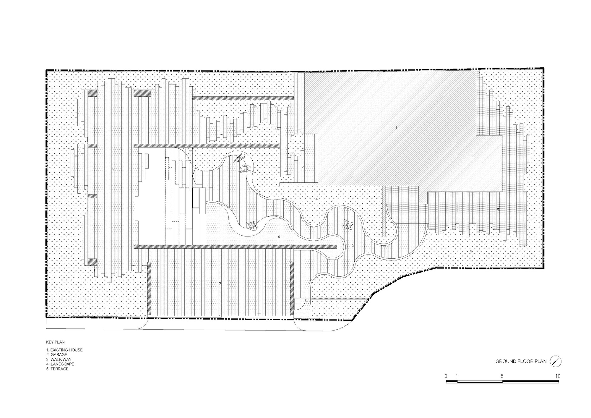
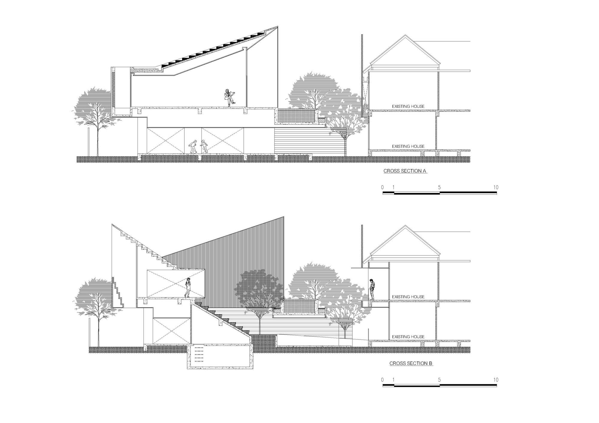
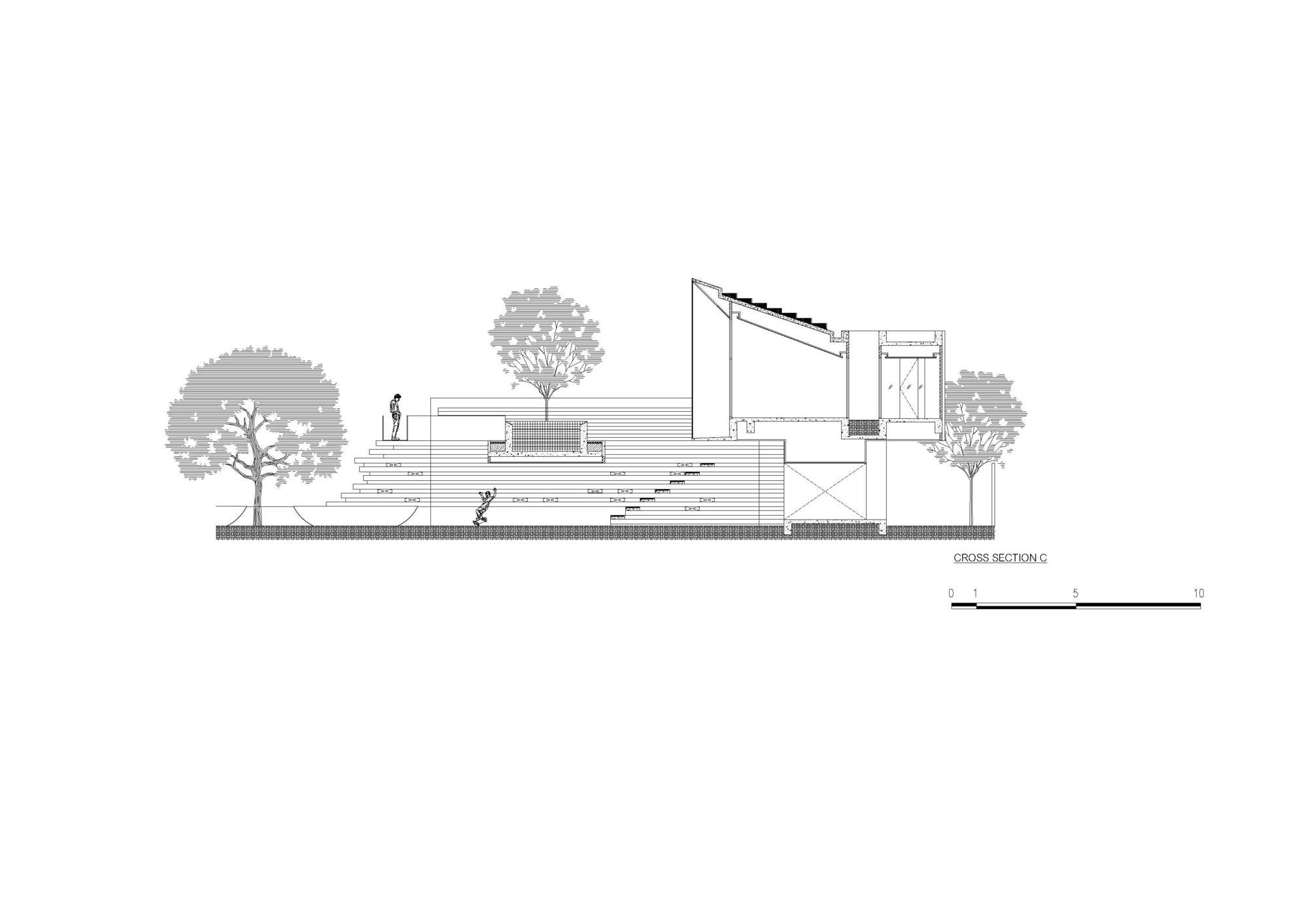
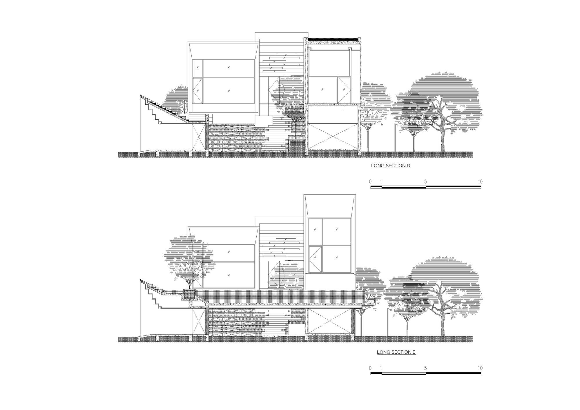
The Long House
#architecture
Architects: Crest Architects
Area: 4890 ft²
Year: 2024
Photographs: Shamanth J. Patil
Lead Architects: Vikas MV, Vishwas Venkat
City: Bengaluru
Country: India


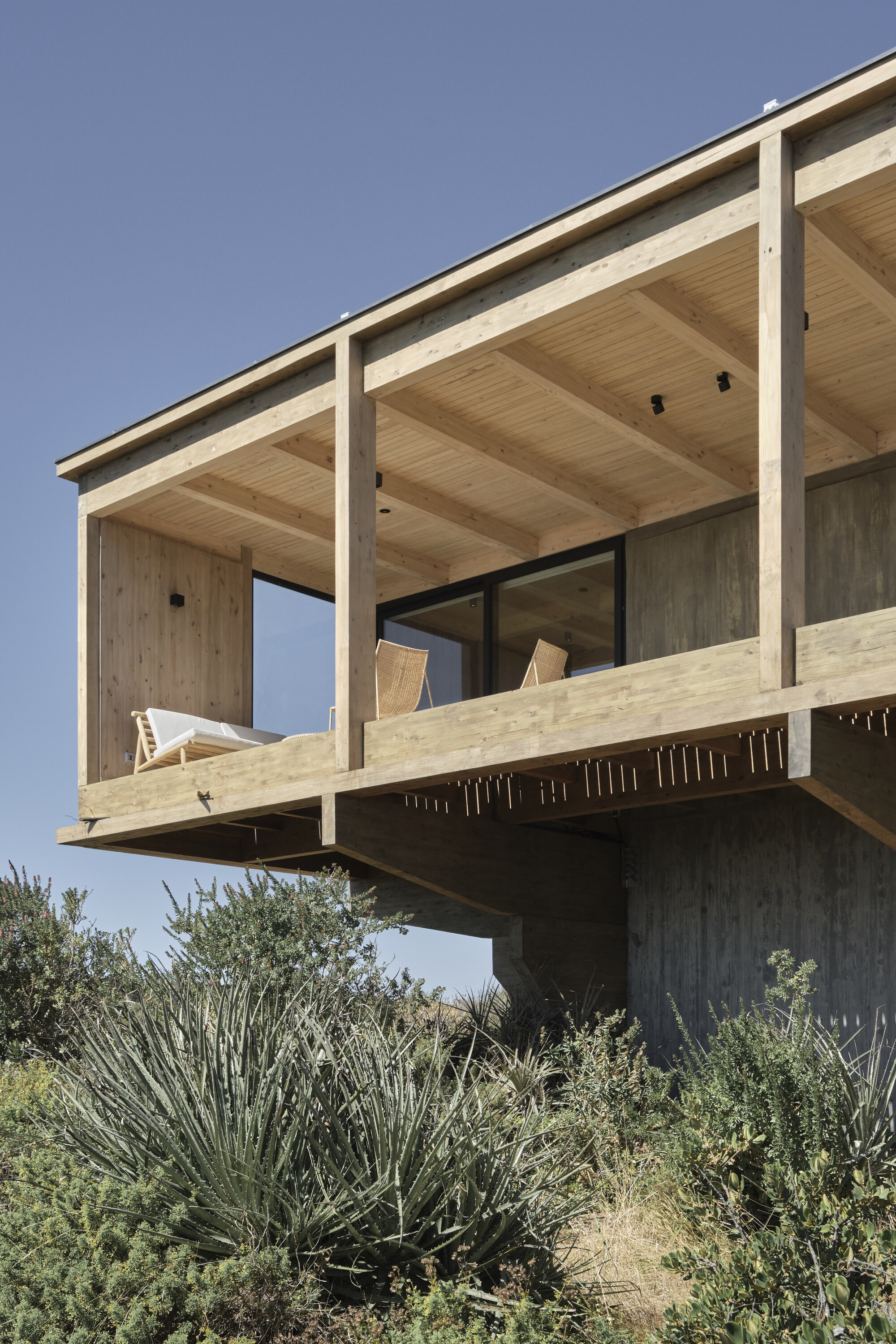
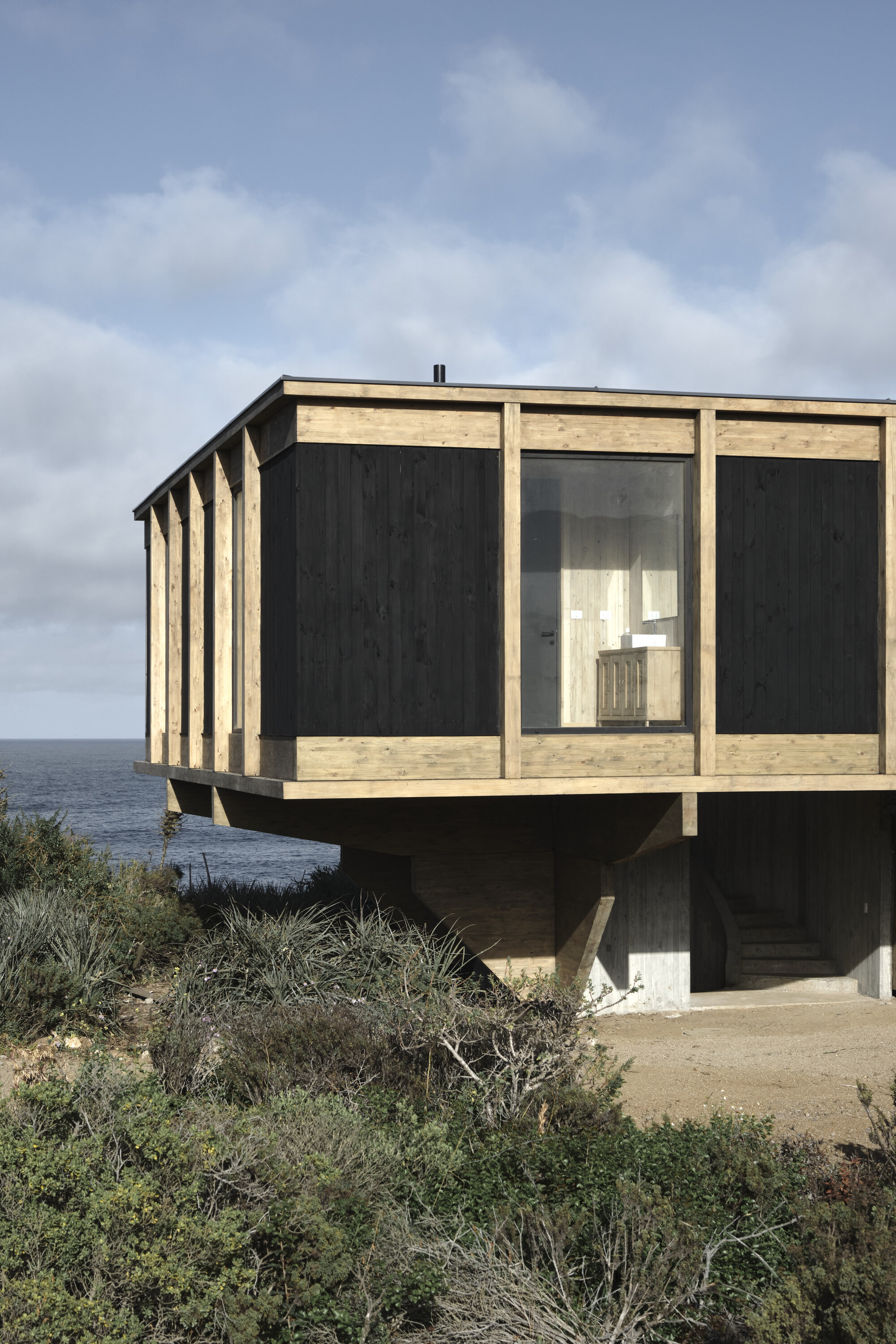
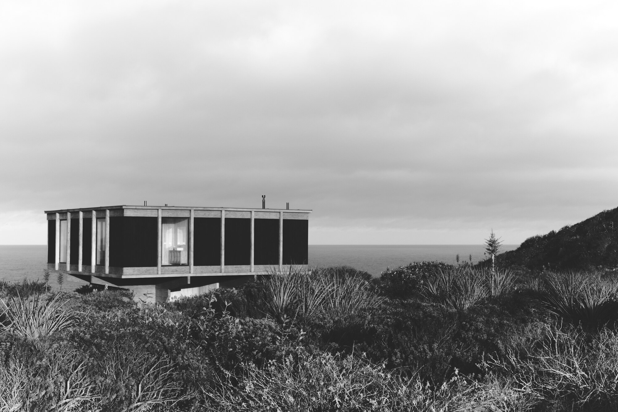
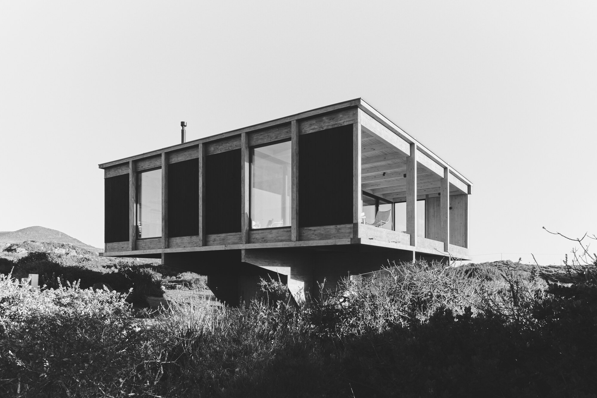
CR House
#architecture
Location: Los Vilos, Chile
Architects: Ignacio Ferreira, LOTE STUDIO
Area: 155 m² Year: 2025
Photographs: Antonia Mardones Nally
Architect: Juan Pablo Gutierrez
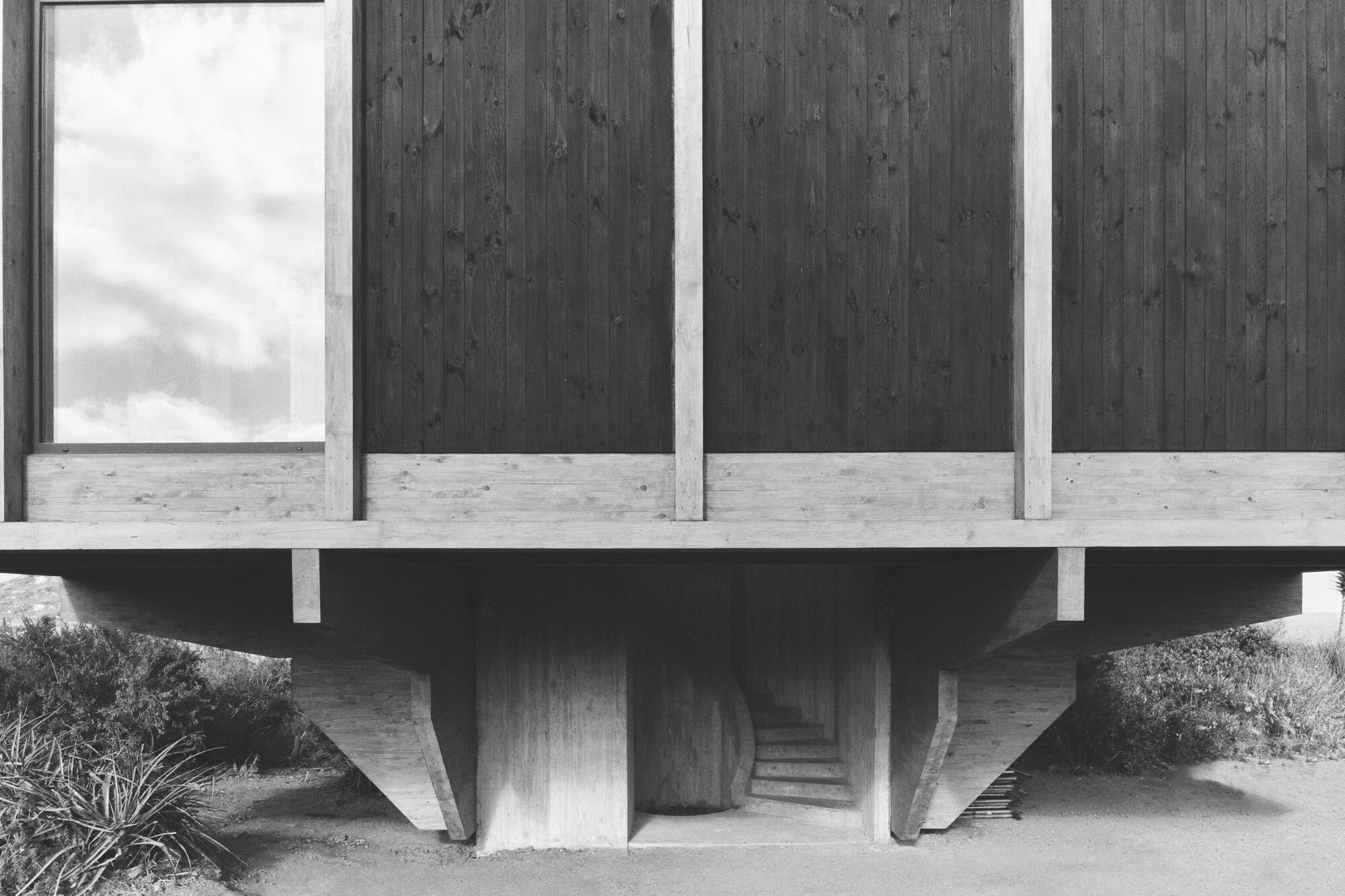
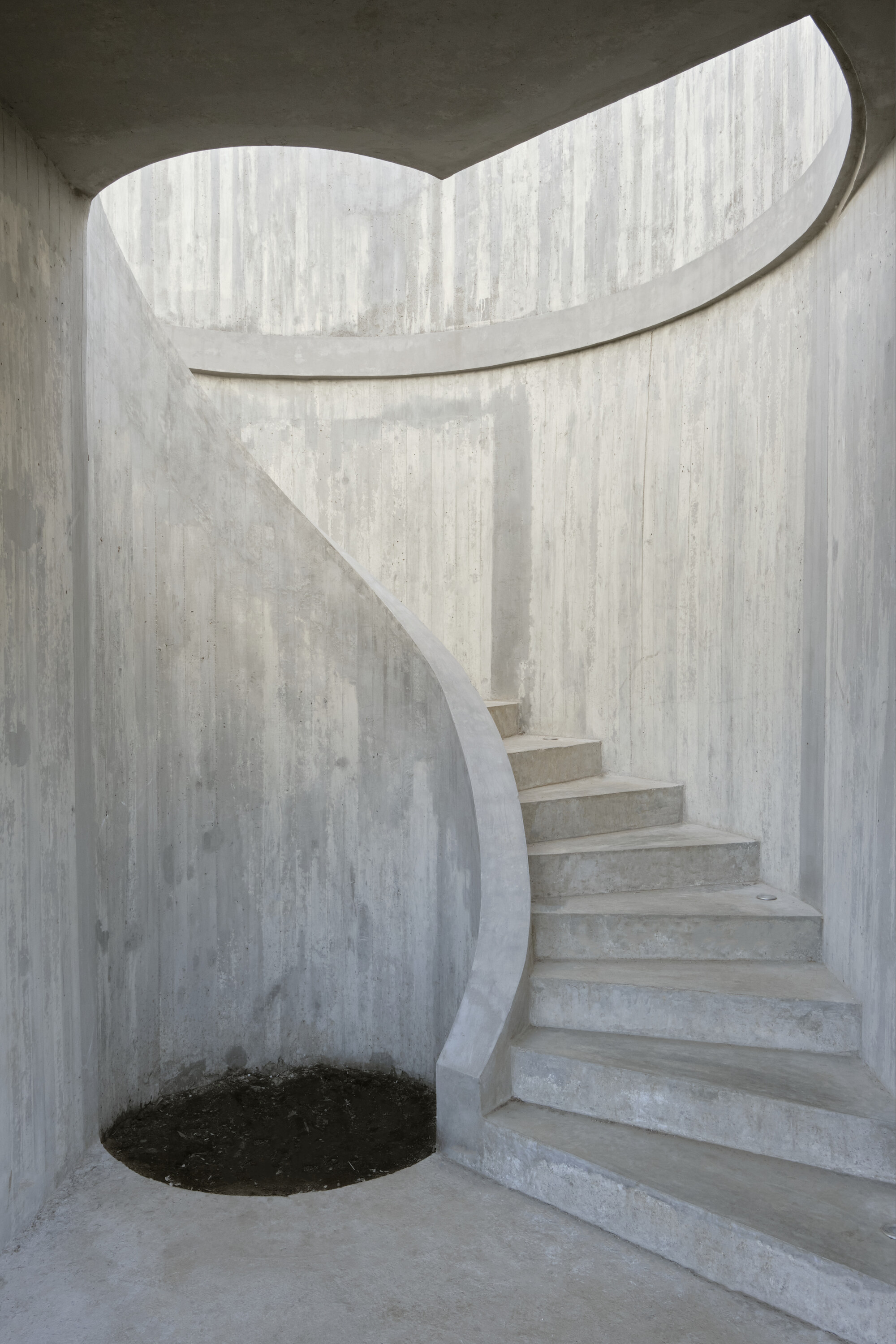
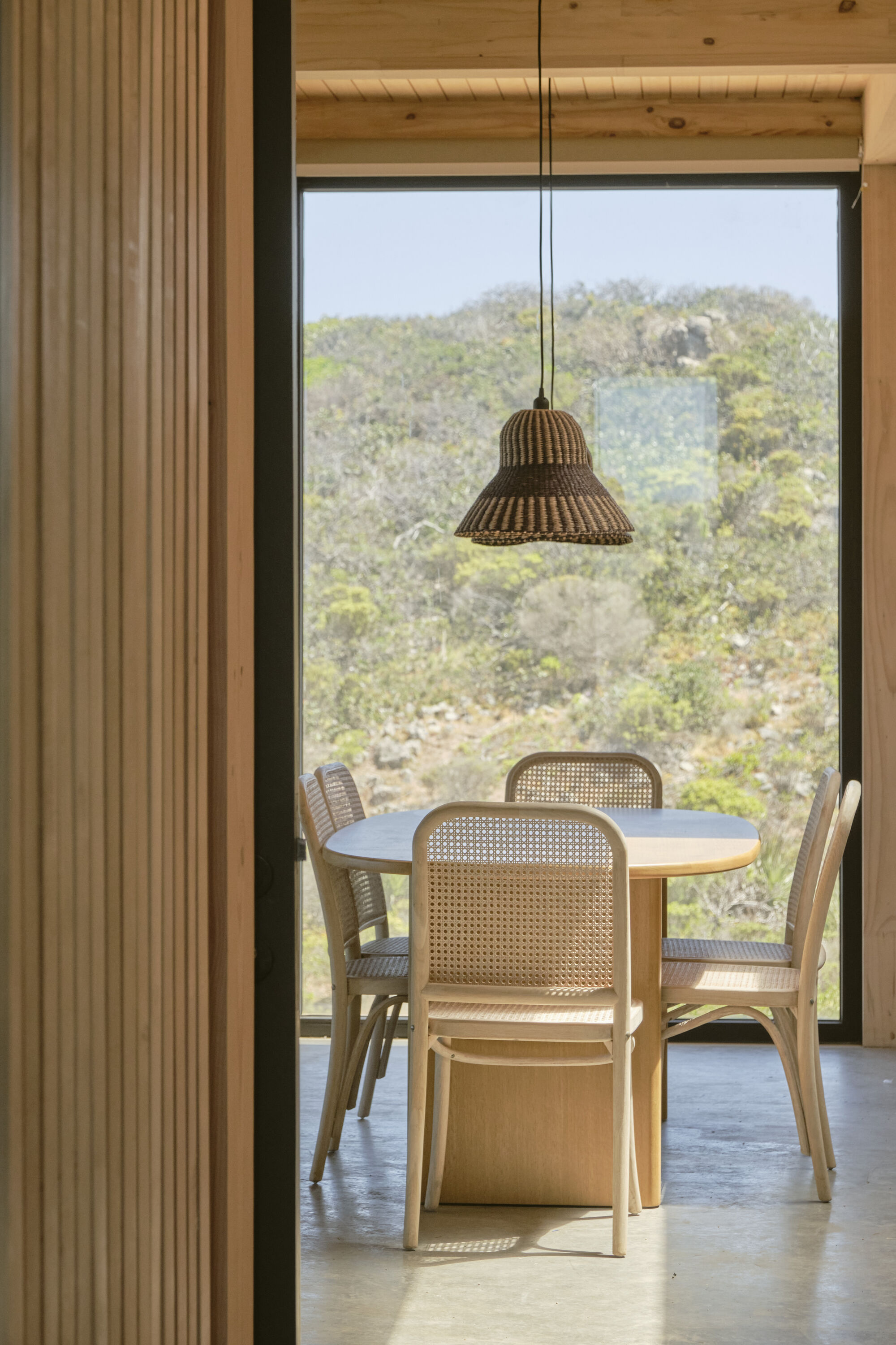
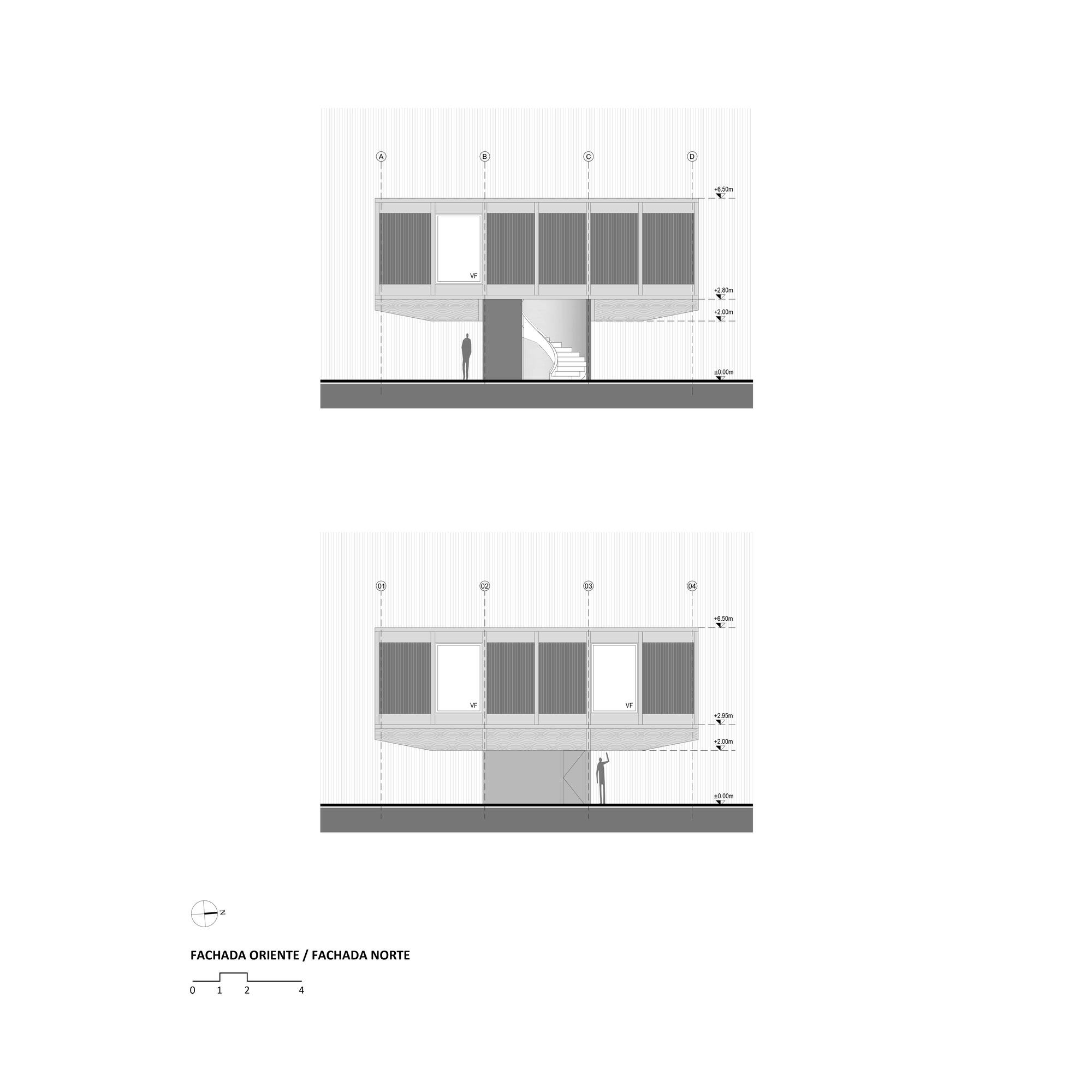
The work is located on the coastal edge of Punta Hueso, Coquimbo region, Chile. It is a site where the coast, rocky formations, and the characteristic medium/low-height vegetation of the northern region prevail. The project is designed based on a grid of nine quadrants composed of eight peripheral wooden quadrants and one central circular concrete quadrant, which rises to serve as the access to the house through what we call a sculptural element, a project in itself like the spiral staircase. The house is elevated to protect the local flora in preservation while enhancing the completely unobstructed 360-degree views of its surroundings.
The main structure of the house is composed of laminated wooden beams, which load onto the central reinforced concrete quadrant. On top of the main beams, smaller secondary beams are placed, and on these, purlins are arranged to form the elevated framework of the main floor.
Once we complete the journey through this sculptural element, we arrive at the main access, through which we enter a small distribution hall that, in one direction, is completely linked to the public space of the house composed of the living room, dining room, and kitchen; distributed across three of the eight wooden quadrants. In the other direction, the private area of the house is projected, consisting of a bedroom and en-suite bathroom, distributed across two quadrants.
The simplicity of the spatial experience was, from the beginning, a key requirement. Thus, it made sense to allow the evolution of this concept outward, through a balcony that offers, due to the orientation of the block, a privileged view of the Pacific Ocean. Additionally, the balcony arranged in the remaining three quadrants allows for the enjoyment of the gradual sunset over the ocean.


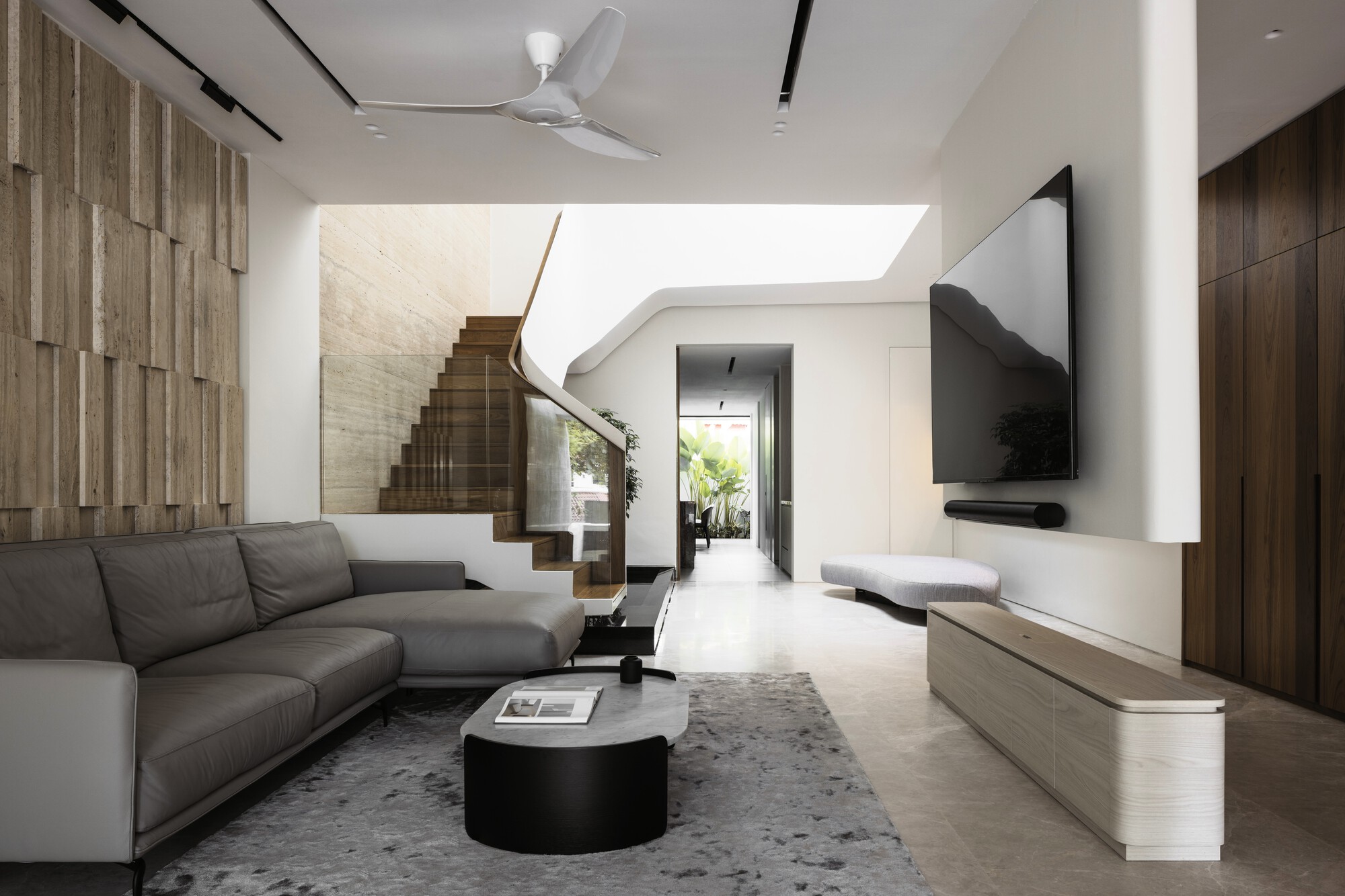
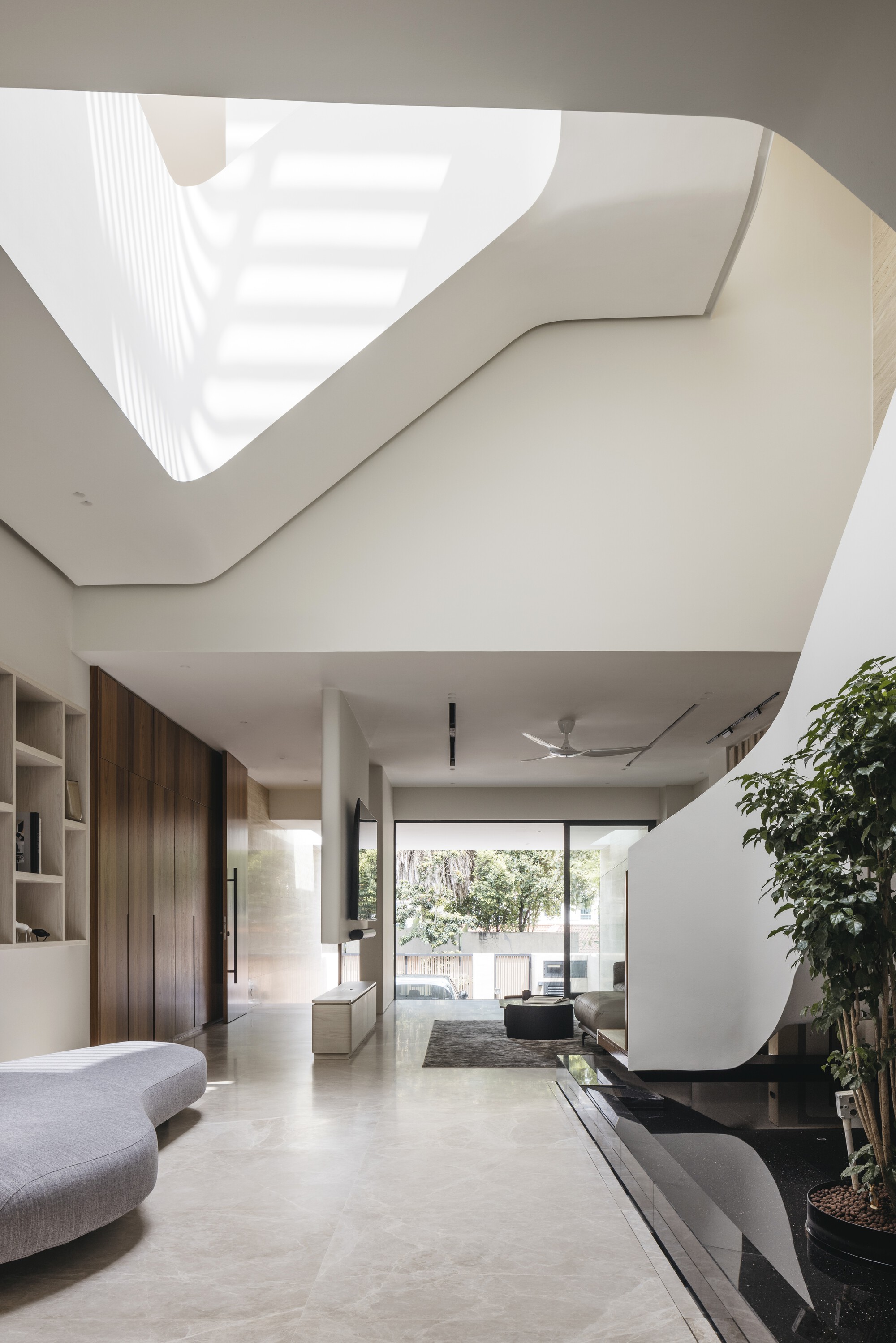
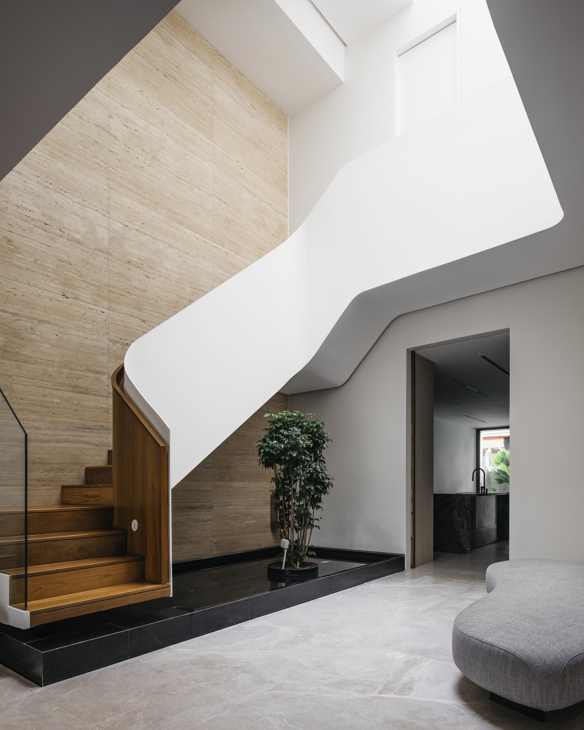
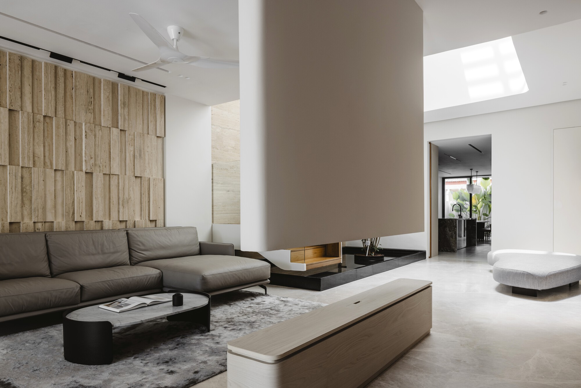
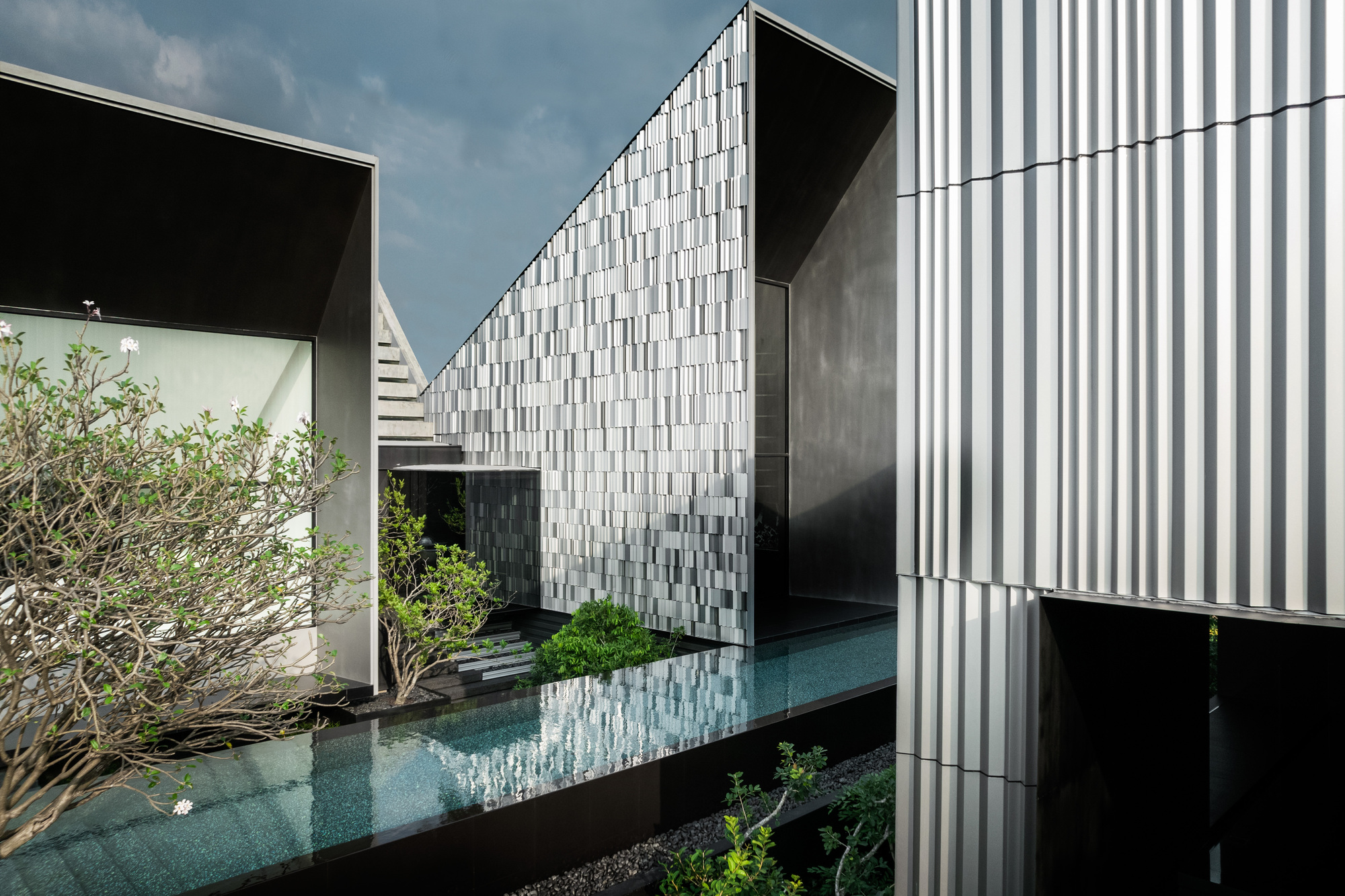
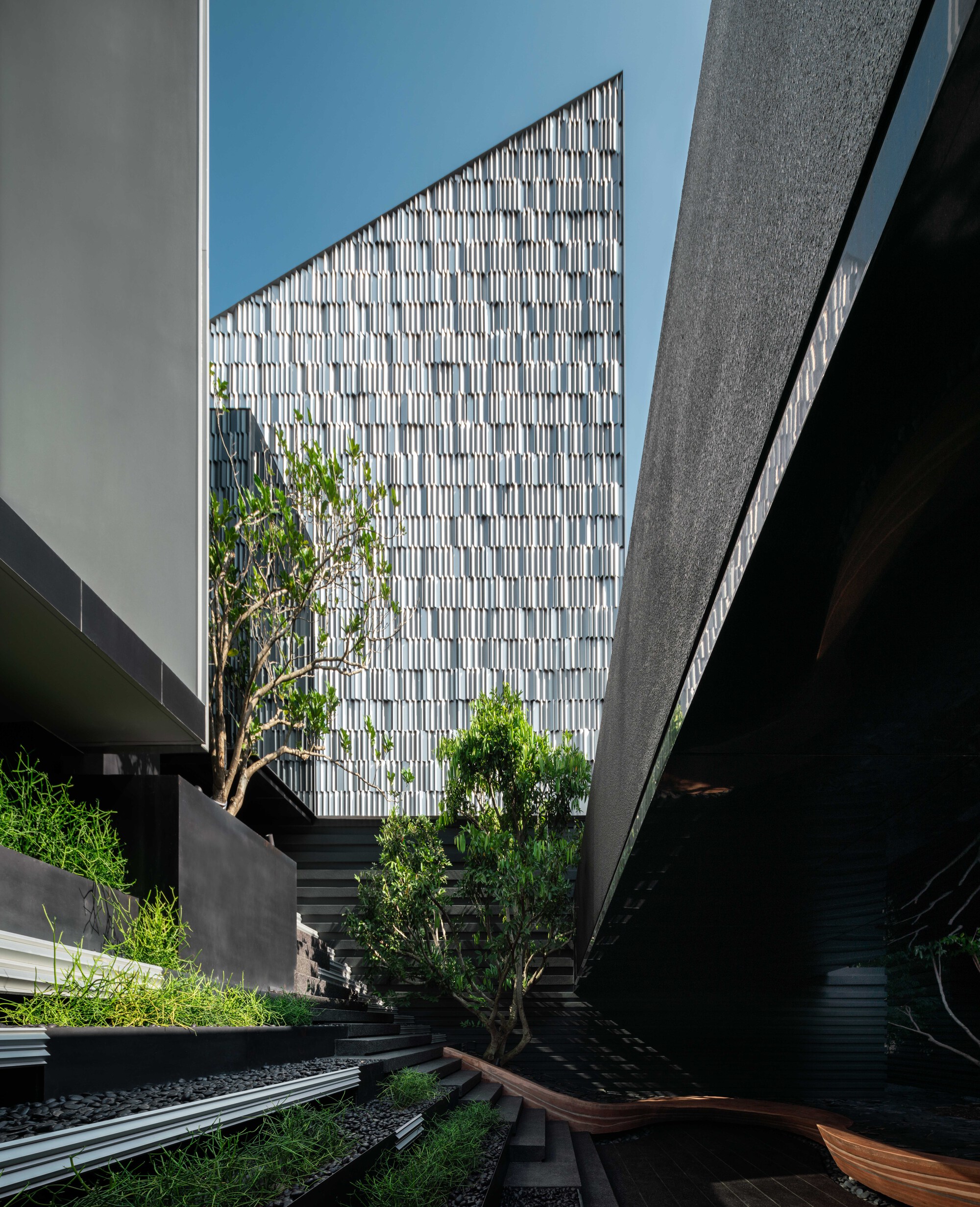
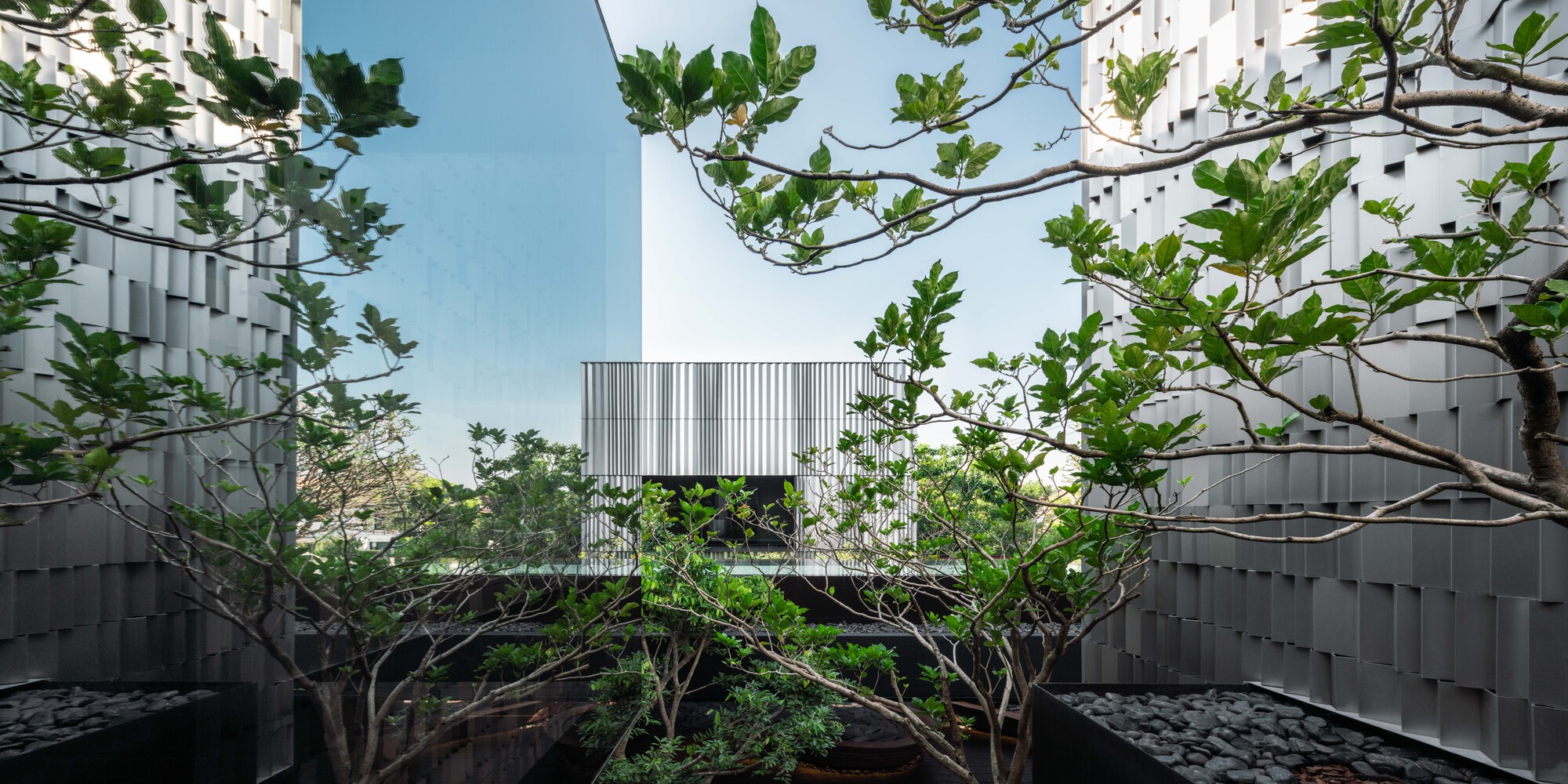
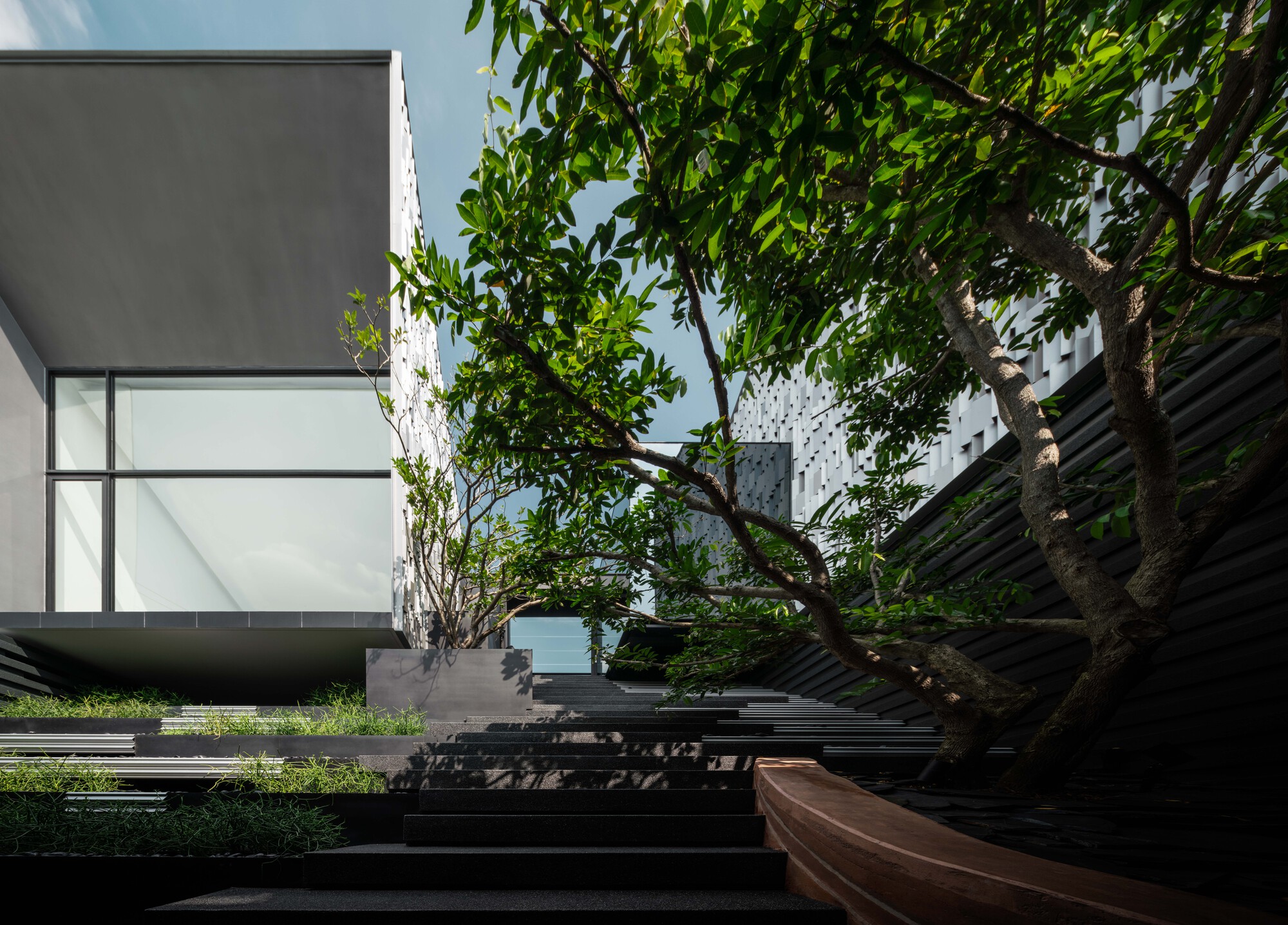
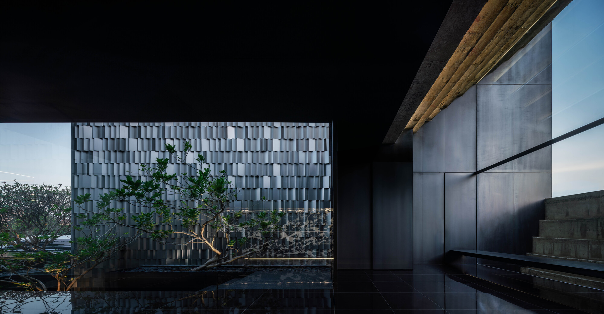
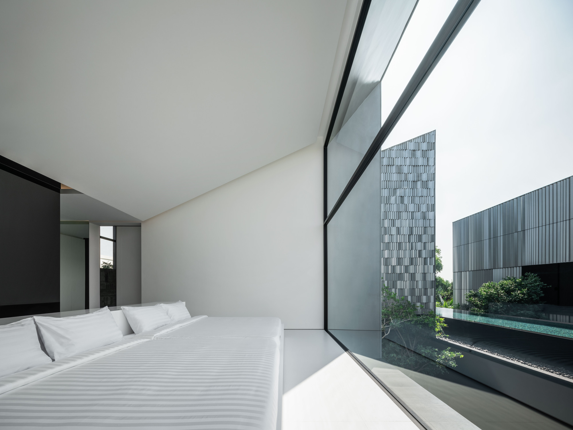
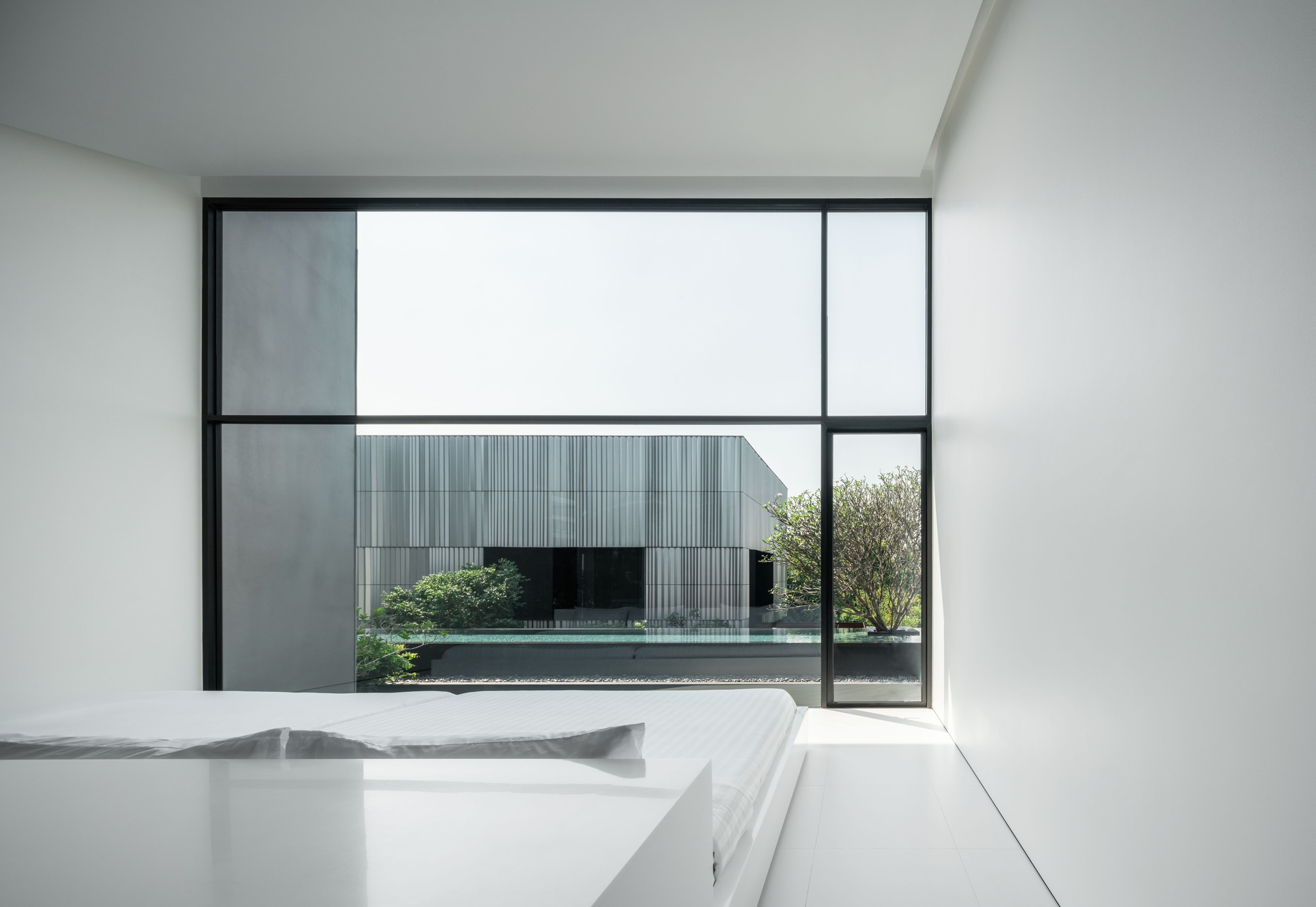
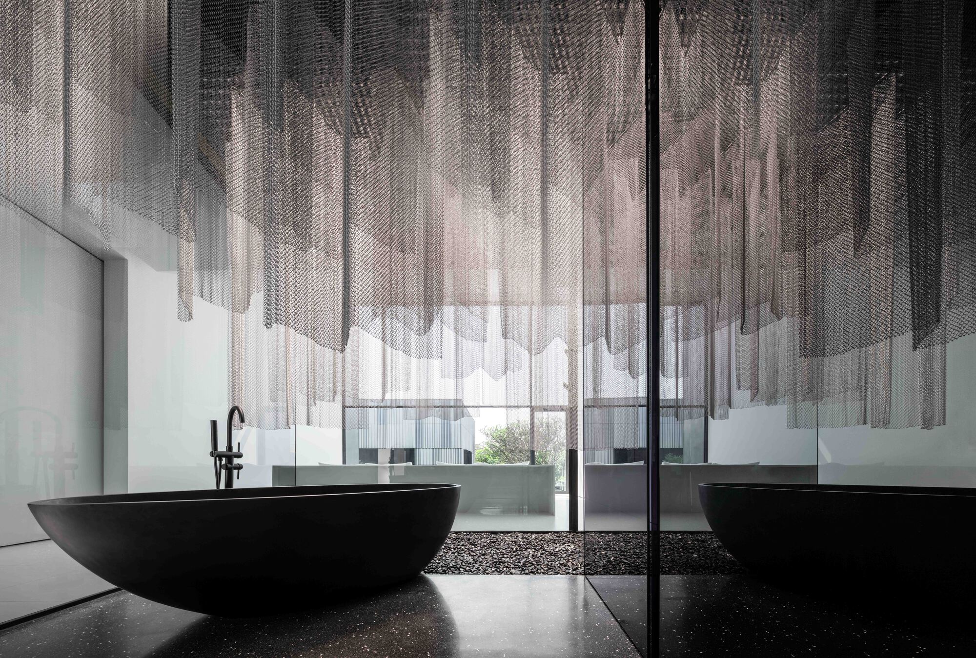
House of Dancing Light
#architecture
Location: Singapore
Architects: Freight Architects
Area: 332 m sq.
Year: 2023
Photographs: Studio Periphery
Lead Architects: Kee Jing Zhi
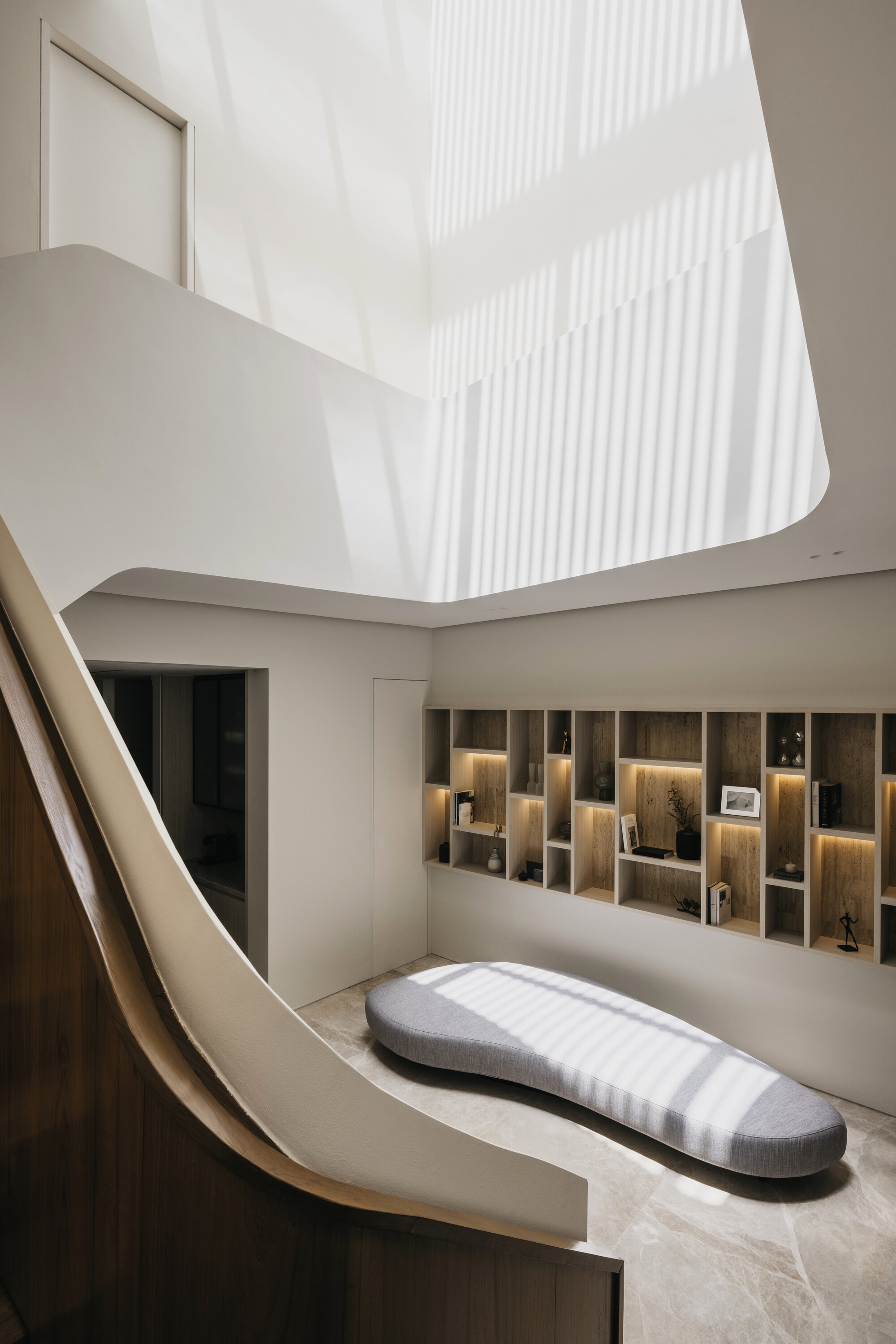
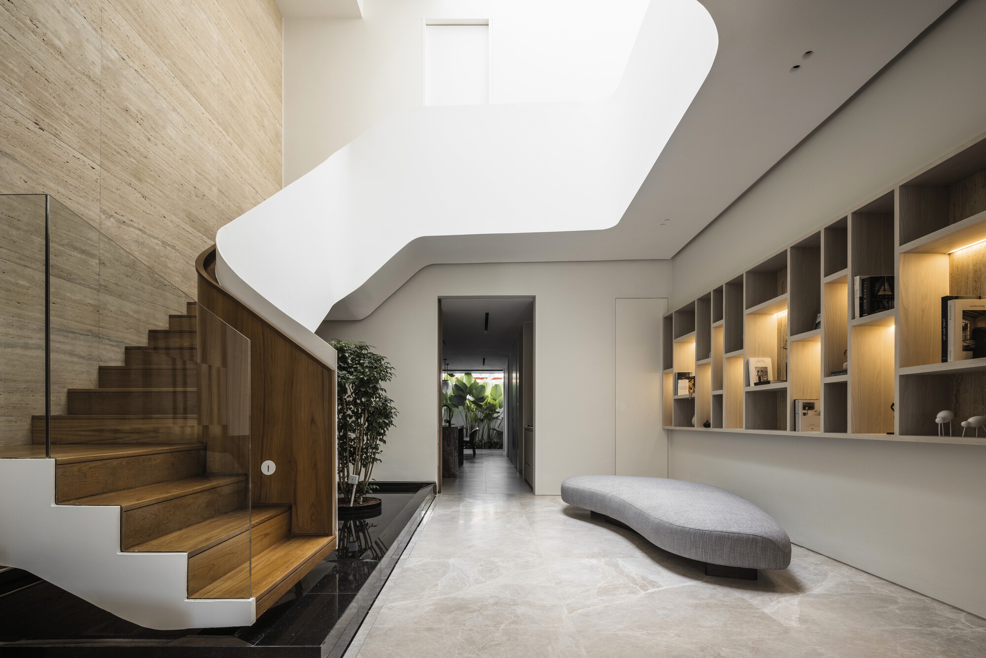
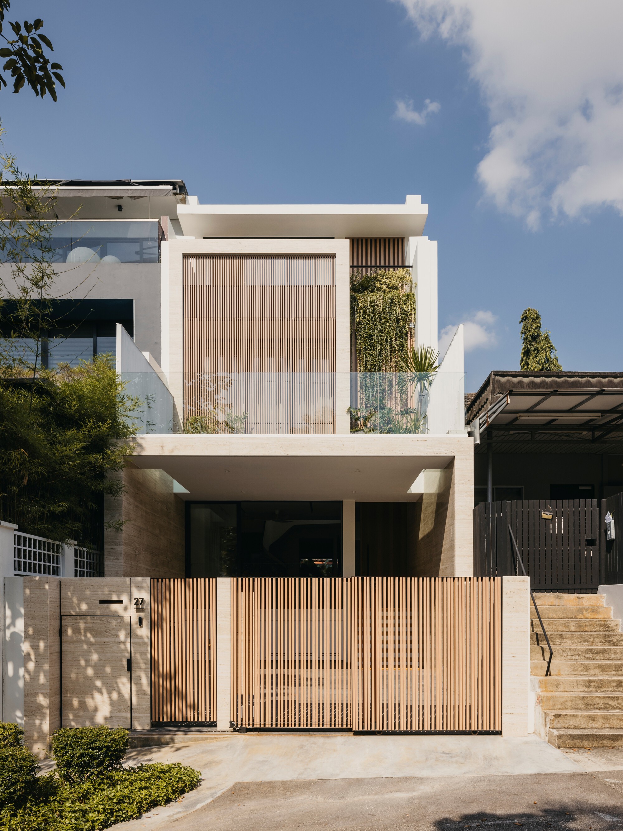
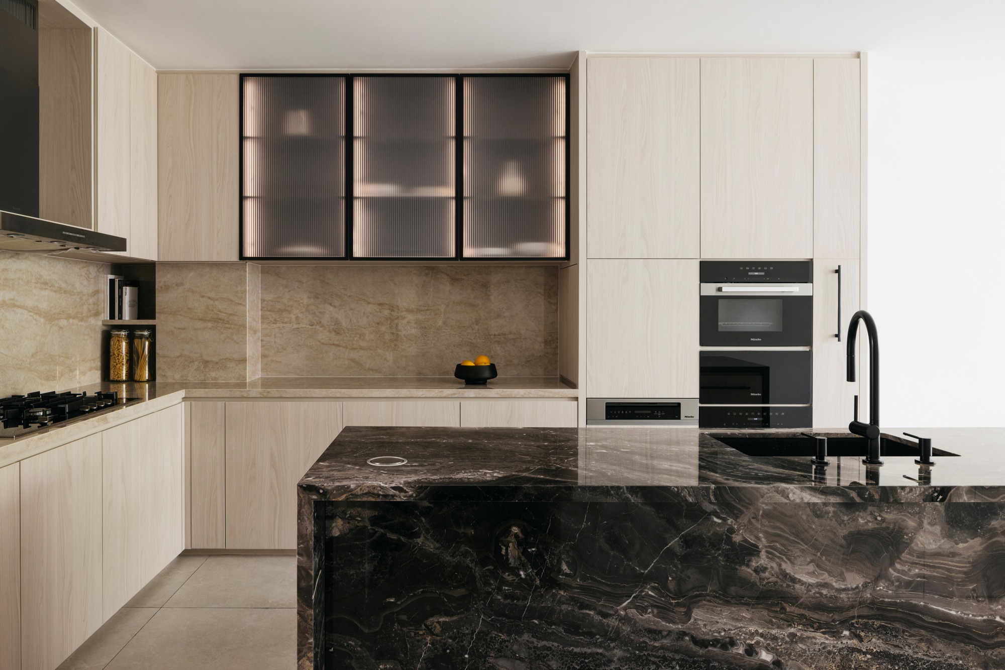
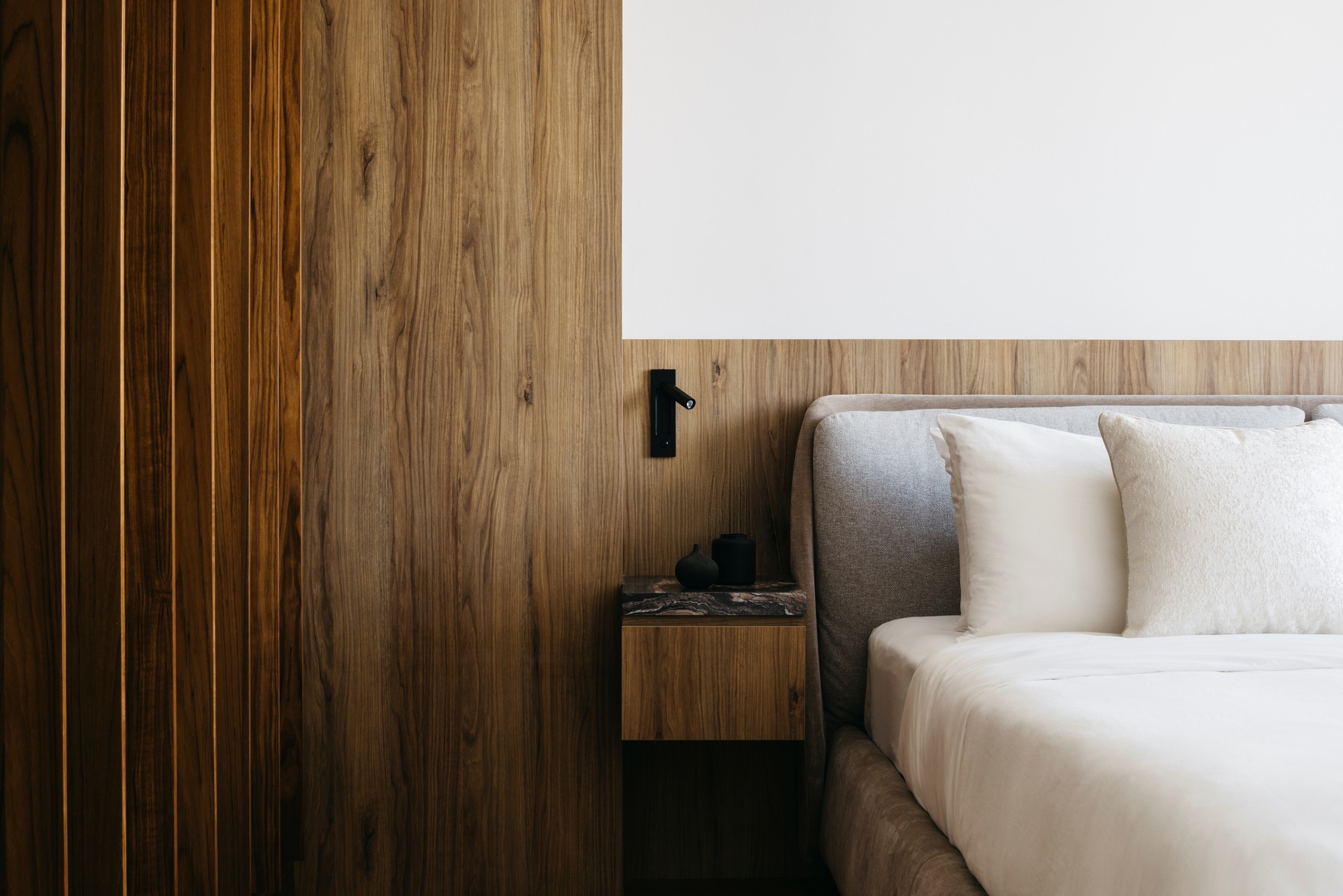
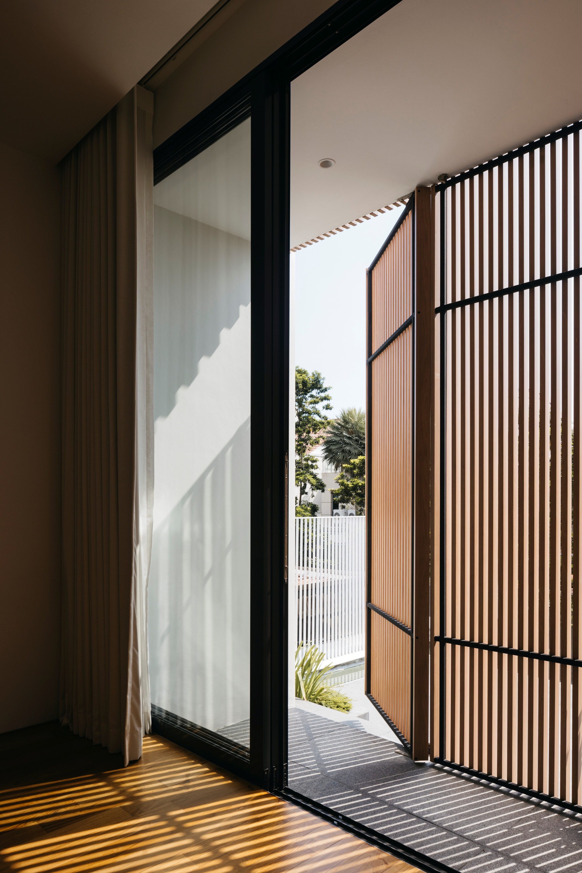
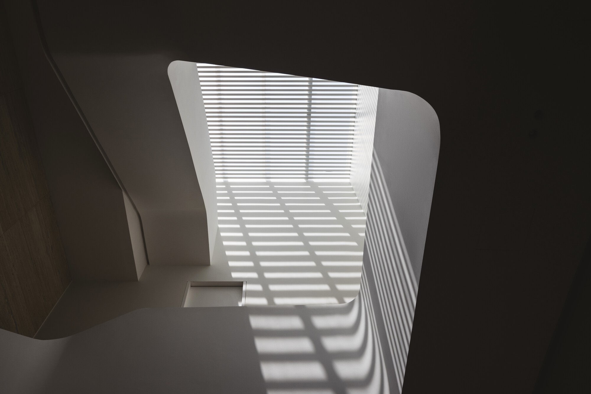
The House of Dancing Light is not merely a built form; it is a living expression of architectural poetry, where light becomes both medium and muse. It celebrates the subtle beauty of illumination, the fluidity of movement, and the atmospheric richness shaped by shadow and stillness.
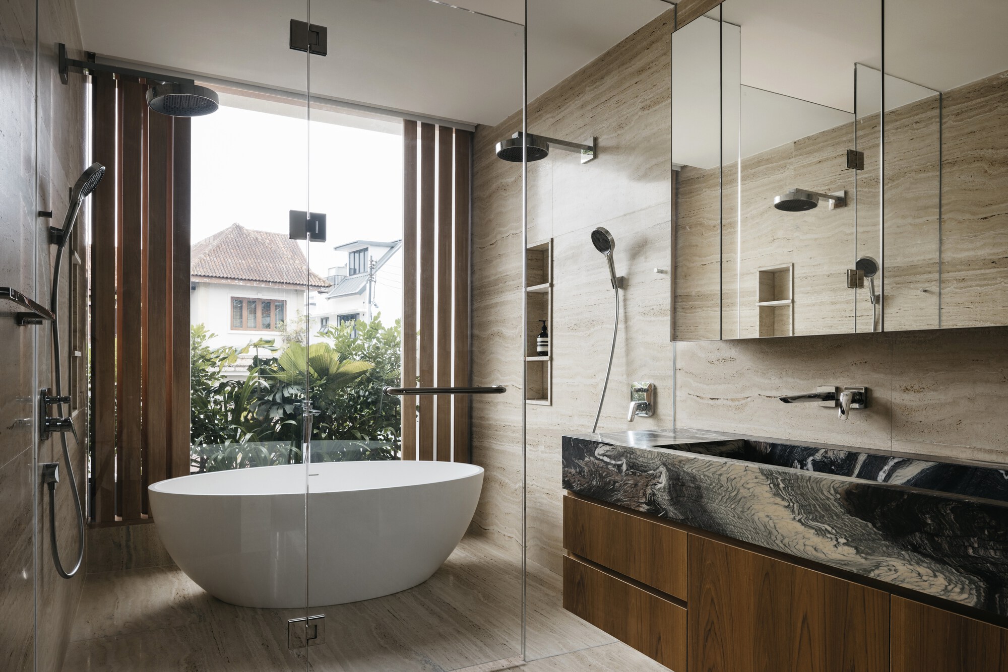
At first glance, the front façade presents as a minimalist canvas: clean travertine planes and delicately proportioned timber screens. Beneath this restraint lies a responsive system, a custom operable timber screen that functions as a dynamic climatic skin. Regulating privacy, ventilation, and daylight, it performs as both environmental mediator and architectural expression, defining the building's identity within its tropical context.
Crossing the threshold, the architectural language shifts. Where the exterior is ruled by orthogonal clarity, the interior reveals a softer, sculptural fluidity. At its heart, a sinuous floating staircase, seemingly weightless, echoes the motion of a ribbon in flight. This lyrical gesture contrasts with the strict geometry of the façade, introducing a spatial choreography that balances movement and stillness.
More than a circulation element, the staircase becomes a sculptural anchor, capturing light as it shifts throughout the day. Much like a dancer trailing a ribbon, it accentuates the passing of time, casting ever-changing shadows across walls while subtly delineating the living and kitchen zones with moments of visual pause and drama.
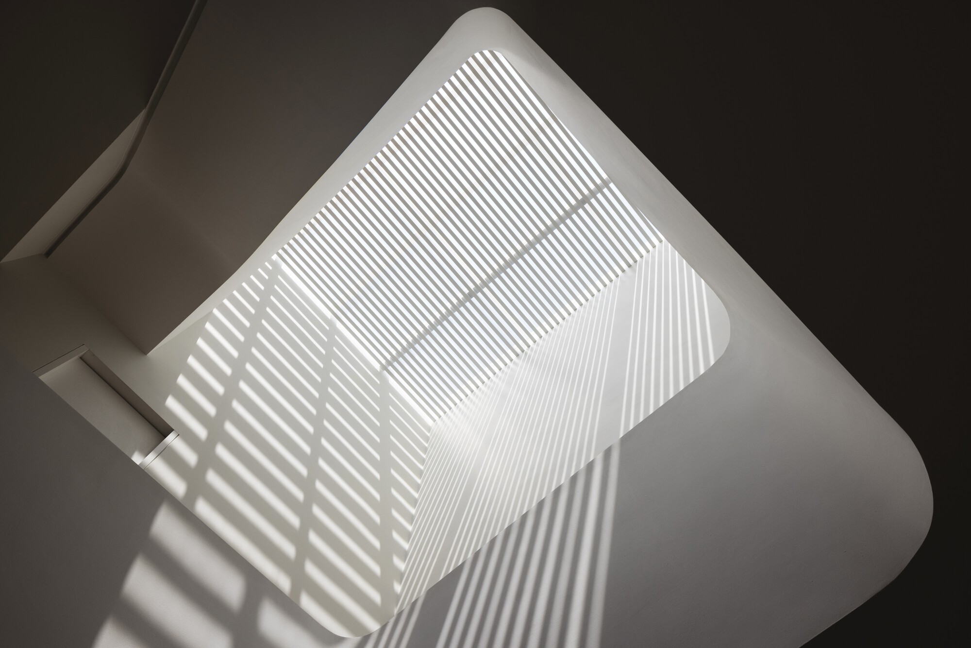
A skylight above introduces a secondary rhythm. As the sun arcs across the sky, the house transforms: morning light glides across warm oak floors, and afternoon shadows animate pale stone surfaces, casting bold, geometric patterns that stretch across the curved interior walls. This interplay turns surfaces into living canvases, animated by time and light. Interiors are intentionally pared back, allowing light, material, and texture to take precedence.
In its entirety, the House of Dancing Light demonstrates a refined approach to contemporary tropical architecture: a home attuned to its environment, materially restrained, and deeply poetic in its expression. It is a home where light is not simply illumination, but experience.


Corrugated House
#architecture
Location: Japan
Architects: monotrum
Area: 134 m²
Year: 2023
Photographs: Yoshiro Masuda
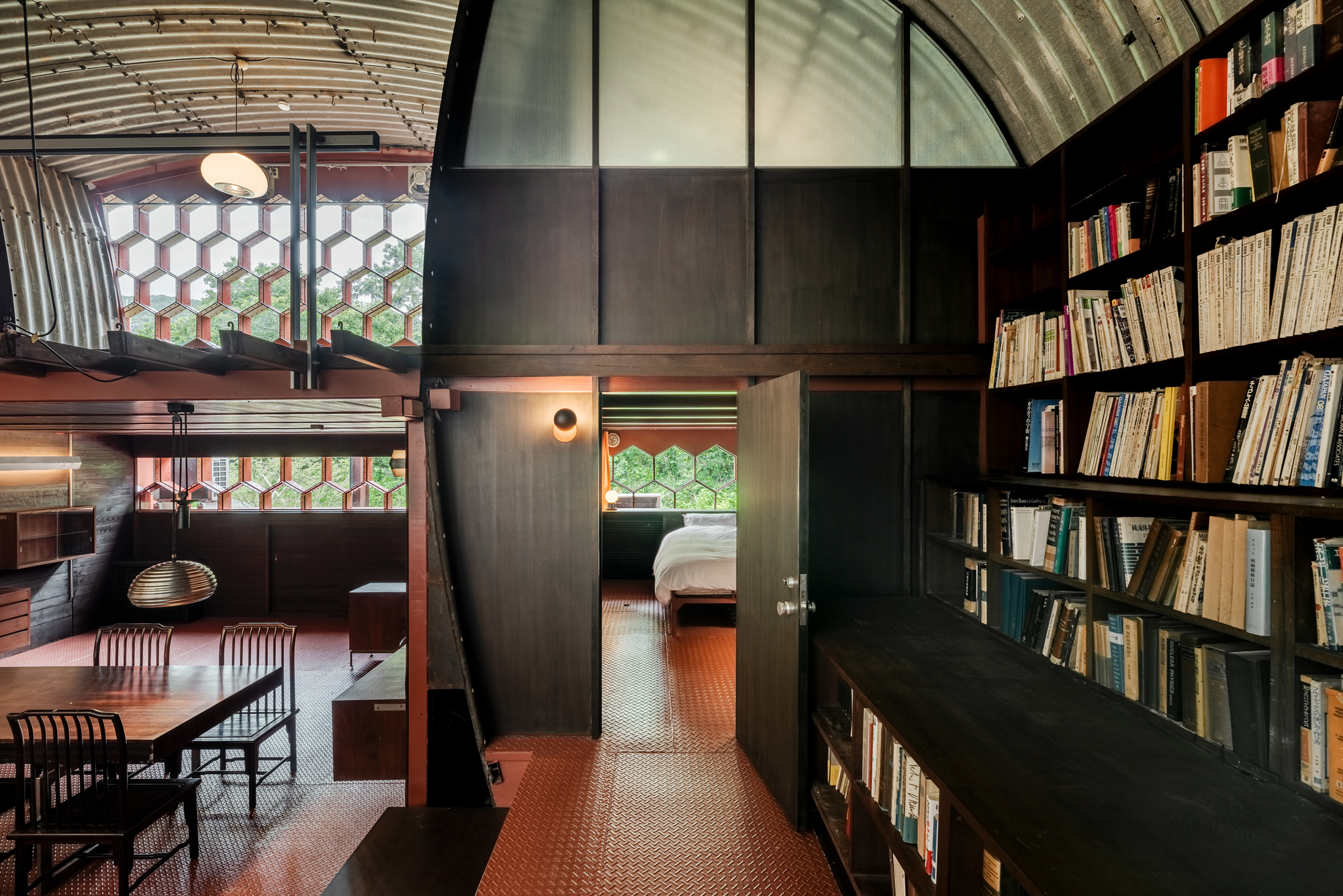
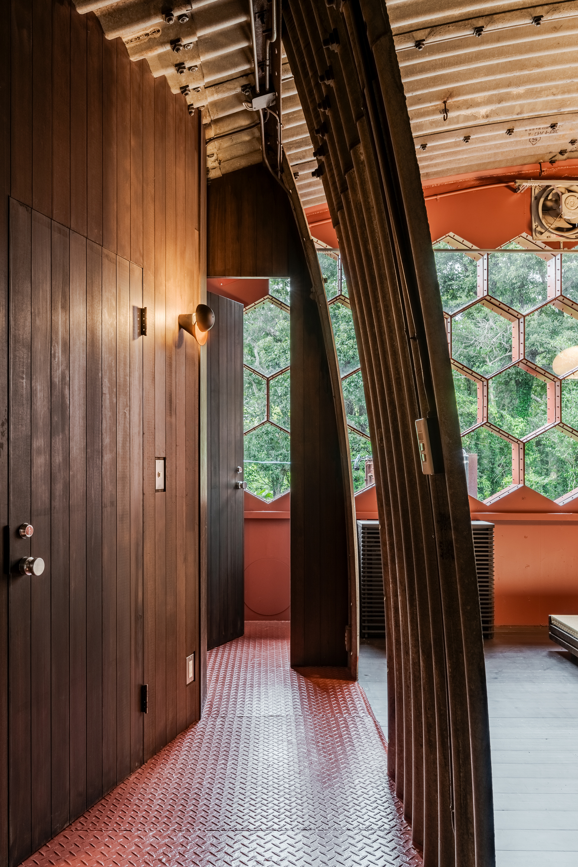
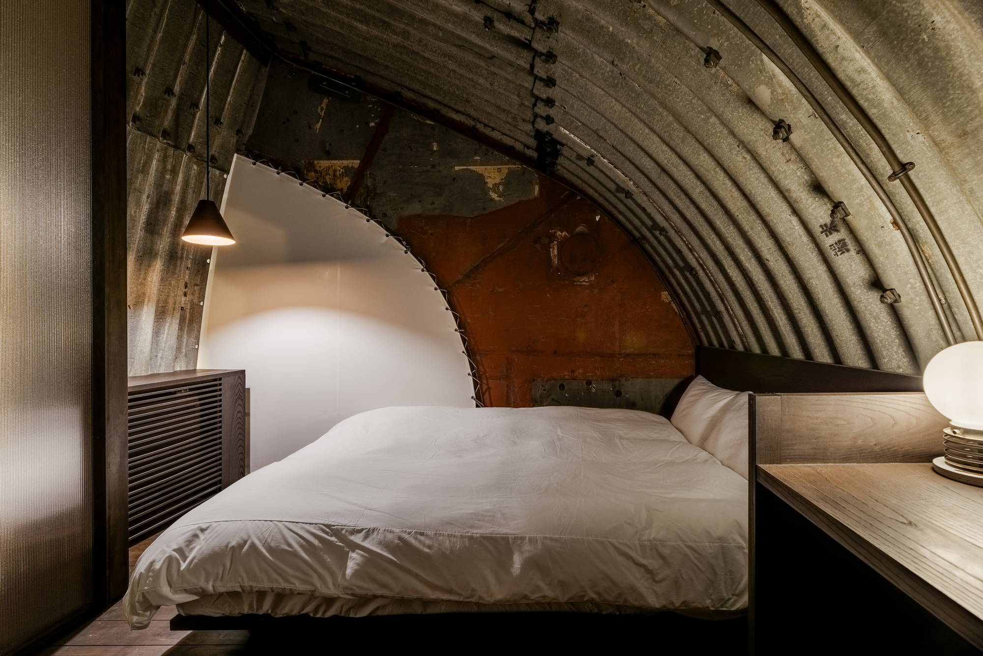
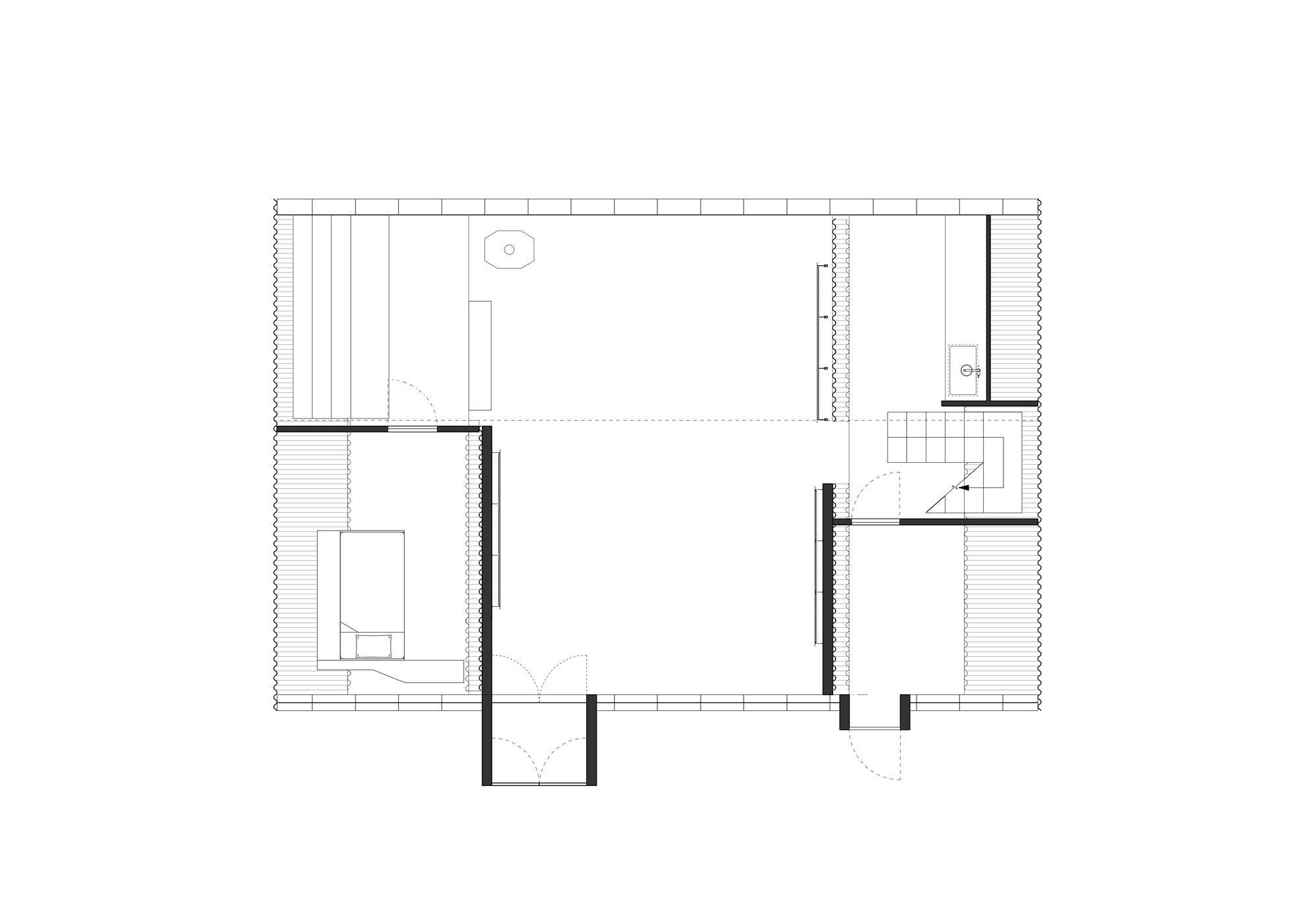
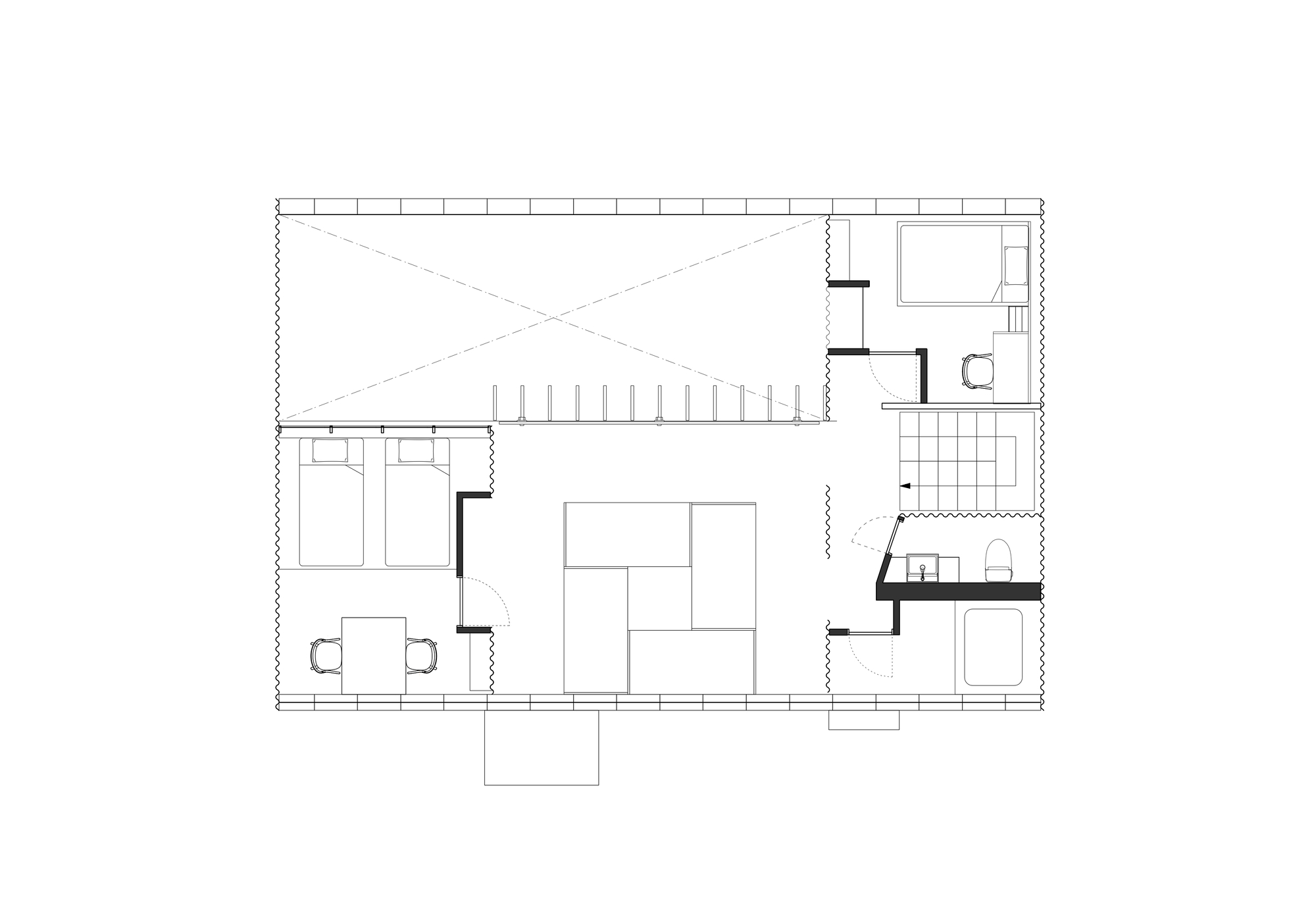
Hotel in renovated house made of corrugated pipes. The project is to renovate a structure made of corrugated pipe, a civil engineering material, into an accommodation facility. This building was built by Kenji Kawai, a facility designer, as his own residence in 1965. It has been selected by DOCOMOMO as a Modern Movement building in Japan. In renovating the building, we sought to preserve it not as a static cultural asset but as a place where visitors can experience the architecture through the experience of staying overnight.
This building was constructed as a house but was set up as an open one-room space with minimal components: a tunnel-like space made of corrugated pipes, walls to seal the two ends, and a floor between them. There were no separate rooms, and even the bathrooms and toilets had no partition walls. For the purpose of utilizing the building as accommodation, it was necessary to create separate spaces for guest rooms and sanitary facilities. Therefore, walls were constructed to fill the gaps between the structural elements, ensuring the provision of independent spaces. The new walls were planned to minimize the number of walls to be built and make the most of the existing elements.
The newly constructed walls are finished with dark brown wooden paneling to match the existing flooring specification. Furniture such as beds, desks, and floor-mounted air conditioner covers are also made of dark brown-stained wood to adjust the tone of the space. The contrast created by the confrontation between the rough iron material and the calm-colored wood was designed.
On the south wall facing the atrium, a large hole (originally intended as a window but sealed off due to excessive brightness) was covered with an oval canvas. Inside the wall, a honeycomb structure is revealed when the canvas is removed, lighting is installed, and a translucent tent fabric is applied in place of the canvas. This revitalized the dormant hole, giving it a new function as a source of illumination.The hole, which had been set up as a light source but had been closed, was updated as a device to obtain light once again. The walls of the guestrooms are partially made of permeable hollow polycarbonate panels so that the light from this iconic wall light can be enjoyed inside the guestrooms as well.
The movable shelves on the first floor walls were designed to allow both board and box shelves to be installed while using off-the-shelf shelf posts by custom fabricating brackets. Following this concept, we fabricated a movable bracket light that can be installed using the existing shelf posts. The same galvanized finish as the corrugated pipes were used for the finish. By reinterpreting the elements of the existing architecture and re-constructing it by crossing it with a set-up for a new use, we have preserved the charm of the unique architecture of the corrugated house while renovating it into a usable space with lodging functions. The goal was to contribute to the continued use of this architecture by ensuring that the designed space contributes to an appealing lodging experience.


I feel we have similar taste. I also felt the curves are great, but the kitchen feels a bit odd. The open living space is great, feels like it can accommodate all sorts of events. I think my favorite part is the bedroom, but I do wonder how you get privacy there, considering the residence is so close to an adjacent road. Anyone could peak in there! Bathroom does feel a bit of an oddity but fits well with the rest of the style I guess. In my opinion the place needs more landscaping and ways to create privacy from the side street.
Awww, c'mon, live a little!


Now robots pretend to be human, clicking around and all.
Ty! Yeah, I think I know what you mean. It looks cool, kind of hobbit-like, and has very California vibes, but something feels off. I guess in a way it reminds me of some of the 60's dome architecture and that may make it feel dated.
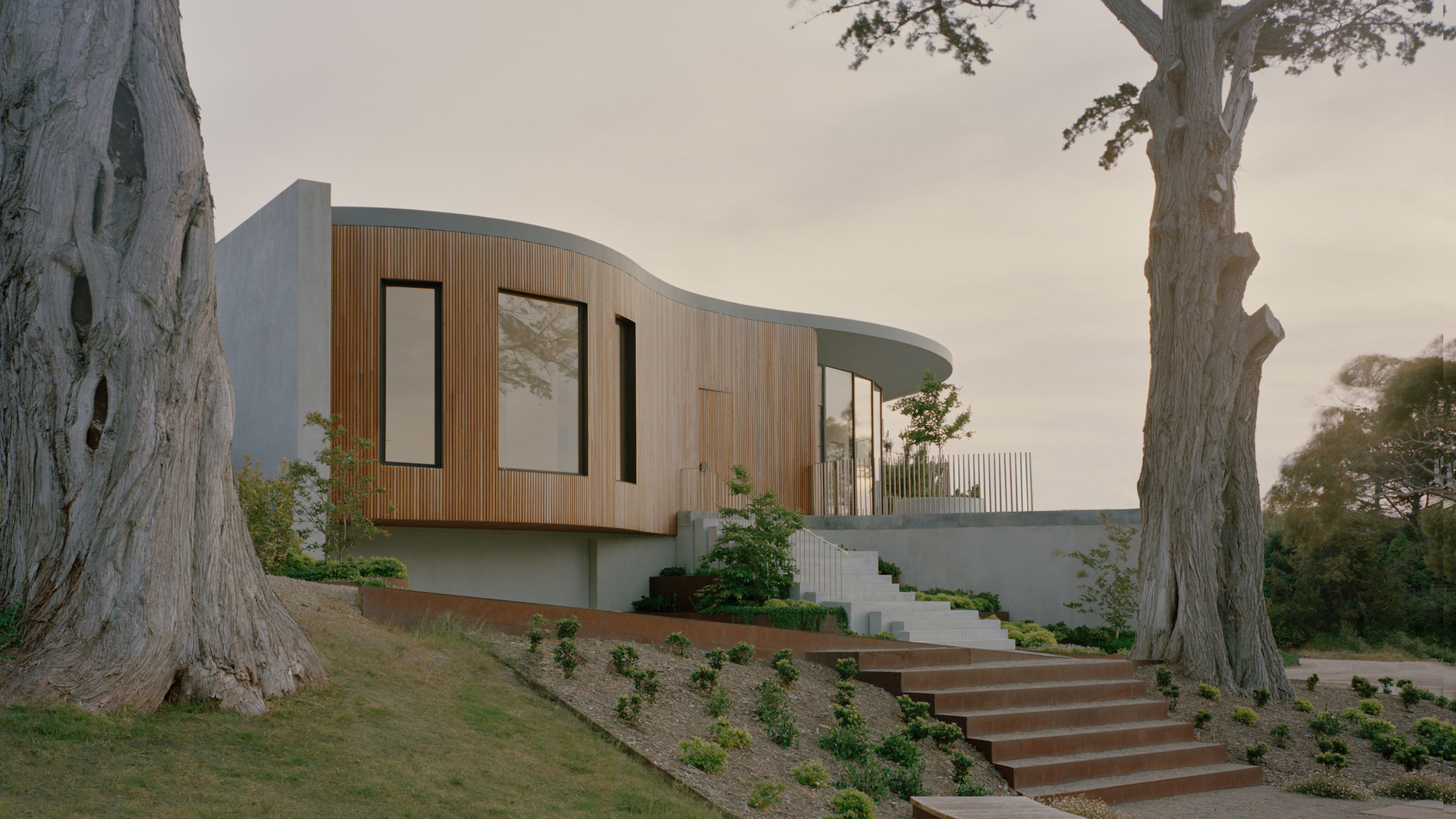
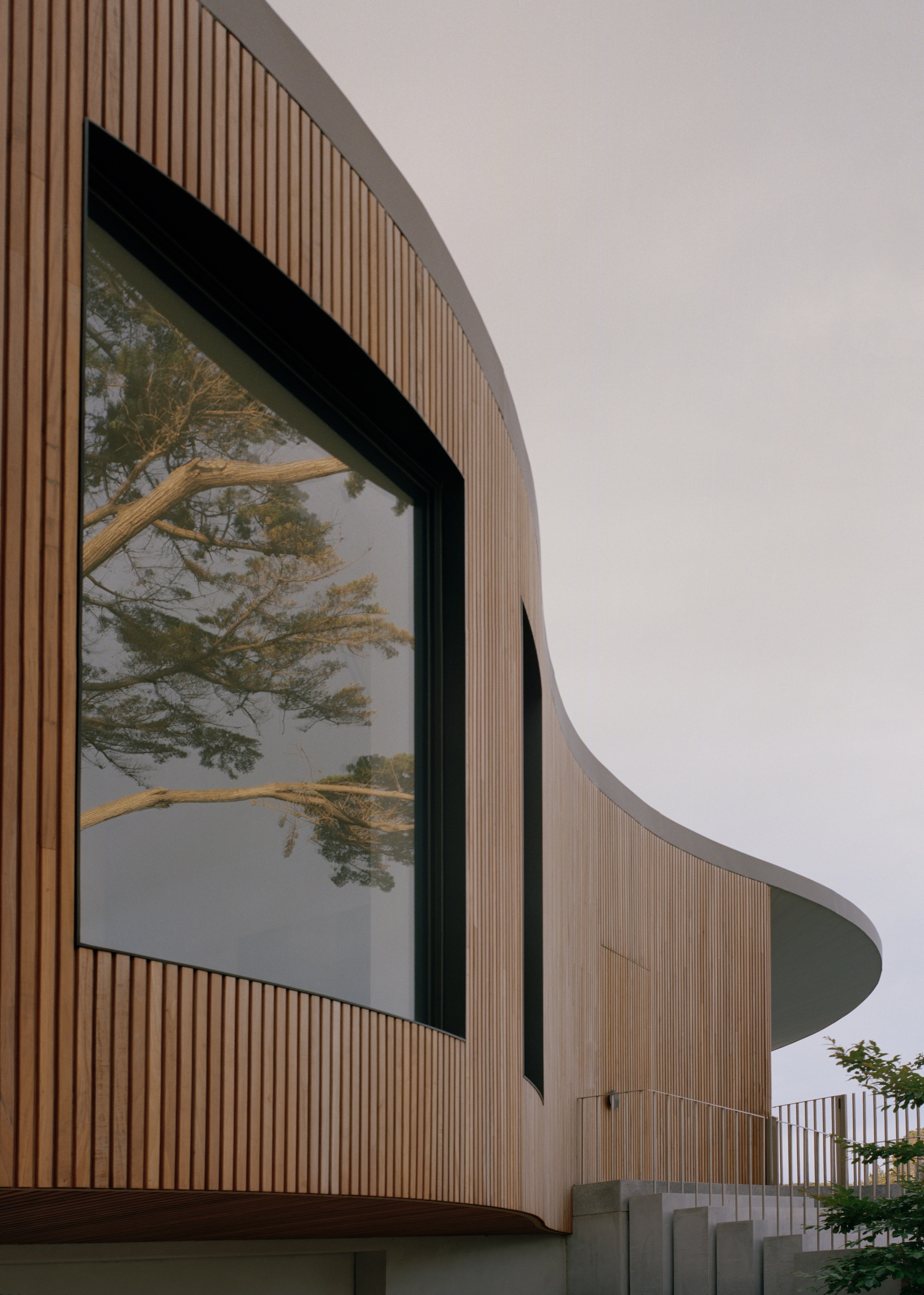
Point Nepean House
#architecture
Architects: Pandolfini Architects
Year: 2024
Photographs: Tasha Tylee
Country: Australia
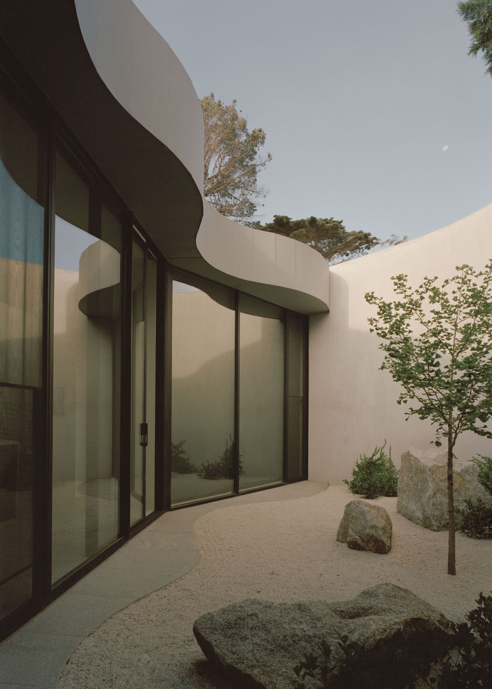
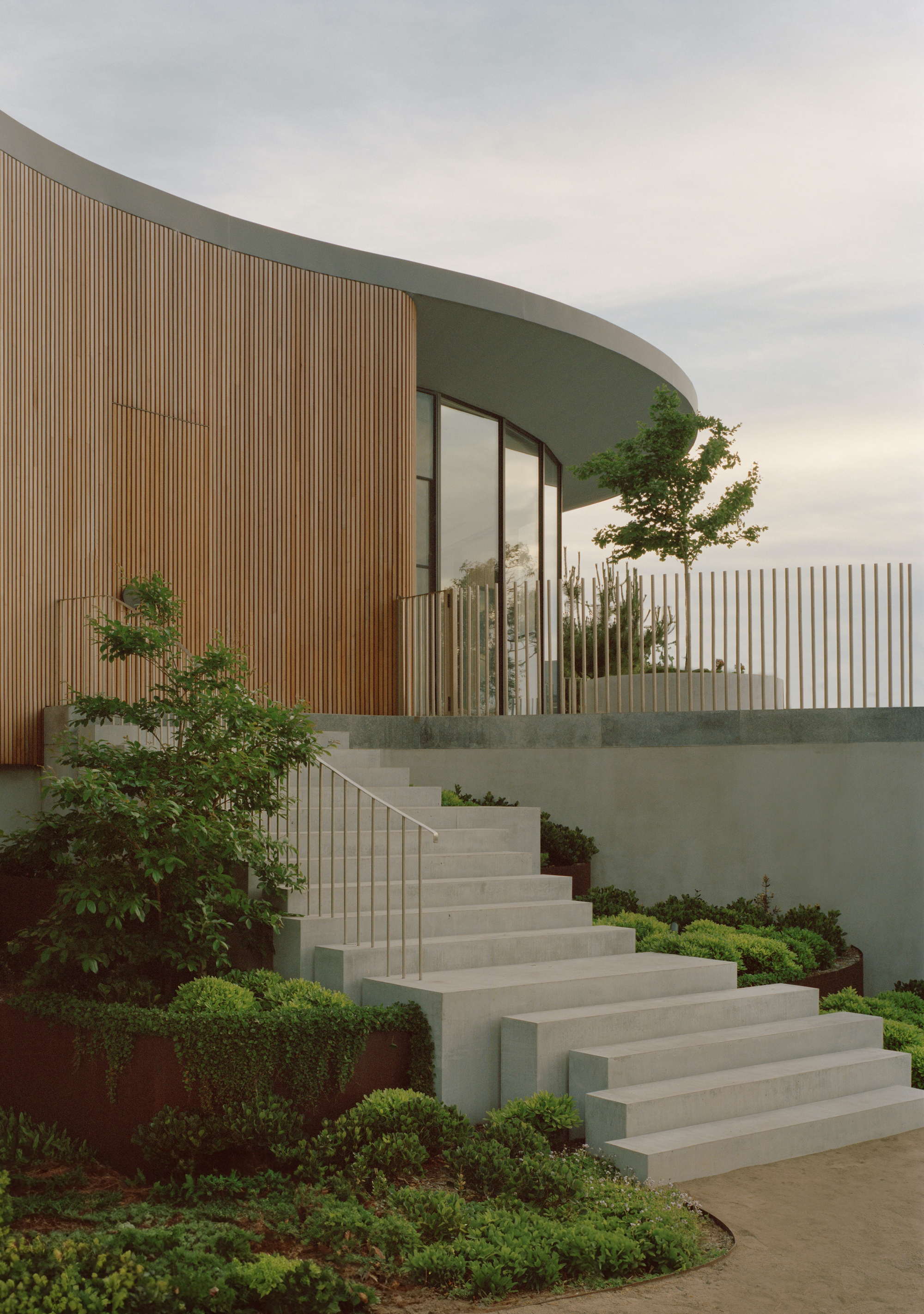
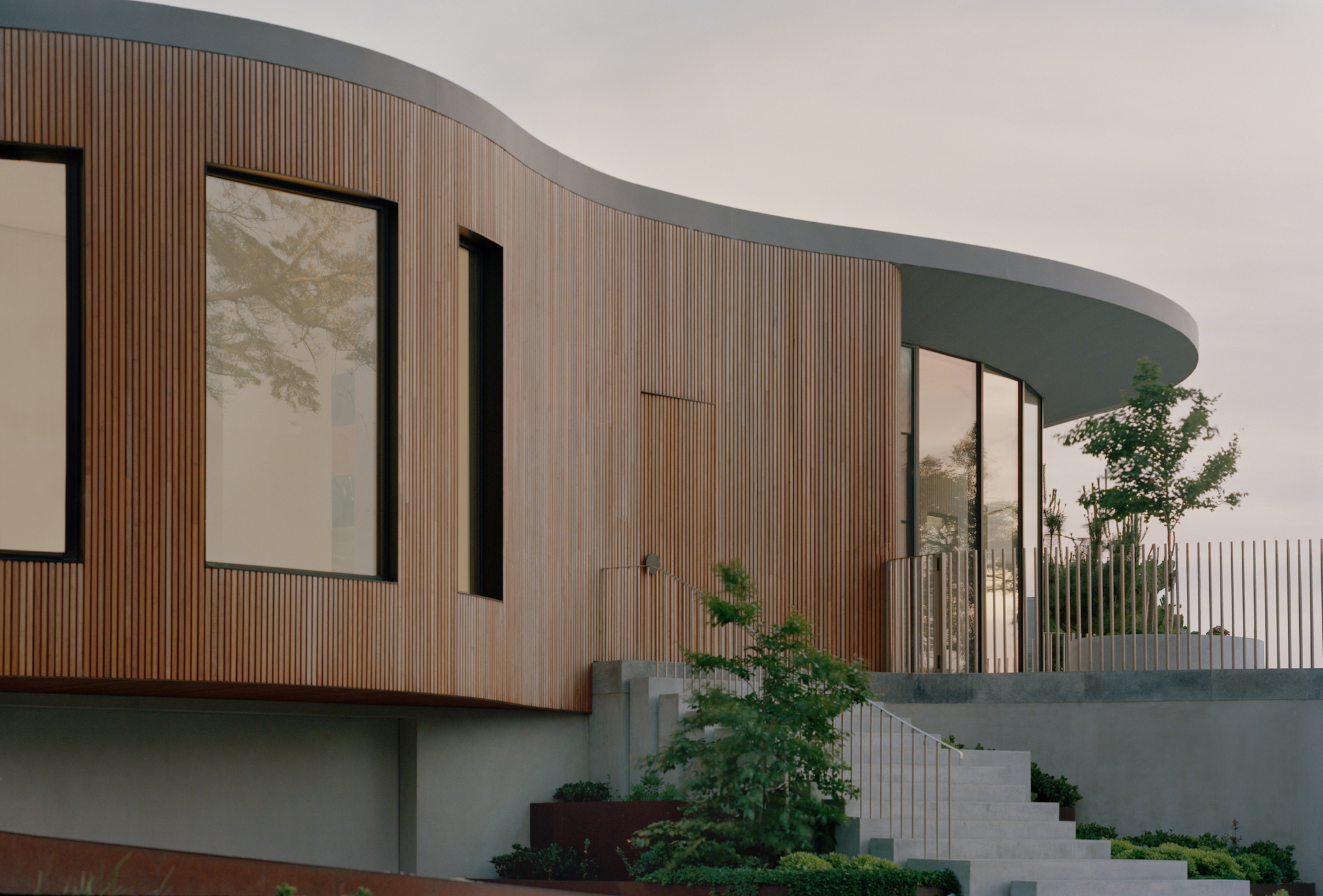
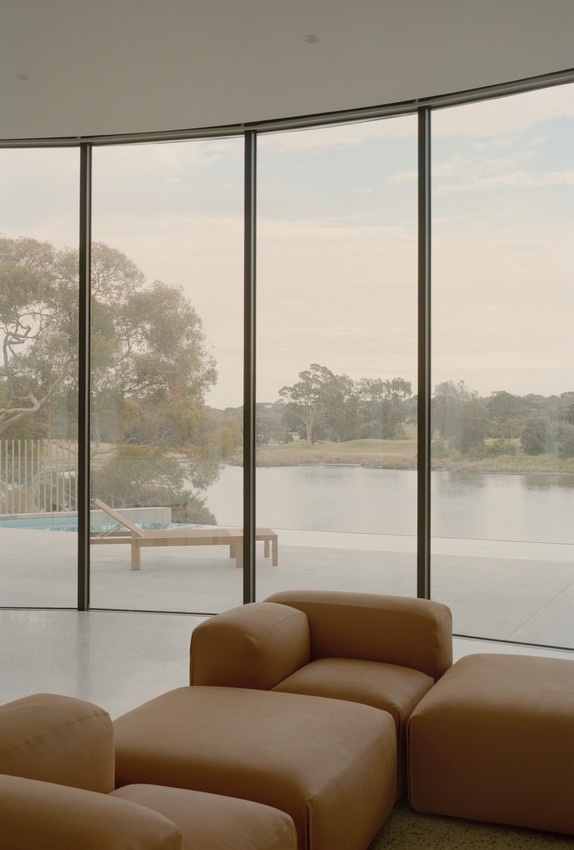
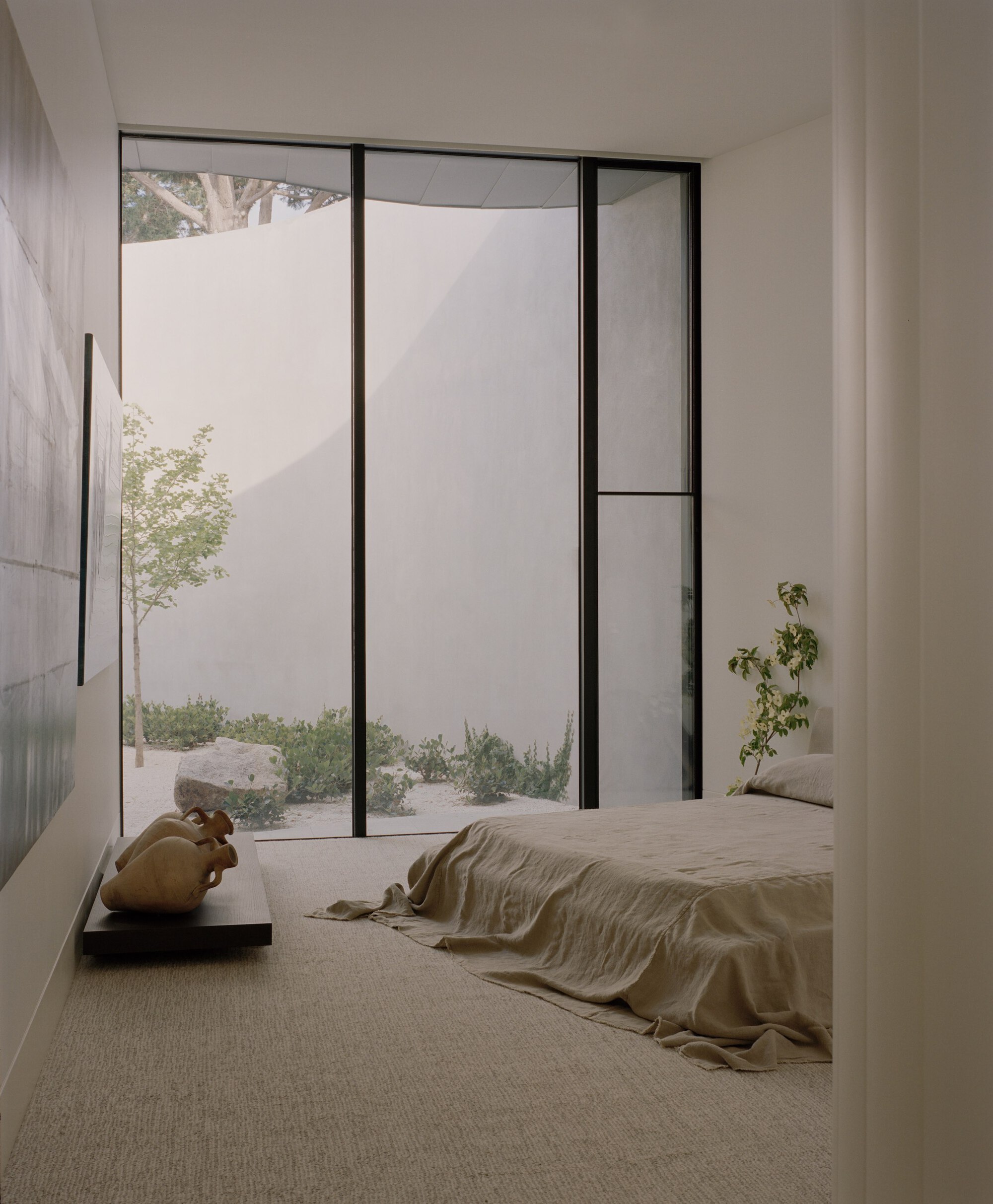
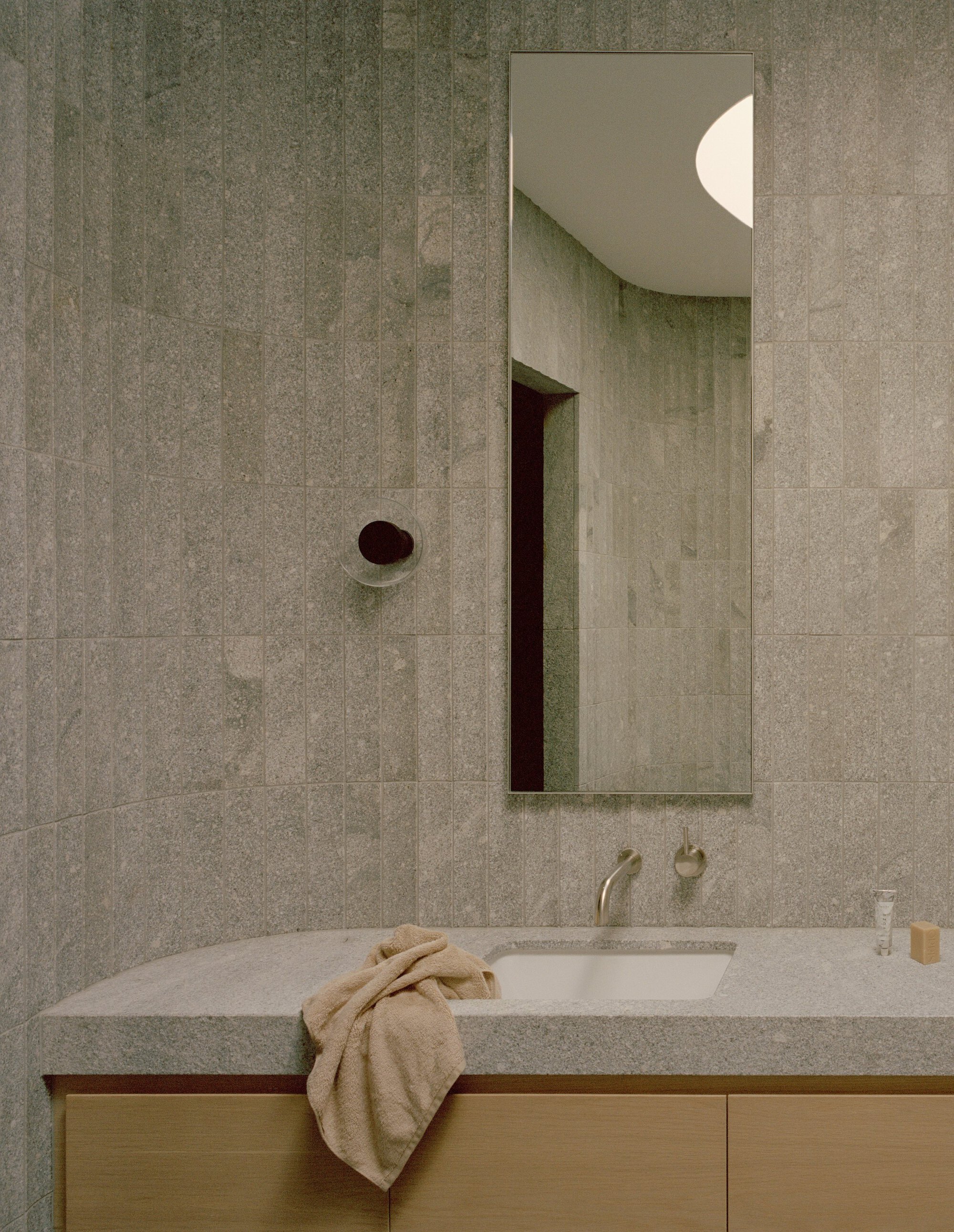
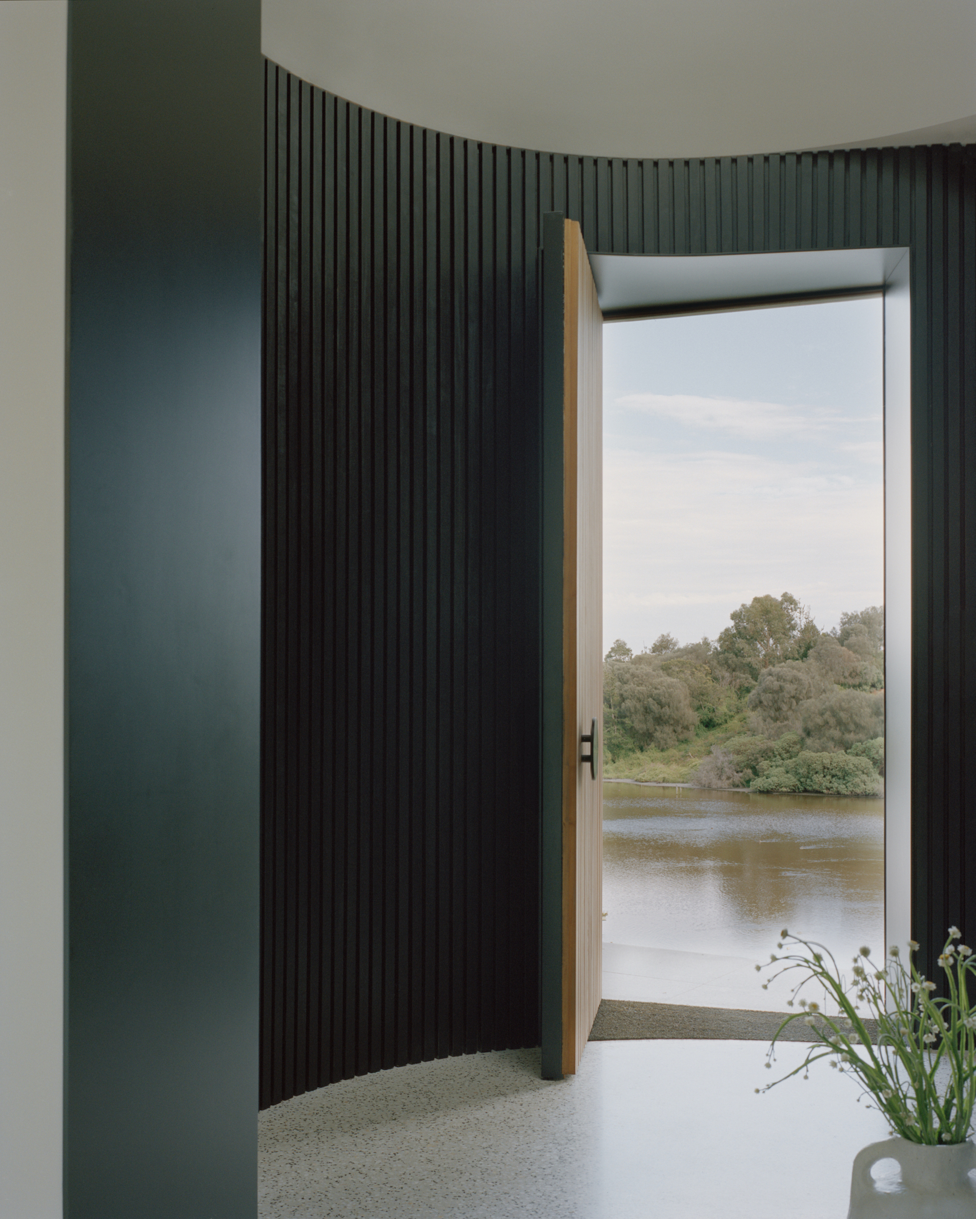
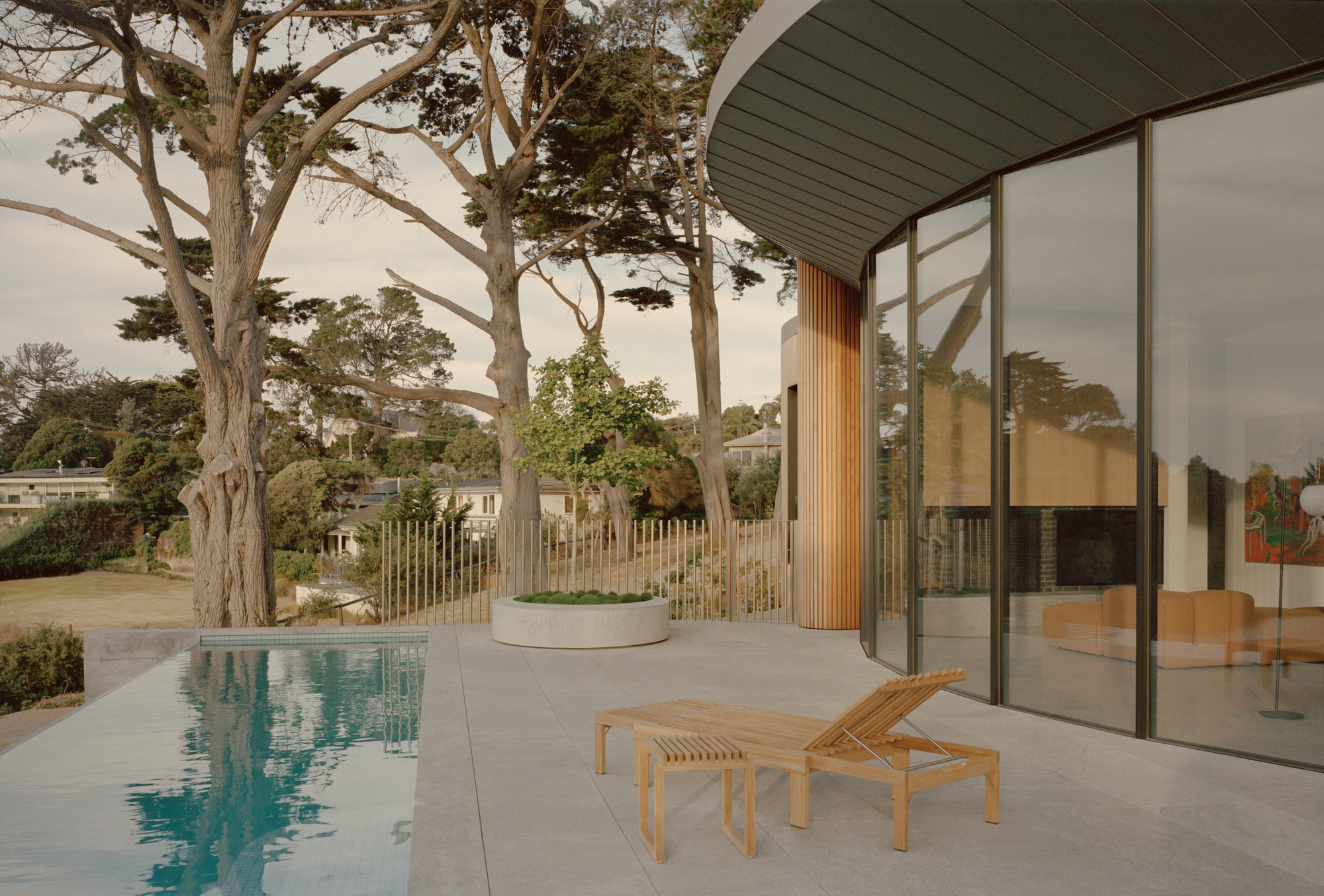
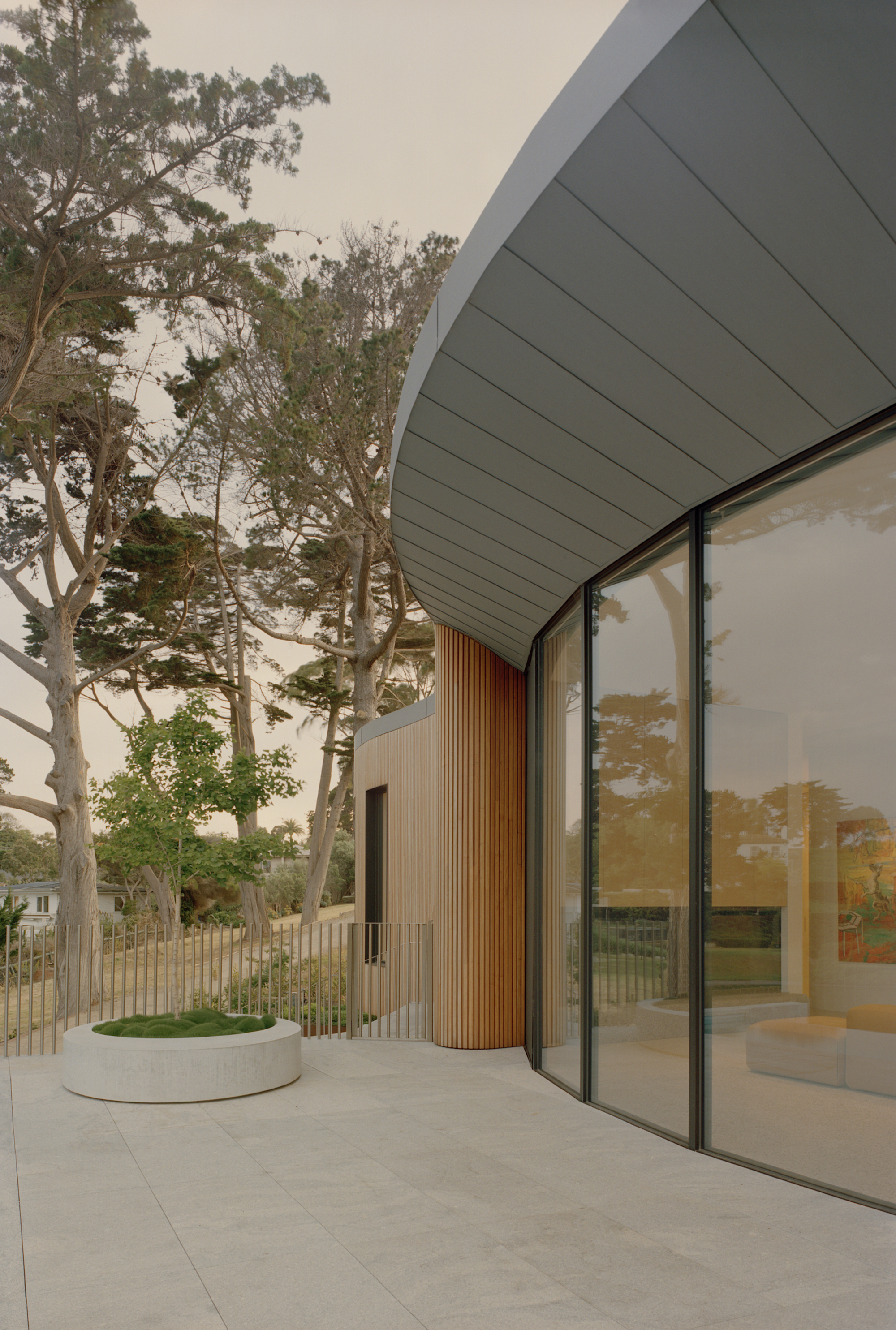
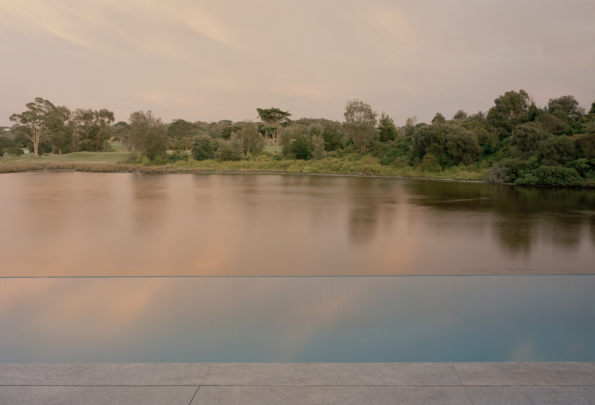
Carved into a steep undulating landscape on the shores of a man-made lake and overlooking Sorrento Golf Course, the Point Nepean House is an ambitious yet sensitive intervention to its environment. The bold eccentric form commands its presence, but its delicate timber skin, flowing parallel to the tranquil body of water is gracious. The home, with its extensive program, is a place that provides refuge and privacy, whilst simultaneously focusing on its surroundings.
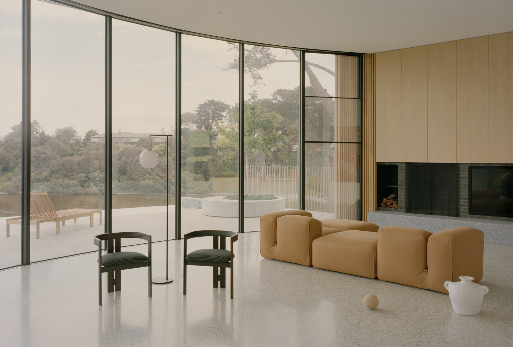
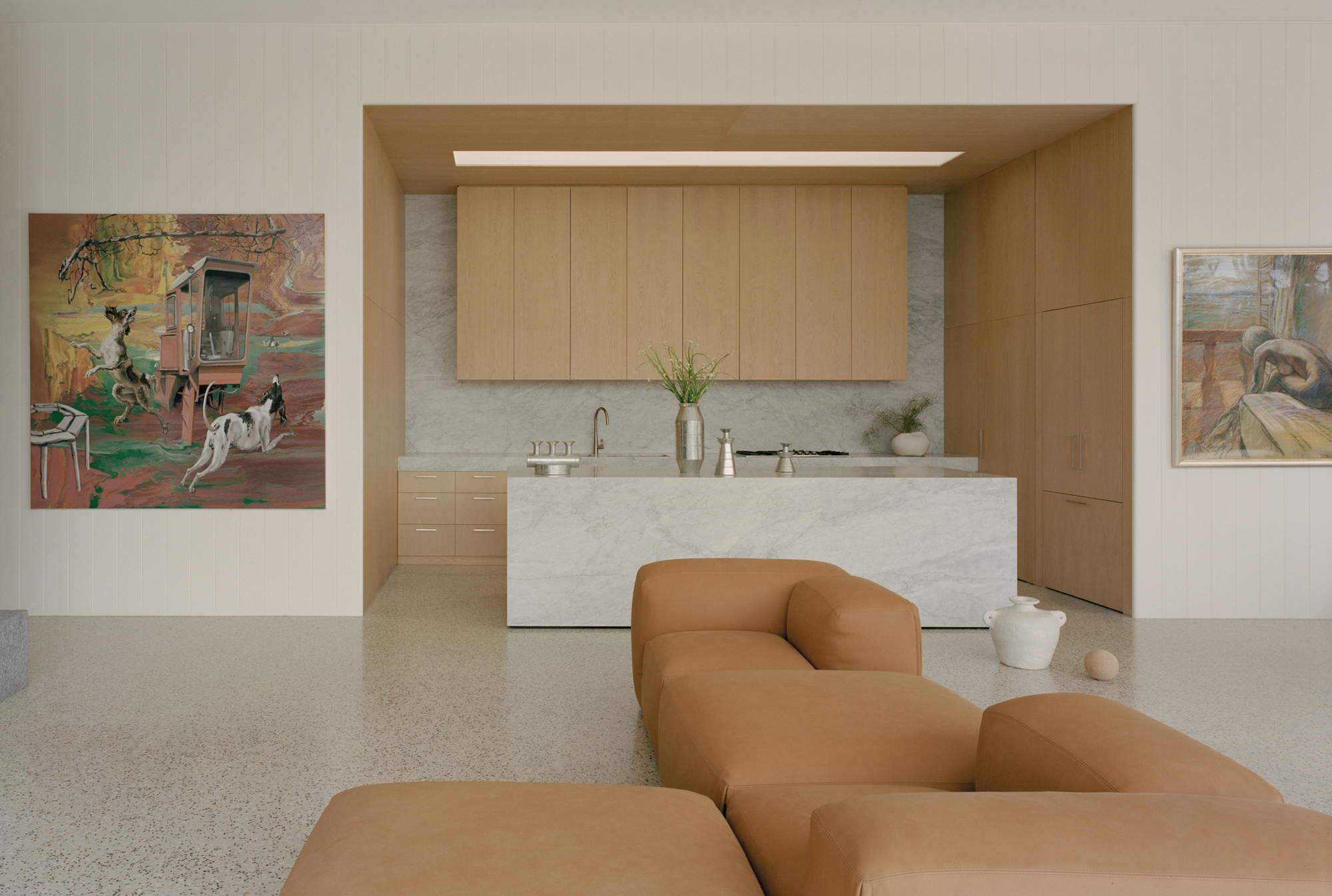
Compositionally, the home consists of four fundamental elements; the sweeping perimeter wall, the clove-shaped form with its curvaceous timber-clad skin, the primary internal dividing walls, and a series of amenity pods within each zone. The monolithic perimeter wall cuts into the sloping site, a single gesture that encapsulates the organic form and provides a protective layer from its surrounding neighbors. Behind this unambiguous outer wall, the contrasting wavy timber-clad form unfolds upon arrival; its dynamic presence a reflection of the soft meandering edges of the adjoining lake. The timber-clad form, although ambitious in scale, sits harmoniously amongst the treescape, reflecting the warming tones of the mature trunks nearby. Internally, the clover-shaped floor plan is split into three zones by the straight primary walls. Contained within each zone, a series of irregular pods are arranged to confine the amenities of the home.
The home allows inhabitants to pause and absorb serene moments internally and externally. To enhance the occupant's relationship with its surroundings, a series of windows puncture the timber-clad skin to create framed views. Pool barrier requirements were strategically navigated to provide undisturbed views over the infinity edge and beyond. The placement of the internal private garden provides the opportunity for all bedrooms and living spaces to focus on nature. Close coordination with Eckersley Garden Architecture to curate a landscape that was integrated with the home and its surrounding environment was vital. Subsequently, the extensive art collection allows inhabitants to decelerate and create tranquil moments inwards as they navigate the home.
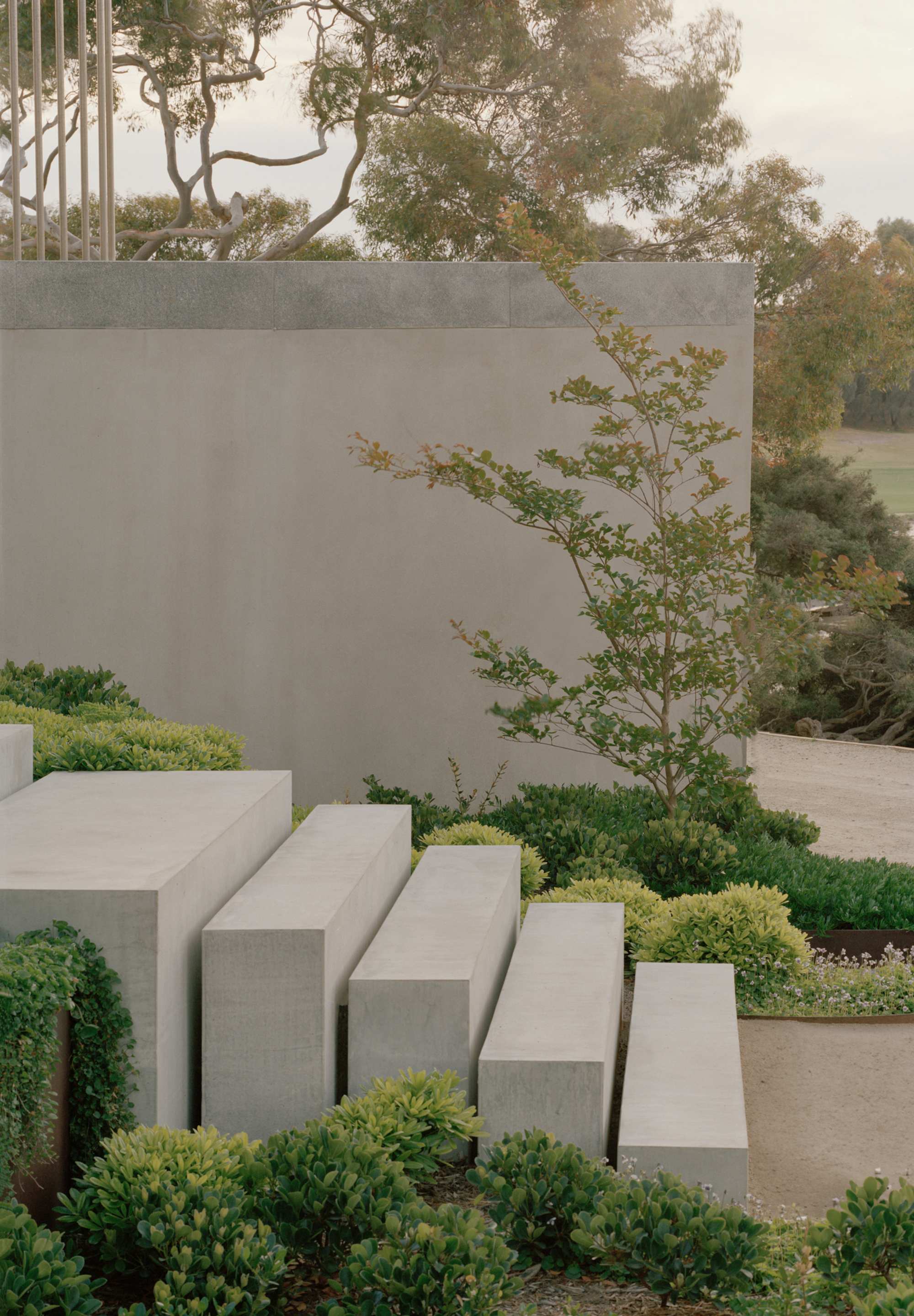
The notion of contradiction is present on arrival at the home. Upon ascending the grand staircase of staggered concrete blocks and absorbing the tonal skin of the timber-clad facade, the inhabitants enter through a small passage into a dark confined circular lobby, a vast difference from the moments prior. A glimpse of natural sunlight penetrates the space from the conical skylight above to create a sense of drama, before transitioning back to the light-filled living space.
The meandering curves of the façade and associated glazing are a response to the orientation, strategically undulating to create a deep eave over the North and West facing windows. This 3.7m high expanse of glazing provides passive solar gain for the winter months, whilst the substantial eave minimizes the harsh summer sunlight. The internal courtyard provides natural light to the deep clove-shaped plan and excellent cross ventilation across the house. A reductive external material palette of concrete, timber cladding, and natural zinc has been used to accentuate the forms and provide hard-wearing materials which will age gracefully and require low maintenance.


Architects deliver what clients ask for. I think in most cases it's just the client following trends and the architect works within the constraints they are provided.
I equate this to blaming the designer for creating the same looking designs when in reality there are many stakeholders and the designer is just trying to satisfy them.
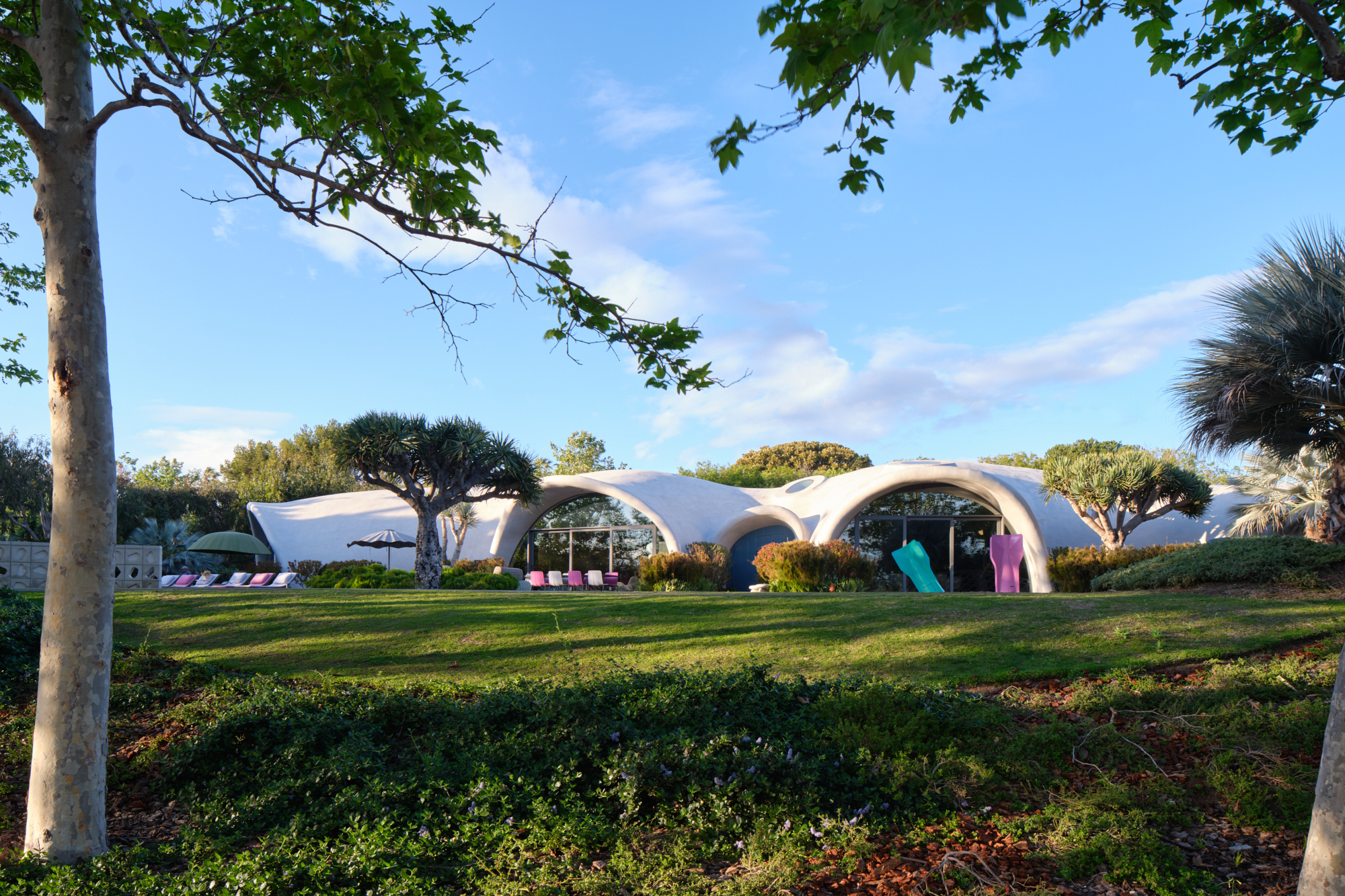
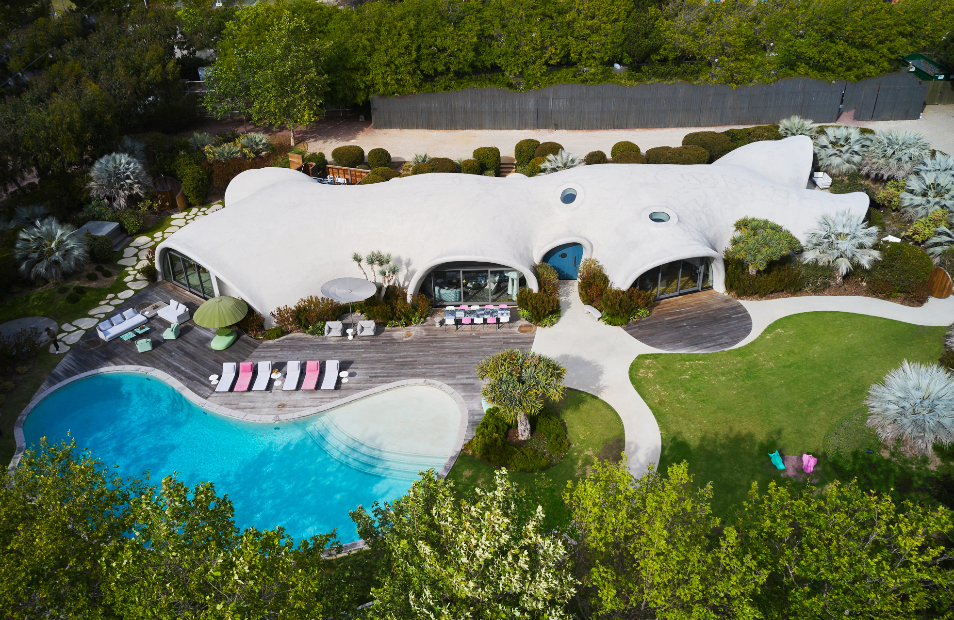
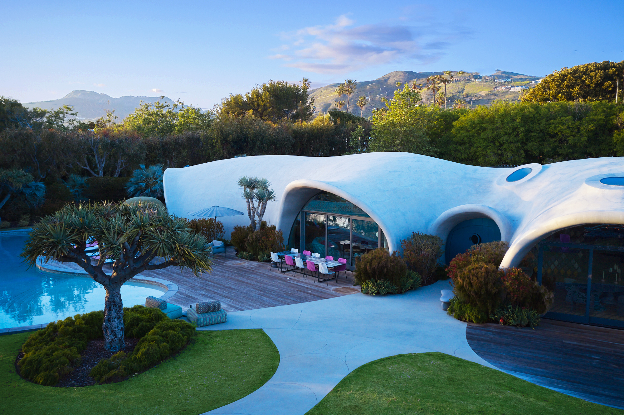
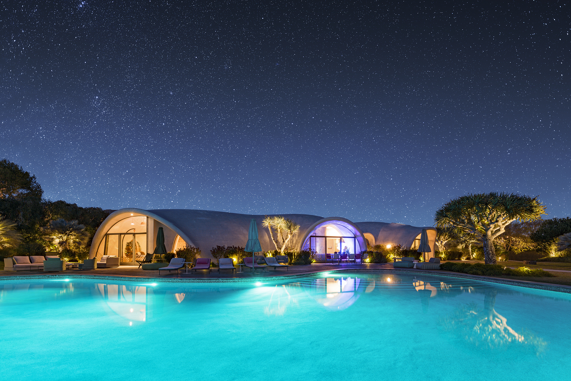
Shell Home
#architecture
Location: Malibu, United States
Area: 6500 ft sq
Year: 2022
Photographs: Roger Davies
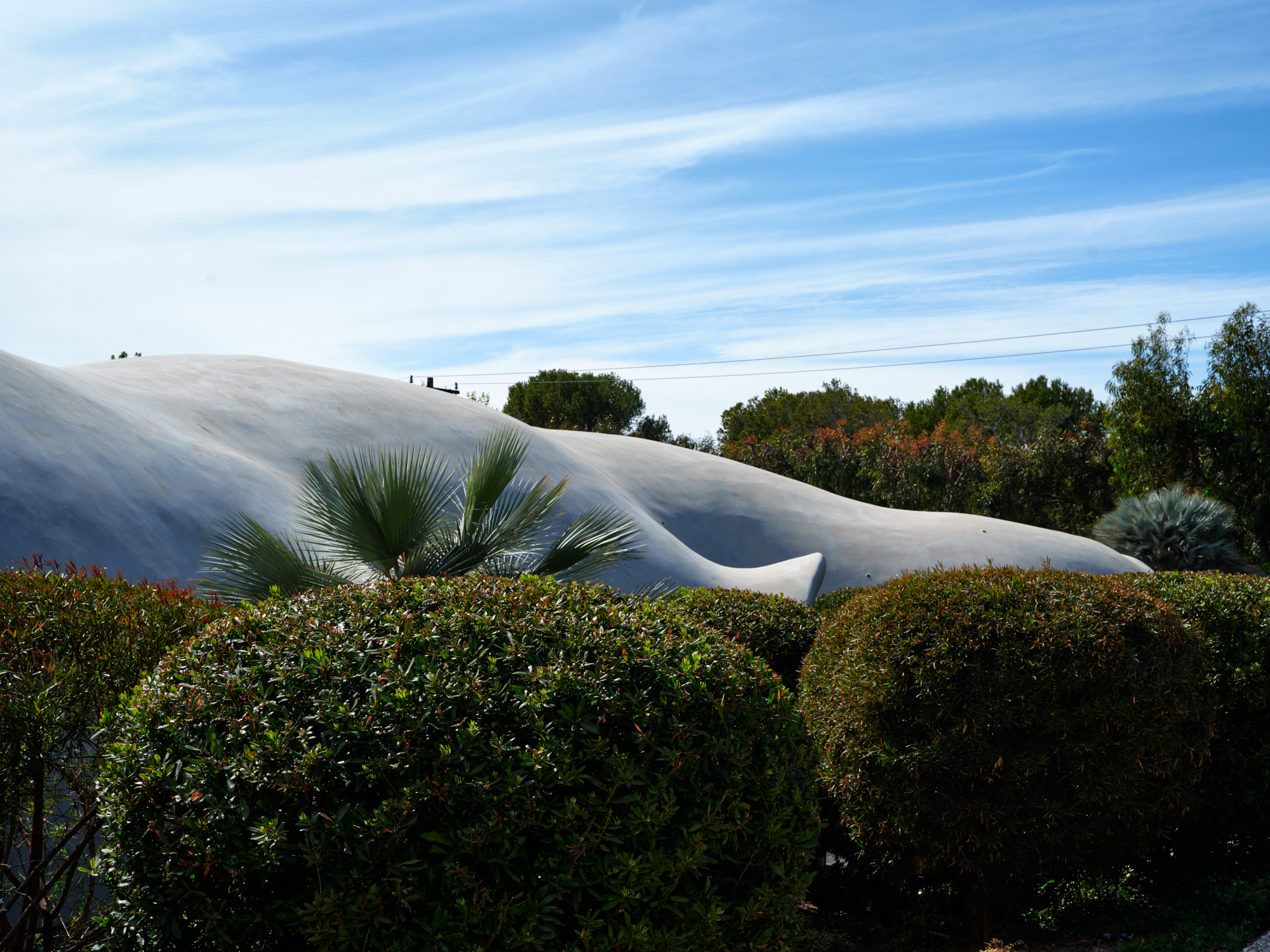
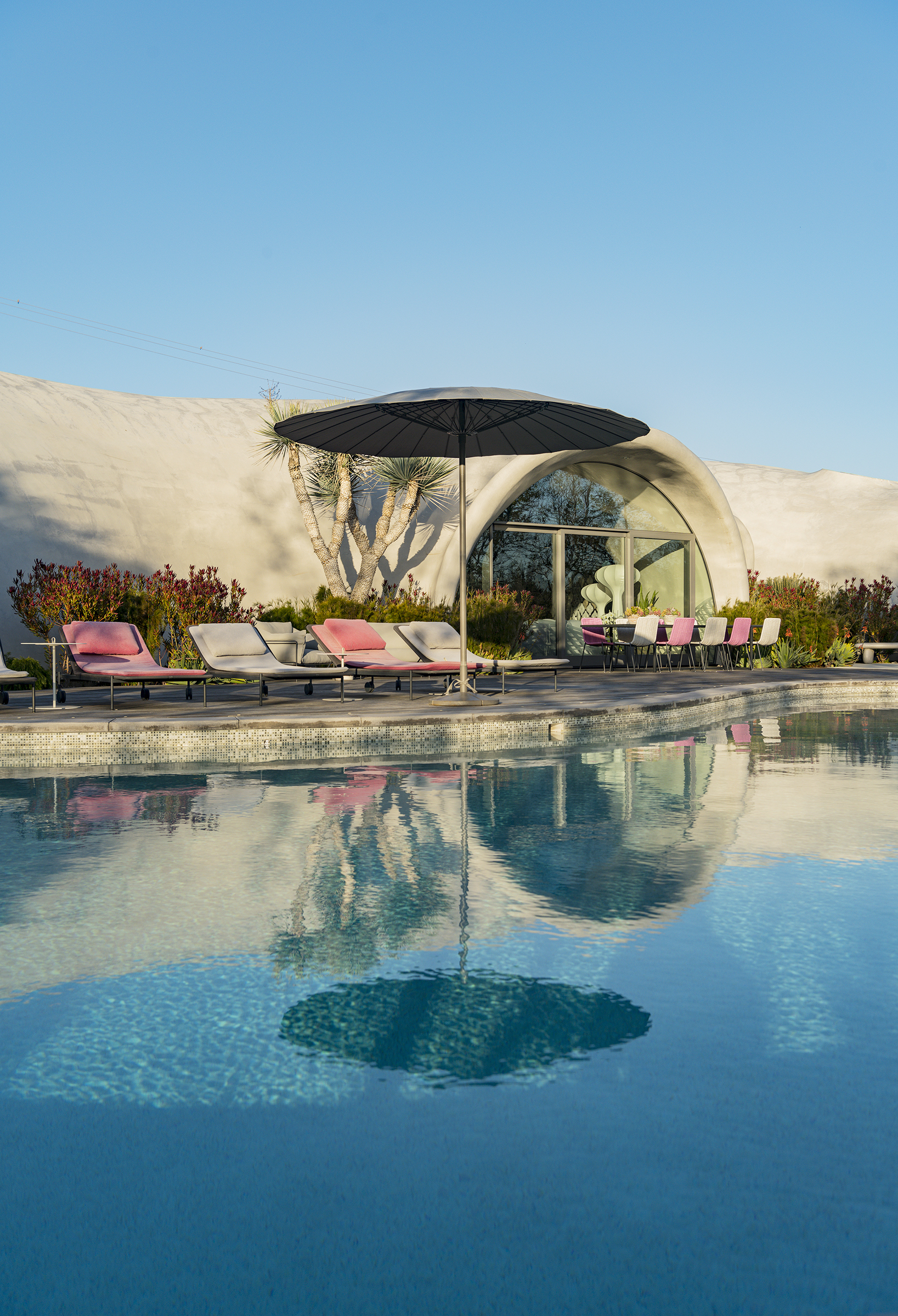
The Shell Home project in Malibu challenges us to reconsider how we design and build architecture. This project illustrates how natural principles may be used to guide design, improve performance and give shape to the envelope of a building. This ‘Form Finding Functionality’ leverages air pressure to design and build an asymmetrical thin shell structure quickly and practically. The resulting building is a sculpture for living. Architecturally expressive and highly resilient, it provides structural and environmental efficiency as well as adaptability within a uniquely flowing organic form.
The construction industry has trailed other major industries with regard to productivity and technology. This has resulted in significant inefficiencies in some of the most basic aspects of construction including safety, speed, affordability and environmental impact. Given buildings account for 30% of the world’s energy consumption, is it not time to rethink how we build and design?
Our alternative approach deploys a single reusable, preformed pneumatic formwork secured to a foundation and inflated to a specified air pressure. Steel reinforcement and concrete are added onto the inflated air form. Air pressure is maintained during construction and curing. Once the specified compressive strength is achieved, the formwork is deflated and ready for reuse. Less material and labor are required and construction waste and timelines are reduced, yet the resulting building envelope is more resilient, safer and greener than traditional construction. The building technology exemplified by this project has applications across scales, programs, and price points and articulates a new architectural and construction approach, synthesizing design, resiliency, and sustainability.
The Shell Home literally and figuratively emerges from the landscape, providing endlessly flowing living spaces tied to views framed by generous organic openings. The project's sinusoidally silhouetted shell is as naturally elegant as it is safe. The building shell curves continuously to articulate sculptural environments and define comfortable, biomorphic spaces. The design approach is derived from natural forces. Air pressure is harnessed to build and design the project. The resulting form elevates both sensations and performance and brings us closer to a synergy with nature.
The dual-curvature, monolithic building envelope is much safer and more resilient than traditional envelopes. It carries dead and live loads efficiently and transfers them elegantly along its entire perimeter to the foundation. The building shell is self-supporting, eliminating the need for columns or bearing walls and allowing total flexibility to design and evolve the interior. It is made up of low-carbon geopolymer concrete and contains less than half the embodied energy of a similarly sized traditional building. The building envelope is also thermal bridge-free and insulated to reduce energy use by as much as 65%. The Shell Home’s high-efficiency envelope, siting, landscape and water elements, natural ventilation, and day-lighting combine with other passive design elements and active systems to further reduce environmental impact.


Interesting contrast between old and new. Not sure if I like it.
Ballymahon
#architecture
Location: Dublin, Ireland
Architects: ODOS architects
Area: 450 sq m
Year: 2009
This collection of 18th Century farm buildings sit central to woodlands outside Ballymahon, Co. Longford. The existing buildings originally formed three sides of a courtyard. An old crumbling stonewall completed this courtyard. A new single storey wing replaces the old wall and provides open plan living kitchen and dining accommodation. To the rear, en-suite master bedroom accommodation has been provided. The existing buildings have been restored to house varying accommodations, notably bedrooms, bathrooms, studio, garage & plantroom.
The introduction of this new wing is an attempt to complete the courtyard whilst allowing a visual transparency between the courtyard and the woodlands beyond. This is something, which is lacking in the existing collection of buildings. Large expanses of frameless glazing allow the user to engage with both the courtyard and the surrounding landscape. This is in stark contrast to the experience one feels when in the existing buildings. Their small aperatured interiors provide lowly lit spaces, which suggest secondary accommodation. Externally, the oiled cedar cladding attempts to connect this new wing to its wooded surroundings whilst offering warmth of material to the inner courtyard, something that is lacking in the existing collection of stone, brick and slate buildings. The use of highly aggregated sand blasted concrete tonally links this new wing to the existing collection of buildings.
The new wing has been raised off the ground to give it a float-like quality. This contrasts against the routed character of the existing buildings. This wing has been ‘skewered’ through the existing two storey farmhouse allowing the surrounding landscape to flood into the inner courtyard. The protruding section to the rear of the farmhouse, houses the master bedroom accommodation and forms an ‘eye’ to the surrounding woodland. The extended raised terrace off the dining area is an attempt to hold an edge to the courtyard. The mobile quality of this new wing, when viewed from the surrounding woodlands, suggests an ‘inhabited’ sliding door has been opened onto the surround woodlands.


.jpg)
.jpg)
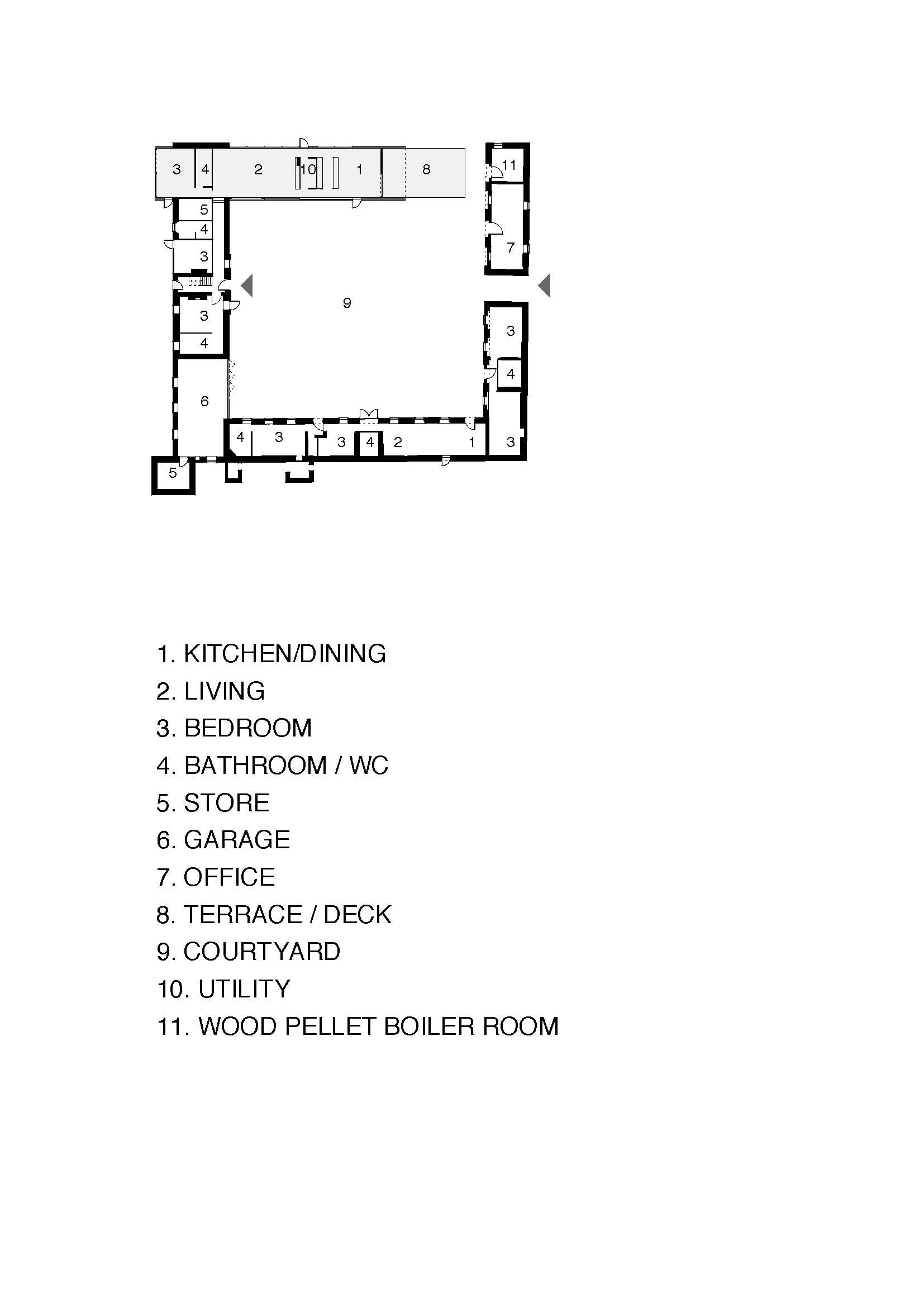
Parkside Home
#architecture
Architects: Austin Maynard Architects
Area: 148 m²
Year: 2024
Photographs: Tess Kelly
City: Fitzroy North
Country: Australia
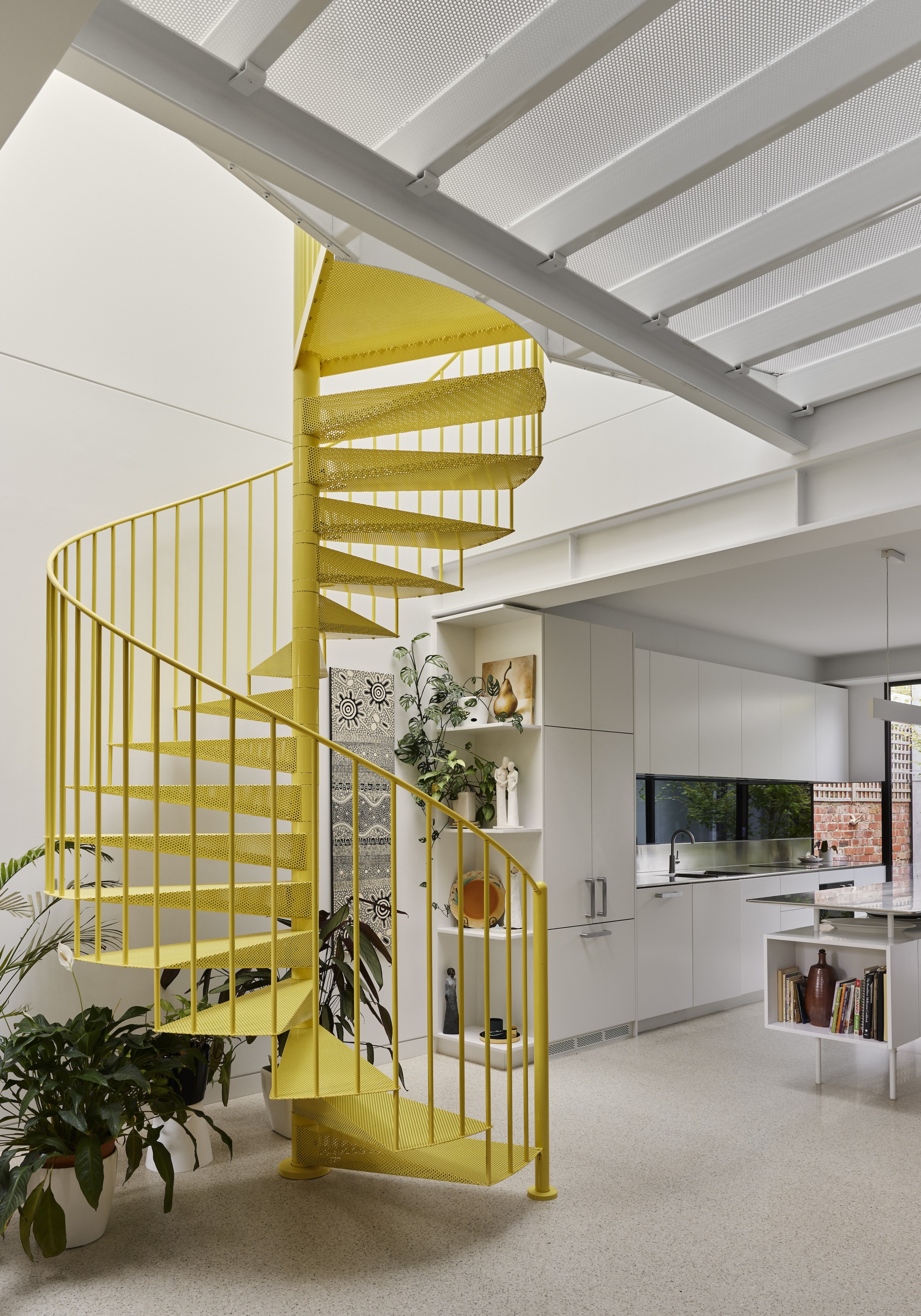
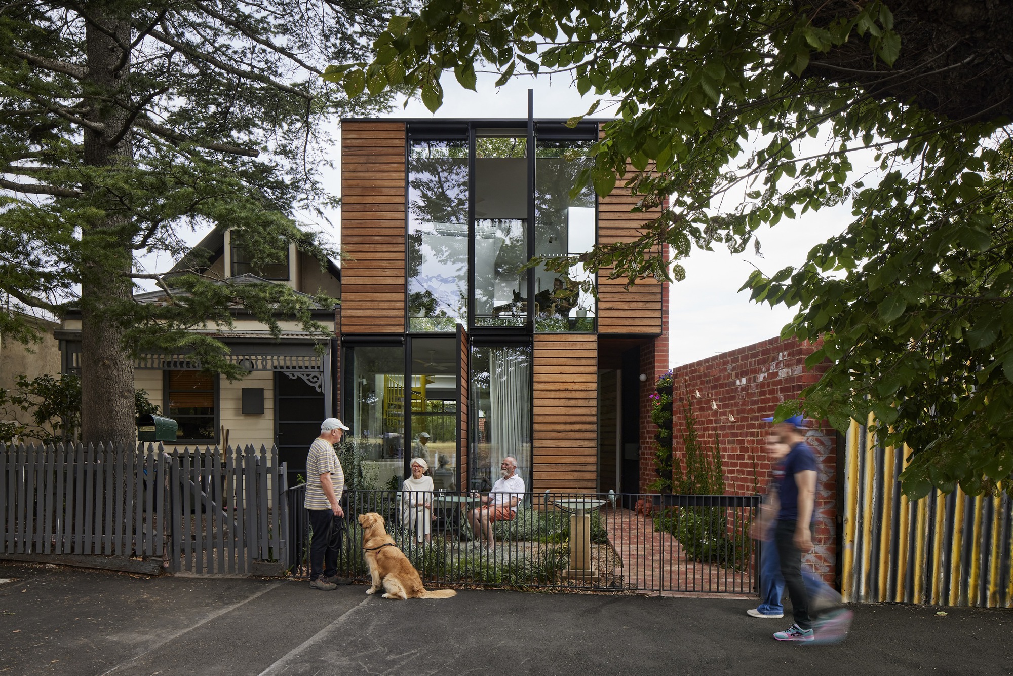
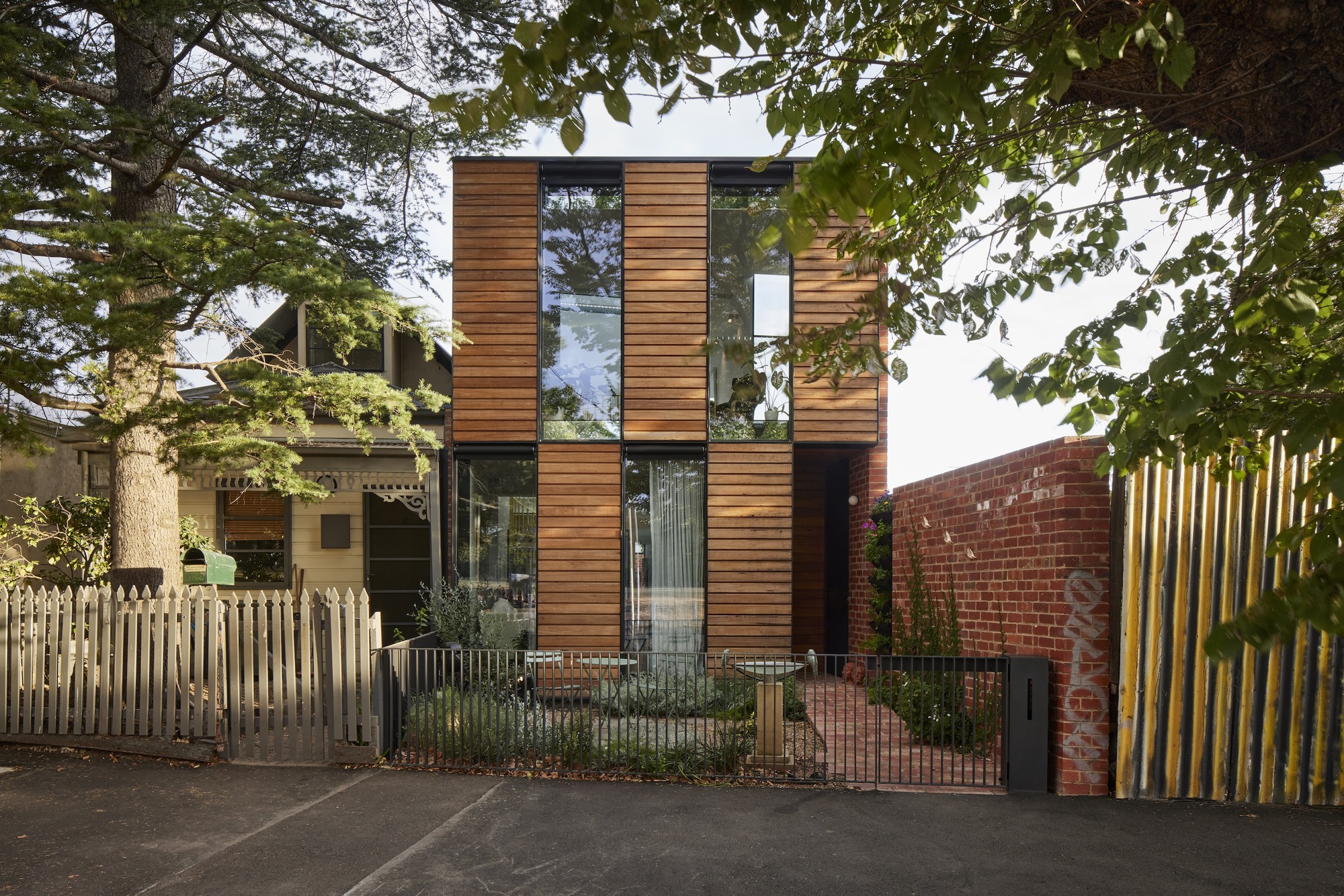
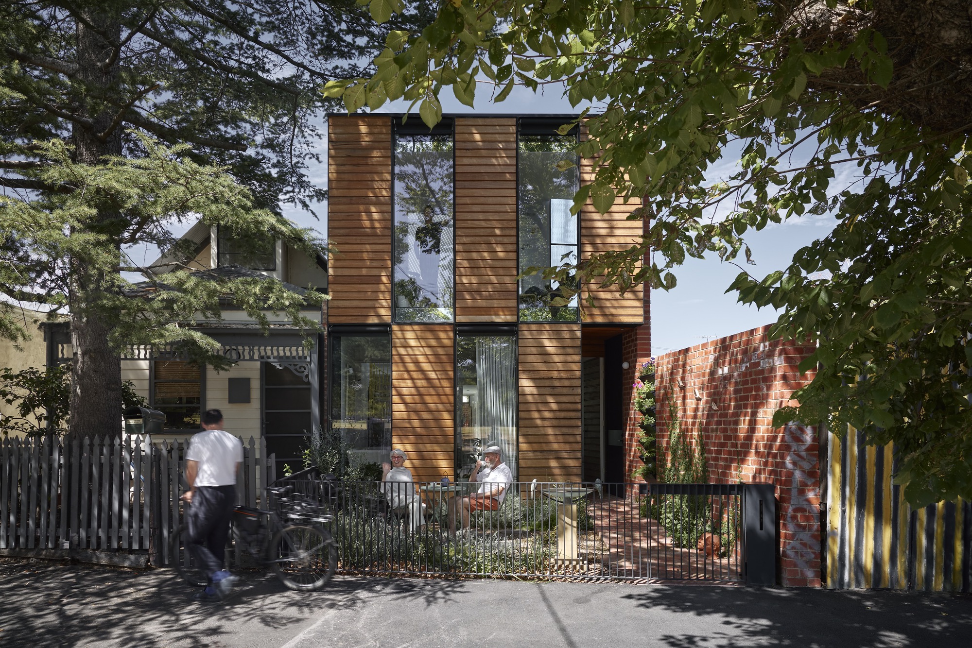
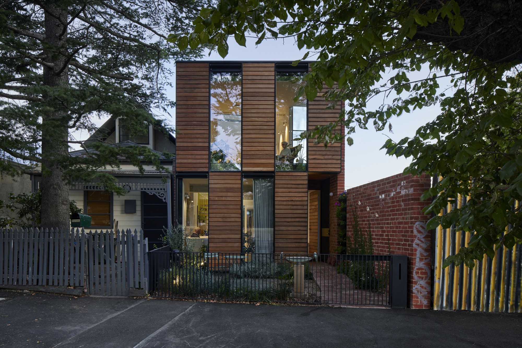
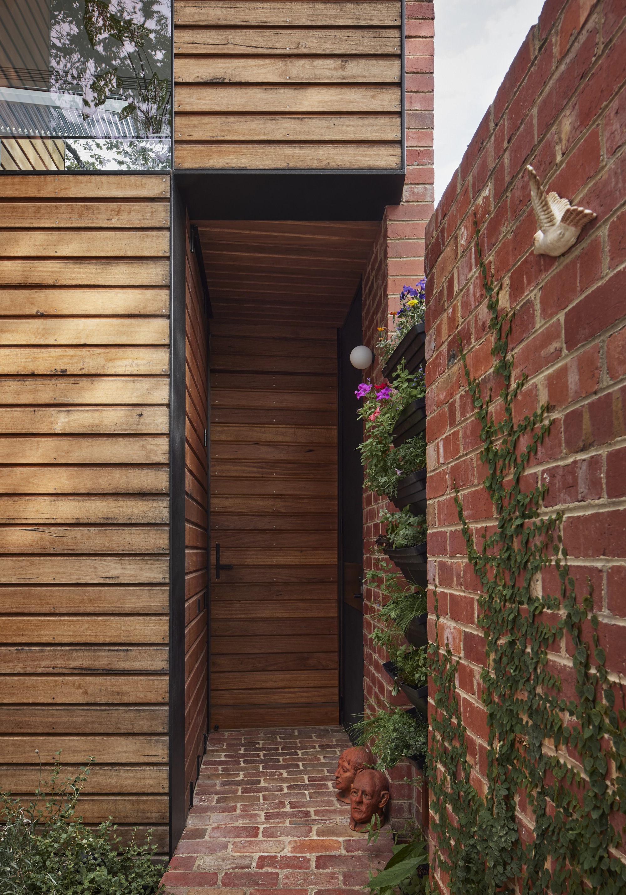
Parkside is an environmentally adaptable and deeply sustainable home intended for aging-in-place. This compact two-storey house realises the owner's longstanding retirement plan; to downsize into their own backyard.
According to studies in the US, the financial benefits of creating a second dwelling on your land are only part of the incentive; as many older householders have strong attachments to their suburbs and communities and simply do not want to leave. In Australia, research shows the same is true here. Retirees and empty nesters are looking to alternative solutions in housing, in a bid to lead simpler lives, reduce costs and make a positive environmental impact by taking up less room.
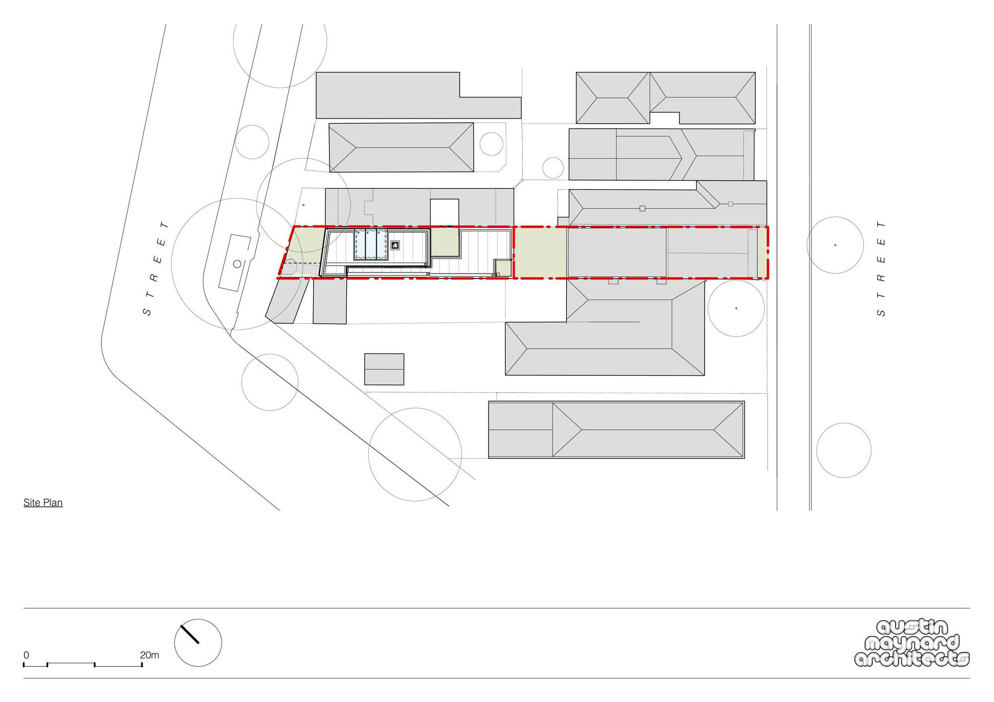
The owners of Parkside, Bryan and Marija, first purchased a single-fronted Victorian terrace in North Fitzroy, Melbourne almost twenty years ago. Drawn to the vibrant location, the 50-metre-deep block and the dual street access, they saw the potential for future subdivision. The plan was to release the original family home at the front of the site and make better sense of the northern orientation at the rear, opening views of the park that were previously blocked by a garage.
Parkside is located on a significant and important heritage-protected street, just north of the city. Although directly responding to the housing shortage and the urgency to increase density within the inner-city suburbs, Parkside is the antithesis of a quick-fix solution. Parkside is a resilient and efficient home that increases connectivity and liveability while respecting the heritage and character of the area.
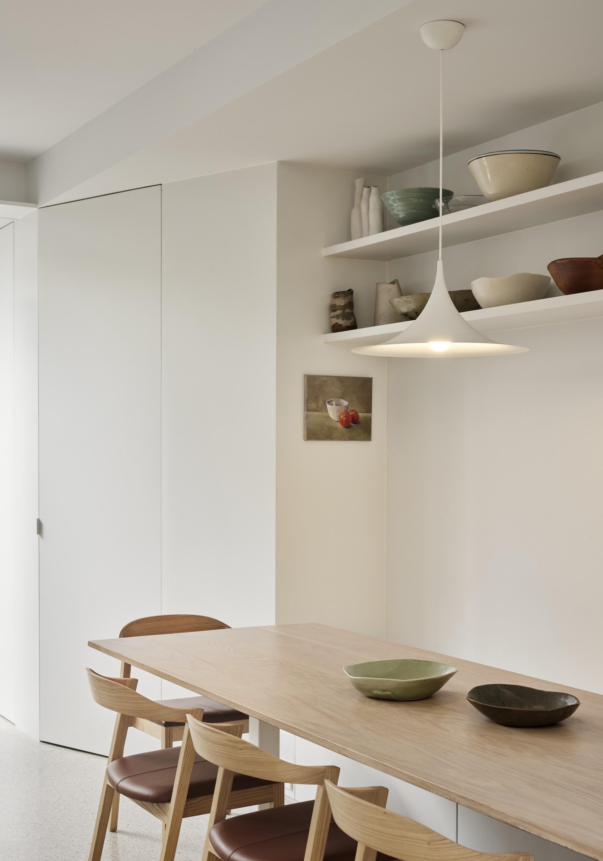
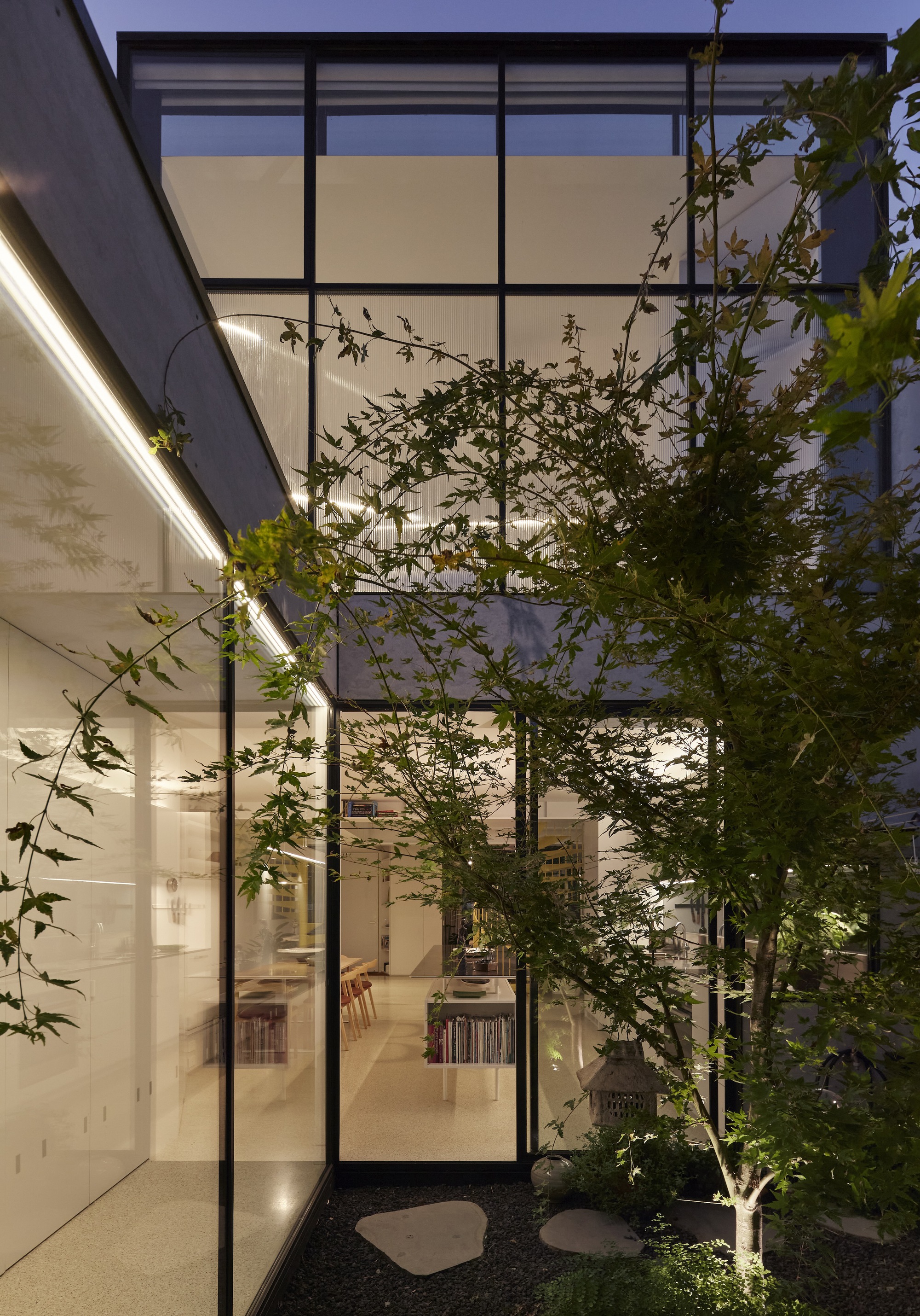
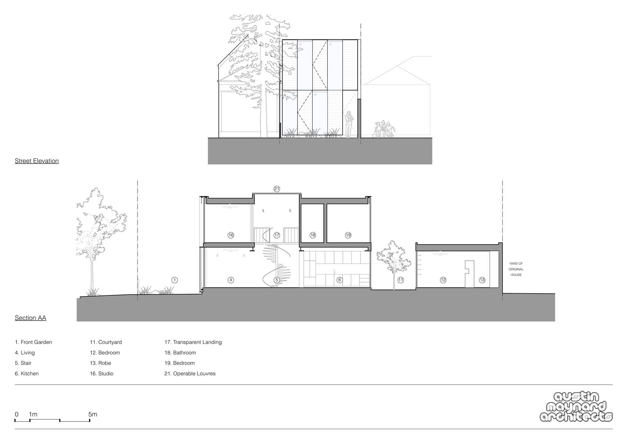
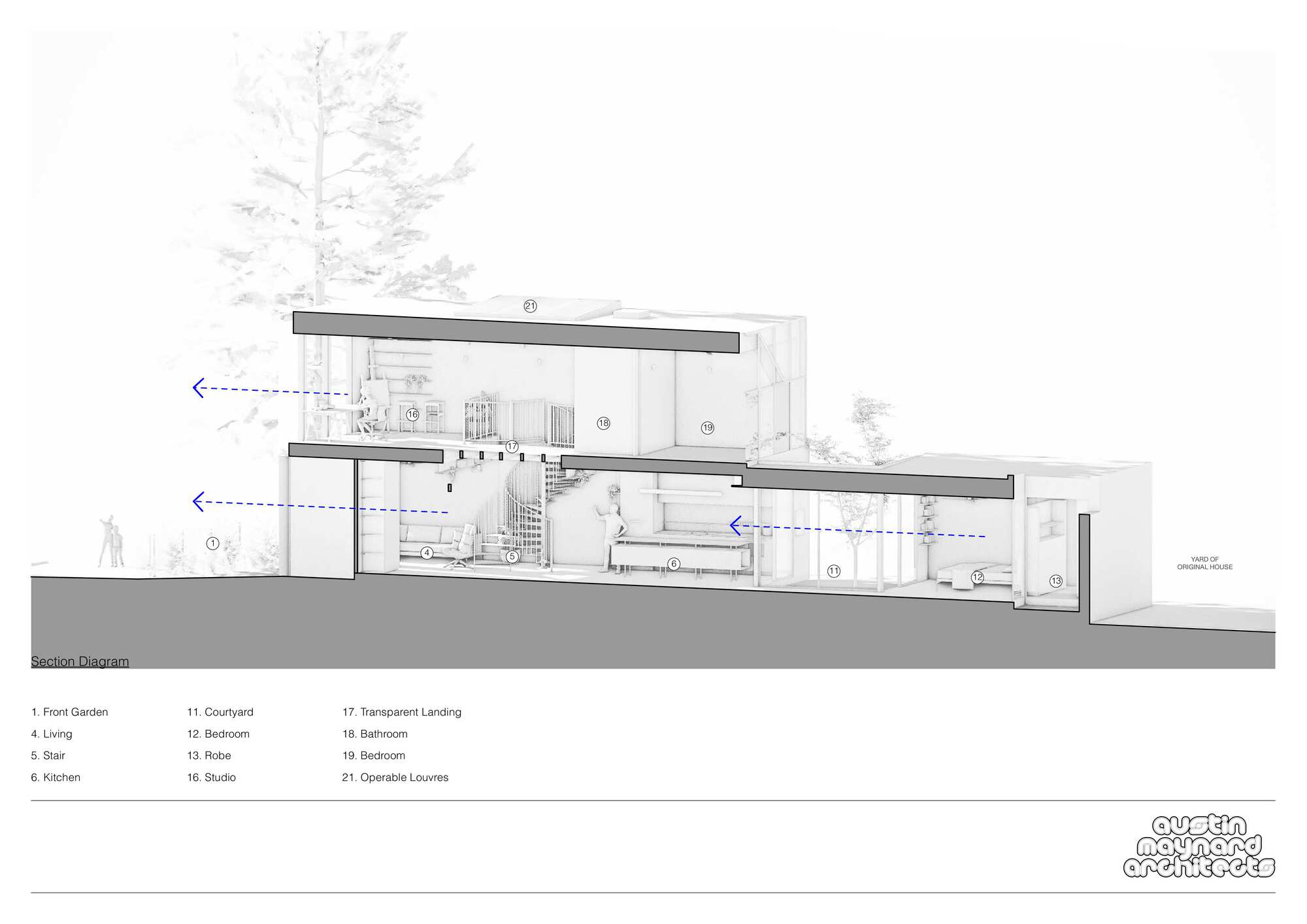
Parkside's design emphasizes flexibility, light control and ventilation, achieved through a combination of operable panels, a central courtyard and strategically placed skylights and louvers. This confluence of strategies allows the owners complete control of their environment, their light, privacy and their connectivity. The front facade is divided into a series of full-height modules - fixed timber panels, fixed glass panels and operable panels; each identical in size and arranged in an alternating pattern. Behind the operable panels, there are windows that can be opened to allow ventilation throughout the house. The operable timber panels are adjustable, and operated on an automatic remote system, as are the full-height external window blinds, affording full control over sunlight and privacy.
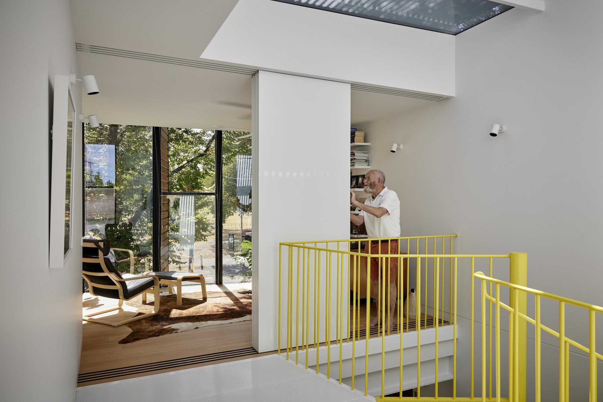
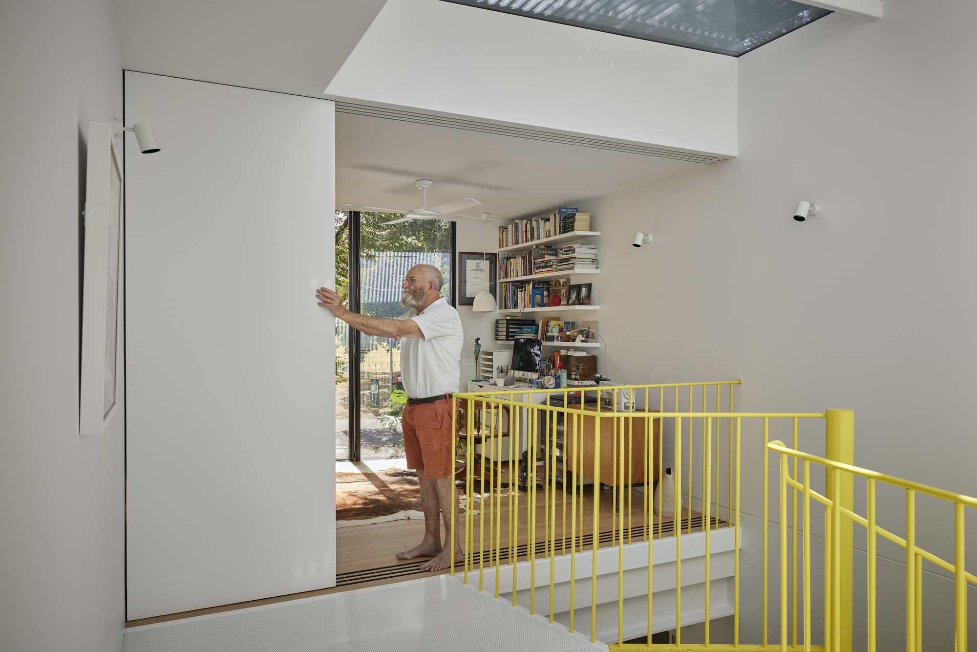
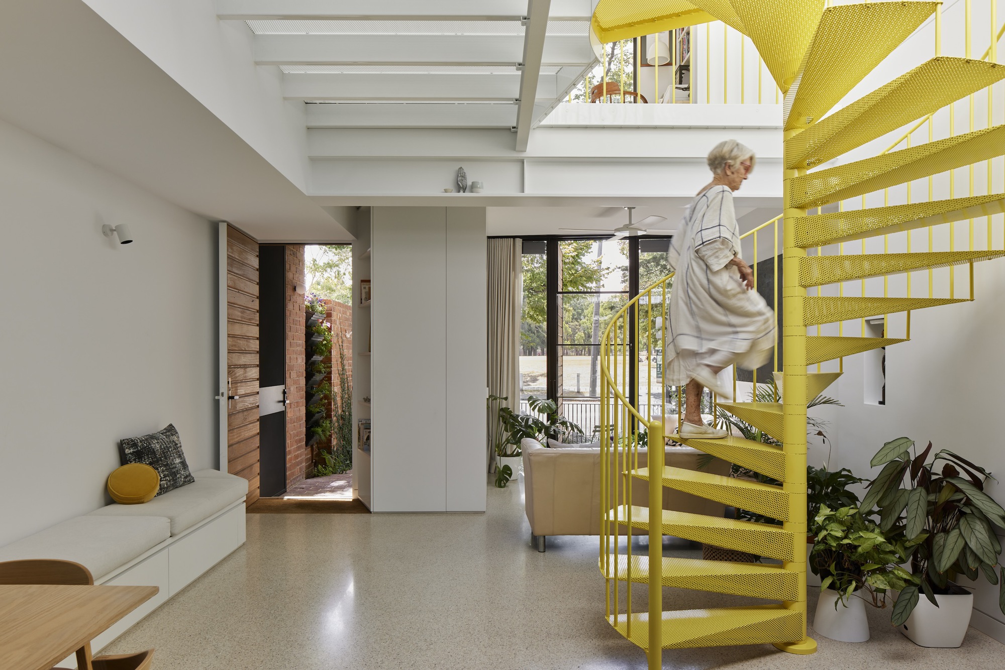
Embracing the notion of smaller, but better, Parkside embraces harder-working design elements. Playing with natural light and vertical space to provide single-level living, as well as a guest bedroom, bathroom and art studio on the first floor - accessed via a sculptural bright yellow spiral stair. A central courtyard invites sunlight, fresh air and greenery directly into the open-plan layout, while the park opposite serves as their garden - an abundance of grass, trees and flowers they have the fortune to use and look at, but don't have to maintain.
"The first thing I do every morning is open up the shutters and blinds. I can't do anything until I've done that. I love the openness of the park, it's absolutely magic. It's like being in the countryside." Bryan, owner of Parkside.


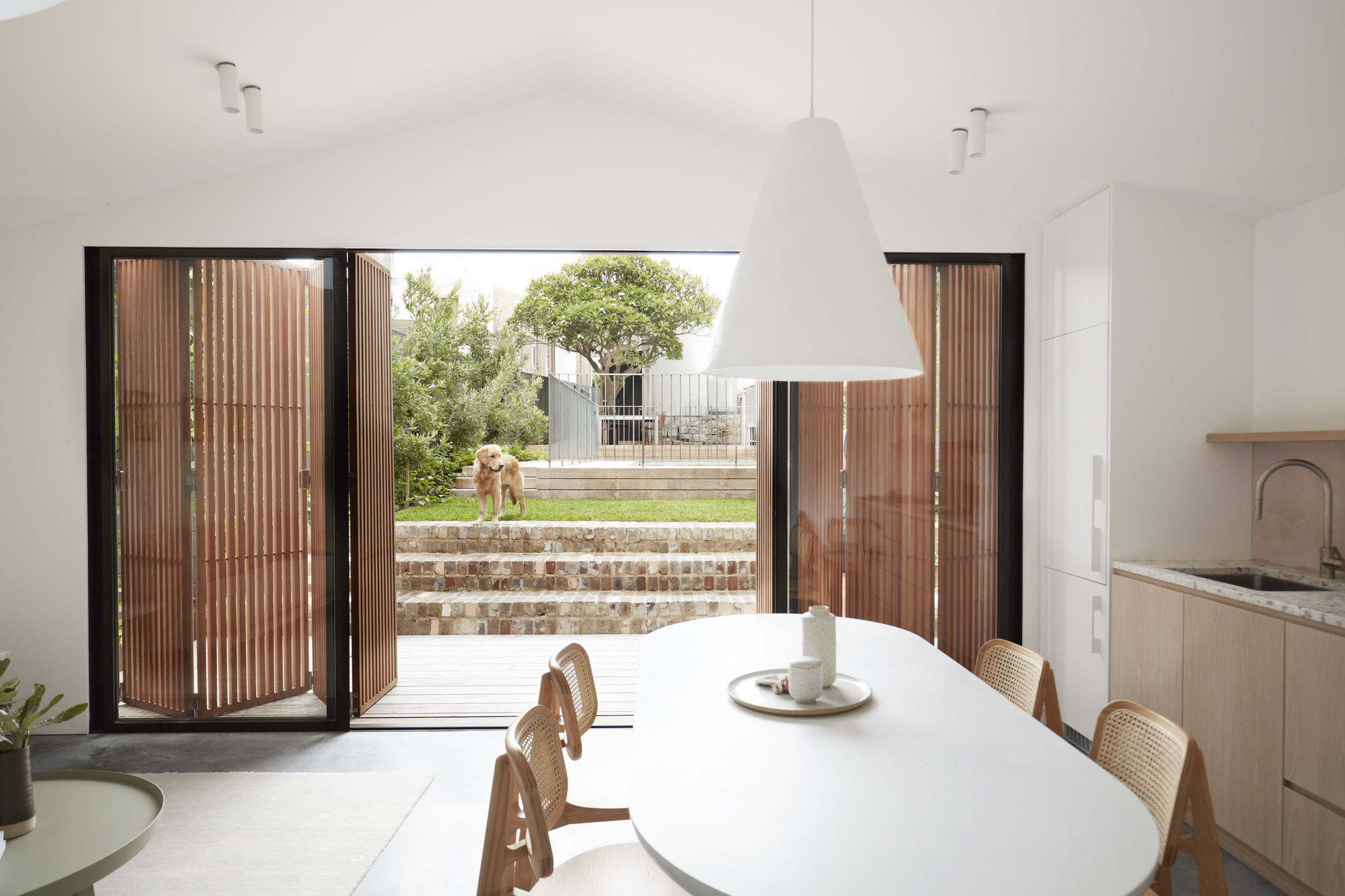
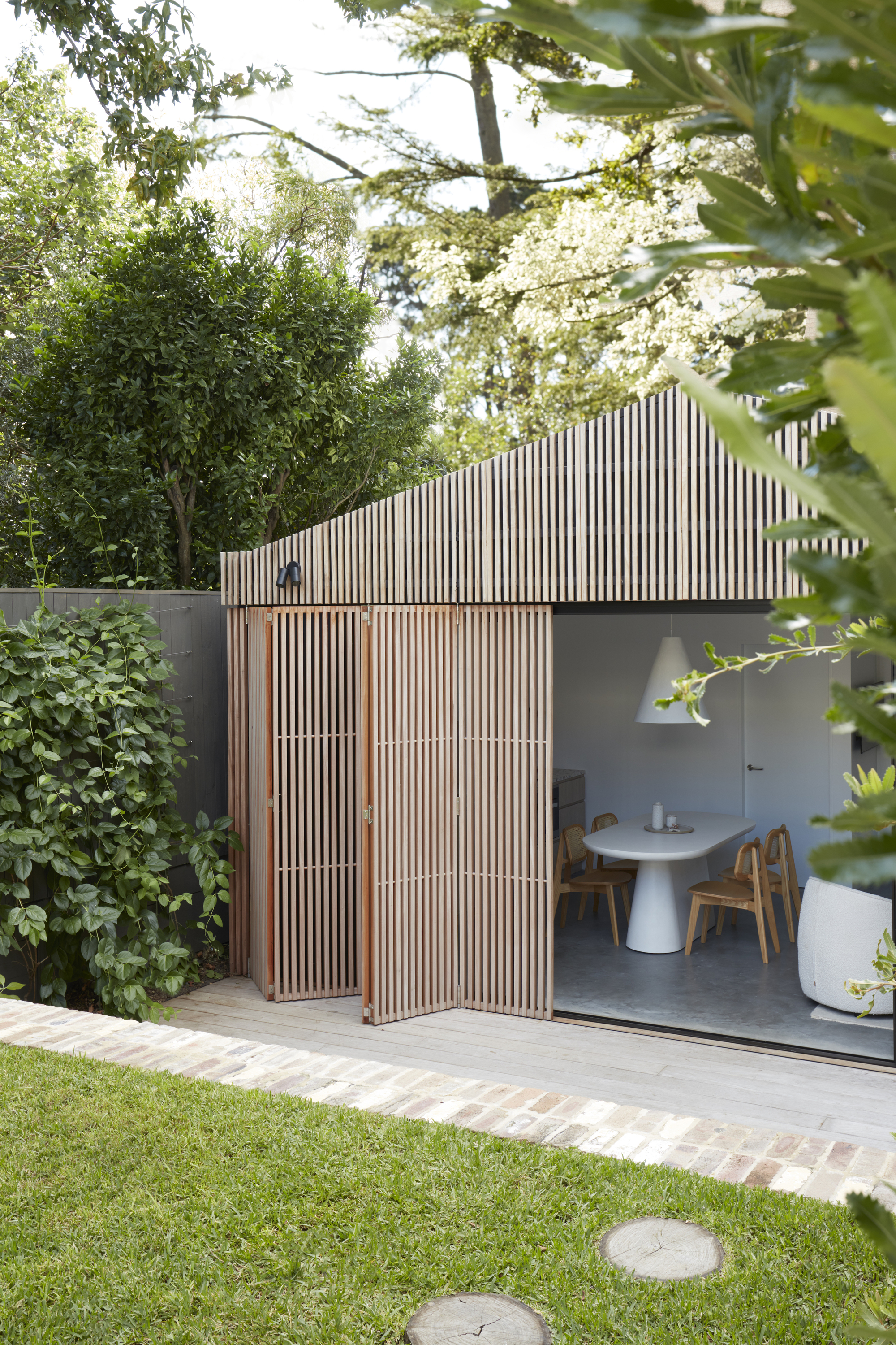
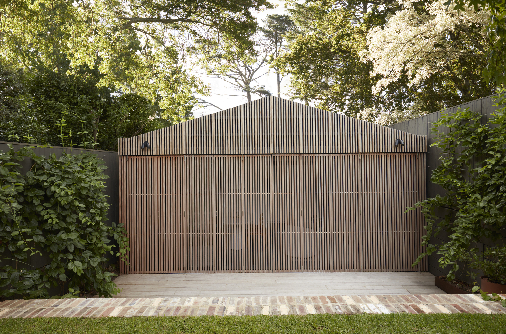
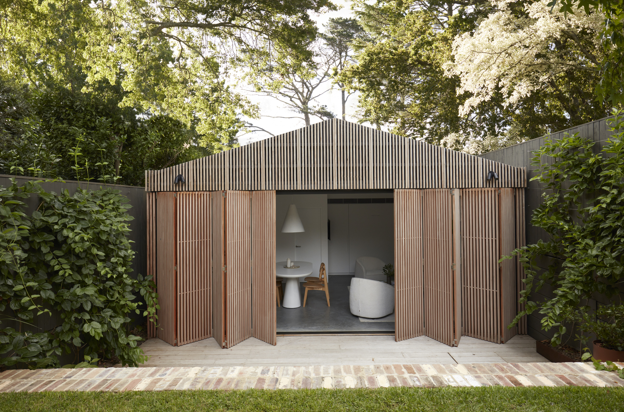
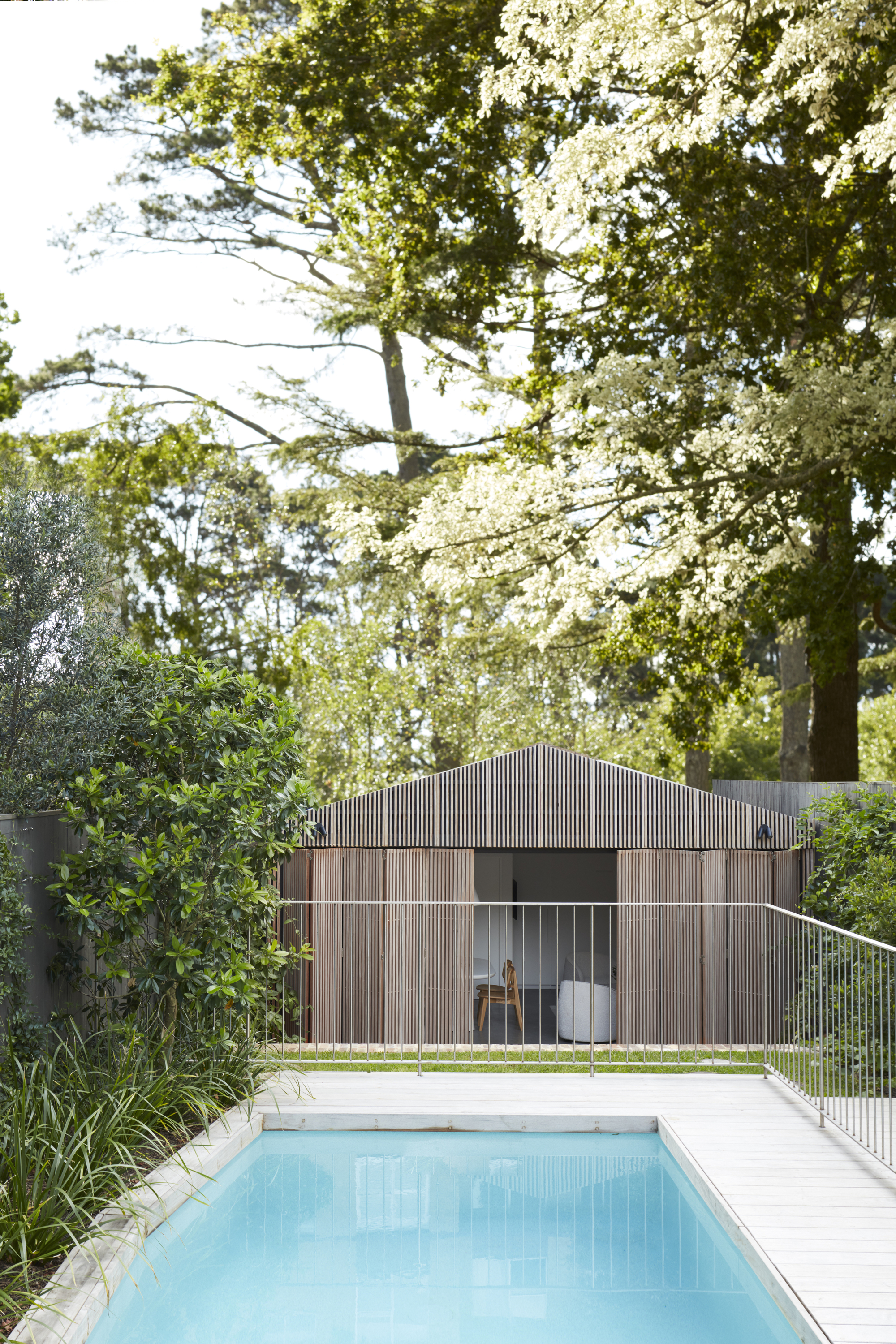
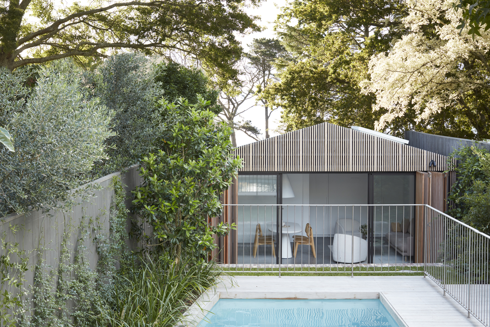
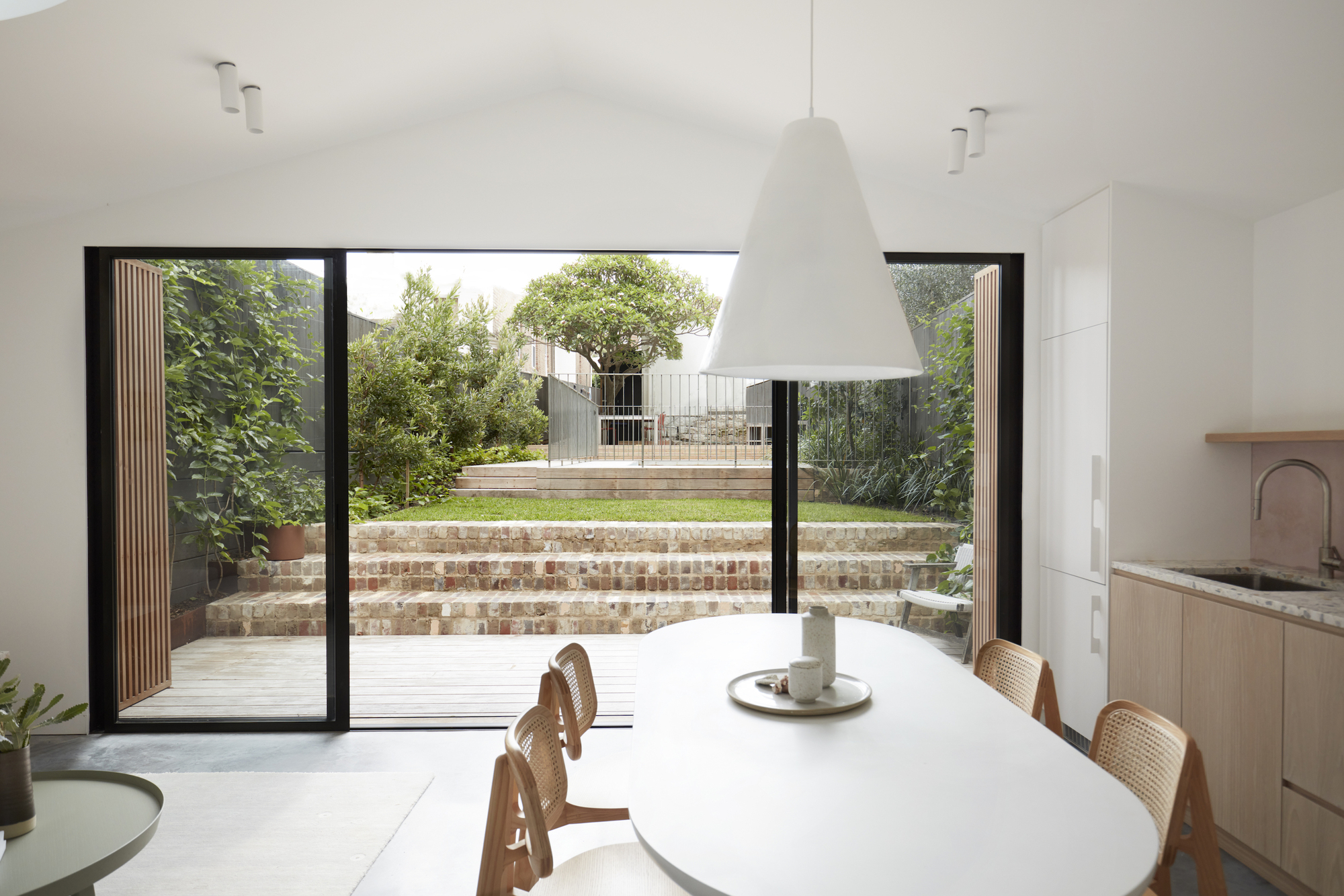
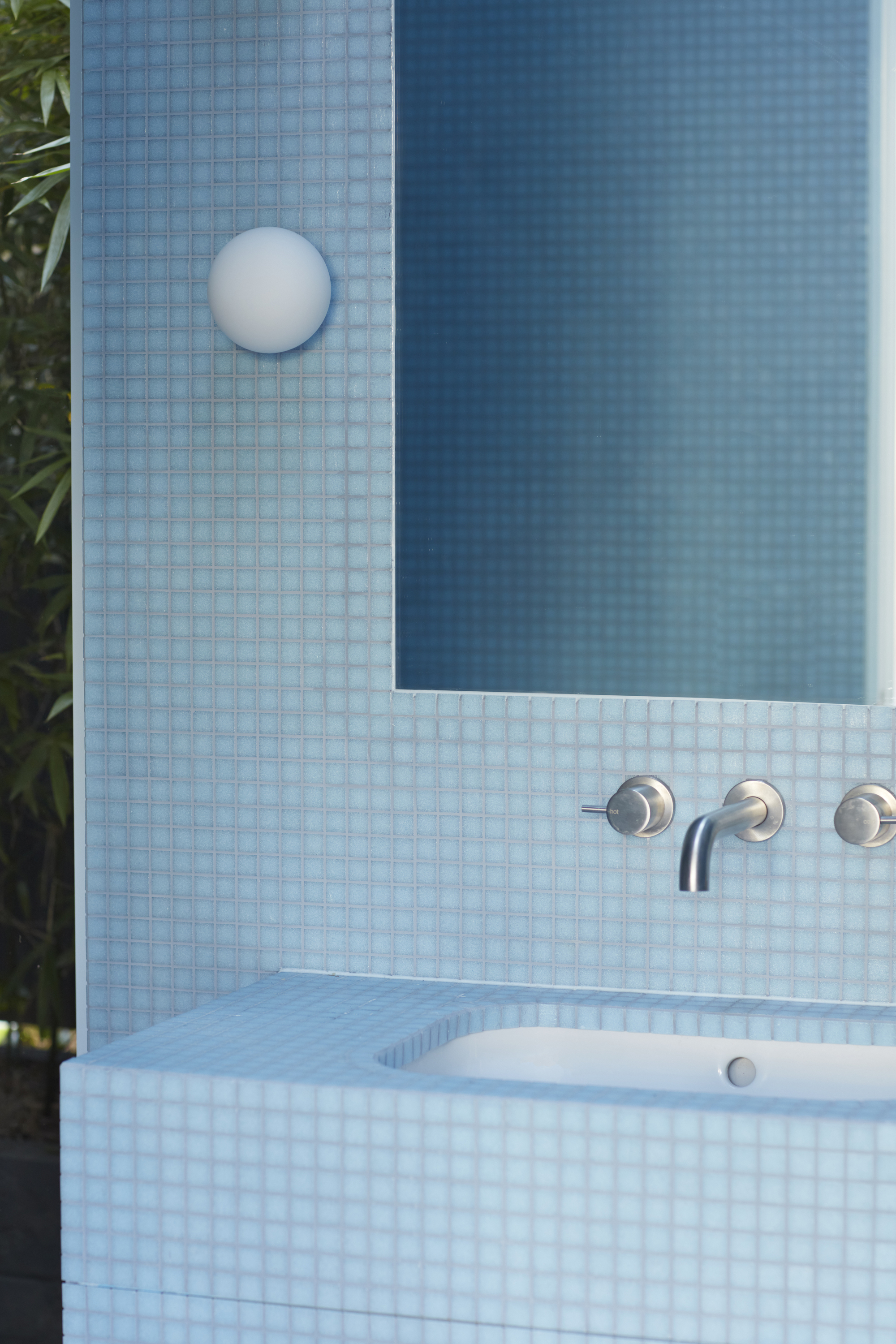
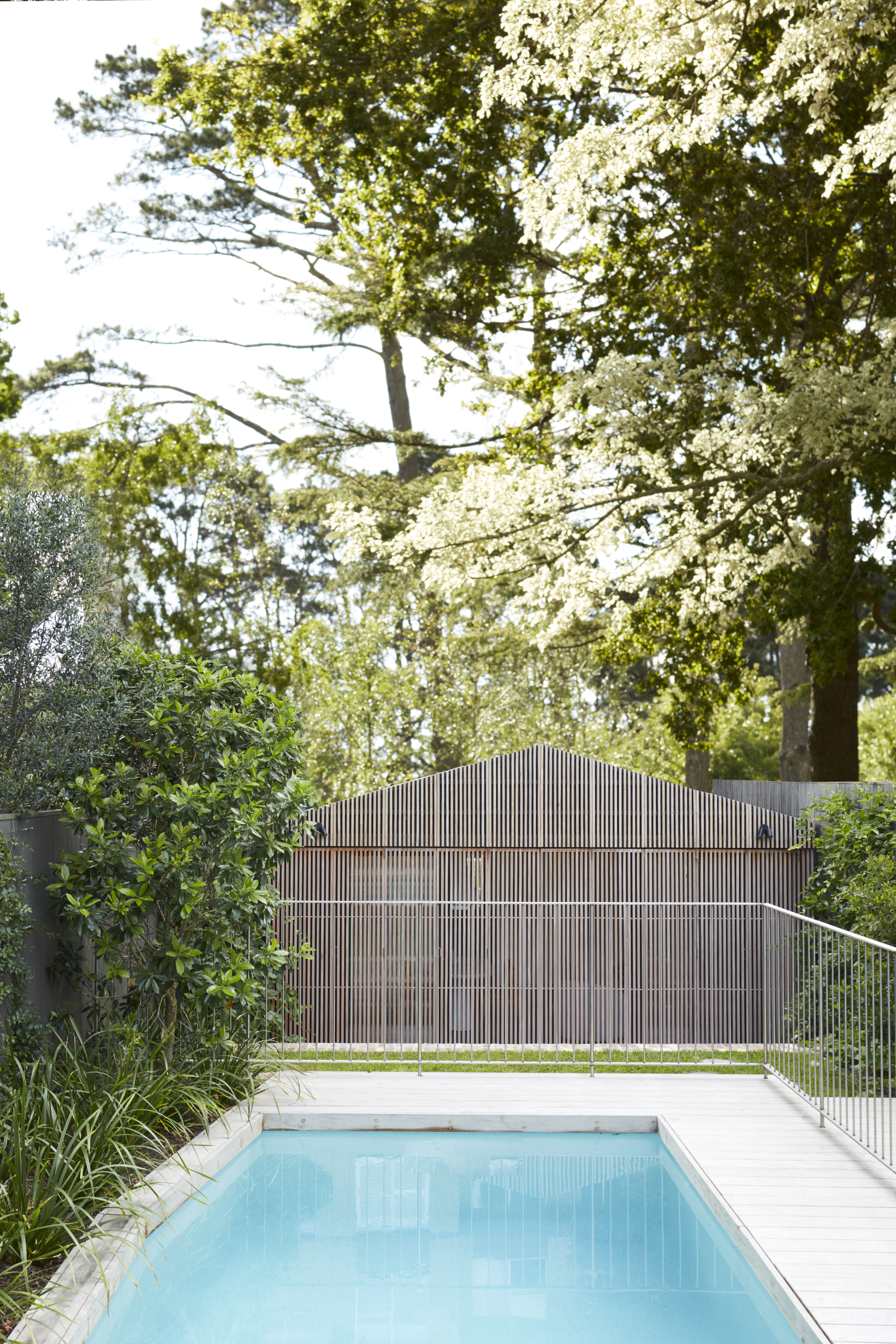
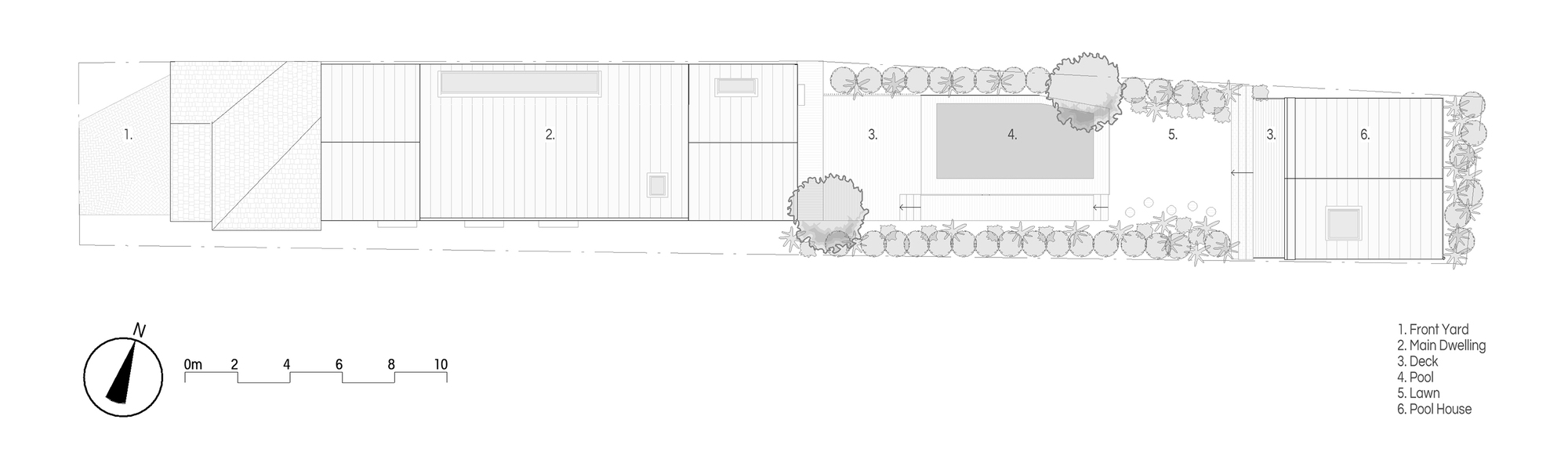
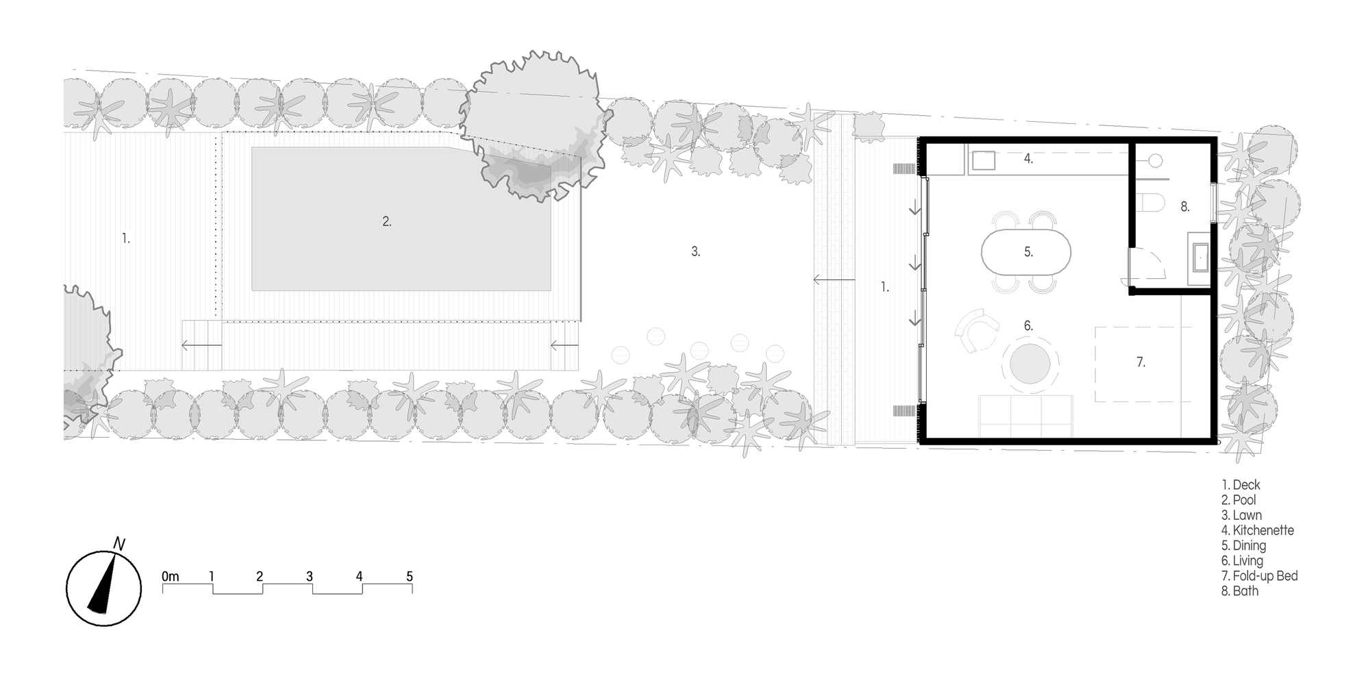
Pool House
#architecture
Architects: buck&simple
Area: 37 m²
Year: 2024
Photographs: Prue Ruscoe
Country: Australia
Located on the traditional lands of the Eora people, tucked behind a traditional semi, Pool House is a hidden backyard gem in the Eastern Suburbs. A statement in simple function, its robust natural materials make it a focal point for leisure and relaxation.
Buck & Simple designed a structure that harmonizes with its suburban surroundings while providing a highly functional and aesthetically appealing outdoor living space. Natural elements such as wood and stone enhance its contextual relevance, creating a soothing atmosphere.
Defined by a minimalist yet durable material palette, the pool house serves as a retreat for entertaining, relaxing, and gathering. It balances privacy with an open connection to the backyard and pool. As the first stage of a broader development, it functions as a secondary dwelling, catering to a shift-working family member while enhancing daily rituals through passive design, natural materials, and seamless indoor-outdoor integration.
Guided by simplicity, material integrity, and a strong connection to place, Pool House fosters a calm, functional environment where form and purpose coexist. Passive design strategies maximize ventilation, natural light, and thermal performance, reducing reliance on mechanical systems. Time-tested construction techniques ensure durability, aligning with a budget-conscious, function-forward approach. Locally sourced and recycled materials age gracefully, minimizing environmental impact.
The pavilion-like structure blurs indoor and outdoor boundaries, reinforcing a connection to nature. Through craftsmanship and material honesty, it maintains an enduring quality where raw materials tell a story of time and use. Every element is intentional, supporting mindful living through spatial clarity, sustainable choices, and timeless materials.
Enhancing daily life as a tranquil retreat, Pool House strengthens the family's bond with nature and the pool. Expansive openings invite fresh air and natural light, ensuring year-round comfort. Durable, tactile materials promote ease of use and low maintenance, allowing the space to evolve over time. Designed for both solitude and social gatherings, it fosters relaxation, connection, and enjoyment.
Carefully positioned to integrate with the pool and landscape, the structure extends outdoor living. Large sliding openings enhance airflow, while a restrained material palette echoes water, stone, and timber, ensuring harmony with its setting. Thoughtful orientation maximizes natural light and ventilation, providing shade, shelter, and an inviting atmosphere.
Strategic decisions balance high-quality design with cost efficiency. Durable, low-maintenance materials, including Fijian mahogany cladding, ensure longevity. Challenges such as water and rock in the groundwork were resolved with careful planning, incorporating a stormwater retention system. Passive design principles, including solar orientation and a burnished floor, enhance energy efficiency while reducing costs. A streamlined structural approach optimized construction expenses without compromising design. These thoughtful decisions resulted in a refined, timeless space that enhances the family's lifestyle for years to come.


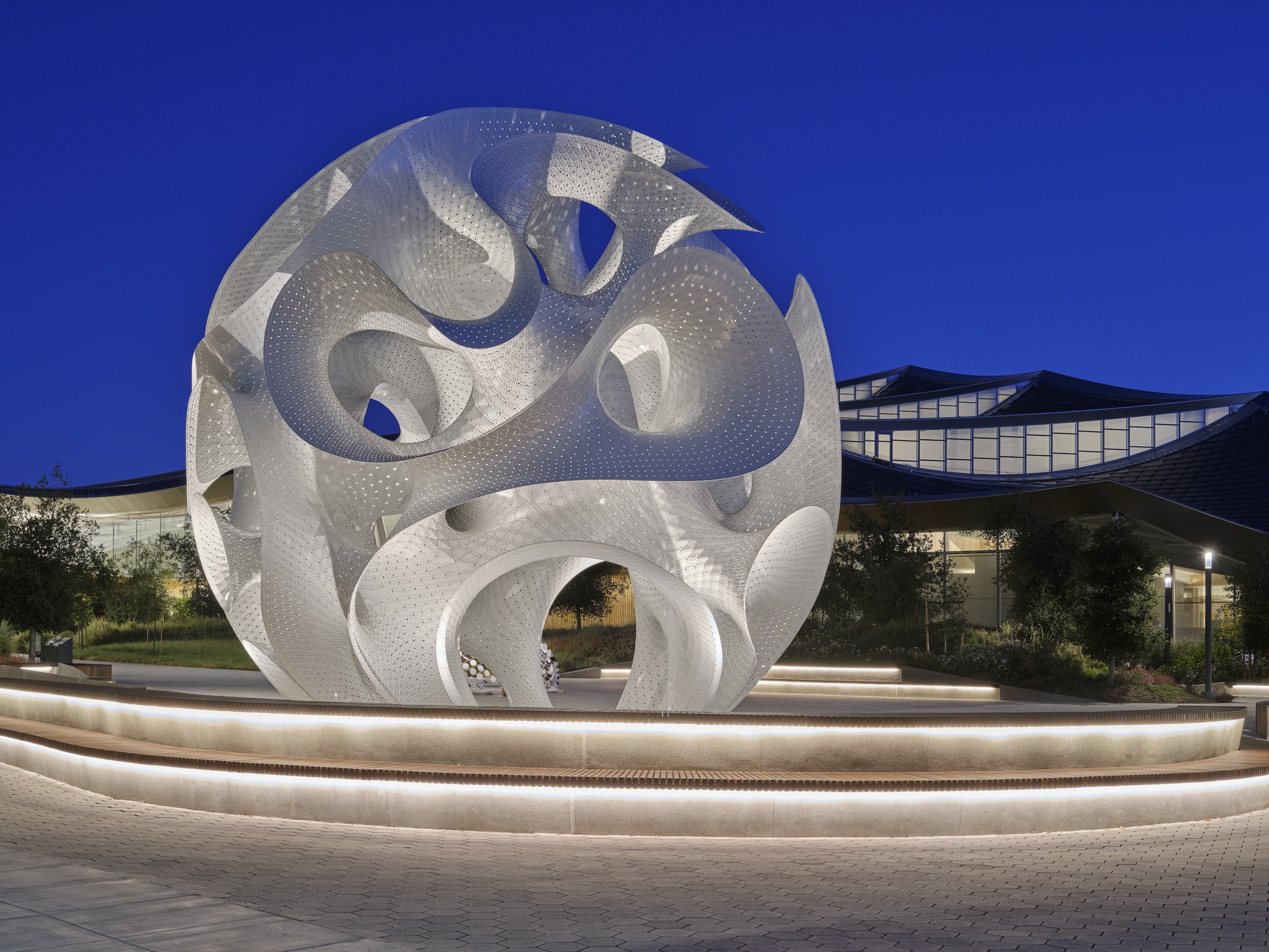
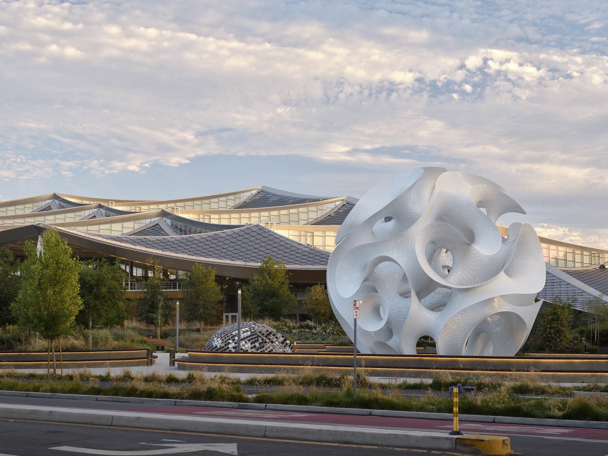
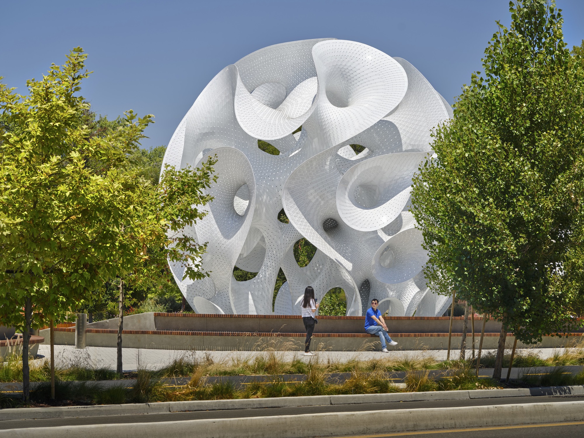
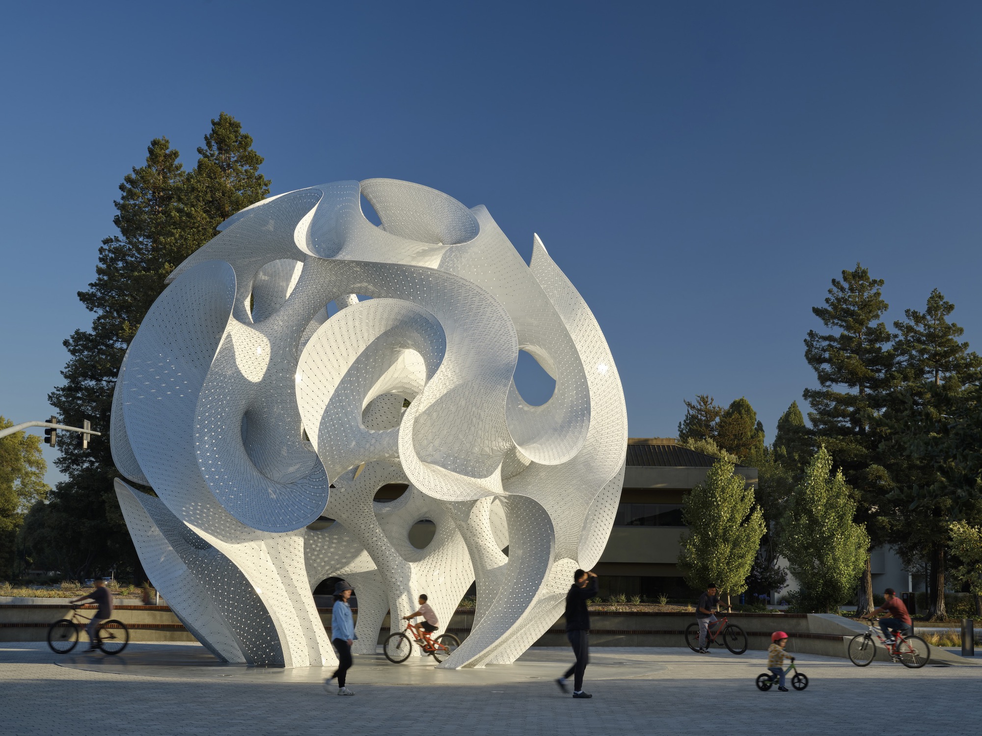
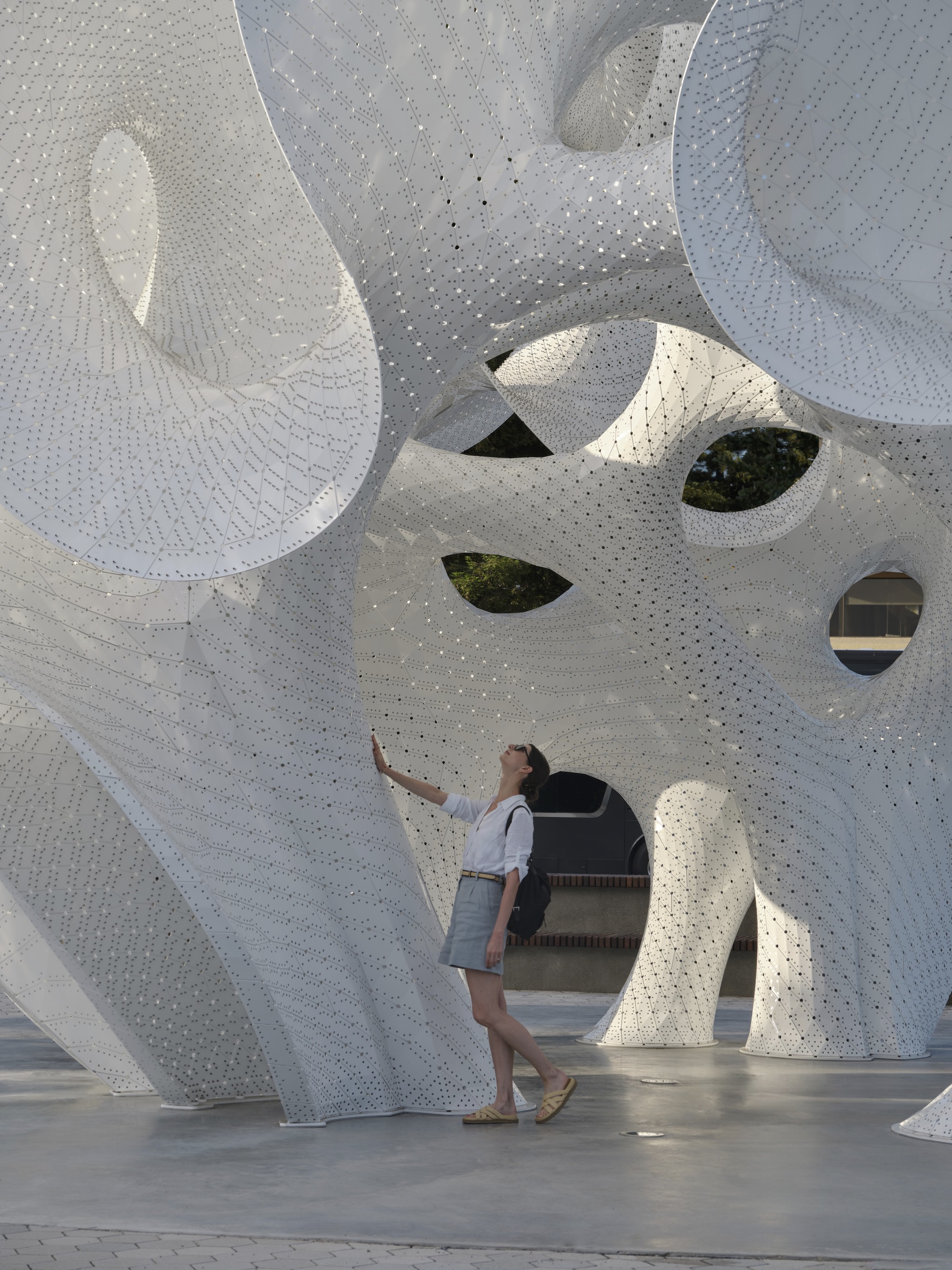
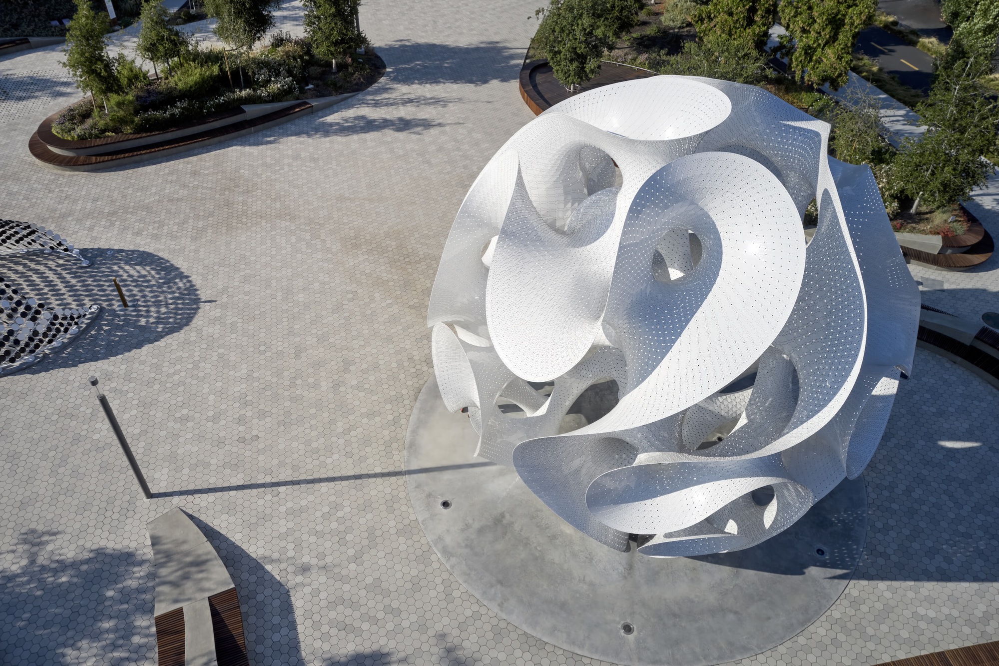
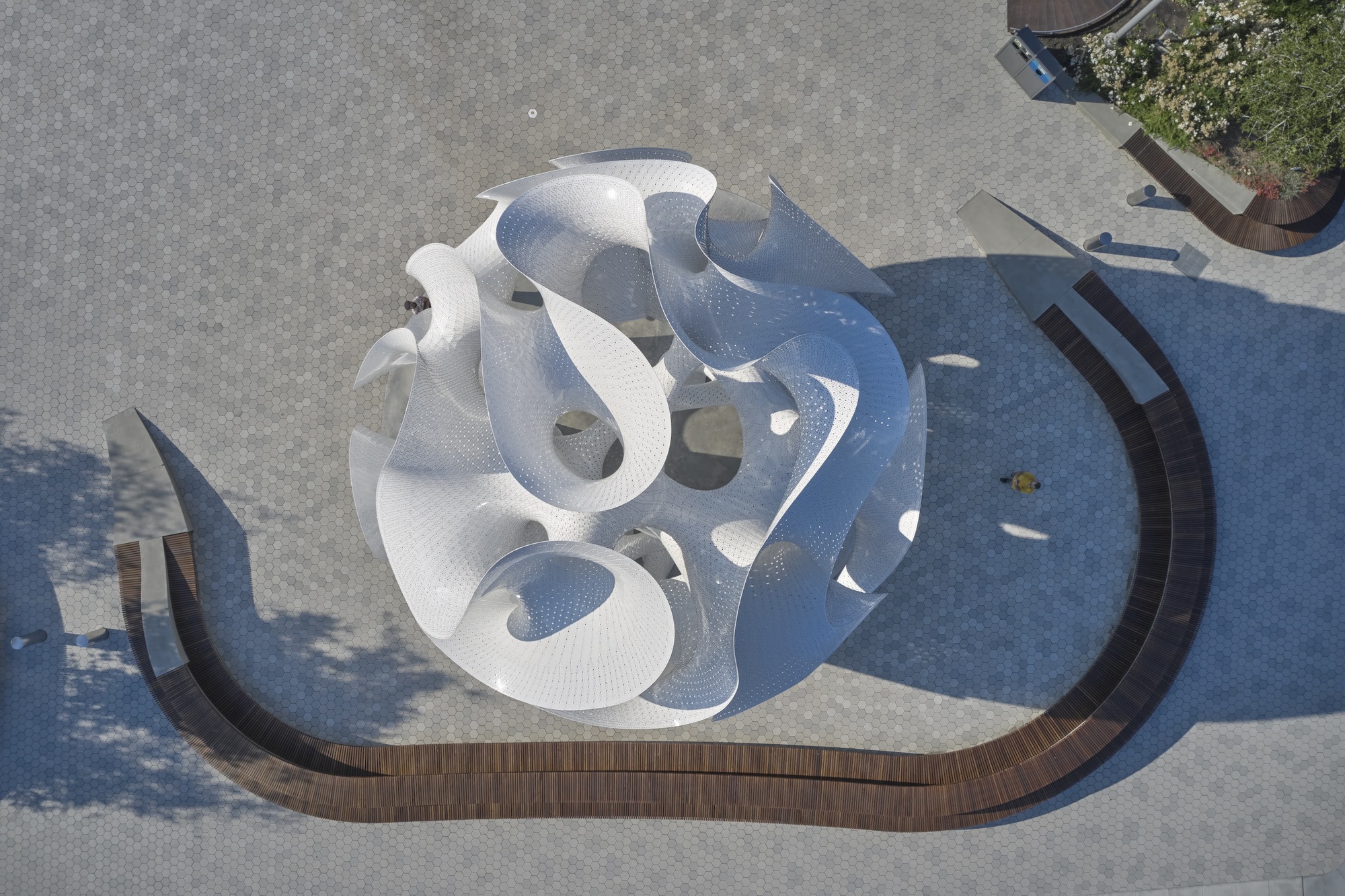
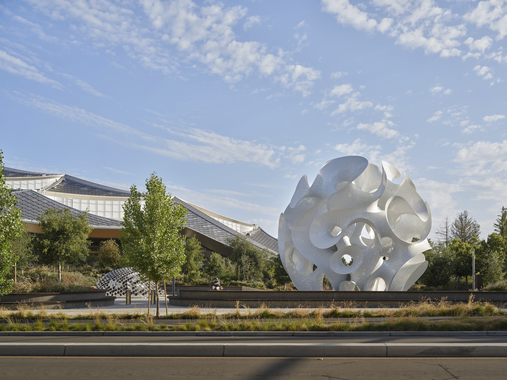
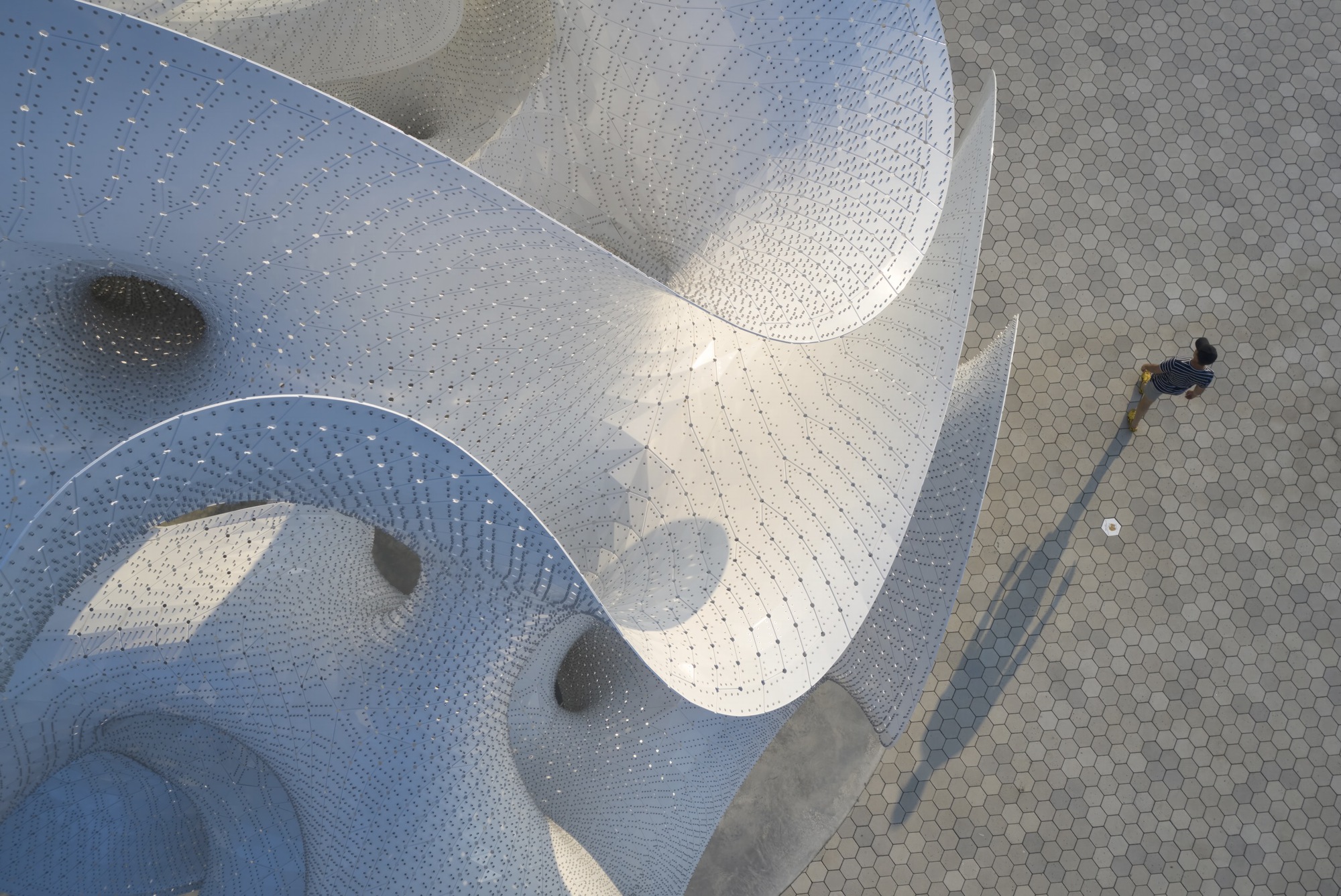
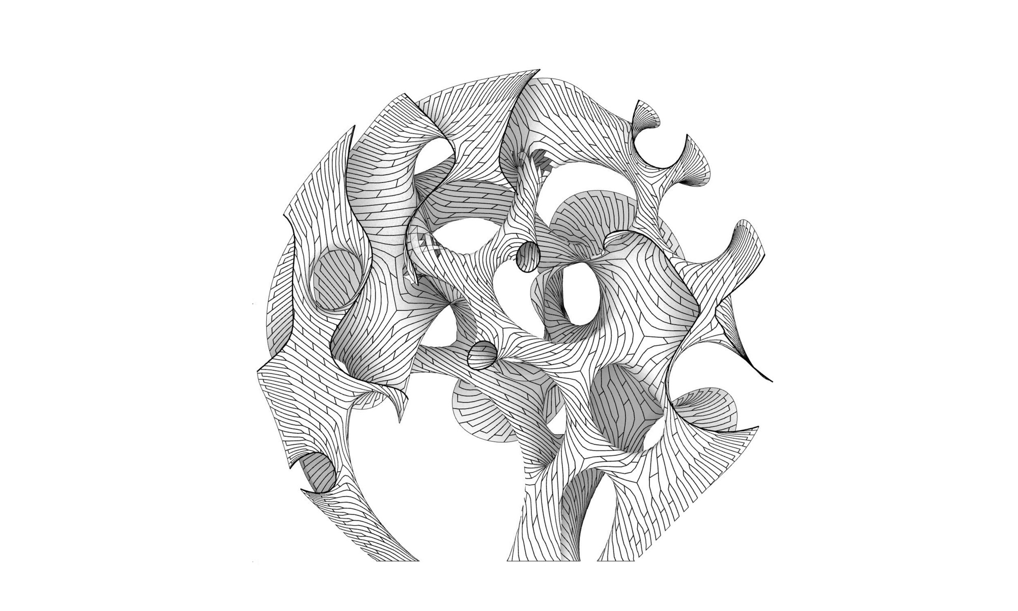
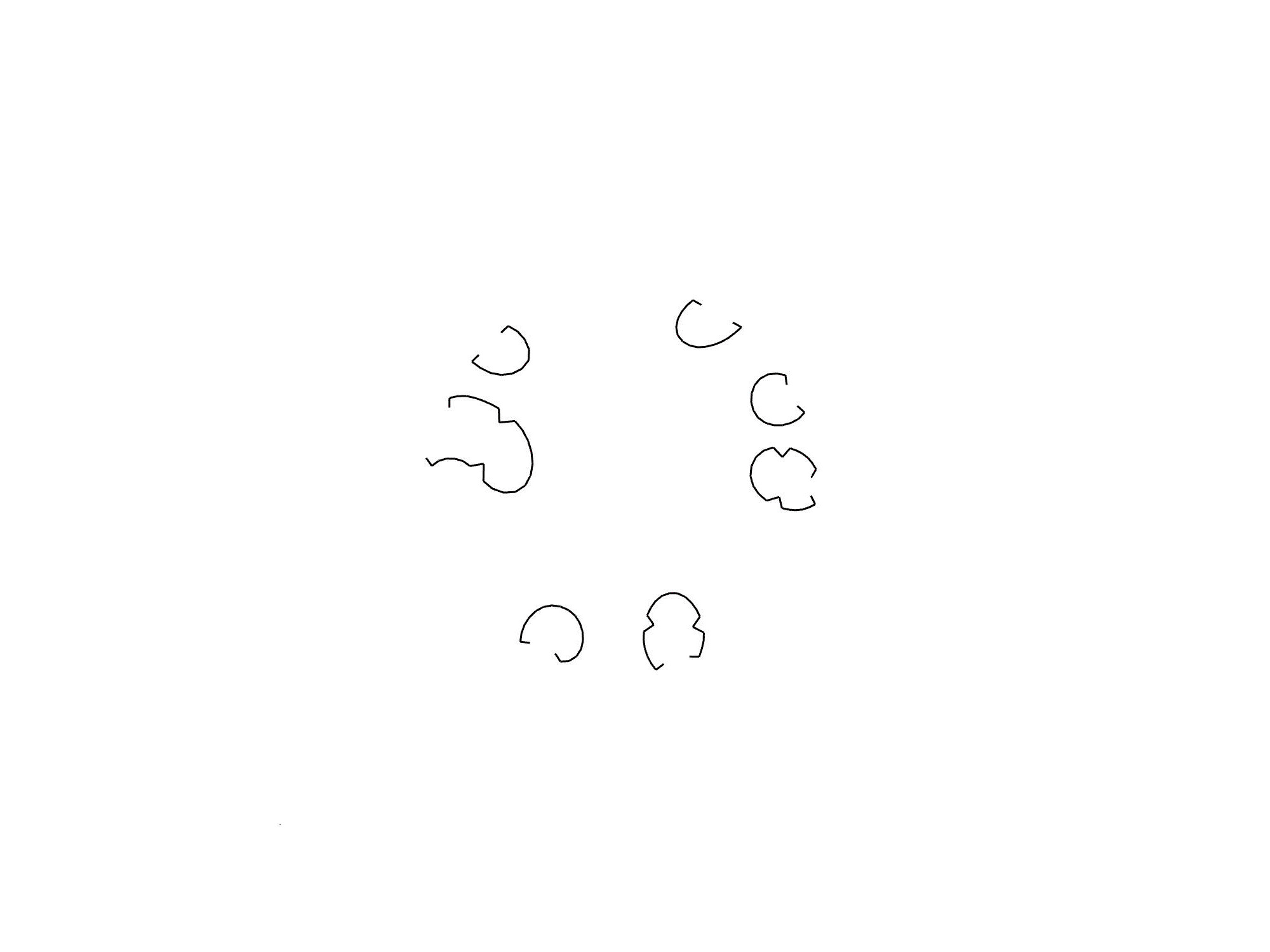
The Orb
#architecture
Architects: MARC FORNES / THEVERYMANY
Year: 2025
Photographs: Doublespace Photography
Commissioner: Google
City: Mountain View
Country: United States
Commissioned by Google and designed by Marc Fornes/THEVERYMANY, The Orb is a monumental pavilion in Mountain View, California. This 10-meter-tall, 26-meter-wide, ultra-thin aluminium structure serves as the centrepiece of the public plaza at Google's Charleston East Campus. Its undulating, surreal form embodies the spirit of innovation and creativity central to the company's work culture.
he Orb lies somewhere between a pavilion and an art installation. "For architects, we're too much of an artist; for artists, too much of an architect," says Marc Fornes. What is essential for his studio is that the object is both functional and capable of provoking emotion and sparking naive curiosity. While The Orb performs as a place for encounters and contemplation, its organic form provides visitors with a dreamlike experience.
Edged yet edgeless, surfaces curve, branch, split, rejoin, and split again. This extreme curvature̶achieved through cutting-edge computational design̶enables the surfaces to be entirely self-supporting despite being just 3mm thick. Though apparently seamless, The Orb is crafted from 6,441 individual aluminium components, connected by over 217,000 rivets̶making it not just visually striking but sophisticatedly engineered.
Even before anyone steps inside, the fluid surfaces of the pavilion interact with light, casting irregular shadows that seem to be constantly in flux. Made of perforated aluminium, these surfaces allow daylight to filter through them, creating a dappled effect on the ground evocative of a starred sky. By night, the entire volume transforms into a glowing sculpture, establishing a dynamic interplay of light and shadow that evolves over time.
The Orb is an experiential landmark contributing to the campus' visual identity. It is an immersive, futuristic space for employees and visitors to gather, explore, and engage. And while the tools used by Marc Fornes/THEVERYMANY to create The Orb are complex, their goal is simple: to craft an experience that evokes joy̶the joy of wandering, the joy of marvelling.


the all caps navigation elements feel dated
I bet you never seen dev rizz like this before!! 🔥
hide ya wives, sisters & aunties nostr:npub1jlrs53pkdfjnts29kveljul2sm0actt6n8dxrrzqcersttvcuv3qdjynqn just got a new cut n it looks fresh my G!

nostr:note1h5h6zsvxrun37xu2uxu5qe83rkr7sem995zekfmhec4qsqaxussqmgd3ft
"hey guys, I heard there was a party here..."
lol
Android design is generally shit. Only people without taste don't recognize it.
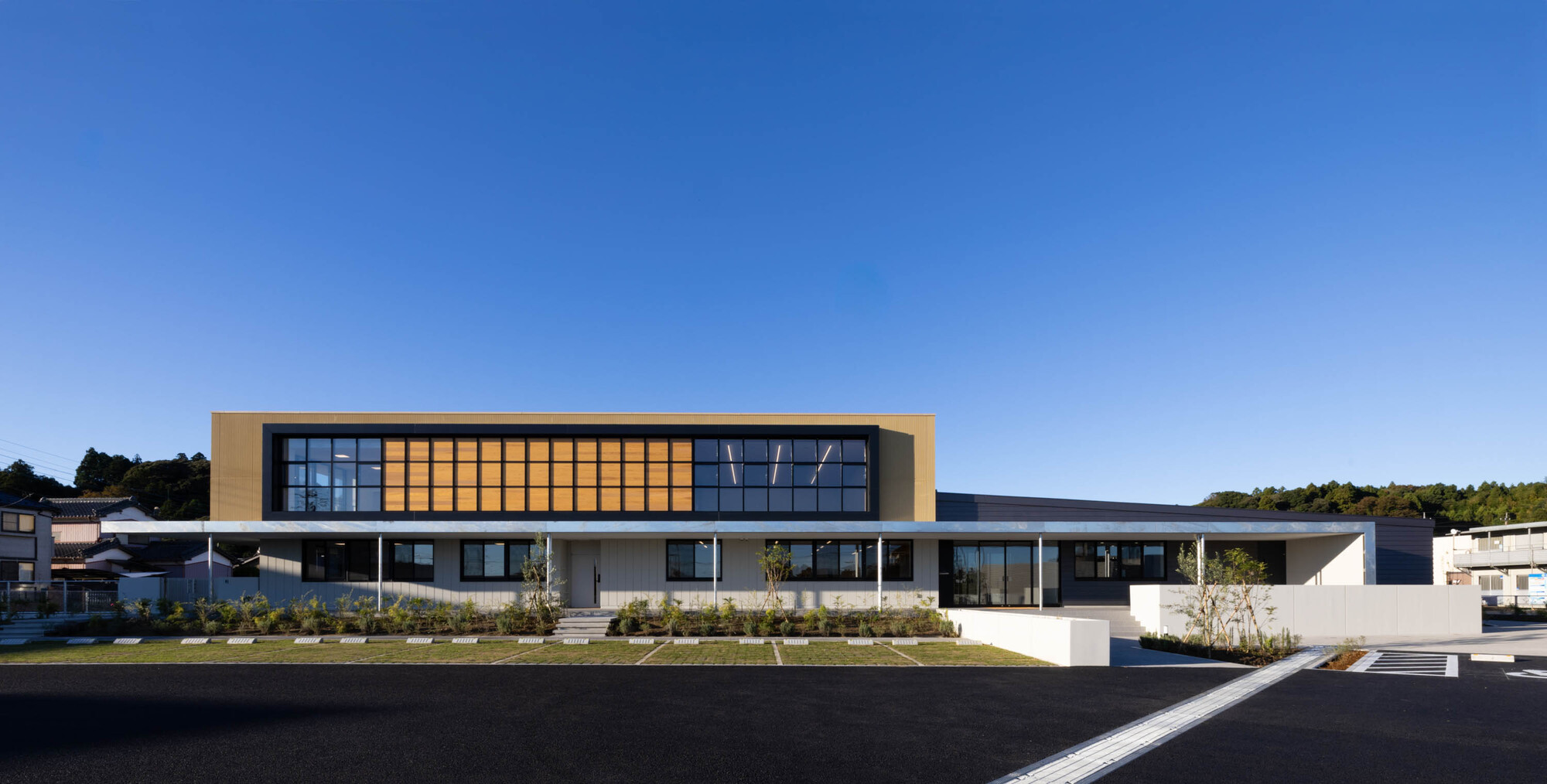
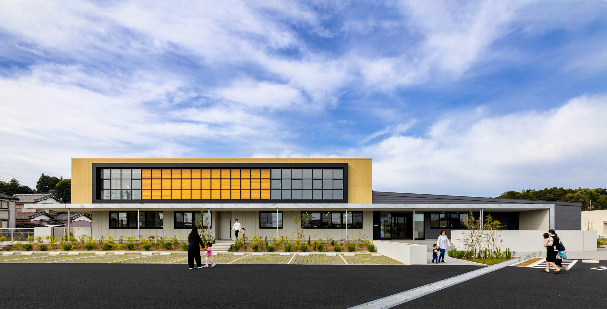
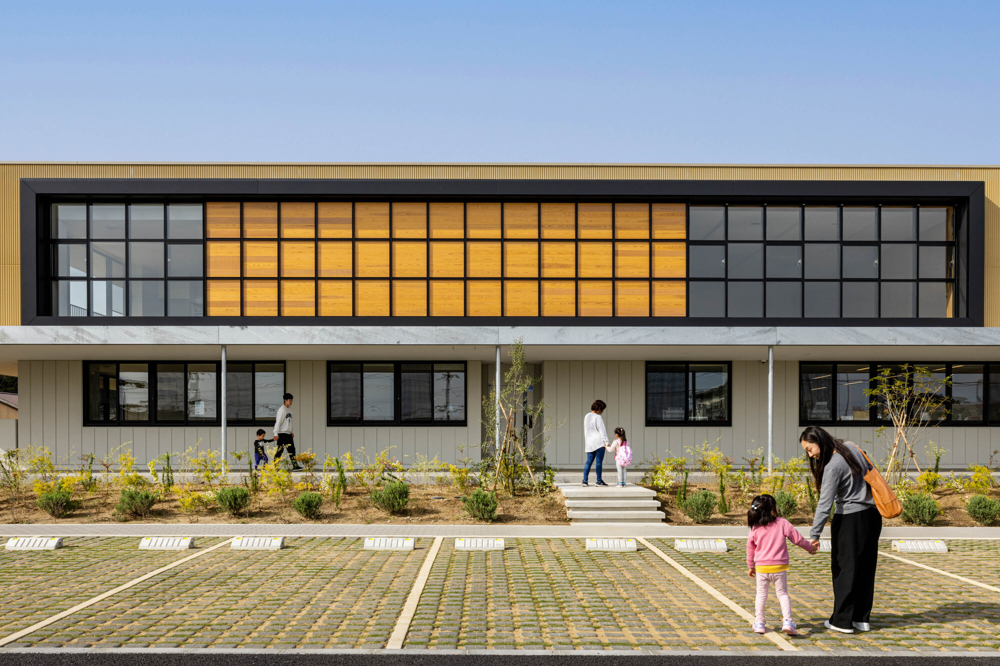
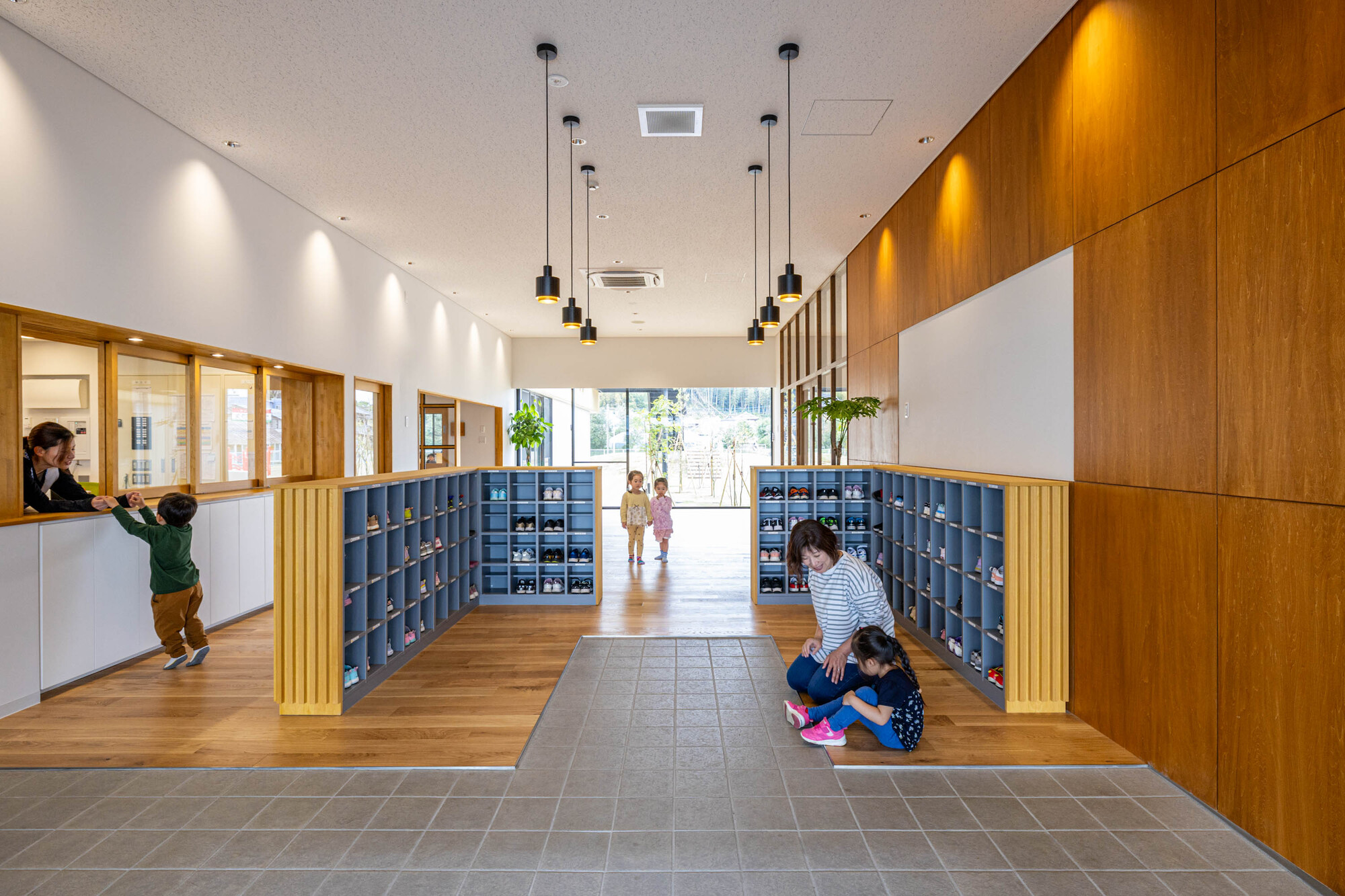
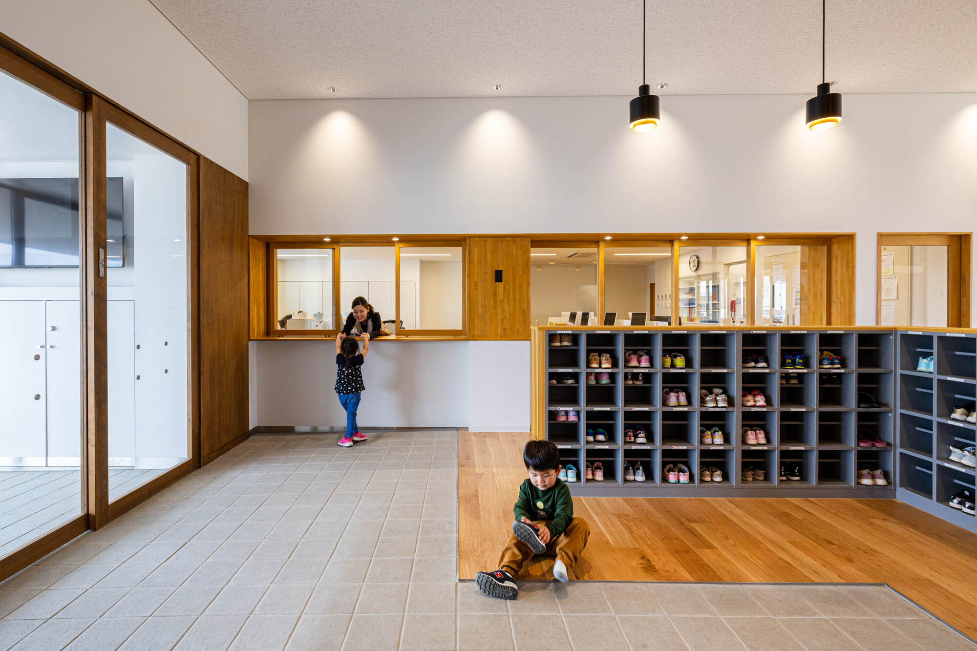
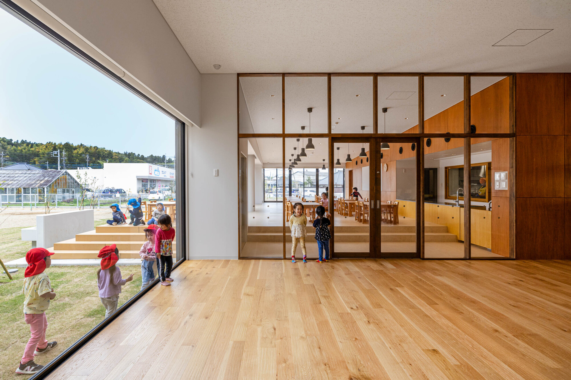
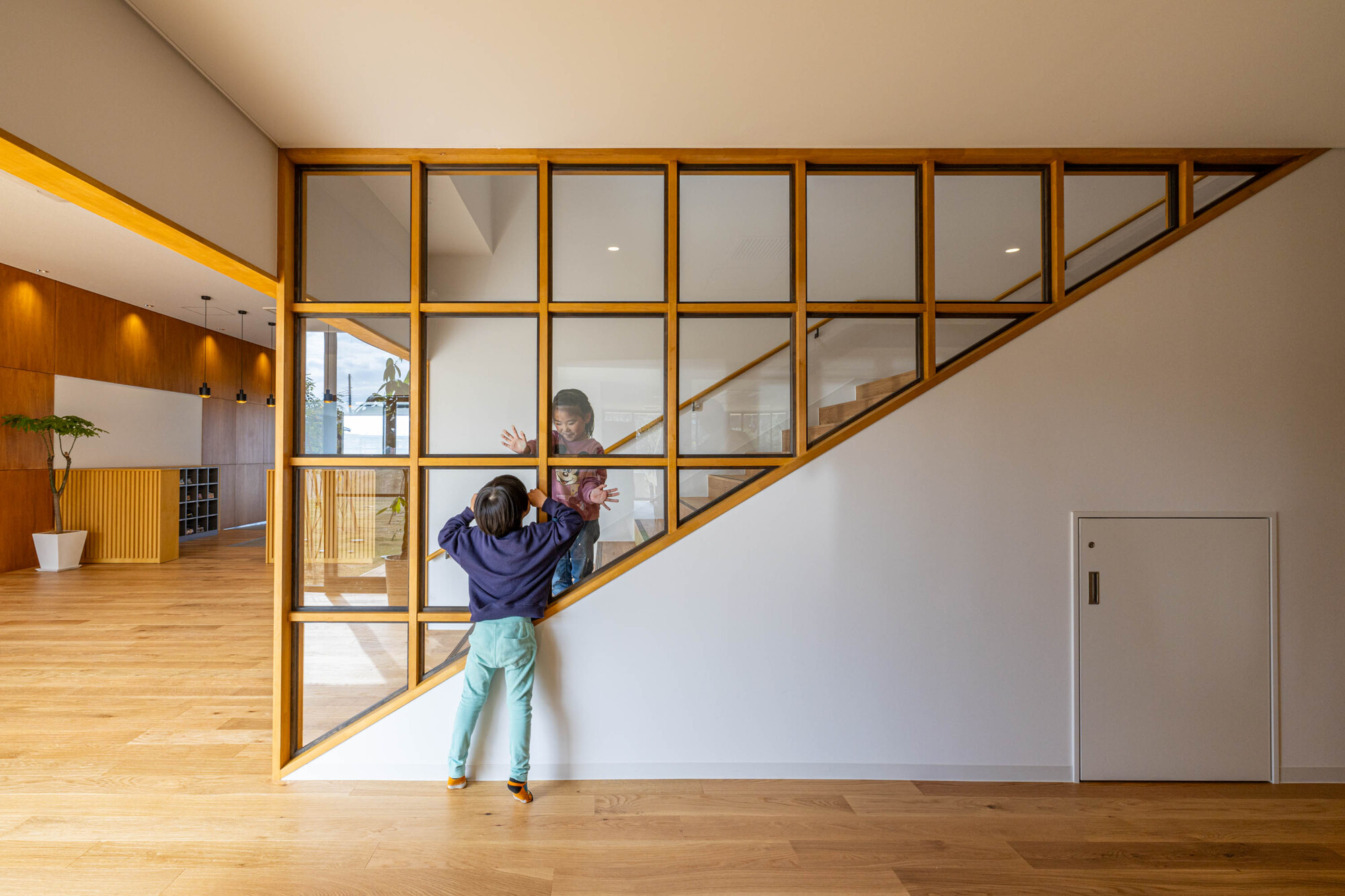
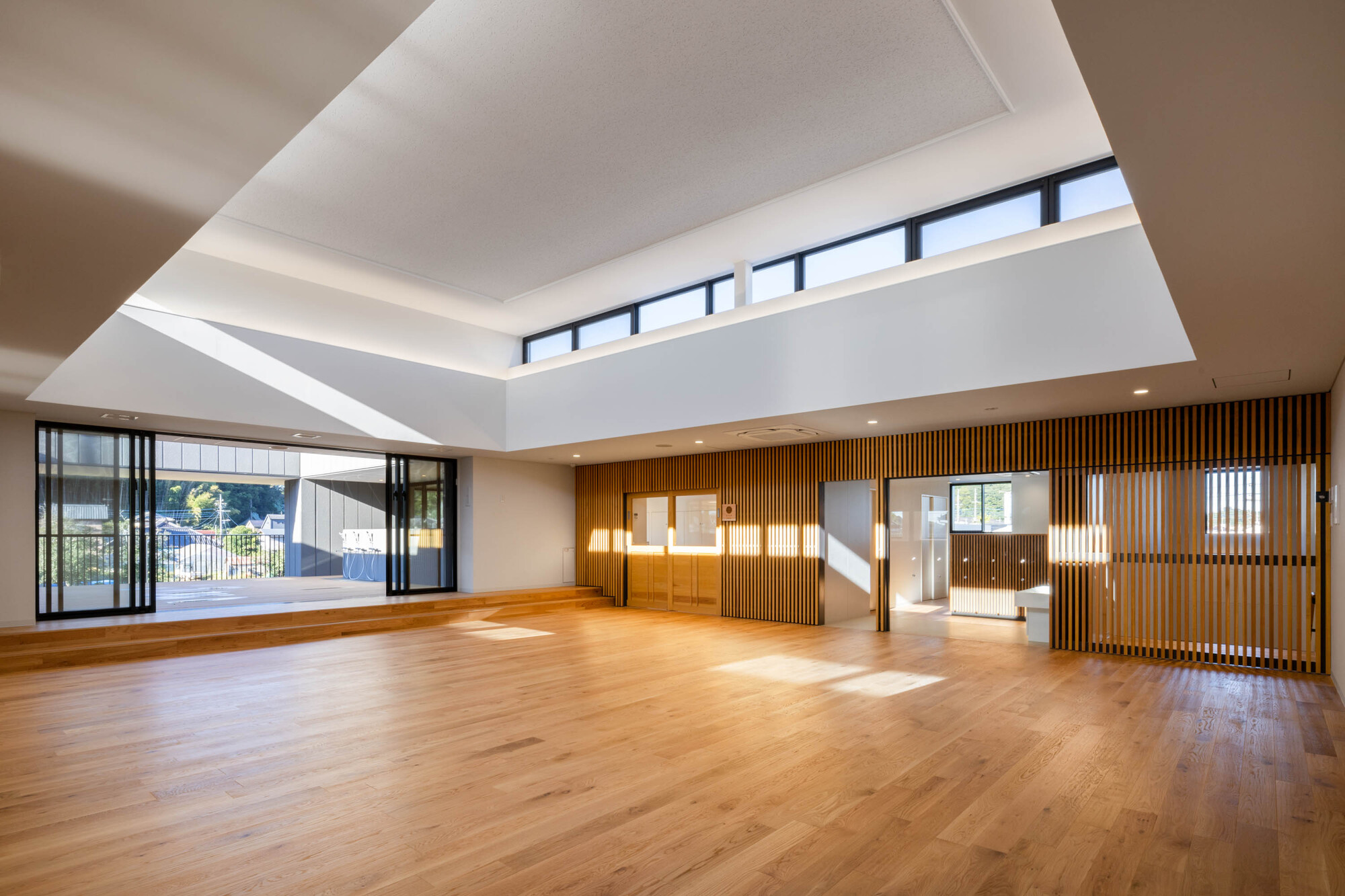
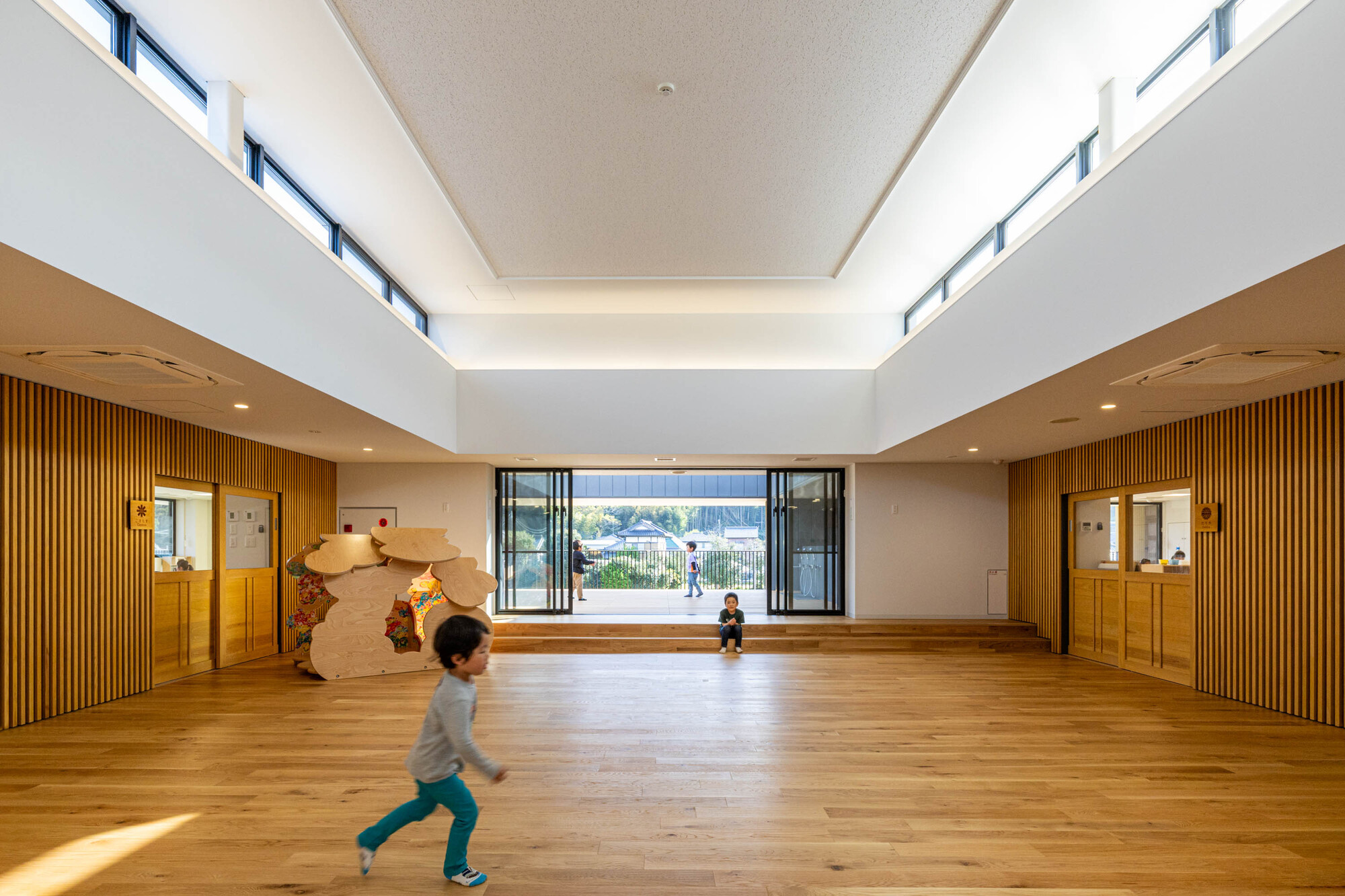
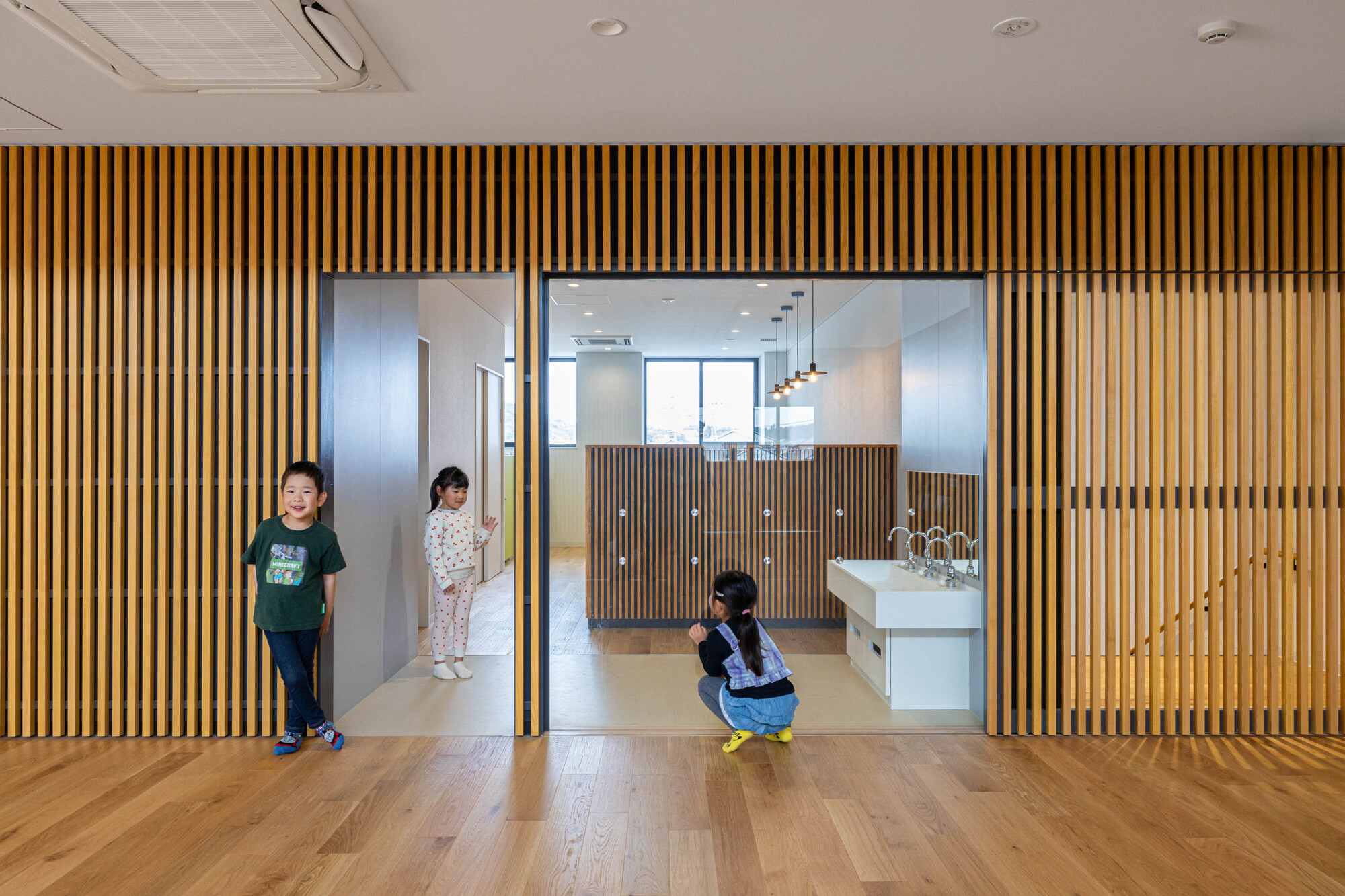
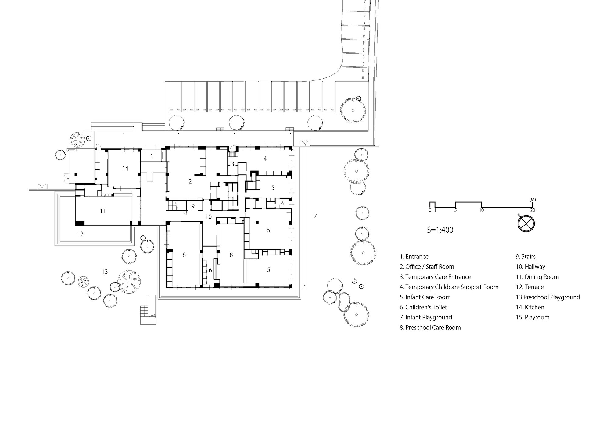
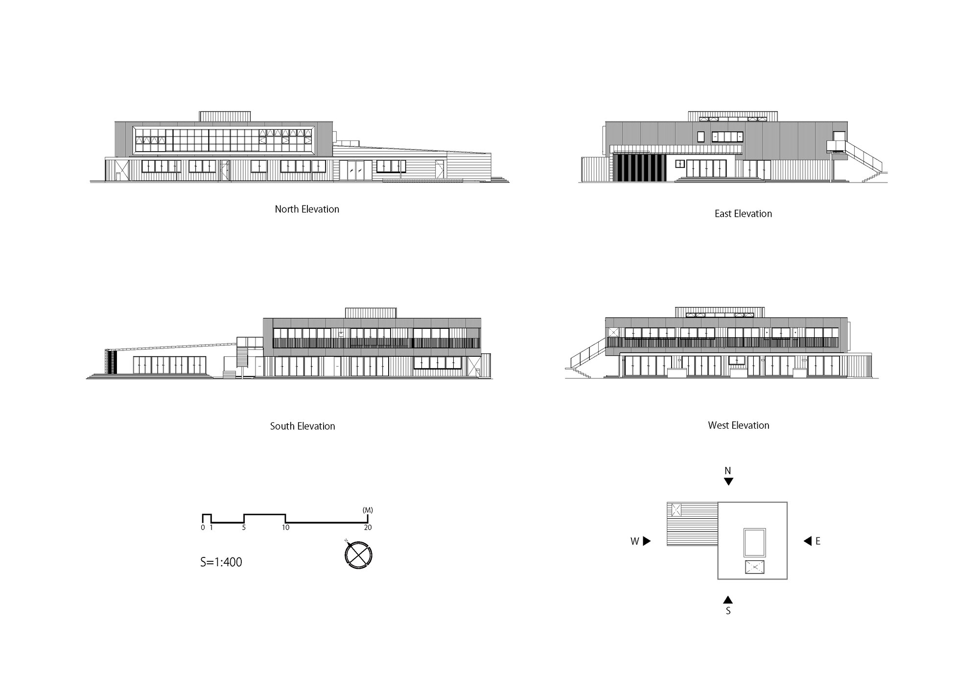
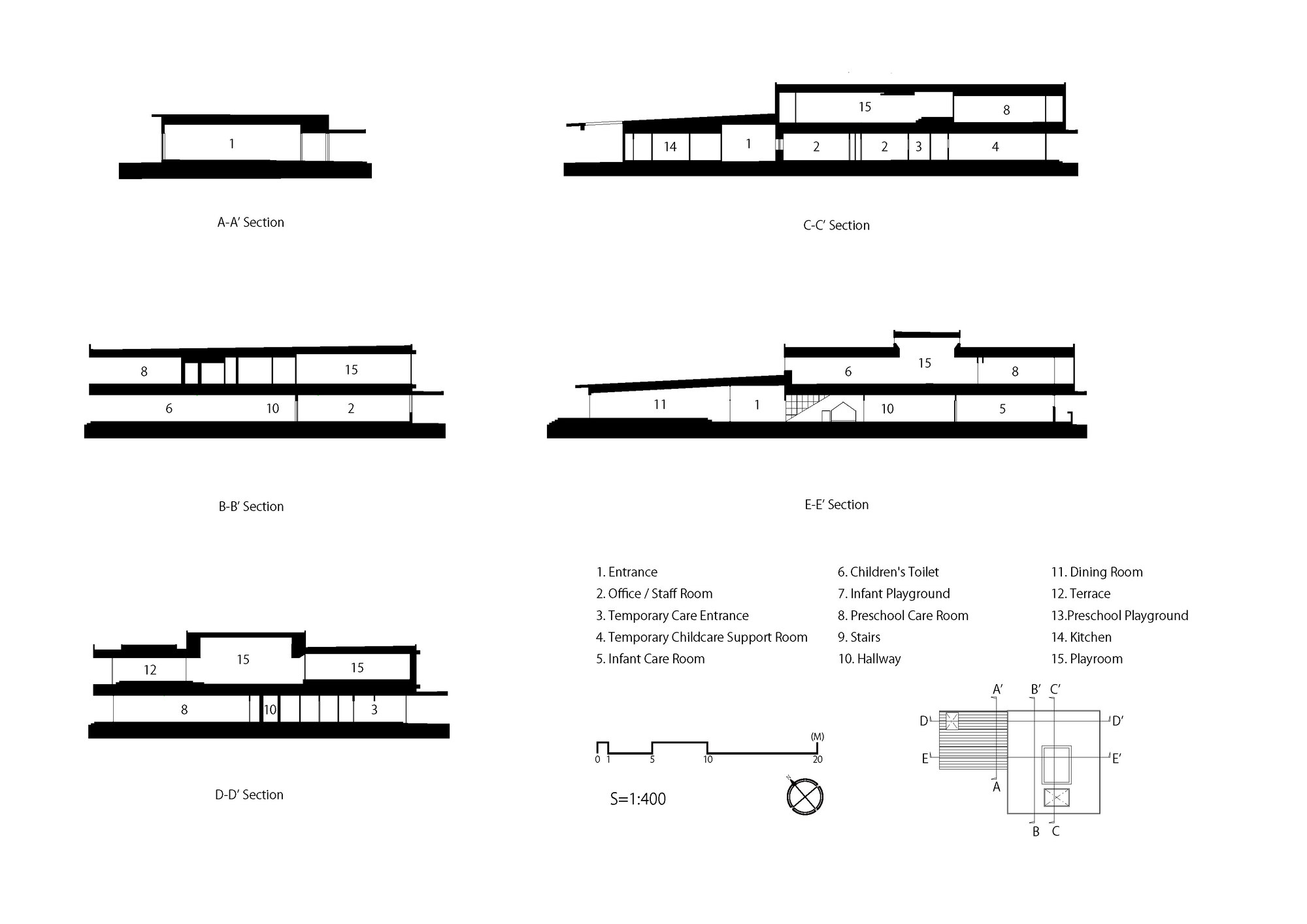
SG Kindergarten and Nursery
#architecture
Architects: HIBINOSEKKEI, Kids Design Labo, Youji no Shiro
Area: 1125 m²
Year: 2023
Photographs: Toshinari Soga ( studio BAUHAUS )
City: Katori
Country: Japan
The new SG Kindergarten and Nursery was constructed by the consolidation and privatization of four dilapidated public preschools in Katori City, Chiba Prefecture. The area has been known as a hub of cultural exchange that prospered due to the waterway transportation across the Tone River during the Edo period. The distinct building type, Machiya (traditional townhouse), and townscapes from that specific period have been carefully preserved and designated as a Preservation District for Groups of Historic Buildings.
The SG Kindergarten and Nursery strives to be a place where children can learn about and appreciate the unique history from the past to the present day. Thanks to the uniqueness of their culture, which has been gradually formed by the interaction of different cultures and people, children can develop an attachment to the local community.
The design of the kindergarten was inspired by their local architecture, Machiya. By reinterpreting traditional elements such as the wooden walls and latticework, one can sense history while enjoying a new understanding of the details. The goal is for children to spend their days in this environment, naturally becoming aware of and familiar with the local characteristics. Children gradually develop a sense of belonging to their hometown.
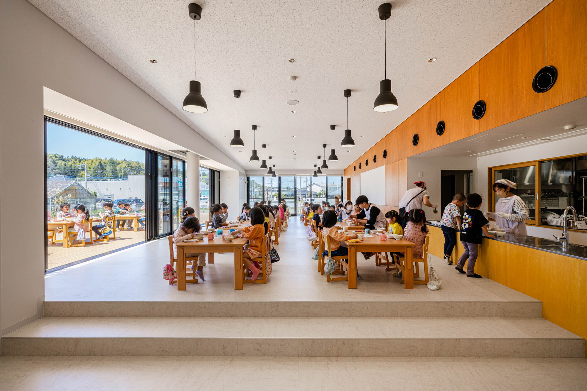
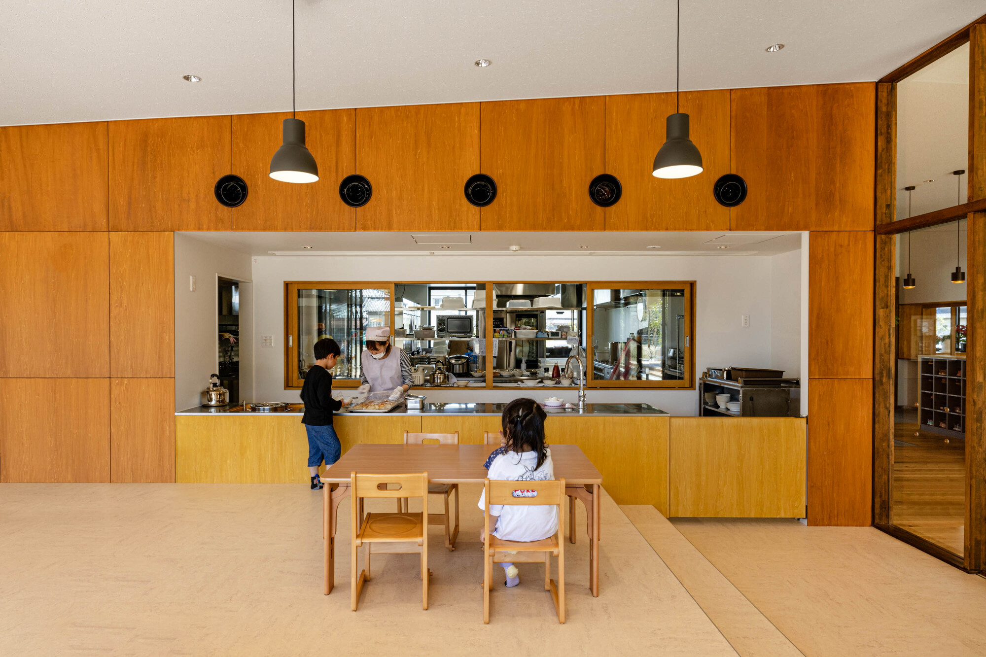
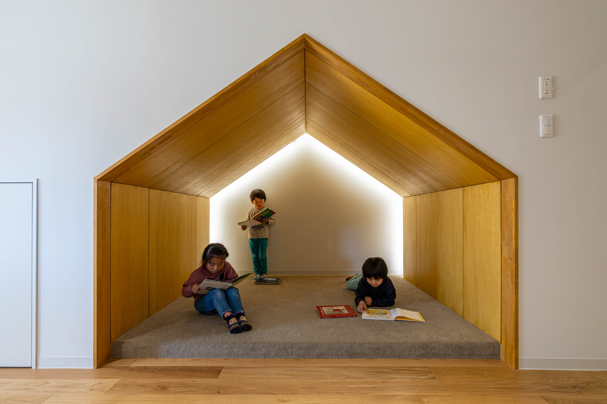
The kindergarten also addresses various issues surrounding children's diet, such as unbalanced nutrient intake, inadequate breakfasts, and solitary dining. In this kindergarten, children can develop both mentally and physically through multifaceted nutritional education. Architecture supports such education. For instance, the dining room, adjacent to the main entrance, a kitchen, and a vegetable garden with a view incorporate food-related experiences in one's daily life. Children naturally learn the joy and importance of eating by observing the vegetables they grow and immersing themselves in the smells of food being prepared. This kindergarten equips children with a strong foundation for healthy dietary habits through which they grow up healthy both physically and mentally.

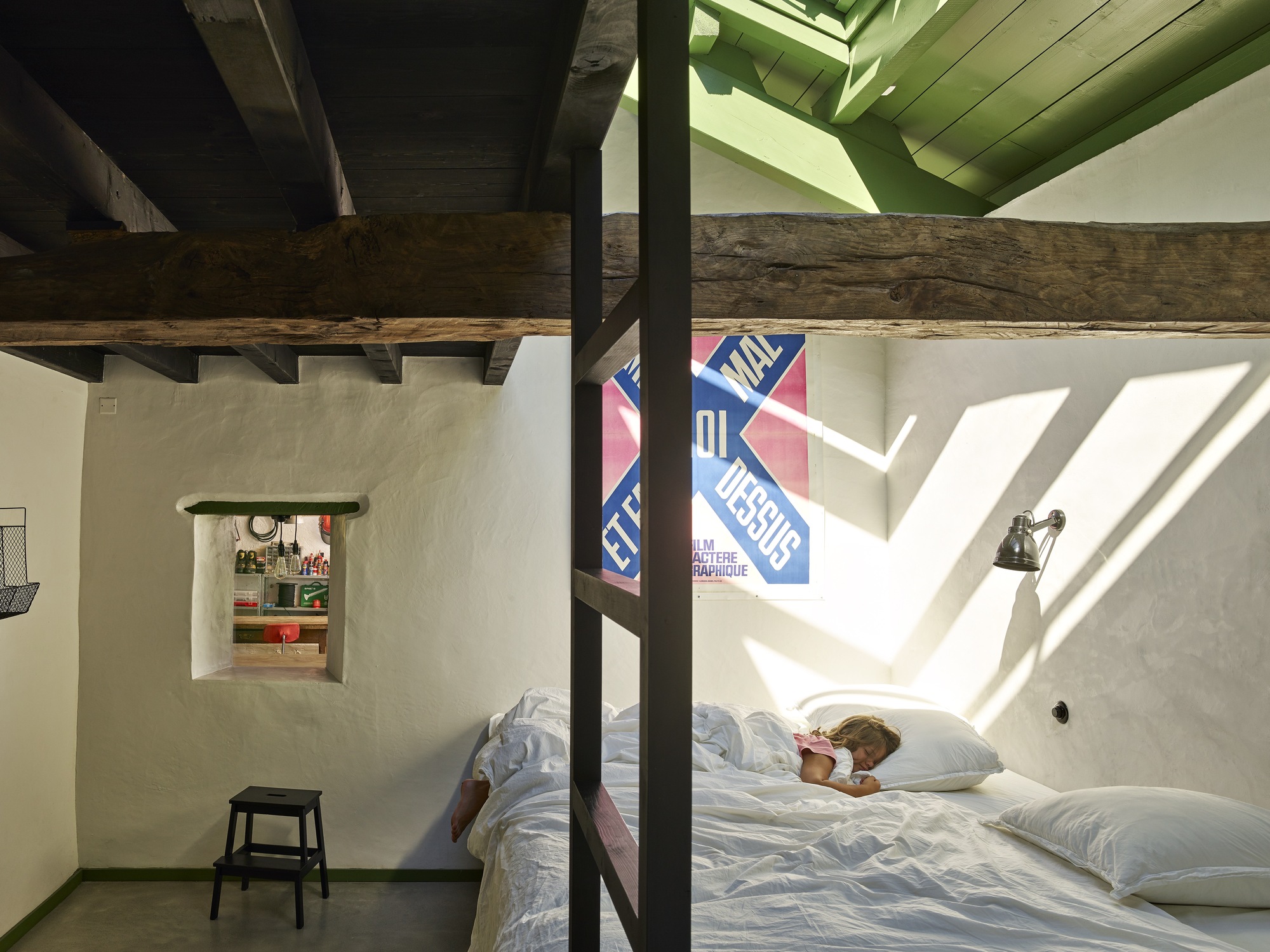
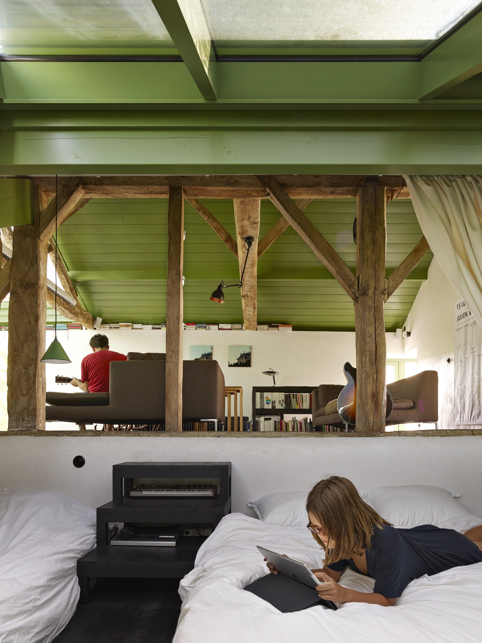
Hourré House
#architecture
Architects: Collectif Encore
Area: 220 m²
Year: 2015
Photographs: Charlotte Gastaut, Michel Bonvin
Lead Architect: Anna Chavepayre
City: Labastide-Villefranche
Country: France
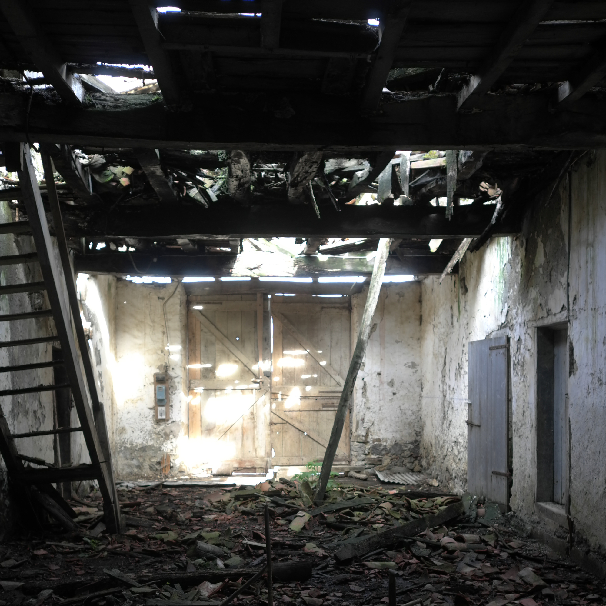
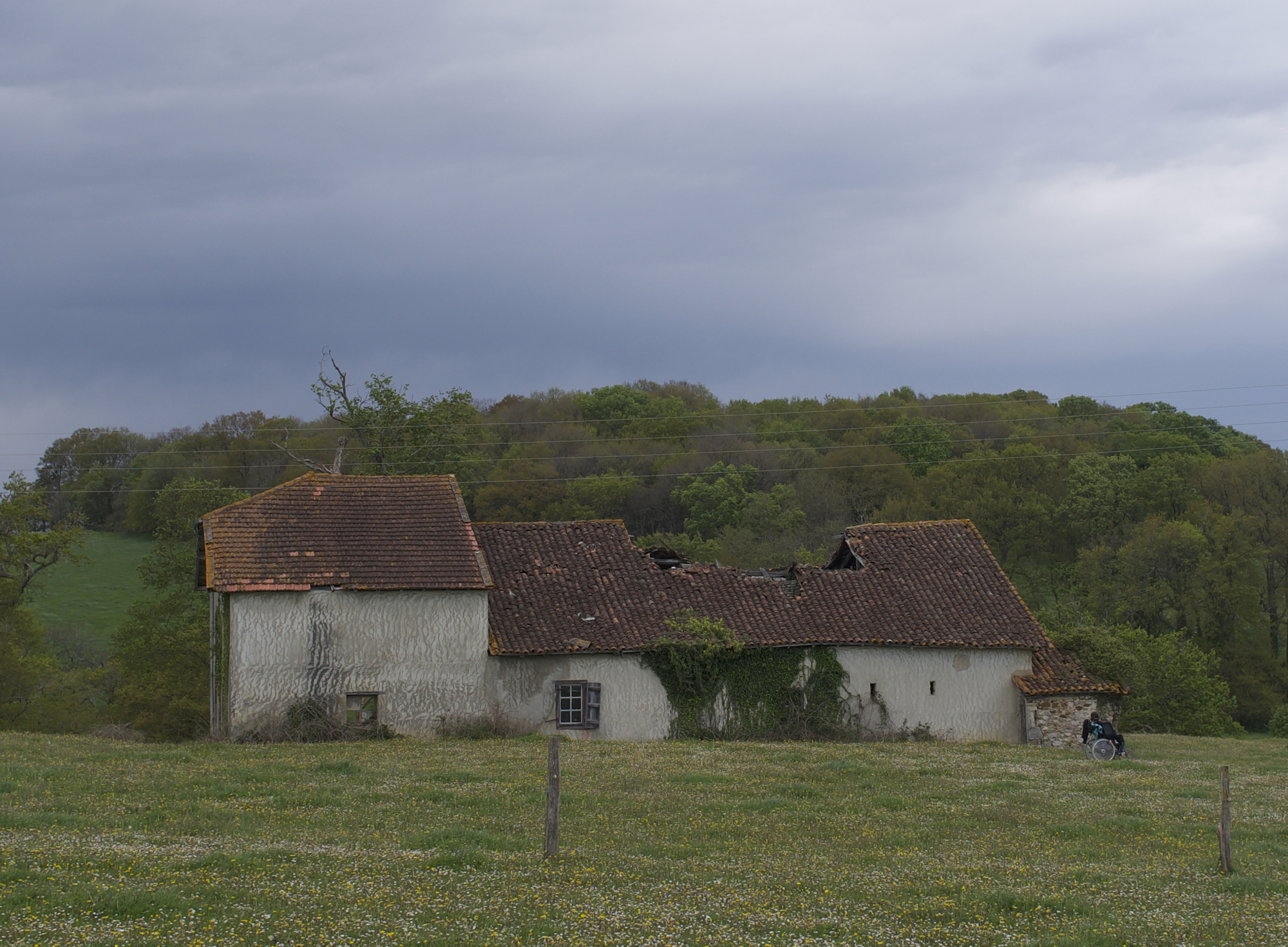
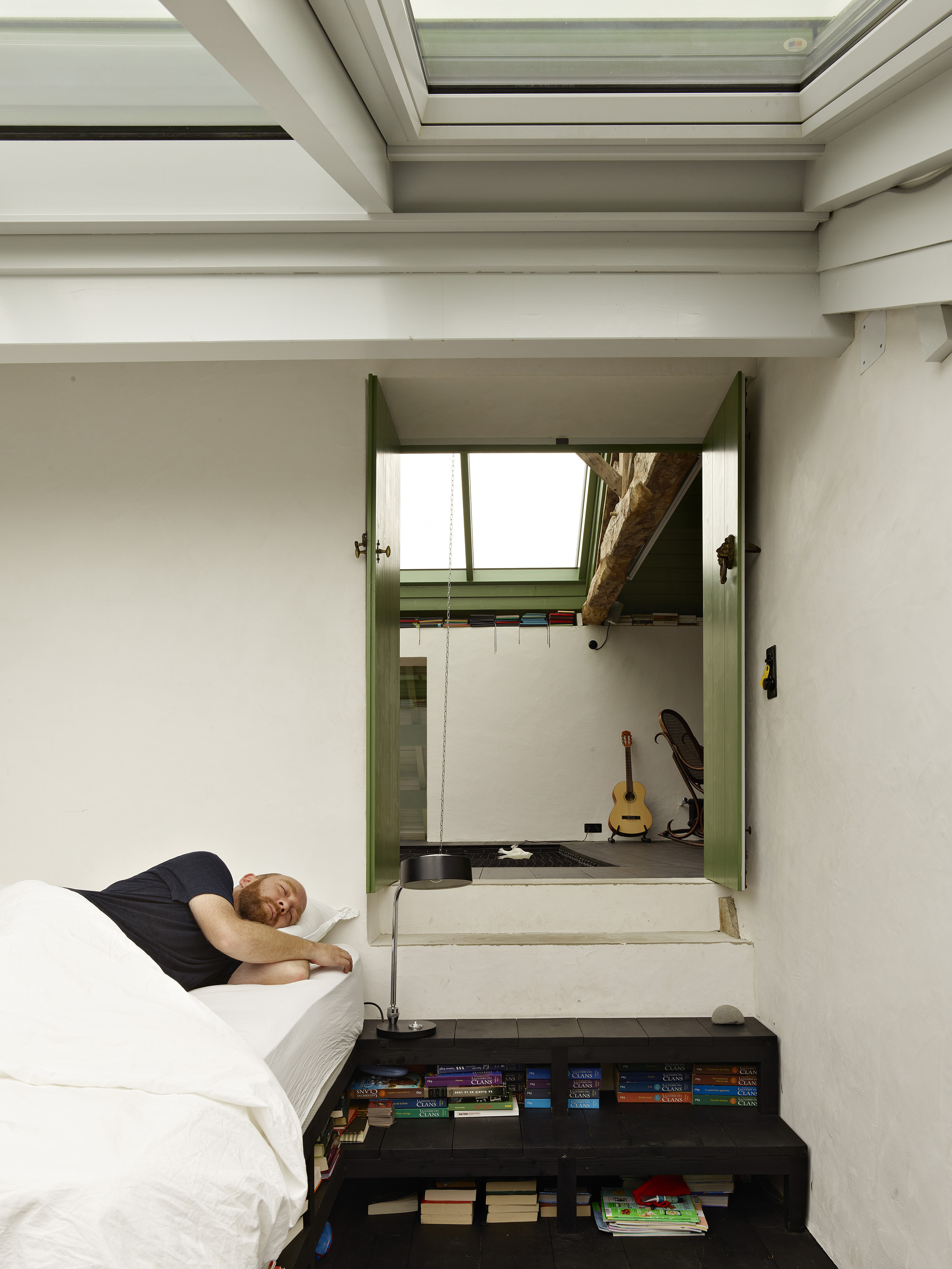
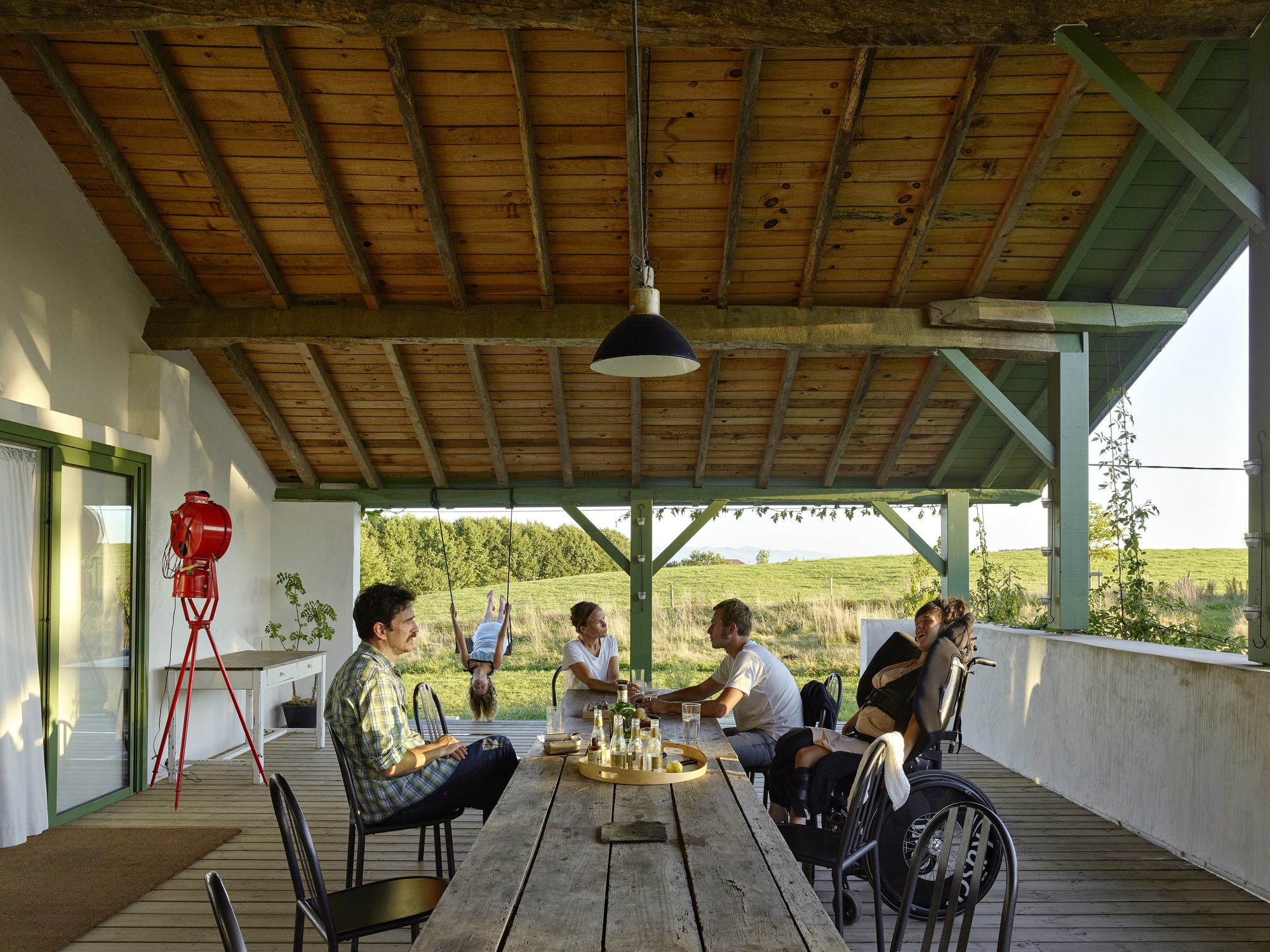
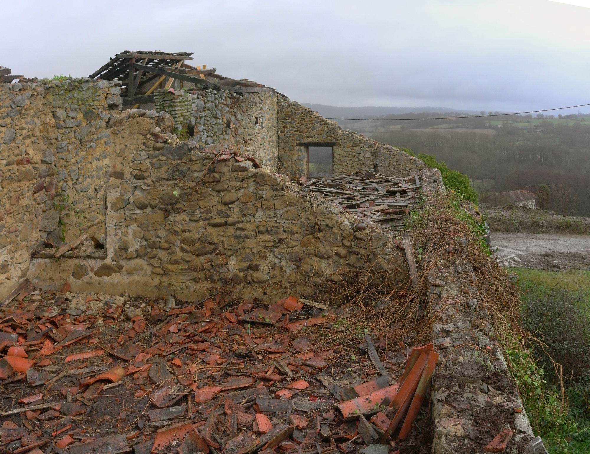
We fell in love in Labastide Villefranche, on the outskirts of the french Basque country. With an old farm, a collapsing vernacular agricultural building.
From outside, the house looked like any farmhouse in the Basque Country, a massive yet unpretentious architecture. When we first opened its main door, we were expecting to come across the usual dark and damp central space called ”Ezkatz”. The roof had collapsed and pulled the upper floor with it, turning the house into a forest whose main room had become a clearing.
”Let’s not change a thing,” we thought.
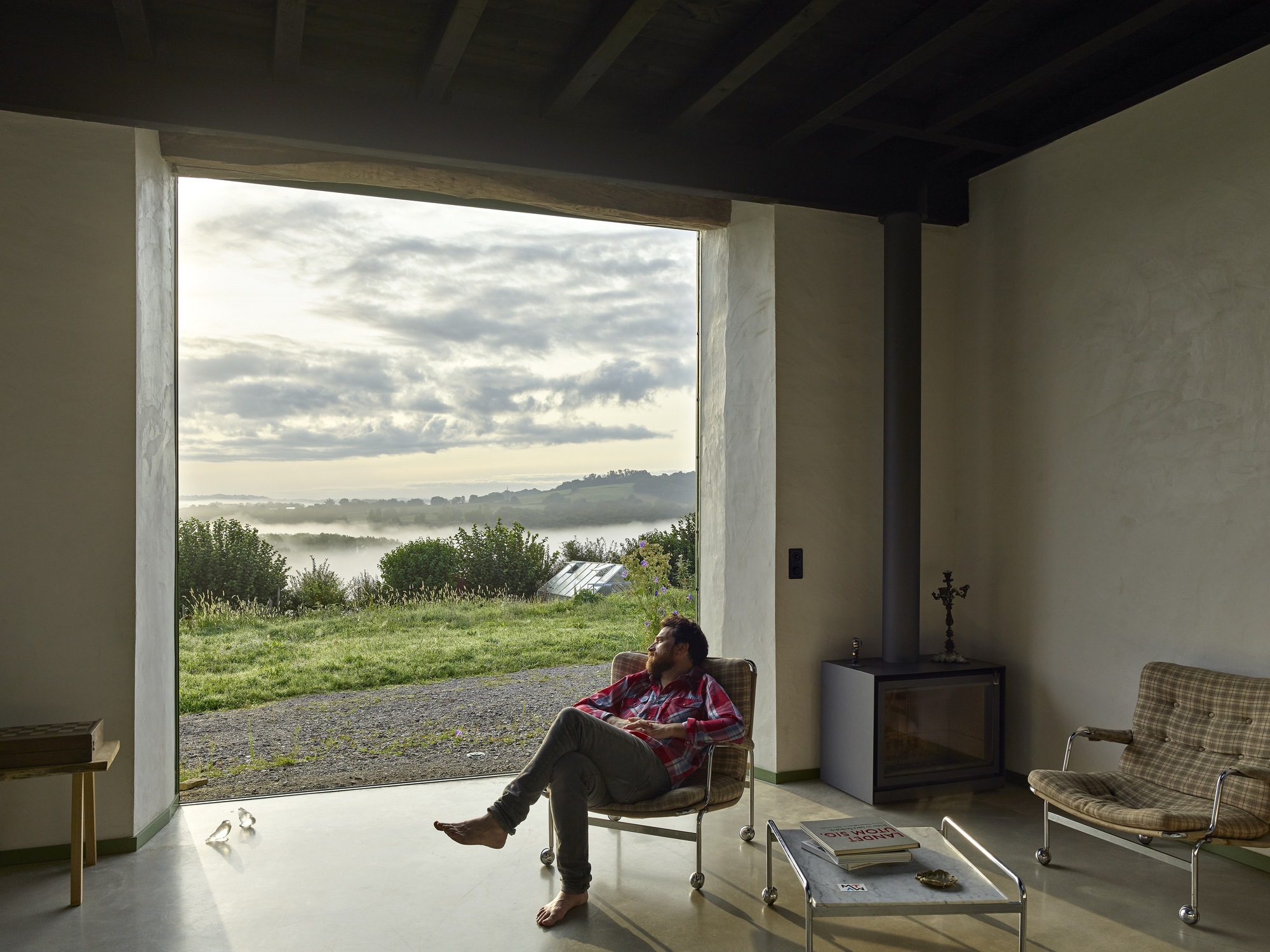
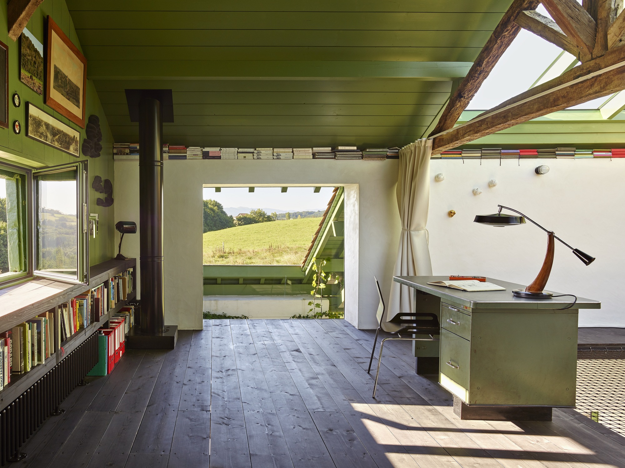
Manifesto for a living house. In many ways, Hourré epitomises our approach to space, landscape, ways of living, and sense of freedom. Moreover, it stresses the priority that we give to what is already there, what is free, and what is yet to come. Also, unlike a lot of ”one-trick poney” buildings that we see, it's a project that is generous with ideas!
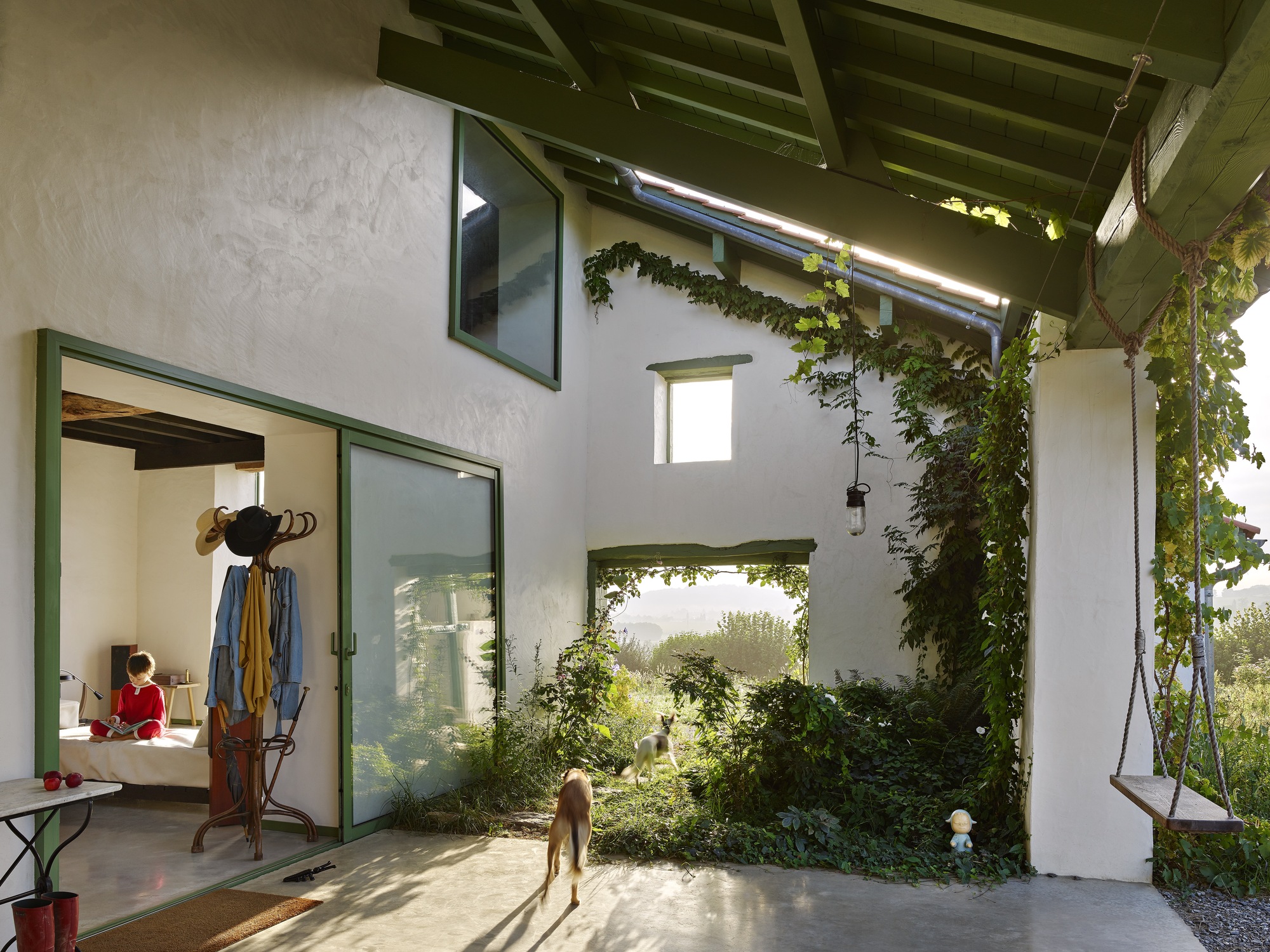
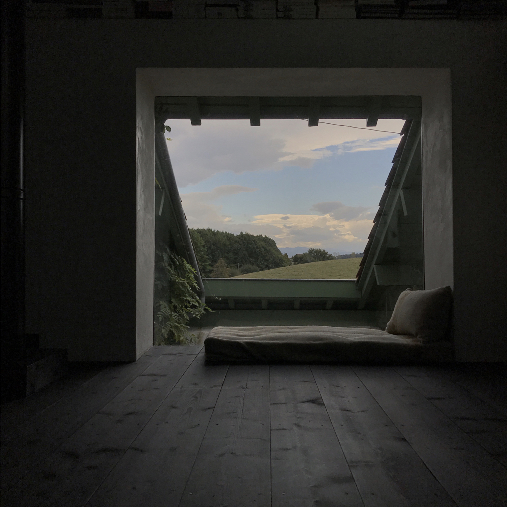
Changing one thing changes everything. And so we kept the roof’s opening intact and turned the doors into sliding windows mounted on the facades so they disappear when opened. Unlike many architects who intend to recreate sunsets at each project they do, we believe that integrating it into our building is enough (and much cheaper). Doing so, the house changes constantly, through the hours, days, and seasons.
Building for birds, flowers, and plants. There is this picture of a swallow inside the house that we always show when we do conferences. It is a pretty lousy picture. Birds are not easy to shoot. Maybe that’s the unfortunate reason why we talk much more about how windows look like instead of making a place for the birds so they can be part of the house. And the same goes for flowers as well as any other plants.
What we want is free: Eco-Services. In winter, the sun directly heats the 70 cm thick stone walls and an air/water heat pump heats up the floor. The walls then turn the house into a stove. The inertia of the uninsulated walls allows the house to fully breathe, silently since there’s no CMV system (some of us have forgotten that air flows naturally without any engine nor electricity).
And in summer ? Well last June, as France recorded a 40° heatwave, the house visitors were asking whether there was any AC to get such a cool room temperature. That’s the magic of these thick stone walls that have not been insulated. Keeping the inertia intact and freshness all summer long.


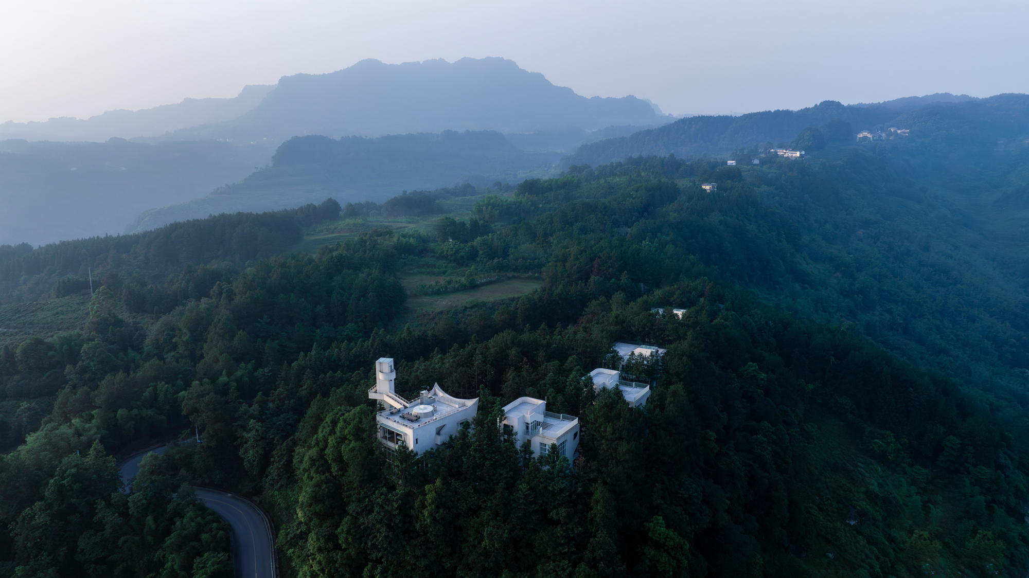
Xanadu Chongchongshan
#architecture
Location: Chongqing, China
Architects: Wilburban Architects Area: 3800 m² Year: 2024 Photographs: Guowei Liu, Hanfeng Zou Lead Architects: Jacky Chan
Type: Hotel
The site is on a steep mountain peak with a large gradient, and only a gentle path at the top. Walking through, visitors are constantly surrounded by tall, slender fir trees, disorienting the sense of direction.
The main building's front elevation is a spherical concave shape, echoing the circular plaza in front, transforming the building into the stage backdrop for the square and creating a three-dimensional space for activities.
The main building is a space that connects the interior and exterior. Visitors can enter through a dimly lit cave, leading into the tall dining hall, wrapped by the surrounding trees. Then, by traversing an external suspended staircase, they reach the rooftop space, elevated above the treetops, offering a panoramic view of the mountains. Alternatively, visitors can ascend via a spiral tower to the highest point and cross a skybridge to reach the rooftop. These two intertwined paths allow movement between the building and the forest, offering a layered, immersive experience.
Four white buildings are arranged along the mountaintop contour, while six treehouses are hidden among the pine trees, resembling an ancient matrix that encircles the central plaza, creating a surreal spatial relationship. The architecture, with its primitive geometric forms, window openings, and large blank wall surfaces reflecting the swaying shadows of the trees, becomes a part of the environment.
The pavilion are located in the valley, hidden on the opposite side of the mountaintop. The pavilion retreats behind cedar trees, appearing like a fleeting white structure in the forest, with its geometric roof floating among the trees.
Architecture is more than simple construction. Through the organization of spatial forms and order, controlling the tension and release of emotions, it transcends materiality and creates poetry. We never overlook nature, allowing light and air to permeate the building.


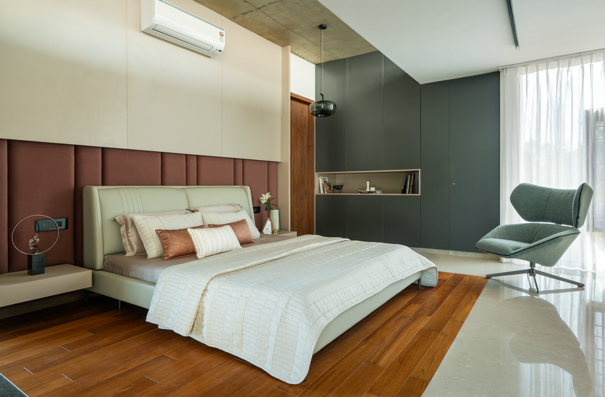
Heirlooms in Concrete
#architecture
Area: 5000 sq. Ft
Year: 2024
Photographs: Anand Jaiu
Location: India, Bengaluru
Located in a longstanding residential layout of Bangalore, the site held a home that had been witness to family histories for over two decades. With generational change came shifting needs. Children had grown up, spaces had grown outdated, and lifestyles had outgrown the architecture that once supported them. The family, rather than opting for a piecemeal renovation, decided to rebuild entirely—a bold yet sentimental decision that acknowledged the limitations of the old while honouring its spirit. The brief to the architects was clear yet complex: design a home that was current, functional, and aesthetically aligned with contemporary sensibilities, but do not erase the emotional memory of the place. It had to support the comfort and routines of the older generation while embracing the pace and recluse that the younger members desired.
The design response came in the form of a twin house: the older generation occupying the lower floors and the younger family living above. This vertical separation allowed both autonomy and proximity, enabling the two generations to maintain their lifestyles while staying connected. On the lower floors, proximity to the street and garden offers easy access, sociability, and rootedness—ideal for the elderly parents. The upper floors, in contrast, are introverted and sky-facing, shaped around openness, privacy, and spatial flow. Yet, these vertical divisions do not result in isolated units.
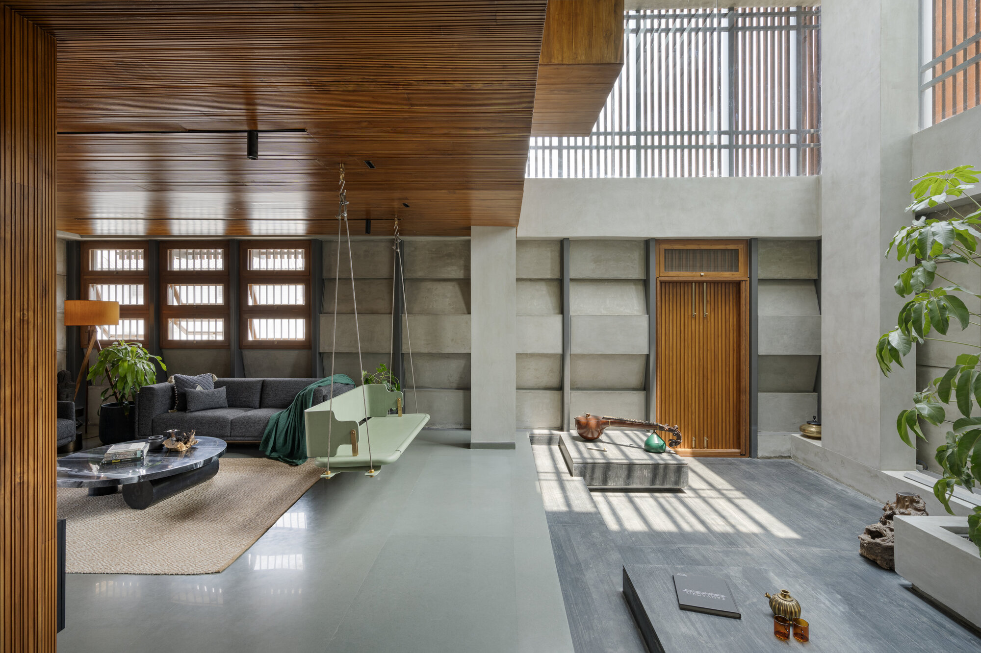
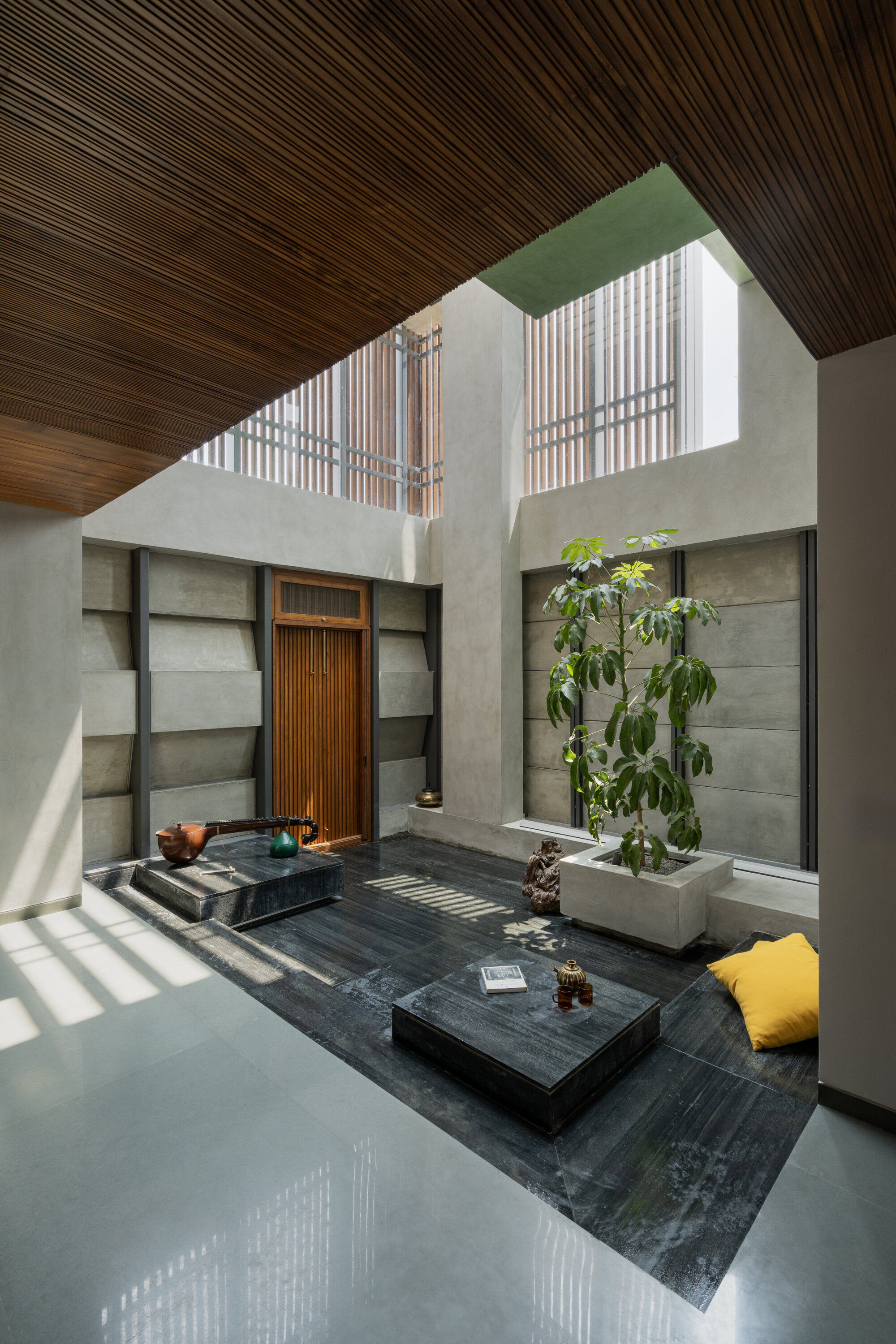
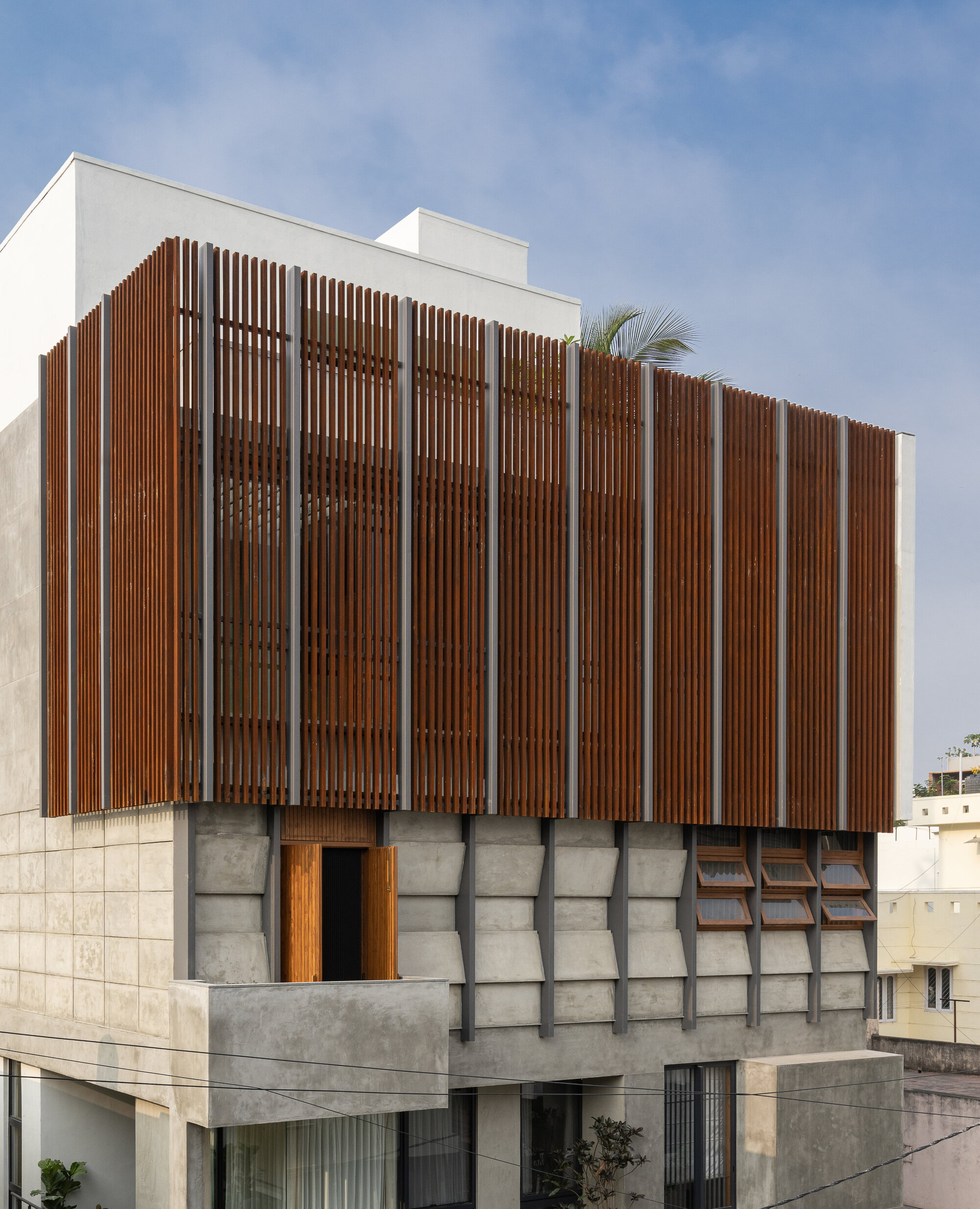
One of the most memorable aspects of the project is the striking enclosing wall to the courtyard. More than a peripheral enclosure, the wall is a sculptural, kinetic surface—both a threshold and a muse in concrete. Conceived from the outset to be both secure and expressive, the client imagined a feature that could function as a fringe while also embodying the design ethos of the home—a wall that speaks as much as it shelters. Initially conceptualized as a series of sloped precast concrete panels, the early iterations felt too static. Through design evolution, the team introduced alternating slopes that create a rhythmic, dynamic illusion. The wall now feels alive—its geometry and shadows constantly shifting with the movement of the sun and the viewer.
Constructed using raw, unfinished concrete panels held in a steel framework, the wall celebrates material honesty. Its imperfections are not masked; they are embraced. Dark matte-finished steel frames provide a crisp outline, while corten steel fins on the upper floor add a layer of warmth and tactile contrast. Practicality is not sacrificed for form. The wall, exposed to rain and weather, includes carefully sealed joints and an internal gutter system to channel water away and preserve visual clarity. The result is a visually commanding wall that transcends its functional role, asserting the home's evolved identity.
At the heart of the house lies a two-storey-high courtyard, the anchor and pulse of the residence. Courtyards are an age-old typology in Indian domestic architecture, often serving as spatial mediators between inside and outside, private and public, communal and individual. In Heirlooms in Concrete, this central volume reinvents the traditional courtyard as a multi-sensory, cross-generational common space.
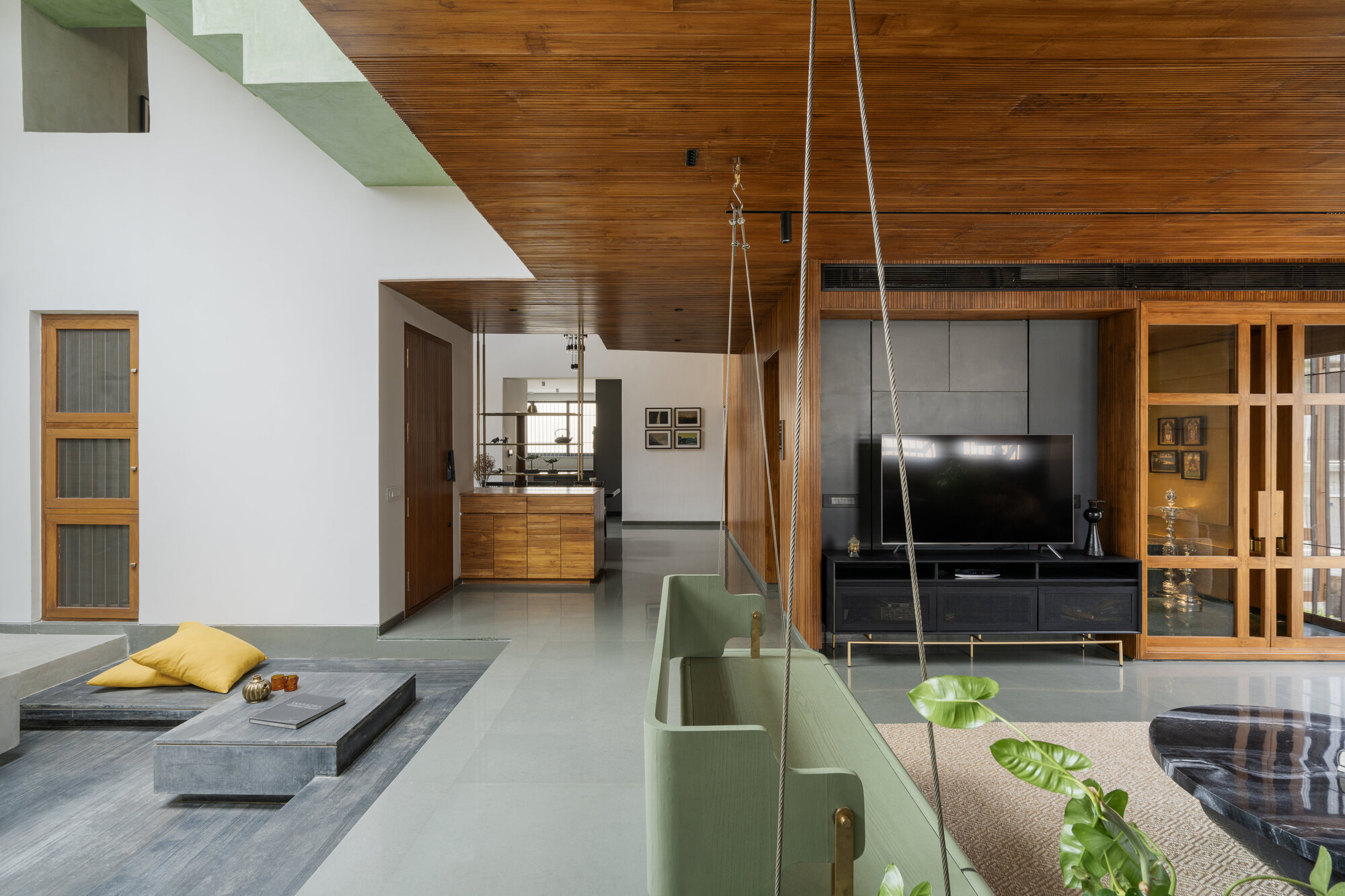
A skylight above ensures the space is always filled with diffused natural light. The courtyard connects the living room, dining area, and the upper-level commons, creating seamless spatial integration across floors. It becomes the family's gathering place, a zone for conversation, play, rest, and celebration. A pastel green swing with brass detailing, suspended delicately within this space, becomes a visual and physical bridge between the courtyard and the adjacent seating areas. It is both nostalgic and modern, a symbolic reminder of how the old and the new coexist in this home.
From a design standpoint, Heirlooms in Concrete emphasizes restraint, clarity, and craftsmanship. The language is contemporary and minimal, allowing the architecture to act as a backdrop for life rather than overwhelm it. Passive thermal comfort was also a key consideration—cavity walls were incorporated into the envelope to provide insulation against Bangalore's fluctuating temperatures. Skylights, fitted with discreet mesh ventilators, allow warm air to escape from double-height volumes, promoting cross-ventilation and passive cooling throughout the day. Every material, finish, and detail is chosen with a dual intent: comfort and expression.
The interiors are defined by soft neutrals, exposed materials, and subtle textures. Stone and oxide flooring grounds the spaces, while timber and metal accents provide contrast and warmth. The living room opens into the courtyard, allowing filtered light to wash over its surfaces through the day. The sculptural staircase that rises from the dining area is a striking element—oxide-finished, curved and quiet in its elegance. As it ascends, it guides movement to the upper level and further to the terrace. The terrace is imagined not as a residual space, but as an active programmatic zone with a gym, home theatre, pantry, and terrace garden. This topmost floor functions as a recreational and contemplative retreat. Designed for leisure and family interaction, it offers expansive views and is wrapped in greenery. Here, architecture provides the opportunity for pause, reflection, and delight. The terrace also houses a solar installation, enabling the home to partially power itself with renewable energy, reducing its environmental footprint and marking a step toward self-sufficiency.
Indian families are in a state of flux. As societal roles evolve and urban lifestyles diversify, the joint family is no longer the norm, yet the nuclear family often finds itself incomplete. Heirlooms in Concrete reflects this ambiguity. It does not impose a fixed model of family living, but instead allows for interdependence within independence. This spatial negotiation—offering connection and privacy simultaneously—is the key to the project's success. Whether it is the shared courtyard, the layered access, or the autonomous upper terrace, each design choice responds to emotional and functional needs.
At its core, Heirlooms in Concrete is a story about belonging. It is about how families adapt to time while holding onto the threads of familiarity. The architecture captures this with grace—using light, volume, and material to choreograph everyday life. The project resists the temptation to be overdesigned. It does not chase architectural spectacle, but creates spaces that are warm, intentional, and adaptable. It is a reminder that homes are not static; they are repositories of time, memory, and future possibilities.
In documenting the evolution of family and form, Heirlooms in Concrete offers a compelling architectural typology for Indian cities. It answers pressing questions: How do we build for the present without forgetting the past? How do we design for individuality without eroding community? How can architecture speak softly, yet profoundly? This residence does all of that. It grows with its users. It holds stories within its walls. It offers introspection and celebration, routine and surprise. It is a model of contemporary Indian domestic architecture that honors complexity, embraces change, and reimagines continuity. In the everyday lives that unfold here, in the shadows cast by the feature wall, in the laughter in the courtyard, and the solitude of the nooks—Heirlooms in Concrete stands as a built testament to the evolving spirit of home.
MIRIN House / Ayutt and Associates design
Architects: Ayutt and Associates design
Area: 600 m²
Year: 2024
Photographs: Chalermwat Wongchompoo (Sofography)
The house is named after the homeowner's daughter, a dedicated medical specialist whose life in the bustling city rarely offers him moments of pause. To create a private sanctuary of calm, he acquired the land adjacent to his existing home, envisioning a new dwelling where time slows down. With a swimming pool and layers of greenery, this was meant to be a retreat. But for A A D design, it became something more: an opportunity to design an immersive experience of living.
Rather than designing a standard pool villa, A A D design approached the house as a narrative told through landscape, pathways, light, wind, sound, and nature, woven into a seamless whole. MIRIN House unfolds from the very first step onto the land. A gradually ascending curved pathway guides visitors inward, serving as a gentle psychological transition from the chaos of the outside world to a peaceful internal realm. Every design element, the terrain, garden, lighting, water sounds, airflow, and shadows, plays a part in shaping the mood of this arrival journey.
The sloped landscape increases the surface area, allowing for more trees to be planted on the compact plot. The compressed-rammed earth walls double as planters and informal seating, inviting touch and interaction without stooping. This carefully choreographed promenade uses form, ventilation, light modulation, and sound to stimulate the senses. Even in rain, the sound of droplets hitting leaves and stone surfaces becomes part of the intended experience. The pathway doubles as a discreet water channel, reminiscent of a natural stream. Interestingly, the entrance to the house itself is hidden. Visitors instinctively understand the direction without being explicitly shown, experiencing a worm's eye perspective that makes the house feel grander and more dimensional than its modest size, one-bedroom, one-living-room function.
At MIRIN House, materials are not just for building - they're mediums for sensory expression. Light and shadow shape what we see. Water and wind orchestrate what we hear. Natural textures convey temperature, dampness, and roughness. Earthy smells and edible herbs in the garden evoke scent and taste. The living quarters are lifted to the second floor, where the pool and treetop canopies define the view. Below, a shaded space echoes the underfloor openness of traditional Thai homes. From this raised vantage point, residents experience a bird's eye perspective of the landscape, contrasting with the grounded perspective of arrival. The house thus offers three distinct perceptual layers - worm's eye view, normal eye view, and bird's eye view perspective - transforming a small home into a richly spatial experience.
Light is meticulously choreographed like stage lighting, manipulating contrast and rhythm. From the carport to the house, light intensity gradually changes, dilating the pupils and heightening emotional anticipation. Inside, the mood shifts: darker, quieter, cooler. Natural light is modulated with deep shadows; indirect and mood lighting inside further softens the space. The result is a gentle contrast between the stimulating exterior and the meditative interior.
For the interior of the house, using dark tones absorbs light and muffles sounds, offering a cool, quiet ambiance - an antidote to Bangkok's heat and noise. Full-height glass openings invite in the trees and sky, transforming the natural landscape into a dynamic artwork that changes with the seasons.
A A D design's vision extended beyond the house and into the community, and didn't create MIRIN House solely for its owner; it was designed with the surrounding community in mind. The roof was intentionally angled to avoid obstructing the neighboring houses' view of the sky, preserving their visual connection with nature. Portions of the home's greenery were also made visible from the street, allowing passersby and nearby residents to share in the serenity of the landscape. In doing so, MIRIN House becomes a link between private space and public nature, not a secluded enclosure but a gentle offering to the community.
The garden doesn't stop at the boundary wall. Given the limited size of the plot in a dense suburban development, the design borrows views of mature trees from neighboring properties, weaving them into the home's visual tapestry. In return, MIRIN House gives back through rooftop gardens, a poolscape, and vertical greenery that soften the building's mass and contribute to the local ecosystem.
This house does more than offer privacy to its owner; it fosters relationships between home and community, between architecture and nature, and between individual and city. It's a design that encourages a new urban mindset - one where we not only coexist with nature but actively share it. Because in the end, a house is not just architecture, but community, life, a living bond. It's not just a place to stay, but it's a relationship with everything around it.
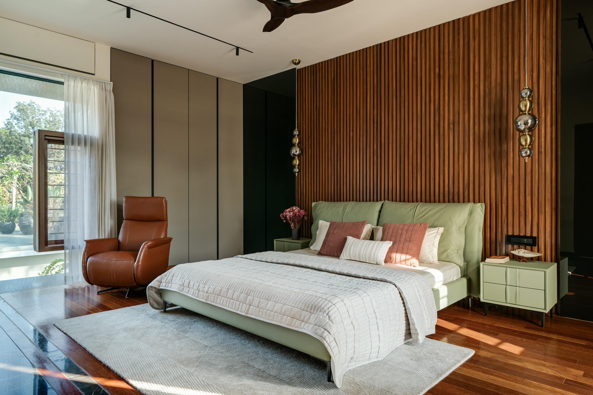
Klåva House
Location: Sweden
Architects: what! arkitektur
Area: 188 m²
Year: 2022
Photographs: Viktor Nilsson
Manufacturers: Troldtekt, Almedalsgolv, Schüco, Sioox, Westcoast Windows
"Klåva" is a local word from Bohuslän, used to describe something that has been split or cleaved. It also refers to the specific topographical feature on the site, a narrow ravine nestled between two ridgelines. The property lies within a nature conservation area, characterized by granite outcrops, sparse vegetation, and a more lush, protected microclimate within the ravine itself, sheltered from the prevailing westerly winds.
The architecture is guided by three main intentions: to allow the buildings to humbly defer to the landscape, to enhance the unique qualities of the green and sheltered klåva, and to capture and frame views of the sea. These principles shaped every decision throughout the design process.
What was initially envisioned as a single building was eventually divided into two volumes. This allowed the architecture to follow the natural topography more closely. The buildings are gently angled to trace the site's existing contours. A concrete retaining wall creates a level plateau for the main house and its outdoor terraces. The guesthouse is a semi-subterranean structure, accessed from the lower garden area of the ravine. Together, the buildings and walls form a linking element between the upper and lower parts of the site, connecting wind-exposed and wind-sheltered zones, barren and fertile landscapes, and large and small spatial experiences.
The volumes establish a subtle boundary between wind and lee, rough and lush, the vast seascape and the intimate garden. In the central spaces of the main house, these contrasting conditions are allowed to meet. Large glazed openings frame both the openness of the sea and the enclosed green heart of the site, inviting the landscape into the interior.
Durable and honest materials such as wood, concrete, and limestone were selected to age naturally over time. Built-in furniture is crafted in oak. The kitchen units are made of stained oak, with a custom-mixed tone that enhances the wood grain while distinguishing it from other interior elements. A close and continuous dialogue with the clients throughout the project ensured a high level of integration between architecture and everyday life, even extending to details like a custom sleeping alcove for the family dog, seamlessly built into the bedroom wardrobe system.
Rather than making a bold statement, the house quietly adapts to the site, shaped by its specific conditions and intended to coexist gently with the surrounding landscape.


