Who’s it for?
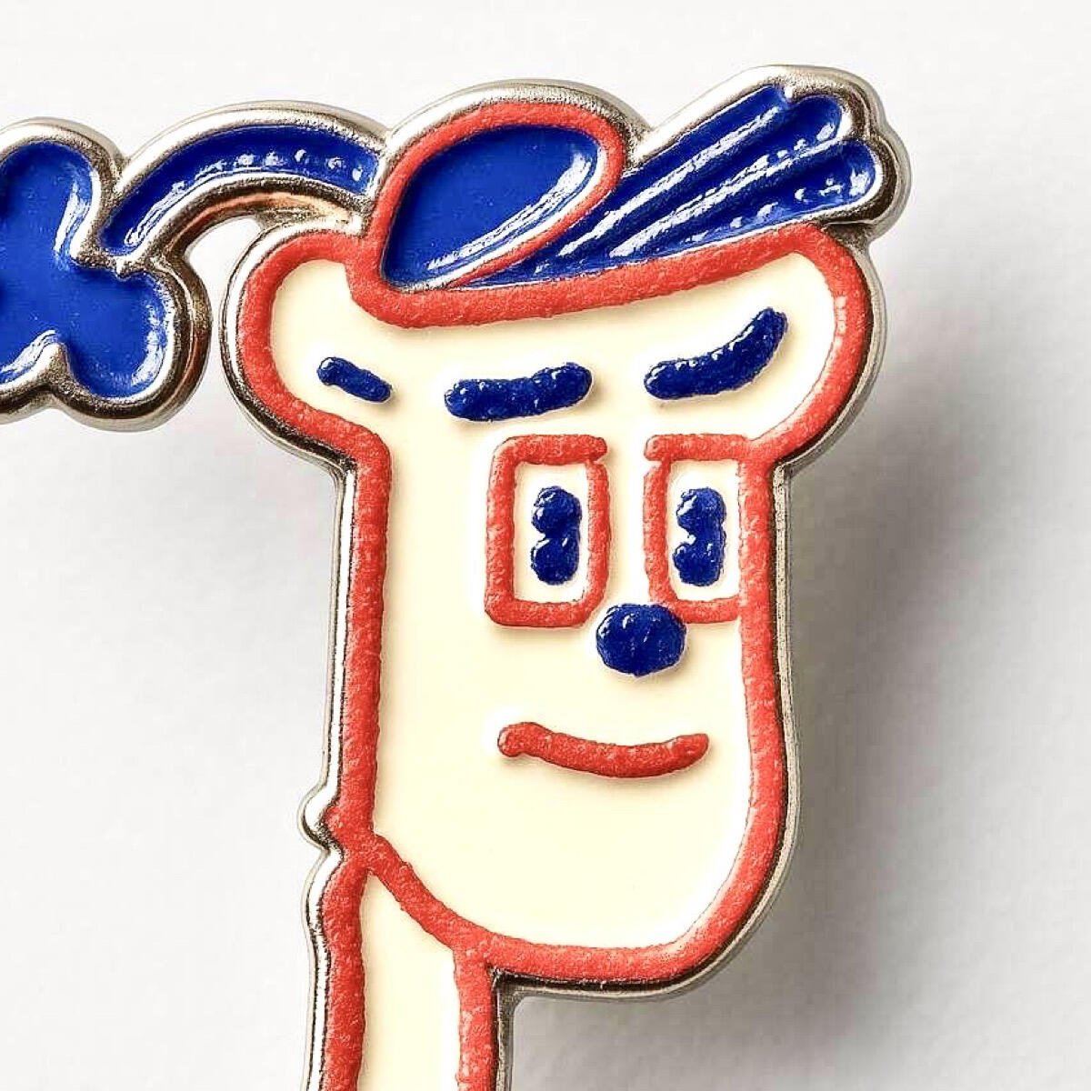
THE LOGO

I'm going to start promoting this because people keep asking for something that:
- is simple & recognisable
- literally anyone can draw in 3 seconds
- is NOT an ostrich
- shows that we're talking about a network
- fits nicely next to our competition's icons (Instagram, X, Facebook, YouTube, Google...)
- Pairs up well with the Bitcoin "B"
This logo has been doing the job for me for months and I still like it.
SVG files of several versions here 👉 https://w3.do/L6ZV6jBo
#nostrdesign #logo #branding
nostr:npub1s0veng2gvfwr62acrxhnqexq76sj6ldg3a5t935jy8e6w3shr5vsnwrmq5
nostr:npub1zach44xjpc4yyhx6pgse2cj2pf98838kja03dv2e8ly8lfr094vqvm5dy5 nostr:npub1ye5ptcxfyyxl5vjvdjar2ua3f0hynkjzpx552mu5snj3qmx5pzjscpknpr nostr:npub1wf4pufsucer5va8g9p0rj5dnhvfeh6d8w0g6eayaep5dhps6rsgs43dgh9
nostr:npub1dergggklka99wwrs92yz8wdjs952h2ux2ha2ed598ngwu9w7a6fsh9xzpc
Discussion

I think it's mostly for and works well as an icon on people's websites imo, like below. The current ostrich logo is difficult to see
 #m=image%2Fjpeg&dim=804x345&blurhash=ZeQmCrt7%7EqRjayWBRjj%5BM%7BRjof%25MRjM%7BofRjxu%25MD%25of%25MWBRjayWBofofD%25of%25MayofWBWBWBRj&x=bafa753dede778eb3a04e9b88e5956ba2213e29606d02c8fe152fbf06ef0b731
What current ostrich logo?
 #m=image%2Fjpeg&dim=241x126&blurhash=i%3BP%24%5EHj%5B_JofV%5Dj%5BMzj%5BoxofazfQj%40fQazj%40j%5Bazt6fQoej%40Mzazx%3FfPfRj%5Dj%40kBayayj%5Ba%23ayj%40xsj%40RRazoej%40oej%5BWC&x=11515887165d0d1876767a984ab28b4ce76572c57a03f47b9011fe23dae68991
That is just one logo. There is no current official logo.
No, you're right. But it has been used. And to a certain extent it would make sense to have a standard, easily identifiable one on people's website in the same way the other logos are easily identifiable
Not sure one is needed. 🤔 It’s a protocol for everyone not a centralised platform (like those logos at the bottom of websites). The logo can never be owned by anyone too - it’s a bit like wanting a logo for the internet (there are many). Anyway, will see what, if anything, unfolds. All I know is that I was here to witness the birth of the nostr ostrich (and nostrich) organically and it would be a shame to lose that community provenance in any “nostr logo”.
Sure, but at the moment barely anyone even knows what nostr is. But I get your point. The logo points to nostr-as-microblogging maybe, and not to the whole protocol. But even that aspect isn't much known
Exactly, but my point is does a protocol need a logo? Nostr can be many things and each client/service can have their own logo. As for people not knowing what Nostr is, this will come with time, if they’re included to research. People still don’t know what the internet actually is, but use it everyday, so one could argue, do they need to know what nostr is? As an example, I bet barely anyone on Bluesky knows what the AT Protocol actually is. Main marketing channel for Nostr will be the clients/services that run on it. This is why I think it’s important that they highlight this fact and why (decentralisation).
I’ve been on Nostr almost a year now and I still don’t know what it is. 😂

Basically, it's like tumblr but without the girls

Googling what tumblr is… lol Iearn new stuff here all the time
I'm stunned you don't know what Tumblr is 👀 it was a defining moment that p much shaped the world we live in today. All the Tumblr aesthetic account egirls posters now run our HR departments 😉
It’s like being able to cryptographically access a variety of soapboxes to stand on and publicly and freely deliver your words/content; to debate with others; or to just take in stuff, all whilst no one can censor you. And that’s mainly just the N in NOSTR, not the O and S…
I have actually compared nostr to Speakers' Corner before lol, and maybe one day it'll be the online equivalent, this weird niche place people have to go to stand on their soapbox and shout their madness cos you'd get arrested anywhere else
https://en.wikipedia.org/wiki/Speakers%27_Corner (just in case)


Bluesky apparently has 3m users now. (Not sure what their daily active user numbers are tho). I mean it's all optional, no one needs to use any of the logos, you could just use the client logo ¯\_(ツ)_/¯.
But I do see the logic in having this as a button icon. Especially with the reality of what people actually interact with as nostr are the the microblogging clients (atm at least).
Jack effect. Not a logo effect. Borne out of Twitter. Bound to get lots of exposure especially after the Elon buy out (as did Mastadon). A nostr logo will no doubt evolve just like the Bitcoin logo did (although that’s not “official” either), but I can only imagine it being used in a “powered by Nostr” king of way…
Yeah I'm not saying bluesky is growing because of their logo:). (Although they have just branded with the butterfly, which will undoubtedly be in the link button thingums).
You could argue that nostr would also have the 'jack effect' but that doesn't seem to be the case or not nearly as much(?). I think something more is going on with bluesky. I think it's more significantly been adopted (and gatekept - if that's even a word lol) by the lgbtq community Elon exodusers, who actually also seem to dislike jack. Much in the same way nostr is predominantly a very particular community - bitcoin twitter offshoot, but this is far more of a niche. Anyway, yeah. I can see 'powered by Nostr' being a thing too¯\_(ツ)_/¯
Yep all early days. The logo for the AT protocol appears to be an @ sign but we don’t see that used anywhere really. But yes, understandable that bitcoiners came to nostr first - we generally understand key pairs. But hey. At least we talked about logos for a bit instead of Bitcoin 😂 I’m all for other topics!
Oh yeah, I actually forgot At protocol has a logo. I was thinking of the bluesky 🦋 logo. 🫡🫡🫡😉

I agree that an official logo is rather strange for a decentralized protocol. But a "sign" can be useful to connect all applications, indicating the network in which they live, and showing that they are "Nostr compatible."
That's why I thought of a logo that can be customized with colors, while maintaining a strong graphic sign:

Exactly!
I may have to switch to use this instead, for this purpose. 👍

Yes. The ostrich has long thin legs and neck, which don’t scale well as an icon. So this does need attention. Thanks for bringing attention to this Niel.
Yes, you don’t need to use the full body of an ostrich.
What wd you use? Just a generic bird head? Might not communicate ostrich recognizably…
Yeah, an ostrich head not a generic bird - unique as birds go. I wouldn’t use just the letter N. It communicates nothing. It’s an acronym after all and focusing just on the letter N either says nothing or says “Notes” and the protocol is and can be much more than that. Personally, if there’s to be no ostrich mascot/emblem, I’d prefer to see the NOSTR acronym used in full and for a pair of stylised keys to be incorporated. It’s not an app so try not to make it look like one.

