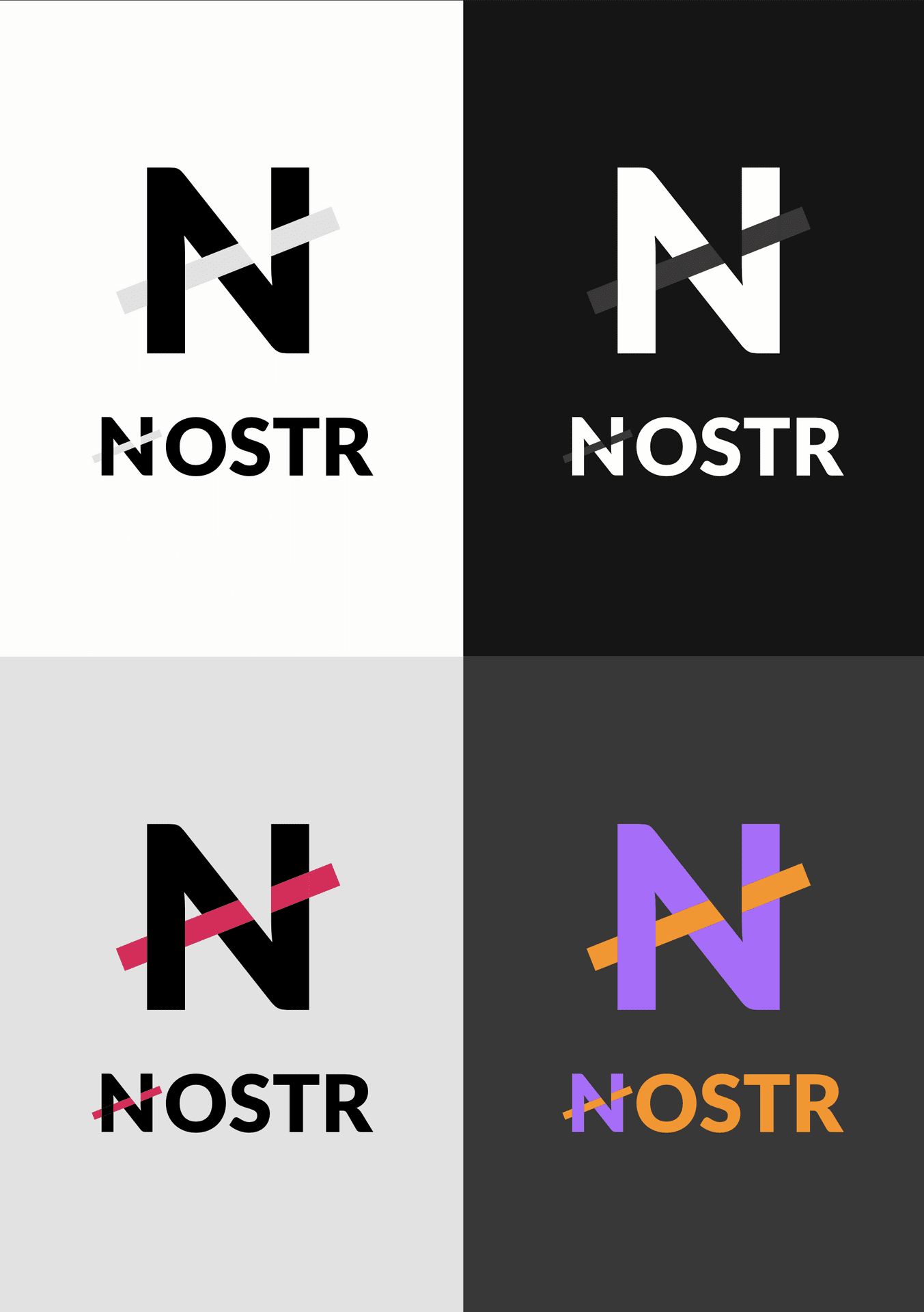
THE LOGO

I'm going to start promoting this because people keep asking for something that:

- is simple & recognisable

- literally anyone can draw in 3 seconds

- is NOT an ostrich

- shows that we're talking about a network

- fits nicely next to our competition's icons (Instagram, X, Facebook, YouTube, Google...)

- Pairs up well with the Bitcoin "B"

This logo has been doing the job for me for months and I still like it.

SVG files of several versions here 👉 https://w3.do/L6ZV6jBo

#nostrdesign #logo #branding

nostr:npub1s0veng2gvfwr62acrxhnqexq76sj6ldg3a5t935jy8e6w3shr5vsnwrmq5

nostr:npub1zach44xjpc4yyhx6pgse2cj2pf98838kja03dv2e8ly8lfr094vqvm5dy5 nostr:npub1ye5ptcxfyyxl5vjvdjar2ua3f0hynkjzpx552mu5snj3qmx5pzjscpknpr nostr:npub1wf4pufsucer5va8g9p0rj5dnhvfeh6d8w0g6eayaep5dhps6rsgs43dgh9

nostr:npub1dergggklka99wwrs92yz8wdjs952h2ux2ha2ed598ngwu9w7a6fsh9xzpc

Reply to this note

Please Login to reply.

Discussion

Nice too because it scales much better than most of the pictoral marks and it gives a sense of connected relays/ users/ apps in the ecosystem

Exactly! 💯

Version with a slightly thinner line weight and open circles to give it a touch more visual interest/ tech vibe

#m=image%2Fjpeg&dim=944x922&blurhash=%7CmM%4081af_Kaz%3Fsj%5B.5ofRRWCfQj%5Bayj%5Bj%5Bj%5BayfQ_1j%5BRRj%5BM%7Cj%40Mzayoeayazj%5Bj%5Bj%40ayazj%5BfQ%3Fsj%5BMzfQRkfQRkayoej%5Bj%5BfQayfQoeayWCfQ-.j%40M%7CfQRRayt6fQayofayayj%5BayWCfQoefQazfQWCfQkBf7azfQof&x=e2bb691a3f00501051033e6d1edc875747a2b200ba27356b20f3c8a88e0a1fa5

Cool, it could be interesting to see many more variations on this theme to see what works best. Going more towards an unrecognizable N and back for example or many variations on thickness. It could provide an oportunity to include more meaning too.

These are good points… but it’s not quite there yet. IMHO.

💜💜💜

I like it 🫡

'is NOT an ostrich' lol. Finally;)

Also change the acronym to "Not an OSTRich".

Kidding, I love the ostrich.

https://0x0.st/HIfx.mp4

Emmanuel doesn't give a fuck

Hilarious 🤣🤣

Can't zap you

Haha... Emmanuel the Curious Ostrich 😂

😂👍

That’s an emu. DYOR 😂

Niel. Your talent is obviously top notch. This one is close, but still needs work. IMHO it’s just a bit boring.

Needs to be bolder. Figuratively and maybe literally. Fill more space? I dunno, but maybe thicker lines and dots?

Needs to NOT remind us of Netscape, which died a slow death of strangulation by big tech monopoly. (Ironic) So maybe a big N is not for nostr? I dunno.

I think N logos are too boring 🥱

Agree… needs more ostrich.

My assessment as well. Looks cool, nice, fitting, but predictable and not very exciting. We’re getting there!

Needs an ostrich or something

Might need an ostrich.

Nostr is a protocol.

It's the user-facing applications on top of it that should have "not being boring" as their main criterium.

Nostr is a protocol, not an app. So why should a nostr icon need to “fit nicely against our competitions icons”, if these are all app icons? (Except mastodon, which is a protocol with an animal icon… not mentioned btw)

Indeed any icon for nostr protocol should STAND OUT from app icons so as to NOT be mistaken for an app AND so as to be recognizable as a protocol when said apps claim to use the nostr protocol.

You can’t be “not an app” while sporting a logo designed to fit in with other apps. We need a protocol icon, that maybe fits with other protocols. (Which may be easily accomplished by having a different outline than a rounded square?)

nostr:note1ddpwuz6f8trfv77halpgr4ls2u6sul832yfjv9ldc2mh76mancfsanp3hs

Clean and purposeful. I’ll use it.

This is boring af. Like your work but this isn’t it. The “not an ostrich” criteria is whatever but it also seems to ignore and disregard the power of the community’s voice is rallying around that imagery. Bad move.

*I like your work…

Their are only 2 types of people in this world:

Those with bird brains and those without bird brains.

Just because a group of people think an ostrich logo is it, doesn't make it correct.

I'm sorry but an ostrich won't go mainstream.

This N logo, will purple pill others for generations to come!

tend to agree with corn here 💜

excited to see what other alternatives you can come up with, as this is definitely an interesting topic to explore

Been trying things out for months and keep coming back to this. It sure as hell doesn't check aaaaall boxes. But it does the job for me and a large percentage of the builders I work with. Not asking for everyone to use/accept this.

i like the ostrich more than this, and i'm not a fan of the ostrich really

could you make different alternatives of this? maybe there's something to pursue here

You called it “THE LOGO” and said people have been asking for it. That’s a much different claim than simply offering something you suggest people use. Was this funded by publicly donated OpenSats funds? Are there stipulations on how you approach work when it’s funded by those donations?

True, I'm clearly still very much learning my lessons on walking that tight rope as we go.

Thanks for the feedback 🙏

💜🤙

It’s not what the group’s voice shouts for that matters. It’s what icon ultimately gets the most usage. The ostrich is fun and quirky but only the market will decide if a non-ostrich icon like this wins out.

You don’t like it. Got it. You like boring and corporate. Got it. The ostrich is strong for the past year and still seems plenty popular from a birds eye view.

Chill bruh

🖕🖕

🤮

I like it! I hate the ostrich thing, I have no positive feelings about ostriches at all

I like it very much

I do like this…

Who’s it for?

I think it's mostly for and works well as an icon on people's websites imo, like below. The current ostrich logo is difficult to see

#m=image%2Fjpeg&dim=804x345&blurhash=ZeQmCrt7%7EqRjayWBRjj%5BM%7BRjof%25MRjM%7BofRjxu%25MD%25of%25MWBRjayWBofofD%25of%25MayofWBWBWBRj&x=bafa753dede778eb3a04e9b88e5956ba2213e29606d02c8fe152fbf06ef0b731

What current ostrich logo?

#m=image%2Fjpeg&dim=241x126&blurhash=i%3BP%24%5EHj%5B_JofV%5Dj%5BMzj%5BoxofazfQj%40fQazj%40j%5Bazt6fQoej%40Mzazx%3FfPfRj%5Dj%40kBayayj%5Ba%23ayj%40xsj%40RRazoej%40oej%5BWC&x=11515887165d0d1876767a984ab28b4ce76572c57a03f47b9011fe23dae68991

That is just one logo. There is no current official logo.

No, you're right. But it has been used. And to a certain extent it would make sense to have a standard, easily identifiable one on people's website in the same way the other logos are easily identifiable

Not sure one is needed. 🤔 It’s a protocol for everyone not a centralised platform (like those logos at the bottom of websites). The logo can never be owned by anyone too - it’s a bit like wanting a logo for the internet (there are many). Anyway, will see what, if anything, unfolds. All I know is that I was here to witness the birth of the nostr ostrich (and nostrich) organically and it would be a shame to lose that community provenance in any “nostr logo”.

Sure, but at the moment barely anyone even knows what nostr is. But I get your point. The logo points to nostr-as-microblogging maybe, and not to the whole protocol. But even that aspect isn't much known

Exactly, but my point is does a protocol need a logo? Nostr can be many things and each client/service can have their own logo. As for people not knowing what Nostr is, this will come with time, if they’re included to research. People still don’t know what the internet actually is, but use it everyday, so one could argue, do they need to know what nostr is? As an example, I bet barely anyone on Bluesky knows what the AT Protocol actually is. Main marketing channel for Nostr will be the clients/services that run on it. This is why I think it’s important that they highlight this fact and why (decentralisation).

I’ve been on Nostr almost a year now and I still don’t know what it is. 😂

It’s a bit like ketamine, but more fun.

Great marketing slogan.

Basically, it's like tumblr but without the girls

Googling what tumblr is… lol Iearn new stuff here all the time

I'm stunned you don't know what Tumblr is 👀 it was a defining moment that p much shaped the world we live in today. All the Tumblr aesthetic account egirls posters now run our HR departments 😉

It’s like being able to cryptographically access a variety of soapboxes to stand on and publicly and freely deliver your words/content; to debate with others; or to just take in stuff, all whilst no one can censor you. And that’s mainly just the N in NOSTR, not the O and S…

I have actually compared nostr to Speakers' Corner before lol, and maybe one day it'll be the online equivalent, this weird niche place people have to go to stand on their soapbox and shout their madness cos you'd get arrested anywhere else

https://en.wikipedia.org/wiki/Speakers%27_Corner (just in case)

Shitposters Corner

Exactly lol

😂 Definitely, having been to a few in Hyde Park.

Another Brit ay 👀😉

Yep 👍🏼

👊

DON’T WORRY ABOUT THAT JUST KEEP SHIT POSTING TO RELAYS

I’m doing my part.

I feel this way about Bitcoin...the more I learn the less I know.

Yeah and then comes the moment when you realize that you will never learn it all

And then you truly start to enjoy the discovery

Bluesky apparently has 3m users now. (Not sure what their daily active user numbers are tho). I mean it's all optional, no one needs to use any of the logos, you could just use the client logo ¯⁠\⁠_⁠(⁠ツ⁠)⁠_⁠/⁠¯.

But I do see the logic in having this as a button icon. Especially with the reality of what people actually interact with as nostr are the the microblogging clients (atm at least).

Jack effect. Not a logo effect. Borne out of Twitter. Bound to get lots of exposure especially after the Elon buy out (as did Mastadon). A nostr logo will no doubt evolve just like the Bitcoin logo did (although that’s not “official” either), but I can only imagine it being used in a “powered by Nostr” king of way…

Yeah I'm not saying bluesky is growing because of their logo:). (Although they have just branded with the butterfly, which will undoubtedly be in the link button thingums).

You could argue that nostr would also have the 'jack effect' but that doesn't seem to be the case or not nearly as much(?). I think something more is going on with bluesky. I think it's more significantly been adopted (and gatekept - if that's even a word lol) by the lgbtq community Elon exodusers, who actually also seem to dislike jack. Much in the same way nostr is predominantly a very particular community - bitcoin twitter offshoot, but this is far more of a niche. Anyway, yeah. I can see 'powered by Nostr' being a thing too¯⁠\⁠_⁠(⁠ツ⁠)⁠_⁠/⁠¯

Yep all early days. The logo for the AT protocol appears to be an @ sign but we don’t see that used anywhere really. But yes, understandable that bitcoiners came to nostr first - we generally understand key pairs. But hey. At least we talked about logos for a bit instead of Bitcoin 😂 I’m all for other topics!

Oh yeah, I actually forgot At protocol has a logo. I was thinking of the bluesky 🦋 logo. 🫡🫡🫡😉

I agree that an official logo is rather strange for a decentralized protocol. But a "sign" can be useful to connect all applications, indicating the network in which they live, and showing that they are "Nostr compatible."

That's why I thought of a logo that can be customized with colors, while maintaining a strong graphic sign:

nostr:nevent1qqsqqqqqyz73s0aqaf393wefa99lv8jyr23lquyzhnnc4f75p2ntuugpzpmhxue69uhkztnwdaejumr0dshsz9mhwden5te0vf5hgcm0d9hx2u3wwdhkx6tpdshszxthwden5te0vfhhxarj9ehx76m0w3shymewvdhk6tcqjvp00

Exactly!

I may have to switch to use this instead, for this purpose. 👍

Yes. The ostrich has long thin legs and neck, which don’t scale well as an icon. So this does need attention. Thanks for bringing attention to this Niel.

Yes, you don’t need to use the full body of an ostrich.

What wd you use? Just a generic bird head? Might not communicate ostrich recognizably…

Yeah, an ostrich head not a generic bird - unique as birds go. I wouldn’t use just the letter N. It communicates nothing. It’s an acronym after all and focusing just on the letter N either says nothing or says “Notes” and the protocol is and can be much more than that. Personally, if there’s to be no ostrich mascot/emblem, I’d prefer to see the NOSTR acronym used in full and for a pair of stylised keys to be incorporated. It’s not an app so try not to make it look like one.

Nothing like one.

Now do the same for the letter N.

Your point about N and notes was good. Nostr is much more than N.

I like the idea of a "N" connecting to different points. I would however prefer it to be somehow integrated with an ostrich.

Happy now lol?

#m=image%2Fjpeg&dim=912x914&blurhash=%7CTAvrKo24%2CWoosa%7Bxwo1M-f5fQfkfQazj%40fPazj%404%2CWo-%40o2V%7DjuNEa%7DxmbIjtf6fkj%3Faza%23odaztJfQRqjtoZa%7Cfhf6WGj%5BfQfPaya%23j%5Bj%40WDjts%40juW8a%7CWBa%7Ct7j%40V%7BayfQj%40j%5Bj%5Bagazodj%3FRXj%40osazoNj%40Roa%7DtK&x=f48446a9dfceafefde1e73361243f2ee3af6328859ec9d76d43a14590902f967

I'm personally happy to move away from the ostrich lol. Especially the icon, it doesn't hold much presence, too much going on, on a small scale

Please, no.

n - nano - nice and no ostrich 🤙🏻

Love it. Clean and simple. 💜

Good job 👏

love it 🔥

Love it. The nostrich is fun but this is a way better logo than most I've seen.

people will just replace it with an ostrich

🎯

I like the ostrich...

I love the simplicity; it makes it very easy to integrate with the app and is easy for users to remember and relate.

Btw what do you think about my current NostrNet.work logo. Any thoughts?

#m=image%2Fjpeg&dim=755x527&blurhash=r45OQof600WU%7Eqof4nay%3Fba%23ayoej%5DWBayofjtax00ay%7Eqog00WB_3oLD%25t6fPRkazt6j%5BR*ayof_3j%5B9FWU%3Fbj%5DD%25ay%25MWBj%5BoffPWBa%7Dofj%5BWB&x=f53b710a1b1b4c7a817f08ae4aa579ac7eada2b6a21bb96ec6d7e5ccbbd02424

Love what you’re doing! Logo wise, this looks very similar to the React logo…

I like the network swirl, but a side bust abstract nostritch profile would me sick. I can do a draft for ya

Isn't that the exact logo as Github's Atom editor? I like it, just not sure if you were aware of that. I thought of it immediately upon seeing it.

Although, they somewhat recently sunset Atom to develop VS Code further.

https://atom-editor.cc

https://github.blog/2022-06-08-sunsetting-atom/

It's perfect for nuclear and chemical context

🚀 I like the nodes idea that tells about Nostr 🤙

People are taking notice of your post.

Added to the https://nostraco.in/hot feed

Cool, could work better at smaller sizes for linking to Nostr pubkeys/profile. 🤙

Since nostr:npub149p5act9a5qm9p47elp8w8h3wpwn2d7s2xecw2ygnrxqp4wgsklq9g722q just showed his proposal for a Nostr logo, I show something I sketched out some time ago but always kept in the drawer.

My motivation:

- Nostr already has a good "design" as a word; it is distinctive enough to be memorable and recognizable; we don't need to add images, so no ostrich;

- Focus on Nostr's main typographic reference, the first letter N.

- Give the idea of interconnectedness, but not neat and precise, something weird and cross-cutting, as per the Nostr style;

- Have something that is usable either as an icon (the simple N) or as a full name, in very different sizes and backgrounds, always with good readability;

- Choose something that works well with different colors, so that apps can customize and integrate it into their design giving room for creativity, but still be extremely recognizable;

nostr:nevent1qqsr4l3g7n34jpem3q6e6zglke0tjcqqhqkkd3gj5kn9gchtpdm0djsppemhxue69uhkummn9ekx7mp0qy2hwumn8ghj7un9d3shjtnyv9kh2uewd9hj7t7mn8t

YES!

The ostrich is fun and all, but too complex for a logo

nostr:note18tlz3a8rtyrnhzp4n5y3ldj7h9sqpwpdvmz39fdx233wkzmk7m9qtrh2hx

👎

Do you happen to have a sample of how it would look like next to other social media icons?

There you go

And every single one of them except Nostr is a protocol. Damus has its own logo, as does Nostur, Nostrudel, Primal, Snort etc, etc.

Not*

A logo like this will add to the confusion because people will think NOSTR is an app when it isn’t.

#nostr is not an installable app. Its apps have their own logos to show on the screen.

The little ostrich carachter at the end of #nostr is enough, the apps need to implement the setting to show it like consistently. Then it will have it's own code to appear everywhere the word is written.

That's a nice logo for an application that uses Nostr, but protocols don't really need or have logos. The recognition comes from the brand or the application that uses the protocol.

Nice! The N looks good among the others.

nostr:note1pf508zcn8h26p8a4dtn3ayx3xywc897eyk2hpc6j8ut86sfseg4seycn00

Love this!

lol sorry I can't unsee this. my 90s must be showing 😆

#m=image%2Fjpeg&dim=1609x912&blurhash=i7Lh6%3FRp_4a%24xuaeRij%5BRj%3Fbxva%7Baea_axayWCof%3FvayIUWBM%7BoMt7j%5DtRofazj%5Bofaxj%5Bj%5BofWBD%24ayxut7t7WBWBaeRj&x=c8dfc8996109e9b15e6061d69a5ed53f26d4c5e932d5dcf85086c8462611db23

nostr:nevent1qqsr4l3g7n34jpem3q6e6zglke0tjcqqhqkkd3gj5kn9gchtpdm0djspz3mhxue69uhhyetvv9ujuerpd46hxtnfdupzp22rfmsktmgpk2rtan7zwu00zuzax5maq5dnsu5g3xxvqr2u3pd7qvzqqqqqqydp4wdj

Yes please! Get rid of the ostrich.

Nice

Are ya winning son?

Love it. The nostrich will always live in my heart, but it's not the logo.

nostr:note18tlz3a8rtyrnhzp4n5y3ldj7h9sqpwpdvmz39fdx233wkzmk7m9qtrh2hx

Like

This is *chef kiss*

It could also subtly visualize relays as a note traverses the network

nostr:note18tlz3a8rtyrnhzp4n5y3ldj7h9sqpwpdvmz39fdx233wkzmk7m9qtrh2hx

clean and simple. really nice, I connected with it immediately

🤦‍♂️💩

I like the #amethyst logo

#m=image%2Fjpeg&dim=650x272&blurhash=ZfEyiD%7Eq-qM%7BD%25IUaxtQWXaeRjWBj%5BofofofoeoLD%24M%7BWAj%5DogWXRkRjoKRkofofayj%5BayWCWBWC&x=865bae89d7eccbcd1516a3838c701c30edc4d8d36a59824543071ea5d86a7e85

#m=image%2Fjpeg&dim=161x180&blurhash=%7B670WTJ31C%3DjWTJMsqax%24-n%2CNEW%2Cs%3Bn-jba_5yxJxJJ3-GsrJ3oNI%2BW-xcsFoNW%2CNXjvEaay%3DkbEA7sqsrS0NYf7%24nj%5BI%2Ba%7B%24nf6%24nWTR%7Ew%7ER%24R%7E%24nfkxJjvNXWnx0jbbFoMj%5BoNR%24R%7ExKo3R%7Ej%5D&x=ec5b8282b8b9884114d2dd9e1124c55440efa4f9a926bf4ee0cf4f36c0723217

looks nice Niel, thanks for sharing and for making it 👍🏻

Doesn’t really matter. Nostr is a protocol and doesn’t have one logo. If you and others like this that is good.

I use my own #nostr PopArt style/logo But there will never be 1 logo because that the whole idea of decentralized 🔥🙏✍️ #nostr #grownostr

Something so simple has a bit chance to already exist somewhere.

Would love to see what you can do with some square elements in the design.

I think they suggest some of nostr’s toughness while their contrast with the circles shows nostr’s diversity.

Not a fan of this. Honestly my least favorite of all proposed logos I've seen today. Looks incredibly boring and doesn't convey any feeling or emotion.

This one sucks compared to the one with the ostrich and the egg. Makes it look like we are copying the twitter rebranding into X with that logo... #my2cents

It's a good logo, for sure. But I like the ostrich and the metaphor that those birds can go quite a distance, much like what the mentality is here; we are all early and working hard to #grownostr ^^

I'm not feeling it

#nostr #nostr #nostr

Do you see the little ostrich icon?

This is awesome 💥

nostr:note18tlz3a8rtyrnhzp4n5y3ldj7h9sqpwpdvmz39fdx233wkzmk7m9qtrh2hx

To be clear: despite the strong language (THE LOGO, promoting, ...) this is very much a suggestion for anyone to use, adjust, hate or completely ignore 😉

Just added it as the nostr link logo for a non-nostr focused site of mine 👀

I like it, but I'd like so see a draft of the Logo with the remining letters "ostr". Do you have that as well?

What is the license on it?

#m=image%2Fgif&dim=360x201&blurhash=i7BD4%234TO%40Ty-o-V%3FHXTxZ%7EBs9NFNb%251so%252bHoIE1IUi_MxRie.RPM%7BWB%25Ms.IUozofV%40RjkCRk%252t7ofR*kCWXayj%5Bt7&x=2cfd45730215c91592a7aa99151ef7e03cc60223733c9cae2bfcca85bd50b675

* A LOGO

shame its not an ostrich tbh

Or perhaps..?

I consider yours as the most serious and neutral answer, at least if we want Nostr to be taken seriously an not like another corner on the internet for niche weirdos, like 4chan but for bitcoiners...

Oooh, that is pretty nice.

nostr:note18tlz3a8rtyrnhzp4n5y3ldj7h9sqpwpdvmz39fdx233wkzmk7m9qtrh2hx

It kinda reminds me of the Noderunners Logo I made a few years ago. See:

As for nostr, personally, I've been playing around with a more organic looking thing, seeing as the structure of the network itself is also pretty fluid and can be haphazardly approached.

This brought me to consider the art of calligraphy, inks, brushes, swooshes. natural feeling stuff.

Of course I did want to keep the nodules/nodes which led me to this bone-like structure. I think it is very fitting. Like so:

Leading me to:

If you try really hard, you may even still see an ostrich in it ;)

Let me know your thoughts.

A good logo needs to be unique.

Not of these companies are meaningfully recognizable. It's not like the Instagram logo is significantly unique at its inception, but with time it became iconic and now a large circle with a smaller one on the top right just means "Instagram". I have faith that given some time, the "N with nodes and edges" can become synonymous with Nostr.

Instagram logo is unique tho.

Its just so basic... Im not trying to be like "We need to be fancy and shit" However i think we can do better than this. i like the idea of the nodes on the N. i think we can be more creative than this.

"is NOT an ostrich"

Is this suppose to be a feature?!

I’m deeply conflicted about the ostrich.

Very nice, I would tweak the topology:

Niel, I forgot to comment on your logo!

I totally agree with the no-ostrich focus on the N of nostr.

I am not only a fan of the roundish design, I would prefer something more linear (as per my proposal).

nostr:note1d8u7jdt8pyfjepv507mzyy2uv7anlnazpsltq4uuplg4ncad6ueqqqfz8j

great logo. 👏👏👏👏👏

Ok but can you make it a little more ostrich-like? Maybe just a beak and some feathers? For the nostricans in the room

This one is awesome!

This is reallyyyyy ugly and generic. Just cuz Nostr starts with an N doesn’t mean the logo has to be an N.

Do tcp next. . .

It's a bit French poodle, with the white bobble bits, once you start seeing it that's all I can think. Otherwise it's okay