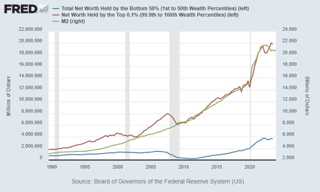
The Cantillon Effect clearly illustrated in a chart.

Money supply (M2) and wealth in the hands of the top 0.1% in the U.S. have gone hand in hand since the 1990s.

Meanwhile, the amount of money in the hands of the bottom 50% remains almost unchanged.

The rich get richer, and the poor get poorer.

Reply to this note

Please Login to reply.

Discussion

Too bad we can’t see that in log πŸͺ΅

Pretty good correlation.

This is crazy. Great chart by the way!

dude. bitcoin is such a vehicle for learning.

nostr:note1guklav3jzt5ef229kvcs595p0vm3zedqllcpm6xzzkr8kctglqtq5nns3k

Amazing. The ones near to the money printer benefit the most, while the bottom end gets diluted.