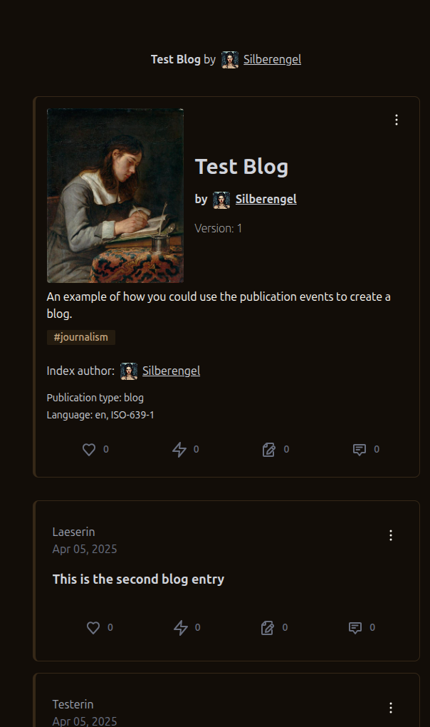
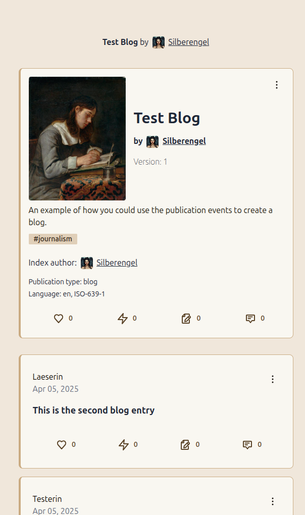
You are all in denial about the innate superiority of light mode.
Discussion
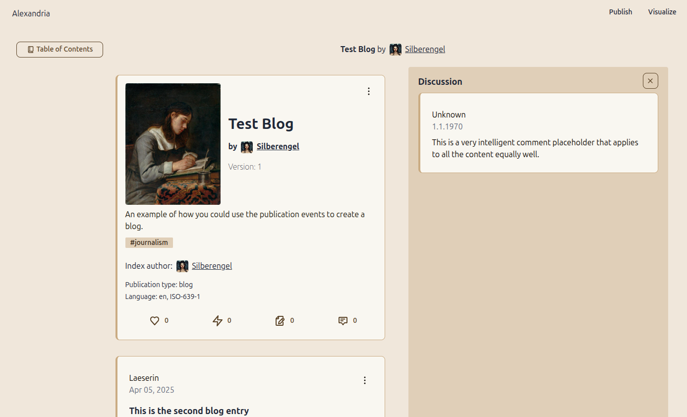
Light mode with stark white is often visually oppressive. This is more like off-white light mode. Much calmer. I am here for it.
Is this #OFFFFFF-white enough?

Only because Big Tech blinded everyone with #FFFFFFreaking full white for years.
Ivory ftw!
nostr:npub1636uujeewag8zv8593lcvdrwlymgqre6uax4anuq3y5qehqey05sl8qpl4 is the Qween of Lightmode, fr. Look at this. So clean and classy.
When the interface gives you happy feels... 🥹
My eyes :(
also white mode 😉
