
Make Apps Beautiful Again
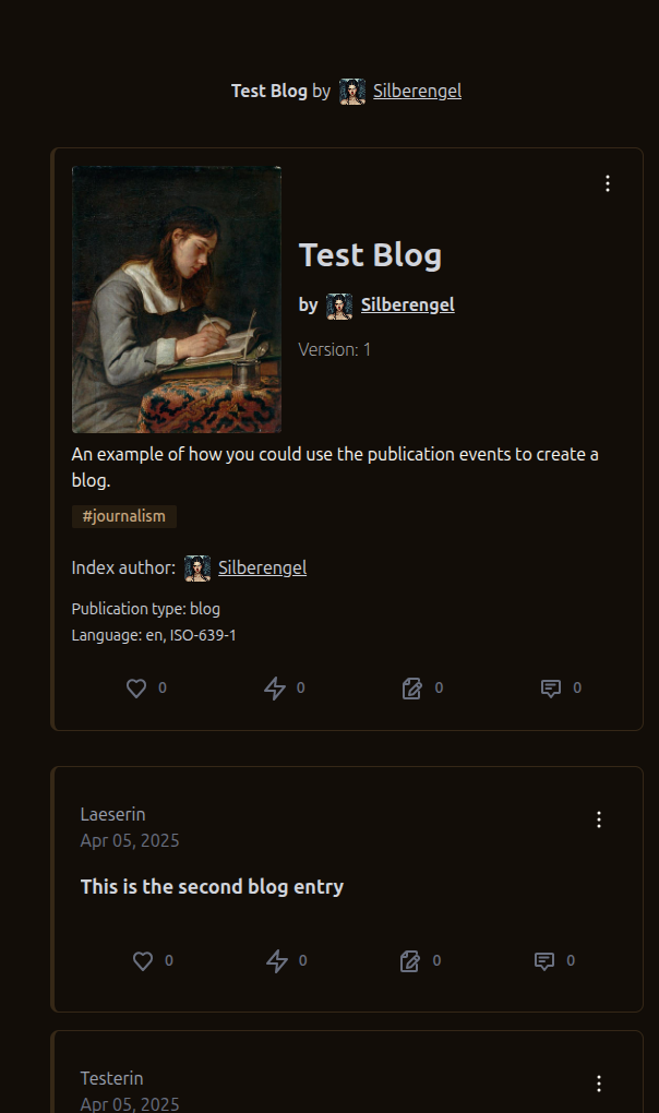
#Alexandria
Make Apps Beautiful Again
#Alexandria
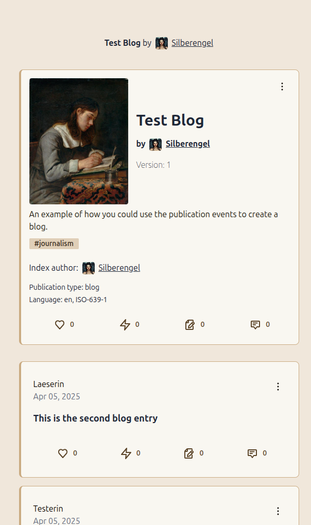
You are all in denial about the innate superiority of light mode.
Light mode with stark white is often visually oppressive. This is more like off-white light mode. Much calmer. I am here for it.
Is this #OFFFFFF-white enough?

Only because Big Tech blinded everyone with #FFFFFFreaking full white for years.
Ivory ftw!
nostr:npub1636uujeewag8zv8593lcvdrwlymgqre6uax4anuq3y5qehqey05sl8qpl4 is the Qween of Lightmode, fr. Look at this. So clean and classy.
When the interface gives you happy feels... 🥹
My eyes :(
also white mode 😉
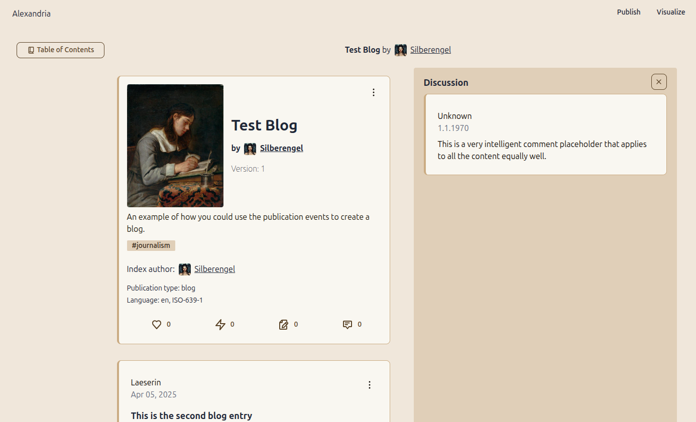
nostr:npub1q6ya7kz84rfnw6yjmg5kyttuplwpauv43a9ug3cajztx4g0v48eqhtt3sh
Sir, the ⭐⭐⭐⭐⭐ ratings will follow nostr:npub1cgd35mxmy37vhkfcmjckk9dylguz6q8l67cj6h9m45tj5rx569cql9kfex's new spec and appear under "View Details" in the ... menu.
It's just number of stars and a comment.
Mike has to admit that Alexandria Light Mode is a thing of beauty and I actually like it quite a bit. 😎
*I have to admit
Beauty is subjective 😅