
I can’t stop thinking about this chart. 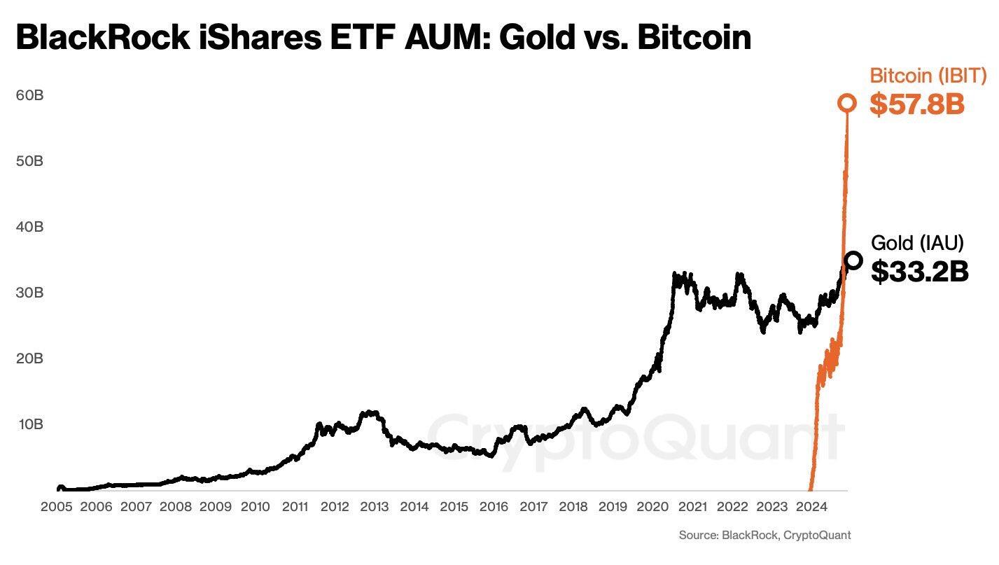
Discussion

No wonder I see it so often

🚀🚀🚀

You mean you can’t stop masturbating to that chart

This chart and the cost of goods in SATs are the same chart. It's the world we were meant to inherit


Cause it's missing overlay of gold price and bitcoin price

I have been asked multiple times if I think bitcoin ETFs will be as successful as gold ETFs were in the 2000s.
My response: 🤦🏻♂️
😂

Kinda makes you even more bullish on bitcoin, right? yeah, I know.. it's hard 🤑


This Is Just the first chapter of the story

Our great great grandchildren will thank us.

Let’s think about it… I am not sure if it is a good sign.
With the number of independent Bitcoin Nodes stagnant…

Do they have to hold gold 1:1 like they have to hold Bitcoin?

Right!! It’s insane.
Insane in a way you thought may happen, or insane in a nefarious WTF is going on ? Is one helluva paradigm shift for sure when you see that. People want exposure just a shame not self sovereignty

All the models will be destroyed!

wow, that is fucking insane.
DONT TRUST ANY OF THIS UNLESS THEY VERIFY. COINBASE & MSTR AS WELL

Keep in mind, etfs are how they suppress the price of gold. Not necessarily a good thing. This just means more people holding paper representation of bitcoin. I doubt they even have 1:1 holdings.

😈😈😈

#IBIT should be compared to #GLD ( 74 Billion) - largest to largest ..

flight to safety

The real-world implications of Digital vs Analog illustrated in a chart.

I think comparing to total gold in ETFs compared to Total Bitcoin held in ETFs gives a better overall picture, but I am sure the trend still applies.