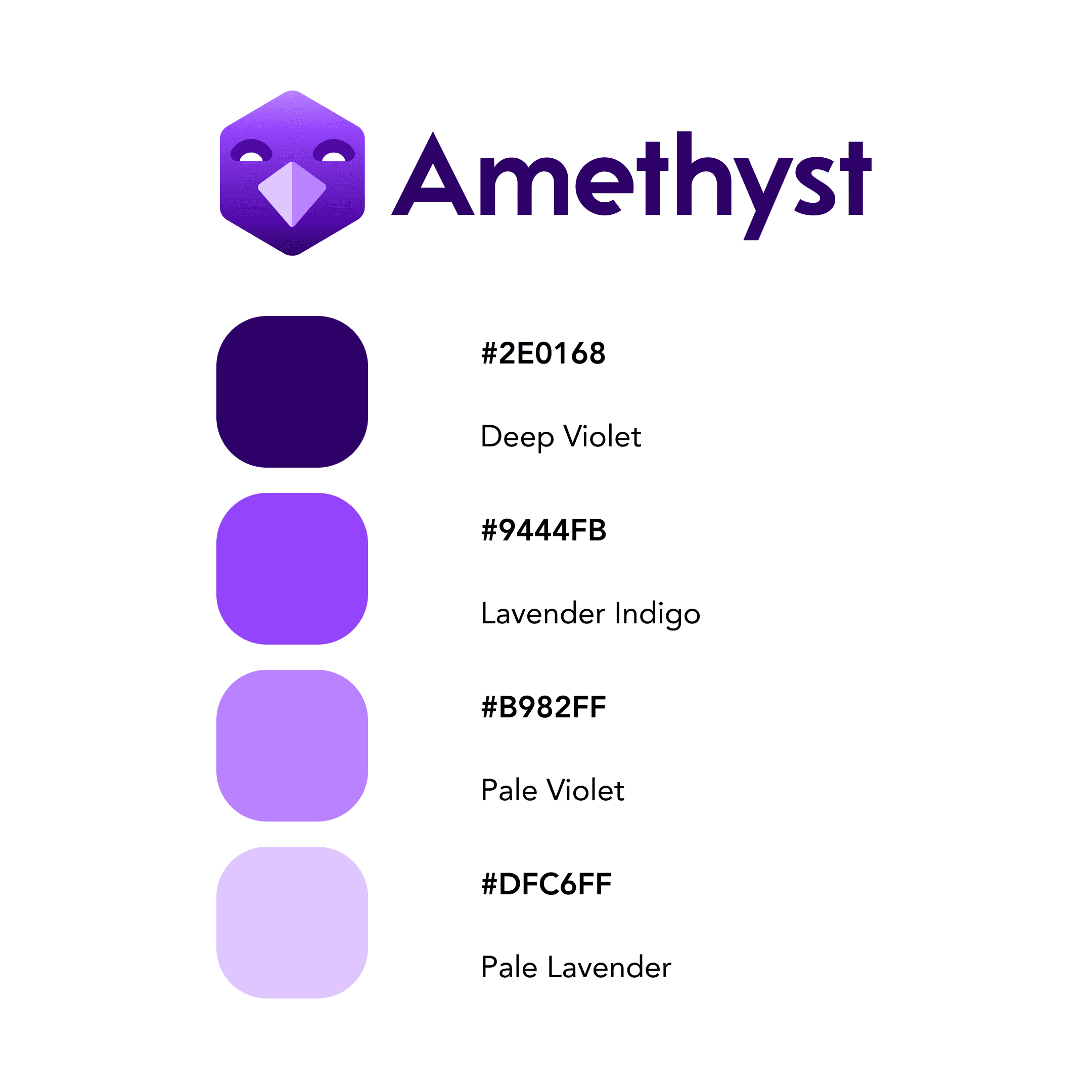
A new Amethyst logo

Proposal by nostr:npub1aeh2zw4elewy5682lxc6xnlqzjnxksq303gwu2npfaxd49vmde6qcq4nwx

2023-10-23

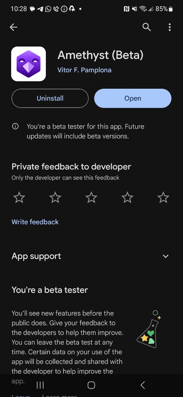
Amethyst, the most popular Nostr client for Android, was first launched in early January 2023. Its original logo design featured a tall, warm purple hexagon with the shape of an ostrich head and beak in the negative space that was also vaguely reminiscent of an arm with a hand making the shaka symbol. πŸ€™

Since then, it has undergone iterations, and now features a cooler purple-to-blue gradient in a more abstract shape which somewhat resembles an A, but isn’t as successful as it should be.

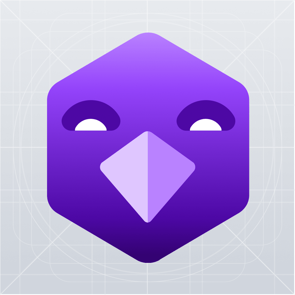
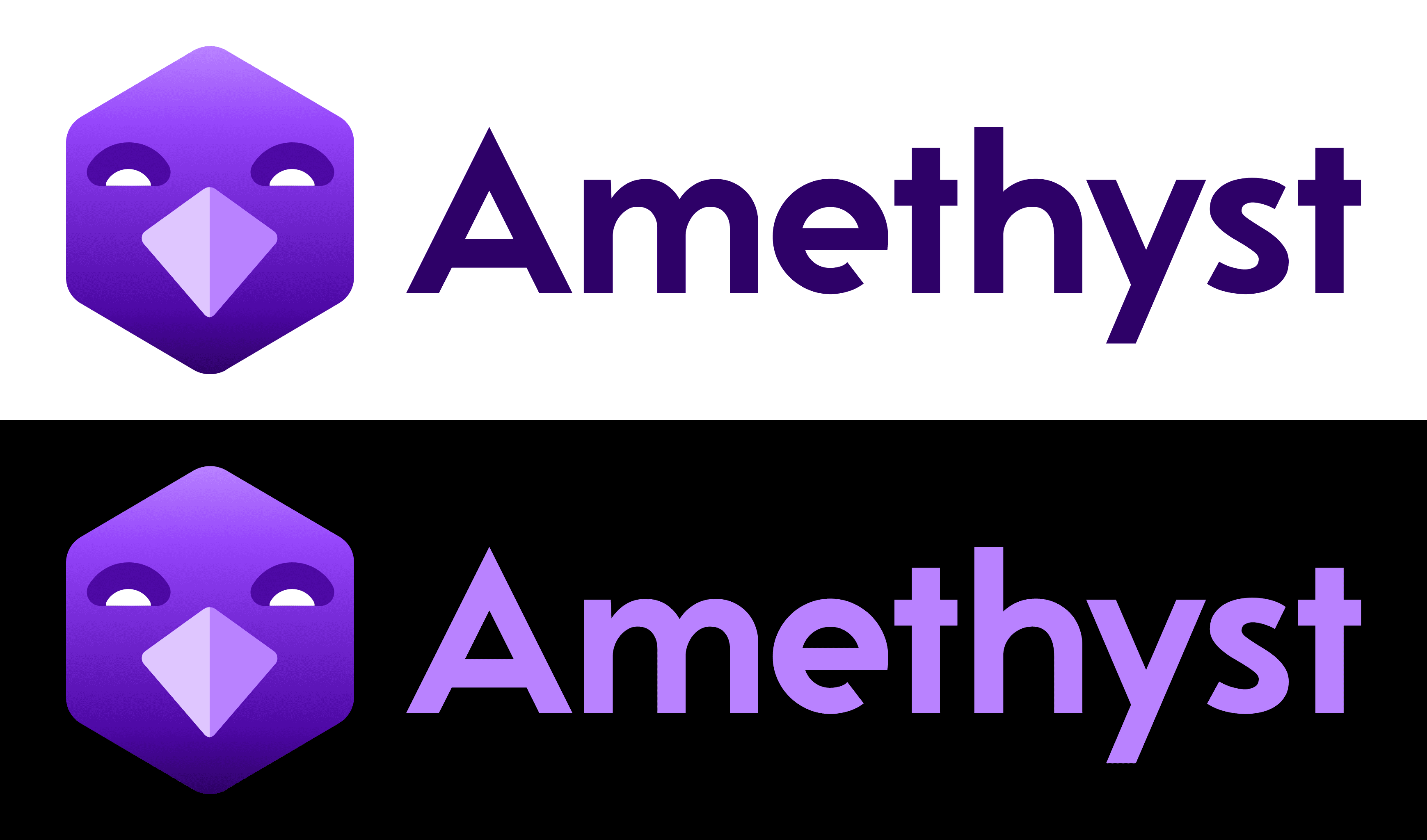
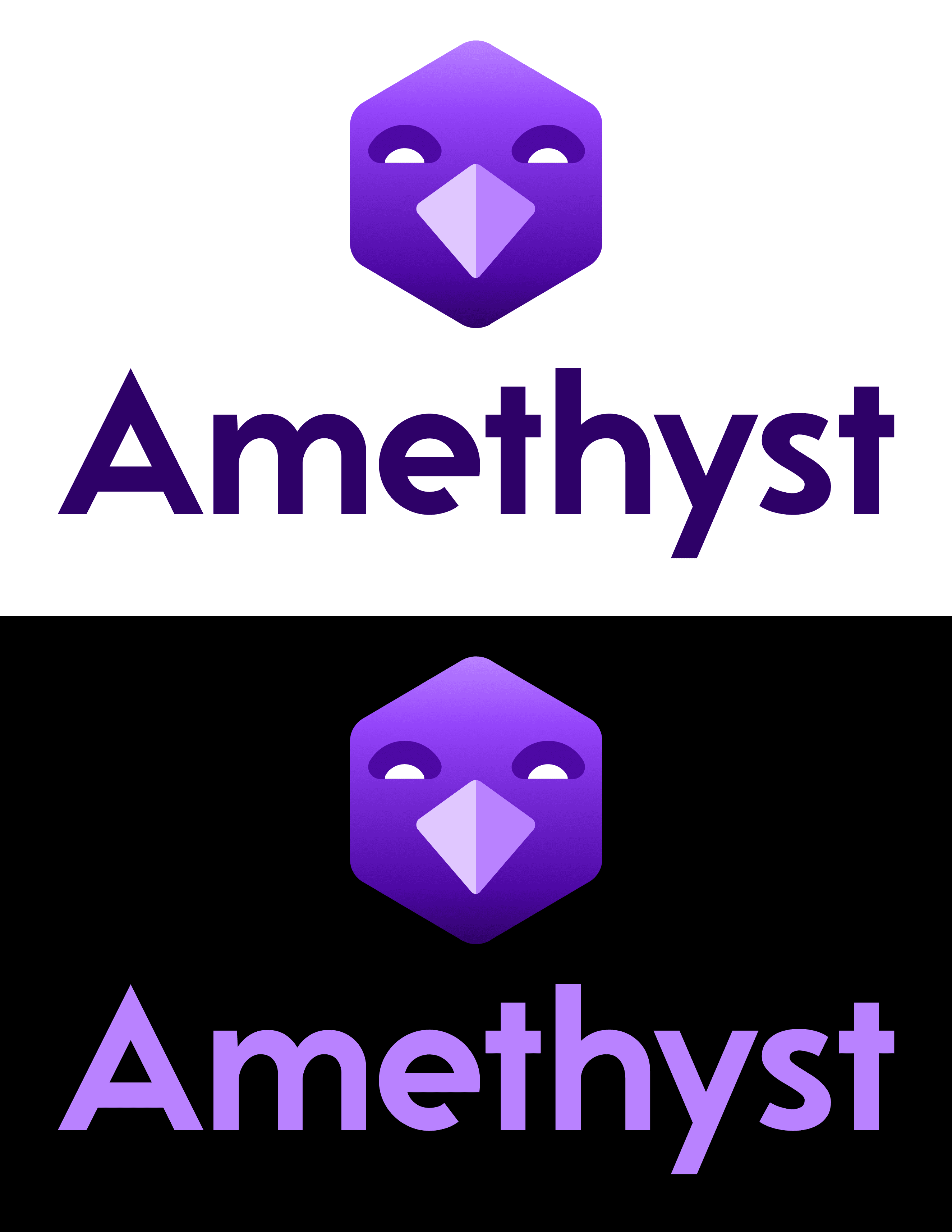
In nature, an amethyst is a hexagonal crystal with deep and rich violet colors. This new design attempts to bring some of that back in a thoughtful and refined way. The new design features an avian face, made up of simple geometric shapes set into a symmetrical hexagon with rounded edges. The colors are vibrant and contrasting, and it is accompanied by a geometric sans-serif typeface that is both bold and distinctive.

I hope this new logo will be embraced by the community, as I think it will help elevate Amethyst to have a friendlier and more polished-looking brand, while still staying true to its origins, and the spirit of the Nostr. πŸ’œ

#nostrdesign

Reply to this note

Please Login to reply.

Discussion

I like the current logo much better.

I like it all except the full application name along with the logo in the app itself.

I like the duck we got

Quack! πŸ¦†

It's cute, but since nostr is like 17+ maybe it's sending the wrong message πŸ€”?

We want to #grownostr to be used by more than 20,000 freaks, and I think one way to do that is to give the apps a more approachable facelift.

Not my place to tell you what to do with your app, but the new logo proposal does not resemble an ostrich at all.

I’m not an Amethyst user, but I think this is a nice looking logo

Looks great!

There is a bird amethyst πŸ˜…

πŸ”₯

I really like it.

Except the ETH beak, change that to β‚Ώ πŸ˜‚

It’s distinct and nice colours, seems inviting.

Without the Amethyst word in the app tho maybe, just the logo. With the word would good on a website

I was about to tell this.. the font, I loved tho

Bitcoin make for great glasses! ;)

Totally not ETH, for starters it’s upside down. Hey maybe this is how we orange pill them, did ya ever think about that? 😁

Logo doesn't matter. Keep working on those crashes and the buggy feed. Those are what makes users abandon or stay. Thanks for all your work.

I love it. Much better than the current one. Especially with the name next to it!

No

If it ain't broke, why try to fix it?

Best design

LFG

I love this new lookπŸ’™πŸ‘ŒπŸ’―

It's a nice logo, but not sure it fits to this app. I actually liked the logos that nostr:npub103vypyhddrad9289zp8lf2dxlkkrmq3e0utx3qg449ea8x2wel6sas2700 proposed originaly, without reference to a bird or ostrich, but they were not accepted by the community.

I have tons of respect for José’s work, BTW. That said, I was never really in love with this particular design, which I felt was missing something and could have been pushed further.

My idea is to create a friendly, approachable icon that makes new users feel that Amethyst and the Nostr are a fun and inviting place to make friends and communicate freely.

A logo has a psychological effect that can make or break a product simply because it might be the reason someone chooses to download an app or not. I want Nostr to succeed and since Android is the world’s most widely-used mobile OS, I want to give people who have never tried it a reason to want to start.

I am not attached to the current logo, but your proposal is too cute for its own good πŸ€— It would fit nicely to a kid friendly nostr client. For Amethyst I would prefer something more abstract and sexy, and less birdy πŸ˜‡ But hey, that's just my opinion man.

You have a good work ;) , I like it, I would just change or choose another font, now, one thing is certain, as long as the community chooses it, like by voting ... , it will always be very complicated...... As nostr:npub16ykyd9en9s08qs7p0k7g8ywhqcctrx8jaw8hxs6e06968zkzzxpqmmrq7r said well, my first proposal is still for me today, much better, it's simple and effective, for example, the last work I did was the creation of the logo and the entire identity for nostr:npub1gp4xzpmluelsakjtayc4wtzj97fhj5kakqjvsannu00xkdlf4x8s0xdqyq, you may have already seen, if not, try the APP, its much bether then Amethyst, by now, nostr:npub1xpuz4qerklyck9evtg40wgrthq5rce2mumwuuygnxcg6q02lz9ms275ams was the one who decided, but he soon realized that as a professional that I am, my proposal was right away, because people forget that a good creative person has to make/create a vast list of attempts until they are 100% sure of what they are going to present to the client. Finally, congratulations nostr:npub1aeh2zw4elewy5682lxc6xnlqzjnxksq303gwu2npfaxd49vmde6qcq4nwx πŸ‘ŒπŸ€ŸπŸ‘Œ

I love this! πŸ’œ

Thanks 😍

Sent you a DM.

Nice