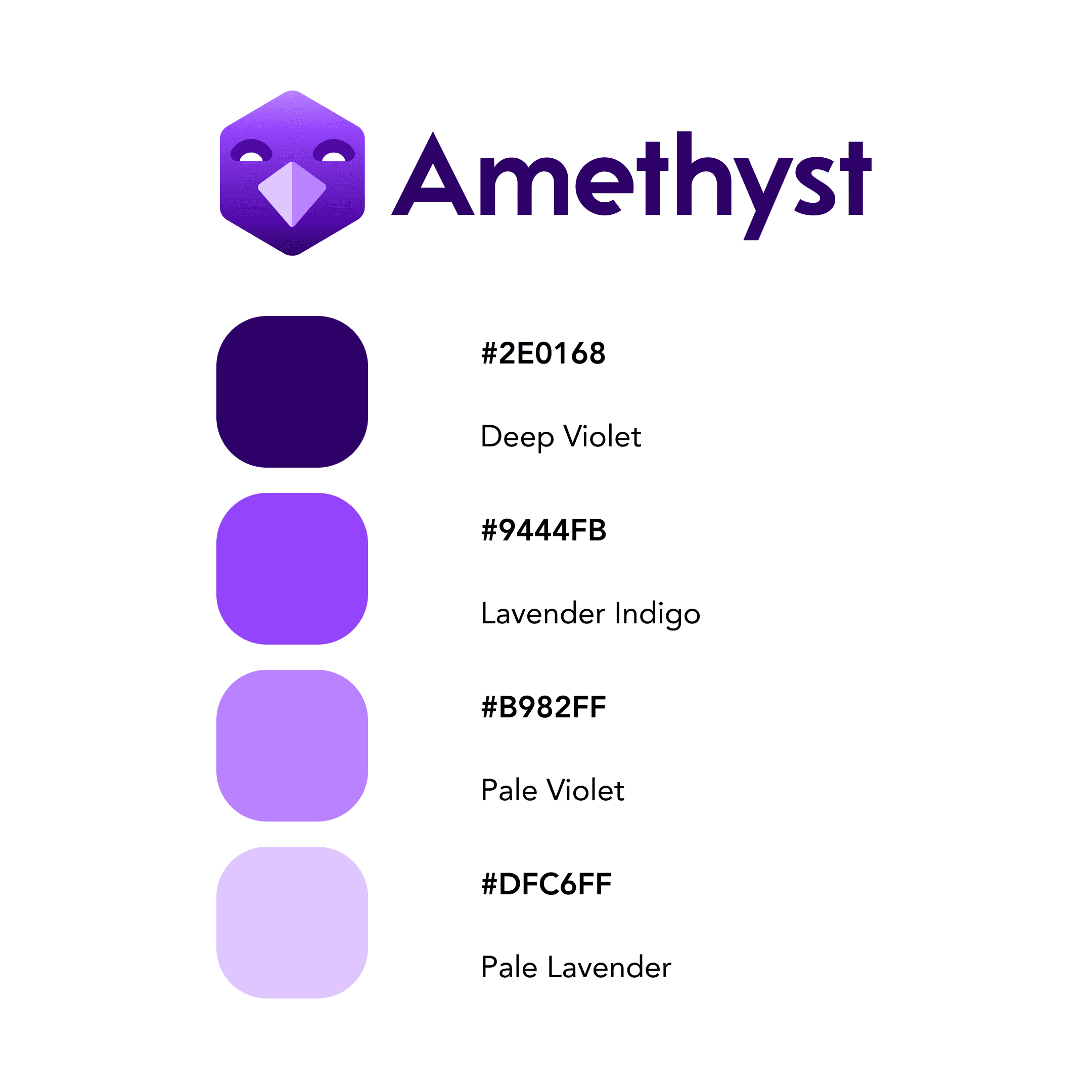
New logo suggestion for Amethyst. This one feels more expressive than many other proposals.
What do you all think?
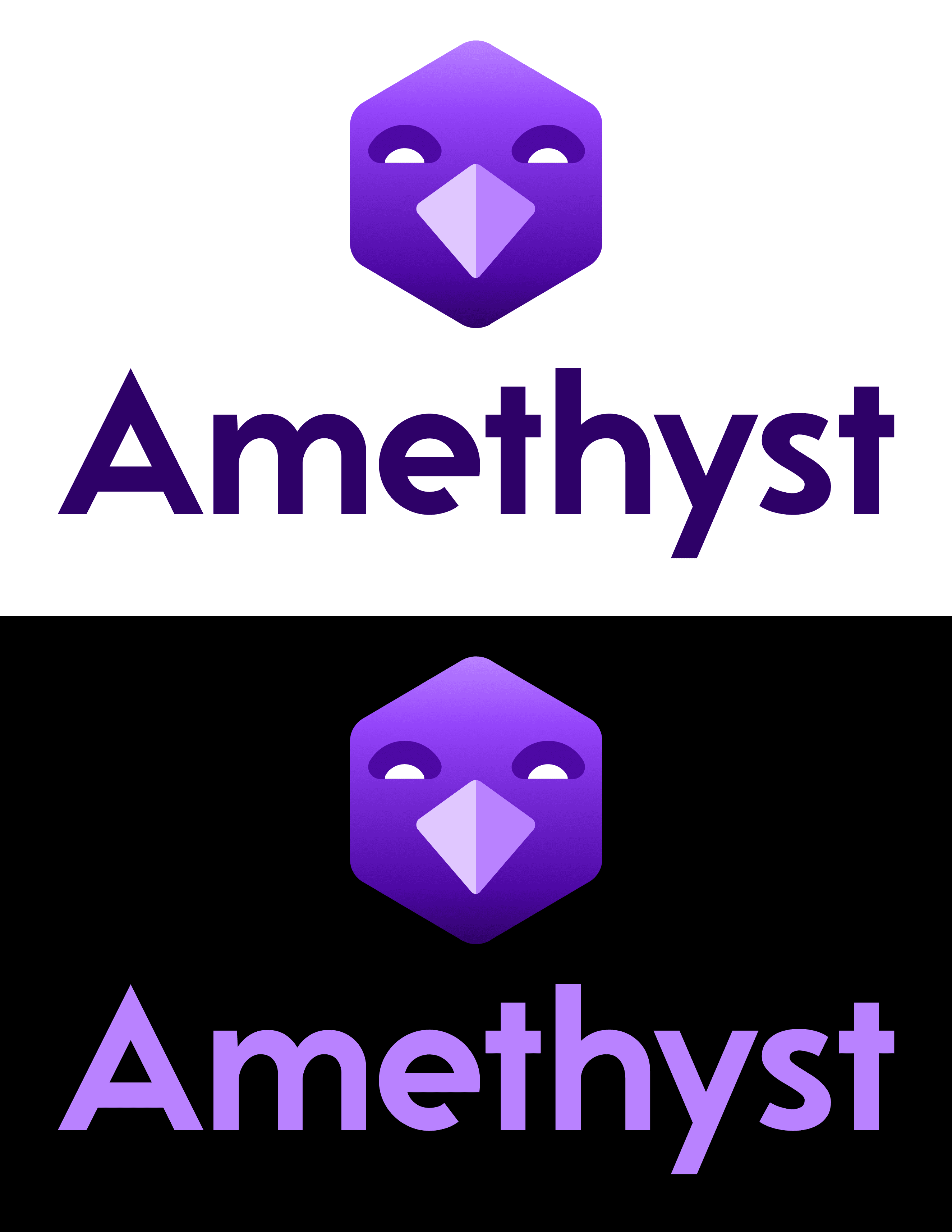
A new Amethyst logo
Proposal by nostr:npub1aeh2zw4elewy5682lxc6xnlqzjnxksq303gwu2npfaxd49vmde6qcq4nwx
2023-10-23
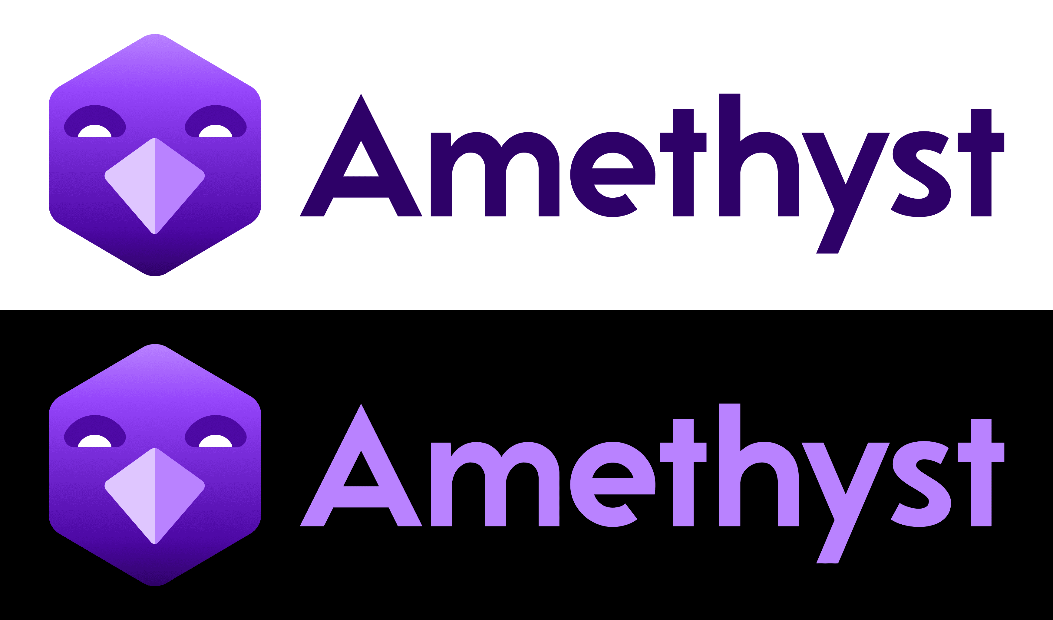
Amethyst, the most popular Nostr client for Android, was first launched in early January 2023. Its original logo design featured a tall, warm purple hexagon with the shape of an ostrich head and beak in the negative space that was also vaguely reminiscent of an arm with a hand making the shaka symbol. 🤙
Since then, it has undergone iterations, and now features a cooler purple-to-blue gradient in a more abstract shape which somewhat resembles an A, but isn’t as successful as it should be.
In nature, an amethyst is a hexagonal crystal with deep and rich violet colors. This new design attempts to bring some of that back in a thoughtful and refined way. The new design features an avian face, made up of simple geometric shapes set into a symmetrical hexagon with rounded edges. The colors are vibrant and contrasting, and it is accompanied by a geometric sans-serif typeface that is both bold and distinctive.
I hope this new logo will be embraced by the community, as I think it will help elevate Amethyst to have a friendlier and more polished-looking brand, while still staying true to its origins, and the spirit of the Nostr. 💜
#nostrdesign


New logo suggestion for Amethyst. This one feels more expressive than many other proposals.
What do you all think?
Very cool sir, i like it!!!
Personally, and no offence to anyone, but I'm so bored of purple ostriches. If you have a new logo my preference would be for something unrelated. Just an lil imo
Then you should change to onyx and get a gray one ✌🏻

I did use onyx for a bit. I wasn't aware it was still being updated.. I do like the both vibes. Some apps let you choose between a selection of logos too. Just an idea.
nostr:npub1gcxzte5zlkncx26j68ez60fzkvtkm9e0vrwdcvsjakxf9mu9qewqlfnj5z 👆🏻 great suggestion. Why not let user chose their favourite icon in settings.
Could just be a simple purple cut gemstone shape.
how about an Ostrich but in Vomit Green ?
🔥
No.
I'm sorry to whoever suggested it and took time braining it, but here's no reason to do so. Current logo is OK and is highly recognizable.
No
I like it
This is nice
I really like it.
Except the ETH beak, change that to ₿ 😂
It’s distinct and nice colours, seems inviting.
Without the Amethyst word in the app tho maybe, just the logo. With the word would good on a website
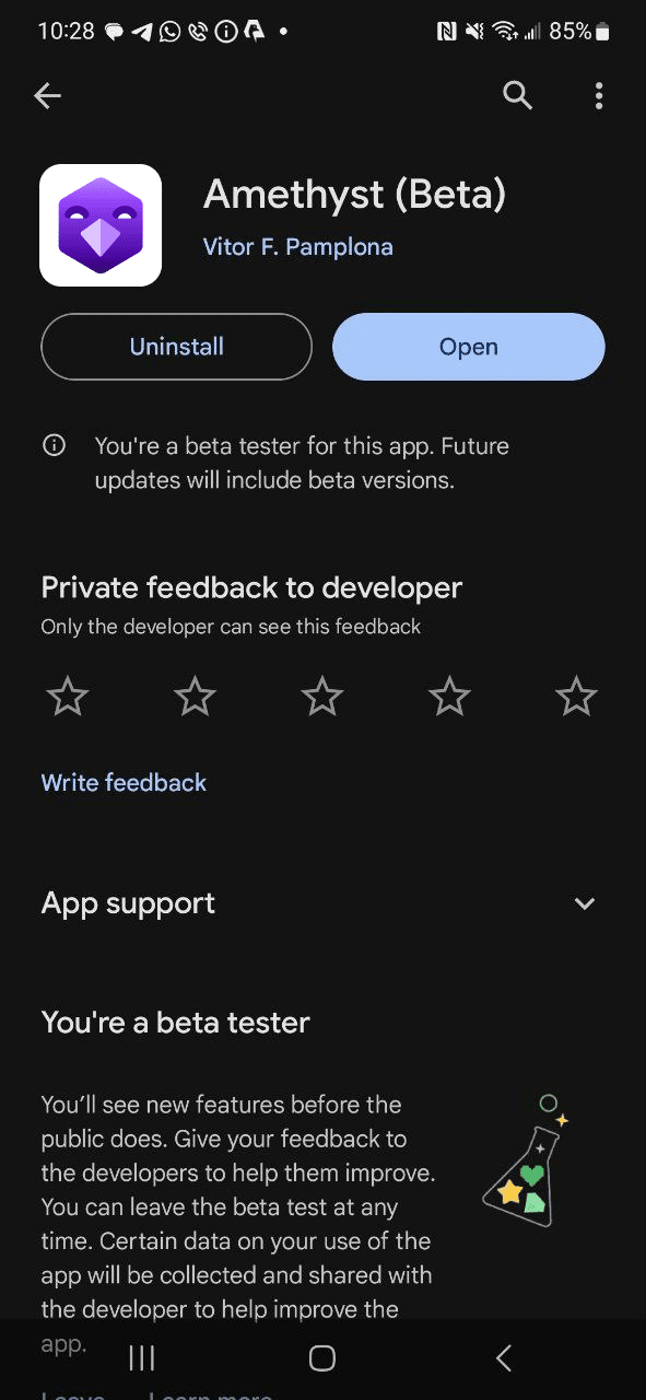
It's nice but I am already used to the old one. Deploy it for a cycle under the beta. Can't hurt.
Logo doesn't matter. Keep working on those crashes and the buggy feed. Those are what makes users abandon or stay. Thanks for all your work.
It's look cool, the logo look like Amethyst gem + Ostrich, but I don't like the eyes pattern on it. Thx.
Love it
Very nice!
The hexagon is beautiful, for an app like Amethyst it represents a lot. I also like the font.
It's funny,.but somehow too quadratic, and the nose angle is weird.
But a logo for me is not priority. Once the app is widely used the logo will get more acceptance
Tip: get all feedback, give it to chatgpt and ask a new proposal
Gostei
I like the eyes. Has a cheeky, giddy vibe to em
Not a fan tbh... the font is cool though.
Not a fan (sorry Daniel).
It's too symmetrical 😬 & the beak could be any bird...I like the vague ostrich reference in the current & previous logo.
I wouldn't even mind a throwback to the first logo with more depth of purple maybe?
The purple hex shape is cool. I don't see the need for going with a bird theme. This is Amethyst, go with the purple mineral theme, cleaner and cooler in my opinion. The chosen font is very nice, the A in amethyst got a nice secure triangular shape. #nostr can have its ostrich theme, but Amethyst don't need it. It got its cool purple Hex-mineral rock! :)
I'm already down with the logo! It's 🔥🔥🔥#LetsGo

Is it possible to make Nostr work in browsers without the need for add-ons in Google Chrome to run it because I have old devices in which Nostr doesn't work because they don't support running Nostr add-ons in the Google Chrome browser?
Oh shit! I'm bullish on it!
I love the current one.
I love that it still has the remnants of the original daggy hand puppet.
What I would like, is the ability to see if someone I follow is following me without having to unfollow them & refollow them. I don't generally do this, but I have done it & it creates unnecessary events.
It's giving "psycho-killer" mask vibes.
The dead eyes ae following be around the room.
Looks cool. Very clean.
Naah, current is fine.