New #Amethyst logo suggestion by nostr:npub103vypyhddrad9289zp8lf2dxlkkrmq3e0utx3qg449ea8x2wel6sas2700
What do you all think?
New #Amethyst logo suggestion by nostr:npub103vypyhddrad9289zp8lf2dxlkkrmq3e0utx3qg449ea8x2wel6sas2700
What do you all think?
Nah. I like the current one.
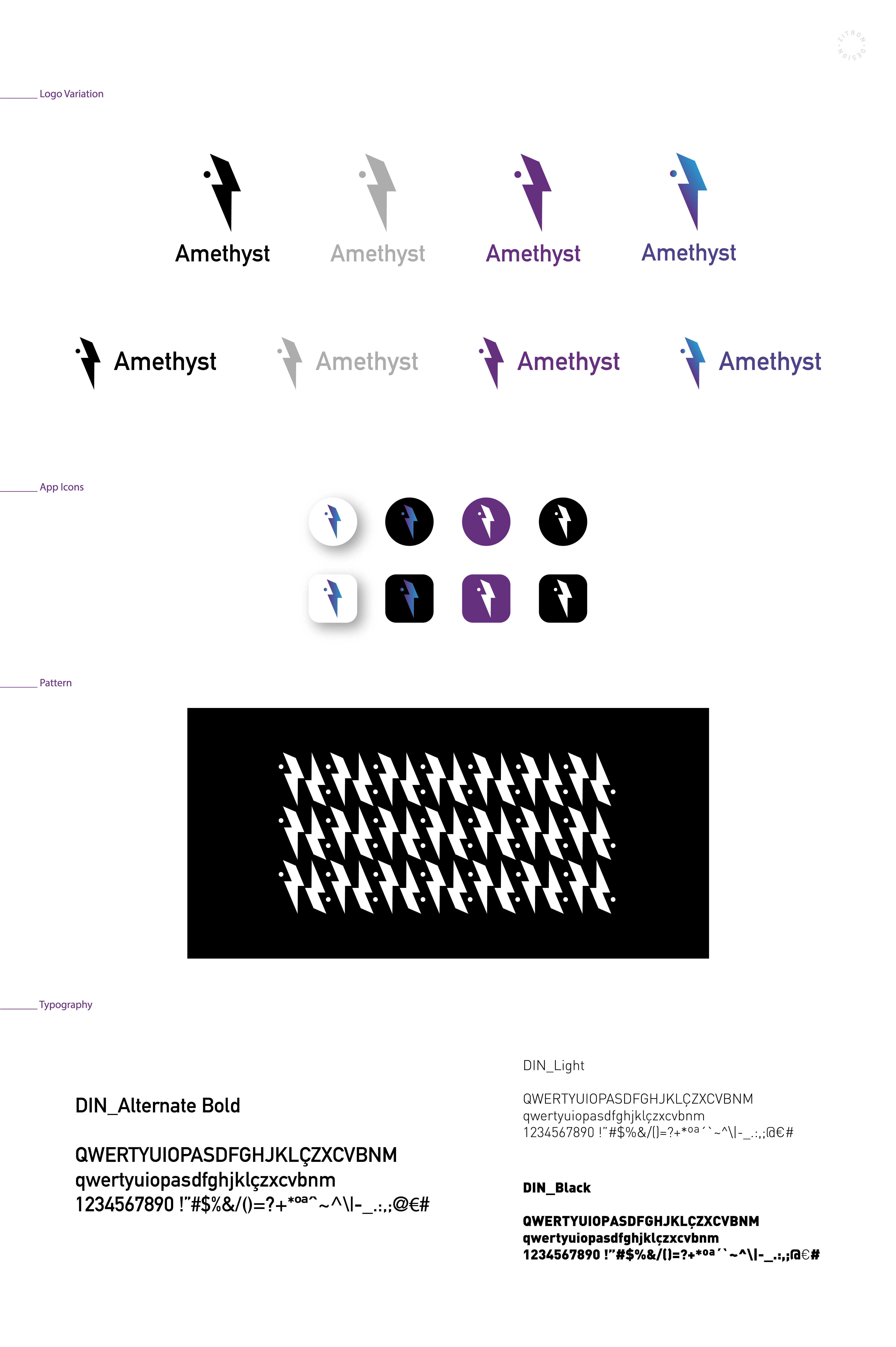
Amethyst is a precious stone when combined with lightning 😗 it's amazing! Dev
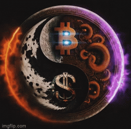
what would prevent users from being able to see images in clients or why they wont load? i see a box blurry color in it but image wont load. ive seen this on other people's post as well as this one. im using client Amethyst.
what i/we see:

Not sure why you can't see it, but here's one of them (others are just different color backgrounds):

Still loading the image.
Same here, no amount of waiting made it load. Copied the URL to my phone's browser and same thing. Turns out it's Imgur blocking my VPN connection, pausing the VPN made it load. It may also be your case. Happens on other clients too with Imgur images.
nostr:npub1gcxzte5zlkncx26j68ez60fzkvtkm9e0vrwdcvsjakxf9mu9qewqlfnj5z maybe make the default choice for file server not Imgur when uploading images? One that doesn't block VPN connections? I know one can choose from the drop-down list but most just use the default.
Update: seems like setting the VPN protocol to UDP allows it to load, while in TCP or NordLynx it doesn't load. Defaulting to a VPN friendly file server is still a must imo.
I think I'll miss the gem shape. Just my two sats 🙂
I think this new one has broader appeal. Most people aren't going to understand the significance is the ostrich. They are more likely to understand the significance of lightning as it pertains to nostr.
I hope vitor still keeps my old logo like #Nostrich #Nostr #Amethyst 🙏🏽
I like it. But let's not forget that you may need to have it on a 1:1 image canvas. This means that it can be interesting to try to redesign the Bolt symbol to fill in better a square image space.
Not too bad actually. I always think that this app needs new logo or the current one needs a facelift.
The gem shape makes the design feel cohesive. This one feels unfinished. The word mark at the bottom too. Keep working IMO.
Kudos those. Looking good so far.
Nice style. I like the current one as well. It's more #nostrich
Let me have my Media Design grade 9 kids work on this. Or open it up to a contest for fun.
I like the current one tbh but I know my students could come up with something cool.
Nice minimalistic style, though I'm not a fan of the theblue to purple transition in the dark mode.
Also, I'm now a bit too fond of the current logo 😅
Not as visually appealing as the logo now. 0/10 unfortunately. I'd stick with a amped up version of logo
I like the current one more, the gem, ostrich and purple theme, all elements are loud and clear.
👎
That's a no for me. Just take the original logo and make it more graphic appealing
I'm torn. The old lady goose is pretty iconic.
Much better than the current one.
I like it. The blue to purple gradient doesn't really work as far as complimentary colors go, in my honest opinion. Keep up the great work!
I like it better than current one.
Current logo is not great imo
I would work on current one.. i would change the background and I'd change a main shape with enphasis on the character.. 😎
I like it
It's very professional.
My 2 sats
I like your style, you are very smart.
I too am a graphic designer and I understand when one is good at it.
Better
It is cool. i like it is minimalistic and can be adapted easily. The only thing is that maybe it is too much of a reference to Lightning Network or zaps. Although this could be a good thing too.
Third one, but increase gradient more in both side!
the current logo has yeoman's with to date but it's time to go/hey a sexy tissue for sure.
i kinda like this new one but works be nice to preserve the "amethyst" suggestive shape - how about a zap inside an "amethyst shape" unless that's too complicated looking?
Def keep the purple don't l dominant color but maybe optionally an orange or yellow subdominant contrast color to signify BTC or LN?
First one, hands down! 👌
With this redesign, can you please make the Amethyst background color black instead of dark grey? 😇
I just see a blurred background, no Image
To me, the lightning bolt is symbolic of bitcoin & specifically the lightning network. They're all aesthetically pleasing but feel pretty boring.
The dodgy hand puppet is Amethyst. Embrace it's unique weird.
If anything I'd make it look more like a hand puppet & play with the shape & maybe gradients on the amethyst.
Keep the first one. There is no love like the first
I like this one the most

Uhm.. nah.
I like it! Very professional.
O escuro é muito legal 👍
Almost but a few tiny changes.
I dig this design! This is my interpretation of it! I did move the dot slightly over to the right (to be centered with the top point so the "A" would be noticeable) and rotated it so the colors would be in sync with the logo. I hope nostr:npub103vypyhddrad9289zp8lf2dxlkkrmq3e0utx3qg449ea8x2wel6sas2700 doesn't mind. Yes I would 💯% support this logo.

If we are going for this, we need to make these interpretations slightly more obvious.
I think they're already obvious but i'm an out of the box thinker and that's why this came quickly to me. But if most people aren't out of the box thinkers their subconscious is.
Thanks for the suggestions !!!! , although I like my work, and I think it works very well, I also believe that it can change completely, create another logo and branding vision for this social network, and I know that Vítor and all team are open to new ideas , I can try to improve your idea, but I also have a new one here that I want to pass on to the design, lets see 👍😃👍
the original logo already felt slender, this looks great, just think it too slender for mobile