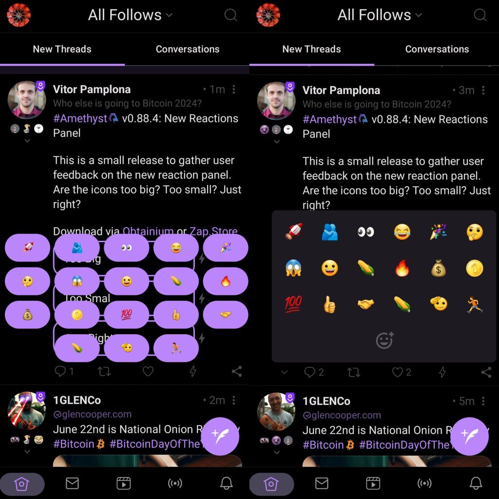
#Amethyst v0.88.4: New Reactions Panel
This is a small release to gather user feedback on the new reaction panel. Are the icons too big? Too small? Just right?
Download via [Obtainium](http://amethyst.social) or [Zap.Store](https://zap.store/)
#Amethyst v0.88.4: New Reactions Panel
This is a small release to gather user feedback on the new reaction panel. Are the icons too big? Too small? Just right?
Download via [Obtainium](http://amethyst.social) or [Zap.Store](https://zap.store/)
Looks perfect! Panel to add custom emjois is great too!
this is by a wide margin easier with the size of my hands, thank you
I like it a lot, but I tend to lean towards smaller text anyways.
Just right and love the add emoji icon 💜🙏
Please vote and/or comment to the poll if you are using Amethyst
But the double emoji only show as single now
Double emoji? It's not suppose to show. The NIP is only for one :)
The nip has no constraint on content
Hum.. maybe the custom emoji update deleted the restriction. A lot of clients don't show more than 1 char.
(leia com a voz do lula)Quem foi que criou esse NIP. a gente deve resolver isso numa mesa de botequim tomando uma cervejinha
Looks great!
Feels like it just needs an add page [+] button and allow me to slide right for multiple custom groups and it would scale. 💯
I like the updates. It feels a bit snappy, too. 😙🤌🏾
Looks good to me, can we get more haptic feedback for actions? Like zaps incoming and going?
Panel looks good but I'd prefer a default reaction on normal press with long press giving you the multi option pop out to select more context.
NACK.
Default reactions are a shitcoin 😂
Zap or custom likes.
Let's go for user defined default then 😎
I'd like to be able to tap on the reaction icon to open the panel and then tap it again to close. Right now it just re-opens and you have to tap on the post to close it, which can trigger unintended actions.
The panel padding is big other than that, I love the functionality.
I think the box should be scrollable after 3 rows maybe. I voted too big but I should remember that fat finger space is important.
I like this look, 👌
Please vote. It's hard to map the needs of every display size out there.
Well, here's what it looks like on pixel 6 pro. I'm no designer, I think it the size looks ok. Maybe slightly less padding would look even better? I did notice it's horizontally offset instead of center, I think centering would look better 🕵️♂️

It follows the position of the like button in the reaction bar. So, if people only have two emojis, it will popup right on top of their finger.
There are two serious flaws in Amethyst's reaction model. First, there should be an emoji search field. Second, emojis must be organized in order of use.
I wouldn't call this "serious" flaws but I agree.
People have when icons move places though.
nostr:nprofile1qqsyvrp9u6p0mfur9dfdru3d853tx9mdjuhkphxuxgfwmryja7zsvhqpz9mhxue69uhkummnw3ezuamfdejj7qghwaehxw309amxjar0wghxummnw3erztnrdakj7qgwwaehxw309ahx7uewd3hkctc6ljg69 I like it, but would really like to reorder the placement of my choices. My "bullseye" isn't in the center anymore after the resize! 😉