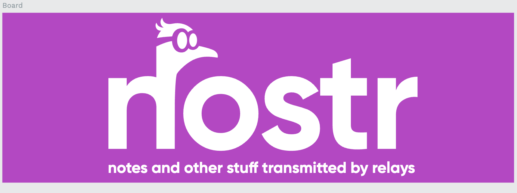
Head off the n looks odd, used to it on the o
Discussion
Or on the r?

That looks nice and balanced 🔥
this one is good
This one is significantly better.
Better on the “r” imho.
Nice. What about adding the webaddress at the bottom?
this one is better design. ✌️
this one is better design. ✌️


