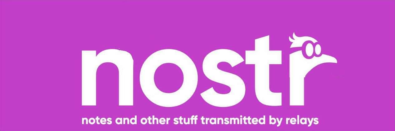
Head off the n looks odd, used to it on the o
Or on the r?
Please Login to reply.
That looks nice and balanced 🔥
👍👍
This makes total sense. It being on the n looks a bit like hostr lol
this one is good
This one is significantly better.
Better on the “r” imho.
Nice. What about adding the webaddress at the bottom?
I say it with a hard R
🤣
nostr:nevent1qqswew0z8qkw7qgq0ynhc4ehnaqmmqymmq3wduqdcsgvhl29pxv7lgspz9mhxue69uhkummnw3ezuamfdejj7q3qt6jxfqz9hv0lygn9thwndekuahwyxkgvycyscjrtauuw73gd5k7sxpqqqqqqz0txdau
this one is better design. ✌️