Looking for input. Do you like text placement, font and font color choice? Do you like the general layout? Is there enough to the image? Would more background be distracting or fill voids? Would you want to read this book to your kids or grandkids based on the cover?

nostr:nevent1qqszv2daz5dmkgz5a46pf0hq248tw6fsxdkylk3j0t98s4k6v9vgw8spzfmhxue69uhk7enxvd5xz6tw9ec82cszyqtn4pglkw293pq364pnwrff4uanhg58ss5ccpja9alddhusjwhlyqcyqqqqqqg2rujyv

#asknostr #grownostr #chickens #kidsbook #childrensbook #book #art #design #coverart #bookcover

Reply to this note

Please Login to reply.

Discussion

I like it a lot and would totally read it to my kids.

If I were to make suggestions, it’d be to maybe extend that grassy definition almost to the kids shoulders and put two more chickens in that area, one on either side. Maybe have one be a different color.

I like the font colors and styling - the “kidsteaders presents” is cool because it suggests more books to come.

Good stuff!

I agree with him. Font styling is great, but a deeper background of the grass would be a nice touch.

Thanks for the input, I'll work on revisions

I think adding to the background would improve it. Maybe a faded/washed-out chicken coop, home, and/or barn?

Other than that, I think what exists already is great. It's immediately obvious that it's a children's edutainment book. I look forward to seeing the finished product!

Thank you for the input! I'll be noting updates as I get things done.

I think it's super cute!!! The only thing I'd change is I would make the title font a LOT bigger.

I'll add that to my revisions. Thanks for the input!

Would you suggest bigger words and making the image smaller/wider? Or just bigger words in the space available?

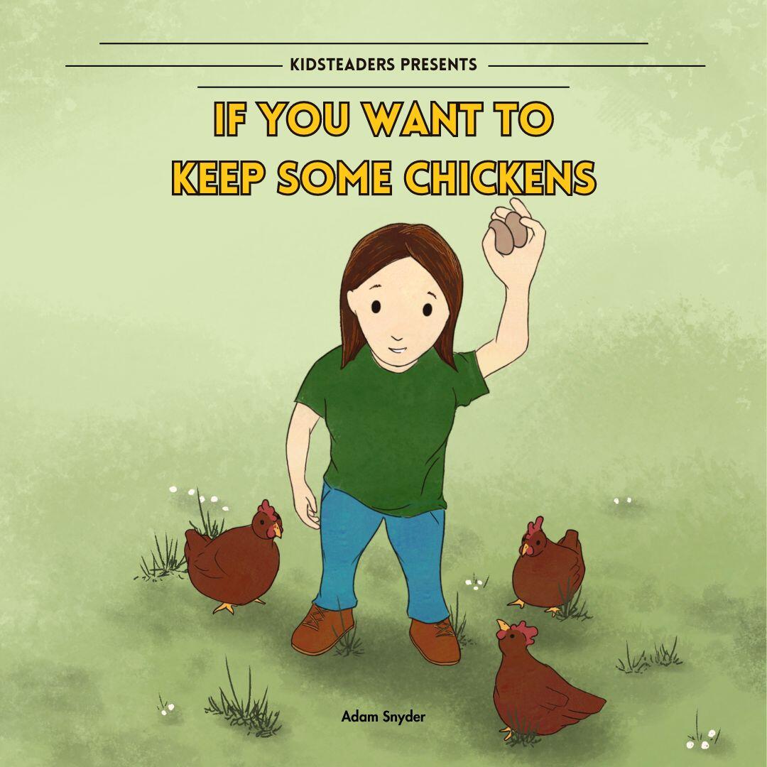
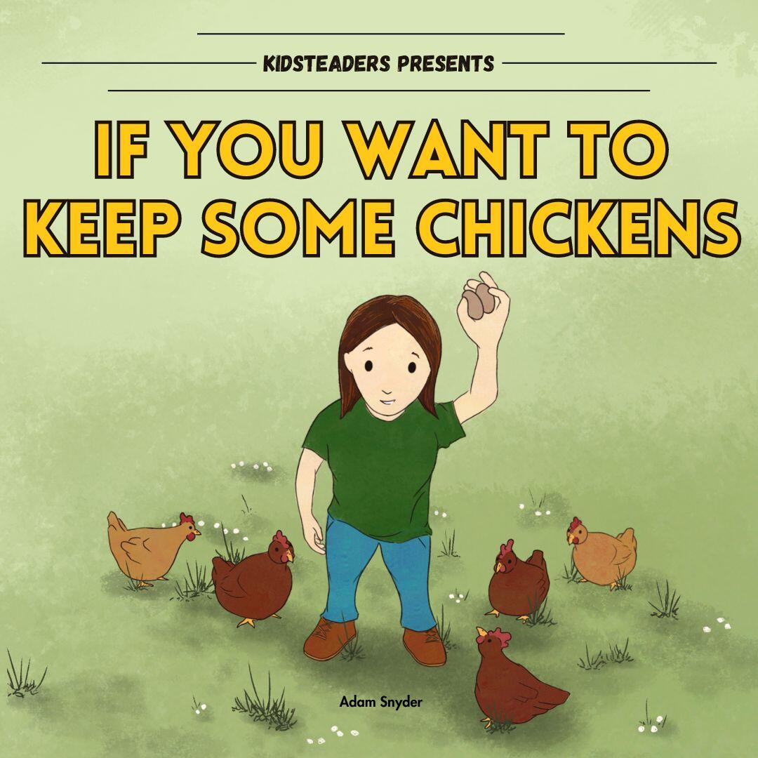
Bigger words in the space available would definitely make a big difference, but if it were me, I'd consider making the image smaller/wider OR even integrating the title into the illustration somehow...I'll add some photos so you know what I mean.

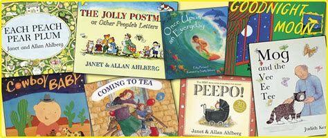
Some books do have smaller title type (The Very Hungry Caterpillar, for instance) but most have very large, high contrast title font.

I'd recommend this because it helps the title stay readable even when the cover is thumbnail size. Also, as a big "bookstagrammer," I've noticed that when I make videos on Instagram featuring my favorite books, some indie published books that I've featured unfortunately do not make their title text stand out enough to be seen in the video, whereas traditionally published books usually have titles that are bold & big enough to be read easily in any video I make. Same applies when catching attention on a bookshelf in a bookstore. So for better marketing, I'd suggest going bold!

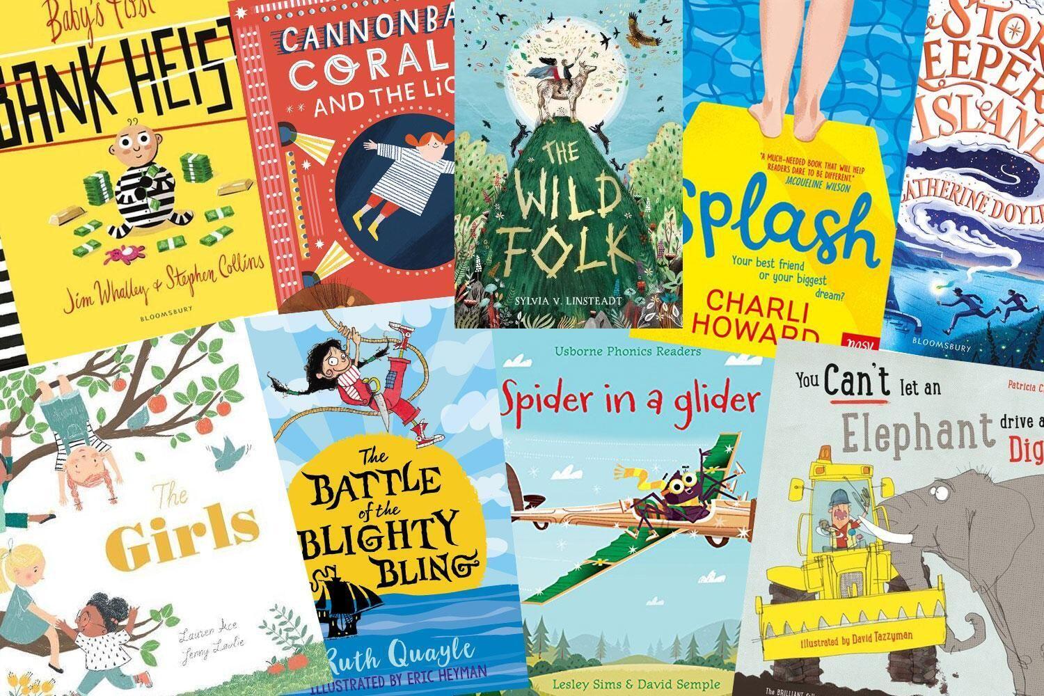
Here's some examples of children's books with bold titles with some that integrate the title font into the illustration:

Fantastic information! Thank you much!

Of course!!! Excited to see it out in the world soon!

Looks good. Font a tad bigger. Possibly fade to white background near the top? Maybe I'm stupid but I didn't immediately recognize the eggs in the hand as eggs. I think they just look small maybe.

The eggs definitely could/should be bigger, and I had thought of transitioning to a sky in the top 1/3. Thanks for the input!

If you want to keep some chickens ...

Add the "..." at the end?

Would definitely pick this up out of interest in reading it to my kid.

I feel like something might be missing from the upper parts of the cover, but it’s hard to say what, since it makes a lot of sense that you’ve gradiented it up to a more bare area to not distract from the image or text.

I might think keeping it simple but extending some sort of “background noise” like the grass and flowers further up the page is worth a try.

Thanks for the input!

How about this one?

Same questions as OP

#grownostr #childrensbook #kidsbook #permaculture #chickens #art #permies #drawing #bookcover

nostr:nevent1qqs2zdvtqeszd424r0kn8twhpjflgcvd24nu0rrze9h5jl2ray89dfcpz3mhxue69uhhyetvv9ujuerpd46hxtnfdupzq9e6s50m89zcssga2sehp5567wem52rcg2vvqewj7lkkm7gf8tljqvzqqqqqqyw3x50d

Bigger text is better!