
Community decides. Is this better?
https://void.cat/d/RA5DZHkCMx4vsoUf427rxY.webp
https://void.cat/d/H4hRiCuiGmiHTkzPEyXsjx.webp
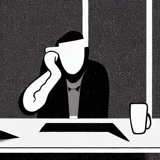
Professional apps need professional logo's.
Current Amethyst logo:
- has the wrong colors
- the eye is not part of the compound path
- lacks alignment
- the A is hard to recognize
Redesign I did a while back:
No pressure though nostr:npub1gcxzte5zlkncx26j68ez60fzkvtkm9e0vrwdcvsjakxf9mu9qewqlfnj5z 😉
#nostrdesign #logo
Discussion

I like the new one better :)
Yeah I love it. Its weird how symmetry is psychologically appealing but looks really nice to me!

Looks way better

Redesign is better.

In with the new⚡️imho

new one is better
the ostrich could also be a hand, with some imagination, which could be used in a commercial to write notes on nostr.
People always mention the hand as if it would be a negative. It would be ok if this was a hand. And I don't dislike the ambiguity. 🙂

I totally understand why one would choose the new one. Theoretically my vote would go there. But to just look at them with nothing else in mind — I like the old one more! 💟
É melhor realmente mas eu ainda abandonaria o degradê, iria de cor sólida
How about a poll?

I disagree that it needs to change, but I like both.

Redesign is better

Sorry about Zitron, but this is much more well done.
If I were you I would change it already from the next version...
Like nostr:npub1gcxzte5zlkncx26j68ez60fzkvtkm9e0vrwdcvsjakxf9mu9qewqlfnj5z said, let the community choose, however, i wouldnt Change anything for now, but in a few months

I like the redesign.

I think the new one looks good, but just remember what tends to happen to the 🦊 over time


yep 👌

The redesign looks more balanced, I like it

Prefer the current one.
Some apps like Telegram allow the user to choose the app icon in the settings. You could give everyone the choice to choose what they like ;)

Re

Redesign

I like the redesign!

I'm so old, I remember when this was the icon. What was it, 2 month ago?

In my opinion, I wouldn't change anything, I would let it be as it is, because what is, is fine 👌, and yes, in a few months, change the logo⚡ but change it completely. This is just my humble opinion. 🤷🏻♂️

Yessir
I would say a mix of the two. Nostrich from the current and the speech bubble gem from nostr:npub149p5act9a5qm9p47elp8w8h3wpwn2d7s2xecw2ygnrxqp4wgsklq9g722q design.

I prefer current sharp edges

2

I like how the redesign looks more like a hand shadow and yes, the A is more visible in that one.
Don't know 🤷🏻.
😅

Much much better! Seemingly small changes make a big difference

honestly like the current one better

Original
I prefer the current one

Redesign. The current logo is has always struck me as uneven and awkward.
Redesign

Redesign 👌🏻

The redesign is better.

Obviously it's not a priority, but it would be great to have an icon picker within settings so users could select any of the versions of the icons they'd like! Then you could also accept user-submitted icons a la Apollo (RIP) on iOS to further strengthen the #amethyst and #nostr communities 🤗

yeah its better. "lebih bagus" , in bahasa


Current

Current