A, B, or C - which is most welcoming, and least scary for someone looking to learn about nostr?
#asknostr 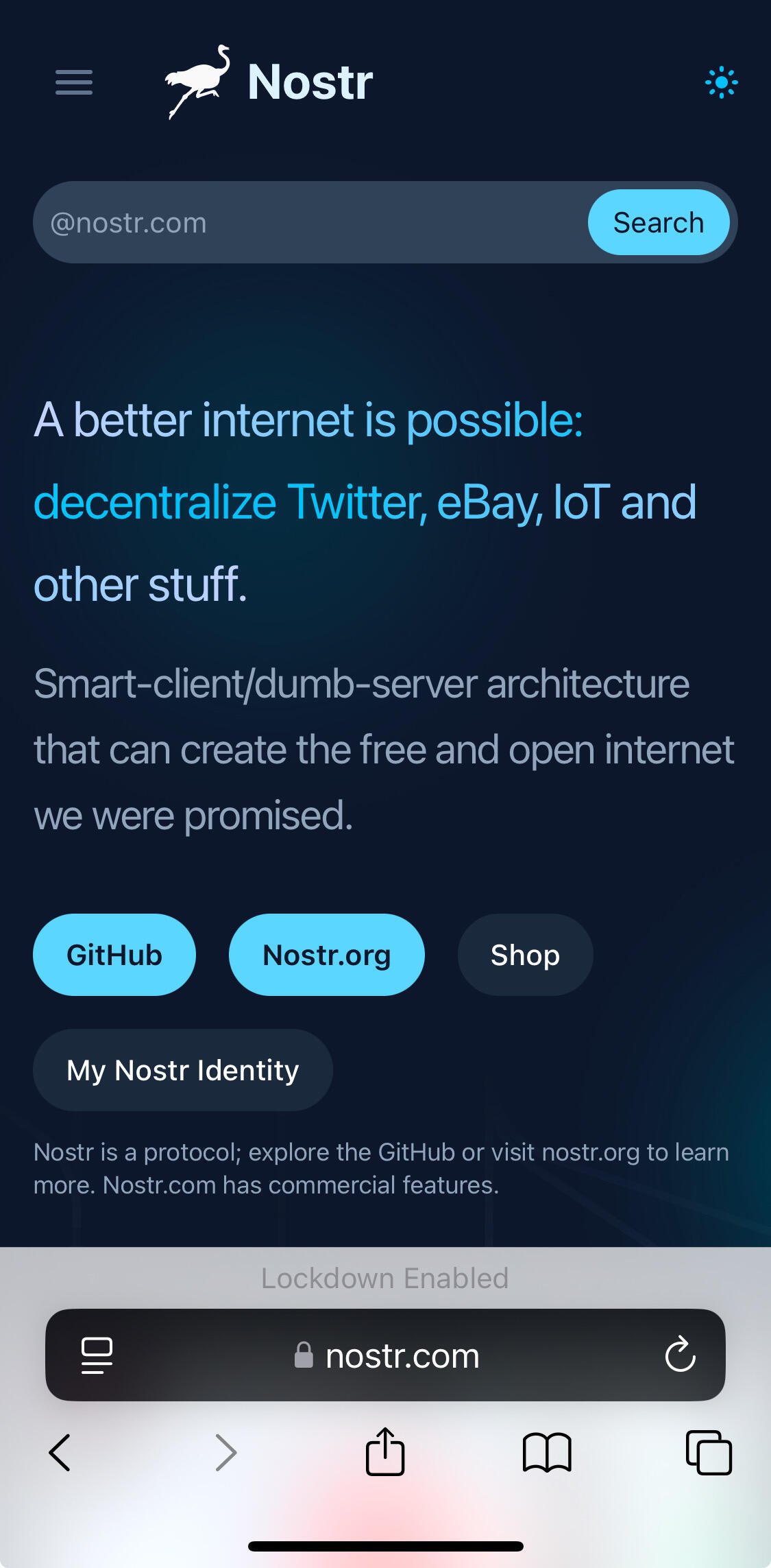
A, B, or C - which is most welcoming, and least scary for someone looking to learn about nostr?
#asknostr
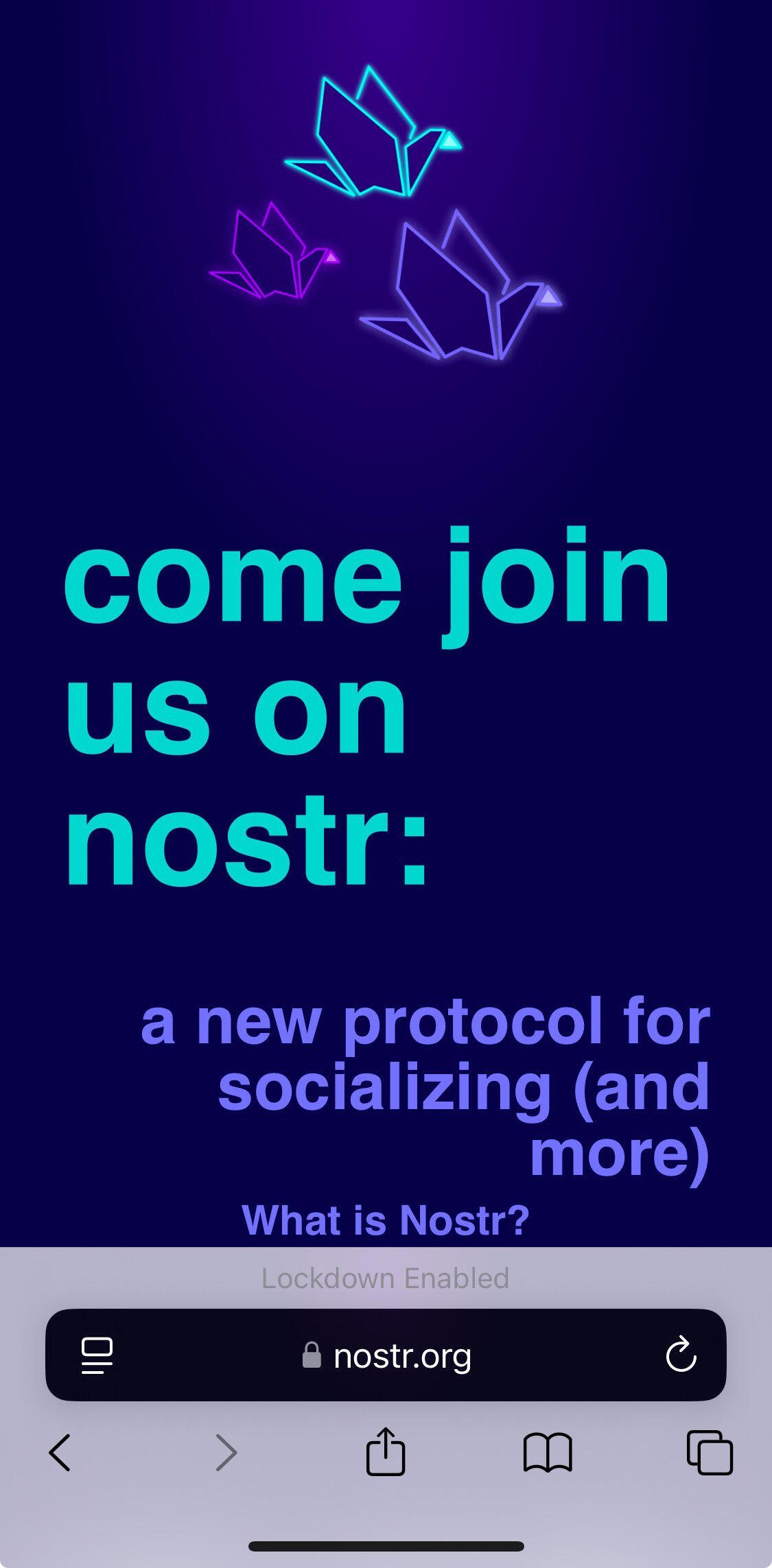
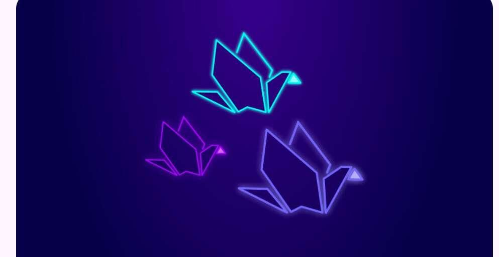
1 looks most professional but I like the origami from 2.
B
A, but with the simplicity of B (less words, don't directly ask "come join..."
jus my opinion but all these are great
C
B. Though a newbie might not know what a protocol is.
HMW explain what a protocol is nostr:npub1a7n2h5y3gt90y00mwrknhx74fyzzjqw25ehkscje58x9tfyhqd5snyvfnu
To truly #grownostr and onboard the next wave of users, we not only need the tools, but we need proper marketing and visuals too. It's all part of the onboarding package to not only offer them the tools, but to make it visually pleasing too, enhancing their user experience. Most people won't stick around just because they're being told that they're early and the experience will get better and improve over time.
A
nostr:npub1j60x528w2g2vkq5kae5uhh8y7sezjyj20zcsg0v9muc72cmdpu0s0md7ua from your customer discovery work what was the biggest turn off for people joining nostr? What should be the main selling point?
When I talk about Nostr to people who know nothing about it they are excited that you can:
- own your social graph and take it with you
- your feed is only who you follow, not ads or other recommendations. The ability to curate is key
For people who take the plunge and join the biggest complaint is:
- lack of diverse content. Even people who own Bitcoin are sick of hearing about it all the time.
- - Paired with 2 above, new users bail almost instantly bc they don’t see content that is relevant to their interests.
- in market research and also from user research people see Twitter-like apps as a great way to get news. On Nostr they don’t see the news they are looking for. This is not always mainstream news it can be specific to a topic or region. On Nostr most of the news is RSS feeds that often overwhelm a timeline making it difficult to see other content.
- - to solve the above problem Nos created a news relay news.nos.social that only select journalists can post to. We have plans to update it in the next couple of weeks to add more news outlets and journalists. NOTE: anyone can read from this relay.
Thanks for writing this linda… I think this feedback is relevant to a lot of peoples experience. The RSS feeds for example are an absolute mess because your timeline essentially becomes that RSS feed. Maybe a separate news like feed for RSS handlers would be awesome way to solve this.
good information here for client developers
B, then A, then C.
Less is more.
Attractive is better than sterile.
Gradually sell the why and the how.
A
A - except the GitHub link
Tell me more about your view on the github link
GitHub to me is a signal that this is for the tech geeks. I don’t know anything about programming. How about adding a sub page like “Tell me more about the tech stuff”? Keep it simple in the first page.
Github blows goat nads. I hate it. I cringe every time I have to do anything with github. I cannot wait until nostr devs pull their collective heads out of each others' butts long enough to get git working on nostr with a better UX/UI so I never have to touch github again. It disgusts me to think nostr is being developed on centralized platforms.
B or C. Don't like using existing brands as reasoning to use something else
B
B
B
The experience on a phone cannot be evaluated apart from scrolling, so the first screen is not totally crucial. Different matter, however, for the desktop.
Really? If I see spam/low quality/ poorly executed or designed landing page I close a mobile page right away.
nostr:npub180cvv07tjdrrgpa0j7j7tmnyl2yr6yr7l8j4s3evf6u64th6gkwsyjh6w6 is the last desktop user remaining anyway, and he knows mobile rules over desktop
Really.
None of the proposed pages are low quality, so your this logic should not apply.
Users scroll to have a complete view of the page.
Actually, I need to add a immediately visible image on mobile.
Any other feedback?
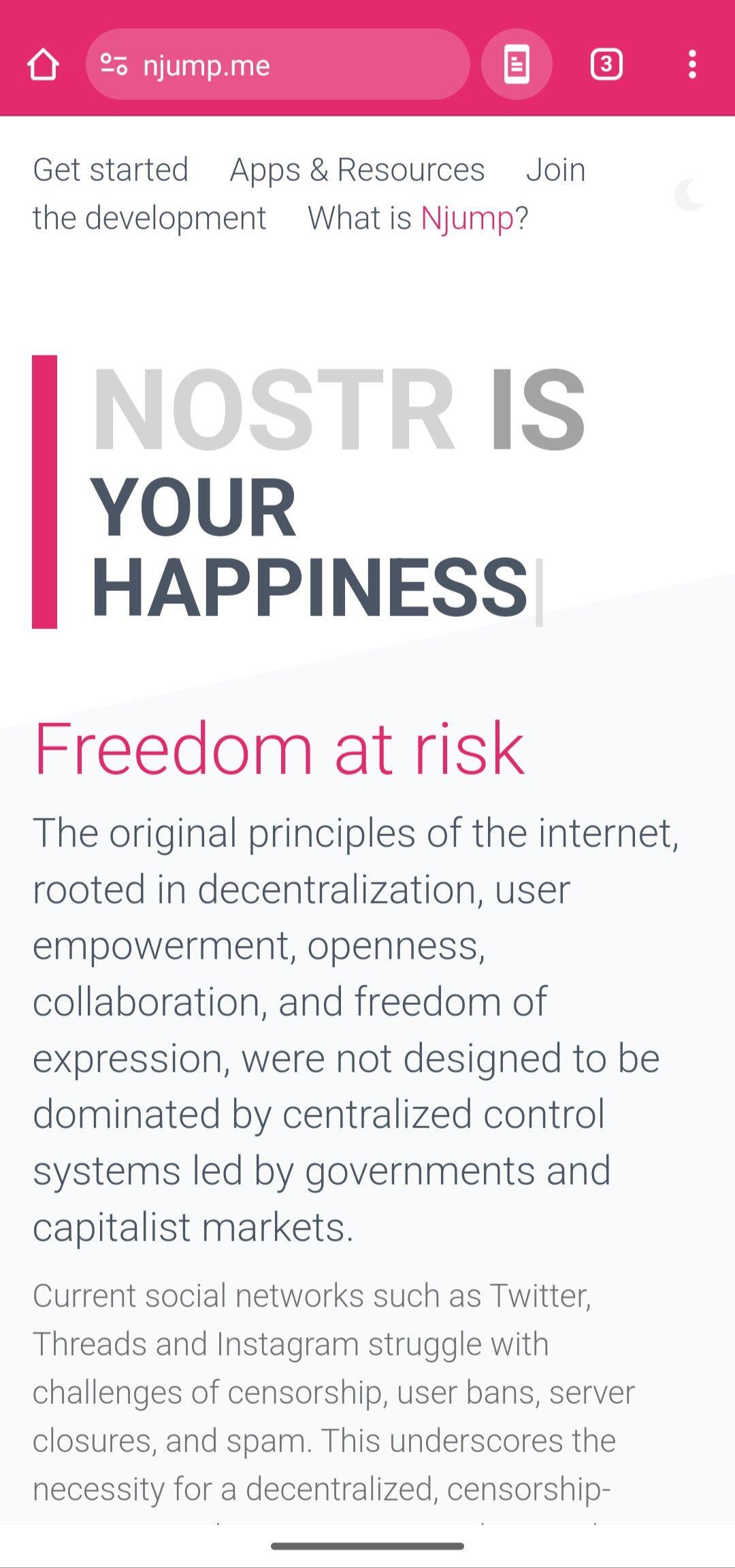
1) Remove all instances of keyword “decentralization”. This is used by the VC funded crypto scammers at farcaster
2) “what is njump” - people feel that njump dot me is a virus website. There should be a clear explanation as one of first things seen if folk have the courage to open a njump link. E.g. “njump previews notes published on nostr” as a sub header
3) for the love of my eyes, please improve the contrast - light grey on white; grey on grey is difficult to see for me and others (I am not a boomer, and I struggle with low contrast designs across nostr and beyond). Ideally black font - white background
4) in discussion with nostr:npub1wf4pufsucer5va8g9p0rj5dnhvfeh6d8w0g6eayaep5dhps6rsgs43dgh9 I’ve come to appreciate the term own. “Own your identity”. “Take your friends with you” (your implies ownership of this relationship)
5) per convo with nostr:npub108pv4cg5ag52nq082kd5leu9ffrn2gdg6g4xdwatn73y36uzplmq9uyev6 nostr:npub1q3sle0kvfsehgsuexttt3ugjd8xdklxfwwkh559wxckmzddywnws6cd26p current optics are there is free speech on twitter. Yes nostr has this, unlike twitter. That said nostr positioning should focus on nostr strength on taking your identity, friends, content with you in *hundreds/thousands* of nostr apps. This is a unique experience.
See nostr:npub1j60x528w2g2vkq5kae5uhh8y7sezjyj20zcsg0v9muc72cmdpu0s0md7ua findings nostr:note1mrdgqx93vc8nv465e853nvex5qvkzassrysq4effd68kaxdc8wys64f57c
1) Tendentially I agree, “decentralization” is only a tool to achieve resistance to censorship.
2) This make no sense to me, what people think that? There are dozens of “strange” extensions used daily (.io, .ly, .lol. etc).
3) Actually you are right, something has changed, the light version as a poor contrast.
4) "Take your friends with you" make sense, but it's not much business oriented. Maybe "take your social network with you".
5) The page explain just that, doesn't?
2) I perpetually receive the njump dot me looks like a virus link from non-nostr friends I have shared the njump link with. They are afraid to open the link
5) I dont see it explained as one of the first things in the screenshot you shared. If anything, the two visible paragraphs are a somewhat vague sounding problem statement.
I am looking for the answer to “What is the benefit/benefits? “ in the first few lines.
2) Would be interesting to know how tech savvy are these people are and how much they trust you :D since usually you should check the link source to initially evaluate the potentially risk of a link. Btw, no links are virus if you don't deeply interact with the page (download and isntall something).
Finally, we are talking about the homepage here, not an internal link with the “strange” url.
5) I didn't say this is explained in the screenshot, I said it's on the page, and I said I think users are inclined to scroll on mobile. Of course the first view has to send a strong signal, and since different people are sensitive to different messages, Njump has an animation that alternates between various phrases that can “hit” the target audience.
Fair. I dont think I’ve ever shared stand-alone njump dot me link to non-nostr folk. Usually it is njump / neventID123etc.
Censorship resistance is not a main selling point, would not prioritize it. Focus on the social graph portability with no permission (even tho we know they are essentially the same thing)
There are several strenghts, censoriship resistance is the first one declared in the fiatjaf presentation and currently present in the main repo.
I agree that for the vast majority, the portability of the social graph is a more attractive value. In fact, it is explained in the "You own your audience" paragraph.
I would not focus immediately on the negative. State how awesome nostr is
Then below use questions such as "have you ever had x/ig/tiktok removed a comment you made?" (Or any similar questions any normie can relate to)...and then present the nostr solution more fleshed out
> I would not focus immediately on the negative
I definitively agree!
Thanks for this interesting feedback.
It conveys mixed emotions to me. Maybe "Digital Freedom" instead of "Freedom at risk" ...or something that matches the happiness of the intro?
Maybe consider some trimming on the forward. Dropping a few adjectives & breaking it into a couple sentences would make it a little easier to follow.
A positive approach would be definitively better.
Keep in mind that the title rotate with different sentences, but all are still positive.
And yes, the text can be shortened.
I really like this one, but I do think the copy could be tightened up a bit.
Oh yeah, I volunteered to do that didn't I?
No, you volunteered for the new super secret project, hahaha
But I would also happily accept any help with this!
I'm always reluctant to edit writing without request, since it's someone's actual thoughts, but if you ever need a second pair of eyes, I'm happy to help.
Yeah nostr:npub10000003zmk89narqpczy4ff6rnuht2wu05na7kpnh3mak7z2tqzsv8vwqk def needs help with words 😂😘
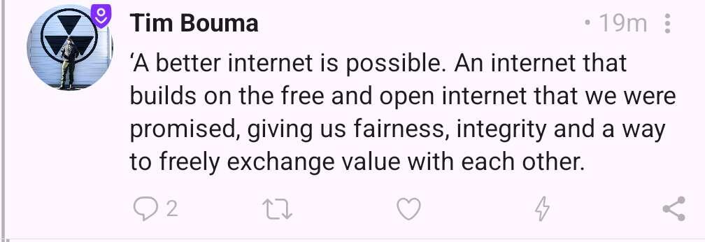
‘A better internet is possible. An internet that builds on the free and open internet that we were promised, giving us fairness, integrity and a way to freely exchange value with each other.
Love this. nostr:npub1c878wu04lfqcl5avfy3p5x83ndpvedaxv0dg7pxthakq3jqdyzcs2n8avm is nostr dot com yours? See suggestion from nostr:npub1q6mcr8tlr3l4gus3sfnw6772s7zae6hqncmw5wj27ejud5wcxf7q0nx7d5 above
I will steal "a better internet" and add it to the typewriter animation of njump.me
Neither.
Just this.
This 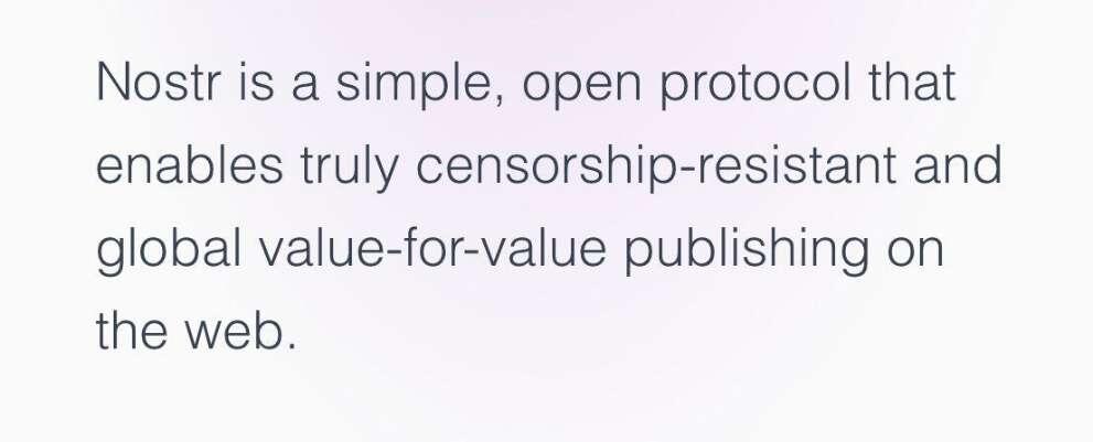
and this
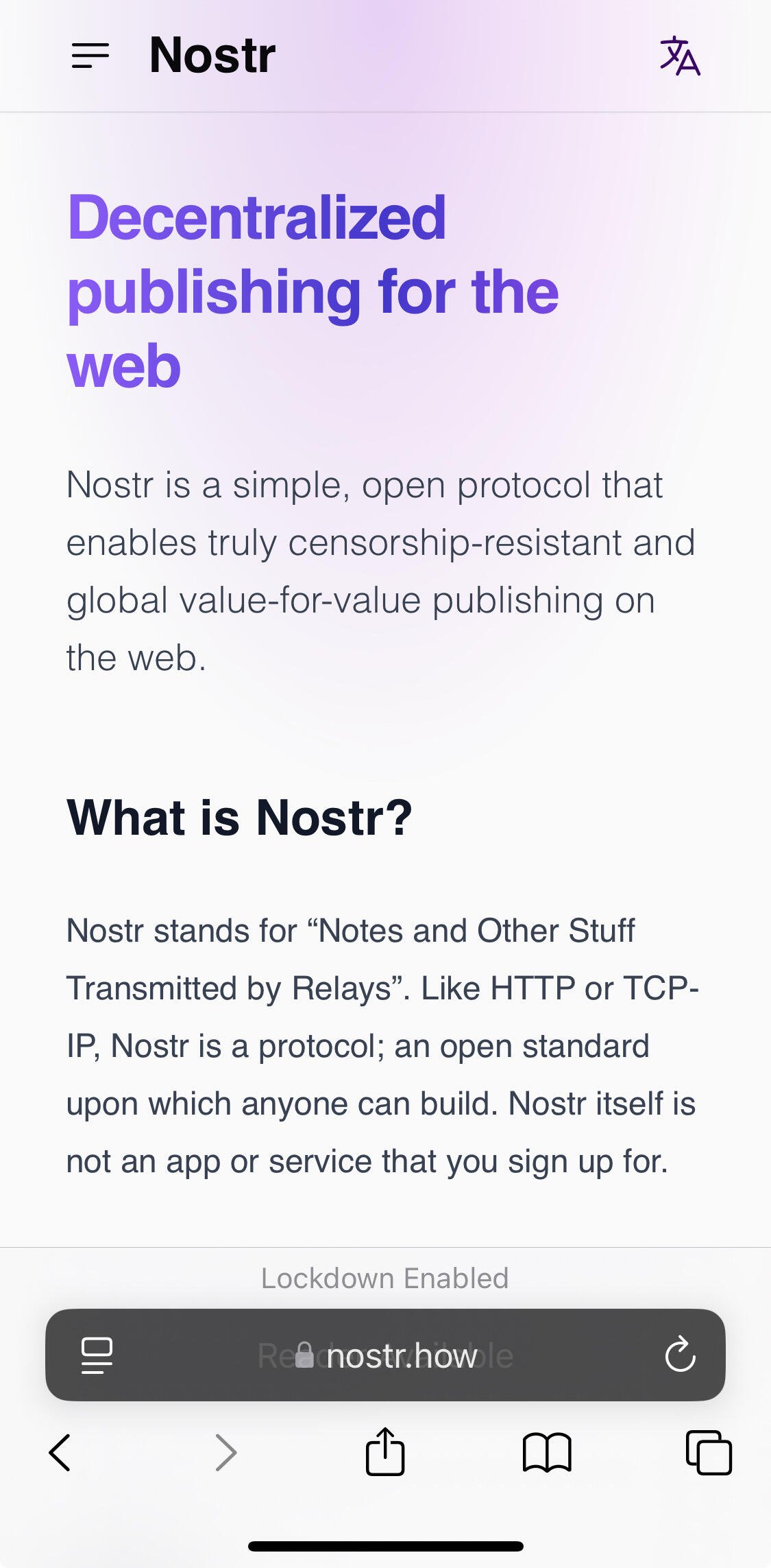
I agree, all the current nostr intros dive into the technical details way too quickly.
Digit used light mode on Discord so I guess some of the most important people you need on your app are light background enjoyers
?
My comment is not about light mode or dark mode (I use both).
It’s about the poor contrast of light font text on a light background.
I agree high contrast text is also important. I prefer dark mode myself, I just think light mode might have wider appeal for landing pages.
nostr:npub10000003zmk89narqpczy4ff6rnuht2wu05na7kpnh3mak7z2tqzsv8vwqk is light/dark mode automatic for njump? That is, mode is selected per reader system time?
I like #2
C makes nostr look most like „the one special & serious thing“ i like that one.
The target group is almost everyone..
The need for nostr can be viewed from different perspectives
At this stage it may be more appealing when it looks like it’s made by a smaller number of people, what it actually is, with the wish to be supported to fight for decentralization. It’s a call to create & to build together, an invitation for a new way to communicate with the wide world. More familiar, for those who are willing to participate to make the thing roll 🙌🏼
₿ is very appealing for that.
I think A may be more welcoming for subject or technical based information about nostr!
If anyone would like to add something, let me hear! :)
> he need for nostr can be viewed from different perspectives
At this stage it may be more appealing when it looks like it’s made by a smaller number of people, what it actually is, with the wish to be supported to fight for decentralization. It’s a call to create & to build together, an invitation for a new way to communicate with the wide world
Hmm. An idea popped from nostr:npub1995y964wmxl94crx3ksfley24szjr390skdd237ex9z7ttp5c9lqld8vtf perspective
nostr:npub10000003zmk89narqpczy4ff6rnuht2wu05na7kpnh3mak7z2tqzsv8vwqk nostr:npub180cvv07tjdrrgpa0j7j7tmnyl2yr6yr7l8j4s3evf6u64th6gkwsyjh6w6 nostr:npub1j60x528w2g2vkq5kae5uhh8y7sezjyj20zcsg0v9muc72cmdpu0s0md7ua
What if there were a website “nostr is for ______ “ where the home page cycles between apps, profile pictures of the developers, and a few users + quotes + PFPs (similar to the njump.me landing page intro animation) 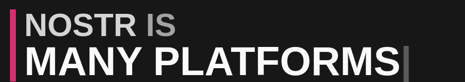
View 1/n “Nostr is for freedom maximalists”
Jb55 PFP creator of Damus app
Enthusiastic damus supporter #1 PFP + quote “I love zaps”
View 2/n “Nostr is for anarchists” Rabble PFP + Nos app Enthusiastic Nos supporter #1 PFP + quote “I love my moderated community”
View 3/n “Nostr is for musician” Mike PFP + Tunestr app + enthusiastic mysician “value for value on nostr lets me escape from the app” etc
As opposed to a vague and broad protocol description, there are now concrete examples of real apps from real devs solving problems for real customers. There is one nostr. There are many apps, devs, and customers.
cc nostr:npub1a7n2h5y3gt90y00mwrknhx74fyzzjqw25ehkscje58x9tfyhqd5snyvfnu
** lets me escape from the spotify musician hamster wheel/gulag
I think this is a job for nostr:npub10000003zmk89narqpczy4ff6rnuht2wu05na7kpnh3mak7z2tqzsv8vwqk
B
A, for builders. B, for average users. C, for content creators. That's the vibes I get. I fall more in the B realm. It's pretty & simple.
B
I like A
₿
B for a general audience. I’d even rewrite to “a new way to be social online (and more!)
“protocol” is a scary tech word. Also FB and X aren’t thought of as protocols by the folks who use them so IMO only a tech would want to know that at this point.
I like this. https://uselessshit.co/resources/nostr/
I used to use heynostr dot com but its gone now.
Honestly... they're all too serious though and contain too much tech jargon for the layman I reckon. We need to REALLY simplify this stuff. UX is vital.
A... Has most info/links above the fold
Definitely not C... No one wants to go blind.
Ugh. None of the above, though, I really love the aesthetics of A.