Please tell me which logo concept you like best:
#1

#2

#3

#4

Please tell me which logo concept you like best:
#1
#2
#3
#4
#1
#1
1
#3
They all fall. The last one falls apart.
#1, then #4!
I think #3
3, with 1 as a close second.
3
#3
#3 and #1
1
3
#1
#3
1
#3 looks more neat IMO
The first one
#4
I’m into 3. What is the reason/meaning of the bump on #2?
3 no doubt
order:
#3
#1
#2
#4
the only thing with the #3, is that’s the colour scheme that Primal is using
prefer the first one
I like #1
#3 looks more “professional” but generic and forgettable
#1
1 or 3 😊
1, but idk if I'd use it twice. Just once at the top and maybe a different font for the wording?
1
1 is the best in my opinion
3
#1
#3
To expand on my thinking:
The two lines in the first logo are unique enough that they make my brain automatically ask, what is this all about? Whereas with logo #3 my mind automatically pre-categorizes it as “generic modern app Logo” and I think no further.
So your first design has some built-in interest building and retention in my opinion.
nostr:note1h98yr4fspzsa7eyh5sxwm0gd5qr7fzw5rzs36sa7qtclgljxzdaqkzrwjy 
3 and no quotes around the tagline. 👍🏼
1
#1
#1 , #4 is ugly like my ex-mother in law 😂
3, but it can be simplified further.
And totally agree with nostr:npub1clk6vc9xhjp8q5cws262wuf2eh4zuvwupft03hy4ttqqnm7e0jrq3upup9
nostr:note1ge6vmsk2k8jnzs3ngjk4z38300t67znejuhjd28zgkftlgksawwsa7xv5r
#4
I love minimalist logos. Good job brother
#1
I'm between 1 and 4... idk I really like 4, tbh
I think #1 purely because the play on a track, different colors to emphasize relays of different value, and ireducible complexity. The others are not as memorable or symmetrical. You could cut number one in half and still recognize what it was.
#1
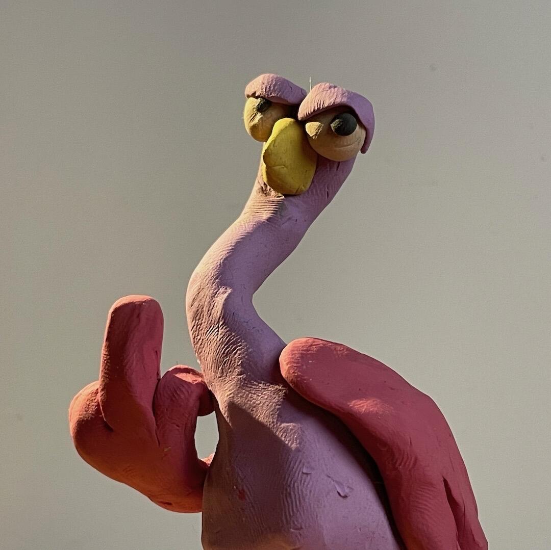
3 ... there's an opportunity to look like a node and an ostrich. just sayin

What is this? Did you just make it on the spot?
yep. just wanted to convey what i was thinkin lookin at your logos. hope im not steppin on any toes.
Opposite man it's great!!!
#1 and #2
4
+1
#2
#2
#3
2,1,3,4
3
2, 3, 1, 4
3,4 Seems like we need a new poll feature on Nostr 😅
#1
3. clearest, most simple.
3
#1
1+2
3
3
3
4
#3
1
#2 i like most, there is some contact & this bubble in the lines
Def #1.